The utility-over-usability effect explains why bad UX persists
uxdesign.cc
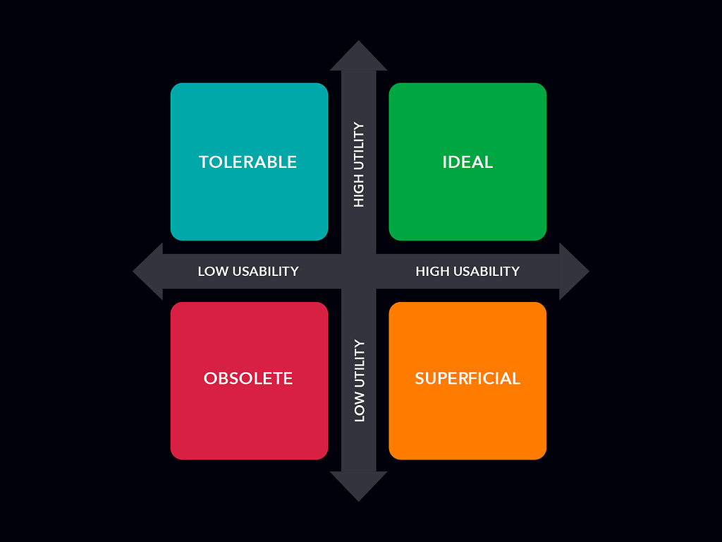
The more essential a product is, the more users tolerate poor usability.For years, UX designers have pushed the idea that usability is everything. The common belief is that a smooth, intuitive experience leads to engagement, retention, and conversions, while bad UX drives users away. And in many cases, thatstrue.However, during my 14 years as head of design at an medical publishing company, I learned something that challenged this assumptionwhen a product, service, or content is highly valuable or necessary, users tolerate badUX.I define this concept as a new UX framework called the Utility Over Usability Effectthe idea that utility (the value of what is being offered) sometimes outweighs usability (the friction required to engage withit).Usability vs. Utility Quadrant Diagram | Illustration byauthorThe Usability vs. UtilityQuadrantThe Utility Over Usability Effect becomes clearer when we break products into four categories based on their utility (how necessary they are) and usability (how easy they are touse).High Utility + High Usability IdealThe gold standard. These products are both essential and intuitive, making them a joy to use. Users rely on them daily with little friction.High Utility + Low Usability TolerableUsers struggle with the experience but keep using it out of necessitythink government portals, medical software, legacy enterprise tools, or even innovative platforms like Amazon andAI.Low Utility + High Usability SuperficialThese products may look great and function smoothly, but they dont provide enough value to be indispensable. If a better alternative comes along, theyre easily replacedlike flashy tech gadgets that fade quickly or apps with great UX but no realdemand.Low Utility + Low Usability ObsoleteA complete failure. These products are neither useful nor easy to use, leading to inevitable abandonment. If something isnt needed and its a pain to use, it wont survive forlong.Understanding where a product falls in this quadrant explains why some frustrating experiences persist while some beautifully designed productsfail.How I Discovered This PhenomenonAs part of my role at the medical publishing company, I not only evaluated our own offerings but also conducted in-depth competitor analysisassessing design choices, branding, marketing strategies, and overall user experience. Our primary focus at the time was professional oncology news and education.During my research, a clear pattern emergedmost oncology-related content platforms, including ours, suffered from frustrating UX issues. Overcomplicated sign-in processes, cluttered interfaces, and poor information architecture yet medical professionals continued using them despite theseflaws.Oncologists werent choosing platforms based on the experiencethey were choosing based on necessity. The information was critical to their work, and with so few alternative sources available, they put up with the friction.The same was true for our own products. Our digital oncology content held exceptional value because it was developed in collaboration with leading oncology societies and institutions. Physicians relied on it not for its UX, but for its credibility.This led me to a key realizationusability wasnt a significant factor in driving engagement and retention. The real reason users stuck around was the utility of thecontent.This insight reshaped my understanding of UX. While usability plays a major role in adoption and satisfaction, its not always the deciding factor. If the perceived or actual value of a product is high enough, users will tolerate poor usability rather than abandon something they genuinely need.A New Perspective on Why Users Endure BadUXMy experience in the medical publishing industry helped establish the principles behind the Utility Over Usability Effect. However, the notion that users accept bad UX under certain conditions isnt newconcepts like Jakobs Law and The Network Effect also demonstrate how familiarity or network-driven value can make users overlook usability issues.Jakobs Law states that users expect interfaces to work like the ones theyre already familiar with. This means they often resist changeseven when usability is improvedbecause relearning a system feels harder than sticking with an inefficient one.Similarly, The Network Effect makes usability a secondary concern when a platforms value comes from its ecosystem. Products like LinkedIn or Microsoft Teams retain users despite frustrating UX because leaving means losing access to essential connections, content, or workflows.While these ideas explain specific reasons why users tolerate bad UX, they dont fully capture the broader dynamics of the Utility Over Usability Effecthow the balance between intrinsic value and usability determines whether users endure friction or seek alternatives.The Effect in the RealWorldThe Utility Over Usability Effect isnt a unique phenomenon. Some of the biggest and most widely used platforms in the world have thrived despite usability issues, simply because they provide something people cant get anywhereelse.Amazon, for example, grew into an e-commerce giant while offering an experience that was anything but smooth. Its early design was clunky, its navigation chaotic, and even today, its interface remains overloaded with features. But that never stopped people from shoppingthere.Amazon homepage with 15 tabs (2000)Source: humanfactorsblog.orgThe reason Amazon dominated wasnt because of its user experienceit was because of what it offeredan unmatched selection of products, fast shipping, and competitive pricing. The sheer utility of the platform outweighed its usability flaws.The same principle applies to professional software. Adobe products have been criticized for years due to their complex menus, inconsistent workflows, and feature bloat. Photoshop, Illustrator, and InDesign are all known for their steep learning curves, yet they remained industry standards fordecades.Designers didnt keep using them because they loved the experiencethey used them because, for a long time, there were no viable alternatives. Adobe owned the market, and professionals had no choice but to adapt to its difficult UX. Only in recent years, with the rise of competitors like Figma, has this grip started toloosen.Even today, were seeing this Utility Over Usability Effect play out in the AI space. Have you attempted creating images using MidJourney? Or simply tried navigating OpenAIs platform? The UX of these tools can be frustratingMidJourney requires users to generate images through Discord with cryptic prompts, and OpenAIs interface can feel counterintuitive attimes.Yet, people tolerate the friction because the technology itself is highly valuable and new. When innovation is fresh and groundbreaking, users are willing to endure bad UX because the utility outweighs the experience.When Theres No ChoiceGovernment, Universities, and Bureaucratic SystemsThe Utility Over Usability Effect is also easy to spot in areas where users have no alternative but to push through bad UX. Universities, government websites, and corporate portals are notorious for poor usability, yet people continue to usethem.Applying for a business license, registering for college courses, or submitting a grant application often means navigating confusing and unintuitive systems. But since these services are necessary, users endure the friction because they dont have anotherchoice.When I was pursuing my graduate degree, I was blown away by how awful the usability of the FAFSA website was. The Free Application for Federal Student Aid (FAFSA) is required for most college enrollments and despite its convoluted design, students have no choice but to endureit.The Illusion of UsabilityWhen Utility and Aesthetics Mask PoorUXWhile the Utility Over Usability Effect explains why users tolerate bad UX when the value is high enough, theres another layer to this phenomenonone that designers and product teams oftenexploit.Sometimes, a product isnt truly usable, but it feels usable because it combines high utility with strong aesthetics. This creates the illusion of usability, where users perceive an experience as smoother than it really is simply because it looks polished and provides something theyneed.This ties into the Aesthetic-Usability Effectthe psychological principle that people perceive aesthetically pleasing designs as more functional and user-friendly, even when they arent. In other words, users subconsciously equate good design with good usability, even if the experience is frustrating.Apples early skeuomorphic designs (Source: iphoneincanada.ca)Think about Apples early skeuomorphic designs. They werent necessarily easier to use than competitors, but they felt intuitive because they mimicked real-world objects. Or consider Teslas touch-based controlsthe interface looks sleek and modern, but in practice, replacing physical buttons with a screen often adds friction rather than reducingit.This illusion works because users associate beautiful design with ease of use. If it looks easy, it must be easy. However, this effect has limits. If usability flaws become too apparentlike Tesla drivers struggling to adjust basic settings while drivingthe illusion breaks. But as long as a product remains high-utility and visually refined, many users will tolerate the friction.Why This Effect Matters for UX DesignersMany UX professionals operate under the assumption that improving usability is always the path to better engagement. But The Utility Over Usability Effect challenges thatbelief.When users keep returning despite bad UX, it often means theyre doing so because they need the product, not because they enjoy the experience. In industries where content depth and functionality are more important than visual appeal or seamless interaction, improving usability might not be a primaryconcern.That said, this effect has a natural limit. As soon as an alternative emerges that offers the same level of utility with better usability, users will make the switch. Microsoft Word was once the default for document creation, but Google Docs gained traction by offering a simpler, more collaborative approach.Leveraging This Effect as a Strategic AdvantageFor companies operating in high-utility, low-usability spaces, The Utility Over Usability Effect can act as a buffer for experimentation. When users rely on a system due to its necessity, businesses may feel they have room to test unrefined features, roll out major interface changes, or even deprioritize usability in favor of other businessgoals.When I worked for the medical publishing company, I did this regularlyblasphemy, I know. We had several high-value content platforms, giving us the luxury of rolling out live feature updates and gathering direct feedback and metrics. To be honest, nothing truly replaces real audience feedback andtesting.However, this is a double-edged sword. While platforms like Amazon, Google, and Adobe have managed to make controversial UX decisions without immediate user drop-off, history shows that usability problems can accumulate until they create an opening for disruption.Take Amazon, for examplethey didnt ignore usability forever. Over time, it introduced one-click purchasing, streamlined checkout processes, and personalized recommendations to improve the experience.This means companies can experiment, but they shouldnt assume users will tolerate bad UX indefinitely. The moment a competitor offers equal utility with better usability, the patience of even the most locked-in users will wearthin.Resource Allocation and Market ConsiderationsFor companies with limited resources, the Utility Over Usability Effect suggests that prioritizing usability investments should depend on how vital or unique the product is within itsmarket.If a product operates in a saturated market with strong competition, usability becomes a crucial differentiatorusers will gravitate toward the option that offers both utility and a seamless experience. However, if a product serves a niche, high-necessity market with little competition, companies can often get away with investing less in UX, as users will endure friction out of necessity.This might not be what most UX professionals want to hear, but businesses think in terms of ROI. When usability isnt the primary reason users engage, companies may allocate resources elsewhere, such as expanding features, improving infrastructure, or increasing content depth. However, this is a calculated riskone that works until a competitor proves that usability can be a differentiator.The KeyTakeawayThe Utility Over Usability Effect is a reminder that bad UX isnt always a dealbreakerif the perceived value of a product is high enough, people will endure friction to access it. But that tolerance only lasts as long as theres no better alternative.For companies operating in high-utility spaces, this effect can sometimes provide room for experimentation. When users rely on a product out of necessity, businesses may have more flexibility in testing changes or rolling out unpolished features without immediate drop-off. However, this is only a temporary advantage.A product that thrives despite poor usability is operating on borrowed time. The question isnt whether usability mattersits whether usability is keeping users engaged or whether its simply being tolerated.If users are putting up with a frustrating UX because they have no other choice, its only a matter of time before someone else gets it right. And when that happens, usability stops being an afterthoughtit becomes the decidingfactor.Dont miss out! Join my email list and receive the latestcontent.The utility-over-usability effect explains why bad UX persists was originally published in UX Collective on Medium, where people are continuing the conversation by highlighting and responding to this story.
0 Commentarii
·0 Distribuiri
·109 Views