Design Milk
Design Milk
Design Milk is dedicated to modern design. Visit us at design-milk.com.
201 людям нравится это
28 Записей
0 Фото
0 Видео
Недавние обновления
  • F5: Nathan Warkentin Talks Brown, the View From His Window + More
    design-milk.com
    Nathan Warkentin has tried his hand at a number of artistic pursuits, from photography to music, but he felt a pull to go in another direction, and so interiors became that space for him to explore. Its the most immersive and dimensional creative process Ive found, he says. It has a bit of everything I have done in the past, yet feels limitless.Warkentin founded his eponymous firm in 2023, noted for a refined, strategic approach. With offices in New York and Los Angeles, he captures the essence of both coasts in hospitality and residential settings. Warkentin also seamlessly integrates originality with functionality to build spaces that resonate on a deeper level.Nathan Warkentin \\\ Photo: Anna ArnetThe designer doesnt have to go far to find inspiration because he has a research library that is filled with books. Covering an array of subjects, some of his favorites are on fashion and Japanese design. He always adds to the collection, too, checking out used bookstores when he travels or is looking for rare finds.Theres not really a separation between life and career for Warkentin. Instead of trying too hard to compartmentalize, he embraces all facets. Whatever he chooses to consume though, whether food or mass media, it will eventually serve as an influence for him in one way or another.Change is constant in the field, and while some people find this stressful, Warkentin thrives. Every project brings a new set of conditions: different city, different scale, different client, he notes. What I enjoy most is the variety.Today, Nathan Warkentin joins us for Friday Five!Photo: Nathan Warkentin1. Homage to Josef Hoffmann by Shiro KuramataI got to see this piece in person at M+ in Hong Kong earlier this year. Kuramata started with a Josef Hoffmann bentwood chair, wrapped it in steel wire, then set it on fire. The wood burned away, leaving only the steel-wire silhouette like a ghost of the chair. I love how it layers reference, materiality, and transformation. Finding the line between functional design and art object is always interesting to me.Photo: Nathan Warkentin2. 90s Music and Fashion MagazinesI love old 90s magazines like Interview and Raygun. Theres something about it that feels so raw. The layouts are always a little chaotic in the best way. I also love the little ads for obscure nightclubs, record shops, or galleries in NY or LA. You dont really see that whole underground culture in print anymore. Does it still exist?Photo: Nathan Warkentin3. Museo Tamayo in Mexico CityI always stop through Museo Tamayo when I am in Mexico City. I love the architecture, the simplicity of materials, the volume, and how it all feels bold but restrained. Its really well balanced, where you can appreciate the building without it ever distracting from the art.Photo: Nathan Warkentin4. The View Out My WindowOur studio is in the Orpheum building in downtown L.A., where the street outside is never boring. From my desk I get a front-row seat to the chaos and charm of L.A. (K-Pop fans wrapped around the block, amateur photo shoots, or the occasional character on a soapbox). Its unpredictable, sometimes a little wild, but always entertaining and a welcome distraction when I am working late.Photo: Nathan Warkentin5. The Color Brown or Variations ofNot many kids would pick brown as their favorite color, but I keep coming back to it or some variation (sienna, ochre, caramel, amber, rust). These warm neutrals have so much depth and versatility, and they age beautifully in a space. More and more, I find myself swapping black for brown for the warmth it adds.Works by Nathan Warkentin and Warkentin Associates:Photo: Yoshihiro MakinoThe Lighthouse VeniceThe Lighthouse is a creative campus we designed in Venice Beach in the old 1939 Venice Post Office. We reimagined the historic building with a Bauhaus spirit. The idea was to keep things really simple, functional, and honest. The spaces flow between analog and digital work, encouraging both focus and collaboration. I think this backdrop allows the people and ideas to really come through.Photo: Anna ArnetEcho Park ResidenceThis hillside home in Echo Park takes inspiration from Ray Kappes Rustic Canyon house, where light and materiality really shape the space. Our interiors build on that spirit with moments of playfulness and unexpected color layered in. Since it was a new build, we really wanted to create a lived-in feel that was achieved by mixing in vintage pieces with custom site-specific design. The dramatic double height volumes also allowed for an interior bridge with suspended sculptural lighting. The home was designed in collaboration with Bunch Design as architect.Photo: Anna ArnetNoun Coffee and WineNoun is a new cafe and lounge we designed in Marina del Rey. Its meant to work as an all-day spot, coffee in the morning and natural wine at night. We leaned into the concept of eclectic comfort, drawing from 90s coffee houses with seating that feels more like a living room than a caf. Vintage pieces, postmodern touches, and some DIY elements give it the charm of an artists loft. Its relaxed, personal, and a little unexpected.Photo: Austin LeisEagle Rock ResidenceOur Eagle Rock home has a simple, open plan that connects to the outdoors and makes the most of the view. We gutted it when we first moved in and then just kept layering over time with art, furniture, and objects collected from estate sales, thrift stores, and travels. Pieces are always moving around or getting swapped out, so the house never feels finished. Its constantly evolving, which keeps it fun.Photo: Yoshihiro MakinoLos Angeles ResidenceThis mid-century home in Mt. Washington hadnt really been touched since the 60s, so we wanted to bring it forward without losing its soul. We looked to Japanese and Chinese principles about light and empty space and avoided the usual mid century cliches. I love the warm and calming feeling of this home.
    0 Комментарии ·0 Поделились
  • CYKLO Eyewear From Vinylize Gives New Life to Old Bike Cables
    design-milk.com
    As sustainability and circular design gain more traction within the design space, greenwashing is also on the rise. Brands are riding the hype of new materials, with a head-in-the-sand approach to the unfortunate consequences of using new materials. Not so with CYKLO, an eyewear line from Vinylize that takes reclaimed bike cables and transforms them into eyeglasses and sunglasses. Breathing new life into material previously discarded (and notoriously hard to recycle), this line provokes welcome conversation around where things go when were done with them.The lineup of dynamic designs keeps CYKLO feeling modern and fresh. The temples are created with the bike cables and fitted with lightweight cellulose acetate fronts made from old vinyl records, offering cohesion within styles. With multiple finishes, including a delightfully striped variant, each offers adornment while also offering prescription and UV protection as well. Since the cables are reclaimed, this means no two pairs can be the same, offering a one-of-a-kind, luxury product that also does good for the earth in tandem.The Bowden cable brake, first invented in 1896, enabled a burgeoning cycling industry to really take off, providing reliability and much-needed handling navigating rocky terrains or city streets. It is ingenious in its simplicity, with a simple three-layered design, yet has had a huge impact on design at large, quickly lending itself to multiple industries, including transportation, manufacturing, and industrial design. This somewhat humble invention has touched an unquantifiable amount of products and processes, enabling freedom and innovation.Because of their ubiquity, an incredible amount of brake cables are made and discarded every year, difficult to recycle due to their layered design. A slender steel wire sits at the core, coiled tightly for tensile strength. A helically wound layer of flat steel wraps around the wire, while a layer of polyethylene holds the entire structure together. Instead of breaking down these components, using a lot of energy to do so, Vinylize takes another route: all discarded cables from local bicycle shops are sorted, cleaned, cut to size, and laser engraved before assembly. This process takes an often forgotten invention and brings this legacy of innovation full circle, reminding us that even modest inventions can have incredible impact.The results are stylish eyeglasses that are comfortable to wear, long-lasting, hypoallergenic, and easily adjustable. The collection consists of six models, including three designs named after key members of the band Queen Mercury, May, and Deacon which are available in five colors. The other three styles arenamed for famed cyclists Bottechia, Franzt, and Aimo and come in three colors each.Vinylize is an eyewear brand creating unique and innovative designs to adorn and inspire. The first Vinylize frame was carved by hand from a 12 Creedence Clearwater Revival album and held together with cigar box hinges. From this first prototype crafted in 2000, co-founder Zachary Tipton set out to find a way to produce frames from records. In 2004, he teamed up with his brother, Zoltan, and established their first factory in the EU. Since then, they have reclaimed tons of records from landfills, working to create a link between fans of sound and sight.To learn more about CYKLO by Vinylize, please visit vinylize.com.Photography courtesy of Vinylize.
    0 Комментарии ·0 Поделились
  • Ariane van Dievoet Explores New Ways to Work Offcuts Into Design
    design-milk.com
    When working with raw materials like wood and natural stone, even the discarded fragments carry a quiet beauty. Instead of sending them to the landfill, Belgium-based designer Ariane van Dievoet explores how these remnants can take center stage in her work. The result is a series of one-of-a-kind pieces that prove quality materials can shine, even in their second life.CONNECTIONS side table \\\ Photo: Oksana TkachukThere are a couple of challenges that come with working in discarded or reclaimed materials. The first is reproducibility. Because fragments vary in size, shape, and color, the final design is nearly impossible to replicate. The second is quality. Many fragments, especially those sourced from demolition sites, come with flaws. Rather than see these issues as limitations, van Dievoet embraces them, allowing constraints to shape the work. Creating from materials that have already been used forces me to take into account their shape, thickness, and any breaks, she explains. These constraints are a driving force and inspiration in my creative process.CONNECTIONS side table \\\ Photo: Oksana TkachukHer CONNECTIONS collection takes on the challenge of reproducibility head-on. Instead of striving for uniformity, van Dievoet builds continuity through the frame, crafted from oak sourced in Brussels Sonian Forest, while reclaimed stone ensures every piece is one-of-a-kind. Using a precision water jet cutter, she carves cut-outs that allow the wooden structure to pass through the stone; the stones weight locks everything into place. The result is a system that supports a cohesive product line while celebrating the uniqueness of each reclaimed piece.CONNECTIONS side table \\\ Photo: Oksana TkachukConnections shelf \\\ Photo: Oksana TkachukCONNECTIONS shelf \\\ Photo: Oksana TkachukCONNECTIONS shelf \\\ Photo: Oksana TkachukCONNECTIONS shelf, Collected Matter bookends \\\ Photo: Oksana TkachukCollected Matter bookends \\\ Photo: Oksana TkachukThe Collected Matter and Reflected Matter collections address the issue of flaws. In Collected Matter, materials gathered from production or demolition sites are given a second life as functional objects in their raw state. Each piece whether a bookend, box, or trinket tray becomes a stage for its new owners own collection of objects.Collected Matter bookends \\\ Photo: Oksana TkachukEcho Mirror \\\ Photo: Oksana TkachukRather than concealing imperfections, Reflected Matter series celebrates them through mirrors. Here, natural stone fragments hold mirrors upright, the reflective surface drawing attention to every edge, crack, and contour of the supporting stone. The result is a dialogue between fragment and reflection, flaw and finish.Echo Mirror \\\ Photo: Oksana TkachukEcho Mirror \\\ Photo: Oksana TkachukTethys Mirror \\\ Photo: Oksana TkachukTethys Mirror \\\ Photo: Oksana TkachukTethys Mirror \\\ Photo: Oksana TkachukRift Coffee Table \\\ Photo: Oksana TkachukLastly, the Rift Coffee Table takes a crack at turning breaks into beauty. Inspired by the surface of her Rift Console and the structure of the Dominican Bench, van Divoet transforms a central fissure into the tables defining feature. The split tabletop is unified by a precise geometric cut, creating a balance between disruption and cohesion. Made from reclaimed oak paneling and crafted with a digital milling machine, the light, playful structure fits together seamlessly a surprising revelation that even a crack can be the foundation of something whole.Rift Coffee Table \\\ Photo: Oksana TkachukRift Coffee Table \\\ Photo: Oksana TkachukFragments, flaws, and fissures are often seen as unsightly, but van Dievoet proves otherwise. Instead of discarding these parts, she transforms them into the driving force of her practice, pushing her to create design that is both inspiring and sustainable.Rift Coffee Table \\\ Photo: Oksana TkachukAriane van Dievoet \\\ Photo: Eline WillaertAriane van Dievoets work can be viewed at the Curated design fair, the Forward furniture exhibition at Dutch Design Week in Eindhoven (October 18-26, 2025), and the Caress exhibition by B Collective during the MAD Parcours in Brussels this November. To learn more about her practice, visit arianevandievoet.com.Photography courtesy of Ariane van Dievoet.
    0 Комментарии ·0 Поделились
  • Wooj Goes Cordless With Portable Lamps for Life on the Go
    design-milk.com
    Every time we think weve settled on a favorite Wooj lamp, they go and drop something new to shake things up. This time, the Brooklyn-based studio has officially gone cordless, giving its sculptural, 3D-printed designs the freedom to move from bedside to backyard no outlets required. The new Cordless Collection keeps the distinctive, modern style Wooj is known for, but adds a practical twist: built-in rechargeable power that makes these lights the perfect choice for setting the mood, no matter where you take them.Mini Wavy Lamp \\\ Photo: Henya RosenKinoko Lamp \\\ Photo: Dillon MatthewThe cordless collection kicks off with portable versions of Woojs best-selling designs, each reimagined for life untethered. A newly designed base allows for USB-C charging and houses the LED unit, which offers three dimmable settings: low (~560 lumens), medium (~1900 lumens), and high (~3180 lumens). On maximum brightness, the lamps run for 15 hours, while the lowest setting clocks in at an impressive 80 hours. Impatient? You can even use the light while its charging.Camp Lantern \\\ Photo: Sean KimCamp Lantern \\\ Photo: Sean KimTo celebrate the launch, Wooj also unveiled a brand-new design: the Camp Lantern. With a paracord sling handle, its easy to tote from room to room, hang on a hook, or bring along for a camping trip. Like the rest of the cordless collection, its waterproof body is built to handle everything from wilderness adventures to backyard parties.Camp Lantern \\\ Photo: Sean KimMini Wavy Lamp \\\ Photo: Henya RosenReturning favorites include the Mini Wavy Lamp, which gets even cuter in cordless form. Like a ripple plucked straight from the sea, it glows just as easily on your nightstand as it can on your patio table.Kinoko Lamp \\\ Photo: Dillon MatthewThe Kinoko Lamp, with its mushroom cap silhouette, is playful, portable, and a little whimsical. Its sibling, the Mini Drum Lamp, is all about clean lines and quiet confidence.Mini Drum Lamp \\\ Photo: Matthew GordonMini Allium Lamps \\\ Photo: Matthew GordonAvailable in amber, smoke, and clear, the Mini Allium Lamp casts a warm glow that makes any corner feel instantly cozier. For some added drama, the Prisma Lamp strikes a pose as a sculptural tower of origami-inspired folded pleats, guaranteed to spark conversation.Prisma Lamp \\\ Photo: Grace RiveraPrisma Lamps \\\ Photo: Grace RiveraAs hosting season kicks off, Woojs new Cordless Collection makes it easier than ever to set the mood anywhere. From holiday parties to impromptu backyard hangs, these portable lamps bring their sculptural glow without the hassle of cords or outlets.Camp Lantern \\\ Photo: Sean KimCamp Lantern \\\ Photo: Sean KimMini Wavy Lamp \\\ Photo: Henya RosenMini Wavy Lamp \\\ Photo: Henya RosenMini Wavy Lamps \\\ Photo: Ben AmandesKinoko Lamp \\\ Photo: Dillon MatthewKinoko Lamp \\\ Photo: Dillon MatthewMini Drum Lamp \\\ Photo: Matthew GordonMini Allium Lamp \\\ Photo: Roshan JacobMini Allium Lamp \\\ Photo: Roshan JacobPrisma Lamp \\\ Photo: Grace RiveraPrisma Lamp \\\ Photo: Grace RiveraPrisma Lamp \\\ Photo: Grace RiveraTo light up your life with Woojs cordless lamps, visit wooj.design.Photography courtesy of Wooj.
    0 Комментарии ·0 Поделились
  • A Palm Springs Residence Is Redesigned With Art at Its Core
    design-milk.com
    When designer Nina Freudenberger was asked to reimagine a Palm Springs, California residence for a pair of longtime clients, the project unfolded less as a renovation and more as a dialogue one with the existing architecture, with the desert, and most notably, with the clients storied art collection. Barring the possibility of major construction, the home became a study in creative restraint for Freudenberger Design Studio requiring thoughtful furniture choices, subtle materiality, and a disciplined palette to transform the existing structure into something deeply personal.The clients art collection quickly became and remains the soul of the project. Rather than compete with it, Freudenberger approached the interiors with what she calls decorating to 92 percent a philosophy of restraint that leaves room for art to breathe and evolve. Gallery-like walls, a light and neutral palette, and moveable furniture allow the collection to take center stage while giving the clients the flexibility to reconfigure displays as their tastes shift.Its important not to overwhelm a space, Freudenberger notes, The clients wanted something that was distinctly unfussy.In a city celebrated for mid-century modernism, Freudenberger resisted the temptation to lean into familiar tropes. Instead, she looked to Post-Modern influences, layered with her signature blend of Scandinavian sensibility and California ease. The result feels contemporary yet rooted in context for a crisp, modern aesthetic that acknowledges Palm Springs design heritage without being defined by it.Climate, too, was an influence. Heavy boucls and dense fabrics are eschewed in favor of breathable, lighter-weight materials that mirror the deserts airy quality. Rift-sawn oak, Roman clay walls, and golden wheat tones warm the space, while cool whites and minimalist gestures lend balance. The meticulous level 5 drywall finish a hallmark of Freudenbergers work offers a smooth, gallery-ready foundation for art while supporting a clean, modern language.At its core, the redesign is about more than aesthetics. The home must support a life at ease for both people and pets, from casual merriment to formal occasion. Durable, stain-resistant fabrics and practical flooring choices make the house livable without sacrificing sophistication. Natural light, an abundant desert resource, is harnessed with fenestration unencumbered by heavy window treatments. This ensures that mornings and evenings are equally considered in their ability to effect change indoors while framing one-of-a-kind views.That balance celebrating the magic of natural light while creating a comfortable environment at any hour was key, the designer adds.The completed Palm Springs residence is both serene and lively: a crisp canvas for art, a comfortable refuge for everyday life, and a welcoming, light-filled environment that feels distinctly of its place and time. It exemplifies Freudenberger Design Studios ethos, which champions spaces that are responsive to clients and architecture alike, elevated not by sweeping intervention, but by thoughtful, intentional design.Here, the art leads. The design follows, not in deference, but in conversation proof that sometimes the most compelling interiors are those that leave just enough room for art and object to do some talking.To learn more about this and other works by Freudenberger Design Studio, visit freudenbergerdesign.com.Photography by Chris Mottalini.
    0 Комментарии ·0 Поделились
  • The HTC Vive Eagle Smart Glasses Have AI-Powered Translation
    design-milk.com
    Smart glasses are quickly becoming one of the most intriguing frontiers in wearable technology, with major players racing to strike the right balance between fashion and function. HTC is the latest to step into the spotlight with the Vive Eagle AI smart glasses, a sleek new model designed to challenge the likes of the Meta Ray-Ban glasses while carving out its own niche with a focus on AI-powered assistance and real-time translation.Unlike bulky AR headsets that have yet to break into the mainstream, the Vive Eagle glasses take a fashion-first approach. They feature slightly thicker-than-average arms to discreetly house their tech, along with a 12MP ultra-wide camera tucked into the frame. While the camera can take photos, its primary role is to give the AI assistant visual context, allowing it to better understand and respond to your environment.Available in several colors most with transparent finishes the Vive Eagles design leans toward a futuristic, lightweight aesthetic. That choice might not appeal to everyone, but it showcases HTCs intent to create glasses that stand out without feeling like a gadget strapped to your face.While the dream of glasses that overlay digital information directly in your field of vision is still a work in progress, HTCs approach makes the most of what todays tech can offer. By pairing microphones, speakers, and smartphone connectivity, the Vive Eagle transforms into a voice-driven AI companion.The glasses integrate with platforms like ChatGPT and Gemini, letting you query the web, ask general knowledge questions, or get contextual answers to whats in front of you. Voice commands expand the functionality further, giving wearers the ability to record quick reminders hands-free; translate conversations in real time across 13 languages; and get local recommendations, such as nearby restaurants or cafs.This emphasis on AI elevates the experience far beyond what basic smart audio glasses can offer. Instead of simply streaming music, the Vive Eagle positions itself as a practical tool for travel, productivity, and everyday convenience.HTC claims the glasses deliver up to 36 hours of standby time and around 4.5 hours of continuous playback, which is on par with other smart eyewear options. As with wireless earbuds, the included charging case helps extend usability throughout the day.For now, the HTC Vive Eagle glasses are launching exclusively in Taiwan, priced at the equivalent of $520 USD. HTC hasnt confirmed a wider rollout, but given the growing interest in AI wearables, a global release may not be far off if early adoption proves strong.To learn more about the HTC Vive Eagle smart glasses, head to vive.com.Photography courtesy of HTC.
    0 Комментарии ·0 Поделились
  • Fatboys Little Lebow Table Lamp Brings Playful Design + Perfect Light
    design-milk.com
    There is something about the weight of an object that gives it depth. As humans, we are intrinsically drawn to metals, gems, and stones for their beauty, rich expanse of color, and intricate detailing.The Little Lebow table lamp from Fatboy, designed by Dutch design duo Kranen/Gille, taps into that same instinct. Crafted from cast aluminum and coated steel components, it feels reassuringly solid, yet its form evokes a lily-of-the-valley likeness organic, approachable, and quietly playful.More than just a pretty face, the Little Lebow is smartly engineered. Each lamp head is both dimmable and rotatable, giving you total control over direction and brightness. Whether youre reading late into the night, powering through work, or simply creating a cozy atmosphere, the lamp adjusts effortlessly to your needs. It even remembers your last light setting, so the next time you switch it on, the ambiance is already set.Practical touches elevate it further: a generous 180cm braided cord (always color-matched to the lamp), an anti-slip base that keeps it steady, and replaceable bulbs that make it built for the long haul. Plug it in, twist the dimmer, and youve got instant ambiance whether a subtle glow or spotlight precision.Design-wise, the lamp straddles the line between refined and fun, available in four finishes: Anthracite (inky charcoal), Bone (a cool cream), Cobalt Blue (bold and striking), and Grasshopper Green (a lively grassy hue with a blue undertone that pairs beautifully with warm-toned woods). Its a versatile fit for a desk, side table, credenza, or even an entryway always grounding the space while adding a touch of personality.The Little Lebow has already earned accolades, including the Best of Design Award from leading European magazine Schner Wohnen, recognized for its ability to seamlessly combine style, function, and joy. Its a reminder that good design doesnt just light up a room it elevates it.Fatboy is a Dutch design brand that believes life is too short for boring. From its iconic oversized Fatboy beanbag to a full collection of playful-yet-practical furniture and lighting, the brand has made a global name for itself with its signature red tag and refreshing spirit. With the Little Lebow, Fatboy continues to show that great design can be both functional and fun proof that even everyday objects deserve a spark of play.To learn more about the Little Lebow table lamp by Kranen/Gille for Fatboy (which is available now in Europe and will be available in the United States in the coming months), please visit fatboy.com.Photography courtesy of Fatboy.
    0 Комментарии ·0 Поделились
  • A Burger Bar in Poland Offers a Modern Twist on a Classic American Eatery
    design-milk.com
    Hamburgers of every variety are fast food favorites, including the popular smash versions popping up on menus everywhere. For the PLUTO brands first brick-and-mortar restaurant, architects at Znamy Si looked to the signature patties for inspiration. The entire design draws from the philosophy of smash burgers simple tools, strong effect, says Wojciech Nowak, co-founder of Znamy Si. We wanted the interior to emphasize richness through minimal means.Located in Wrocaw, Poland, the busy lunch spot is seemingly simple, but filled with the kind of elements that add character. An open grill sits at the heart of the space, framed by a raw metal structure reminiscent of a city food stand.The long bar and leather-topped stools, reminiscent of the furnishings in a traditional American diner, also double as a social zone where guests can eat their meals and watch the cooks at work in the open kitchen. A unique triple-layer countertop echoes the look of a perfectly composed burger.Lighting offers an ambient glow directed toward the ceiling, where the PLUTO logo floats inside a circular frame. Materials throughout are restrained, yet still have richness. Textured plaster covers the walls, while ceramic flooring brings a luxe touch underfoot. Wood and leather finishes complement retro-style polished accents. Irregular glass blocks provide just enough sheen. Undulating lines enliven every corner with a sense of natural fluidity.Colors like deep caramel brown and orange tones represent the flavors and heat synonymous with cooking, and are coupled with the soft baby blue tint of the brand to create a balanced, fresh palette.The combination of the contemporary design and classic fare are paired to delight customers. Our goal was to make the guest experience start even before the first bite, with an interior that feels warm, energetic, and authentic, like comfort food turned into space, Nowak notes.PLUTO x Znamy SiFor more information, visit znamysie.com.Photography by Migdal studio.
    0 Комментарии ·0 Поделились
  • Audio Pro Takes on Sonos With the A10 MkII Black
    design-milk.com
    Audio Pro is aiming straight at Sonos with the latest update to its compact yet powerful wireless speaker, the A10 MkII. Already praised for its rich sound, versatile streaming support, and minimalist design, the speaker now comes in the sleek new A10 MkII Black edition. The fabric-wrapped cylindrical design keeps things understated and modern, making it an easy fit for just about any interior.While the A10 MkII may be small, its designed to make a big impression. The speakers compact, circular build looks elegant on a table or shelf, but it can also be wall-mounted for those who prefer a more discreet setup. The new black fabric finish adds a subtle, premium edge for users who want their audio gear to blend seamlessly with home decor rather than stand out.Despite its modest size, the A10 MkII Black doesnt compromise on performance. Inside is a dedicated woofer that delivers impressively deep bass for its class, while a radiator driver ensures crisp, detailed highs. Audio Pro has engineered the radiating driver to spread those high frequencies wider than traditional setups, helping to create a fuller, room-filling soundstage. Of course, bass lovers may still gravitate toward larger speakers, but the A10 MkII balances clarity, depth, and punch in a way that makes it a strong contender in the compact smart speaker market.Like its predecessor, the A10 MkII Black comes loaded with support for todays most important streaming technologies. Users can stream wirelessly via Apple AirPlay 2, Google Cast, Spotify Connect, and Audio Pros own multi-room system. That last feature allows listeners to connect multiple Audio Pro speakers together, filling an entire home with synchronized music a direct rival to Sonos multi-room dominance.Adding to the convenience, the four physical buttons on the top of the speaker can be customized with presets. That means with a single press you can launch a playlist, tune into your favorite radio station, or instantly start a streaming service.Our presets have become undeniably popular. We see that the ease of use of this function is greatly appreciated by our customers, says Jens Henriksen of Audio Pro.The Audio Pro A10 MkII Black joins the existing lineup of fabric finishes and is priced at $250.For more information or to purchase visit audiopro.com.Photography courtesy of Audio Pro.
    0 Комментарии ·0 Поделились
  • Take 5: A Quirky Crocs Collab, Colorful Glassware + More!
    design-milk.com
    Twice a month were inviting one of the Design Milk team members to share five personal favorites an opportunity for each of us to reveal the sort of designs we love and appreciate in our own lives from a more personal perspective. Social Media ConsultantMaivy Tranreturns this week for ourTake 5series.1. SLBS x Crocs collabCrocs may not be your cup of tea and they werent mine but this phone case might have converted me. The SLBS x Crocs collab has taken the quirkiest part of Crocs and turned it into phone fashion, and I didnt think I needed it but the more I stare, maybe I do? The cases mimic Crocs signature ventilated uppers, come in cotton candy pastels (mint green, baby blue, blush pink) plus timeless classics like ivory and black, and you can deck them out with Jibbitz charms (the absolute best part)! Theres even a detachable, modular strap so your phone can be carried like its part of your outfit, not just stuffed in your bag. Galaxy users had first dibs, and iPhone users youre finally in on the fun. Coming soon, so keep your eyes peeled!2. PlayfieldI recently discovered Playfield and learned it all started with a dog named Bailey (aka the founders soul dog). What began as a personal love for Bailey has blossomed into gear that actually makes sense stylish, functional, and totally un-basic. Every piece feels like someone imagined a real day out with a pup, not just what looks cute on Instagram, and thats exactly what I love about it. Plus, theres something so fun about switching up your dog gear it makes outings with your pup something to look forward to when you know youve got playful, thoughtfully designed goodies to grab on the way out the door.3. Ursula Futuras GlasswareUrsula Futuras glassware is pure happiness in object form colorful, whimsical, and impossible not to smile at! Every piece is full of personality (basically the opposite of sad beige), and I love how they instantly transform a tablescape into something playful and unexpected. The brand itself is all about channeling curiosity and wonder into functional objects, which totally comes through in their wavy silhouettes and dreamy hues. Honestly, even just having one of their pieces on display would deliver a little daily dose of joy and thats exactly what we all need in our everyday lives.4. MUSEWASH Laundry Detergent SheetsIve been more conscious lately about the products I bring into my home, and making the switch to non-toxic ingredients has been at the top of my list. MUSEWASHs detergent sheets check all the boxes: plant-based, biodegradable, cruelty-free, and way less wasteful than the bulky plastic jugs Ive been trying to ditch. They even come in unique scents that sound so luxurious (and if they smell as good as they sound, Im sold!), plus an unscented option for anyone sensitive. Its refreshing to know a brand can be clean, sustainable, and actually make my clothes feel and smell amazing, all without compromising the planet in the process. Once my current detergent runs out, these little sheets are next in line for a spin!5. SEVAS Water CatcherI love an eco-idea thats as clever as it is simple, and the SEVAS Water Catcher is just that a sleek container that sits in your shower, catching all that perfectly clean water we usually let run down the drain while waiting for it to heat up. Each one can save up to 1,800 liters a year(!!), and the genius part? It doubles as a watering can! It feels like such a small action, but reusing water like this is such an effortless way to make a meaningful impact on the planet. Its perfect for anyone with a garden or anyone who just likes knowing theyre making a small but real difference.
    0 Комментарии ·0 Поделились
  • The Nasayem House Brings Wind, Light, and Natural Materials to Saadiyat Island
    design-milk.com
    On Saadiyat Island in Abu Dhabi, the Nasayem house by A Work of Substance offers a modern sanctuary inspired by desert winds, light, and cultural heritage. Spanning nearly 19,400 square feet, this private residence is shaped not only by architectural vision but also by the deserts gentle breezes its very name, Nasayem, means soft winds in Arabic.Rather than shielding itself from the environment, the home embraces the natural forces of Saadiyat Island. Wind, light, and shadow are treated as design partners, weaving through the layers of the building to create a living, breathing structure. The result is a residence that feels at once secluded and open, intimate and expansive.Every detail reflects a deep connection to the cultural heritage of the region. Intricate Arabic patterns are etched into archways, windows, and screens, infusing the home with historical resonance. Hand-carved teak latticework, inspired by Bedouin geometric motifs, creates thresholds that filter sunlight, encourage airflow, and provide privacy without enclosure. Locally inspired materials such as palm leaf, mud brick, coral stone, and thatch further root the home in the deserts timeless aesthetic.At its center, Nasayem features a double-height courtyard that reinterprets a cornerstone of Islamic architecture. A massive live tree rises from the courtyards center, its canopy growing toward the skylight above. At its base, a circular bench wraps around the planter, transforming the tree into a focal point for gathering.The courtyard also serves as a passive cooling system, harnessing airflow and natural light. Above, an expansive skylight filters sunlight, creating shifting patterns that move across walls and floors throughout the day.The homes interior and exterior draw directly from the deserts tones and textures. Walls and finishes are rendered in soft neutrals and sandy hues, while natural wood adds warmth and depth. The color palette is deliberately quiet and expressive. Handmade teak screens double as sculptural accents, regulating transparency and airflow while reinforcing the architectural cohesion throughout.Nasayem is not only a bold architectural statement but also a demonstration of how design can respond intelligently to the environment. By prioritizing passive cooling strategies, the house reduces reliance on mechanical air-conditioning, instead using airflow, shading, and the central courtyard to regulate temperature naturally.Handmade latticework screens filter harsh sunlight while maintaining ventilation, and the integration of local, materials minimizes environmental impact while celebrating regional traditions. Natural textures like palm leaf and coral stone are both durable and climate-sensitive, offering comfort within the demanding desert environment.From communal gathering areas to intimate escapes, Nasayem is carefully designed to balance connection and solitude. The combination of heritage-inspired details, desert-informed colors, and natural ventilation creates a residence that feels deeply rooted in its setting while attuned to modern life.For more information on Nasayem and A Work of Substance, visit aworkofsubstance.com.Photography by Natalee Cocks.
    0 Комментарии ·0 Поделились
  • Moody Tones Meet Mid-Century Vibes in This Contemporary Texas Home
    design-milk.com
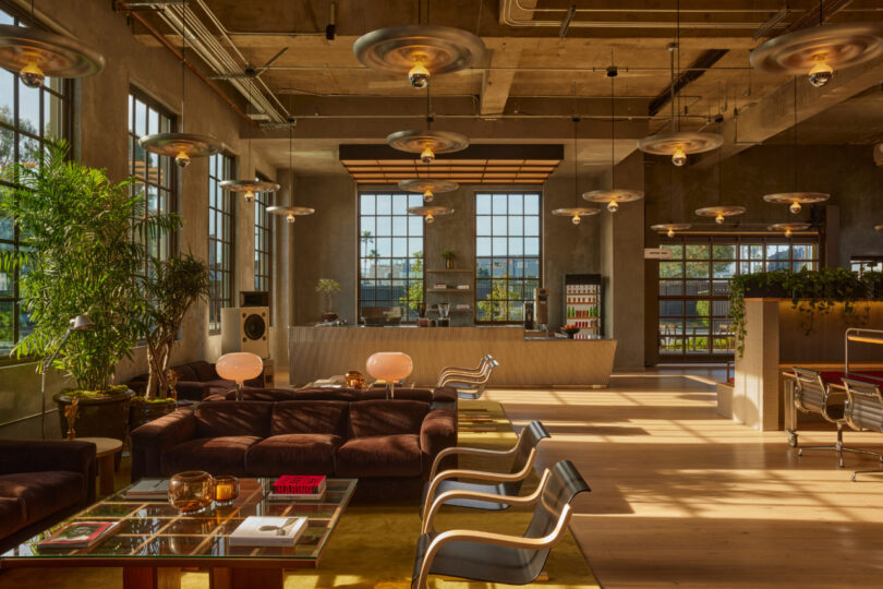
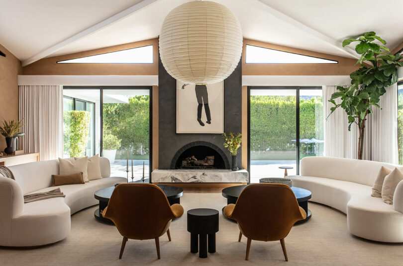
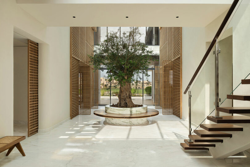
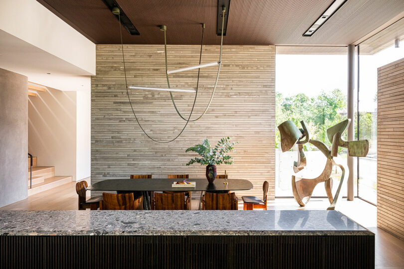
    Contemporary architecture often references ideals from modernism canonical elements like clean lines, open plans, and material honesty further tempered to suit current tastes and needs. This Highland Park residence, designed by SmithArc with interiors by Joshua Rice, belongs firmly in that lineage. While expressing its modernist DNA, the home reconsiders what it means to be a machine for living, with an emphasis on how color, material, and built-in conveniences will impact a growing family. Far from the white, minimal modern box stereotype, this house proves that the subtleties of tone and texture can enhance modernism to create something sensual and moody.The structure is set on the east side of Highland Park one of Dallass most storied neighborhoods positioning the location as a canvas for architectural experimentation. From early 20th-century Tudors and Mediterranean revivals to the later arrival of starkly contemporary projects, the neighborhood reflects a layered history of design. Building there is both a privilege and a challenge. But this new construction home, integrated into a difficult corner lot, respects the established visual narrative while offering something distinctly of its time.The architecture is anchored by gray limestone walls, a material chosen for both its durability and its sculptural quality. These walls flow between exterior and interior, creating a sense of continuity. Expanses of glass connect the family to the outdoors while raked wood panels and stucco soften the rigor of the stone. But the interiors are where the project most clearly establishes its voice. Rice builds on modernisms lesser-known experiments with color by leveraging the hue derived from the very character of materials used.The interior palette ebbs and flows through 5,600 square feet with tones that are muted but never flat. Ceppo marble floors, fumed oak cabinetry, warm-gray laminates, and plaster matched to the architectural stone all bring depth and variation within a tightly edited spectrum. In the primary suite, natural white oak meets deep blue Japanese tile and Icelandic marble, combining warmth with shadow. Light oak wide-plank floors contrast with the darker elements, ensuring the atmosphere remains balanced.Programming is also central to the projects success. From north to south, the homes ground floor unfurls to reveal a wide range of spaces: a covered outdoor living area that spills into the kitchen and scullery; a partially sunken, open living and dining zone; and a well-dressed hallway leading to the primary suite, powder room, office, yoga studio, media room, mudroom, and laundry. The distinct, paneled-oak wall designed in a racetrack shape organizes the plan while discreetly enclosing private functions at the center of the home.Upstairs, a treetop family room anchors four childrens bedrooms, each an en suite, along with a second laundry to ease daily life. The arrangement reflects a contemporary sensibility: communal spaces flow into one another for family gatherings, while tucked-away rooms allow for quiet work, exercise, or retreat. The programming demonstrates that while the house pulls inspiration from modernisms open plans or mid-century novelties, it adapts them to the complexities of raising a young family today.For Rice, the choice to embrace a darker, moodier palette was a deliberate challenge to prevailing expectations. In residential architecture, modern is often equated with bright, white, and minimal. Yet the designer understood that a palette grounded in shadow would create a calmer, more serene experience, given the abundant Texas daylight. The strategy was less about resisting the inundating rays and more about shaping them. Darker materials absorb and diffuse the sun, creating a sense of grounding that allows rooms to feel restful rather than overexposed.Rice does not treat color as an accent but as integral to architecture itself something that emerges from the natural variations of stone, the smoked tones of oak, the mineral depth of tile. The palette is structural, not decorative.The furnishings further this dialogue between modernist lineage and contemporary sensibility. Instead of defaulting to the familiar icons of mid-century modern design, Rice curated a collection that blends rare vintage pieces with limited-edition works by contemporary designers. Sculptural lighting, carved wood chairs, and stone tables enrich the interiors with history and personality while remaining in harmony with the homes muted chromatic atmosphere. Each piece contributes not only function but also a unique sense of self, reflecting the clients passion for the unexpected design.This house demonstrates how contemporary architecture can honor modernism without mere imitation. It draws from the movements clarity of space and truth to materials, but modifies those ideas for the realities of 21st-century family life. Albeit restrained, it reclaims the role of color too often forgotten in the retelling of modernisms history as central to architectures emotional impact.The clients are big fans of modern design but wanted something more unique and unusual than the typical design classics, Rice says. Luckily, that is my passion.Here, color is not bold or loud, but quiet, grounding, and enduring. It is embedded in the limestone walls that define the house, in the marble veining beneath ones feet, in the shadows that move across oak grain. This contemporary sanctuary proves that color in current architecture is far more impactful than the clichs of white walls and glass boxes. And that by returning to those roots, designers can craft homes that are as timeless as they are deeply personal.To see this and other works by the architect and interior designer, visit smitharc.com and joshuaricedesign.com respectively.Photography by Robert Tsai.
    0 Комментарии ·0 Поделились
  • The McLaren Artura Spider Is Plug-In Hybrid Perfection
    design-milk.com
    Few names carry the same weight in the world of supercars as McLaren. With the launch of the Artura, McLaren entered new territory: its first plug-in hybrid, capable of running on pure electric power when desired. Now, the brand has expanded the lineup with the McLaren Artura Spider, which pairs that innovative powertrain with a retractable hardtop roof delivering open-air thrills without sacrificing performance.Ive spent a few days behind the wheel of the Artura Spider driving it everywhere from a casual trip to my tennis lesson to enjoying the sights along Californias Highway 1. My takeaway? This car encapsulates what a modern supercar should be. Its hybrid system isnt about eco-friendly virtue signaling; its about wringing every ounce of performance from the drivetrain. And while some electric vehicles can feel soulless, the Artura Spider proves you dont lose character just because theres an electric motor involved.Technically, the Artura and Artura Spider are considered McLarens entry-level models but with a starting price of $273,000, that phrase is almost misleading. Entry-level or not, the Spider is every inch a supercar.Visually, the Artura Spider retains McLarens unmistakable DNA. Carbon fibre elements and sculpted aluminum panels shape a silhouette thats as aggressive as it is elegant. Aerodynamics drive the design: a sharp, low splitter, angled LED headlights that flow into the bodywork, and purposeful intakes at the front and sides. At the rear, a dual-exit exhaust system available in standard or sport configuration makes itself known with active valves that deliver a guttural soundtrack tuned to your driving mode, whether the roof is up or down.And of course, the signature McLaren butterfly doors make every entry and exit an event, opening into a cabin that is focused, minimalist, and unapologetically performance-oriented. It isnt draped in unnecessary luxury, but it feels deliberate, comfortable, and purposeful.Convertibles are inherently fun, but the Artura Spider elevates the experience. The retractable hardtop roof operates in just 11 seconds and can be raised or lowered at speeds up to 30 mph perfect for spur-of-the-moment decisions when the sun breaks through.Despite being a plug-in hybrid, the Artura Spider doesnt follow the usual playbook. Theres no regenerative braking. Instead, the system charges the battery under certain drive modes, primarily using it for performance boosts or for up to 21 miles of electric-only driving. But lets be honest youre not buying a McLaren Spider to drive it silently through town.On the road, the Artura Spider feels every bit as thrilling as it looks. Its combined output of 690 horsepower comes courtesy of a twin-turbocharged V6 paired with an electric motor. In Sport mode, the motor assists launches before handing off to the V6, recharging as you drive. Other modes integrate the electric motor more, and if you really want, you can drive in electric-only silence.The control setup takes a little adjustment. Rocker switches behind the wheel manage chassis and powertrain modes, while small buttons toggle between manual and automatic shifting. But once youre familiar, everything feels intuitive and designed with the driver at the center.The original Artura earned acclaim as one of the finest mid-engine performance cars available, and the Spider builds on that legacy with added versatility and character. Its striking to look at, fun to drive, and filled with the kind of personality that makes every trip memorable.To learn more about the McLaren Artura Spider, visit cars.mclaren.com.Photography courtesy of Christian de Looper.
    0 Комментарии ·0 Поделились
  • Maison&Objet 2025 Boasts Brightness Supersaturated in Design
    design-milk.com
    As minimalism infiltrated media en masse, the mainstreaming of its aesthetic left interiors feeling blah and the concept conflated with fashions genre of quiet luxury. Through this lens, only homes with neutral furniture, whitewashed walls, generic decor, and immaculateness are considered stylish and tasteful. At a moment when pop culture edges past hushed tones, Maison&Objets September 2025 edition arrives as designs own answer to this cultural pivot.Under the artistic direction of Amlie Pichard a designer known for subverting conventions and fusing craft with irony the show celebrates renewal through six curated sectors, the newly inaugurated Design District, and the bold, immersive Welcome Home installation.What I appreciate most is Maison&Objets positioning of home furnishings, or the object, not as a discreet accessory but as a manifesto. Emerging talents, experimental practices, and cross-disciplinary dialogues push past restraint toward a new decorative eloquence where tradition meets AI, where ceramics become statements, and where homes are staged as laboratories of imagination. In contrast to the pared-back anonymity of quiet luxury, this years fair embraces design as expressive, layered, and alive in a response that invites viewers to revel in the materiality, emotion, and vitality of the spaces we inhabit.Join us as we reminisce about the Paris fair and enjoy the following selection of 10 disparate designs that can inject energy, play, and experimentation back into the home.Euclidea + Cartesiana Collection by Paolo SantangeloThe Puglia-born, Milan-inspired Paolo Santangelo nurtures unrelenting joy with his Euclidea and Cartesiana collections. These high-contrast ceramic forms are hard to resist with their jumbo detailing, unique silhouettes, and bold use of color.Handmade Mobiles by Flensted Hanging ArtMobiles exist in this liminal space between sculpture and traditional hanging art, which is rather enchanting. Here, Flensted Hanging Art a Danish brand and family business has managed to balance whimsy with highly-graphic, smart design.Zooom Rug by Haus OttoArtist and design duo Haus Otto bridge two home furnishing typologies with their supersized, chunky knit neon rug, which doubles as a daybed. The jumbo weave is hyper-minimal while remaining ultra cozy, showcasing traditional weaving techniques at a visually accessible scale.Halo Lamp by Rayon Vert StudioAptly named, the Halo Lamp throws bright light through colored discs for a heavenly glow. Rayon Vert Studios design allows users to experiment with up to 27 possible combinations for a truly unique fixture that can be altered to satisfy your every passing fancy.Ollim Speaker by Studio Oll & AllThis wooden speakers unique composition is non-electric and an eco-sensitive design that applies the principle of resonance to amplify sound from your smartphone. And the bell or cone, available in a variety of colors, helps the tiny device punch up above its weight class.Mellow Wall Clock by Design House StockholmDesigned by Joe Parr for Design House Stockholm, this abstract wall clock blends beauty with a whisper of utility for a design piece that can hold its own against any other artful objects in the home. And its monochromatic quality helps articulate the unique form.Catharine Starter Kit by Hooge LandLike a few other offerings from Hooge Land, the Catharine Starter Kit commands the power of thinness with its skinny taper candles and ultra-thin base, yielding a high return on minimal material investment. The bright colors and matching metallic holders add a bit of whimsy.Bow Tie Corkscrew by Addison Ross LondonThe Bow Tie Corkscrew, available at Addison Ross, is the perfect marriage of form and function. The silhouette is informed by utility while the contrasting color detailing speaks to the design savvy.Spiri Vases by Mimo StudioMimo Studio presents Spiri, a collection of two-town graphic vases with wavy lines that makes modularity a little more playful and floral arrangements a lot less formal. It encourages the practice of enjoying simple, fresh flowers rather than extravagant bouquets only on occasion.Vanity Mirror by &klevering&kleverings vanity mirror is a study in contrasts, chunky and soft in form yet somehow petite and strong in stature. This statement accessory is slightly unassuming but somehow immediately caught our eye. Its a selfie-worthy mirror thats hard to resist.Photography by Joseph Sgambati III.
    0 Комментарии ·0 Поделились
  • ENESSs Monumental Rock Garden Is Actually Made of Air
    design-milk.com
    From a distance, it looks like Melbourne sprouted a mountain range overnight. Up close, the rocks arent rocks at all theyre air. With the Australian debut of Iwagumi Air Scape, art and technology studio ENESS turned Prahran Square into a larger-than-life rock garden you can squeeze through, touch, and hear come alive with sound.Although Melbourne-based, ENESS founder and artist Nimrod Weis drew inspiration from Japanese culture in creating Iwagumi Air Scape. Through this artwork we are celebrating how Japanese people acknowledge and recognize nature as the ultimate designer in terms of composition, Weis explains. Culturally, the Japanese admire and respect natural forms such as rock formations, observing these compositions in great detail, which they then translate into various artforms. This is evidenced by rock gardens in spiritual places, in civic spaces, in small domestic gardens and aquariums through aquascaping. Weis takes this concept and inflates it literally to monumental size.The installation is made up of 16 inflatable rocks some stretching up to over 30 feet long arranged to form crevices and passages that mimic a canyon. As visitors move through the work, they trigger a layered soundscape of birds, frogs, crickets, monkeys, bats, and mountain streams. Each inflatable appears strikingly real thanks to surface patterns derived from photographs of granite. Only when touched does the illusion break, revealing that what looks like thousands of tons of stone is, in fact, weightless. There is a huge element of surprise in this work, when visitors touch the artworks and realize that in fact, they are inflatable, Weis says. At night, Iwagumi Air Scape transforms again, glowing in vibrant red tones as if the Weis was hosting the installation on another planet.While the work is designed to reconnect us with nature, its very existence is rooted in technology, raising questions about how wilderness and our relationship to it can exist in an increasingly digital world. Our creative practice interrogates the relationship between the virtual and physical worlds. In this case, we created digital rocks that are printed and illuminated but exist in space as convincing natural forms. The fact that these artificial objects can help in reconnecting people with nature says a lot about our world at this time, says Weis. The installation reflects this duality, as sounds from the surrounding streets seep into the immersive soundscape, blurring the line between the constructed canyon and the real city beyond.Although Iwagumi Air Scape has wrapped its Melbourne run, the installation is set to continue its global tour. Next stop: Spain. Keep an eye on ENESS to see if their monumental, weightless rocks land in your city next.To learn more about the Iwagumi Air Scape installation by ENESS, visit eness.com.Photos by Ben Weinstein.
    0 Комментарии ·0 Поделились
  • F5: Jule Cats on Making Music, Demolished Buildings, Nature + More
    design-milk.com
    When Jule Cats was a young girl her mother had already sensed that she was destined to choose a creative profession because of her interest in all things artistic. A significant event when Cats was 12 years old set her on a lifelong path. I visited the graduation show of Design Academy Eindhoven during Dutch Design Week when I was in primary school, she says. I still remember the feeling I got when I walked into the exhibition, in awe of all the amazing projects and designs.Cats studied at the Willem de Kooning Academy, where she earned a bachelors degree in product design. Just a year later, in 2016, she opened her eponymous studio. Based in Rotterdam, the artist and designer is known for her bespoke objects for the interior that range from vases to paperweights.Jule Cats \\\ Photo: Gabriela LarreaShe is continually inspired by the concept of time, from the way individuals cling to memories to how they experience the present. With materials like water-based resin and mineral powder, her pieces have folds and creases that seem to shift and change, similar to a viewers perception.By carrying a notebook with her, Cats can take her time and record her thoughts. She puts the initial concepts down on paper, writing or sketching, and then reflects upon the elements later. It is a process that helps her in the initial stages of her work when everything is still new and fragile.For Cats, transformation is poetic, and she savors each phase as a project comes together. I get very excited when I see my ideas turn into something tangible by making small prototypes, she explains. This is the moment where it clicks for me.Today, Jule Cats joins us for Friday Five!1. Rock and StonesI always find myself looking for interesting stones whenever Im out in nature. Whether its along a riverside, at the beach or in the mountains, a special gradient or texture will always catch my eye.2. Ever-Changing SkiesThe color palettes that the sky offers keep amazing me. I like it when quite unexpected colors come together, like bright pink and soft blue. It motivates me to choose colors for my designs that I otherwise wouldnt have combined.3. Demolished BuildingsWhen a building is in the middle of its demolition process, it offers a glimpse into the lives that have gone on inside. To me its a very intimate moment, as if the stones start to reveal their stories. Thats why I like visiting these demolition sites and collect materials to work with.4. Details in NatureWhenever Im out in nature, I keep being surprised by the unintended beauty in certain things. Patterns, shapes, or the way a plant folds itself. I capture the things that surprise me, as a reminder that you dont always have to overthink a design and to follow your intuition.5. Making MusicThe reason why my creative process usually starts with writing, is probably because I used to write and play songs. I still have the urge to tell a story, but now my medium has turned into something tangible. Still, I like to play music every now and then, because I like the liberating feeling it gives me.Works by Jule Cats:Photo: Jacqueline FuijkschotSWAY Floor LampThis 1,5-meter-high floor lamp looks like a solid marble sculpture, but its actually a very lightweight hollow design. In the creating process, I guide the shapes, but I dont aim for full control. Each piece finds its own unique flow, offering a reminder of the beauty in letting go and allowing things to unfold naturally.IN DISGUISE VasesThis series was the starting point of my design studio. When I was graduating, I was living in houses which were up for demolition. By combining concrete remains with polyester resin, I started giving discarded materials a new purpose and presence. While at the same time, I revealed the emotional beauty hidden in what is often seen as waste. The series became an international success and encouraged me to dive deeper into this concept.RISE Table LampsThe RISE lamps dive deeper into the concept of revealing the beauty of waste. After creating the IN DISGUISE vases, I wanted to expand this idea into a new shape. Thats how the lamps came to life, in which the light is quite literally rising out of the ashes from the demolished buildings. In the bottom layer, in which the remains are integrated, I often use extra pigments to give each lamp a unique touch.FLOW Wall PieceMy FLOW pieces are very suitable for commissions. They look like theyve been carved out of marble, and even by touching the surface you might think so. But because I use a liquid resin to create these works, Im flexible to adjust the sizes. This project was quite special, as it was the longest piece that has been requested so far: 1,80 meters long.FLOW TilesBesides creating big sculptures within the FLOW series, Ive recently worked on a design which is modular. This design includes individual tiles, which can build up to an artwork in the preferred size of my client. The composition in the picture is 70 cm by 32 cm wide, but I recently installed artwork from 1 meter high and 2 meters wide!
    0 Комментарии ·0 Поделились
  • Timekettle W4 AI Interpreter Earbuds Streamline Translation
    design-milk.com
    Shenzhen-based tech company Timekettle has just released the W4 AI Interpreter Earbuds, designed to make real-time multilingual communication seamless. Building on the proven performance of the professional-grade W4 Pro, the new consumer-facing model delivers instant, AI-powered translation that addresses one of the worlds most persistent challenges: miscommunication across languages.Viral videos of world leaders, diplomats, and other officials comically misunderstanding each other during negotiations at institutions like the UN are a dime a dozen. The root of the problem: interpreters moving too slowly or inadvertently misinterpreting the idiosyncrasies of what is being said. The many clips of tourists struggling with phone apps to converse with locals in their native languages but failing are equally humorous. The sheer differences in how intonation is expressed and syntax structured is often the cause of confusion.While artificial intelligence might not yet fully decipher the subtle nuances of culturally charged expression, it can certainly help in getting general ideas across quickly even immediately.Launched at a leading tech fair IFA, held in Berlin this month, the device features integrated Bone-voiceprint sensor voice capture and cutting-edge Al LLM-powered technology. Designed for seamless, real-time multilingual communication, the W4 revolutionizes language interpretation with its innovative dual-voice pickup, unparalleled noise-filtering capabilities, and context-aware translation that corrects confusing homophones. The system delivers 98% accuracy and a near-zero lag time.The connected program is Babel OS 2.0 which is enabled with 42 languages and 92 accents. A French speaker from France can finally understand someone from the most remote parts of Quebec.The idea of being able to instantaneously understand the person in front of you, speaking a different language or dialect is a paradigm shifting proposition if there ever was one.This tangible innovation harnessing AI as a tool but not necessarily as a dominant force, even if partially replacing a profession is achieved not merely through integrated technology but also the ergonomic formal configuration of the device.The biggest problem with these types of objects is their size and often slippery texture aerodynamic streamlines over functionality. Everyone has experienced an ear bud fall out of its case and disappear forever. While the actual in-ear component is smaller and more conducive to the shape of the ear, its touch-enabled appendage is far more manageable.A marked contrast from other popular products in this category, the W4 AI Interpreter Earbuds comes in a more conspicuous navy blue and sand gold. The device has all the capabilities of this unnamed alternative: noise-canceling, and discrete music playing. Switching between both functionalities is just a matter of a click.Another issue is power. Many bluetooth-enabled earbuds require recharging after just three hours. The W4 AI Interpreter Earbuds have a 24-hour battery life, which more or less ensures there wont be any interruption in performance; a break in the seamless exchange of world leaders making important decisions or tourists trying to find their way through a remote countryside.For more information on the W4 AI Interpreter Earbuds from Timekettle, visit timekettle.co.Photography courtesy of Timekettle.
    0 Комментарии ·0 Поделились
  • Sofa to System: HAY Refreshes the Amanta Sofa by Mario Bellini
    design-milk.com
    Architect and designer Mario Bellini was a titan within the industry, his enduring influence in Italian furniture and design unquantifiable. Receiving the Golden Compass Award eight times, 25 of his works are in the permanent design collection of the MoMA, which dedicated a personal retrospective to him in 1987. The Amanta Sofa, now produced by HAY about 60 years later, marks the first Italian reissue for the brand along with a materiality refresh, the colors are just right for 2025. From the beginning, Mette and I insisted that HAY should be an international brand, not just Danish, says HAY cofounder Rolf Hay. The Italian design of this period has had a huge impact on the way we look at design today. With one-seater, two-seater, three-seater, and four-seater options, this modular lounger, originally designed in 1966, stays mod, in more ways than one.Inspired by the structural logic of the Barcelona Chair by Mies van der Rohe, the modular system is designed around the floating cushions that fit neatly into the provided shell, intuitive and thoughtful. The low-slung silhouette of the Amanta collection was revolutionary for its time, relaxed pitch and supportive, yet plushy seating marking a newer, more laid-back approach to furniture. Modular units spoke to a flexibility in arrangement, the first of its kind to do so.Material interaction is interesting here, a channel running down the back of the sofa, giving the Amanta visual interest wherever it happens to be seen. A plush back invites us to stay, and the impermanence of position allows us to go a respectful and endearing take on seating, one that contemporary designers would do well to note.The color palette speaks to the timelessness of the collection, contrasting accents with upholstery, creating a lovely conversation. Bold, technical, and beautiful, Italian design of this era was highly humanist, a yearning for not necessarily the finer things in life, but the good, lasting ones. A lake blue, emerald green, and blush mauve suggest optimism, ushering in a more expansive notion of what sofas could be. The shell cradles the upholstered portion, holding its vertices partially the softness extends outward, supported by its metal counterparts, both stronger together than apart.Lastly, this refresh doesnt solely exist on the surface HAY dove deep into the materiality of the Amanta Sofa, discarding the metal for 99% post-consumer plastic. Even better, the foam is 94% biomass balance foam, ensuring a plushy yet supportive seat for years to come.To learn more about the Amanta Sofa by Mario Bellini for HAY, please visit hay.com.Photography courtesy of HAY.
    0 Комментарии ·0 Поделились
  • Mesonia Is an Artisan-Made Boutique Suite in San Miguel de Allende
    design-milk.com
    Situated in San Miguel de Allendes lively San Antonio neighborhood, a new design-forward escape invites travelers to slow down and live within the creative spirit of contemporary Mexican craft. Mesonia, which opened in June 2025, is the latest creation from artist and designer Daniel Valero, founder of Mestiz Studio, and it transforms the idea of boutique lodging into a fully immersive design experience.Far from a conventional hotel room, Mesonia functions as an experimental living space part private retreat, part living gallery where every surface, fixture, and furnishing tells a story of craft, culture, and place. The rental suites interiors were brought to life with architectural finesse by Maye Estudio, whose approach weaves warmth and cohesion into Valeros bold, organic vision. The branding, by designer Daniel Martnez Larsen, distills Mesonias essence into a clean, contemporary identity that mirrors the suites balance between heritage and modernity.Inside, every detail is custom, including furniture, lighting, woven textiles, ceramics, and architectural details, all designed by Mestiz Studio and brought to life through artisanal techniques developed in collaboration with master craftspeople from the Bajo region and northern Mexico. This results in a space that feels deeply rooted in place while remaining fresh and original.The suite is a sensory treat, brought together by a vivid and joyful color palette sky blue walls that mirror San Miguels endless skies, accents of magenta that energize the space, caramel tones that echo sunbaked earth, and touches of kelly green that recall the lush vibrancy of the surrounding highlands. These hues thread through everything from handwoven rugs to ceramic tiles, creating a visual rhythm thats both grounded and uplifting.Guests will find a serene king-size bedroom, a fully equipped kitchen, a lounge with built-in seating dressed in hand-finished fabrics, and a private terrace designed for moments of quiet contemplation. Textured walls, organic materials, and artisanal finishes form a tactile backdrop to daily life, inviting guests to touch, explore, and linger.Mesonia embraces the rhythm of independent living there is no on-site staff or restaurant allowing visitors to move at their own pace. Just steps away, San Antonios streets hum with everyday life: family-run bakeries, open-air markets, and artist studios offer a glimpse into the neighborhoods creative energy.To learn more about Mestiz Studio, visit mestiz.mx, or to book Mesonia for yourself, head to mesonia.mx.Photography by Pepe Molina.
    Like
    Love
    Wow
    Sad
    Angry
    1Кб
    · 0 Комментарии ·0 Поделились
  • The LS24-Lounge System Transforms Pradas Rooftop Into a Futuristic Terrace
    design-milk.com
    Step onto the rooftop terrace of the Fondazione Prada Tower and the Milan skyline stretches in every direction. Anchoring this 360 view is the LS24-Lounge System, a new futuristic seating installation by architect Federico Pompignoli of PMP Architecture. Set against the terraces graphic black-and-white flooring and mirrored walls, the seating transforms the space into an optical playground where design, technology, and architecture converge.While some seating is designed to quietly disappear into its surroundings letting the sweeping skyline or bold flooring take center stage the LS24-Lounge System does the opposite. It punctuates the terrace with gleaming chrome curves, pigmented silicone cushions, and saturated purple discs. Engineered from carbon fiber with a recycled PET core, each piece balances strength with lightness, making the system easy to rearrange for events. The cushions add a playful shock of color and are translucent enough to reveal the glow of LED lights within, giving the furniture a luminous quality that shifts from day to night.The visual impact of the LS24-Lounge System is heightened by the terraces black-and-white striped flooring and mirrored parapet walls, which play tricks on your spatial perception. Reflections bounce across the surfaces, multiplying curves and circular footrests into endless repetitions. The result is a three-dimensional optical illusion where movement is exaggerated and space feels like a time warp expanding, contracting, and shimmering depending on where you stand. In this way, the LS24-Lounge System doesnt just occupy the rooftop; it transforms it into a living, shifting installation.Realized in collaboration with Mailas an innovative leader in architecture, construction, and technology the system is a testament to advanced research and materials. From carbon fiber structures to translucent polymer cushions, Mailas expertise brought Pompignolis bold vision to life. Beyond its visual drama, the design is flexible at its core. Each piece generates two seating typologies at once: a casual, stool-like seat along the exterior and a concave, lounge-style seat on the interior. The elevated intersecting disc creates these dual zones, offering both a quick perch and a more embracing rest. As a modular system, the units can stand alone or cluster into sweeping configurations, adapting seamlessly to everything from laid-back hangs to full-scale events.Suspended between city and sky, the LS24-Lounge System transforms Fondazione Pradas rooftop into a shifting landscape of light, reflection, and form. More than a place to sit, its an experience meant to linger for years to come.Photography courtesy of Gabriele Croppi and Prada.
    Like
    Love
    Wow
    Sad
    Angry
    1Кб
    · 0 Комментарии ·0 Поделились
Больше
CGShares https://cgshares.com