NOSIPHO MAKETO-VAN DEN BRAGT ALTERED HER CAREER PATH TO LAUNCH CHOCOLATE TRIBE
By TREVOR HOGG
Images courtesy of Chocolate Tribe.
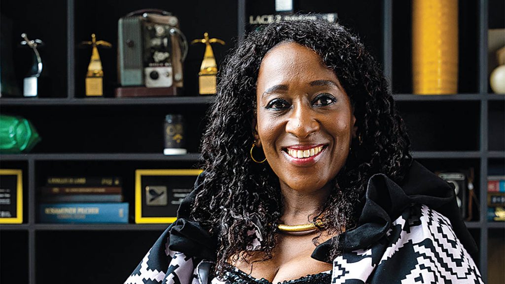
Nosipho Maketo-van den Bragt, Owner and CEO, Chocolate Tribe
After initially pursuing a career as an attorney, Nosipho Maketo-van den Bragt discovered her true calling was to apply her legal knowledge in a more artistic endeavor with her husband, Rob Van den Bragt, who had forged a career as a visual effects supervisor. The couple co-founded Chocolate Tribe, the Johannesburg and Cape Town-based visual effects and animation studio that has done work for Netflix, BBC, Disney and Voltage Pictures.
“It was following my passion and my passion finding me,” observes Maketo-van den Bragt, Owner and CEO of Chocolate Tribe and Founder of AVIJOZI. “I grew up in Soweto, South Africa, and we had this old-fashioned television. I was always fascinated by how those people got in there to perform and entertain us. Living in the townships, you become the funnel for your parents’ aspirations and dreams. My dad was a judge’s registrar, so he was writing all of the court cases coming up for a judge. My dad would come home and tell us stories of what happened in court. I found this enthralling, funny and sometimes painful because it was about people’s lives. I did law and to some extent still practice it. My legal career and entertainment media careers merged because I fell in love with the storytelling aspect of it all. There are those who say that lawyers are failed actors!”
Chocolate Tribe hosts what has become the annual AVIJOZI festival with Netflix. AVIJOZI is a two-day, free-access event in Johannesburg focused on Animation/Film, Visual Effects and Interactive Technology. This year’s AVIJOZI is scheduled for September 13-14 in Johannesburg. Photo: Casting Director and Actor Spaces Founder Ayanda Sithebeand friends at AVIJOZI 2024.
A personal ambition was to find a way to merge married life into a professional partnership. “I never thought that a lawyer and a creative would work together,” admits Maketo-van den Bragt. “However, Rob and I had this great love for watching films together and music; entertainment was the core fabric of our relationship. That was my first gentle schooling into the visual effects and animation content development space. Starting the company was due to both of us being out of work. I had quit my job without any sort of plan B. I actually incorporated Chocolate Tribe as a company without knowing what we would do with it. As time went on, there was a project that we were asked to come to do. The relationship didn’t work out, so Rob and I decided, ‘Okay, it seems like we can do this on our own.’ I’ve read many books about visual effects and animation, and I still do. I attend a lot of festivals. I am connected with a lot of the guys who work in different visual effects spaces because it is all about understanding how it works and, from a business side, how can we leverage all of that information?”
Chocolate Tribe provided VFX and post-production for Checkers supermarket’s “Planet” ad promoting environmental sustainability. The Chocolate Tribe team pushed photorealism for the ad, creating three fully CG creatures: a polar bear, orangutan and sea turtle.
With a population of 1.5 billion, there is no shortage of consumers and content creators in Africa. “Nollywood is great because it shows us that even with minimal resources, you can create a whole movement and ecosystem,” Maketo-van den Bragt remarks. “Maybe the question around Nollywood is making sure that the caliber and quality of work is high end and speaks to a global audience. South Africa has the same dynamics. It’s a vibrant traditional film and animation industry that grows in leaps and bounds every year. More and more animation houses are being incorporated or started with CEOs or managing directors in their 20s. There’s also an eagerness to look for different stories which haven’t been told. Africa gives that opportunity to tell stories that ordinary people, for example, in America, have not heard or don’t know about. There’s a huge rise in animation, visual effects and content in general.”
Rob van den Bragt served as Creative Supervisor and Nosipho Maketo-van den Bragt as Studio Executive for the “Surf Sangoma” episode of the Disney+ series Kizazi Moto: Generation Fire.
Rob van den Bragt, CCO, and Nosipho Maketo-van den Bragt, CEO, Co-Founders of Chocolate Tribe, in an AVIJOZI planning meeting.
Stella Gono, Software Developer, working on the Chocolate Tribe website.
Family photo of the Maketos. Maketo-van de Bragt has two siblings.
Film tax credits have contributed to The Woman King, Dredd, Safe House, Black Sails and Mission: Impossible – Final Reckoning shooting in South Africa. “People understand principal photography, but there is confusion about animation and visual effects,” Maketo-van den Bragt states. “Rebates pose a challenge because now you have to go above and beyond to explain what you are selling. It’s taken time for the government to realize this is a viable career.” The streamers have had a positive impact. “For the most part, Netflix localizes, and that’s been quite a big hit because it speaks to the demographics and local representation and uplifts talent within those geographical spaces. We did one of the shorts for Disney’s Kizazi Moto: Generation Fire, and there was huge global excitement to that kind of anthology coming from Africa. We’ve worked on a number of collaborations with the U.K., and often that melding of different partners creates a fusion of universality. We need to tell authentic stories, and that authenticity will be dictated by the voices in the writing room.”
AVIJOZI was established to support the development of local talent in animation, visual effects, film production and gaming. “AVIJOZI stands for Animation Visual Effects Interactive in JOZI,” Maketo-van den Bragt explains. “It is a conference as well as a festival. The conference part is where we have networking sessions, panel discussions and behind-the-scenes presentations to draw the curtain back and show what happens when people create avatars. We want to show the next generation that there is a way to do this magical craft. The festival part is people have film screenings and music as well. We’ve brought in gaming as an integral aspect, which attracts many young people because that’s something they do at an early age. Gaming has become the common sport. AVIJOVI is in its fourth year now. It started when I got irritated by people constantly complaining, ‘Nothing ever happens in Johannesburg in terms of animation and visual effects.’ Nobody wanted to do it. So, I said, ‘I’ll do it.’ I didn’t know what I was getting myself into, and four years later I have lots of gray hair!”
Rob van den Bragt served as Animation Supervisor/Visual Effects Supervisor and Nosipho Maketo-van den Bragt as an Executive Producer on iNumber Number: Jozi Goldfor Netflix.Mentorship and internship programs have been established with various academic institutions, and while there are times when specific skills are being sought, like rigging, the field of view tends to be much wider. “What we are finding is that the people who have done other disciplines are much more vibrant,” Maketo-van den Bragt states. “Artists don’t always know how to communicate because it’s all in their heads. Sometimes, somebody with a different background can articulate that vision a bit better because they have those other skills. We also find with those who have gone to art school that the range within their artistry and craftsmanship has become a ‘thing.’ When you have mentally traveled where you have done other things, it allows you to be a more well-rounded artist because you can pull references from different walks of life and engage with different topics without being constrained to one thing. We look for people with a plethora of skills and diverse backgrounds. It’s a lot richer as a Chocolate Tribe. There are multiple flavors.”
South African director/producer/cinematographer and drone cinemtography specialist FC Hamman, Founder of FC Hamman Films, at AVIJOZI 2024.
There is a particular driving force when it comes to mentoring. “I want to be the mentor I hoped for,” Maketo-van den Bragt remarks. “I have silent mentors in that we didn’t formalize the relationship, but I knew they were my mentors because every time I would encounter an issue, I would be able to call them. One of the people who not only mentored but pushed me into different spaces is Jinko Gotoh, who is part of Women in Animation. She brought me into Women in Animation, and I had never mentored anybody. Here I was, sitting with six women who wanted to know how I was able to build up Chocolate Tribe. I didn’t know how to structure a presentation to tell them about the journey because I had been so focused on the journey. It’s a sense of grit and feeling that I cannot fail because I have a whole community that believes in me. Even when I felt my shoulders sagging, they would be there to say, ‘We need this. Keep it moving.’ This isn’t just about me. I have a whole stream of people who want this to work.”
Netflix VFX Manager Ben Perry, who oversees Netflix’s VFX strategy across Africa, the Middle East and Europe, at AVIJOZI 2024. Netflix was a partner in AVIJOZI with Chocolate Tribe for three years.
Zama Mfusi, Founder of IndiLang, and Isabelle Rorke, CEO of Dreamforge Creative and Deputy Chair of Animation SA, at AVIJOZI 2024.
Numerous unknown factors had to be accounted for, which made predicting how the journey would unfold extremely difficult. “What it looks like and what I expected it to be, you don’t have the full sense of what it would lead to in this situation,” Maketo-van den Bragt states. “I can tell you that there have been moments of absolute joy where I was so excited we got this project or won that award. There are other moments where you feel completely lost and ask yourself, ‘Am I doing the right thing?’ The journey is to have the highs, lows and moments of confusion. I go through it and accept that not every day will be an award-winning day. For the most part, I love this journey. I wanted to be somewhere where there was a purpose. What has been a big highlight is when I’m signing a contract for new employees who are excited about being part of Chocolate Tribe. Also, when you get a new project and it’s exciting, especially from a service or visual effects perspective, we’re constantly looking for that dragon or big creature. It’s about being mesmerizing, epic and awesome.”
Maketo-van den Bragt has two major career-defining ambitions. “Fostering the next generation of talent and making sure that they are ready to create these amazing stories properly – that is my life work, and relating the African narrative to let the world see the human aspect of who we are because for the longest time we’ve been written out of the stories and narratives.”
#nosipho #maketovan #den #bragt #alteredNOSIPHO MAKETO-VAN DEN BRAGT ALTERED HER CAREER PATH TO LAUNCH CHOCOLATE TRIBE
By TREVOR HOGG
Images courtesy of Chocolate Tribe.
Nosipho Maketo-van den Bragt, Owner and CEO, Chocolate Tribe
After initially pursuing a career as an attorney, Nosipho Maketo-van den Bragt discovered her true calling was to apply her legal knowledge in a more artistic endeavor with her husband, Rob Van den Bragt, who had forged a career as a visual effects supervisor. The couple co-founded Chocolate Tribe, the Johannesburg and Cape Town-based visual effects and animation studio that has done work for Netflix, BBC, Disney and Voltage Pictures.
“It was following my passion and my passion finding me,” observes Maketo-van den Bragt, Owner and CEO of Chocolate Tribe and Founder of AVIJOZI. “I grew up in Soweto, South Africa, and we had this old-fashioned television. I was always fascinated by how those people got in there to perform and entertain us. Living in the townships, you become the funnel for your parents’ aspirations and dreams. My dad was a judge’s registrar, so he was writing all of the court cases coming up for a judge. My dad would come home and tell us stories of what happened in court. I found this enthralling, funny and sometimes painful because it was about people’s lives. I did law and to some extent still practice it. My legal career and entertainment media careers merged because I fell in love with the storytelling aspect of it all. There are those who say that lawyers are failed actors!”
Chocolate Tribe hosts what has become the annual AVIJOZI festival with Netflix. AVIJOZI is a two-day, free-access event in Johannesburg focused on Animation/Film, Visual Effects and Interactive Technology. This year’s AVIJOZI is scheduled for September 13-14 in Johannesburg. Photo: Casting Director and Actor Spaces Founder Ayanda Sithebeand friends at AVIJOZI 2024.
A personal ambition was to find a way to merge married life into a professional partnership. “I never thought that a lawyer and a creative would work together,” admits Maketo-van den Bragt. “However, Rob and I had this great love for watching films together and music; entertainment was the core fabric of our relationship. That was my first gentle schooling into the visual effects and animation content development space. Starting the company was due to both of us being out of work. I had quit my job without any sort of plan B. I actually incorporated Chocolate Tribe as a company without knowing what we would do with it. As time went on, there was a project that we were asked to come to do. The relationship didn’t work out, so Rob and I decided, ‘Okay, it seems like we can do this on our own.’ I’ve read many books about visual effects and animation, and I still do. I attend a lot of festivals. I am connected with a lot of the guys who work in different visual effects spaces because it is all about understanding how it works and, from a business side, how can we leverage all of that information?”
Chocolate Tribe provided VFX and post-production for Checkers supermarket’s “Planet” ad promoting environmental sustainability. The Chocolate Tribe team pushed photorealism for the ad, creating three fully CG creatures: a polar bear, orangutan and sea turtle.
With a population of 1.5 billion, there is no shortage of consumers and content creators in Africa. “Nollywood is great because it shows us that even with minimal resources, you can create a whole movement and ecosystem,” Maketo-van den Bragt remarks. “Maybe the question around Nollywood is making sure that the caliber and quality of work is high end and speaks to a global audience. South Africa has the same dynamics. It’s a vibrant traditional film and animation industry that grows in leaps and bounds every year. More and more animation houses are being incorporated or started with CEOs or managing directors in their 20s. There’s also an eagerness to look for different stories which haven’t been told. Africa gives that opportunity to tell stories that ordinary people, for example, in America, have not heard or don’t know about. There’s a huge rise in animation, visual effects and content in general.”
Rob van den Bragt served as Creative Supervisor and Nosipho Maketo-van den Bragt as Studio Executive for the “Surf Sangoma” episode of the Disney+ series Kizazi Moto: Generation Fire.
Rob van den Bragt, CCO, and Nosipho Maketo-van den Bragt, CEO, Co-Founders of Chocolate Tribe, in an AVIJOZI planning meeting.
Stella Gono, Software Developer, working on the Chocolate Tribe website.
Family photo of the Maketos. Maketo-van de Bragt has two siblings.
Film tax credits have contributed to The Woman King, Dredd, Safe House, Black Sails and Mission: Impossible – Final Reckoning shooting in South Africa. “People understand principal photography, but there is confusion about animation and visual effects,” Maketo-van den Bragt states. “Rebates pose a challenge because now you have to go above and beyond to explain what you are selling. It’s taken time for the government to realize this is a viable career.” The streamers have had a positive impact. “For the most part, Netflix localizes, and that’s been quite a big hit because it speaks to the demographics and local representation and uplifts talent within those geographical spaces. We did one of the shorts for Disney’s Kizazi Moto: Generation Fire, and there was huge global excitement to that kind of anthology coming from Africa. We’ve worked on a number of collaborations with the U.K., and often that melding of different partners creates a fusion of universality. We need to tell authentic stories, and that authenticity will be dictated by the voices in the writing room.”
AVIJOZI was established to support the development of local talent in animation, visual effects, film production and gaming. “AVIJOZI stands for Animation Visual Effects Interactive in JOZI,” Maketo-van den Bragt explains. “It is a conference as well as a festival. The conference part is where we have networking sessions, panel discussions and behind-the-scenes presentations to draw the curtain back and show what happens when people create avatars. We want to show the next generation that there is a way to do this magical craft. The festival part is people have film screenings and music as well. We’ve brought in gaming as an integral aspect, which attracts many young people because that’s something they do at an early age. Gaming has become the common sport. AVIJOVI is in its fourth year now. It started when I got irritated by people constantly complaining, ‘Nothing ever happens in Johannesburg in terms of animation and visual effects.’ Nobody wanted to do it. So, I said, ‘I’ll do it.’ I didn’t know what I was getting myself into, and four years later I have lots of gray hair!”
Rob van den Bragt served as Animation Supervisor/Visual Effects Supervisor and Nosipho Maketo-van den Bragt as an Executive Producer on iNumber Number: Jozi Goldfor Netflix.Mentorship and internship programs have been established with various academic institutions, and while there are times when specific skills are being sought, like rigging, the field of view tends to be much wider. “What we are finding is that the people who have done other disciplines are much more vibrant,” Maketo-van den Bragt states. “Artists don’t always know how to communicate because it’s all in their heads. Sometimes, somebody with a different background can articulate that vision a bit better because they have those other skills. We also find with those who have gone to art school that the range within their artistry and craftsmanship has become a ‘thing.’ When you have mentally traveled where you have done other things, it allows you to be a more well-rounded artist because you can pull references from different walks of life and engage with different topics without being constrained to one thing. We look for people with a plethora of skills and diverse backgrounds. It’s a lot richer as a Chocolate Tribe. There are multiple flavors.”
South African director/producer/cinematographer and drone cinemtography specialist FC Hamman, Founder of FC Hamman Films, at AVIJOZI 2024.
There is a particular driving force when it comes to mentoring. “I want to be the mentor I hoped for,” Maketo-van den Bragt remarks. “I have silent mentors in that we didn’t formalize the relationship, but I knew they were my mentors because every time I would encounter an issue, I would be able to call them. One of the people who not only mentored but pushed me into different spaces is Jinko Gotoh, who is part of Women in Animation. She brought me into Women in Animation, and I had never mentored anybody. Here I was, sitting with six women who wanted to know how I was able to build up Chocolate Tribe. I didn’t know how to structure a presentation to tell them about the journey because I had been so focused on the journey. It’s a sense of grit and feeling that I cannot fail because I have a whole community that believes in me. Even when I felt my shoulders sagging, they would be there to say, ‘We need this. Keep it moving.’ This isn’t just about me. I have a whole stream of people who want this to work.”
Netflix VFX Manager Ben Perry, who oversees Netflix’s VFX strategy across Africa, the Middle East and Europe, at AVIJOZI 2024. Netflix was a partner in AVIJOZI with Chocolate Tribe for three years.
Zama Mfusi, Founder of IndiLang, and Isabelle Rorke, CEO of Dreamforge Creative and Deputy Chair of Animation SA, at AVIJOZI 2024.
Numerous unknown factors had to be accounted for, which made predicting how the journey would unfold extremely difficult. “What it looks like and what I expected it to be, you don’t have the full sense of what it would lead to in this situation,” Maketo-van den Bragt states. “I can tell you that there have been moments of absolute joy where I was so excited we got this project or won that award. There are other moments where you feel completely lost and ask yourself, ‘Am I doing the right thing?’ The journey is to have the highs, lows and moments of confusion. I go through it and accept that not every day will be an award-winning day. For the most part, I love this journey. I wanted to be somewhere where there was a purpose. What has been a big highlight is when I’m signing a contract for new employees who are excited about being part of Chocolate Tribe. Also, when you get a new project and it’s exciting, especially from a service or visual effects perspective, we’re constantly looking for that dragon or big creature. It’s about being mesmerizing, epic and awesome.”
Maketo-van den Bragt has two major career-defining ambitions. “Fostering the next generation of talent and making sure that they are ready to create these amazing stories properly – that is my life work, and relating the African narrative to let the world see the human aspect of who we are because for the longest time we’ve been written out of the stories and narratives.”
#nosipho #maketovan #den #bragt #altered