The Butterfly takes flight: The Butterfly, Vancouver, BC
The tower takes shape as two sets of overlapping cylinders, clad with prefabricated panels intended to evoke clouds.
PROJECT The Butterfly + First Baptist Church Complex
ARCHITECT Revery Architecture
PHOTOS Ema Peter
When you fly into Vancouver, the most prominent structure in the city’s forest of glass skyscrapers is now a 57-storey edifice known as the Butterfly. Designed by Revery Architecture, the luxury residential tower is the latest in a string of high-rises that pop out of the city’s backdrop of generic window-wall façades.
The Butterfly’s striking form evolved over many years, beginning with studies dating back to 2012. Revery principal Venelin Kokalov imagined several options, most of them suggesting a distinct pair of architectural forms in dialogue. Renderings and models of the early concepts relay a wealth of imagination that is sorely missing from much of the city’s contemporary architecture, as land economics, zoning issues, and the profit motive often compel a default into generic glass-and-steel towers. The earliest concepts look starkly different—some evoke the Ginger and Fred building in Prague; others the Absolute Towers in Mississauga. But one consistent theme runs through the design evolution: a sense of two Rilkean solitudes, touching.
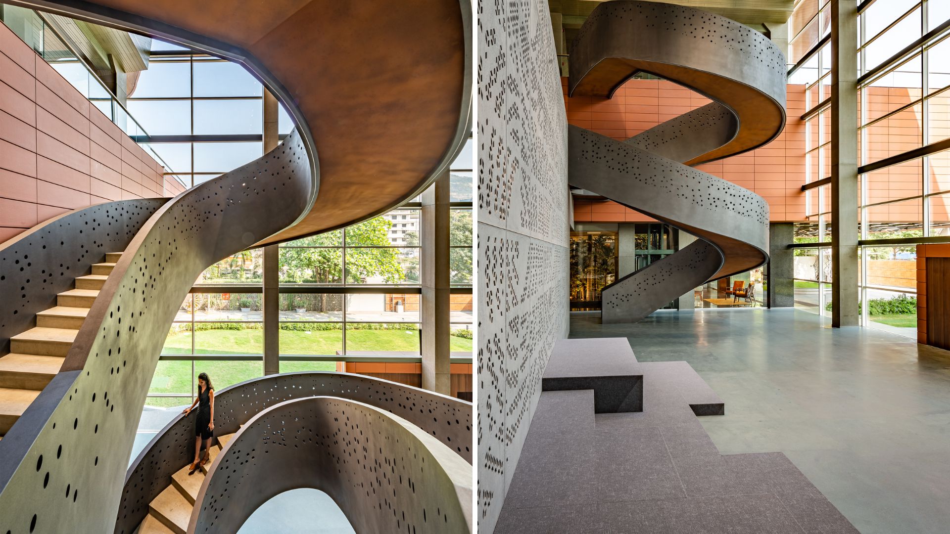
On each floor, semi-private sky gardens offer an outdoor place for residents to socialize.
Client feedback, engineering studies, and simple pragmatics led to the final form: two sets of overlapping cylinders linked by a common breezeway and flanked by a rental apartment on one side and a restored church doubling as a community centre on the other. The contours of the floorplan are visually organic: evocative of human cells dividing. The roundness of the main massing is complemented by curvilinear balustrades that smoothly transform into the outer walls of each unit. It’s an eye-catching counterpoint to the orthogonality of the city’s built landscape. The two adjacent buildings—built, restored, and expanded as part of a density bonus arrangement with the city—help integrate this gargantuan structure with the lower-rise neighbourhood around it.
The Butterfly is a high-end, high-priced residential tower—one of the few typologies in which clients and communities are now willing to invest big money and resources in creative, visually astonishing architecture. That leads to a fundamental question: what is the public purpose of a luxury condo tower?
A public galleria joins the renovated First Baptist Church to the new building. Serving as a welcoming atrium, it allows for community access to the expanded church, including its daycare, full gymnasium, multi-purpose rooms, overnight emergency shelter, and community dining hall equipped with a commercial kitchen.
Whatever one feels about the widening divide between the haves and have-nots in our big cities, this building—like its ilk—does serve several important public purposes. The most direct and quantifiable benefits are the two flanking buildings, also designed by Revery and part of the larger project. The seven-storey rental apartment provides a modest contribution to the city’s dearth of mid-priced housing. The superbly restored and seismically upgraded First Baptist Church has expanded into the area between the new tower and original church, and now offers the public a wider array of programming including a gymnasium, childcare facility, and areas for emergency shelter and counselling services for individuals in need.
The church’s Pinder Hall has been reimagined as a venue for church and community events including concerts, weddings, and cultural programming.
The Butterfly’s character is largely defined by undulating precast concrete panels that wrap around the building. The architects describe the swooping lines as being inspired by clouds, but for this writer, the Butterfly evokes a 57-layer frosted cake towering above the city’s boxy skyline. Kokalov winces when he hears that impression, but it’s meant as a sincere compliment. Clouds are not universally welcome, but who doesn’t like cake?
Kokalov argues that its experiential quality is the building’s greatest distinction—most notably, the incorporation of an “outdoors”—not a balcony or deck, but an actual outdoor pathway—at all residential levels. For years the lead form-maker at Bing Thom Architects, Kokalov was responsible for much of the curvilinearity in the firm’s later works, including the 2019 Xiqu Centre opera house in Hong Kong. It’s easy to assume that his forte and focus would be pure aesthetic delight, but he avers that every sinuous curve has a practical rationale.
The breezeways provide residents with outdoor entries to their units—an unusual attribute for high-rise towers—and contribute to natural cooling, ventilation, and daylight in the suites.
Defying the local tower-on-podium formula, the building’s façade falls almost straight to the ground. At street level, the building is indented with huge parabolic concavities. It’s an abrupt way to meet the street, but the fall is visually “broken” by a publicly accessible courtyard.
The tower’s layered, undulating volume is echoed in a soaring residential lobby, which includes developer Westbank’s signature—a bespoke Fazioli grand piano designed by the building’s architect.
After passing through this courtyard, you enter the building via the usual indoor luxe foyer—complete with developer Westbank’s signature, an over-the-top hand-built grand piano designed by the architect. In this case, the piano’s baroquely sculpted legs are right in keeping with the architecture. But after taking the elevator up to the designated floor, you step out into what is technically “outdoors” and walk to your front door in a brief but bracing open-air transition.
The main entrance of every unit is accessed via a breezeway that runs from one side of the building to another. Unglazed and open to the outside, each breezeway is marked at one end with what the architects calla “sky garden,” in most cases consisting of a sapling that will grow into a leafy tree in due course, God and strata maintenance willing. This incorporation of nature and fresh air transforms the condominium units into something akin to townhouses, albeit stacked exceptionally high.
The suites feature a custom counter with a sculptural folded form.
Inside each unit, the space can be expanded and contracted and reconfigured visually—not literally—by the fact that the interior wall of the secondary bedroom is completely transparent, floor to ceiling. It’s unusual, and slightly unnerving, but undeniably exciting for any occupants who wish to maximize their views to the mountains and sea. The curved glass wall transforms the room into a private enclave by means of a curtain, futuristically activated by remote control.
The visual delight of swooping curves is only tempered when it’s wholly impractical—the offender here being a massive built-in counter that serves to both anchor and divide the living-kitchen areas. It reads as a long, pliable slab that is “folded” into the middle in such a way that the counter itself transforms into its own horseshoe-shaped base, creating a narrow crevice in the middle of the countertop. I marvel at its beauty and uniqueness; I weep for whoever is assigned to clean out the crumbs and other culinary flotsam that will fall into that crevice.
A structure made of high-performance modular precast concrete structural ribs arcs over a swimming pool that bridges between the building’s main amenity space and the podium roof.
The building’s high-priced architecture may well bring more to the table than density-bonus amenities. On a broader scale, these luxe dwellings may be just what is needed to help lure the affluent from their mansions. As wealthy residents and investors continue to seek out land-hogging detached homes, the Butterfly offers an alternate concept that maintains the psychological benefit of a dedicated outside entrance and an outrageously flexible interior space. Further over-the-top amenities add to the appeal. Prominent among these is a supremely gorgeous residents-only swimming pool, housed within ribs of concrete columns that curve and dovetail into beams.
The ultimate public purpose for the architecturally spectacular condo tower: its role as public art in the city. The units in any of these buildings are the private side of architecture’s Janus face, but its presence in the skyline and on the street is highly public. By contributing a newly striking visual ballast, the Butterfly has served its purpose as one of the age-old Seven Arts: defining a location, a community, and an era.
Adele Weder is a contributing editor to Canadian Architect.
Screenshot
CLIENT Westbank Corporation, First Baptist Church | ARCHITECT TEAM Venelin Kokalov, Bing Thom, Amirali Javidan, Nicole Hu, Shinobu Homma MRAIC, Bibi Fehr, Culum Osborne, Dustin Yee, Cody Loeffen, Kailey O’Farrell, Mark Melnichuk, Andrea Flynn, Jennifer Zhang, Daniel Gasser, Zhuoli Yang, Lisa Potopsingh | STRUCTURAL Glotman Simpson | MECHANICAL Introba | ELECTRICAL Nemetz & Associates, Inc. | LANDSCAPE SWA Groupw/ Cornelia Oberlander & G|ALA – Gauthier & Associates Landscape Architecture, Inc.| INTERIORS Revery Architecture | CONTRACTOR Icon West Construction; The Haebler Group| LIGHTING ARUP& Nemetz| SUSTAINABILITY & ENERGY MODELlING Introba | BUILDING ENVELOPE RDH Building Science, Inc. | HERITAGE CONSERVATION Donald Luxton & Associates, Inc.| ACOUSTICS BKL Consultants Ltd. | TRAFFIC Bunt & Associates, Inc. | POOL Rockingham Pool Consulting, Inc. | FOUNTAIN Vincent Helton & Associates | WIND Gradient Wind Engineering, Inc. | WASTE CONSULTANT Target Zero Waste Consulting, Inc. | AREA 56,206 M2 | BUDGET Withheld | COMPLETION Spring 2025
ENERGY USE INTENSITY106 kWh/m2/year | WATER USE INTENSITY0.72 m3/m2/year
As appeared in the June 2025 issue of Canadian Architect magazine
The post The Butterfly takes flight: The Butterfly, Vancouver, BC appeared first on Canadian Architect.
#butterfly #takes #flight #vancouver
The Butterfly takes flight: The Butterfly, Vancouver, BC
The tower takes shape as two sets of overlapping cylinders, clad with prefabricated panels intended to evoke clouds.
PROJECT The Butterfly + First Baptist Church Complex
ARCHITECT Revery Architecture
PHOTOS Ema Peter
When you fly into Vancouver, the most prominent structure in the city’s forest of glass skyscrapers is now a 57-storey edifice known as the Butterfly. Designed by Revery Architecture, the luxury residential tower is the latest in a string of high-rises that pop out of the city’s backdrop of generic window-wall façades.
The Butterfly’s striking form evolved over many years, beginning with studies dating back to 2012. Revery principal Venelin Kokalov imagined several options, most of them suggesting a distinct pair of architectural forms in dialogue. Renderings and models of the early concepts relay a wealth of imagination that is sorely missing from much of the city’s contemporary architecture, as land economics, zoning issues, and the profit motive often compel a default into generic glass-and-steel towers. The earliest concepts look starkly different—some evoke the Ginger and Fred building in Prague; others the Absolute Towers in Mississauga. But one consistent theme runs through the design evolution: a sense of two Rilkean solitudes, touching.
On each floor, semi-private sky gardens offer an outdoor place for residents to socialize.
Client feedback, engineering studies, and simple pragmatics led to the final form: two sets of overlapping cylinders linked by a common breezeway and flanked by a rental apartment on one side and a restored church doubling as a community centre on the other. The contours of the floorplan are visually organic: evocative of human cells dividing. The roundness of the main massing is complemented by curvilinear balustrades that smoothly transform into the outer walls of each unit. It’s an eye-catching counterpoint to the orthogonality of the city’s built landscape. The two adjacent buildings—built, restored, and expanded as part of a density bonus arrangement with the city—help integrate this gargantuan structure with the lower-rise neighbourhood around it.
The Butterfly is a high-end, high-priced residential tower—one of the few typologies in which clients and communities are now willing to invest big money and resources in creative, visually astonishing architecture. That leads to a fundamental question: what is the public purpose of a luxury condo tower?
A public galleria joins the renovated First Baptist Church to the new building. Serving as a welcoming atrium, it allows for community access to the expanded church, including its daycare, full gymnasium, multi-purpose rooms, overnight emergency shelter, and community dining hall equipped with a commercial kitchen.
Whatever one feels about the widening divide between the haves and have-nots in our big cities, this building—like its ilk—does serve several important public purposes. The most direct and quantifiable benefits are the two flanking buildings, also designed by Revery and part of the larger project. The seven-storey rental apartment provides a modest contribution to the city’s dearth of mid-priced housing. The superbly restored and seismically upgraded First Baptist Church has expanded into the area between the new tower and original church, and now offers the public a wider array of programming including a gymnasium, childcare facility, and areas for emergency shelter and counselling services for individuals in need.
The church’s Pinder Hall has been reimagined as a venue for church and community events including concerts, weddings, and cultural programming.
The Butterfly’s character is largely defined by undulating precast concrete panels that wrap around the building. The architects describe the swooping lines as being inspired by clouds, but for this writer, the Butterfly evokes a 57-layer frosted cake towering above the city’s boxy skyline. Kokalov winces when he hears that impression, but it’s meant as a sincere compliment. Clouds are not universally welcome, but who doesn’t like cake?
Kokalov argues that its experiential quality is the building’s greatest distinction—most notably, the incorporation of an “outdoors”—not a balcony or deck, but an actual outdoor pathway—at all residential levels. For years the lead form-maker at Bing Thom Architects, Kokalov was responsible for much of the curvilinearity in the firm’s later works, including the 2019 Xiqu Centre opera house in Hong Kong. It’s easy to assume that his forte and focus would be pure aesthetic delight, but he avers that every sinuous curve has a practical rationale.
The breezeways provide residents with outdoor entries to their units—an unusual attribute for high-rise towers—and contribute to natural cooling, ventilation, and daylight in the suites.
Defying the local tower-on-podium formula, the building’s façade falls almost straight to the ground. At street level, the building is indented with huge parabolic concavities. It’s an abrupt way to meet the street, but the fall is visually “broken” by a publicly accessible courtyard.
The tower’s layered, undulating volume is echoed in a soaring residential lobby, which includes developer Westbank’s signature—a bespoke Fazioli grand piano designed by the building’s architect.
After passing through this courtyard, you enter the building via the usual indoor luxe foyer—complete with developer Westbank’s signature, an over-the-top hand-built grand piano designed by the architect. In this case, the piano’s baroquely sculpted legs are right in keeping with the architecture. But after taking the elevator up to the designated floor, you step out into what is technically “outdoors” and walk to your front door in a brief but bracing open-air transition.
The main entrance of every unit is accessed via a breezeway that runs from one side of the building to another. Unglazed and open to the outside, each breezeway is marked at one end with what the architects calla “sky garden,” in most cases consisting of a sapling that will grow into a leafy tree in due course, God and strata maintenance willing. This incorporation of nature and fresh air transforms the condominium units into something akin to townhouses, albeit stacked exceptionally high.
The suites feature a custom counter with a sculptural folded form.
Inside each unit, the space can be expanded and contracted and reconfigured visually—not literally—by the fact that the interior wall of the secondary bedroom is completely transparent, floor to ceiling. It’s unusual, and slightly unnerving, but undeniably exciting for any occupants who wish to maximize their views to the mountains and sea. The curved glass wall transforms the room into a private enclave by means of a curtain, futuristically activated by remote control.
The visual delight of swooping curves is only tempered when it’s wholly impractical—the offender here being a massive built-in counter that serves to both anchor and divide the living-kitchen areas. It reads as a long, pliable slab that is “folded” into the middle in such a way that the counter itself transforms into its own horseshoe-shaped base, creating a narrow crevice in the middle of the countertop. I marvel at its beauty and uniqueness; I weep for whoever is assigned to clean out the crumbs and other culinary flotsam that will fall into that crevice.
A structure made of high-performance modular precast concrete structural ribs arcs over a swimming pool that bridges between the building’s main amenity space and the podium roof.
The building’s high-priced architecture may well bring more to the table than density-bonus amenities. On a broader scale, these luxe dwellings may be just what is needed to help lure the affluent from their mansions. As wealthy residents and investors continue to seek out land-hogging detached homes, the Butterfly offers an alternate concept that maintains the psychological benefit of a dedicated outside entrance and an outrageously flexible interior space. Further over-the-top amenities add to the appeal. Prominent among these is a supremely gorgeous residents-only swimming pool, housed within ribs of concrete columns that curve and dovetail into beams.
The ultimate public purpose for the architecturally spectacular condo tower: its role as public art in the city. The units in any of these buildings are the private side of architecture’s Janus face, but its presence in the skyline and on the street is highly public. By contributing a newly striking visual ballast, the Butterfly has served its purpose as one of the age-old Seven Arts: defining a location, a community, and an era.
Adele Weder is a contributing editor to Canadian Architect.
Screenshot
CLIENT Westbank Corporation, First Baptist Church | ARCHITECT TEAM Venelin Kokalov, Bing Thom, Amirali Javidan, Nicole Hu, Shinobu Homma MRAIC, Bibi Fehr, Culum Osborne, Dustin Yee, Cody Loeffen, Kailey O’Farrell, Mark Melnichuk, Andrea Flynn, Jennifer Zhang, Daniel Gasser, Zhuoli Yang, Lisa Potopsingh | STRUCTURAL Glotman Simpson | MECHANICAL Introba | ELECTRICAL Nemetz & Associates, Inc. | LANDSCAPE SWA Groupw/ Cornelia Oberlander & G|ALA – Gauthier & Associates Landscape Architecture, Inc.| INTERIORS Revery Architecture | CONTRACTOR Icon West Construction; The Haebler Group| LIGHTING ARUP& Nemetz| SUSTAINABILITY & ENERGY MODELlING Introba | BUILDING ENVELOPE RDH Building Science, Inc. | HERITAGE CONSERVATION Donald Luxton & Associates, Inc.| ACOUSTICS BKL Consultants Ltd. | TRAFFIC Bunt & Associates, Inc. | POOL Rockingham Pool Consulting, Inc. | FOUNTAIN Vincent Helton & Associates | WIND Gradient Wind Engineering, Inc. | WASTE CONSULTANT Target Zero Waste Consulting, Inc. | AREA 56,206 M2 | BUDGET Withheld | COMPLETION Spring 2025
ENERGY USE INTENSITY106 kWh/m2/year | WATER USE INTENSITY0.72 m3/m2/year
As appeared in the June 2025 issue of Canadian Architect magazine
The post The Butterfly takes flight: The Butterfly, Vancouver, BC appeared first on Canadian Architect.
#butterfly #takes #flight #vancouver
0 Yorumlar
·0 hisse senetleri
·0 önizleme