F5: Leta Sobierajski Talks Giant Pandas, Sculptural Clothing + More
When Leta Sobierajski enrolled in college, she already knew what she was meant to do, and she didn’t settle for anything less. “When I went to school for graphic design, I really didn’t have a backup plan – it was this, or nothing,” she says. “My work is a constantly evolving practice, and from the beginning, I have always convinced myself that if I put in the time and experimentation, I would grow and evolve.”
After graduation, Sobierajski took on a range of projects, which included animation, print, and branding elements. She collaborated with corporate clients, but realized that she wouldn’t feel comfortable following anyone else’s rules in a 9-to-5 environment.
Leta Sobierajskiand Wade Jeffree\\\ Photo: Matt Dutile
Sobierajski eventually decided to team up with fellow artist and kindred spirit Wade Jeffree. In 2016 they launched their Brooklyn-based studio, Wade and Leta. The duo, who share a taste for quirky aesthetics, produces sculpture, installations, or anything else they can dream up. Never static in thinking or method, they are constantly searching for another medium to try that will complement their shared vision of the moment.
The pair is currently interested in permanency, and they want to utilize more metal, a strong material that will stand the test of time. Small architectural pieces are also on tap, and on a grander scale, they’d like to focus on a park or communal area that everyone can enjoy.
With so many ideas swirling around, Sobierajski will record a concept in at least three different ways so that she’s sure to unearth it at a later date. “In some ways, I like to think I’m impeccably organized, as I have countless spreadsheets tracking our work, our lives, and our well-being,” she explains. “The reality is that I am great at over-complicating situations with my intensified list-making and note-taking. The only thing to do is to trust the process.”
Today, Leta Sobierajski joins us for Friday Five!
Photo: Melitta Baumeister and Michał Plata
1. Melitta Baumeister and Michał Plata
The work of Melitta Baumeister and Michał Plata has been a constant inspiration to me for their innovative, artful, and architectural silhouettes. By a practice of draping and arduous pattern-making, the garments that they develop season after season feel like they could be designed for existence in another universe. I’m a person who likes to dress up for anything when I’m not in the studio, and every time I opt to wear one of their looks, I feel like I can take on the world. The best part about their pieces is that they’re extremely functional, so whether I need to hop on a bicycle or show up at an opening, I’m still able to make a statement – these garments even have the ability to strike up conversations on their own.
Photo: Wade and Leta
2. Pandas!
I was recently in Chengdu to launch a new project and we took half the day to visit the Chengdu Research Base of Giant Pandas and I am a new panda convert. Yes, they’re docile and cute, but their lifestyles are utterly chill and deeply enviable for us adults with responsibilities. Giant pandas primarily eat bamboo and can consume 20-40 kilograms per day. When they’re not doing that, they’re sleeping. When we visited, many could be seen reclining on their backs, feasting on some of the finest bamboo they could select within arm’s reach. While not necessarily playful in appearance, they do seem quite cheeky in their agendas and will do as little as they can to make the most of their meals. It felt like I was watching a mirrored image of myself on a Sunday afternoon while trying to make the most of my last hours of the weekend.
Photo: Courtesy of Aoiro
3. Aoiro
I’m not really a candle personbut I love the luxurious subtlety of a fragrant space. It’s an intangible feeling that really can only be experienced in the present. Some of the best people to create these fragrances, in my opinion, are Shizuko and Manuel, the masterminds behind Aoiro, a Japanese and Austrian duo who have developed a keen sense for embodying the fragrances of some of the most intriguing and captivating olfactory atmospheres – earthy forest floors with crackling pine needles, blue cypress tickling the moon in an indigo sky, and rainfall on a spirited Japanese island. Despite living in an urban city, Aoiro’s olfactory design is capable of transporting me to the deepest forests of misty Yakushima island.
Photo: Wade and Leta
4. Takuro Kuwata
A few months ago, I saw the work of Japanese ceramicist Takuro Kuwata at an exhibition at Salon94 and have been having trouble getting it out of my head. Kuwata’s work exemplifies someone who has worked with a medium so much to completely use the medium as a medium – if that makes sense. His ability to manipulate clay and glaze and use it to create gravity-defying effects within the kiln are exceptionally mysterious to me and feel like they could only be accomplished with years and years of experimentation with the material. I’m equally impressed seeing how he’s grown his work with scale, juxtaposing it with familiar iconography like the fuzzy peach, but sculpting it from materials like bronze.
Photo: Wade and Leta
5. The Site of Reversible Destiny, a park built by artists Arakawa and Gins, in Yoro Japan
The park is a testament to their career as writers, architects, and their idea of reversible destiny, which in its most extreme form, eliminates death. For all that are willing to listen, Arakawa and Gins’ Reversible Destiny mentality aims to make our lives a little more youthful by encouraging us to reevaluate our relationship with architecture and our surroundings. The intention of “reversible destiny” is not to prolong death, postpone it, grow older alongside it, but to entirely not acknowledge and surpass it. Wadeand I have spent the last ten years traveling to as many of their remaining sites as possible to further understand this notion of creating spaces to extend our lives and question how conventional living spaces can become detrimental to our longevity.
Works by Wade and Leta:
Photo: Wade and Leta and Matt Alexander
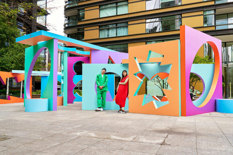
Now You See Me is a large-scale installation in the heart of Shoreditch, London, that explores the relationship between positive and negative space through bold color, geometry, and light. Simple, familiar shapes are embedded within monolithic forms, creating a layered visual experience that shifts throughout the day. As sunlight passes through the structures, shadows and silhouettes stretch and connect, forming dynamic compositions on the surrounding concrete.
Photo: Wade and Leta and John Wylie
Paint Your Own Path is series of five towering sculptures, ranging from 10 to 15 feet tall, invites viewers to explore balance, tension, and perspective through bold color and form. Inspired by the delicate, often precarious act of stacking objects, the sculptures appear as if they might topple – yet each one holds steady, challenging perceptions of stability. Created in partnership with the Corolla Cross, the installation transforms its environment into a pop-colored landscape.
Photo: Millenia Walk and Outer Edit, Eurthe Studio
Monument to Movement is a 14-meter-tall kinetic sculpture that celebrates the spirit of the holiday season through rhythm, motion, and color. Rising skyward in layered compositions, the work symbolizes collective joy, renewal, and the shared energy of celebrations that span cultures and traditions. Powered by motors and constructed from metal beams and cardboard forms, the sculpture continuously shifts, inviting viewers to reflect on the passage of time and the cycles that connect us all.
Photo: Wade and Leta and Erika Hara, Piotr Maslanka, and Jeremy Renault
Falling Into Place is a vibrant rooftop installation at Ginza Six that explores themes of alignment, adaptability, and perspective. Six colorful structures – each with a void like a missing puzzle piece – serve as spaces for reflection, inviting visitors to consider their place within a greater whole. Rather than focusing on absence, the design transforms emptiness into opportunity, encouraging people to embrace spontaneity and the unfolding nature of life. Playful yet contemplative, the work emphasizes that only through connection and participation can the full picture come into view.
Photo: Wade and Leta and Erika Hara, Piotr Maslanka, and Jeremy Renault
Photo: Wade and Leta
Stop, Listen, Look is a 7-meter-tall interactive artwork atop IFS Chengdu that captures the vibrant rhythm of the city through movement, sound, and form. Blending motorized and wind-powered elements with seesaws and sound modulation, it invites people of all ages to engage, play, and reflect. Inspired by Chengdu’s balance of tradition and modernity, the piece incorporates circular motifs from local symbolism alongside bold, geometric forms to create a dialogue between past and present. With light, motion, and community at its core, the work invites visitors to connect with the city – and each other – through shared interaction.
The Cloud is a permanent sculptural kiosk in Burlington, Vermont’s historic City Hall Park, created in collaboration with Brooklyn-based Studio RENZ+OEI. Designed to reinterpret the ephemeral nature of clouds through architecture, it blends art, air, and imagination into a light, fluid structure that defies traditional rigidity. Originally born from a creative exchange between longtime friends and collaborators, the design challenges expectations of permanence by embodying movement and openness. Now home to a local food vendor, The Cloud brings a playful, uplifting presence to the park, inviting reflection and interaction rain or shine..
#leta #sobierajski #talks #giant #pandasF5: Leta Sobierajski Talks Giant Pandas, Sculptural Clothing + More
When Leta Sobierajski enrolled in college, she already knew what she was meant to do, and she didn’t settle for anything less. “When I went to school for graphic design, I really didn’t have a backup plan – it was this, or nothing,” she says. “My work is a constantly evolving practice, and from the beginning, I have always convinced myself that if I put in the time and experimentation, I would grow and evolve.”
After graduation, Sobierajski took on a range of projects, which included animation, print, and branding elements. She collaborated with corporate clients, but realized that she wouldn’t feel comfortable following anyone else’s rules in a 9-to-5 environment.
Leta Sobierajskiand Wade Jeffree\\\ Photo: Matt Dutile
Sobierajski eventually decided to team up with fellow artist and kindred spirit Wade Jeffree. In 2016 they launched their Brooklyn-based studio, Wade and Leta. The duo, who share a taste for quirky aesthetics, produces sculpture, installations, or anything else they can dream up. Never static in thinking or method, they are constantly searching for another medium to try that will complement their shared vision of the moment.
The pair is currently interested in permanency, and they want to utilize more metal, a strong material that will stand the test of time. Small architectural pieces are also on tap, and on a grander scale, they’d like to focus on a park or communal area that everyone can enjoy.
With so many ideas swirling around, Sobierajski will record a concept in at least three different ways so that she’s sure to unearth it at a later date. “In some ways, I like to think I’m impeccably organized, as I have countless spreadsheets tracking our work, our lives, and our well-being,” she explains. “The reality is that I am great at over-complicating situations with my intensified list-making and note-taking. The only thing to do is to trust the process.”
Today, Leta Sobierajski joins us for Friday Five!
Photo: Melitta Baumeister and Michał Plata
1. Melitta Baumeister and Michał Plata
The work of Melitta Baumeister and Michał Plata has been a constant inspiration to me for their innovative, artful, and architectural silhouettes. By a practice of draping and arduous pattern-making, the garments that they develop season after season feel like they could be designed for existence in another universe. I’m a person who likes to dress up for anything when I’m not in the studio, and every time I opt to wear one of their looks, I feel like I can take on the world. The best part about their pieces is that they’re extremely functional, so whether I need to hop on a bicycle or show up at an opening, I’m still able to make a statement – these garments even have the ability to strike up conversations on their own.
Photo: Wade and Leta
2. Pandas!
I was recently in Chengdu to launch a new project and we took half the day to visit the Chengdu Research Base of Giant Pandas and I am a new panda convert. Yes, they’re docile and cute, but their lifestyles are utterly chill and deeply enviable for us adults with responsibilities. Giant pandas primarily eat bamboo and can consume 20-40 kilograms per day. When they’re not doing that, they’re sleeping. When we visited, many could be seen reclining on their backs, feasting on some of the finest bamboo they could select within arm’s reach. While not necessarily playful in appearance, they do seem quite cheeky in their agendas and will do as little as they can to make the most of their meals. It felt like I was watching a mirrored image of myself on a Sunday afternoon while trying to make the most of my last hours of the weekend.
Photo: Courtesy of Aoiro
3. Aoiro
I’m not really a candle personbut I love the luxurious subtlety of a fragrant space. It’s an intangible feeling that really can only be experienced in the present. Some of the best people to create these fragrances, in my opinion, are Shizuko and Manuel, the masterminds behind Aoiro, a Japanese and Austrian duo who have developed a keen sense for embodying the fragrances of some of the most intriguing and captivating olfactory atmospheres – earthy forest floors with crackling pine needles, blue cypress tickling the moon in an indigo sky, and rainfall on a spirited Japanese island. Despite living in an urban city, Aoiro’s olfactory design is capable of transporting me to the deepest forests of misty Yakushima island.
Photo: Wade and Leta
4. Takuro Kuwata
A few months ago, I saw the work of Japanese ceramicist Takuro Kuwata at an exhibition at Salon94 and have been having trouble getting it out of my head. Kuwata’s work exemplifies someone who has worked with a medium so much to completely use the medium as a medium – if that makes sense. His ability to manipulate clay and glaze and use it to create gravity-defying effects within the kiln are exceptionally mysterious to me and feel like they could only be accomplished with years and years of experimentation with the material. I’m equally impressed seeing how he’s grown his work with scale, juxtaposing it with familiar iconography like the fuzzy peach, but sculpting it from materials like bronze.
Photo: Wade and Leta
5. The Site of Reversible Destiny, a park built by artists Arakawa and Gins, in Yoro Japan
The park is a testament to their career as writers, architects, and their idea of reversible destiny, which in its most extreme form, eliminates death. For all that are willing to listen, Arakawa and Gins’ Reversible Destiny mentality aims to make our lives a little more youthful by encouraging us to reevaluate our relationship with architecture and our surroundings. The intention of “reversible destiny” is not to prolong death, postpone it, grow older alongside it, but to entirely not acknowledge and surpass it. Wadeand I have spent the last ten years traveling to as many of their remaining sites as possible to further understand this notion of creating spaces to extend our lives and question how conventional living spaces can become detrimental to our longevity.
Works by Wade and Leta:
Photo: Wade and Leta and Matt Alexander
Now You See Me is a large-scale installation in the heart of Shoreditch, London, that explores the relationship between positive and negative space through bold color, geometry, and light. Simple, familiar shapes are embedded within monolithic forms, creating a layered visual experience that shifts throughout the day. As sunlight passes through the structures, shadows and silhouettes stretch and connect, forming dynamic compositions on the surrounding concrete.
Photo: Wade and Leta and John Wylie
Paint Your Own Path is series of five towering sculptures, ranging from 10 to 15 feet tall, invites viewers to explore balance, tension, and perspective through bold color and form. Inspired by the delicate, often precarious act of stacking objects, the sculptures appear as if they might topple – yet each one holds steady, challenging perceptions of stability. Created in partnership with the Corolla Cross, the installation transforms its environment into a pop-colored landscape.
Photo: Millenia Walk and Outer Edit, Eurthe Studio
Monument to Movement is a 14-meter-tall kinetic sculpture that celebrates the spirit of the holiday season through rhythm, motion, and color. Rising skyward in layered compositions, the work symbolizes collective joy, renewal, and the shared energy of celebrations that span cultures and traditions. Powered by motors and constructed from metal beams and cardboard forms, the sculpture continuously shifts, inviting viewers to reflect on the passage of time and the cycles that connect us all.
Photo: Wade and Leta and Erika Hara, Piotr Maslanka, and Jeremy Renault
Falling Into Place is a vibrant rooftop installation at Ginza Six that explores themes of alignment, adaptability, and perspective. Six colorful structures – each with a void like a missing puzzle piece – serve as spaces for reflection, inviting visitors to consider their place within a greater whole. Rather than focusing on absence, the design transforms emptiness into opportunity, encouraging people to embrace spontaneity and the unfolding nature of life. Playful yet contemplative, the work emphasizes that only through connection and participation can the full picture come into view.
Photo: Wade and Leta and Erika Hara, Piotr Maslanka, and Jeremy Renault
Photo: Wade and Leta
Stop, Listen, Look is a 7-meter-tall interactive artwork atop IFS Chengdu that captures the vibrant rhythm of the city through movement, sound, and form. Blending motorized and wind-powered elements with seesaws and sound modulation, it invites people of all ages to engage, play, and reflect. Inspired by Chengdu’s balance of tradition and modernity, the piece incorporates circular motifs from local symbolism alongside bold, geometric forms to create a dialogue between past and present. With light, motion, and community at its core, the work invites visitors to connect with the city – and each other – through shared interaction.
The Cloud is a permanent sculptural kiosk in Burlington, Vermont’s historic City Hall Park, created in collaboration with Brooklyn-based Studio RENZ+OEI. Designed to reinterpret the ephemeral nature of clouds through architecture, it blends art, air, and imagination into a light, fluid structure that defies traditional rigidity. Originally born from a creative exchange between longtime friends and collaborators, the design challenges expectations of permanence by embodying movement and openness. Now home to a local food vendor, The Cloud brings a playful, uplifting presence to the park, inviting reflection and interaction rain or shine..
#leta #sobierajski #talks #giant #pandas