AN EXPLOSIVE MIX OF SFX AND VFX IGNITES FINAL DESTINATION BLOODLINES
By CHRIS McGOWAN
Images courtesy of Warner Bros. Pictures.
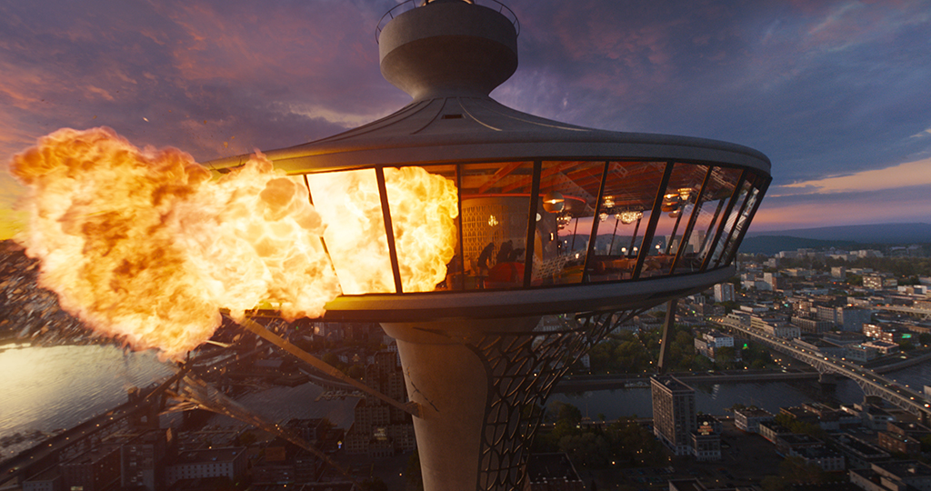
Final Destination Bloodlines, the sixth installment in the graphic horror series, kicks off with the film’s biggest challenge – deploying an elaborate, large-scale set piece involving the 400-foot-high Skyview Tower restaurant. While there in 1968, young Iris Campbellhas a premonition about the Skyview burning, cracking, crumbling and collapsing. Then, when she sees these events actually starting to happen around her, she intervenes and causes an evacuation of the tower, thus thwarting death’s design and saving many lives. Years later, her granddaughter, Stefani Reyes, inherits the vision of the destruction that could have occurred and realizes death is still coming for the survivors.
“I knew we couldn’t put the wholeon fire, but Tonytried and put as much fire as he could safely and then we just built off thatand added a lot more. Even when it’s just a little bit of real fire, the lighting and interaction that can’t be simulated, so I think it was a success in terms of blending that practical with the visual.”
—Nordin Rahhali, VFX Supervisor
The film opens with an elaborate, large-scale set piece involving the 400-foot-high Skyview Tower restaurant – and its collapse. Drone footage was digitized to create a 3D asset for the LED wall so the time of day could be changed as needed.
“The set that the directors wanted was very large,” says Nordin Rahhali, VFX Supervisor. “We had limited space options in stages given the scale and the footprint of the actual restaurant that they wanted. It was the first set piece, the first big thing we shot, so we had to get it all ready and going right off the bat. We built a bigger volume for our needs, including an LED wall that we built the assets for.”
“We were outside Vancouver at Bridge Studios in Burnaby. The custom-built LED volume was a little over 200 feet in length” states Christian Sebaldt, ASC, the movie’s DP. The volume was 98 feet in diameter and 24 feet tall. Rahhali explains, “Pixomondo was the vendor that we contracted to come in and build the volume. They also built the asset that went on the LED wall, so they were part of our filming team and production shoot. Subsequently, they were also the main vendor doing post, which was by design. By having them design and take care of the asset during production, we were able to leverage their assets, tools and builds for some of the post VFX.” Rahhali adds, “It was really important to make sure we had days with the volume team and with Christian and his camera team ahead of the shoot so we could dial it in.”
Built at Bridge Studios in Burnaby outside Vancouver, the custom-built LED volume for events at the Skyview restaurant was over 200 feet long, 98 feet wide and 24 feet tall. Extensive previs with Digital Domain was done to advance key shots.Zach Lipovsky and Adam Stein directed Final Destination Bloodlines for New Line film, distributed by Warner Bros., in which chain reactions of small and big events lead to bloody catastrophes befalling those who have cheated death at some point. Pixomondo was the lead VFX vendor, followed by FOLKS VFX. Picture Shop also contributed. There were around 800 VFX shots. Tony Lazarowich was the Special Effects Supervisor.
“The Skyview restaurant involved building a massive setwas fire retardant, which meant the construction took longer than normal because they had to build it with certain materials and coat it with certain things because, obviously, it serves for the set piece. As it’s falling into chaos, a lot of that fire was practical. I really jived with what Christian and directors wanted and how Tony likes to work – to augment as much real practical stuff as possible,” Rahhali remarks. “I knew we couldn’t put the whole thing on fire, but Tony tried and put as much fire as he could safely, and then we just built off thatand added a lot more. Even when it’s just a little bit of real fire, the lighting and interaction can’t be simulated, so I think it was a success in terms of blending that practical with the visual.”
The Skyview restaurant required building a massive set that was fire retardant. Construction on the set took longer because it had to be built and coated with special materials. As the Skyview restaurant falls into chaos, much of the fire was practical.“We got all the Vancouver skylineso we could rebuild our version of the city, which was based a little on the Vancouver footprint. So, we used all that to build a digital recreation of a city that was in line with what the directors wanted, which was a coastal city somewhere in the States that doesn’t necessarily have to be Vancouver or Seattle, but it looks a little like the Pacific Northwest.”
—Christian Sebaldt, ASC, Director of Photography
For drone shots, the team utilized a custom heavy-lift drone with three RED Komodo Digital Cinema cameras “giving us almost 180 degrees with overlap that we would then stitch in post and have a ridiculous amount of resolution off these three cameras,” Sebaldt states. “The other drone we used was a DJI Inspire 3, which was also very good. And we flew these drones up at the height. We flew them at different times of day. We flew full 360s, and we also used them for photogrammetry. We got all the Vancouver skyline so we could rebuild our version of the city, which was based a little on the Vancouver footprint. So, we used all that to build a digital recreation of a city that was in line with what the directors wanted, which was a coastal city somewhere in the States that doesn’t necessarily have to be Vancouver or Seattle, but it looks a little like the Pacific Northwest.” Rahhali adds, “All of this allowed us to figure out what we were going to shoot. We had the stage build, and we had the drone footage that we then digitized and created a 3D asset to go on the wallwe could change the times of day”
Pixomondo built the volume and the asset that went on the LED wall for the Skyview sequence. They were also the main vendor during post. FOLKS VFX and Picture Shop contributed.“We did extensive previs with Digital Domain,” Rahhali explains. “That was important because we knew the key shots that the directors wanted. With a combination of those key shots, we then kind of reverse-engineeredwhile we did techvis off the previs and worked with Christian and the art department so we would have proper flexibility with the set to be able to pull off some of these shots.some of these shots required the Skyview restaurant ceiling to be lifted and partially removed for us to get a crane to shoot Paulas he’s about to fall and the camera’s going through a roof, that we then digitally had to recreate. Had we not done the previs to know those shots in advance, we would not have been able to build that in time to accomplish the look. We had many other shots that were driven off the previs that allowed the art department, construction and camera teams to work out how they would get those shots.”
Some shots required the Skyview’s ceiling to be lifted and partially removed to get a crane to shoot Paul Campbellas he’s about to fall.
The character Iris lived in a fortified house, isolating herself methodically to avoid the Grim Reaper. Rahhali comments, “That was a beautiful locationGVRD, very cold. It was a long, hard shoot, because it was all nights. It was just this beautiful pocket out in the middle of the mountains. We in visual effects didn’t do a ton other than a couple of clean-ups of the big establishing shots when you see them pull up to the compound. We had to clean up small roads we wanted to make look like one road and make the road look like dirt.” There were flames involved. Sebaldt says, “The explosionwas unbelievably big. We had eight cameras on it at night and shot it at high speed, and we’re all going ‘Whoa.’” Rahhali notes, “There was some clean-up, but the explosion was 100% practical. Our Special Effects Supervisor, Tony, went to town on that. He blew up the whole house, and it looked spectacular.”
The tattoo shop piercing scene is one of the most talked-about sequences in the movie, where a dangling chain from a ceiling fan attaches itself to the septum nose piercing of Erik Campbelland drags him toward a raging fire. Rahhali observes, “That was very Final Destination and a great Rube Goldberg build-up event. Richard was great. He was tied up on a stunt line for most of it, balancing on top of furniture. All of that was him doing it for real with a stunt line.” Some effects solutions can be surprisingly extremely simple. Rahhali continues, “Our producercame up with a great gagseptum ring.” Richard’s nose was connected with just a nose plug that went inside his nostrils. “All that tugging and everything that you’re seeing was real. For weeks and weeks, we were all trying to figure out how to do it without it being a big visual effects thing. ‘How are we gonna pull his nose for real?’ Craig said, ‘I have these things I use to help me open up my nose and you can’t really see them.’ They built it off of that, and it looked great.”
Filmmakers spent weeks figuring out how to execute the harrowing tattoo shop scene. A dangling chain from a ceiling fan attaches itself to the septum nose ring of Erik Campbell– with the actor’s nose being tugged by the chain connected to a nose plug that went inside his nostrils.
“ome of these shots required the Skyview restaurant ceiling to be lifted and partially removed for us to get a crane to shoot Paulas he’s about to fall and the camera’s going through a roof, that we then digitally had to recreate. Had we not done the previs to know those shots in advance, we would not have been able to build that in time to accomplish the look. We had many other shots that were driven off the previs that allowed the art department, construction and camera teams to work out how they would get those shots.”
—Nordin Rahhali, VFX Supervisor
Most of the fire in the tattoo parlor was practical. “There are some fire bars and stuff that you’re seeing in there from SFX and the big pool of fire on the wide shots.” Sebaldt adds, “That was a lot of fun to shoot because it’s so insane when he’s dancing and balancing on all this stuff – we were laughing and laughing. We were convinced that this was going to be the best scene in the movie up to that moment.” Rahhali says, “They used the scene wholesale for the trailer. It went viral – people were taking out their septum rings.” Erik survives the parlor blaze only to meet his fate in a hospital when he is pulled by a wheelchair into an out-of-control MRI machine at its highest magnetic level. Rahhali comments, “That is a good combination of a bunch of different departments. Our Stunt Coordinator, Simon Burnett, came up with this hard pull-wire linewhen Erik flies and hits the MRI. That’s a real stunt with a double, and he hit hard. All the other shots are all CG wheelchairs because the directors wanted to art-direct how the crumpling metal was snapping and bending to show pressure on him as his body starts going into the MRI.”
To augment the believability that comes with reality, the directors aimed to capture as much practically as possible, then VFX Supervisor Nordin Rahhali and his team built on that result.A train derailment concludes the film after Stefani and her brother, Charlie, realize they are still on death’s list. A train goes off the tracks, and logs from one of the cars fly though the air and kills them. “That one was special because it’s a hard sequence and was also shot quite late, so we didn’t have a lot of time. We went back to Vancouver and shot the actual street, and we shot our actors performing. They fell onto stunt pads, and the moment they get touched by the logs, it turns into CG as it was the only way to pull that off and the train of course. We had to add all that. The destruction of the houses and everything was done in visual effects.”
Erik survives the tattoo parlor blaze only to meet his fate in a hospital when he is crushed by a wheelchair while being pulled into an out-of-control MRI machine.
Erikappears about to be run over by a delivery truck at the corner of 21A Ave. and 132A St., but he’s not – at least not then. The truck is actually on the opposite side of the road, and the person being run over is Howard.
A rolling penny plays a major part in the catastrophic chain reactions and seems to be a character itself. “The magic penny was a mix from two vendors, Pixomondo and FOLKS; both had penny shots,” Rahhali says. “All the bouncing pennies you see going through the vents and hitting the fan blade are all FOLKS. The bouncing penny at the end as a lady takes it out of her purse, that goes down the ramp and into the rail – that’s FOLKS. The big explosion shots in the Skyview with the penny slowing down after the kid throws itare all Pixomondo shots. It was a mix. We took a little time to find that balance between readability and believability.”
Approximately 800 VFX shots were required for Final Destination Bloodlines.Chain reactions of small and big events lead to bloody catastrophes befalling those who have cheated Death at some point in the Final Destination films.
From left: Kaitlyn Santa Juana as Stefani Reyes, director Adam Stein, director Zach Lipovsky and Gabrielle Rose as Iris.Rahhali adds, “The film is a great collaboration of departments. Good visual effects are always a good combination of special effects, makeup effects and cinematography; it’s all the planning of all the pieces coming together. For a film of this size, I’m really proud of the work. I think we punched above our weight class, and it looks quite good.”
#explosive #mix #sfx #vfx #ignitesAN EXPLOSIVE MIX OF SFX AND VFX IGNITES FINAL DESTINATION BLOODLINES
By CHRIS McGOWAN
Images courtesy of Warner Bros. Pictures.
Final Destination Bloodlines, the sixth installment in the graphic horror series, kicks off with the film’s biggest challenge – deploying an elaborate, large-scale set piece involving the 400-foot-high Skyview Tower restaurant. While there in 1968, young Iris Campbellhas a premonition about the Skyview burning, cracking, crumbling and collapsing. Then, when she sees these events actually starting to happen around her, she intervenes and causes an evacuation of the tower, thus thwarting death’s design and saving many lives. Years later, her granddaughter, Stefani Reyes, inherits the vision of the destruction that could have occurred and realizes death is still coming for the survivors.
“I knew we couldn’t put the wholeon fire, but Tonytried and put as much fire as he could safely and then we just built off thatand added a lot more. Even when it’s just a little bit of real fire, the lighting and interaction that can’t be simulated, so I think it was a success in terms of blending that practical with the visual.”
—Nordin Rahhali, VFX Supervisor
The film opens with an elaborate, large-scale set piece involving the 400-foot-high Skyview Tower restaurant – and its collapse. Drone footage was digitized to create a 3D asset for the LED wall so the time of day could be changed as needed.
“The set that the directors wanted was very large,” says Nordin Rahhali, VFX Supervisor. “We had limited space options in stages given the scale and the footprint of the actual restaurant that they wanted. It was the first set piece, the first big thing we shot, so we had to get it all ready and going right off the bat. We built a bigger volume for our needs, including an LED wall that we built the assets for.”
“We were outside Vancouver at Bridge Studios in Burnaby. The custom-built LED volume was a little over 200 feet in length” states Christian Sebaldt, ASC, the movie’s DP. The volume was 98 feet in diameter and 24 feet tall. Rahhali explains, “Pixomondo was the vendor that we contracted to come in and build the volume. They also built the asset that went on the LED wall, so they were part of our filming team and production shoot. Subsequently, they were also the main vendor doing post, which was by design. By having them design and take care of the asset during production, we were able to leverage their assets, tools and builds for some of the post VFX.” Rahhali adds, “It was really important to make sure we had days with the volume team and with Christian and his camera team ahead of the shoot so we could dial it in.”
Built at Bridge Studios in Burnaby outside Vancouver, the custom-built LED volume for events at the Skyview restaurant was over 200 feet long, 98 feet wide and 24 feet tall. Extensive previs with Digital Domain was done to advance key shots.Zach Lipovsky and Adam Stein directed Final Destination Bloodlines for New Line film, distributed by Warner Bros., in which chain reactions of small and big events lead to bloody catastrophes befalling those who have cheated death at some point. Pixomondo was the lead VFX vendor, followed by FOLKS VFX. Picture Shop also contributed. There were around 800 VFX shots. Tony Lazarowich was the Special Effects Supervisor.
“The Skyview restaurant involved building a massive setwas fire retardant, which meant the construction took longer than normal because they had to build it with certain materials and coat it with certain things because, obviously, it serves for the set piece. As it’s falling into chaos, a lot of that fire was practical. I really jived with what Christian and directors wanted and how Tony likes to work – to augment as much real practical stuff as possible,” Rahhali remarks. “I knew we couldn’t put the whole thing on fire, but Tony tried and put as much fire as he could safely, and then we just built off thatand added a lot more. Even when it’s just a little bit of real fire, the lighting and interaction can’t be simulated, so I think it was a success in terms of blending that practical with the visual.”
The Skyview restaurant required building a massive set that was fire retardant. Construction on the set took longer because it had to be built and coated with special materials. As the Skyview restaurant falls into chaos, much of the fire was practical.“We got all the Vancouver skylineso we could rebuild our version of the city, which was based a little on the Vancouver footprint. So, we used all that to build a digital recreation of a city that was in line with what the directors wanted, which was a coastal city somewhere in the States that doesn’t necessarily have to be Vancouver or Seattle, but it looks a little like the Pacific Northwest.”
—Christian Sebaldt, ASC, Director of Photography
For drone shots, the team utilized a custom heavy-lift drone with three RED Komodo Digital Cinema cameras “giving us almost 180 degrees with overlap that we would then stitch in post and have a ridiculous amount of resolution off these three cameras,” Sebaldt states. “The other drone we used was a DJI Inspire 3, which was also very good. And we flew these drones up at the height. We flew them at different times of day. We flew full 360s, and we also used them for photogrammetry. We got all the Vancouver skyline so we could rebuild our version of the city, which was based a little on the Vancouver footprint. So, we used all that to build a digital recreation of a city that was in line with what the directors wanted, which was a coastal city somewhere in the States that doesn’t necessarily have to be Vancouver or Seattle, but it looks a little like the Pacific Northwest.” Rahhali adds, “All of this allowed us to figure out what we were going to shoot. We had the stage build, and we had the drone footage that we then digitized and created a 3D asset to go on the wallwe could change the times of day”
Pixomondo built the volume and the asset that went on the LED wall for the Skyview sequence. They were also the main vendor during post. FOLKS VFX and Picture Shop contributed.“We did extensive previs with Digital Domain,” Rahhali explains. “That was important because we knew the key shots that the directors wanted. With a combination of those key shots, we then kind of reverse-engineeredwhile we did techvis off the previs and worked with Christian and the art department so we would have proper flexibility with the set to be able to pull off some of these shots.some of these shots required the Skyview restaurant ceiling to be lifted and partially removed for us to get a crane to shoot Paulas he’s about to fall and the camera’s going through a roof, that we then digitally had to recreate. Had we not done the previs to know those shots in advance, we would not have been able to build that in time to accomplish the look. We had many other shots that were driven off the previs that allowed the art department, construction and camera teams to work out how they would get those shots.”
Some shots required the Skyview’s ceiling to be lifted and partially removed to get a crane to shoot Paul Campbellas he’s about to fall.
The character Iris lived in a fortified house, isolating herself methodically to avoid the Grim Reaper. Rahhali comments, “That was a beautiful locationGVRD, very cold. It was a long, hard shoot, because it was all nights. It was just this beautiful pocket out in the middle of the mountains. We in visual effects didn’t do a ton other than a couple of clean-ups of the big establishing shots when you see them pull up to the compound. We had to clean up small roads we wanted to make look like one road and make the road look like dirt.” There were flames involved. Sebaldt says, “The explosionwas unbelievably big. We had eight cameras on it at night and shot it at high speed, and we’re all going ‘Whoa.’” Rahhali notes, “There was some clean-up, but the explosion was 100% practical. Our Special Effects Supervisor, Tony, went to town on that. He blew up the whole house, and it looked spectacular.”
The tattoo shop piercing scene is one of the most talked-about sequences in the movie, where a dangling chain from a ceiling fan attaches itself to the septum nose piercing of Erik Campbelland drags him toward a raging fire. Rahhali observes, “That was very Final Destination and a great Rube Goldberg build-up event. Richard was great. He was tied up on a stunt line for most of it, balancing on top of furniture. All of that was him doing it for real with a stunt line.” Some effects solutions can be surprisingly extremely simple. Rahhali continues, “Our producercame up with a great gagseptum ring.” Richard’s nose was connected with just a nose plug that went inside his nostrils. “All that tugging and everything that you’re seeing was real. For weeks and weeks, we were all trying to figure out how to do it without it being a big visual effects thing. ‘How are we gonna pull his nose for real?’ Craig said, ‘I have these things I use to help me open up my nose and you can’t really see them.’ They built it off of that, and it looked great.”
Filmmakers spent weeks figuring out how to execute the harrowing tattoo shop scene. A dangling chain from a ceiling fan attaches itself to the septum nose ring of Erik Campbell– with the actor’s nose being tugged by the chain connected to a nose plug that went inside his nostrils.
“ome of these shots required the Skyview restaurant ceiling to be lifted and partially removed for us to get a crane to shoot Paulas he’s about to fall and the camera’s going through a roof, that we then digitally had to recreate. Had we not done the previs to know those shots in advance, we would not have been able to build that in time to accomplish the look. We had many other shots that were driven off the previs that allowed the art department, construction and camera teams to work out how they would get those shots.”
—Nordin Rahhali, VFX Supervisor
Most of the fire in the tattoo parlor was practical. “There are some fire bars and stuff that you’re seeing in there from SFX and the big pool of fire on the wide shots.” Sebaldt adds, “That was a lot of fun to shoot because it’s so insane when he’s dancing and balancing on all this stuff – we were laughing and laughing. We were convinced that this was going to be the best scene in the movie up to that moment.” Rahhali says, “They used the scene wholesale for the trailer. It went viral – people were taking out their septum rings.” Erik survives the parlor blaze only to meet his fate in a hospital when he is pulled by a wheelchair into an out-of-control MRI machine at its highest magnetic level. Rahhali comments, “That is a good combination of a bunch of different departments. Our Stunt Coordinator, Simon Burnett, came up with this hard pull-wire linewhen Erik flies and hits the MRI. That’s a real stunt with a double, and he hit hard. All the other shots are all CG wheelchairs because the directors wanted to art-direct how the crumpling metal was snapping and bending to show pressure on him as his body starts going into the MRI.”
To augment the believability that comes with reality, the directors aimed to capture as much practically as possible, then VFX Supervisor Nordin Rahhali and his team built on that result.A train derailment concludes the film after Stefani and her brother, Charlie, realize they are still on death’s list. A train goes off the tracks, and logs from one of the cars fly though the air and kills them. “That one was special because it’s a hard sequence and was also shot quite late, so we didn’t have a lot of time. We went back to Vancouver and shot the actual street, and we shot our actors performing. They fell onto stunt pads, and the moment they get touched by the logs, it turns into CG as it was the only way to pull that off and the train of course. We had to add all that. The destruction of the houses and everything was done in visual effects.”
Erik survives the tattoo parlor blaze only to meet his fate in a hospital when he is crushed by a wheelchair while being pulled into an out-of-control MRI machine.
Erikappears about to be run over by a delivery truck at the corner of 21A Ave. and 132A St., but he’s not – at least not then. The truck is actually on the opposite side of the road, and the person being run over is Howard.
A rolling penny plays a major part in the catastrophic chain reactions and seems to be a character itself. “The magic penny was a mix from two vendors, Pixomondo and FOLKS; both had penny shots,” Rahhali says. “All the bouncing pennies you see going through the vents and hitting the fan blade are all FOLKS. The bouncing penny at the end as a lady takes it out of her purse, that goes down the ramp and into the rail – that’s FOLKS. The big explosion shots in the Skyview with the penny slowing down after the kid throws itare all Pixomondo shots. It was a mix. We took a little time to find that balance between readability and believability.”
Approximately 800 VFX shots were required for Final Destination Bloodlines.Chain reactions of small and big events lead to bloody catastrophes befalling those who have cheated Death at some point in the Final Destination films.
From left: Kaitlyn Santa Juana as Stefani Reyes, director Adam Stein, director Zach Lipovsky and Gabrielle Rose as Iris.Rahhali adds, “The film is a great collaboration of departments. Good visual effects are always a good combination of special effects, makeup effects and cinematography; it’s all the planning of all the pieces coming together. For a film of this size, I’m really proud of the work. I think we punched above our weight class, and it looks quite good.”
#explosive #mix #sfx #vfx #ignites