The Invisible Visual Effects Secrets of ‘Severance’ with ILM’s Eric Leven
ILM teams with Ben Stiller and Apple TV+ to bring thousands of seamless visual effects shots to the hit drama’s second season.
By Clayton Sandell
There are mysterious and important secrets to be uncovered in the second season of the wildly popular Apple TV+ series Severance.
About 3,500 of them are hiding in plain sight.
That’s roughly the number of visual effects shots helping tell the Severance story over 10 gripping episodes in the latest season, a collaborative effort led by Industrial Light & Magic.
ILM’s Eric Leven served as the Severance season two production visual effects supervisor. We asked him to help pull back the curtain on some of the show’s impressive digital artistry that most viewers will probably never notice.
“This is the first show I’ve ever done where it’s nothing but invisible effects,” Leven tells ILM.com. “It’s a really different calculus because nobody talks about them. And if you’ve done them well, they are invisible to the naked eye.”
With so many season two shots to choose from, Leven helped us narrow down a list of his favorite visual effects sequences to five.Before we dig in, a word of caution. This article contains plot spoilers for Severance.Severance tells the story of Mark Scout, department chief of the secretive Severed Floor located in the basement level of Lumon Industries, a multinational biotech corporation. Mark S., as he’s known to his co-workers, heads up Macrodata Refinement, a department where employees help categorize numbers without knowing the true purpose of their work.
Mark and his team – Helly R., Dylan G., and Irving B., have all undergone a surgical procedure to “sever” their personal lives from their work lives. The chip embedded in their brains effectively creates two personalities that are sometimes at odds: an “Innie” during Lumon office hours and an “Outie” at home.
“This is the first show I’ve ever done where it’s nothing but invisible effects. It’s a really different calculus because nobody talks about them. And if you’ve done them well, they are invisible to the naked eye.”Eric Leven
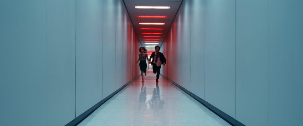
1. The Running ManThe season one finale ends on a major cliffhanger. Mark S. learns that his Outie’s wife, Gemma – believed killed in a car crash years ago – is actually alive somewhere inside the Lumon complex. Season two opens with Mark S. arriving at the Severed Floor in a desperate search for Gemma, who he only knows as her Innie persona, Ms. Casey.
The fast-paced sequence is designed to look like a single, two-minute shot. It begins with the camera making a series of rapid and elaborate moves around a frantic Mark S. as he steps out of the elevator, into the Severed Floor lobby, and begins running through the hallways.
“The nice thing about that sequence was that everyone knew it was going to be difficult and challenging,” Leven says, adding that executive producer and Episode 201 director, Ben Stiller, began by mapping out the hallway run with his team. Leven recommended that a previsualization sequence – provided by The Third Floor – would help the filmmakers refine their plan before cameras rolled.
“While prevising it, we didn’t worry about how we would actually photograph anything. It was just, ‘These are the visuals we want to capture,’” Leven says. “‘What does it look like for this guy to run down this hallway for two minutes? We’ll figure out how to shoot it later.’”
The previs process helped determine how best to shoot the sequence, and also informed which parts of the soundstage set would have to be digitally replaced. The first shot was captured by a camera mounted on a Bolt X Cinebot motion-control arm provided by The Garage production company. The size of the motion-control setup, however, meant it could not fit in the confined space of an elevator or the existing hallways.
“We couldn’t actually shoot in the elevator,” Leven says. “The whole elevator section of the set was removed and was replaced with computer graphics.” In addition to the elevator, ILM artists replaced portions of the floor, furniture, and an entire lobby wall, even adding a reflection of Adam Scott into the elevator doors.
As Scott begins running, he’s picked up by a second camera mounted on a more compact, stabilized gimbal that allows the operator to quickly run behind and sometimes in front of the actor as he darts down different hallways. ILM seamlessly combined the first two Mark S. plates in a 2D composite.
“Part of that is the magic of the artists at ILM who are doing that blend. But I have to give credit to Adam Scott because he ran the same way in both cameras without really being instructed,” says Leven. “Lucky for us, he led with the same foot. He used the same arm. I remember seeing it on the set, and I did a quick-and-dirty blend right there and thought, ‘Oh my gosh, this is going to work.’ So it was really nice.”
The action continues at a frenetic pace, ultimately combining ten different shots to complete the sequence.
“We didn’t want the very standard sleight of hand that you’ve seen a lot where you do a wipe across the white hallway,” Leven explains. “We tried to vary that as much as possible because we didn’t want to give away the gag. So, there are times when the camera will wipe across a hallway, and it’s not a computer graphics wipe. We’d hide the wipe somewhere else.”
A slightly more complicated illusion comes as the camera sweeps around Mark S. from back to front as he barrels down another long hallway. “There was no way to get the camera to spin around Mark while he is running because there’s physically not enough room for the camera there,” says Leven.
To capture the shot, Adam Scott ran on a treadmill placed on a green screen stage as the camera maneuvered around him. At that point, the entire hallway environment is made with computer graphics. Artists even added a few extra frames of the actor to help connect one shot to the next, selling the illusion of a single continuous take. “We painted in a bit of Adam Scott running around the corner. So if you freeze and look through it, you’ll see a bit of his heel. He never completely clears the frame,” Leven points out.
Leven says ILM also provided Ben Stiller with options when it came to digitally changing up the look of Lumon’s sterile hallways: sometimes adding extra doors, vents, or even switching door handles. “I think Ben was very excited about having this opportunity,” says Leven. “He had never had a complete, fully computer graphics version of these hallways before. And now he was able to do things that he was never able to do in season one.”.
2. Let it SnowThe MDR team – Mark, Helly, Dylan, and Irving – unexpectedly find themselves in the snowy wilderness as part of a two-day Lumon Outdoor Retreat and Team-Building Occurrence, or ORTBO.
Exterior scenes were shot on location at Minnewaska State Park Preserve in New York. Throughout the ORTBO sequence, ILM performed substantial environment enhancements, making trees and landscapes appear far snowier than they were during the shoot. “It’s really nice to get the actors out there in the cold and see their breath,” Leven says. “It just wasn’t snowy during the shoot. Nearly every exterior shot was either replaced or enhanced with snow.”
For a shot of Irving standing on a vast frozen lake, for example, virtually every element in the location plate – including an unfrozen lake, mountains, and trees behind actor John Turturro – was swapped out for a CG environment. Wide shots of a steep, rocky wall Irving must scale to reach his co-workers were also completely digital.
Eventually, the MDR team discovers a waterfall that marks their arrival at a place called Woe’s Hollow. The location – the state park’s real-life Awosting Falls – also got extensive winter upgrades from ILM, including much more snow covering the ground and trees, an ice-covered pond, and hundreds of icicles clinging to the rocky walls. “To make it fit in the world of Severance, there’s a ton of work that has to happen,” Leven tells ILM.com..
3. Welcome to LumonThe historic Bell Labs office complex, now known as Bell Works in Holmdel Township, New Jersey, stands in as the fictional Lumon Industries headquarters building.
Exterior shots often underwent a significant digital metamorphosis, with artists transforming areas of green grass into snow-covered terrain, inserting a CG water tower, and rendering hundreds of 1980s-era cars to fill the parking lot.
“We’re always adding cars, we’re always adding snow. We’re changing, subtly, the shape and the layout of the design,” says Leven. “We’re seeing new angles that we’ve never seen before. On the roof of Lumon, for example, the air conditioning units are specifically designed and created with computer graphics.”
In real life, the complex is surrounded by dozens of houses, requiring the digital erasure of entire neighborhoods. “All of that is taken out,” Leven explains. “CG trees are put in, and new mountains are put in the background.”
Episodes 202 and 203 feature several night scenes shot from outside the building looking in. In one sequence, a camera drone flying outside captured a long tracking shot of Helena Eaganmaking her way down a glass-enclosed walkway. The building’s atrium can be seen behind her, complete with a massive wall sculpture depicting company founder Kier Eagan.
“We had to put the Kier sculpture in with the special lighting,” Leven reveals. “The entire atrium was computer graphics.” Artists completed the shot by adding CG reflections of the snowy parking lot to the side of the highly reflective building.
“We have to replace what’s in the reflections because the real reflection is a parking lot with no snow or a parking lot with no cars,” explains Leven. “We’re often replacing all kinds of stuff that you wouldn’t think would need to be replaced.”
Another nighttime scene shot from outside the building features Helena in a conference room overlooking the Lumon parking lot, which sits empty except for Mr. Milchickriding in on his motorcycle.
“The top story, where she is standing, was practical,” says Leven, noting the shot was also captured using a drone hovering outside the window. “The second story below her was all computer graphics. Everything other than the building is computer graphics. They did shoot a motorcycle on location, getting as much practical reference as possible, but then it had to be digitally replaced after the fact to make it work with the rest of the shot.”.
4. Time in MotionEpisode seven reveals that MDR’s progress is being monitored by four dopplegang-ish observers in a control room one floor below, revealed via a complex move that has the camera traveling downward through a mass of data cables.
“They built an oversize cable run, and they shot with small probe lenses. Visual effects helped by blending several plates together,” explains Leven. “It was a collaboration between many different departments, which was really nice. Visual effects helped with stuff that just couldn’t be shot for real. For example, when the camera exits the thin holes of the metal grate at the bottom of the floor, that grate is computer graphics.”
The sequence continues with a sweeping motion-control time-lapse shot that travels around the control-room observers in a spiral pattern, a feat pulled off with an ingenious mix of technical innovation and old-school sleight of hand.
A previs sequence from The Third Floor laid out the camera move, but because the Bolt arm motion-control rig could only travel on a straight track and cover roughly one-quarter of the required distance, The Garage came up with a way to break the shot into multiple passes. The passes would later be stitched together into one seemingly uninterrupted movement.
The symmetrical set design – including the four identical workstations – helped complete the illusion, along with a clever solution that kept the four actors in the correct position relative to the camera.
“The camera would basically get to the end of the track,” Leven explains. “Then everybody would switch positions 90 degrees. Everyone would get out of their chairs and move. The camera would go back to one, and it would look like one continuous move around in a circle because the room is perfectly symmetrical, and everything in it is perfectly symmetrical. We were able to move the actors, and it looks like the camera was going all the way around the room.”
The final motion-control move switches from time-lapse back to real time as the camera passes by a workstation and reveals Mr. Drummondand Dr. Mauerstanding behind it. Leven notes that each pass was completed with just one take.
5. Mark vs. MarkThe Severance season two finale begins with an increasingly tense conversation between Innie Mark and Outie Mark, as the two personas use a handheld video camera to send recorded messages back and forth. Their encounter takes place at night in a Lumon birthing cabin equipped with a severance threshold that allows Mark S. to become Mark Scout each time he steps outside and onto the balcony.
The cabin set was built on a soundstage at York Studios in the Bronx, New York. The balcony section consisted of the snowy floor, two chairs, and a railing, all surrounded by a blue screen background. Everything else was up to ILM to create.
“It was nice to have Ben’s trust that we could just do it,” Leven remembers. “He said, ‘Hey, you’re just going to make this look great, right?’ We said, ‘Yeah, no problem.’”
Artists filled in the scene with CG water, mountains, and moonlight to match the on-set lighting and of course, more snow. As Mark Scout steps onto the balcony, the camera pulls back to a wide shot, revealing the cabin’s full exterior. “They built a part of the exterior of the set. But everything other than the windows, even the railing, was digitally replaced,” Leven says.
“It was nice to have Bentrust that we could just do it. He said, ‘Hey, you’re just going to make this look great, right?’ We said, ‘Yeah, no problem.’”Eric Leven
Bonus: Marching Band MagicFinally, our bonus visual effects shot appears roughly halfway through the season finale. To celebrate Mark S. completing the Cold Harbor file, Mr. Milchick orders up a marching band from Lumon’s Choreography and Merriment department. Band members pour into MDR, but Leven says roughly 15 to 20 shots required adding a few more digital duplicates. “They wanted it to look like MDR was filled with band members. And for several of the shots there were holes in there. It just didn’t feel full enough,” he says.
In a shot featuring a God’s-eye view of MDR, band members hold dozens of white cards above their heads, forming a giant illustration of a smiling Mark S. with text that reads “100%.”
“For the top shot, we had to find a different stage because the MDR ceiling is only about eight feet tall,” recalls Leven. “And Ben really pushed to have it done practically, which I think was the right call because you’ve already got the band members, you’ve made the costumes, you’ve got the instruments. Let’s find a place to shoot it.”
To get the high shot, the production team set up on an empty soundstage, placing signature MDR-green carpet on the floor. A simple foam core mock-up of the team’s desks occupied the center of the frame, with the finished CG versions added later.
Even without the restraints of the practical MDR walls and ceiling, the camera could only get enough height to capture about 30 band members in the shot. So the scene was digitally expanded, with artists adding more green carpet, CG walls, and about 50 more band members.
“We painted in new band members, extracting what we could from the practical plate,” Leven says. “We moved them around; we added more, just to make it look as full as Ben wanted.” Every single white card in the shot, Leven points out, is completely digital..
A Mysterious and Important Collaboration
With fans now fiercely debating the many twists and turns of Severance season two, Leven is quick to credit ILM’s two main visual effects collaborators: east side effects and Mango FX INC, as well as ILM studios and artists around the globe, including San Francisco, Vancouver, Singapore, Sydney, and Mumbai.
Leven also believes Severance ultimately benefited from a successful creative partnership between ILM and Ben Stiller.
“This one clicked so well, and it really made a difference on the show,” Leven says. “I think we both had the same sort of visual shorthand in terms of what we wanted things to look like. One of the things I love about working with Ben is that he’s obviously grounded in reality. He wants to shoot as much stuff real as possible, but then sometimes there’s a shot that will either come to him late or he just knows is impractical to shoot. And he knows that ILM can deliver it.”
—
Clayton Sandell is a Star Wars author and enthusiast, TV storyteller, and a longtime fan of the creative people who keep Industrial Light & Magic and Skywalker Sound on the leading edge of visual effects and sound design. Follow him on InstagramBlueskyor X.
#invisible #visual #effects #secrets #severanceThe Invisible Visual Effects Secrets of ‘Severance’ with ILM’s Eric Leven
ILM teams with Ben Stiller and Apple TV+ to bring thousands of seamless visual effects shots to the hit drama’s second season.
By Clayton Sandell
There are mysterious and important secrets to be uncovered in the second season of the wildly popular Apple TV+ series Severance.
About 3,500 of them are hiding in plain sight.
That’s roughly the number of visual effects shots helping tell the Severance story over 10 gripping episodes in the latest season, a collaborative effort led by Industrial Light & Magic.
ILM’s Eric Leven served as the Severance season two production visual effects supervisor. We asked him to help pull back the curtain on some of the show’s impressive digital artistry that most viewers will probably never notice.
“This is the first show I’ve ever done where it’s nothing but invisible effects,” Leven tells ILM.com. “It’s a really different calculus because nobody talks about them. And if you’ve done them well, they are invisible to the naked eye.”
With so many season two shots to choose from, Leven helped us narrow down a list of his favorite visual effects sequences to five.Before we dig in, a word of caution. This article contains plot spoilers for Severance.Severance tells the story of Mark Scout, department chief of the secretive Severed Floor located in the basement level of Lumon Industries, a multinational biotech corporation. Mark S., as he’s known to his co-workers, heads up Macrodata Refinement, a department where employees help categorize numbers without knowing the true purpose of their work.
Mark and his team – Helly R., Dylan G., and Irving B., have all undergone a surgical procedure to “sever” their personal lives from their work lives. The chip embedded in their brains effectively creates two personalities that are sometimes at odds: an “Innie” during Lumon office hours and an “Outie” at home.
“This is the first show I’ve ever done where it’s nothing but invisible effects. It’s a really different calculus because nobody talks about them. And if you’ve done them well, they are invisible to the naked eye.”Eric Leven
1. The Running ManThe season one finale ends on a major cliffhanger. Mark S. learns that his Outie’s wife, Gemma – believed killed in a car crash years ago – is actually alive somewhere inside the Lumon complex. Season two opens with Mark S. arriving at the Severed Floor in a desperate search for Gemma, who he only knows as her Innie persona, Ms. Casey.
The fast-paced sequence is designed to look like a single, two-minute shot. It begins with the camera making a series of rapid and elaborate moves around a frantic Mark S. as he steps out of the elevator, into the Severed Floor lobby, and begins running through the hallways.
“The nice thing about that sequence was that everyone knew it was going to be difficult and challenging,” Leven says, adding that executive producer and Episode 201 director, Ben Stiller, began by mapping out the hallway run with his team. Leven recommended that a previsualization sequence – provided by The Third Floor – would help the filmmakers refine their plan before cameras rolled.
“While prevising it, we didn’t worry about how we would actually photograph anything. It was just, ‘These are the visuals we want to capture,’” Leven says. “‘What does it look like for this guy to run down this hallway for two minutes? We’ll figure out how to shoot it later.’”
The previs process helped determine how best to shoot the sequence, and also informed which parts of the soundstage set would have to be digitally replaced. The first shot was captured by a camera mounted on a Bolt X Cinebot motion-control arm provided by The Garage production company. The size of the motion-control setup, however, meant it could not fit in the confined space of an elevator or the existing hallways.
“We couldn’t actually shoot in the elevator,” Leven says. “The whole elevator section of the set was removed and was replaced with computer graphics.” In addition to the elevator, ILM artists replaced portions of the floor, furniture, and an entire lobby wall, even adding a reflection of Adam Scott into the elevator doors.
As Scott begins running, he’s picked up by a second camera mounted on a more compact, stabilized gimbal that allows the operator to quickly run behind and sometimes in front of the actor as he darts down different hallways. ILM seamlessly combined the first two Mark S. plates in a 2D composite.
“Part of that is the magic of the artists at ILM who are doing that blend. But I have to give credit to Adam Scott because he ran the same way in both cameras without really being instructed,” says Leven. “Lucky for us, he led with the same foot. He used the same arm. I remember seeing it on the set, and I did a quick-and-dirty blend right there and thought, ‘Oh my gosh, this is going to work.’ So it was really nice.”
The action continues at a frenetic pace, ultimately combining ten different shots to complete the sequence.
“We didn’t want the very standard sleight of hand that you’ve seen a lot where you do a wipe across the white hallway,” Leven explains. “We tried to vary that as much as possible because we didn’t want to give away the gag. So, there are times when the camera will wipe across a hallway, and it’s not a computer graphics wipe. We’d hide the wipe somewhere else.”
A slightly more complicated illusion comes as the camera sweeps around Mark S. from back to front as he barrels down another long hallway. “There was no way to get the camera to spin around Mark while he is running because there’s physically not enough room for the camera there,” says Leven.
To capture the shot, Adam Scott ran on a treadmill placed on a green screen stage as the camera maneuvered around him. At that point, the entire hallway environment is made with computer graphics. Artists even added a few extra frames of the actor to help connect one shot to the next, selling the illusion of a single continuous take. “We painted in a bit of Adam Scott running around the corner. So if you freeze and look through it, you’ll see a bit of his heel. He never completely clears the frame,” Leven points out.
Leven says ILM also provided Ben Stiller with options when it came to digitally changing up the look of Lumon’s sterile hallways: sometimes adding extra doors, vents, or even switching door handles. “I think Ben was very excited about having this opportunity,” says Leven. “He had never had a complete, fully computer graphics version of these hallways before. And now he was able to do things that he was never able to do in season one.”.
2. Let it SnowThe MDR team – Mark, Helly, Dylan, and Irving – unexpectedly find themselves in the snowy wilderness as part of a two-day Lumon Outdoor Retreat and Team-Building Occurrence, or ORTBO.
Exterior scenes were shot on location at Minnewaska State Park Preserve in New York. Throughout the ORTBO sequence, ILM performed substantial environment enhancements, making trees and landscapes appear far snowier than they were during the shoot. “It’s really nice to get the actors out there in the cold and see their breath,” Leven says. “It just wasn’t snowy during the shoot. Nearly every exterior shot was either replaced or enhanced with snow.”
For a shot of Irving standing on a vast frozen lake, for example, virtually every element in the location plate – including an unfrozen lake, mountains, and trees behind actor John Turturro – was swapped out for a CG environment. Wide shots of a steep, rocky wall Irving must scale to reach his co-workers were also completely digital.
Eventually, the MDR team discovers a waterfall that marks their arrival at a place called Woe’s Hollow. The location – the state park’s real-life Awosting Falls – also got extensive winter upgrades from ILM, including much more snow covering the ground and trees, an ice-covered pond, and hundreds of icicles clinging to the rocky walls. “To make it fit in the world of Severance, there’s a ton of work that has to happen,” Leven tells ILM.com..
3. Welcome to LumonThe historic Bell Labs office complex, now known as Bell Works in Holmdel Township, New Jersey, stands in as the fictional Lumon Industries headquarters building.
Exterior shots often underwent a significant digital metamorphosis, with artists transforming areas of green grass into snow-covered terrain, inserting a CG water tower, and rendering hundreds of 1980s-era cars to fill the parking lot.
“We’re always adding cars, we’re always adding snow. We’re changing, subtly, the shape and the layout of the design,” says Leven. “We’re seeing new angles that we’ve never seen before. On the roof of Lumon, for example, the air conditioning units are specifically designed and created with computer graphics.”
In real life, the complex is surrounded by dozens of houses, requiring the digital erasure of entire neighborhoods. “All of that is taken out,” Leven explains. “CG trees are put in, and new mountains are put in the background.”
Episodes 202 and 203 feature several night scenes shot from outside the building looking in. In one sequence, a camera drone flying outside captured a long tracking shot of Helena Eaganmaking her way down a glass-enclosed walkway. The building’s atrium can be seen behind her, complete with a massive wall sculpture depicting company founder Kier Eagan.
“We had to put the Kier sculpture in with the special lighting,” Leven reveals. “The entire atrium was computer graphics.” Artists completed the shot by adding CG reflections of the snowy parking lot to the side of the highly reflective building.
“We have to replace what’s in the reflections because the real reflection is a parking lot with no snow or a parking lot with no cars,” explains Leven. “We’re often replacing all kinds of stuff that you wouldn’t think would need to be replaced.”
Another nighttime scene shot from outside the building features Helena in a conference room overlooking the Lumon parking lot, which sits empty except for Mr. Milchickriding in on his motorcycle.
“The top story, where she is standing, was practical,” says Leven, noting the shot was also captured using a drone hovering outside the window. “The second story below her was all computer graphics. Everything other than the building is computer graphics. They did shoot a motorcycle on location, getting as much practical reference as possible, but then it had to be digitally replaced after the fact to make it work with the rest of the shot.”.
4. Time in MotionEpisode seven reveals that MDR’s progress is being monitored by four dopplegang-ish observers in a control room one floor below, revealed via a complex move that has the camera traveling downward through a mass of data cables.
“They built an oversize cable run, and they shot with small probe lenses. Visual effects helped by blending several plates together,” explains Leven. “It was a collaboration between many different departments, which was really nice. Visual effects helped with stuff that just couldn’t be shot for real. For example, when the camera exits the thin holes of the metal grate at the bottom of the floor, that grate is computer graphics.”
The sequence continues with a sweeping motion-control time-lapse shot that travels around the control-room observers in a spiral pattern, a feat pulled off with an ingenious mix of technical innovation and old-school sleight of hand.
A previs sequence from The Third Floor laid out the camera move, but because the Bolt arm motion-control rig could only travel on a straight track and cover roughly one-quarter of the required distance, The Garage came up with a way to break the shot into multiple passes. The passes would later be stitched together into one seemingly uninterrupted movement.
The symmetrical set design – including the four identical workstations – helped complete the illusion, along with a clever solution that kept the four actors in the correct position relative to the camera.
“The camera would basically get to the end of the track,” Leven explains. “Then everybody would switch positions 90 degrees. Everyone would get out of their chairs and move. The camera would go back to one, and it would look like one continuous move around in a circle because the room is perfectly symmetrical, and everything in it is perfectly symmetrical. We were able to move the actors, and it looks like the camera was going all the way around the room.”
The final motion-control move switches from time-lapse back to real time as the camera passes by a workstation and reveals Mr. Drummondand Dr. Mauerstanding behind it. Leven notes that each pass was completed with just one take.
5. Mark vs. MarkThe Severance season two finale begins with an increasingly tense conversation between Innie Mark and Outie Mark, as the two personas use a handheld video camera to send recorded messages back and forth. Their encounter takes place at night in a Lumon birthing cabin equipped with a severance threshold that allows Mark S. to become Mark Scout each time he steps outside and onto the balcony.
The cabin set was built on a soundstage at York Studios in the Bronx, New York. The balcony section consisted of the snowy floor, two chairs, and a railing, all surrounded by a blue screen background. Everything else was up to ILM to create.
“It was nice to have Ben’s trust that we could just do it,” Leven remembers. “He said, ‘Hey, you’re just going to make this look great, right?’ We said, ‘Yeah, no problem.’”
Artists filled in the scene with CG water, mountains, and moonlight to match the on-set lighting and of course, more snow. As Mark Scout steps onto the balcony, the camera pulls back to a wide shot, revealing the cabin’s full exterior. “They built a part of the exterior of the set. But everything other than the windows, even the railing, was digitally replaced,” Leven says.
“It was nice to have Bentrust that we could just do it. He said, ‘Hey, you’re just going to make this look great, right?’ We said, ‘Yeah, no problem.’”Eric Leven
Bonus: Marching Band MagicFinally, our bonus visual effects shot appears roughly halfway through the season finale. To celebrate Mark S. completing the Cold Harbor file, Mr. Milchick orders up a marching band from Lumon’s Choreography and Merriment department. Band members pour into MDR, but Leven says roughly 15 to 20 shots required adding a few more digital duplicates. “They wanted it to look like MDR was filled with band members. And for several of the shots there were holes in there. It just didn’t feel full enough,” he says.
In a shot featuring a God’s-eye view of MDR, band members hold dozens of white cards above their heads, forming a giant illustration of a smiling Mark S. with text that reads “100%.”
“For the top shot, we had to find a different stage because the MDR ceiling is only about eight feet tall,” recalls Leven. “And Ben really pushed to have it done practically, which I think was the right call because you’ve already got the band members, you’ve made the costumes, you’ve got the instruments. Let’s find a place to shoot it.”
To get the high shot, the production team set up on an empty soundstage, placing signature MDR-green carpet on the floor. A simple foam core mock-up of the team’s desks occupied the center of the frame, with the finished CG versions added later.
Even without the restraints of the practical MDR walls and ceiling, the camera could only get enough height to capture about 30 band members in the shot. So the scene was digitally expanded, with artists adding more green carpet, CG walls, and about 50 more band members.
“We painted in new band members, extracting what we could from the practical plate,” Leven says. “We moved them around; we added more, just to make it look as full as Ben wanted.” Every single white card in the shot, Leven points out, is completely digital..
A Mysterious and Important Collaboration
With fans now fiercely debating the many twists and turns of Severance season two, Leven is quick to credit ILM’s two main visual effects collaborators: east side effects and Mango FX INC, as well as ILM studios and artists around the globe, including San Francisco, Vancouver, Singapore, Sydney, and Mumbai.
Leven also believes Severance ultimately benefited from a successful creative partnership between ILM and Ben Stiller.
“This one clicked so well, and it really made a difference on the show,” Leven says. “I think we both had the same sort of visual shorthand in terms of what we wanted things to look like. One of the things I love about working with Ben is that he’s obviously grounded in reality. He wants to shoot as much stuff real as possible, but then sometimes there’s a shot that will either come to him late or he just knows is impractical to shoot. And he knows that ILM can deliver it.”
—
Clayton Sandell is a Star Wars author and enthusiast, TV storyteller, and a longtime fan of the creative people who keep Industrial Light & Magic and Skywalker Sound on the leading edge of visual effects and sound design. Follow him on InstagramBlueskyor X.
#invisible #visual #effects #secrets #severance