Learn How This Portrait of Star Trek's Captain Picard Was Made in Blender
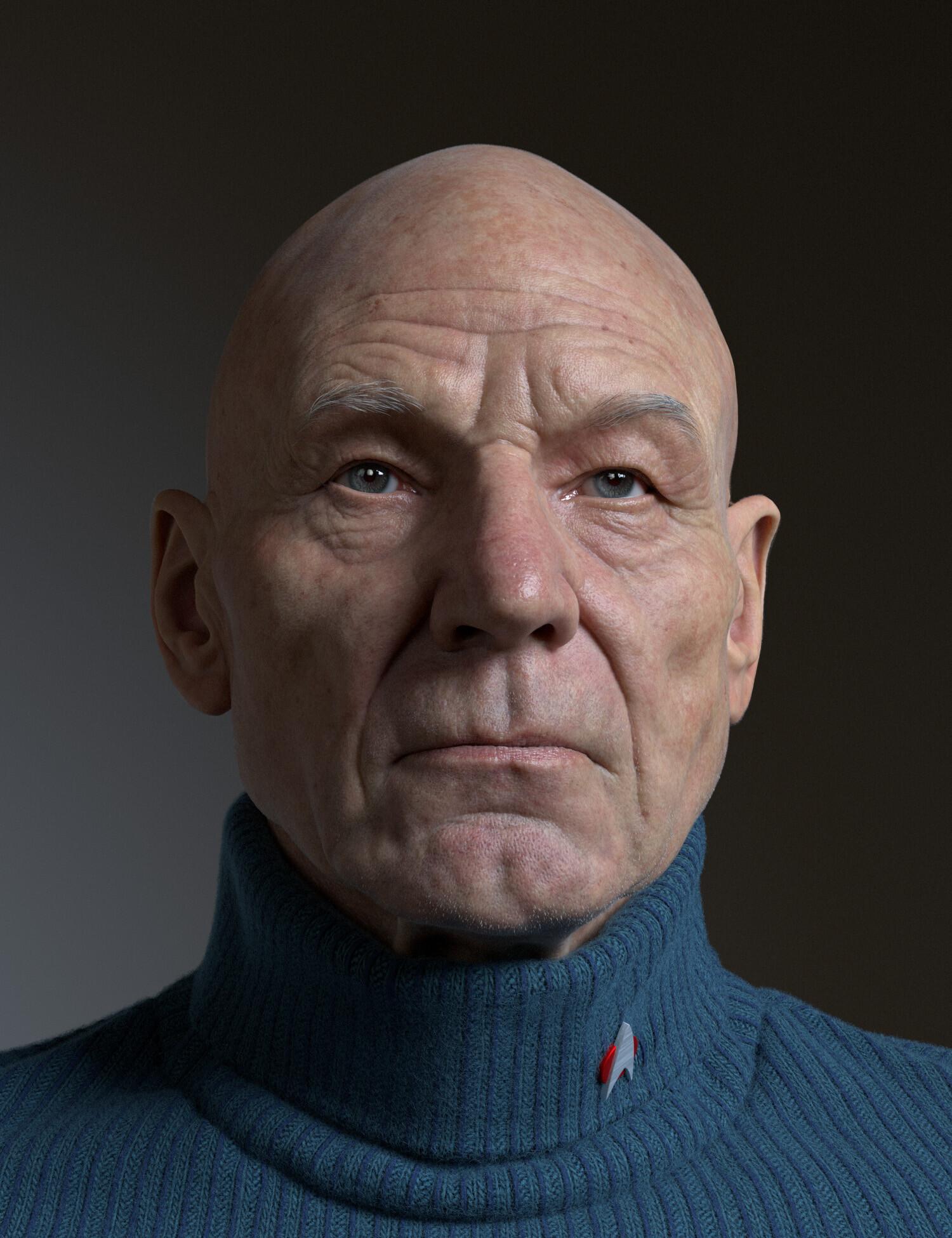
Alex Huguet talked to us about The Captain project and shared his experience with working in Blender, guiding us through the modeling, texturing, and rendering pipelines and giving some tips for beginners.
Introduction
My name is Alex. I was born and raised in beautiful Barcelona, Spain. I got into the 3D world in the mid-90s with a crappy x286 computer and a few old software programs (Moray, 3D Studio DOS, and Bryce mostly) that were given as demos in computer magazines. I started learning and having fun with those programs, which were very basic compared to what one can achieve nowadays. However, being only 15 years old with no knowledge of English or access to the internet, it was very challenging to learn at that time. Resources were limited, and the learning curve was steep!
As for projects I have worked on, I have been in the entertainment industry for over 23 years now. In my early 20s, I moved to the UK after I got a job offer there. I have worked on some big movies such as Harry Potter 5, 6, 7, Captain America: Civil War, Kong: Skull Island, Warcraft, Aquaman, and many more, primarily as a Creature Artist. Currently, I live and work in the entertainment industry in Vancouver, Canada.
The Captain Project
This was just a little side project that I used to learn and get more familiar with Blender. I have been playing with Blender for the last year or so, but now I'm trying to get more familiar with it and finish some more elaborate stuff. So, the goal, I guess, was just to get more familiar with Blender and try to finish something to a decent level.
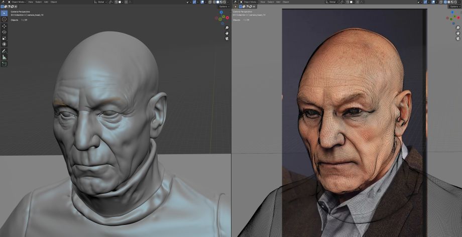
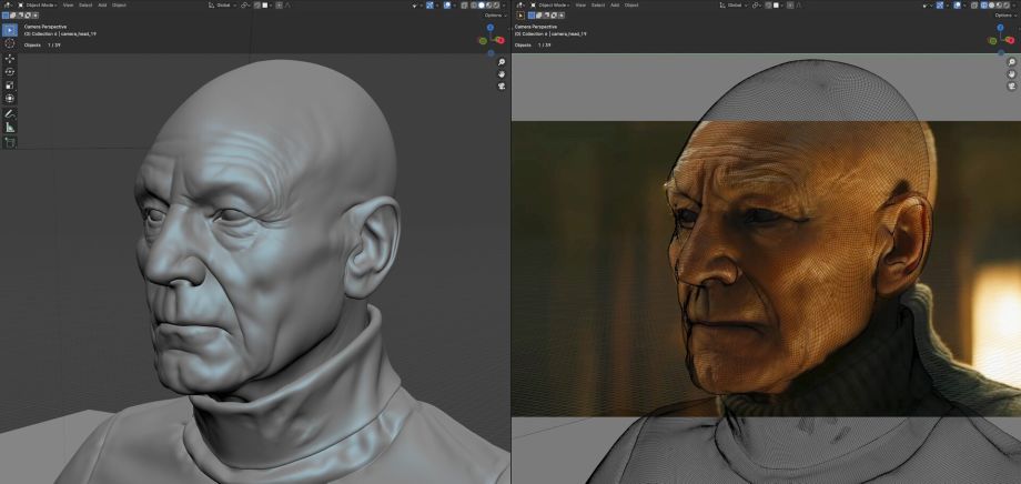
I used a bunch of reference images that I found online on Google. Making portraits like this is always challenging, as finding the right references can be challenging. Each reference picture is from different points in time, with different lighting conditions, lenses, and different everything. It's always tricky, but anyway, I got around 12 pictures that I used as references for the modeling and texturing tasks.
The Workflow Behind the Head & Face
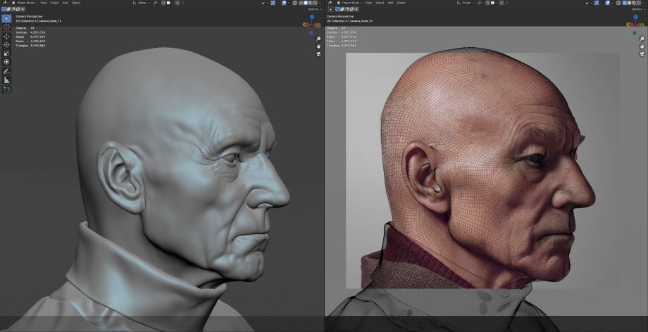
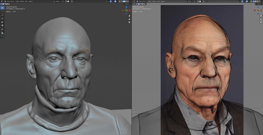
I normally use a generic piece of geometry for all the portraits. Sometimes I start from scratch with a sphere and have fun sculpting it to a certain level. Then, I wrap the correct topology on top of that sculpted sphere to have the right model. Other times, I start directly with ready-to-go topology and just sculpt using reference images as a guide. I try to work from big to small, focusing on the main shapes, proportions, and gestures before getting into detailing (which I kind of hate).
I used Blender's sculpting tools for the modeling/sculpting process. I try to eyeball stuff and set all my reference images as image planes through different cameras in Blender so that I can line up everything properly and make sure I don't go off-model, which can happen easily when you keep tweaking and tweaking your model.
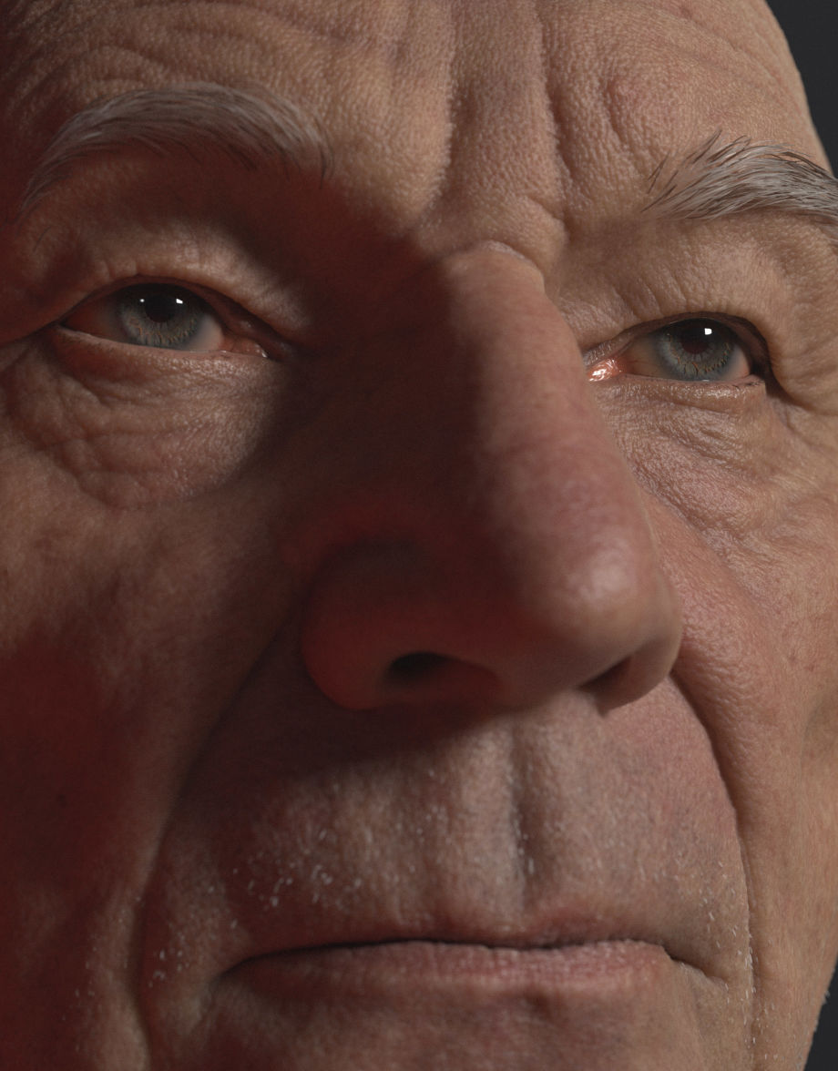
I also used Mari for texturing and projecting some VFace Maps on the final mesh to get those pore details (which was the first time for me using it, and I have mixed feelings about it, but that's a whole different discussion I guess!)
The eyes are also sculpted by hand. I created an iris, added subdivisions, and sculpted all the details by hand. Then, I hand-painted a texture for it in Mari. I modeled the actual eyeball and separated the sclera from the cornea with a black-and-white mask. Then, I set the iris inside the eyeball... a pretty standard setup, I believe. Nothing super crazy in there. Skin wrinkles were manually sculpted trying to follow the visual clues I could see on the reference images.
I used geometry nodes hair for the eyebrows, eyelids, etc. I used an add-on called "Medusa" that simplifies the hair creation and makes the whole process similar to XGen for Maya, which I am familiar with, I learned a lot about the Medusa nodes on this project alone, so I am excited to keep exploring it for my next projects...
Making the Character's Outfit
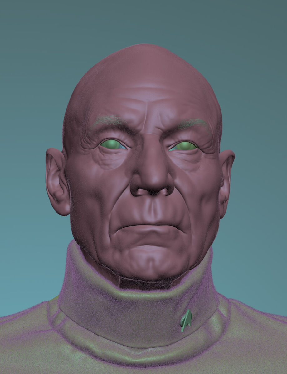
That was a very straightforward process. I just modeled and sculpted the turtleneck by hand in Blender. It was a basic model, and I created the UVs. To stamp the pattern on the jersey, I used a tileable texture for both the diffuse color and displacement, which was a bit more elaborate than just a Tileable Map, but mostly it was a tileable map. I also used geometry node hair to create some fibers on the turtleneck, to give it a bit more detail. As for the pin, that was a very basic poly modeling in Blender. It was very simple to model.
Retopology & Unwrapping
For this specific project, I didn't have to retopologize anything because I used an already retopologized mesh for the face. So, for once, I had to do zero topology. However, in other projects, I have just used Blender's default tools, nothing fancy.
The same goes for the UVs of the face – I already had them done. Unfortunately, I feel that Blender's UV tools are quite behind compared to Maya (for example). It could be that I have no experience with them, while I have used Maya for a long time. Unfolding UVs in Maya is second nature to me, while in Blender, I feel very lost and do find myself missing a few tools from Maya's arsenal.
Texturing
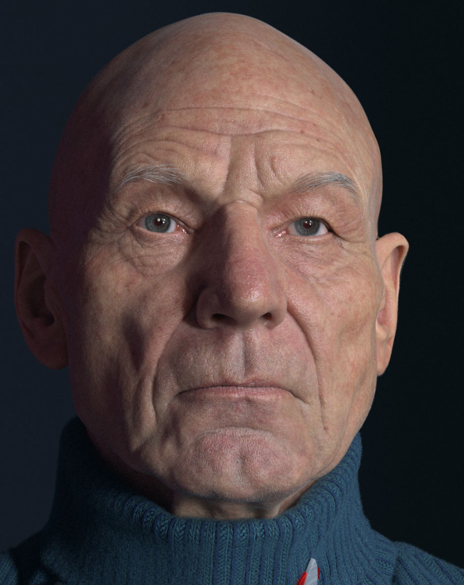
I used the Principled BSDF shader for everything. I created the diffuse textures using VFace and baked them onto my own UVs using Mari. I then did a lot of painting over those textures. For the face, I used 6 UDIMS with 8k Maps. I wasn't sure if Blender would manage so many high-resolution textures, but it worked just fine. I also used a hand-painted Roughness Map and Spec Map. All the textures were painted in Mari and exported as 8-bit UDIM Maps.
The most challenging part was the skin. I am not really pleased with how the shader turned out at the end, and it's something I will need to explore and do better on my next projects. It was also the first time to lookdev anything in Blender and Cycles, so I was a bit lost with some things. It was definitely a challenge to make the skin look good, and I feel like it didn't look as good as I wanted, so I am a bit disappointed with myself for that.
Rendering, Lighting & Post-Production
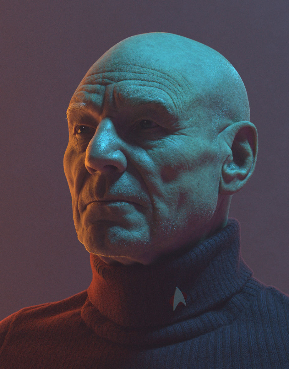
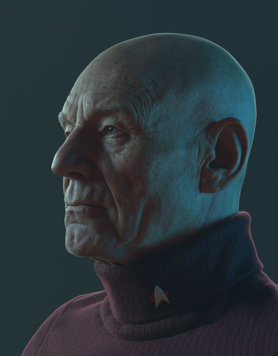
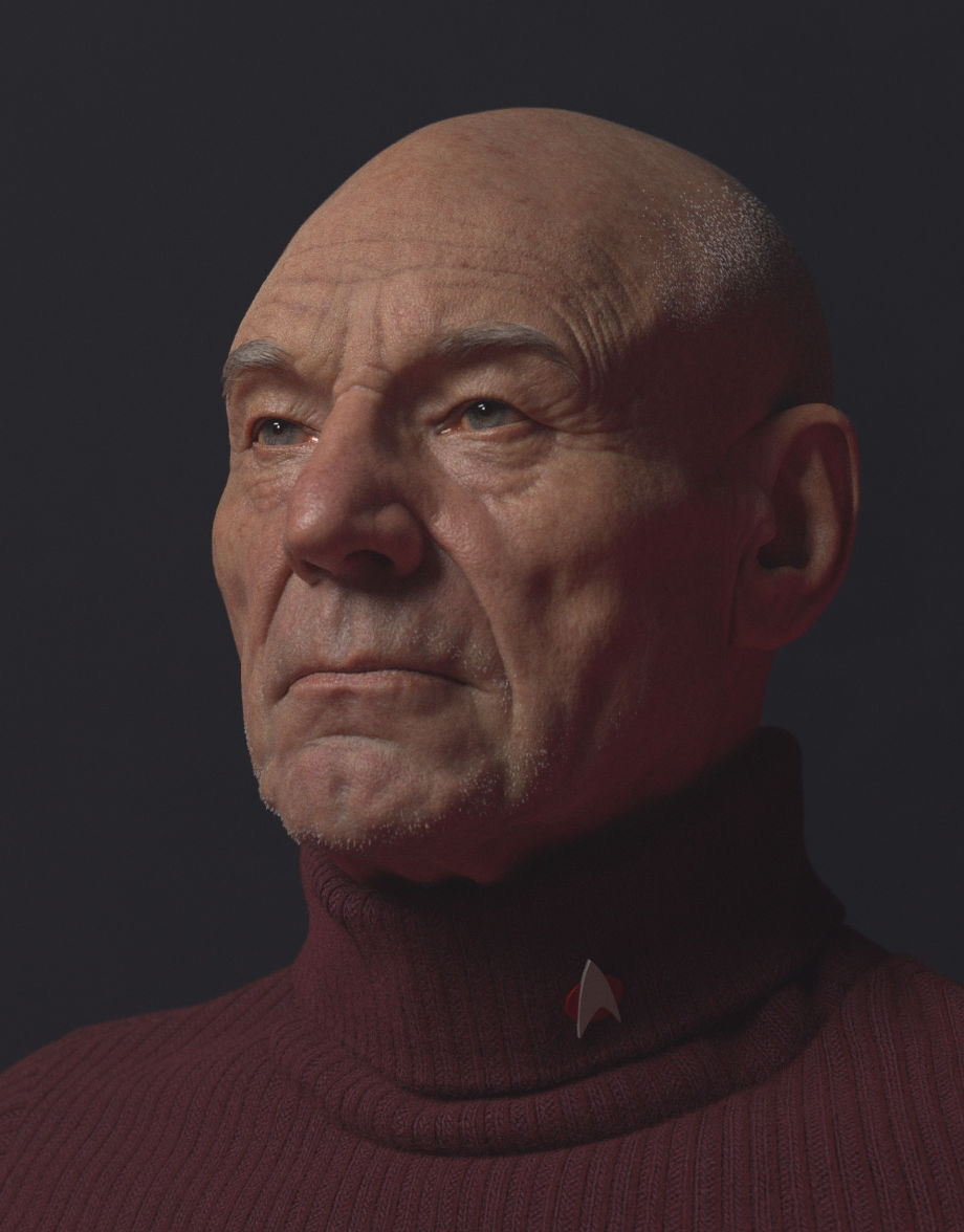
I rendered the whole thing in Blender/Cycles. I used 2 area lights for it and a couple of walls around the character to get the light to bounce around a bit. There was no HDRI or anything like that, nothing fancy. I did quite a lot of tests (perhaps, I should also publish those), but in the end, I found myself endlessly tweaking and testing different light setups, and I was not pleased with any of them.
One little trick I did was to create an empty object and use that as a target for the area light. This way, I could just move the light around, and it would always point at the empty object, which was located on the face of the guy. I also created a third area of light that was only affecting the reflection for the eyes, so that I could place a highlight on the eyes exactly where I wanted it to be. That worked very well thanks to the new light linking system. For me, that's one of the cool tricks you can do to bring your characters to life. Whenever I would hide that light and I would lose the highlight/spec on the eyes, the character would immediately look so much worse.
For the final render, there was no post-process done, that's just the render straight out of the render buffer. However, I did create a bug volume enclosing the character and I added a fog material to it, like a very thin layer of fog, and I think that helped to make it look a bit better. It's hard to tell exactly how that affected the final render, but it definitely removed a bit of the high contrast in the render, not that it is better or worse. It was more of an artistic choice for me and just me testing different things for fun.
Challenges & Tips for Artists
It is hard to tell how long it took me since I played with it on and off for quite a while. I always have different personal projects running in parallel, so I keep jumping from one to another whenever I get bored with one, so it is hard to track how much time I spend on a project.
There were quite a few main challenges in this project. Since I have rarely used Blender for rendering anything, the whole shading and lighting part was tricky for me. The grooming was also difficult since I don't have much experience with Blender other than for sculpting. Every part was challenging, but the most challenging I would say was getting the likeness of the character and getting the skin shader to look good, which I don't feel I succeeded this time. Hopefully, my next projects turn out better and they will also be easier and faster to finish, now that I have a bit more experience in Blender.
As for people trying to get into the industry or improve their skills, my advice is to practice, practice, and practice. Be critical of your own work and keep trying to improve in every single project. The results will come.
I'd say many beginners focus on learning just the tools, I think is very important to also train your eyes and your artistic vision, which is something that works regardless of what software you are gonna be using. I have worked with many different software, some of which have died, while others have stood the test of time. You always adapt to whatever software, but artistic development is something you can apply in any software and any discipline, whether it is 3D, 2D drawing, painting, etc.

Categories
Read More
marque personnelle, branding personnel, identité, réputation en ligne, exemples de marques personnelles, conseils de branding ## Introduction Dans un monde où chaque interaction compte, la marque personnelle devient essentielle. Elle est bien plus qu'un simple logo ou un slogan accrocheur ; elle est l'empreinte que nous laissons dans l'esprit des autres. Cette empreinte, souvent invisible...
harcèlement sexuel, Ubisoft, procès, dirigeants, accusations, France, culture d'entreprise, violences au travail ## Introduction Il est grand temps que le monde du jeu vidéo se réveille et prenne conscience des horreurs qui se cachent derrière ses portes dorées. Alors que le procès des anciens dirigeants d'Ubisoft pour harcèlement sexuel et bullying bat son plein en France, il est impératif...
Beat Saber, VR, PS4, PS5, mises à jour, ActuGaming, marché VR, fin support ## Introduction C'est officiel, Beat Saber, l'un des jeux de réalité virtuelle les plus populaires, a décidé de cesser son support sur les consoles PS4 et PS5. Ce changement marque la fin des mises à jour pour ces plateformes. Dans un contexte où le marché de la réalité virtuelle (VR) traverse une période difficile,...
## Introducción En un mundo donde las guerras no se libran solo en campos de batalla, sino también en el vasto océano de la información, un grupo de hackers vinculado a Israel ha decidido hacer de las suyas. Su último golpe maestro ha sido el ataque al banco Sepah de Irán, y como si eso fuera poco, han logrado destruir más de 90 millones de dólares en la plataforma de intercambio de...
