26 Billboard Fonts You Can Read at 80 MPH
In this article:See more ▼Post may contain affiliate links which give us commissions at no cost to you.When you’re racing down the highway at 80 mph, you’ve got about 3 seconds to grab someone’s attention with your billboard. In those crucial moments, your font choice can make or break your entire advertising campaign.
As a designer who’s worked on countless outdoor advertising campaigns, I can tell you that billboard fonts are a completely different beast from what works on your laptop screen. What looks stunning in your design software might be completely illegible from 500 feet away.
Billboard typography isn’t just about being big and bold—though that certainly helps. It’s about creating maximum impact with minimal reading time, ensuring your message cuts through visual noise, and making split-second connections with drivers who are focused on the road.
In this comprehensive guide, we’ll explore the art and science of billboard fonts. From the towering sans-serifs that dominate Times Square to the custom letterforms that make brands unforgettable, we’ll break down exactly what makes a font work at highway speeds.
Psst... Did you know you can get unlimited downloads of 59,000+ fonts and millions of other creative assets for just /mo? Learn more »The Ultimate Collection of Billboard-Ready Fonts
Not all fonts are created equal when it comes to outdoor advertising. I’ve compiled the most effective billboard fonts that deliver maximum readability and impact from distances that matter. Here are the champions:
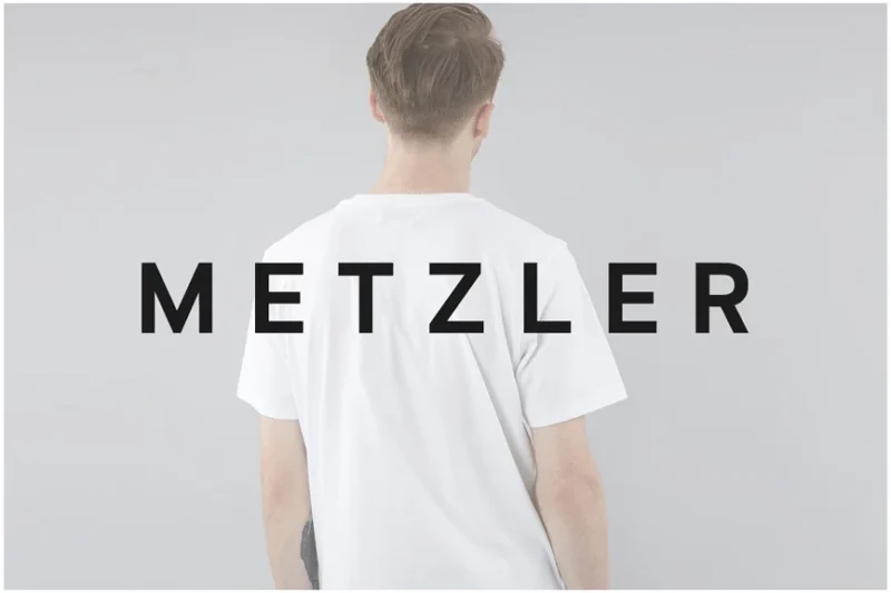
METZLER
METZLER is a minimal sans-serif typeface that embodies simplicity and clarity. Its clean lines and balanced proportions make it ideal for modern design projects, especially in digital environments where readability is crucial.Qualivite
Qualivite is a bold serif font that combines vintage charm with contemporary flair. Its strong character and elegant serifs make it perfect for creating impactful headlines and adding a touch of sophistication to design projects.Get 300+ Fonts for FREEEnter your email to download our 100% free "Font Lover's Bundle". For commercial & personal use. No royalties. No fees. No attribution. 100% free to use anywhere.
Carientz
Carientz is a modern, minimal, and bold sans-serif font that exudes confidence and strength. Its clean, geometric shapes and thick strokes make it an excellent choice for branding, logos, and striking headlines in contemporary designs.Glofin
Glofin is a modern and soft bold font that bridges the gap between vintage and contemporary styles. Its rounded edges and bold presence create a friendly yet impactful impression, suitable for a wide range of design applications.RNS Guaire
RNS Guaire is a modern and elegant sans-serif font that exudes sophistication. Its refined lines and balanced proportions make it perfect for high-end branding, editorial design, and projects that require a touch of class.Space
Space is a minimalist sans-serif font that embraces simplicity and functionality. Its clean, uncluttered design makes it highly legible and versatile, ideal for modern web design, user interfaces, and minimalist branding projects.Lonzies
Lonzies is a display sans-serif font with a soft bold style that uniquely combines Christmas and graffiti influences. Its playful yet bold character makes it suitable for creating eye-catching headlines and designs with a urban, festive twist.Boldy Grotesque
Boldy Grotesque is a condensed sans-serif font that embodies minimalism and strength. Its narrow letterforms, similar to the popular font Impact, and clean lines make it excellent for creating impactful headlines and efficient use of space in various design contexts.Harlet
Harlet is a modern sans-serif font designed with headlines and fashion in mind. Its sleek, contemporary appearance and balanced proportions make it perfect for creating stylish designs in fashion magazines, posters, and branding materials.Alaska
Alaska is an adventure-inspired sans-serif typeface that combines minimalism with a nostalgic feel. Its clean lines and subtle vintage touches make it ideal for outdoor-themed designs, travel branding, and projects that aim to evoke a sense of exploration.NORD
NORD is a minimal display typeface designed for headlines and logos. Its clean, geometric forms and versatile character make it an excellent choice for modern branding projects, creating impactful headlines, and designing memorable logos.MARXURE
MARXURE is a bold headline typeface with a modern edge. Its strong presence and contemporary design make it perfect for creating attention-grabbing headlines in web design, posters, and other media where impact is crucial.Girast
Girast is a modern condensed font that combines boldness with efficiency. Its narrow letterforms and contemporary style make it ideal for designs where space is at a premium, such as in packaging, posters, and responsive web design.Bondie Slab
Bondie Slab is a condensed slab serif font that combines strength with elegance. Its sturdy serifs and narrow proportions make it excellent for creating impactful headlines and adding a touch of sophistication to various design projects.Roadway Country
Roadway Country is a sans-serif font inspired by highway and street signage. Its bold, clear design makes it highly legible and perfect for creating designs with a road trip theme or projects that require a strong, directional feel.JUST Sans
JUST Sans is a clean, modern, and minimal geometric typeface. Its simple forms and balanced design make it highly versatile, suitable for a wide range of applications from branding to user interface design where clarity and simplicity are key.BERLIN Rounded
BERLIN Rounded is a sans-serif display typeface featuring soft, rounded edges. Its friendly appearance and good readability make it ideal for creating welcoming designs, particularly in branding, packaging, and digital interfaces.CRUX
CRUX is a minimal display typeface designed for headlines and logos. Its clean, geometric forms and distinctive character make it perfect for creating memorable branding elements and impactful headlines in modern design projects.Glacier
Glacier is a clean and minimal font family that embodies simplicity and elegance. Its crisp lines and balanced proportions make it highly versatile, suitable for both body text and headlines in projects that prioritize clarity and modern aesthetics.Prinles
Prinles is a bold font that exudes strength and confidence. Its thick strokes and solid presence make it ideal for creating powerful headlines, impactful logos, and designs that need to make a strong statement.Bensoud
Bensoud is a sans-serif font that combines modern simplicity with subtle character. Its clean lines and balanced design make it versatile for various applications, from body text to headlines, especially in projects that require a contemporary yet approachable feel.Quicksed
Quicksed is a condensed sans display font designed for efficiency and impact. Its narrow letterforms and clean design make it excellent for headlines, posters, and designs where space is limited but visual impact is crucial.Valeno
Valeno is a decorative display font that blends sans-serif simplicity with subtle serif-like details. Its unique character makes it stand out in headlines and logos, perfect for creating distinctive branding and eye-catching designs.Pinnid
Pinnid is a modern font that combines sans-serif and serif elements. Its hybrid nature gives it a unique character, making it versatile for various design applications, from contemporary branding to editorial design where a touch of sophistication is desired.Tactico
Tactico is a bold font that blends vintage charm with modern boldness. Its strong presence and subtle retro touches make it ideal for creating impactful headlines, logos, and designs that need to combine strength with a hint of nostalgia.NOAH
NOAH is a minimalist font that seamlessly blends sans-serif and serif styles. Its clean, versatile design makes it suitable for a wide range of applications, from body text to headlines, especially in projects that require a modern yet timeless aesthetic.
What Makes a Font Billboard-Ready?
Designing for billboards is like designing for the visually impaired—everything needs to be bigger, bolder, and more contrasted than you think. But there’s more nuance to it than just cranking up the size.
Maximum Contrast is your best friend. Billboard fonts need thick strokes and generous white space. Think of fonts like Impact or Bebas Neue—letterforms that create strong silhouettes against any background. Thin, delicate fonts simply disappear at highway viewing distances.
Wide Character Spacing prevents letters from bleeding together visually. What looks perfectly spaced on your monitor becomes an illegible blob from 300 feet away. Billboard fonts often feature naturally wide spacing, or you’ll need to manually increase tracking significantly.
Simplified Letterforms eliminate visual confusion. Fancy serifs, decorative flourishes, and intricate details get lost in the distance. The most effective billboard fonts strip away everything non-essential, leaving only the core structure of each letter.
Consistent Weight Distribution ensures every part of every letter maintains visibility. Fonts with extreme thick-to-thin variations might look elegant up close, but those delicate thin strokes vanish when viewed from afar.
Size Matters: Typography at Scale
Here’s something that might surprise you: the biggest billboard fonts aren’t necessarily the most readable. There’s actually a science to sizing typography for outdoor advertising.
The rule of thumb? For every 10 feet of viewing distance, you need at least 1 inch of letter height. So if drivers will see your billboard from 250 feet away, your main headline needs to be at least 25 inches tall. But that’s just the starting point.
Consider the viewing angle too. A billboard positioned perpendicular to traffic gets viewed straight-on, while one at an angle requires larger text to compensate for the distorted perspective. Highway billboards also need larger fonts than city billboards since viewing time is much shorter.
Hierarchy becomes critical at billboard scale. Your main message might be 30 inches tall, but secondary information should drop to maybe 15 inches, and fine print shouldn’t go below 8 inches if you expect anyone to read it.
Color and Contrast: The Billboard Font’s Best Friends
Even the perfect billboard font can fail spectacularly with poor color choices. High contrast isn’t just recommended—it’s absolutely essential for highway visibility.
Black on white remains the gold standard for readability, but it’s not always the most eye-catching combination. Dark blue on yellow, white on deep red, or black on bright yellow all deliver excellent contrast while adding visual punch.
Avoid color combinations that create vibration effects—like red text on blue backgrounds—which become even more problematic when viewed through car windshields or in varying light conditions. Remember, your billboard needs to work in bright sunlight, during golden hour, and under streetlights.
Background considerations matter enormously. A font that’s perfectly readable on a solid background might disappear when placed over a busy photograph or gradient. Many successful billboards use solid color blocks behind text to ensure consistent readability.
The Psychology of Highway Typography
Billboard fonts don’t just communicate words—they communicate emotions and brand personality in milliseconds. The psychology behind font choice becomes amplified when you’re designing for split-second attention spans.
Sans-serif fonts dominate billboard advertising because they project modernity, clarity, and straightforwardness. Brands like Apple, Nike, and Google use clean sans-serifs on their billboards because these fonts align with their contemporary, no-nonsense brand personalities.
Bold display fonts work when you want to project energy, excitement, or urgency. Think movie posters, event announcements, or retail sales promotions. These fonts scream for attention—literally and figuratively.
Custom lettering helps brands stand out in a sea of standard fonts. Coca-Cola’s distinctive script, McDonald’s golden arches typography, or Disney’s magical letterforms are instantly recognizable from highway distances because they’re completely unique.
Digital vs. Traditional Billboard Considerations
The rise of digital billboards has changed the font game entirely. Static billboards have one shot to communicate your message, while digital boards can cycle through multiple messages, each with different typographic approaches.
Digital billboards allow for animated text, which can help with readability—but it can also become distracting. Simple animations like fading in or sliding can help direct attention, while complex animations often reduce legibility.
Digital displays also deal with pixel density limitations. Fonts that look crisp in print might appear pixelated or blurry on LED screens, especially when viewed from angles. Sans-serif fonts generally translate better to digital displays than serif fonts.
Brightness and contrast work differently on digital billboards. These displays can achieve much higher contrast ratios than printed billboards, but they also compete with ambient light conditions that change throughout the day.
Common Billboard Font Mistakes to Avoid
I’ve seen enough billboard design disasters to fill a horror movie. Here are the most common mistakes that turn potentially effective advertising into roadside illegible art.
Script fonts might look elegant in wedding invitations, but they’re billboard poison. Cursive letterforms, decorative swashes, and connecting characters become unreadable mush from highway distances. the scripts for intimate applications.
Thin fonts simply vanish. What looks sophisticated and minimalist on your computer screen becomes invisible on the highway. If you wouldn’t use a font for an eye chart, don’t use it for a billboard.
Too many fonts create visual chaos. Stick to one or two fonts maximum. Using three or more fonts on a billboard usually results in a confused, amateur-looking design that fails to communicate effectively.
Insufficient contrast between text and background kills readability faster than anything else. That subtle gray text on white background might look trendy, but it’s useless for outdoor advertising.
Industry Secrets from Billboard Designers
After years in the outdoor advertising industry, I’ve picked up some insider knowledge about what really works for billboard typography.
Test at distance before finalizing your design. Print out your billboard concept at a much smaller size and view it from across a large room. If you can’t read it easily from that distance, it won’t work on an actual billboard.
Consider viewing conditions beyond just distance. Will drivers see your billboard while going uphill or downhill? Are there trees or buildings that might partially obstruct the view? These factors influence font size and placement decisions.
Design for the worst-case scenario. If your billboard is readable during a rainstorm at dusk with dirty windshields, it’ll definitely work under optimal conditions. This usually means going bigger and bolder than your initial instincts suggest.
Prioritize the primary message. Your billboard should communicate one main idea instantly. Supporting information can be smaller, but your core message needs to hit like a typographic freight train.
The Future of Billboard Typography
Billboard fonts continue evolving alongside technology and changing urban landscapes. Digital displays, augmented reality integration, and responsive outdoor advertising are reshaping how we think about highway typography.
Variable fonts are starting to appear on digital billboards, allowing designs to adapt based on viewing distance, time of day, or even traffic speed. Imagine fonts that automatically adjust their weight and spacing based on current highway conditions.
Interactive elements are becoming more common, with QR codes and social media handles requiring specific typographic treatment to remain scannable at highway speeds.
Environmental consciousness is influencing font choices too. Some advertising companies are choosing fonts that require less ink or energy to display, proving that even typography can be sustainable.
Making Your Billboard Font Choice
Choosing the right font for your billboard campaign requires balancing readability, brand personality, and practical constraints. Start with your message and audience, then work backward to typography that serves both.
Consider your brand first. A law firm and a music festival require completely different typographic approaches, even when advertising on the same highway. Your font choice should reinforce brand personality while maintaining highway-speed readability.
Think about context. Urban billboards can often use slightly more complex fonts than rural highway signs because viewing distances are shorter and speeds are lower. Location matters as much as message.
Test ruthlessly. The most beautiful font in the world is worthless if drivers can’t read your message. When in doubt, choose readability over artistry—your advertising budget depends on it.
Billboard fonts represent typography at its most challenging and most impactful. These fonts don’t just carry messages—they deliver them at 70 mph, fighting for attention in a world of visual noise. Master the art of billboard typography, and you’ll master the art of communication itself.
So the next time you’re cruising down the highway, pay attention to the fonts flying past your windshield. Notice which ones grab your attention and which ones blend into the background. That’s the difference between typography that works and typography that simply exists.
Your billboard has seconds to make an impression. Make sure your font choice makes those seconds count.
#billboard #fonts #you #can #read26 Billboard Fonts You Can Read at 80 MPH
In this article:See more ▼Post may contain affiliate links which give us commissions at no cost to you.When you’re racing down the highway at 80 mph, you’ve got about 3 seconds to grab someone’s attention with your billboard. In those crucial moments, your font choice can make or break your entire advertising campaign.
As a designer who’s worked on countless outdoor advertising campaigns, I can tell you that billboard fonts are a completely different beast from what works on your laptop screen. What looks stunning in your design software might be completely illegible from 500 feet away.
Billboard typography isn’t just about being big and bold—though that certainly helps. It’s about creating maximum impact with minimal reading time, ensuring your message cuts through visual noise, and making split-second connections with drivers who are focused on the road.
In this comprehensive guide, we’ll explore the art and science of billboard fonts. From the towering sans-serifs that dominate Times Square to the custom letterforms that make brands unforgettable, we’ll break down exactly what makes a font work at highway speeds.
👋 Psst... Did you know you can get unlimited downloads of 59,000+ fonts and millions of other creative assets for just /mo? Learn more »The Ultimate Collection of Billboard-Ready Fonts
Not all fonts are created equal when it comes to outdoor advertising. I’ve compiled the most effective billboard fonts that deliver maximum readability and impact from distances that matter. Here are the champions:
METZLER
METZLER is a minimal sans-serif typeface that embodies simplicity and clarity. Its clean lines and balanced proportions make it ideal for modern design projects, especially in digital environments where readability is crucial.Qualivite
Qualivite is a bold serif font that combines vintage charm with contemporary flair. Its strong character and elegant serifs make it perfect for creating impactful headlines and adding a touch of sophistication to design projects.Get 300+ Fonts for FREEEnter your email to download our 100% free "Font Lover's Bundle". For commercial & personal use. No royalties. No fees. No attribution. 100% free to use anywhere.
Carientz
Carientz is a modern, minimal, and bold sans-serif font that exudes confidence and strength. Its clean, geometric shapes and thick strokes make it an excellent choice for branding, logos, and striking headlines in contemporary designs.Glofin
Glofin is a modern and soft bold font that bridges the gap between vintage and contemporary styles. Its rounded edges and bold presence create a friendly yet impactful impression, suitable for a wide range of design applications.RNS Guaire
RNS Guaire is a modern and elegant sans-serif font that exudes sophistication. Its refined lines and balanced proportions make it perfect for high-end branding, editorial design, and projects that require a touch of class.Space
Space is a minimalist sans-serif font that embraces simplicity and functionality. Its clean, uncluttered design makes it highly legible and versatile, ideal for modern web design, user interfaces, and minimalist branding projects.Lonzies
Lonzies is a display sans-serif font with a soft bold style that uniquely combines Christmas and graffiti influences. Its playful yet bold character makes it suitable for creating eye-catching headlines and designs with a urban, festive twist.Boldy Grotesque
Boldy Grotesque is a condensed sans-serif font that embodies minimalism and strength. Its narrow letterforms, similar to the popular font Impact, and clean lines make it excellent for creating impactful headlines and efficient use of space in various design contexts.Harlet
Harlet is a modern sans-serif font designed with headlines and fashion in mind. Its sleek, contemporary appearance and balanced proportions make it perfect for creating stylish designs in fashion magazines, posters, and branding materials.Alaska
Alaska is an adventure-inspired sans-serif typeface that combines minimalism with a nostalgic feel. Its clean lines and subtle vintage touches make it ideal for outdoor-themed designs, travel branding, and projects that aim to evoke a sense of exploration.NORD
NORD is a minimal display typeface designed for headlines and logos. Its clean, geometric forms and versatile character make it an excellent choice for modern branding projects, creating impactful headlines, and designing memorable logos.MARXURE
MARXURE is a bold headline typeface with a modern edge. Its strong presence and contemporary design make it perfect for creating attention-grabbing headlines in web design, posters, and other media where impact is crucial.Girast
Girast is a modern condensed font that combines boldness with efficiency. Its narrow letterforms and contemporary style make it ideal for designs where space is at a premium, such as in packaging, posters, and responsive web design.Bondie Slab
Bondie Slab is a condensed slab serif font that combines strength with elegance. Its sturdy serifs and narrow proportions make it excellent for creating impactful headlines and adding a touch of sophistication to various design projects.Roadway Country
Roadway Country is a sans-serif font inspired by highway and street signage. Its bold, clear design makes it highly legible and perfect for creating designs with a road trip theme or projects that require a strong, directional feel.JUST Sans
JUST Sans is a clean, modern, and minimal geometric typeface. Its simple forms and balanced design make it highly versatile, suitable for a wide range of applications from branding to user interface design where clarity and simplicity are key.BERLIN Rounded
BERLIN Rounded is a sans-serif display typeface featuring soft, rounded edges. Its friendly appearance and good readability make it ideal for creating welcoming designs, particularly in branding, packaging, and digital interfaces.CRUX
CRUX is a minimal display typeface designed for headlines and logos. Its clean, geometric forms and distinctive character make it perfect for creating memorable branding elements and impactful headlines in modern design projects.Glacier
Glacier is a clean and minimal font family that embodies simplicity and elegance. Its crisp lines and balanced proportions make it highly versatile, suitable for both body text and headlines in projects that prioritize clarity and modern aesthetics.Prinles
Prinles is a bold font that exudes strength and confidence. Its thick strokes and solid presence make it ideal for creating powerful headlines, impactful logos, and designs that need to make a strong statement.Bensoud
Bensoud is a sans-serif font that combines modern simplicity with subtle character. Its clean lines and balanced design make it versatile for various applications, from body text to headlines, especially in projects that require a contemporary yet approachable feel.Quicksed
Quicksed is a condensed sans display font designed for efficiency and impact. Its narrow letterforms and clean design make it excellent for headlines, posters, and designs where space is limited but visual impact is crucial.Valeno
Valeno is a decorative display font that blends sans-serif simplicity with subtle serif-like details. Its unique character makes it stand out in headlines and logos, perfect for creating distinctive branding and eye-catching designs.Pinnid
Pinnid is a modern font that combines sans-serif and serif elements. Its hybrid nature gives it a unique character, making it versatile for various design applications, from contemporary branding to editorial design where a touch of sophistication is desired.Tactico
Tactico is a bold font that blends vintage charm with modern boldness. Its strong presence and subtle retro touches make it ideal for creating impactful headlines, logos, and designs that need to combine strength with a hint of nostalgia.NOAH
NOAH is a minimalist font that seamlessly blends sans-serif and serif styles. Its clean, versatile design makes it suitable for a wide range of applications, from body text to headlines, especially in projects that require a modern yet timeless aesthetic.
What Makes a Font Billboard-Ready?
Designing for billboards is like designing for the visually impaired—everything needs to be bigger, bolder, and more contrasted than you think. But there’s more nuance to it than just cranking up the size.
Maximum Contrast is your best friend. Billboard fonts need thick strokes and generous white space. Think of fonts like Impact or Bebas Neue—letterforms that create strong silhouettes against any background. Thin, delicate fonts simply disappear at highway viewing distances.
Wide Character Spacing prevents letters from bleeding together visually. What looks perfectly spaced on your monitor becomes an illegible blob from 300 feet away. Billboard fonts often feature naturally wide spacing, or you’ll need to manually increase tracking significantly.
Simplified Letterforms eliminate visual confusion. Fancy serifs, decorative flourishes, and intricate details get lost in the distance. The most effective billboard fonts strip away everything non-essential, leaving only the core structure of each letter.
Consistent Weight Distribution ensures every part of every letter maintains visibility. Fonts with extreme thick-to-thin variations might look elegant up close, but those delicate thin strokes vanish when viewed from afar.
Size Matters: Typography at Scale
Here’s something that might surprise you: the biggest billboard fonts aren’t necessarily the most readable. There’s actually a science to sizing typography for outdoor advertising.
The rule of thumb? For every 10 feet of viewing distance, you need at least 1 inch of letter height. So if drivers will see your billboard from 250 feet away, your main headline needs to be at least 25 inches tall. But that’s just the starting point.
Consider the viewing angle too. A billboard positioned perpendicular to traffic gets viewed straight-on, while one at an angle requires larger text to compensate for the distorted perspective. Highway billboards also need larger fonts than city billboards since viewing time is much shorter.
Hierarchy becomes critical at billboard scale. Your main message might be 30 inches tall, but secondary information should drop to maybe 15 inches, and fine print shouldn’t go below 8 inches if you expect anyone to read it.
Color and Contrast: The Billboard Font’s Best Friends
Even the perfect billboard font can fail spectacularly with poor color choices. High contrast isn’t just recommended—it’s absolutely essential for highway visibility.
Black on white remains the gold standard for readability, but it’s not always the most eye-catching combination. Dark blue on yellow, white on deep red, or black on bright yellow all deliver excellent contrast while adding visual punch.
Avoid color combinations that create vibration effects—like red text on blue backgrounds—which become even more problematic when viewed through car windshields or in varying light conditions. Remember, your billboard needs to work in bright sunlight, during golden hour, and under streetlights.
Background considerations matter enormously. A font that’s perfectly readable on a solid background might disappear when placed over a busy photograph or gradient. Many successful billboards use solid color blocks behind text to ensure consistent readability.
The Psychology of Highway Typography
Billboard fonts don’t just communicate words—they communicate emotions and brand personality in milliseconds. The psychology behind font choice becomes amplified when you’re designing for split-second attention spans.
Sans-serif fonts dominate billboard advertising because they project modernity, clarity, and straightforwardness. Brands like Apple, Nike, and Google use clean sans-serifs on their billboards because these fonts align with their contemporary, no-nonsense brand personalities.
Bold display fonts work when you want to project energy, excitement, or urgency. Think movie posters, event announcements, or retail sales promotions. These fonts scream for attention—literally and figuratively.
Custom lettering helps brands stand out in a sea of standard fonts. Coca-Cola’s distinctive script, McDonald’s golden arches typography, or Disney’s magical letterforms are instantly recognizable from highway distances because they’re completely unique.
Digital vs. Traditional Billboard Considerations
The rise of digital billboards has changed the font game entirely. Static billboards have one shot to communicate your message, while digital boards can cycle through multiple messages, each with different typographic approaches.
Digital billboards allow for animated text, which can help with readability—but it can also become distracting. Simple animations like fading in or sliding can help direct attention, while complex animations often reduce legibility.
Digital displays also deal with pixel density limitations. Fonts that look crisp in print might appear pixelated or blurry on LED screens, especially when viewed from angles. Sans-serif fonts generally translate better to digital displays than serif fonts.
Brightness and contrast work differently on digital billboards. These displays can achieve much higher contrast ratios than printed billboards, but they also compete with ambient light conditions that change throughout the day.
Common Billboard Font Mistakes to Avoid
I’ve seen enough billboard design disasters to fill a horror movie. Here are the most common mistakes that turn potentially effective advertising into roadside illegible art.
Script fonts might look elegant in wedding invitations, but they’re billboard poison. Cursive letterforms, decorative swashes, and connecting characters become unreadable mush from highway distances. the scripts for intimate applications.
Thin fonts simply vanish. What looks sophisticated and minimalist on your computer screen becomes invisible on the highway. If you wouldn’t use a font for an eye chart, don’t use it for a billboard.
Too many fonts create visual chaos. Stick to one or two fonts maximum. Using three or more fonts on a billboard usually results in a confused, amateur-looking design that fails to communicate effectively.
Insufficient contrast between text and background kills readability faster than anything else. That subtle gray text on white background might look trendy, but it’s useless for outdoor advertising.
Industry Secrets from Billboard Designers
After years in the outdoor advertising industry, I’ve picked up some insider knowledge about what really works for billboard typography.
Test at distance before finalizing your design. Print out your billboard concept at a much smaller size and view it from across a large room. If you can’t read it easily from that distance, it won’t work on an actual billboard.
Consider viewing conditions beyond just distance. Will drivers see your billboard while going uphill or downhill? Are there trees or buildings that might partially obstruct the view? These factors influence font size and placement decisions.
Design for the worst-case scenario. If your billboard is readable during a rainstorm at dusk with dirty windshields, it’ll definitely work under optimal conditions. This usually means going bigger and bolder than your initial instincts suggest.
Prioritize the primary message. Your billboard should communicate one main idea instantly. Supporting information can be smaller, but your core message needs to hit like a typographic freight train.
The Future of Billboard Typography
Billboard fonts continue evolving alongside technology and changing urban landscapes. Digital displays, augmented reality integration, and responsive outdoor advertising are reshaping how we think about highway typography.
Variable fonts are starting to appear on digital billboards, allowing designs to adapt based on viewing distance, time of day, or even traffic speed. Imagine fonts that automatically adjust their weight and spacing based on current highway conditions.
Interactive elements are becoming more common, with QR codes and social media handles requiring specific typographic treatment to remain scannable at highway speeds.
Environmental consciousness is influencing font choices too. Some advertising companies are choosing fonts that require less ink or energy to display, proving that even typography can be sustainable.
Making Your Billboard Font Choice
Choosing the right font for your billboard campaign requires balancing readability, brand personality, and practical constraints. Start with your message and audience, then work backward to typography that serves both.
Consider your brand first. A law firm and a music festival require completely different typographic approaches, even when advertising on the same highway. Your font choice should reinforce brand personality while maintaining highway-speed readability.
Think about context. Urban billboards can often use slightly more complex fonts than rural highway signs because viewing distances are shorter and speeds are lower. Location matters as much as message.
Test ruthlessly. The most beautiful font in the world is worthless if drivers can’t read your message. When in doubt, choose readability over artistry—your advertising budget depends on it.
Billboard fonts represent typography at its most challenging and most impactful. These fonts don’t just carry messages—they deliver them at 70 mph, fighting for attention in a world of visual noise. Master the art of billboard typography, and you’ll master the art of communication itself.
So the next time you’re cruising down the highway, pay attention to the fonts flying past your windshield. Notice which ones grab your attention and which ones blend into the background. That’s the difference between typography that works and typography that simply exists.
Your billboard has seconds to make an impression. Make sure your font choice makes those seconds count.
#billboard #fonts #you #can #read