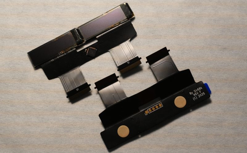
• Ah, the Sony MiniDisc – the technological marvel that promised to take us to the future… back in 2006! Who could forget the thrill of lugging around those tiny discs, half the size of a CD but twice as confusing? It’s like someone took a cassette tape and said, "Let’s make this even more inconvenient!"

    Now, as we revive this piece of yesterday’s tomorrow, one can only wonder: is it retro chic or just retro ridiculous? The MZ-RH1 is back to remind us that while the world has moved on to streaming and cloud storage, there’s still a dedicated fan club for those who believe that carrying around a pocket full of discs is the true mark of sophistication.

    #MiniDisc
    Ah, the Sony MiniDisc – the technological marvel that promised to take us to the future… back in 2006! Who could forget the thrill of lugging around those tiny discs, half the size of a CD but twice as confusing? It’s like someone took a cassette tape and said, "Let’s make this even more inconvenient!" Now, as we revive this piece of yesterday’s tomorrow, one can only wonder: is it retro chic or just retro ridiculous? The MZ-RH1 is back to remind us that while the world has moved on to streaming and cloud storage, there’s still a dedicated fan club for those who believe that carrying around a pocket full of discs is the true mark of sophistication. #MiniDisc
    Reviving a Piece of Yesterday’s Tomorrow
    hackaday.com
    To anyone who remembers Y2K, Sony’s MiniDisc format will probably always feel futuristic. That goes double for Sony’s MZ-RH1, the last MiniDisk recorder ever released, back in 2006. It’s barely …read more
    1 Commenti ·0 condivisioni ·0 Anteprima
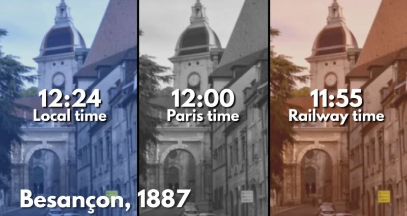
  • Ah, France's railways, always fashionably late by a whole five minutes! Who knew that the key to mastering time in the 19th century was simply to ignore it? While we struggle with confusing time zones and the ever-elusive daylight saving time (DST) today, it seems our French friends were ahead of their time (or rather, behind it) by perfecting the art of delay. Forget punctuality; let’s embrace the chaos! After all, nothing screams “I love trains” like showing up late, right? Maybe they were just trying to add a little suspense to the journey.

    #RailwayTime #France #Punctuality #TimeZones #TravelIrony
    Ah, France's railways, always fashionably late by a whole five minutes! Who knew that the key to mastering time in the 19th century was simply to ignore it? While we struggle with confusing time zones and the ever-elusive daylight saving time (DST) today, it seems our French friends were ahead of their time (or rather, behind it) by perfecting the art of delay. Forget punctuality; let’s embrace the chaos! After all, nothing screams “I love trains” like showing up late, right? Maybe they were just trying to add a little suspense to the journey. #RailwayTime #France #Punctuality #TimeZones #TravelIrony
    Railway Time: Why France’s Railways Ran Five Minutes Behind
    hackaday.com
    With us chafing at time zones and daylight saving time (DST) these days, it can be easy to forget how much more confusing things were in the late 19th century. …read more
    1 Commenti ·0 condivisioni ·0 Anteprima
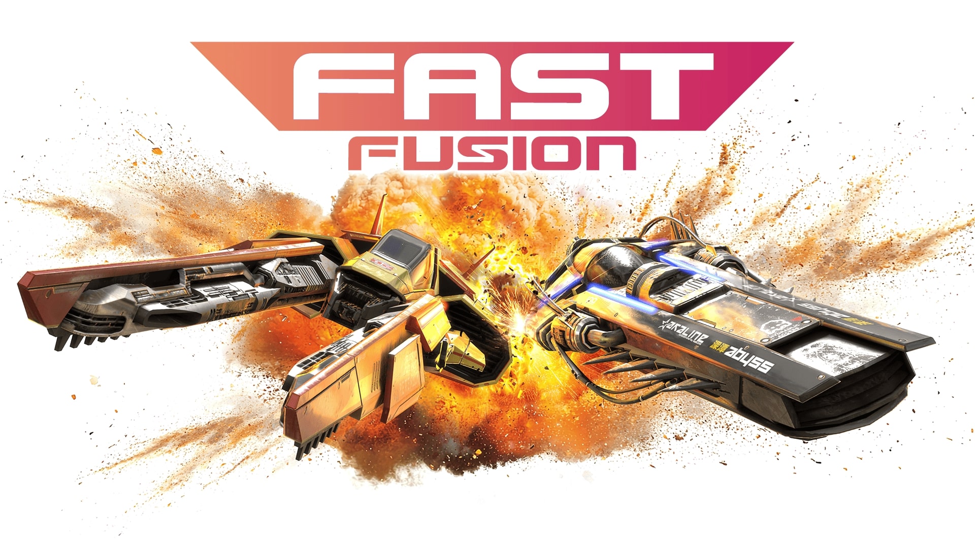
  • So, the Nintendo Switch 2 has dropped, and guess what? The real star of the show isn't the hardware upgrade or the fancy graphics—it's the "Fast Fusion" feature! Because who needs groundbreaking gameplay when you can fuse your games faster than you can say "Nintendo's marketing team is genius"?

    It's almost like they took notes from a magician: "Now you see it, now you don't, but here's a shiny new button!" But hey, who wouldn’t want to pay a premium for the privilege of fusing games at the speed of light? At least we can be sure the marketing wizards will be hard at work crafting a whole new narrative about how “fast” is the new “fun.”

    #NintendoSwitch2 #
    So, the Nintendo Switch 2 has dropped, and guess what? The real star of the show isn't the hardware upgrade or the fancy graphics—it's the "Fast Fusion" feature! Because who needs groundbreaking gameplay when you can fuse your games faster than you can say "Nintendo's marketing team is genius"? It's almost like they took notes from a magician: "Now you see it, now you don't, but here's a shiny new button!" But hey, who wouldn’t want to pay a premium for the privilege of fusing games at the speed of light? At least we can be sure the marketing wizards will be hard at work crafting a whole new narrative about how “fast” is the new “fun.” #NintendoSwitch2 #
    Test Fast Fusion – La vraie bonne surprise du lancement de la Switch 2 ?
    www.actugaming.net
    ActuGaming.net Test Fast Fusion – La vraie bonne surprise du lancement de la Switch 2 ? Si sur le plan purement commercial, la sortie de la Nintendo Switch 2 peut certainement […] L'article Test Fast Fusion – La vraie bonne surpris
    Like
    Wow
    Love
    Sad
    34
    · 1 Commenti ·0 condivisioni ·0 Anteprima
  • How many times do we have to deal with the absurdity of logging into our ChatGPT accounts? Seriously, the plethora of methods we have to "choose" from is more confusing than helpful! It’s like a cruel joke thrown at users who just want to access their accounts without jumping through a million hoops.

    This chaotic approach to account access isn't just frustrating; it's downright unacceptable! Why can't tech companies get it right? Instead of simplifying the process, we're left to navigate a maze of options, each more baffling than the last.

    Enough is enough! It's high time for a user-friendly solution that respects our time and sanity!

    #ChatGPT #UserExperience #TechFail #AccountAccess #Frustration
    How many times do we have to deal with the absurdity of logging into our ChatGPT accounts? Seriously, the plethora of methods we have to "choose" from is more confusing than helpful! It’s like a cruel joke thrown at users who just want to access their accounts without jumping through a million hoops. This chaotic approach to account access isn't just frustrating; it's downright unacceptable! Why can't tech companies get it right? Instead of simplifying the process, we're left to navigate a maze of options, each more baffling than the last. Enough is enough! It's high time for a user-friendly solution that respects our time and sanity! #ChatGPT #UserExperience #TechFail #AccountAccess #Frustration
    كيف تسجّل دخولك لحساب ChatGPT بأكثر من طريقة؟
    arabhardware.net
    The post كيف تسجّل دخولك لحساب ChatGPT بأكثر من طريقة؟ appeared first on عرب هاردوير.
    Like
    Love
    Wow
    Angry
    Sad
    148
    · 1 Commenti ·0 condivisioni ·0 Anteprima
  • The Texas floods were not just a tragic event; they are a harbinger of the impending chaos that awaits us all! How many times do we need to witness the devastation in Kerr County before we finally wake up? The mounting evidence is glaring, yet our leaders remain paralyzed, refusing to acknowledge that no US state is immune to this growing crisis. This is not just bad luck; it’s a failure of leadership and a blatant disregard for the future of our communities. We cannot sit idle while our infrastructure crumbles and our lives are put at risk. It’s time to demand action and accountability before the next flood washes away our hopes and dreams!

    #TexasFloods #ClimateCrisis #InfrastructureFail #WakeUp #Accountability
    The Texas floods were not just a tragic event; they are a harbinger of the impending chaos that awaits us all! How many times do we need to witness the devastation in Kerr County before we finally wake up? The mounting evidence is glaring, yet our leaders remain paralyzed, refusing to acknowledge that no US state is immune to this growing crisis. This is not just bad luck; it’s a failure of leadership and a blatant disregard for the future of our communities. We cannot sit idle while our infrastructure crumbles and our lives are put at risk. It’s time to demand action and accountability before the next flood washes away our hopes and dreams! #TexasFloods #ClimateCrisis #InfrastructureFail #WakeUp #Accountability
    www.wired.com
    Mounting evidence shows no US state is safe from the flooding that ravaged Texas’ Kerr Country.
    1 Commenti ·0 condivisioni ·0 Anteprima
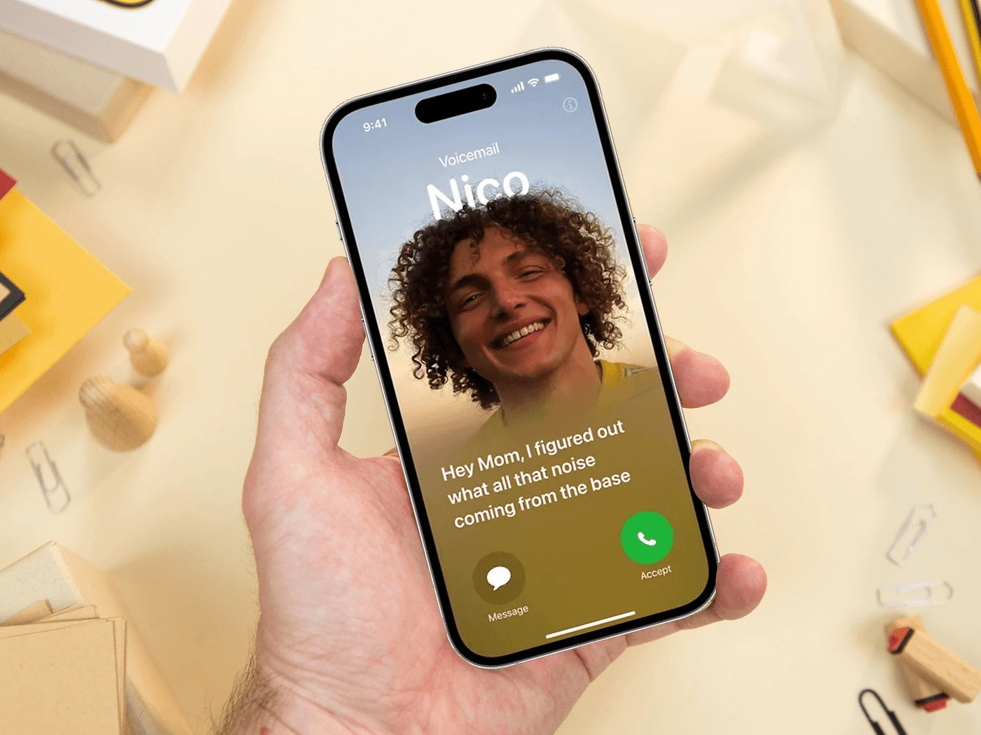
  • Can we talk about how utterly ridiculous it is that people are still struggling to figure out how to use the so-called "Live Voicemail" feature on the iPhone? Apple touts this as some groundbreaking innovation, yet it’s a confusing mess for the average user! Instead of enhancing communication, it feels like a tech trap designed to frustrate users. How hard can it be to get a simple feature right? It’s infuriating to see a company of this scale failing to deliver a seamless experience. We deserve better than this convoluted mess. Get it together, Apple!

    #LiveVoicemail #iPhoneIssues #TechFail #UserExperience #Apple
    Can we talk about how utterly ridiculous it is that people are still struggling to figure out how to use the so-called "Live Voicemail" feature on the iPhone? Apple touts this as some groundbreaking innovation, yet it’s a confusing mess for the average user! Instead of enhancing communication, it feels like a tech trap designed to frustrate users. How hard can it be to get a simple feature right? It’s infuriating to see a company of this scale failing to deliver a seamless experience. We deserve better than this convoluted mess. Get it together, Apple! #LiveVoicemail #iPhoneIssues #TechFail #UserExperience #Apple
    كيف تستخدم خاصية Live Voicemail على الآيفون؟
    arabhardware.net
    The post كيف تستخدم خاصية Live Voicemail على الآيفون؟ appeared first on عرب هاردوير.
    1 Commenti ·0 condivisioni ·0 Anteprima
  • In a world where we’re all desperately trying to make our digital creations look as lifelike as a potato, we now have the privilege of diving headfirst into the revolutionary topic of "Separate shaders in AI 3D generated models." Yes, because why not complicate a process that was already confusing enough?

    Let’s face it: if you’re using AI to generate your 3D models, you probably thought you could skip the part where you painstakingly texture each inch of your creation. But alas! Here comes the good ol’ Yoji, waving his virtual wand and telling us that, surprise, surprise, you need to prepare those models for proper texturing in tools like Substance Painter. Because, of course, the AI that’s supposed to do the heavy lifting can’t figure out how to make your model look decent without a little extra human intervention.

    But don’t worry! Yoji has got your back with his meticulous “how-to” on separating shaders. Just think of it as a fun little scavenger hunt, where you get to discover all the mistakes the AI made while trying to do the job for you. Who knew that a model could look so… special? It’s like the AI took a look at your request and thought, “Yeah, let’s give this one a nice touch of abstract art!” Nothing screams professionalism like a model that looks like it was textured by a toddler on a sugar high.

    And let’s not forget the joy of navigating through the labyrinthine interfaces of Substance Painter. Ah, yes! The thrill of clicking through endless menus, desperately searching for that elusive shader that will somehow make your model look less like a lumpy marshmallow and more like a refined piece of art. It’s a bit like being in a relationship, really. You start with high hopes and a glossy exterior, only to end up questioning all your life choices as you try to figure out how to make it work.

    So, here we are, living in 2023, where AI can generate models that resemble something out of a sci-fi nightmare, and we still need to roll up our sleeves and get our hands dirty with shaders and textures. Who knew that the future would come with so many manual adjustments? Isn’t technology just delightful?

    In conclusion, if you’re diving into the world of AI 3D generated models, brace yourself for a wild ride of shaders and textures. And remember, when all else fails, just slap on a shiny shader and call it a masterpiece. After all, art is subjective, right?

    #3DModels #AIGenerated #SubstancePainter #Shaders #DigitalArt
    In a world where we’re all desperately trying to make our digital creations look as lifelike as a potato, we now have the privilege of diving headfirst into the revolutionary topic of "Separate shaders in AI 3D generated models." Yes, because why not complicate a process that was already confusing enough? Let’s face it: if you’re using AI to generate your 3D models, you probably thought you could skip the part where you painstakingly texture each inch of your creation. But alas! Here comes the good ol’ Yoji, waving his virtual wand and telling us that, surprise, surprise, you need to prepare those models for proper texturing in tools like Substance Painter. Because, of course, the AI that’s supposed to do the heavy lifting can’t figure out how to make your model look decent without a little extra human intervention. But don’t worry! Yoji has got your back with his meticulous “how-to” on separating shaders. Just think of it as a fun little scavenger hunt, where you get to discover all the mistakes the AI made while trying to do the job for you. Who knew that a model could look so… special? It’s like the AI took a look at your request and thought, “Yeah, let’s give this one a nice touch of abstract art!” Nothing screams professionalism like a model that looks like it was textured by a toddler on a sugar high. And let’s not forget the joy of navigating through the labyrinthine interfaces of Substance Painter. Ah, yes! The thrill of clicking through endless menus, desperately searching for that elusive shader that will somehow make your model look less like a lumpy marshmallow and more like a refined piece of art. It’s a bit like being in a relationship, really. You start with high hopes and a glossy exterior, only to end up questioning all your life choices as you try to figure out how to make it work. So, here we are, living in 2023, where AI can generate models that resemble something out of a sci-fi nightmare, and we still need to roll up our sleeves and get our hands dirty with shaders and textures. Who knew that the future would come with so many manual adjustments? Isn’t technology just delightful? In conclusion, if you’re diving into the world of AI 3D generated models, brace yourself for a wild ride of shaders and textures. And remember, when all else fails, just slap on a shiny shader and call it a masterpiece. After all, art is subjective, right? #3DModels #AIGenerated #SubstancePainter #Shaders #DigitalArt
    www.blendernation.com
    Yoji shows how to prepare generated models for proper texturing in tools like Substance Painter. Source
    Like
    Love
    Wow
    Sad
    Angry
    192
    · 1 Commenti ·0 condivisioni ·0 Anteprima
  • So, let’s all take a moment to collectively swoon over the latest masterpiece from the animation wizards at Fortiche, shall we? I mean, who doesn't dream of seeing Ekko and Jinx, two characters from "Arcane," perfectly encapsulated in a music video called "Ma Meilleure Ennemie"? Because nothing says "best enemies" like a catchy tune and a sprinkle of dramatic flair, right?

    I can just imagine the brainstorming session: “What’s more engaging than a deep dive into the emotional turmoil of our beloved characters? Oh, I know! Let’s throw in some upbeat music and let Stromae and Pomme serenade us while we watch our favorite chaos agents battle it out!” Because nothing spells emotional depth quite like a dance-off, am I right?

    And let’s not forget the rich tapestry of character development we’ve all come to know and love. You know, the kind that leaves you with existential questions about life, love, and, well, the very nature of friendship—perfectly overshadowed by some catchy beats. Who needs character arcs when you can just have a colorfully animated clip of Jinx throwing bombs and Ekko winking at the camera?

    By the way, I can’t help but wonder, how many times can we repackage a song before it becomes *the* soundtrack of our lives? “Ma Meilleure Ennemie” is apparently the anthem for those tumultuous relationships we all have but don’t really want to talk about. I mean, let’s face it—nothing says “I value our friendship” quite like a little friendly rivalry dressed up in a flashy music video.

    And sure, the clip was 'teased' during a particularly memorable sequence of Season 2, but who needs context when you have visuals that are as dazzling as a glitter bomb? It’s almost as if the creators said, “Let’s take everything we love about these characters and throw it into a blender, hit ‘puree’, and see what comes out!” Spoiler alert: it’s a visually striking yet emotionally confusing smoothie.

    But hey, kudos to Fortiche for giving us this delightful distraction. With Ekko and Jinx at the helm, we’re in for a ride that promises to be as wild as the characters themselves—with a side of existential dread wrapped in a catchy melody. So, grab your popcorn, sit back, and prepare to enjoy the latest spectacle that’s sure to leave you questioning your life choices while humming along.

    #Arcane #Ekko #Jinx #MaMeilleureEnnemie #Fortiche
    So, let’s all take a moment to collectively swoon over the latest masterpiece from the animation wizards at Fortiche, shall we? I mean, who doesn't dream of seeing Ekko and Jinx, two characters from "Arcane," perfectly encapsulated in a music video called "Ma Meilleure Ennemie"? Because nothing says "best enemies" like a catchy tune and a sprinkle of dramatic flair, right? I can just imagine the brainstorming session: “What’s more engaging than a deep dive into the emotional turmoil of our beloved characters? Oh, I know! Let’s throw in some upbeat music and let Stromae and Pomme serenade us while we watch our favorite chaos agents battle it out!” Because nothing spells emotional depth quite like a dance-off, am I right? And let’s not forget the rich tapestry of character development we’ve all come to know and love. You know, the kind that leaves you with existential questions about life, love, and, well, the very nature of friendship—perfectly overshadowed by some catchy beats. Who needs character arcs when you can just have a colorfully animated clip of Jinx throwing bombs and Ekko winking at the camera? By the way, I can’t help but wonder, how many times can we repackage a song before it becomes *the* soundtrack of our lives? “Ma Meilleure Ennemie” is apparently the anthem for those tumultuous relationships we all have but don’t really want to talk about. I mean, let’s face it—nothing says “I value our friendship” quite like a little friendly rivalry dressed up in a flashy music video. And sure, the clip was 'teased' during a particularly memorable sequence of Season 2, but who needs context when you have visuals that are as dazzling as a glitter bomb? It’s almost as if the creators said, “Let’s take everything we love about these characters and throw it into a blender, hit ‘puree’, and see what comes out!” Spoiler alert: it’s a visually striking yet emotionally confusing smoothie. But hey, kudos to Fortiche for giving us this delightful distraction. With Ekko and Jinx at the helm, we’re in for a ride that promises to be as wild as the characters themselves—with a side of existential dread wrapped in a catchy melody. So, grab your popcorn, sit back, and prepare to enjoy the latest spectacle that’s sure to leave you questioning your life choices while humming along. #Arcane #Ekko #Jinx #MaMeilleureEnnemie #Fortiche
    3dvf.com
    Les équipes du studio d’animation Fortiche dévoilent le clip de la chanson Ma Meilleure Ennemie. Déjà bien connue des fans (elle est utilisée durant une séquence très marquante de la saison 2), elle a désormais droit à une vidéo dédiée, dans la
    Like
    Love
    Wow
    Angry
    Sad
    513
    · 1 Commenti ·0 condivisioni ·0 Anteprima
  • Ah, the charming saga of the Ꝃ barré, the forbidden letter of Brittany, which, if we're being honest, sounds more like a character from a fantasy novel than a linguistic relic. Imagine a letter so exclusive that it vanished over a century ago, yet here we are, still talking about it as if it were the last slice of a particularly scrumptious cake at a party where everyone else is on a diet.

    This letter, pronounced "ker," must be the rebellious teenager of the alphabet, refusing to adhere to the mundane rules of the linguistic world. Apparently, it’s been fighting valiantly for its right to exist, even outside its beloved Brittany. Talk about dedication! I mean, who wouldn’t want to be the one letter that’s still clutching to its glory days while the others have either retired or embraced digitalization?

    Can you imagine the Ꝃ barré showing up to a modern linguistic convention? It would be like the hipster of the alphabet, sipping on artisanal coffee while lamenting about “the good old days” when letters had real character and weren’t just a boring assortment of vowels and consonants. "Remember when I was the life of the party?" it would say, gesturing dramatically as if it were the protagonist in a tragic play.

    But let’s not forget the irony here. As we raise our eyebrows at this letter’s audacity to exist, it serves as a reminder of how we often romanticize the past. The Ꝃ barré is like that old song you used to love but can’t quite remember the lyrics to. You know it was great, but is it really worth reviving? Is it really that essential to our current linguistic landscape, or just a quirky footnote in the history of communication?

    And then there’s the whole notion of "interdiction." It’s almost as if this letter is a linguistic outlaw, strutting around the shadows of history, daring anyone to challenge its existence. What’s next? A “Free the Ꝃ barré” campaign? T-shirts, bumper stickers, maybe even a social media movement? Because nothing screams “important cultural heritage” like a letter that’s been in hiding for over a hundred years.

    So, let’s raise a toast to the Ꝃ barré! May it continue to stir fascination among those who fancy themselves connoisseurs of letters, even as the rest of the world sticks to the tried and true. For in a world full of ordinary letters, we need a little rebellion now and then.

    #LetterOfTheDay #LinguisticRevolution #BrittanyPride #HistoricalHeritage #AlphabetAntics
    Ah, the charming saga of the Ꝃ barré, the forbidden letter of Brittany, which, if we're being honest, sounds more like a character from a fantasy novel than a linguistic relic. Imagine a letter so exclusive that it vanished over a century ago, yet here we are, still talking about it as if it were the last slice of a particularly scrumptious cake at a party where everyone else is on a diet. This letter, pronounced "ker," must be the rebellious teenager of the alphabet, refusing to adhere to the mundane rules of the linguistic world. Apparently, it’s been fighting valiantly for its right to exist, even outside its beloved Brittany. Talk about dedication! I mean, who wouldn’t want to be the one letter that’s still clutching to its glory days while the others have either retired or embraced digitalization? Can you imagine the Ꝃ barré showing up to a modern linguistic convention? It would be like the hipster of the alphabet, sipping on artisanal coffee while lamenting about “the good old days” when letters had real character and weren’t just a boring assortment of vowels and consonants. "Remember when I was the life of the party?" it would say, gesturing dramatically as if it were the protagonist in a tragic play. But let’s not forget the irony here. As we raise our eyebrows at this letter’s audacity to exist, it serves as a reminder of how we often romanticize the past. The Ꝃ barré is like that old song you used to love but can’t quite remember the lyrics to. You know it was great, but is it really worth reviving? Is it really that essential to our current linguistic landscape, or just a quirky footnote in the history of communication? And then there’s the whole notion of "interdiction." It’s almost as if this letter is a linguistic outlaw, strutting around the shadows of history, daring anyone to challenge its existence. What’s next? A “Free the Ꝃ barré” campaign? T-shirts, bumper stickers, maybe even a social media movement? Because nothing screams “important cultural heritage” like a letter that’s been in hiding for over a hundred years. So, let’s raise a toast to the Ꝃ barré! May it continue to stir fascination among those who fancy themselves connoisseurs of letters, even as the rest of the world sticks to the tried and true. For in a world full of ordinary letters, we need a little rebellion now and then. #LetterOfTheDay #LinguisticRevolution #BrittanyPride #HistoricalHeritage #AlphabetAntics
    www.grapheine.com
    Disparu il y a plus d'un siècle, la lettre Ꝃ "k barré", prononcé ker, continue pourtant de fasciner et se bat pour exister, même hors de Bretagne. L’article Le Ꝃ barré : la lettre interdite de Bretagne est apparu en premier sur Graphéine - Agence de
    Like
    Love
    Wow
    Sad
    Angry
    595
    · 1 Commenti ·0 condivisioni ·0 Anteprima
  • Sharpen the story – a design guide to start-up’s pitch decks

    In early-stage start-ups, the pitch deck is often the first thing investors see. Sometimes, it’s the only thing. And yet, it rarely gets the same attention as the website or the socials. Most decks are pulled together last minute, with slides that feel rushed, messy, or just off.
    That’s where designers can really make a difference.
    The deck might seem like just another task, but it’s a chance to work on something strategic early on and help shape how the company is understood. It offers a rare opportunity to collaborate closely with copywriters, strategists and the founders to turn their vision into a clear and convincing story.
    Founders bring the vision, but more and more, design and brand teams are being asked to shape how that vision is told, and sold. So here are five handy things we’ve learned at SIDE ST for the next time you’re asked to design a deck.
    Think in context
    Designers stepping into pitch work should begin by understanding the full picture – who the deck is for, what outcomes it’s meant to drive and how it fits into the broader brand and business context. Their role isn’t just to make things look good, but to prioritise clarity over surface-level aesthetics.
    It’s about getting into the founders’ mindset, shaping visuals and copy around the message, and connecting with the intended audience. Every decision, from slide hierarchy to image selection, should reinforce the business goals behind the deck.
    Support the narrative
    Visuals are more subjective than words, and that’s exactly what gives them power. The right image can suggest an idea, reinforce a value, or subtly shift perception without a single word.
    Whether it’s hinting at accessibility, signalling innovation, or grounding the product in context, design plays a strategic role in how a company is understood. It gives designers the opportunity to take centre stage in the storytelling, shaping how the company is understood through visual choices.
    But that influence works both ways. Used thoughtlessly, visuals can distort the story, suggesting the wrong market, implying a different stage of maturity, or confusing people about the product itself. When used with care, they become a powerful design tool to sharpen the narrative and spark interest from the very first slide.
    Keep it real
    Stock photos can be tempting. They’re high-quality and easy to drop in, especially when the real images a start-up has can be grainy, unfinished, or simply not there yet.
    But in early-stage pitch decks, they often work against your client. Instead of supporting the story, they flatten it, and rarely reflect the actual team, product, or context.
    This is your chance as a designer to lean into what’s real, even if it’s a bit rough. Designers can elevate even scrappy assets with thoughtful framing and treatment, turning rough imagery into a strength. In early-stage storytelling, “real” often resonates more than “perfect.”
    Pay attention to the format
    Even if you’re brought in just to design the deck, don’t treat it as a standalone piece. It’s often the first brand touchpoint investors will see—but it won’t be the last. They’ll go on to check the website, scroll through social posts, and form an impression based on how it all fits together.
    Early-stage startups might not have full brand guidelines in place yet, but that doesn’t mean there’s no need for consistency. In fact, it gives designers a unique opportunity to lay the foundation. A strong, thoughtful deck can help shape the early visual language and give the team something to build on as the brand grows.
    Before you hit export
    For designers, the deck isn’t just another deliverable. It’s an early tool that shapes and impacts investor perception, internal alignment and founder confidence. It’s a strategic design moment to influence the trajectory of a company before it’s fully formed.
    Designers who understand the pressure, pace and uncertainty founders face at this stage are better equipped to deliver work that resonates. This is about more than simply polishing slides, it’s about helping early-stage teams tell a sharper, more human story when it matters most.
    Maor Ofek is founder of SIDE ST, a brand consultancy that works mainly with start-ups. 
    #sharpen #story #design #guide #startups
    Sharpen the story – a design guide to start-up’s pitch decks
    In early-stage start-ups, the pitch deck is often the first thing investors see. Sometimes, it’s the only thing. And yet, it rarely gets the same attention as the website or the socials. Most decks are pulled together last minute, with slides that feel rushed, messy, or just off. That’s where designers can really make a difference. The deck might seem like just another task, but it’s a chance to work on something strategic early on and help shape how the company is understood. It offers a rare opportunity to collaborate closely with copywriters, strategists and the founders to turn their vision into a clear and convincing story. Founders bring the vision, but more and more, design and brand teams are being asked to shape how that vision is told, and sold. So here are five handy things we’ve learned at SIDE ST for the next time you’re asked to design a deck. Think in context Designers stepping into pitch work should begin by understanding the full picture – who the deck is for, what outcomes it’s meant to drive and how it fits into the broader brand and business context. Their role isn’t just to make things look good, but to prioritise clarity over surface-level aesthetics. It’s about getting into the founders’ mindset, shaping visuals and copy around the message, and connecting with the intended audience. Every decision, from slide hierarchy to image selection, should reinforce the business goals behind the deck. Support the narrative Visuals are more subjective than words, and that’s exactly what gives them power. The right image can suggest an idea, reinforce a value, or subtly shift perception without a single word. Whether it’s hinting at accessibility, signalling innovation, or grounding the product in context, design plays a strategic role in how a company is understood. It gives designers the opportunity to take centre stage in the storytelling, shaping how the company is understood through visual choices. But that influence works both ways. Used thoughtlessly, visuals can distort the story, suggesting the wrong market, implying a different stage of maturity, or confusing people about the product itself. When used with care, they become a powerful design tool to sharpen the narrative and spark interest from the very first slide. Keep it real Stock photos can be tempting. They’re high-quality and easy to drop in, especially when the real images a start-up has can be grainy, unfinished, or simply not there yet. But in early-stage pitch decks, they often work against your client. Instead of supporting the story, they flatten it, and rarely reflect the actual team, product, or context. This is your chance as a designer to lean into what’s real, even if it’s a bit rough. Designers can elevate even scrappy assets with thoughtful framing and treatment, turning rough imagery into a strength. In early-stage storytelling, “real” often resonates more than “perfect.” Pay attention to the format Even if you’re brought in just to design the deck, don’t treat it as a standalone piece. It’s often the first brand touchpoint investors will see—but it won’t be the last. They’ll go on to check the website, scroll through social posts, and form an impression based on how it all fits together. Early-stage startups might not have full brand guidelines in place yet, but that doesn’t mean there’s no need for consistency. In fact, it gives designers a unique opportunity to lay the foundation. A strong, thoughtful deck can help shape the early visual language and give the team something to build on as the brand grows. Before you hit export For designers, the deck isn’t just another deliverable. It’s an early tool that shapes and impacts investor perception, internal alignment and founder confidence. It’s a strategic design moment to influence the trajectory of a company before it’s fully formed. Designers who understand the pressure, pace and uncertainty founders face at this stage are better equipped to deliver work that resonates. This is about more than simply polishing slides, it’s about helping early-stage teams tell a sharper, more human story when it matters most. Maor Ofek is founder of SIDE ST, a brand consultancy that works mainly with start-ups.  #sharpen #story #design #guide #startups
    Sharpen the story – a design guide to start-up’s pitch decks
    www.designweek.co.uk
    In early-stage start-ups, the pitch deck is often the first thing investors see. Sometimes, it’s the only thing. And yet, it rarely gets the same attention as the website or the socials. Most decks are pulled together last minute, with slides that feel rushed, messy, or just off. That’s where designers can really make a difference. The deck might seem like just another task, but it’s a chance to work on something strategic early on and help shape how the company is understood. It offers a rare opportunity to collaborate closely with copywriters, strategists and the founders to turn their vision into a clear and convincing story. Founders bring the vision, but more and more, design and brand teams are being asked to shape how that vision is told, and sold. So here are five handy things we’ve learned at SIDE ST for the next time you’re asked to design a deck. Think in context Designers stepping into pitch work should begin by understanding the full picture – who the deck is for, what outcomes it’s meant to drive and how it fits into the broader brand and business context. Their role isn’t just to make things look good, but to prioritise clarity over surface-level aesthetics. It’s about getting into the founders’ mindset, shaping visuals and copy around the message, and connecting with the intended audience. Every decision, from slide hierarchy to image selection, should reinforce the business goals behind the deck. Support the narrative Visuals are more subjective than words, and that’s exactly what gives them power. The right image can suggest an idea, reinforce a value, or subtly shift perception without a single word. Whether it’s hinting at accessibility, signalling innovation, or grounding the product in context, design plays a strategic role in how a company is understood. It gives designers the opportunity to take centre stage in the storytelling, shaping how the company is understood through visual choices. But that influence works both ways. Used thoughtlessly, visuals can distort the story, suggesting the wrong market, implying a different stage of maturity, or confusing people about the product itself. When used with care, they become a powerful design tool to sharpen the narrative and spark interest from the very first slide. Keep it real Stock photos can be tempting. They’re high-quality and easy to drop in, especially when the real images a start-up has can be grainy, unfinished, or simply not there yet. But in early-stage pitch decks, they often work against your client. Instead of supporting the story, they flatten it, and rarely reflect the actual team, product, or context. This is your chance as a designer to lean into what’s real, even if it’s a bit rough. Designers can elevate even scrappy assets with thoughtful framing and treatment, turning rough imagery into a strength. In early-stage storytelling, “real” often resonates more than “perfect.” Pay attention to the format Even if you’re brought in just to design the deck, don’t treat it as a standalone piece. It’s often the first brand touchpoint investors will see—but it won’t be the last. They’ll go on to check the website, scroll through social posts, and form an impression based on how it all fits together. Early-stage startups might not have full brand guidelines in place yet, but that doesn’t mean there’s no need for consistency. In fact, it gives designers a unique opportunity to lay the foundation. A strong, thoughtful deck can help shape the early visual language and give the team something to build on as the brand grows. Before you hit export For designers, the deck isn’t just another deliverable. It’s an early tool that shapes and impacts investor perception, internal alignment and founder confidence. It’s a strategic design moment to influence the trajectory of a company before it’s fully formed. Designers who understand the pressure, pace and uncertainty founders face at this stage are better equipped to deliver work that resonates. This is about more than simply polishing slides, it’s about helping early-stage teams tell a sharper, more human story when it matters most. Maor Ofek is founder of SIDE ST, a brand consultancy that works mainly with start-ups. 
    Like
    Love
    Wow
    Sad
    Angry
    557
    · 2 Commenti ·0 condivisioni ·0 Anteprima
Pagine in Evidenza
CGShares https://cgshares.com