This is not a pipe: UX, AI, and the risk of satisficed product design
AI’s grip on design forces us to reconsider our role in shaping perception, reality, and—most importantly—decision-making.Image composed in Figma using AI-generated assets.I love a good prototype.You know that old saying—a picture’s worth a thousand words? Well, a prototype is worth a million, especially if you’re a developer, a stakeholder, or a decision-maker trying to make sense of a complex idea with a lot of moving parts.A prototype compresses context. It gives form to the abstract. It invites feedback for iteration and improvement. I’ve built them my whole career, and I still believe they’re the most powerful artifacts in product design.But I’m also starting to worry.The old daysBack in the early days of the web, I used to prototype in hand-coded HTML. Not because I loved code, but because I cared about quality. Browsers were unpredictable animals. Netscape and IE rendered the same markup in wildly different ways. The best we could do was chase consistency through hours of trial and error—hoping somehow that one of us would find and document the answer for the rest.Then Jeffrey Zeldman came along, armed with his famous pop culture wit and transparent brilliance, rallying the web community behind standards and semantic code. And it worked. Slowly, thankfully, the browser makers listened. We built better websites with better languages. HTML became standardized and meaningful under the hood.That was craft.Not just the mechanics of markup, but the intentionality behind it. Craft, to me, is thoughtful execution learned over time. It’s the subtle accumulation of experience, taste, and judgment. It’s a uniquely human achievement.The new nowFast forward to today, and we’re surrounded by tools promising instant output. AI is the new rallying cry, and its promise is both thrilling and disorienting.Tools like Lovable, v0.dev, and Cursor offer prototyping at the speed of thought. With a single prompt, we can summon UI layouts, component libraries, even entire interaction flows. It’s an addictive sort of magic. And in a product world driven by speed and iteration, this kind of acceleration is a godsend.But there’s something quietly unsettling about the ease of it all.Because with great speed comes great risk—perhaps to our users and to our own hard-won standards. And ironically, those who seem to value “craft” as the standard bearers of the current definition—forged exclusively in the conventional tooling of Figma—seem to be the loudest proponents of the new speed.René Magritte, The Treachery of Images. Los Angeles County Museum of Art.This is not a pipeMagritte once painted a pipe and wrote underneath, “Ceci n’est pas une pipe”—This is not a pipe.He was right. It’s just a painting of a pipe, a representation, not the object itself. Postmodern thinkers wasted many French brain cells expanding on this idea, which eventually made its way into popular culture via The Matrix film franchise.In UX, we live and breathe representations. Wireframes, mockups, user flows, prototypes—they’re all stand-ins for future experiences. And yet, stakeholders and product teams often quickly treat them as the final product. The flow becomes the experience. The mockup becomes the truth.Add AI to the mix, and the illusion intensifies exponentially.When an AI-generated interface looks authentic and clickable, it’s dangerously easy to accept it at face value. But what if it’s based on flawed assumptions? What if it reflects patterns that don’t serve our users? What if it simply looks finished, when it’s not even close to holding real value?The risk of satisficingHerbert Simon had a made-up word for this kind of decision-making: satisficing. A blend of “satisfy” and “suffice.” It means settling for a good-enough solution when the perfect one is too costly or too far out of reach.In AI-generated design, satisficing isn’t just a risk—it’s the default.The algorithm gives us something that looks fine, behaves fine, and maybe even tests fine. And in the absence of the right checkpoints for critical thought, we’re liable to ship it. Not because it’s right, but because it’s fast and frictionless.And that worries me.Because over time, we get complacent and stuck in our comfort zones. When that happens, design becomes more template-driven. Interfaces lose connectivity to the humans they’re supposed to serve. And worst of all, we stop asking why.Diagram inspired by Herbert Simon’s model of bounded rationality. Created by author.Shifting timesNow, there’s nothing inherently wrong about satisficed decision making. In fact, Simon viewed the term practically—recognizing that humans, limited in time, knowledge, and processing capacity, operate within what he called a “bounded rationality.”In agile product design, this is the whole point of an MVP.The problem arises when we’re out of sync with one another, when one discipline overrides the other with disregard, deciding that something is “good enough” without considering the wider trade offs.The optimist in me wants to believe we’re well-suited and prepared for this inevitability.I’m currently one of those displaced knowledge workers, looking for my next opportunity in UX / Product Design. I’ve seen the shift from using the term UX Designer to Product Designer in the job descriptions. Leaving the organizational debates and the shameful clickbait aside, this shift seems to signal a natural evolution—traditional UX design roles are moving deeper into product delivery.But if design and product are becoming equal partners in the organizational chart, then our collective vision should be to make decisions together, without being a consensus machine. That means mapping out our processes and synthesizing data into rational decisions within a new bounded reality—one that’s accelerated from the start.Because the point isn’t to eliminate satisficing. It’s to make it conscious, collaborative, and aligned. UX and design professionals need to be embedded in the conversation—not just reacting to outputs, but helping frame the questions and the goals. Otherwise, speed wins by default—leaving craft, context, and care lost in the latest sprint.The new frontierI’m not anti-AI. Quite the opposite. I’m genuinely excited about what these tools can unlock—especially in early design stages, where low fidelity and high experimentation are crucial. We should be moving faster. We should be looking at and testing more ideas. We should be using AI to remove blockers and free up energy for deeper thinking.But we also need to stay alert. We need to protect the human-centered insights and the basic fundamentals of context and critical thought that live outside the models.We can’t let the ease of generation become a substitute for our better judgment. We can’t let groupthink dictate taste. We can’t let empathy get stripped from the process just because the output looks like a viable product to the loudest person in the room.As designers, our job is not just to create. It’s to question. To inform. To shape. To provoke. To guide.And sometimes, to remind the team… This is not a pipe.This is not a pipe: UX, AI, and the risk of satisficed product design was originally published in UX Collective on Medium, where people are continuing the conversation by highlighting and responding to this story.
#this #not #pipe #risk #satisficed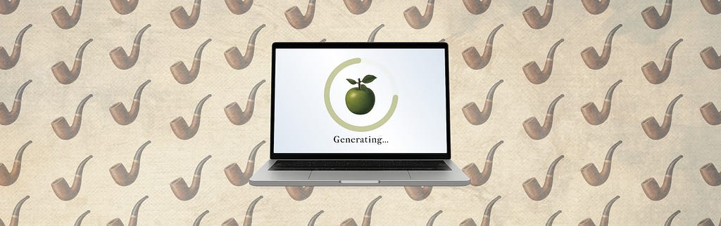
12 Commentarios
·0 Acciones
·0 Vista previa