
 map
map
Try the new UI Toolkit sample – now available on the Asset Store
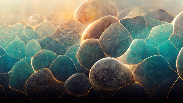
In Unity 2021 LTS, UI Toolkit offers a collection of features, resources, and tools to help you build and debug adaptive runtime UIs on a wide range of game applications and Editor extensions. Its intuitive workflow enables Unity creators in different roles – artists, programmers, and designers alike – to get started with UI development as quickly as possible.See our earlier blog post for an explanation of UI Toolkit’s main benefits, such as enhanced scalability and performance, already being leveraged by studios like Mechanistry for their game, Timberborn.While Unity UI remains the go-to solution for positioning and lighting UI in a 3D world or integrating with other Unity systems, UI Toolkit for runtime UI can already benefit game productions seeking performance and scalability as of Unity 2021 LTS. It’s particularly effective for Screen Space – Overlay UI, and scales well on a variety of screen resolutions.That’s why we’re excited to announce two new learning resources to better support UI development with UI Toolkit:UI Toolkit sample – Dragon Crashers: The demo is now available to download for free from the Asset Store.User interface design and implementation in Unity: This free e-book can be download from hereRead on to learn about some key features part of the UI Toolkit sample project.The UI Toolkit sample demonstrates how you can leverage UI Toolkit for your own applications. This demo involves a full-featured interface over a slice of the 2D project Dragon Crashers, a mini RPG, using the Unity 2021 LTS UI Toolkit workflow at runtime.Some of the actions illustrated in the sample project show you how to:Style with selectors in Unity style sheetfiles and use UXML templatesCreate custom controls, such as a circular meter or tabbed viewsCustomize the appearance of elements like sliders and toggle buttonsUse Render Texture for UI overlay effects, USS animations, seasonal themes, and moreTo try out the project after adding it to your assets, enter Play mode. Please note that UI Toolkit interfaces do not appear in the Scene view. Instead, you can view them in the Game view or UI Builder.The menu on the left helps you navigate the modal main menu screens. This vertical column of buttons provides access to the five modal screens that comprise the main menu.While some interactivity is possible, such as healing the characters by dragging available potions in the scene, gameplay has been kept to a minimum to ensure continued focus on the UI examples.Let’s take a closer look at the UIs in the menu bar:The home screen serves as a landing pad when launching the application. You can use this screen to play the game or receive simulated chat messages.The character screen involves a mix of GameObjects and UI elements. This is where you can explore each of the four Dragon Crashers characters. Use the stats, skills, and bio tabs to read the specific character details, and click on the inventory slots to add or remove items. The preview area shows a 2D lit and rigged character over a tiled background.The resources screen links to documentation, the forum, and other resources for making the most of UI Toolkit.The shop screen simulates an in-game store where you can purchase hard and soft currency, such as gold or gems, as well as virtual goods like healing potions. Each item in the shop screen is a separate VisualTreeAsset. UI Toolkit instantiates these assets at runtime; one for each ScriptableObject in the Resources/GameData.The mail screen is a front-end reader of fictitious messages that uses a tabbed menu to separate the inbox and deleted messages.The game screen is a mini version of the Dragon Crashers project that starts playing automatically. In this project, you’ll notice a few revised elements with UI Toolkit, such as a pause button, health bars, and the capacity to drag a healing potion element to your characters when they take damage.UI Toolkit enables you to build stable and consistent UIs for your entire project. At the same time, it provides flexible tools for adding your own design flourishes and details to further flesh out the game’s theme and style.Let’s go over some of the features used to refine the UI designs in the sample:Render Textures:UI Toolkit interfaces are rendered last in the render queue, meaning you can’t overlay other game graphics on top of a UI Toolkit UI. Render Textures provide a workaround to this limitation, making it possible to integrate in-game effects into UI Toolkit UIs. While these effects based on Render Textures should be used sparingly, you’ll still be able to afford sharp effects within the context of a fullscreen UI, without running gameplay. The following images show a number of Render Textures from the demo.Themes with Theme style sheets: TSS files are Asset files that are similar to regular USS files. They serve as a starting point for defining your own custom theme via USS selectors as well as property and variable settings. In the demo, we duplicated the default theme files and modified the copies to offer seasonal variations.Custom UI elements: Since designers are trained to think outside the box, UI Toolkit gives you plenty of room to customize or extend the standard library. The demo project highlights a few custom-built elements in the tabbed menus, slide toggles, and drop-down lists, plus a radial counter to demonstrate what UI artists are capable of alongside developers.USS transitions for animated UI state changes: Adding transitions to the menu screens can polish and smooth out your visuals. UI Toolkit makes this more straightforward with the Transition Animations property, part of the UI Builder’s Inspector. Adjust the Property, Duration, Easing, and Delay properties to set up the animation. Then simply change styles for UI Toolkit to apply the animated transition at runtime.Post-processing volume for a background blur: A popular effect in games is to blur a crowded gameplay scene to draw the player’s attention to a particular pop-up message or dialog window. You can achieve this effect by enabling Depth of Field in the Volume framework.We made sure that efficient workflows were used to fortify the UI. Here are a few recommendations for keeping the project well-organized:Consistent naming conventions: It’s important to adopt naming conventions that align with your visual elements and style sheets. Clear naming conventions not only maintain the hierarchy’s organization in UI Builder, they make it more accessible to your teammates, and keep the code clean and readable. More specifically, we suggest the Block Element Modifiernaming convention for visual elements and style sheets. Just at a glance, an element’s BEM naming can tell you what it does, how it appears, and how it relates to the other elements around it. See the following BEM naming examples:Responsive UI layout: Similar to web technologies, UI Toolkit offers the possibility of creating layouts where “child” visual elements adapt to the current available size inside their “parent” visual elements, and others where each element has an absolute position anchored to a reference point, akin to the Unity UI system. The sample uses both options as needed through the visual elements of the UI.PSD Importer: One of the most effective tools for creating the demo, PSD Importer allows artists to work in a master document without having to manually export every sprite separately. When changes are needed, they can be done in the original PSD file and updated automatically in Unity.ScriptableObjects: In order to focus on UI design and implementation, the sample project simulates backend data, such as in-app purchases and mail messages, using ScriptableObjects. You can conveniently customize this stand-in data from the Resources/GameData folder and use the example to create similar data assets, like inventory items and character or dialog data in UI Toolkit.Remember that with UI Toolkit, UI layouts and styles are decoupled from code. This means that rewriting the backend data can occur independently from the UI design. If your development team replaces those systems, the interface should continue to work.Additional tools used in the demo include particle systems created with the Built-in Particle System for special effects, and the 2D toolset, among others. Feel free to review the project via the Inspector to see how these different elements come into play.You can find reference art made by the UI artists under UI/Reference, as replicated in UI Builder. The whole process, from mockups to wireframes, is also documented in the e-book. Finally, all of the content in the sample can be added to your own Unity project.You can download the UI Toolkit sample – Dragon Crashers from the Asset Store. Once you’ve explored its different UI designs, please provide your feedback on the forum.Then be sure to check out our e-book, User interface design and implementation in Unity. Download
#try #new #toolkit #sample #now
Try the new UI Toolkit sample – now available on the Asset Store
In Unity 2021 LTS, UI Toolkit offers a collection of features, resources, and tools to help you build and debug adaptive runtime UIs on a wide range of game applications and Editor extensions. Its intuitive workflow enables Unity creators in different roles – artists, programmers, and designers alike – to get started with UI development as quickly as possible.See our earlier blog post for an explanation of UI Toolkit’s main benefits, such as enhanced scalability and performance, already being leveraged by studios like Mechanistry for their game, Timberborn.While Unity UI remains the go-to solution for positioning and lighting UI in a 3D world or integrating with other Unity systems, UI Toolkit for runtime UI can already benefit game productions seeking performance and scalability as of Unity 2021 LTS. It’s particularly effective for Screen Space – Overlay UI, and scales well on a variety of screen resolutions.That’s why we’re excited to announce two new learning resources to better support UI development with UI Toolkit:UI Toolkit sample – Dragon Crashers: The demo is now available to download for free from the Asset Store.User interface design and implementation in Unity: This free e-book can be download from hereRead on to learn about some key features part of the UI Toolkit sample project.The UI Toolkit sample demonstrates how you can leverage UI Toolkit for your own applications. This demo involves a full-featured interface over a slice of the 2D project Dragon Crashers, a mini RPG, using the Unity 2021 LTS UI Toolkit workflow at runtime.Some of the actions illustrated in the sample project show you how to:Style with selectors in Unity style sheetfiles and use UXML templatesCreate custom controls, such as a circular meter or tabbed viewsCustomize the appearance of elements like sliders and toggle buttonsUse Render Texture for UI overlay effects, USS animations, seasonal themes, and moreTo try out the project after adding it to your assets, enter Play mode. Please note that UI Toolkit interfaces do not appear in the Scene view. Instead, you can view them in the Game view or UI Builder.The menu on the left helps you navigate the modal main menu screens. This vertical column of buttons provides access to the five modal screens that comprise the main menu.While some interactivity is possible, such as healing the characters by dragging available potions in the scene, gameplay has been kept to a minimum to ensure continued focus on the UI examples.Let’s take a closer look at the UIs in the menu bar:The home screen serves as a landing pad when launching the application. You can use this screen to play the game or receive simulated chat messages.The character screen involves a mix of GameObjects and UI elements. This is where you can explore each of the four Dragon Crashers characters. Use the stats, skills, and bio tabs to read the specific character details, and click on the inventory slots to add or remove items. The preview area shows a 2D lit and rigged character over a tiled background.The resources screen links to documentation, the forum, and other resources for making the most of UI Toolkit.The shop screen simulates an in-game store where you can purchase hard and soft currency, such as gold or gems, as well as virtual goods like healing potions. Each item in the shop screen is a separate VisualTreeAsset. UI Toolkit instantiates these assets at runtime; one for each ScriptableObject in the Resources/GameData.The mail screen is a front-end reader of fictitious messages that uses a tabbed menu to separate the inbox and deleted messages.The game screen is a mini version of the Dragon Crashers project that starts playing automatically. In this project, you’ll notice a few revised elements with UI Toolkit, such as a pause button, health bars, and the capacity to drag a healing potion element to your characters when they take damage.UI Toolkit enables you to build stable and consistent UIs for your entire project. At the same time, it provides flexible tools for adding your own design flourishes and details to further flesh out the game’s theme and style.Let’s go over some of the features used to refine the UI designs in the sample:Render Textures:UI Toolkit interfaces are rendered last in the render queue, meaning you can’t overlay other game graphics on top of a UI Toolkit UI. Render Textures provide a workaround to this limitation, making it possible to integrate in-game effects into UI Toolkit UIs. While these effects based on Render Textures should be used sparingly, you’ll still be able to afford sharp effects within the context of a fullscreen UI, without running gameplay. The following images show a number of Render Textures from the demo.Themes with Theme style sheets: TSS files are Asset files that are similar to regular USS files. They serve as a starting point for defining your own custom theme via USS selectors as well as property and variable settings. In the demo, we duplicated the default theme files and modified the copies to offer seasonal variations.Custom UI elements: Since designers are trained to think outside the box, UI Toolkit gives you plenty of room to customize or extend the standard library. The demo project highlights a few custom-built elements in the tabbed menus, slide toggles, and drop-down lists, plus a radial counter to demonstrate what UI artists are capable of alongside developers.USS transitions for animated UI state changes: Adding transitions to the menu screens can polish and smooth out your visuals. UI Toolkit makes this more straightforward with the Transition Animations property, part of the UI Builder’s Inspector. Adjust the Property, Duration, Easing, and Delay properties to set up the animation. Then simply change styles for UI Toolkit to apply the animated transition at runtime.Post-processing volume for a background blur: A popular effect in games is to blur a crowded gameplay scene to draw the player’s attention to a particular pop-up message or dialog window. You can achieve this effect by enabling Depth of Field in the Volume framework.We made sure that efficient workflows were used to fortify the UI. Here are a few recommendations for keeping the project well-organized:Consistent naming conventions: It’s important to adopt naming conventions that align with your visual elements and style sheets. Clear naming conventions not only maintain the hierarchy’s organization in UI Builder, they make it more accessible to your teammates, and keep the code clean and readable. More specifically, we suggest the Block Element Modifiernaming convention for visual elements and style sheets. Just at a glance, an element’s BEM naming can tell you what it does, how it appears, and how it relates to the other elements around it. See the following BEM naming examples:Responsive UI layout: Similar to web technologies, UI Toolkit offers the possibility of creating layouts where “child” visual elements adapt to the current available size inside their “parent” visual elements, and others where each element has an absolute position anchored to a reference point, akin to the Unity UI system. The sample uses both options as needed through the visual elements of the UI.PSD Importer: One of the most effective tools for creating the demo, PSD Importer allows artists to work in a master document without having to manually export every sprite separately. When changes are needed, they can be done in the original PSD file and updated automatically in Unity.ScriptableObjects: In order to focus on UI design and implementation, the sample project simulates backend data, such as in-app purchases and mail messages, using ScriptableObjects. You can conveniently customize this stand-in data from the Resources/GameData folder and use the example to create similar data assets, like inventory items and character or dialog data in UI Toolkit.Remember that with UI Toolkit, UI layouts and styles are decoupled from code. This means that rewriting the backend data can occur independently from the UI design. If your development team replaces those systems, the interface should continue to work.Additional tools used in the demo include particle systems created with the Built-in Particle System for special effects, and the 2D toolset, among others. Feel free to review the project via the Inspector to see how these different elements come into play.You can find reference art made by the UI artists under UI/Reference, as replicated in UI Builder. The whole process, from mockups to wireframes, is also documented in the e-book. Finally, all of the content in the sample can be added to your own Unity project.You can download the UI Toolkit sample – Dragon Crashers from the Asset Store. Once you’ve explored its different UI designs, please provide your feedback on the forum.Then be sure to check out our e-book, User interface design and implementation in Unity. Download
#try #new #toolkit #sample #now
0 Comments
·0 Shares
·0 Reviews