• 50 Preppy Fonts with Rich & Fancy Vibes

    In this article:See more ▼Post may contain affiliate links which give us commissions at no cost to you.Preppy fonts capture that quintessential East Coast elite vibe – think Nantucket summers, yacht clubs, and monogrammed everything. These typefaces embody the perfect balance of tradition and refinement that makes preppy design so timeless and aspirational.
    But here’s the thing: not all fonts can pull off that coveted preppy aesthetic. The best preppy fonts have a certain je ne sais quoi – they’re classic without being stuffy, elegant without being pretentious, and refined without being inaccessible.
    In this comprehensive guide, we’ll explore the most gorgeous preppy fonts that’ll have your designs looking like they belong in the pages of Town & Country magazine. So grab your pearls and let’s dive into this typographic treasure trove!
    Psst... Did you know you can get unlimited downloads of 59,000+ fonts and millions of other creative assets for just /mo? Learn more »The Preppiest Fonts That Define 2025
    Let’s start with the crème de la crème – the fonts that truly embody that preppy spirit. I’ve curated this list based on their ability to channel that classic New England charm while remaining versatile enough for modern design needs.

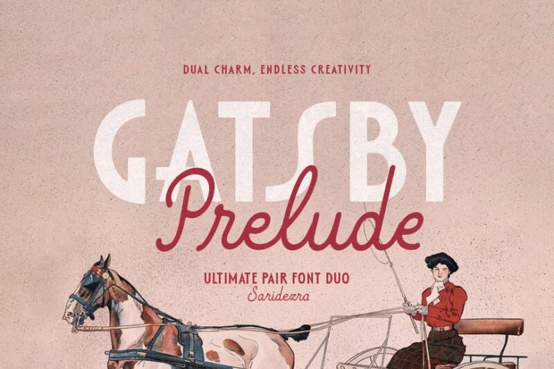
    Gatsby Prelude

    Gatsby Prelude is an elegant and modern Art Deco font duo. It combines sans-serif characters with decorative elements, perfect for creating sophisticated designs with a touch of vintage glamour.Burtuqol

    Burtuqol is a vintage slab serif font that exudes a retro charm. Its bold, chunky serifs and aged appearance make it ideal for projects requiring a nostalgic or timeworn aesthetic.Gafler

    Gafler is a classy vintage serif font with decorative elements. It combines elegance with a touch of old-world charm, making it perfect for high-end branding and classic design projects.Get 300+ Fonts for FREEEnter your email to download our 100% free "Font Lover's Bundle". For commercial & personal use. No royalties. No fees. No attribution. 100% free to use anywhere.

    Kagnue

    Kagnue is a modern and classy serif font. It offers a fresh take on traditional serif typefaces, blending contemporary design with timeless elegance for versatile use in various design contexts.The Blendinroom

    The Blendinroom is a retro serif typeface featuring luxurious ligatures. Its vintage-inspired design and intricate details make it ideal for creating sophisticated, old-world aesthetics in design projects.MODER BULES

    MODER BULES is a playful sans-serif font with a fun, childlike appeal. Its quirky design makes it perfect for kids-oriented projects or Halloween-themed designs, adding a touch of whimsy to typography.Nickey Vintage

    Nickey Vintage is a decorative display font with a strong vintage flair. Its bold, eye-catching characters make it ideal for headlines, logos, and designs that require a striking retro aesthetic.Ladger

    Ladger is a casual script font that exudes luxury and elegance. Its flowing lines and graceful curves make it perfect for logo designs, high-end branding, and projects requiring a touch of sophistication.Hadnich

    Hadnich is a modern script font with a brush-like quality. Its versatile design makes it suitable for various applications, from signage to branding, offering a contemporary take on handwritten typography.Belly and Park

    Belly and Park is a condensed beauty classic font family featuring both serif and sans-serif styles. Its vintage-inspired design and narrow characters make it ideal for creating elegant, space-efficient layouts.Loubag

    Loubag is a modern retro font family encompassing sans-serif, serif, and decorative styles. Its bold, fashion-forward design makes it perfect for creating eye-catching headlines and trendy branding materials.Petter And Sons

    Petter And Sons is a romantic beauty script font with decorative elements. Its elegant, flowing design makes it ideal for wedding invitations, luxury branding, and projects requiring a touch of refined beauty.Preteoria

    Preteoria is a modern cursive font with a sleek, contemporary feel. Its smooth curves and clean lines make it versatile for various design applications, from branding to digital media projects.Delauney

    Delauney is an Art Deco-inspired sans-serif font that captures the essence of the roaring twenties. Its geometric shapes and sleek lines make it perfect for creating designs with a bold, metropolitan flair.Amadi Vintage

    Amadi Vintage is a chic and beautiful serif font with a timeless appeal. Its elegant design and vintage-inspired details make it ideal for creating sophisticated, classic-looking designs and branding materials.LEDERSON

    LEDERSON is a vintage-inspired shadow font. Its weathered look and strong character make it perfect for designs requiring an authentic, aged aesthetic.Fancyou

    Fancyou is a versatile serif font with alternate characters. Its elegant design and customizable options make it suitable for a wide range of projects, from formal invitations to modern branding materials.Catterpie Font

    Catterpie is a handwritten script font that mimics natural handlettering. Its fluid, signature-like style makes it perfect for creating personal, authentic-looking designs and branding materials.Jemmy Wonder

    Jemmy Wonder is a Victorian-inspired serif font with a strong vintage character. Its ornate details and old-world charm make it ideal for creating designs with a classic, nostalgic feel.Monthey

    Monthey is a bold, elegant vintage display serif font. Its chunky characters and 70s-inspired design make it perfect for creating eye-catching headlines and retro-themed branding materials.Madville

    Madville is a classy script font with a versatile design. Its elegant curves and smooth transitions make it suitable for a wide range of projects, from formal invitations to modern branding materials.Crowk

    Crowk is a luxury serif font with a timeless, elegant appeal. Its refined design and classic proportions make it ideal for high-end branding, editorial layouts, and sophisticated design projects.Peachy Fantasy

    Peachy Fantasy is an Art Nouveau-inspired display font with decorative elements. Its vintage charm and unique character make it perfect for creating eye-catching headlines and artistic design projects.Cormier

    Cormier is a decorative sans-serif font with a strong artistic flair. Its unique design and fashion-forward aesthetic make it ideal for creating bold, attention-grabbing headlines and branding materials.Syntage

    Syntage is a decorative modern luxury font with both serif and ornamental elements. Its retro-inspired design and luxurious details make it perfect for high-end branding and sophisticated design projects.Jeniffer Selfies

    Jeniffer Selfies is a retro-inspired bold font combining sans-serif and script styles. Its playful design and vintage feel make it ideal for creating nostalgic, fun-loving designs and branding materials.The Rilman

    The Rilman is a ligature-rich rounded sans-serif font with a 90s-inspired design. Its retro charm and smooth edges make it perfect for creating playful, nostalgic designs and branding materials.Milky Croffle

    Milky Croffle is a classic beauty elegant serif font. Its refined design and timeless appeal make it ideal for creating sophisticated layouts, high-end branding, and projects requiring a touch of traditional elegance.
    What Makes a Font Feel Preppy?
    You might be wondering what exactly gives a font that unmistakable preppy vibe. After years of working with typography, I’ve identified several key characteristics that define the preppy aesthetic:
    Classic Serif Structure: Most preppy fonts are serifs, drawing inspiration from traditional typography used in prestigious publications and academic institutions. These serifs aren’t just decorative – they’re a nod to centuries of refined typographic tradition.
    Elegant Proportions: Preppy fonts tend to have well-balanced letterforms with moderate contrast between thick and thin strokes. They’re neither too delicate nor too bold – just perfectly poised, like a well-tailored blazer.
    Timeless Appeal: The best preppy fonts don’t scream “trendy.” Instead, they whisper “timeless.” They’re the typography equivalent of a strand of pearls – always appropriate, never out of style.
    Sophisticated Details: Look for subtle refinements in letterforms – graceful curves, well-crafted terminals, and thoughtful spacing. These details separate truly preppy fonts from their more pedestrian cousins.
    Heritage Inspiration: Many preppy fonts draw inspiration from historical typefaces used by Ivy League universities, prestigious publishing houses, and old-money families. This connection to tradition is what gives them their authentic preppy pedigree.
    Where to Use Preppy FontsPreppy fonts aren’t one-size-fits-all solutions, but when used appropriately, they’re absolutely magical. Here’s where they shine brightest:
    Wedding Invitations: Nothing says “elegant affair” quite like a beautifully chosen preppy serif. These fonts are perfect for formal invitations, save-the-dates, and wedding stationery that needs to feel sophisticated and timeless.
    Luxury Branding: Brands targeting affluent audiences or positioning themselves as premium often benefit from preppy typography. Think boutique hotels, high-end fashion, or artisanal goods.
    Editorial Design: Magazines, newsletters, and publications focusing on lifestyle, fashion, or culture can leverage preppy fonts to establish credibility and sophistication.
    Corporate Identity: Professional services, law firms, financial institutions, and consulting companies often choose preppy fonts to convey trustworthiness and establishment credibility.
    Academic Materials: Universities, prep schools, and educational institutions naturally gravitate toward preppy typography that reflects their traditional values and heritage.
    However, preppy fonts might not be the best choice for:
    Tech Startups: The traditional nature of preppy fonts can feel at odds with innovation and disruption. Modern sans serifs usually work better for tech companies.
    Children’s Brands: While elegant, preppy fonts might feel too formal for products targeting young children. Playful, rounded fonts are typically more appropriate.
    Casual Brands: If your brand personality is laid-back and approachable, overly formal preppy fonts might create distance between you and your audience.
    How to Choose the Perfect Preppy Font
    Selecting the right preppy font requires careful consideration of several factors. Here’s my tried-and-true process:
    Consider Your Audience: Are you designing for actual prep school alumni, or are you trying to capture that aspirational preppy aesthetic for a broader audience? Your target demographic should influence how traditional or accessible your font choice is.
    Evaluate the Context: A wedding invitation can handle more ornate details than a business card. Consider where your text will appear and how much personality the context can support.
    Test Readability: Preppy doesn’t mean hard to read. Always test your chosen font at various sizes to ensure it remains legible. Your typography should enhance communication, not hinder it.
    Think About Pairing: Will you be using this font alone or pairing it with others? Consider how your preppy serif will work alongside sans serifs for body text or script fonts for accents.
    Consider Your Medium: Some preppy fonts work beautifully in print but struggle on screens. Others are optimized for digital use but lose their charm in print. Choose accordingly.
    Pairing Preppy Fonts Like a Pro
    The magic of preppy typography often lies in thoughtful font pairing. Here are some winning combinations that never fail:
    Classic Serif + Clean Sans Serif: Pair your preppy serif headline font with a crisp, readable sans serif for body text. This creates hierarchy while maintaining sophistication.
    Traditional Serif + Script Accent: Use a refined script font sparingly for special elements like signatures or decorative text, balanced by a solid preppy serif for main content.
    Serif + Serif Variation: Sometimes pairing two serifs from the same family – perhaps a regular weight for body text and a bold condensed version for headlines – creates beautiful, cohesive designs.
    Remember, less is often more with preppy design. Stick to two or three fonts maximum, and let the inherent elegance of your chosen typefaces do the heavy lifting.
    The Psychology Behind Preppy Typography
    Understanding why preppy fonts work so well psychologically can help you use them more effectively. These typefaces tap into powerful associations:
    Trust and Reliability: The traditional nature of preppy fonts suggests stability and permanence. When people see these fonts, they subconsciously associate them with established institutions and time-tested values.
    Sophistication and Education: Preppy fonts are reminiscent of academic institutions and intellectual pursuits. They suggest refinement, education, and cultural awareness.
    Exclusivity and Status: Let’s be honest – part of the preppy aesthetic’s appeal is its association with privilege and exclusivity. These fonts can make designs feel more premium and aspirational.
    Quality and Craftsmanship: The careful attention to typographic detail in preppy fonts suggests similar attention to quality in whatever they’re representing.
    Modern Takes on Classic Preppy Style
    While preppy fonts are rooted in tradition, the best designers know how to give them contemporary flair. Here are some ways to modernize preppy typography:
    Unexpected Color Palettes: Pair traditional preppy fonts with modern colors. Think sage green and cream instead of navy and white, or soft blush tones for a fresh take.
    Generous White Space: Give your preppy fonts room to breathe with plenty of white space. This modern approach to layout keeps traditional fonts feeling fresh and uncluttered.
    Mixed Media Integration: Combine preppy typography with photography, illustrations, or graphic elements for a more contemporary feel while maintaining that sophisticated foundation.
    Strategic Contrast: Pair your refined preppy fonts with unexpected elements – maybe a bold geometric shape or modern photography – to create dynamic tension.
    Preppy Font Alternatives for Every Budget
    Not every preppy project has a premium font budget, and that’s okay! Here are some strategies for achieving that coveted preppy look without breaking the bank:
    Google Fonts Gems: Fonts like Playfair Display, Crimson Text, and Libre Baskerville offer sophisticated serif options that can work beautifully for preppy designs.
    Font Pairing Magic: Sometimes combining two free fonts thoughtfully can create a more expensive-looking result than using a single premium font poorly.
    Focus on Execution: A free font used with excellent spacing, hierarchy, and layout will always look better than an expensive font used carelessly.
    Common Preppy Font Mistakes to Avoid
    Even with the perfect preppy font, poor execution can ruin the effect. Here are the most common mistakes I see designers make:
    Overdoing the Decoration: Just because a font has elegant details doesn’t mean you need to add more flourishes. Let the typeface’s inherent sophistication speak for itself.
    Ignoring Hierarchy: Preppy design relies on clear, elegant hierarchy. Don’t make everything the same size or weight – create visual flow through thoughtful typography scaling.
    Poor Spacing: Cramped text kills the elegant feel of preppy fonts. Give your typography generous leading and appropriate margins.
    Wrong Context: Using an ultra-formal preppy font for a casual pizza restaurant’s menu will feel jarring and inappropriate. Match your font choice to your content and audience.
    The Future of Preppy Typography
    As we look ahead in 2025, preppy fonts continue to evolve while maintaining their classic appeal. We’re seeing interesting trends emerge:
    Variable Font Technology: Modern preppy fonts are increasingly available as variable fonts, allowing designers to fine-tune weight, width, and optical size for perfect customization.
    Screen Optimization: Classic preppy fonts are being redrawn and optimized for digital screens without losing their traditional charm.
    Inclusive Preppy: Designers are expanding the preppy aesthetic beyond its traditional boundaries, creating fonts that maintain sophistication while feeling more accessible and diverse.
    Sustainable Design: The timeless nature of preppy fonts aligns perfectly with sustainable design principles – these typefaces won’t look dated next year, making them environmentally responsible choices.
    Conclusion: Embracing Timeless Elegance
    Preppy fonts represent more than just letterforms – they’re a gateway to timeless elegance and sophisticated communication. Whether you’re designing wedding invitations for a Martha’s Vineyard ceremony or creating brand identity for a boutique law firm, the right preppy font can elevate your work from merely professional to genuinely distinguished.
    The beauty of preppy typography lies in its ability to feel both traditional and fresh, formal yet approachable. These fonts have stood the test of time because they tap into something fundamental about how we perceive quality, tradition, and sophistication.
    As you explore the world of preppy fonts, remember that the best typography choices support your message rather than overshadowing it. Choose fonts that enhance your content’s inherent qualities and speak to your audience’s aspirations and values.
    So whether you’re channeling that old-money aesthetic or simply want to add a touch of refined elegance to your designs, preppy fonts offer a wealth of possibilities. After all, good typography, like good manners, never goes out of style.
    #preppy #fonts #with #rich #ampamp
    50 Preppy Fonts with Rich & Fancy Vibes
    In this article:See more ▼Post may contain affiliate links which give us commissions at no cost to you.Preppy fonts capture that quintessential East Coast elite vibe – think Nantucket summers, yacht clubs, and monogrammed everything. These typefaces embody the perfect balance of tradition and refinement that makes preppy design so timeless and aspirational. But here’s the thing: not all fonts can pull off that coveted preppy aesthetic. The best preppy fonts have a certain je ne sais quoi – they’re classic without being stuffy, elegant without being pretentious, and refined without being inaccessible. In this comprehensive guide, we’ll explore the most gorgeous preppy fonts that’ll have your designs looking like they belong in the pages of Town & Country magazine. So grab your pearls and let’s dive into this typographic treasure trove! 👋 Psst... Did you know you can get unlimited downloads of 59,000+ fonts and millions of other creative assets for just /mo? Learn more »The Preppiest Fonts That Define 2025 Let’s start with the crème de la crème – the fonts that truly embody that preppy spirit. I’ve curated this list based on their ability to channel that classic New England charm while remaining versatile enough for modern design needs. Gatsby Prelude Gatsby Prelude is an elegant and modern Art Deco font duo. It combines sans-serif characters with decorative elements, perfect for creating sophisticated designs with a touch of vintage glamour.Burtuqol Burtuqol is a vintage slab serif font that exudes a retro charm. Its bold, chunky serifs and aged appearance make it ideal for projects requiring a nostalgic or timeworn aesthetic.Gafler Gafler is a classy vintage serif font with decorative elements. It combines elegance with a touch of old-world charm, making it perfect for high-end branding and classic design projects.Get 300+ Fonts for FREEEnter your email to download our 100% free "Font Lover's Bundle". For commercial & personal use. No royalties. No fees. No attribution. 100% free to use anywhere. Kagnue Kagnue is a modern and classy serif font. It offers a fresh take on traditional serif typefaces, blending contemporary design with timeless elegance for versatile use in various design contexts.The Blendinroom The Blendinroom is a retro serif typeface featuring luxurious ligatures. Its vintage-inspired design and intricate details make it ideal for creating sophisticated, old-world aesthetics in design projects.MODER BULES MODER BULES is a playful sans-serif font with a fun, childlike appeal. Its quirky design makes it perfect for kids-oriented projects or Halloween-themed designs, adding a touch of whimsy to typography.Nickey Vintage Nickey Vintage is a decorative display font with a strong vintage flair. Its bold, eye-catching characters make it ideal for headlines, logos, and designs that require a striking retro aesthetic.Ladger Ladger is a casual script font that exudes luxury and elegance. Its flowing lines and graceful curves make it perfect for logo designs, high-end branding, and projects requiring a touch of sophistication.Hadnich Hadnich is a modern script font with a brush-like quality. Its versatile design makes it suitable for various applications, from signage to branding, offering a contemporary take on handwritten typography.Belly and Park Belly and Park is a condensed beauty classic font family featuring both serif and sans-serif styles. Its vintage-inspired design and narrow characters make it ideal for creating elegant, space-efficient layouts.Loubag Loubag is a modern retro font family encompassing sans-serif, serif, and decorative styles. Its bold, fashion-forward design makes it perfect for creating eye-catching headlines and trendy branding materials.Petter And Sons Petter And Sons is a romantic beauty script font with decorative elements. Its elegant, flowing design makes it ideal for wedding invitations, luxury branding, and projects requiring a touch of refined beauty.Preteoria Preteoria is a modern cursive font with a sleek, contemporary feel. Its smooth curves and clean lines make it versatile for various design applications, from branding to digital media projects.Delauney Delauney is an Art Deco-inspired sans-serif font that captures the essence of the roaring twenties. Its geometric shapes and sleek lines make it perfect for creating designs with a bold, metropolitan flair.Amadi Vintage Amadi Vintage is a chic and beautiful serif font with a timeless appeal. Its elegant design and vintage-inspired details make it ideal for creating sophisticated, classic-looking designs and branding materials.LEDERSON LEDERSON is a vintage-inspired shadow font. Its weathered look and strong character make it perfect for designs requiring an authentic, aged aesthetic.Fancyou Fancyou is a versatile serif font with alternate characters. Its elegant design and customizable options make it suitable for a wide range of projects, from formal invitations to modern branding materials.Catterpie Font Catterpie is a handwritten script font that mimics natural handlettering. Its fluid, signature-like style makes it perfect for creating personal, authentic-looking designs and branding materials.Jemmy Wonder Jemmy Wonder is a Victorian-inspired serif font with a strong vintage character. Its ornate details and old-world charm make it ideal for creating designs with a classic, nostalgic feel.Monthey Monthey is a bold, elegant vintage display serif font. Its chunky characters and 70s-inspired design make it perfect for creating eye-catching headlines and retro-themed branding materials.Madville Madville is a classy script font with a versatile design. Its elegant curves and smooth transitions make it suitable for a wide range of projects, from formal invitations to modern branding materials.Crowk Crowk is a luxury serif font with a timeless, elegant appeal. Its refined design and classic proportions make it ideal for high-end branding, editorial layouts, and sophisticated design projects.Peachy Fantasy Peachy Fantasy is an Art Nouveau-inspired display font with decorative elements. Its vintage charm and unique character make it perfect for creating eye-catching headlines and artistic design projects.Cormier Cormier is a decorative sans-serif font with a strong artistic flair. Its unique design and fashion-forward aesthetic make it ideal for creating bold, attention-grabbing headlines and branding materials.Syntage Syntage is a decorative modern luxury font with both serif and ornamental elements. Its retro-inspired design and luxurious details make it perfect for high-end branding and sophisticated design projects.Jeniffer Selfies Jeniffer Selfies is a retro-inspired bold font combining sans-serif and script styles. Its playful design and vintage feel make it ideal for creating nostalgic, fun-loving designs and branding materials.The Rilman The Rilman is a ligature-rich rounded sans-serif font with a 90s-inspired design. Its retro charm and smooth edges make it perfect for creating playful, nostalgic designs and branding materials.Milky Croffle Milky Croffle is a classic beauty elegant serif font. Its refined design and timeless appeal make it ideal for creating sophisticated layouts, high-end branding, and projects requiring a touch of traditional elegance. What Makes a Font Feel Preppy? You might be wondering what exactly gives a font that unmistakable preppy vibe. After years of working with typography, I’ve identified several key characteristics that define the preppy aesthetic: Classic Serif Structure: Most preppy fonts are serifs, drawing inspiration from traditional typography used in prestigious publications and academic institutions. These serifs aren’t just decorative – they’re a nod to centuries of refined typographic tradition. Elegant Proportions: Preppy fonts tend to have well-balanced letterforms with moderate contrast between thick and thin strokes. They’re neither too delicate nor too bold – just perfectly poised, like a well-tailored blazer. Timeless Appeal: The best preppy fonts don’t scream “trendy.” Instead, they whisper “timeless.” They’re the typography equivalent of a strand of pearls – always appropriate, never out of style. Sophisticated Details: Look for subtle refinements in letterforms – graceful curves, well-crafted terminals, and thoughtful spacing. These details separate truly preppy fonts from their more pedestrian cousins. Heritage Inspiration: Many preppy fonts draw inspiration from historical typefaces used by Ivy League universities, prestigious publishing houses, and old-money families. This connection to tradition is what gives them their authentic preppy pedigree. Where to Use Preppy FontsPreppy fonts aren’t one-size-fits-all solutions, but when used appropriately, they’re absolutely magical. Here’s where they shine brightest: Wedding Invitations: Nothing says “elegant affair” quite like a beautifully chosen preppy serif. These fonts are perfect for formal invitations, save-the-dates, and wedding stationery that needs to feel sophisticated and timeless. Luxury Branding: Brands targeting affluent audiences or positioning themselves as premium often benefit from preppy typography. Think boutique hotels, high-end fashion, or artisanal goods. Editorial Design: Magazines, newsletters, and publications focusing on lifestyle, fashion, or culture can leverage preppy fonts to establish credibility and sophistication. Corporate Identity: Professional services, law firms, financial institutions, and consulting companies often choose preppy fonts to convey trustworthiness and establishment credibility. Academic Materials: Universities, prep schools, and educational institutions naturally gravitate toward preppy typography that reflects their traditional values and heritage. However, preppy fonts might not be the best choice for: Tech Startups: The traditional nature of preppy fonts can feel at odds with innovation and disruption. Modern sans serifs usually work better for tech companies. Children’s Brands: While elegant, preppy fonts might feel too formal for products targeting young children. Playful, rounded fonts are typically more appropriate. Casual Brands: If your brand personality is laid-back and approachable, overly formal preppy fonts might create distance between you and your audience. How to Choose the Perfect Preppy Font Selecting the right preppy font requires careful consideration of several factors. Here’s my tried-and-true process: Consider Your Audience: Are you designing for actual prep school alumni, or are you trying to capture that aspirational preppy aesthetic for a broader audience? Your target demographic should influence how traditional or accessible your font choice is. Evaluate the Context: A wedding invitation can handle more ornate details than a business card. Consider where your text will appear and how much personality the context can support. Test Readability: Preppy doesn’t mean hard to read. Always test your chosen font at various sizes to ensure it remains legible. Your typography should enhance communication, not hinder it. Think About Pairing: Will you be using this font alone or pairing it with others? Consider how your preppy serif will work alongside sans serifs for body text or script fonts for accents. Consider Your Medium: Some preppy fonts work beautifully in print but struggle on screens. Others are optimized for digital use but lose their charm in print. Choose accordingly. Pairing Preppy Fonts Like a Pro The magic of preppy typography often lies in thoughtful font pairing. Here are some winning combinations that never fail: Classic Serif + Clean Sans Serif: Pair your preppy serif headline font with a crisp, readable sans serif for body text. This creates hierarchy while maintaining sophistication. Traditional Serif + Script Accent: Use a refined script font sparingly for special elements like signatures or decorative text, balanced by a solid preppy serif for main content. Serif + Serif Variation: Sometimes pairing two serifs from the same family – perhaps a regular weight for body text and a bold condensed version for headlines – creates beautiful, cohesive designs. Remember, less is often more with preppy design. Stick to two or three fonts maximum, and let the inherent elegance of your chosen typefaces do the heavy lifting. The Psychology Behind Preppy Typography Understanding why preppy fonts work so well psychologically can help you use them more effectively. These typefaces tap into powerful associations: Trust and Reliability: The traditional nature of preppy fonts suggests stability and permanence. When people see these fonts, they subconsciously associate them with established institutions and time-tested values. Sophistication and Education: Preppy fonts are reminiscent of academic institutions and intellectual pursuits. They suggest refinement, education, and cultural awareness. Exclusivity and Status: Let’s be honest – part of the preppy aesthetic’s appeal is its association with privilege and exclusivity. These fonts can make designs feel more premium and aspirational. Quality and Craftsmanship: The careful attention to typographic detail in preppy fonts suggests similar attention to quality in whatever they’re representing. Modern Takes on Classic Preppy Style While preppy fonts are rooted in tradition, the best designers know how to give them contemporary flair. Here are some ways to modernize preppy typography: Unexpected Color Palettes: Pair traditional preppy fonts with modern colors. Think sage green and cream instead of navy and white, or soft blush tones for a fresh take. Generous White Space: Give your preppy fonts room to breathe with plenty of white space. This modern approach to layout keeps traditional fonts feeling fresh and uncluttered. Mixed Media Integration: Combine preppy typography with photography, illustrations, or graphic elements for a more contemporary feel while maintaining that sophisticated foundation. Strategic Contrast: Pair your refined preppy fonts with unexpected elements – maybe a bold geometric shape or modern photography – to create dynamic tension. Preppy Font Alternatives for Every Budget Not every preppy project has a premium font budget, and that’s okay! Here are some strategies for achieving that coveted preppy look without breaking the bank: Google Fonts Gems: Fonts like Playfair Display, Crimson Text, and Libre Baskerville offer sophisticated serif options that can work beautifully for preppy designs. Font Pairing Magic: Sometimes combining two free fonts thoughtfully can create a more expensive-looking result than using a single premium font poorly. Focus on Execution: A free font used with excellent spacing, hierarchy, and layout will always look better than an expensive font used carelessly. Common Preppy Font Mistakes to Avoid Even with the perfect preppy font, poor execution can ruin the effect. Here are the most common mistakes I see designers make: Overdoing the Decoration: Just because a font has elegant details doesn’t mean you need to add more flourishes. Let the typeface’s inherent sophistication speak for itself. Ignoring Hierarchy: Preppy design relies on clear, elegant hierarchy. Don’t make everything the same size or weight – create visual flow through thoughtful typography scaling. Poor Spacing: Cramped text kills the elegant feel of preppy fonts. Give your typography generous leading and appropriate margins. Wrong Context: Using an ultra-formal preppy font for a casual pizza restaurant’s menu will feel jarring and inappropriate. Match your font choice to your content and audience. The Future of Preppy Typography As we look ahead in 2025, preppy fonts continue to evolve while maintaining their classic appeal. We’re seeing interesting trends emerge: Variable Font Technology: Modern preppy fonts are increasingly available as variable fonts, allowing designers to fine-tune weight, width, and optical size for perfect customization. Screen Optimization: Classic preppy fonts are being redrawn and optimized for digital screens without losing their traditional charm. Inclusive Preppy: Designers are expanding the preppy aesthetic beyond its traditional boundaries, creating fonts that maintain sophistication while feeling more accessible and diverse. Sustainable Design: The timeless nature of preppy fonts aligns perfectly with sustainable design principles – these typefaces won’t look dated next year, making them environmentally responsible choices. Conclusion: Embracing Timeless Elegance Preppy fonts represent more than just letterforms – they’re a gateway to timeless elegance and sophisticated communication. Whether you’re designing wedding invitations for a Martha’s Vineyard ceremony or creating brand identity for a boutique law firm, the right preppy font can elevate your work from merely professional to genuinely distinguished. The beauty of preppy typography lies in its ability to feel both traditional and fresh, formal yet approachable. These fonts have stood the test of time because they tap into something fundamental about how we perceive quality, tradition, and sophistication. As you explore the world of preppy fonts, remember that the best typography choices support your message rather than overshadowing it. Choose fonts that enhance your content’s inherent qualities and speak to your audience’s aspirations and values. So whether you’re channeling that old-money aesthetic or simply want to add a touch of refined elegance to your designs, preppy fonts offer a wealth of possibilities. After all, good typography, like good manners, never goes out of style. #preppy #fonts #with #rich #ampamp
    DESIGNWORKLIFE.COM
    50 Preppy Fonts with Rich & Fancy Vibes
    In this article:See more ▼Post may contain affiliate links which give us commissions at no cost to you.Preppy fonts capture that quintessential East Coast elite vibe – think Nantucket summers, yacht clubs, and monogrammed everything. These typefaces embody the perfect balance of tradition and refinement that makes preppy design so timeless and aspirational. But here’s the thing: not all fonts can pull off that coveted preppy aesthetic. The best preppy fonts have a certain je ne sais quoi – they’re classic without being stuffy, elegant without being pretentious, and refined without being inaccessible. In this comprehensive guide, we’ll explore the most gorgeous preppy fonts that’ll have your designs looking like they belong in the pages of Town & Country magazine. So grab your pearls and let’s dive into this typographic treasure trove! 👋 Psst... Did you know you can get unlimited downloads of 59,000+ fonts and millions of other creative assets for just $16.95/mo? Learn more »The Preppiest Fonts That Define 2025 Let’s start with the crème de la crème – the fonts that truly embody that preppy spirit. I’ve curated this list based on their ability to channel that classic New England charm while remaining versatile enough for modern design needs. Gatsby Prelude Gatsby Prelude is an elegant and modern Art Deco font duo. It combines sans-serif characters with decorative elements, perfect for creating sophisticated designs with a touch of vintage glamour.Burtuqol Burtuqol is a vintage slab serif font that exudes a retro charm. Its bold, chunky serifs and aged appearance make it ideal for projects requiring a nostalgic or timeworn aesthetic.Gafler Gafler is a classy vintage serif font with decorative elements. It combines elegance with a touch of old-world charm, making it perfect for high-end branding and classic design projects.Get 300+ Fonts for FREEEnter your email to download our 100% free "Font Lover's Bundle". For commercial & personal use. No royalties. No fees. No attribution. 100% free to use anywhere. Kagnue Kagnue is a modern and classy serif font. It offers a fresh take on traditional serif typefaces, blending contemporary design with timeless elegance for versatile use in various design contexts.The Blendinroom The Blendinroom is a retro serif typeface featuring luxurious ligatures. Its vintage-inspired design and intricate details make it ideal for creating sophisticated, old-world aesthetics in design projects.MODER BULES MODER BULES is a playful sans-serif font with a fun, childlike appeal. Its quirky design makes it perfect for kids-oriented projects or Halloween-themed designs, adding a touch of whimsy to typography.Nickey Vintage Nickey Vintage is a decorative display font with a strong vintage flair. Its bold, eye-catching characters make it ideal for headlines, logos, and designs that require a striking retro aesthetic.Ladger Ladger is a casual script font that exudes luxury and elegance. Its flowing lines and graceful curves make it perfect for logo designs, high-end branding, and projects requiring a touch of sophistication.Hadnich Hadnich is a modern script font with a brush-like quality. Its versatile design makes it suitable for various applications, from signage to branding, offering a contemporary take on handwritten typography.Belly and Park Belly and Park is a condensed beauty classic font family featuring both serif and sans-serif styles. Its vintage-inspired design and narrow characters make it ideal for creating elegant, space-efficient layouts.Loubag Loubag is a modern retro font family encompassing sans-serif, serif, and decorative styles. Its bold, fashion-forward design makes it perfect for creating eye-catching headlines and trendy branding materials.Petter And Sons Petter And Sons is a romantic beauty script font with decorative elements. Its elegant, flowing design makes it ideal for wedding invitations, luxury branding, and projects requiring a touch of refined beauty.Preteoria Preteoria is a modern cursive font with a sleek, contemporary feel. Its smooth curves and clean lines make it versatile for various design applications, from branding to digital media projects.Delauney Delauney is an Art Deco-inspired sans-serif font that captures the essence of the roaring twenties. Its geometric shapes and sleek lines make it perfect for creating designs with a bold, metropolitan flair.Amadi Vintage Amadi Vintage is a chic and beautiful serif font with a timeless appeal. Its elegant design and vintage-inspired details make it ideal for creating sophisticated, classic-looking designs and branding materials.LEDERSON LEDERSON is a vintage-inspired shadow font. Its weathered look and strong character make it perfect for designs requiring an authentic, aged aesthetic.Fancyou Fancyou is a versatile serif font with alternate characters. Its elegant design and customizable options make it suitable for a wide range of projects, from formal invitations to modern branding materials.Catterpie Font Catterpie is a handwritten script font that mimics natural handlettering. Its fluid, signature-like style makes it perfect for creating personal, authentic-looking designs and branding materials.Jemmy Wonder Jemmy Wonder is a Victorian-inspired serif font with a strong vintage character. Its ornate details and old-world charm make it ideal for creating designs with a classic, nostalgic feel.Monthey Monthey is a bold, elegant vintage display serif font. Its chunky characters and 70s-inspired design make it perfect for creating eye-catching headlines and retro-themed branding materials.Madville Madville is a classy script font with a versatile design. Its elegant curves and smooth transitions make it suitable for a wide range of projects, from formal invitations to modern branding materials.Crowk Crowk is a luxury serif font with a timeless, elegant appeal. Its refined design and classic proportions make it ideal for high-end branding, editorial layouts, and sophisticated design projects.Peachy Fantasy Peachy Fantasy is an Art Nouveau-inspired display font with decorative elements. Its vintage charm and unique character make it perfect for creating eye-catching headlines and artistic design projects.Cormier Cormier is a decorative sans-serif font with a strong artistic flair. Its unique design and fashion-forward aesthetic make it ideal for creating bold, attention-grabbing headlines and branding materials.Syntage Syntage is a decorative modern luxury font with both serif and ornamental elements. Its retro-inspired design and luxurious details make it perfect for high-end branding and sophisticated design projects.Jeniffer Selfies Jeniffer Selfies is a retro-inspired bold font combining sans-serif and script styles. Its playful design and vintage feel make it ideal for creating nostalgic, fun-loving designs and branding materials.The Rilman The Rilman is a ligature-rich rounded sans-serif font with a 90s-inspired design. Its retro charm and smooth edges make it perfect for creating playful, nostalgic designs and branding materials.Milky Croffle Milky Croffle is a classic beauty elegant serif font. Its refined design and timeless appeal make it ideal for creating sophisticated layouts, high-end branding, and projects requiring a touch of traditional elegance. What Makes a Font Feel Preppy? You might be wondering what exactly gives a font that unmistakable preppy vibe. After years of working with typography, I’ve identified several key characteristics that define the preppy aesthetic: Classic Serif Structure: Most preppy fonts are serifs, drawing inspiration from traditional typography used in prestigious publications and academic institutions. These serifs aren’t just decorative – they’re a nod to centuries of refined typographic tradition. Elegant Proportions: Preppy fonts tend to have well-balanced letterforms with moderate contrast between thick and thin strokes. They’re neither too delicate nor too bold – just perfectly poised, like a well-tailored blazer. Timeless Appeal: The best preppy fonts don’t scream “trendy.” Instead, they whisper “timeless.” They’re the typography equivalent of a strand of pearls – always appropriate, never out of style. Sophisticated Details: Look for subtle refinements in letterforms – graceful curves, well-crafted terminals, and thoughtful spacing. These details separate truly preppy fonts from their more pedestrian cousins. Heritage Inspiration: Many preppy fonts draw inspiration from historical typefaces used by Ivy League universities, prestigious publishing houses, and old-money families. This connection to tradition is what gives them their authentic preppy pedigree. Where to Use Preppy Fonts (And Where Not To) Preppy fonts aren’t one-size-fits-all solutions, but when used appropriately, they’re absolutely magical. Here’s where they shine brightest: Wedding Invitations: Nothing says “elegant affair” quite like a beautifully chosen preppy serif. These fonts are perfect for formal invitations, save-the-dates, and wedding stationery that needs to feel sophisticated and timeless. Luxury Branding: Brands targeting affluent audiences or positioning themselves as premium often benefit from preppy typography. Think boutique hotels, high-end fashion, or artisanal goods. Editorial Design: Magazines, newsletters, and publications focusing on lifestyle, fashion, or culture can leverage preppy fonts to establish credibility and sophistication. Corporate Identity: Professional services, law firms, financial institutions, and consulting companies often choose preppy fonts to convey trustworthiness and establishment credibility. Academic Materials: Universities, prep schools, and educational institutions naturally gravitate toward preppy typography that reflects their traditional values and heritage. However, preppy fonts might not be the best choice for: Tech Startups: The traditional nature of preppy fonts can feel at odds with innovation and disruption. Modern sans serifs usually work better for tech companies. Children’s Brands: While elegant, preppy fonts might feel too formal for products targeting young children. Playful, rounded fonts are typically more appropriate. Casual Brands: If your brand personality is laid-back and approachable, overly formal preppy fonts might create distance between you and your audience. How to Choose the Perfect Preppy Font Selecting the right preppy font requires careful consideration of several factors. Here’s my tried-and-true process: Consider Your Audience: Are you designing for actual prep school alumni, or are you trying to capture that aspirational preppy aesthetic for a broader audience? Your target demographic should influence how traditional or accessible your font choice is. Evaluate the Context: A wedding invitation can handle more ornate details than a business card. Consider where your text will appear and how much personality the context can support. Test Readability: Preppy doesn’t mean hard to read. Always test your chosen font at various sizes to ensure it remains legible. Your typography should enhance communication, not hinder it. Think About Pairing: Will you be using this font alone or pairing it with others? Consider how your preppy serif will work alongside sans serifs for body text or script fonts for accents. Consider Your Medium: Some preppy fonts work beautifully in print but struggle on screens. Others are optimized for digital use but lose their charm in print. Choose accordingly. Pairing Preppy Fonts Like a Pro The magic of preppy typography often lies in thoughtful font pairing. Here are some winning combinations that never fail: Classic Serif + Clean Sans Serif: Pair your preppy serif headline font with a crisp, readable sans serif for body text. This creates hierarchy while maintaining sophistication. Traditional Serif + Script Accent: Use a refined script font sparingly for special elements like signatures or decorative text, balanced by a solid preppy serif for main content. Serif + Serif Variation: Sometimes pairing two serifs from the same family – perhaps a regular weight for body text and a bold condensed version for headlines – creates beautiful, cohesive designs. Remember, less is often more with preppy design. Stick to two or three fonts maximum, and let the inherent elegance of your chosen typefaces do the heavy lifting. The Psychology Behind Preppy Typography Understanding why preppy fonts work so well psychologically can help you use them more effectively. These typefaces tap into powerful associations: Trust and Reliability: The traditional nature of preppy fonts suggests stability and permanence. When people see these fonts, they subconsciously associate them with established institutions and time-tested values. Sophistication and Education: Preppy fonts are reminiscent of academic institutions and intellectual pursuits. They suggest refinement, education, and cultural awareness. Exclusivity and Status: Let’s be honest – part of the preppy aesthetic’s appeal is its association with privilege and exclusivity. These fonts can make designs feel more premium and aspirational. Quality and Craftsmanship: The careful attention to typographic detail in preppy fonts suggests similar attention to quality in whatever they’re representing. Modern Takes on Classic Preppy Style While preppy fonts are rooted in tradition, the best designers know how to give them contemporary flair. Here are some ways to modernize preppy typography: Unexpected Color Palettes: Pair traditional preppy fonts with modern colors. Think sage green and cream instead of navy and white, or soft blush tones for a fresh take. Generous White Space: Give your preppy fonts room to breathe with plenty of white space. This modern approach to layout keeps traditional fonts feeling fresh and uncluttered. Mixed Media Integration: Combine preppy typography with photography, illustrations, or graphic elements for a more contemporary feel while maintaining that sophisticated foundation. Strategic Contrast: Pair your refined preppy fonts with unexpected elements – maybe a bold geometric shape or modern photography – to create dynamic tension. Preppy Font Alternatives for Every Budget Not every preppy project has a premium font budget, and that’s okay! Here are some strategies for achieving that coveted preppy look without breaking the bank: Google Fonts Gems: Fonts like Playfair Display, Crimson Text, and Libre Baskerville offer sophisticated serif options that can work beautifully for preppy designs. Font Pairing Magic: Sometimes combining two free fonts thoughtfully can create a more expensive-looking result than using a single premium font poorly. Focus on Execution: A free font used with excellent spacing, hierarchy, and layout will always look better than an expensive font used carelessly. Common Preppy Font Mistakes to Avoid Even with the perfect preppy font, poor execution can ruin the effect. Here are the most common mistakes I see designers make: Overdoing the Decoration: Just because a font has elegant details doesn’t mean you need to add more flourishes. Let the typeface’s inherent sophistication speak for itself. Ignoring Hierarchy: Preppy design relies on clear, elegant hierarchy. Don’t make everything the same size or weight – create visual flow through thoughtful typography scaling. Poor Spacing: Cramped text kills the elegant feel of preppy fonts. Give your typography generous leading and appropriate margins. Wrong Context: Using an ultra-formal preppy font for a casual pizza restaurant’s menu will feel jarring and inappropriate. Match your font choice to your content and audience. The Future of Preppy Typography As we look ahead in 2025, preppy fonts continue to evolve while maintaining their classic appeal. We’re seeing interesting trends emerge: Variable Font Technology: Modern preppy fonts are increasingly available as variable fonts, allowing designers to fine-tune weight, width, and optical size for perfect customization. Screen Optimization: Classic preppy fonts are being redrawn and optimized for digital screens without losing their traditional charm. Inclusive Preppy: Designers are expanding the preppy aesthetic beyond its traditional boundaries, creating fonts that maintain sophistication while feeling more accessible and diverse. Sustainable Design: The timeless nature of preppy fonts aligns perfectly with sustainable design principles – these typefaces won’t look dated next year, making them environmentally responsible choices. Conclusion: Embracing Timeless Elegance Preppy fonts represent more than just letterforms – they’re a gateway to timeless elegance and sophisticated communication. Whether you’re designing wedding invitations for a Martha’s Vineyard ceremony or creating brand identity for a boutique law firm, the right preppy font can elevate your work from merely professional to genuinely distinguished. The beauty of preppy typography lies in its ability to feel both traditional and fresh, formal yet approachable. These fonts have stood the test of time because they tap into something fundamental about how we perceive quality, tradition, and sophistication. As you explore the world of preppy fonts, remember that the best typography choices support your message rather than overshadowing it. Choose fonts that enhance your content’s inherent qualities and speak to your audience’s aspirations and values. So whether you’re channeling that old-money aesthetic or simply want to add a touch of refined elegance to your designs, preppy fonts offer a wealth of possibilities. After all, good typography, like good manners, never goes out of style.
    Like
    Love
    Wow
    Sad
    Angry
    518
    0 Comments 0 Shares
  • Unreal and Unity Summer Bundles: $4,453 Value for Only $40!

    Summer Limited-Time Mega Discounted Unreal Engine Bundle


    Summer Limited-Time Mega Discounted Unity Engine Bundle


    Use the S60 discount code for 60% Discount from original price and grab it for 40$

    -----------------------------------------------

    unreal engine 5,ue5 asset bundle,tutorial,quixel,megascans,unreal engine environments,leartes in unreal engine 5,ue5 leartes studios,unreal big environment bundle,huge discount marketplace,unreal engine 5 how to get environments,unreal engine 5 assets at 50 dollars,unreal engine 5 big bundle, marketplace sale
    #unreal #unity #summer #bundles #value
    Unreal and Unity Summer Bundles: $4,453 Value for Only $40!
    Summer Limited-Time Mega Discounted Unreal Engine Bundle 🔗 Summer Limited-Time Mega Discounted Unity Engine Bundle 🔗 Use the S60 discount code for 60% Discount from original price and grab it for 40$ ----------------------------------------------- unreal engine 5,ue5 asset bundle,tutorial,quixel,megascans,unreal engine environments,leartes in unreal engine 5,ue5 leartes studios,unreal big environment bundle,huge discount marketplace,unreal engine 5 how to get environments,unreal engine 5 assets at 50 dollars,unreal engine 5 big bundle, marketplace sale #unreal #unity #summer #bundles #value
    WWW.YOUTUBE.COM
    Unreal and Unity Summer Bundles: $4,453 Value for Only $40!
    Summer Limited-Time Mega Discounted Unreal Engine Bundle 🔗 https://gumroad.com/a/39658451/rqvyh Summer Limited-Time Mega Discounted Unity Engine Bundle 🔗 https://gumroad.com/a/39658451/dalmi Use the S60 discount code for 60% Discount from original price and grab it for 40$ ----------------------------------------------- unreal engine 5,ue5 asset bundle,tutorial,quixel,megascans,unreal engine environments,leartes in unreal engine 5,ue5 leartes studios,unreal big environment bundle,huge discount marketplace,unreal engine 5 how to get environments,unreal engine 5 assets at 50 dollars,unreal engine 5 big bundle, marketplace sale
    Like
    Love
    Wow
    Sad
    Angry
    530
    0 Comments 0 Shares
  • iPad Air vs reMarkable Paper Pro: Which tablet is best for note taking? [Updated]

    Over the past few months, I’ve had the pleasure of testing out the reMarkable Paper Pro. You can read my full review here, but in short, it gets everything right about the note taking experience.
    Despite being an e-ink tablet, it does get quite pricey. However, there are certainly some fantastic parts of the experience that make it worth comparing to an iPad Air, depending on what you’re looking for in a note taking device for school, work, or whatever else.

    Updated June 15th to reflect reMarkable’s new post-tariff pricing.
    Overview
    Since the reMarkable Paper Pro comes in at with the reMarkable Marker Plus included, it likely makes most sense to compare this against Apple’s iPad Air 11-inch. That comes in at without an Apple Pencil, and adding in the Apple Pencil Pro will run you an additional The equivalent iPad setup will run you more than the reMarkable Paper Pro.
    Given the fact that iPad Air‘s regularly go on sale, it’d be fair to say they’re roughly on the same playing field. So, for a reMarkable Paper Pro setup, versus for a comparable iPad Air setup. Which is better for you?
    Obviously, the iPad Air has one key advantage: It runs iOS, has millions of apps available, can browse the web, play games, stream TV shows/movies, and much more. To some, that might end the comparison and make the iPad a clear winner, but I disagree.
    Yes, if you want your tablet to do all of those things for you, the iPad Air is a no brainer. At the end of the day, the iPad Air is a general purpose tablet that’ll do a lot more for you.
    However, if you also have a laptop to accompany your tablet, I’d argue that the iPad Air may fall into a category of slight redundance. Most things you’d want to do on the iPad can be done on a laptop, excluding any sort of touchscreen/stylus reliant features.
    iPads are great, and if you want that – you should pick that. However, I have an alternative argument to offer…
    The reMarkable Paper Pro does one thing really well: note taking. At first thought, you might think: why would I pay so much for a device that only does one thing?
    Well, that’s because it does that one thing really well. There’s also a second side to this argument: focus.
    It’s much easier to focus on what you’re doing when the device isn’t capable of anything else. If you’re taking notes while studying, you could easily see a notification or have the temptation to check notification center. Or, if you’re reading an e-book, you could easily choose to swipe up and get into another app.
    The best thing about the reMarkable Paper Pro is that you can’t easily get lost in the world of modern technology, while still having important technological features like cloud backup of your notes. Plus, you don’t have to worry about carrying around physical paper.
    One last thing – the reMarkable Paper Pro also has rubber feet on the back, so if you place it down flat on a table caseless, you don’t have to worry about scratching it up.
    Spec comparison
    Here’s a quick rundown of all of the key specs between the two devices. reMarkable Paper Pro‘s strengths definitely lie in battery, form factor, and stylus. iPad has some rather neat features with the Apple Pencil Pro, and also clears in the display category. Both devices also offer keyboards for typed notes, though only the iPad offers a trackpad.
    Display– 10.9-inch LCD display– Glossy glass– 2360 × 1640 at 264 ppi– 11.8-inch Color e-ink display– Paper-feeling textured glass– 2160 × 1620 at 229 ppiHardware– 6.1mm thin– Anodized aluminum coating– Weighs 461g w/o Pencil Pro– 5.1mm thin– Textured aluminum edges– Weighs 360g w/ Marker attachedStylus– Magnetically charges from device– Supports tilt/pressure sensitivity– Low latency– Matte plastic build– Squeeze features, double tap gestures– Magnetically charges from device– Supports tilt/pressure sensitivity– Ultra-low latency– Premium textured aluminum build– Built in eraser on the bottomBattery life– Up to 10 hours of web browsing– Recharges to 100% in 2-3 hrs– Up to 14 days of typical usage– Fast charges to 90% in 90 minsPrice–for iPad Air–for Pencil Pro– bundled with Marker Plus
    Wrap up
    All in all, I’m not going to try to convince anyone that wanted to buy an iPad that they should buy a reMarkable Paper Pro. You can’t beat the fact that the iPad Air will do a lot more, for roughly the same cost.
    But, if you’re not buying this to be a primary computing device, I’d argue that the reMarkable Paper Pro is a worthy alternative, especially if you really just want something you can zone in on. The reMarkable Paper Pro feels a lot nicer to write on, has substantially longer battery life, and really masters a minimalist form of digital note taking.
    Buy M3 iPad Air on Amazon:
    Buy reMarkable Paper Pro on Amazon:
    What do you think of these two tablets? Let us know in the comments.

    My favorite Apple accessory recommendations:
    Follow Michael: X/Twitter, Bluesky, Instagram

    Add 9to5Mac to your Google News feed. 

    FTC: We use income earning auto affiliate links. More.You’re reading 9to5Mac — experts who break news about Apple and its surrounding ecosystem, day after day. Be sure to check out our homepage for all the latest news, and follow 9to5Mac on Twitter, Facebook, and LinkedIn to stay in the loop. Don’t know where to start? Check out our exclusive stories, reviews, how-tos, and subscribe to our YouTube channel
    #ipad #air #remarkable #paper #pro
    iPad Air vs reMarkable Paper Pro: Which tablet is best for note taking? [Updated]
    Over the past few months, I’ve had the pleasure of testing out the reMarkable Paper Pro. You can read my full review here, but in short, it gets everything right about the note taking experience. Despite being an e-ink tablet, it does get quite pricey. However, there are certainly some fantastic parts of the experience that make it worth comparing to an iPad Air, depending on what you’re looking for in a note taking device for school, work, or whatever else. Updated June 15th to reflect reMarkable’s new post-tariff pricing. Overview Since the reMarkable Paper Pro comes in at with the reMarkable Marker Plus included, it likely makes most sense to compare this against Apple’s iPad Air 11-inch. That comes in at without an Apple Pencil, and adding in the Apple Pencil Pro will run you an additional The equivalent iPad setup will run you more than the reMarkable Paper Pro. Given the fact that iPad Air‘s regularly go on sale, it’d be fair to say they’re roughly on the same playing field. So, for a reMarkable Paper Pro setup, versus for a comparable iPad Air setup. Which is better for you? Obviously, the iPad Air has one key advantage: It runs iOS, has millions of apps available, can browse the web, play games, stream TV shows/movies, and much more. To some, that might end the comparison and make the iPad a clear winner, but I disagree. Yes, if you want your tablet to do all of those things for you, the iPad Air is a no brainer. At the end of the day, the iPad Air is a general purpose tablet that’ll do a lot more for you. However, if you also have a laptop to accompany your tablet, I’d argue that the iPad Air may fall into a category of slight redundance. Most things you’d want to do on the iPad can be done on a laptop, excluding any sort of touchscreen/stylus reliant features. iPads are great, and if you want that – you should pick that. However, I have an alternative argument to offer… The reMarkable Paper Pro does one thing really well: note taking. At first thought, you might think: why would I pay so much for a device that only does one thing? Well, that’s because it does that one thing really well. There’s also a second side to this argument: focus. It’s much easier to focus on what you’re doing when the device isn’t capable of anything else. If you’re taking notes while studying, you could easily see a notification or have the temptation to check notification center. Or, if you’re reading an e-book, you could easily choose to swipe up and get into another app. The best thing about the reMarkable Paper Pro is that you can’t easily get lost in the world of modern technology, while still having important technological features like cloud backup of your notes. Plus, you don’t have to worry about carrying around physical paper. One last thing – the reMarkable Paper Pro also has rubber feet on the back, so if you place it down flat on a table caseless, you don’t have to worry about scratching it up. Spec comparison Here’s a quick rundown of all of the key specs between the two devices. reMarkable Paper Pro‘s strengths definitely lie in battery, form factor, and stylus. iPad has some rather neat features with the Apple Pencil Pro, and also clears in the display category. Both devices also offer keyboards for typed notes, though only the iPad offers a trackpad. Display– 10.9-inch LCD display– Glossy glass– 2360 × 1640 at 264 ppi– 11.8-inch Color e-ink display– Paper-feeling textured glass– 2160 × 1620 at 229 ppiHardware– 6.1mm thin– Anodized aluminum coating– Weighs 461g w/o Pencil Pro– 5.1mm thin– Textured aluminum edges– Weighs 360g w/ Marker attachedStylus– Magnetically charges from device– Supports tilt/pressure sensitivity– Low latency– Matte plastic build– Squeeze features, double tap gestures– Magnetically charges from device– Supports tilt/pressure sensitivity– Ultra-low latency– Premium textured aluminum build– Built in eraser on the bottomBattery life– Up to 10 hours of web browsing– Recharges to 100% in 2-3 hrs– Up to 14 days of typical usage– Fast charges to 90% in 90 minsPrice–for iPad Air–for Pencil Pro– bundled with Marker Plus Wrap up All in all, I’m not going to try to convince anyone that wanted to buy an iPad that they should buy a reMarkable Paper Pro. You can’t beat the fact that the iPad Air will do a lot more, for roughly the same cost. But, if you’re not buying this to be a primary computing device, I’d argue that the reMarkable Paper Pro is a worthy alternative, especially if you really just want something you can zone in on. The reMarkable Paper Pro feels a lot nicer to write on, has substantially longer battery life, and really masters a minimalist form of digital note taking. Buy M3 iPad Air on Amazon: Buy reMarkable Paper Pro on Amazon: What do you think of these two tablets? Let us know in the comments. My favorite Apple accessory recommendations: Follow Michael: X/Twitter, Bluesky, Instagram Add 9to5Mac to your Google News feed.  FTC: We use income earning auto affiliate links. More.You’re reading 9to5Mac — experts who break news about Apple and its surrounding ecosystem, day after day. Be sure to check out our homepage for all the latest news, and follow 9to5Mac on Twitter, Facebook, and LinkedIn to stay in the loop. Don’t know where to start? Check out our exclusive stories, reviews, how-tos, and subscribe to our YouTube channel #ipad #air #remarkable #paper #pro
    9TO5MAC.COM
    iPad Air vs reMarkable Paper Pro: Which tablet is best for note taking? [Updated]
    Over the past few months, I’ve had the pleasure of testing out the reMarkable Paper Pro. You can read my full review here, but in short, it gets everything right about the note taking experience. Despite being an e-ink tablet, it does get quite pricey. However, there are certainly some fantastic parts of the experience that make it worth comparing to an iPad Air, depending on what you’re looking for in a note taking device for school, work, or whatever else. Updated June 15th to reflect reMarkable’s new post-tariff pricing. Overview Since the reMarkable Paper Pro comes in at $679 with the reMarkable Marker Plus included, it likely makes most sense to compare this against Apple’s iPad Air 11-inch. That comes in at $599 without an Apple Pencil, and adding in the Apple Pencil Pro will run you an additional $129. The equivalent iPad setup will run you $50 more than the reMarkable Paper Pro. Given the fact that iPad Air‘s regularly go on sale, it’d be fair to say they’re roughly on the same playing field. So, $679 for a reMarkable Paper Pro setup, versus $728 for a comparable iPad Air setup. Which is better for you? Obviously, the iPad Air has one key advantage: It runs iOS, has millions of apps available, can browse the web, play games, stream TV shows/movies, and much more. To some, that might end the comparison and make the iPad a clear winner, but I disagree. Yes, if you want your tablet to do all of those things for you, the iPad Air is a no brainer. At the end of the day, the iPad Air is a general purpose tablet that’ll do a lot more for you. However, if you also have a laptop to accompany your tablet, I’d argue that the iPad Air may fall into a category of slight redundance. Most things you’d want to do on the iPad can be done on a laptop, excluding any sort of touchscreen/stylus reliant features. iPads are great, and if you want that – you should pick that. However, I have an alternative argument to offer… The reMarkable Paper Pro does one thing really well: note taking. At first thought, you might think: why would I pay so much for a device that only does one thing? Well, that’s because it does that one thing really well. There’s also a second side to this argument: focus. It’s much easier to focus on what you’re doing when the device isn’t capable of anything else. If you’re taking notes while studying, you could easily see a notification or have the temptation to check notification center. Or, if you’re reading an e-book, you could easily choose to swipe up and get into another app. The best thing about the reMarkable Paper Pro is that you can’t easily get lost in the world of modern technology, while still having important technological features like cloud backup of your notes. Plus, you don’t have to worry about carrying around physical paper. One last thing – the reMarkable Paper Pro also has rubber feet on the back, so if you place it down flat on a table caseless, you don’t have to worry about scratching it up. Spec comparison Here’s a quick rundown of all of the key specs between the two devices. reMarkable Paper Pro‘s strengths definitely lie in battery, form factor, and stylus. iPad has some rather neat features with the Apple Pencil Pro, and also clears in the display category. Both devices also offer keyboards for typed notes, though only the iPad offers a trackpad. Display– 10.9-inch LCD display– Glossy glass– 2360 × 1640 at 264 ppi– 11.8-inch Color e-ink display– Paper-feeling textured glass– 2160 × 1620 at 229 ppiHardware– 6.1mm thin– Anodized aluminum coating– Weighs 461g w/o Pencil Pro– 5.1mm thin– Textured aluminum edges– Weighs 360g w/ Marker attachedStylus– Magnetically charges from device– Supports tilt/pressure sensitivity– Low latency (number unspecified)– Matte plastic build– Squeeze features, double tap gestures– Magnetically charges from device– Supports tilt/pressure sensitivity– Ultra-low latency (12ms)– Premium textured aluminum build– Built in eraser on the bottomBattery life– Up to 10 hours of web browsing– Recharges to 100% in 2-3 hrs– Up to 14 days of typical usage– Fast charges to 90% in 90 minsPrice– $599 ($529 on sale) for iPad Air– $129 ($99 on sale) for Pencil Pro– $679 bundled with Marker Plus Wrap up All in all, I’m not going to try to convince anyone that wanted to buy an iPad that they should buy a reMarkable Paper Pro. You can’t beat the fact that the iPad Air will do a lot more, for roughly the same cost. But, if you’re not buying this to be a primary computing device, I’d argue that the reMarkable Paper Pro is a worthy alternative, especially if you really just want something you can zone in on. The reMarkable Paper Pro feels a lot nicer to write on, has substantially longer battery life, and really masters a minimalist form of digital note taking. Buy M3 iPad Air on Amazon: Buy reMarkable Paper Pro on Amazon: What do you think of these two tablets? Let us know in the comments. My favorite Apple accessory recommendations: Follow Michael: X/Twitter, Bluesky, Instagram Add 9to5Mac to your Google News feed.  FTC: We use income earning auto affiliate links. More.You’re reading 9to5Mac — experts who break news about Apple and its surrounding ecosystem, day after day. Be sure to check out our homepage for all the latest news, and follow 9to5Mac on Twitter, Facebook, and LinkedIn to stay in the loop. Don’t know where to start? Check out our exclusive stories, reviews, how-tos, and subscribe to our YouTube channel
    Like
    Love
    Wow
    Sad
    Angry
    407
    2 Comments 0 Shares
  • Learn GameDev with Unity, Unreal, GameMaker, Blender and C# Humble Bundle

    Learn GameDev with Unity, Unreal, GameMaker, Blender and C# Humble Bundle / News / June 11, 2025 /

    The Learn GameDev with Unity, Godot, Unreal, GameMaker, Blender and C# Humble Bundle from Zenva is now available. Each game engine comes with 5 or more courses covering all aspects of game development. This bundle joins the No-Code No-Problem Develop bundle and the Big Bang Unreal Unity and Godot bundle already live on Humble.
    As with most Humble Bundles, this one is organized into tiers:
    1$ Tier
    Intro to Godot 4 Game DevelopmentIntro to the Game Development Industry
    Makes No Sense Tier
    Explore Audio for Godot 4 Games
    UV Mapping in Blender for Beginners
    UI/UX for Game Design
    25$ Tier
    Godot 4 Mini-ProjectsCreate a Micro Turn-Based RPG in Godot3D Action-Adventure Game in Godot – Unit 1 – Characters
    Intro to Visual Shaders in Godot 4
    Learn Game Optimization for Godot 4
    Coin Collector Game – Godot Mobile Projects
    Unreal Engine Mini-Projects
    Intro to Unreal Engine Game Development
    Create a Racing Game in Unreal Engine
    The Complete Unreal Engine C++ Course – Build an FPS
    Create a Turn-Based Mini RPG in Unreal Engine
    Build a 2.5D Farming RPG with Unreal Engine
    Intro to Game Development with Unity
    Unity Mini-Projects – C# Fundamentals
    Explore Game Optimization in Unity 6
    Intro to ECS for Unity 6
    Build an Arcade Kart Racing Game in Unity
    Construct a Mobile Physics Game in Unity
    Intro to Particle Systems for Unity Games
    Intro to Game Development with GameMaker
    Create a Complete 2D Action RPG in GameMaker
    Build a Real-Time Strategy Mini-Game with GameMaker
    Develop an Idle Clicker from Scratch in GameMaker
    Make a Mini Turn-Based RPG from Scratch in GameMaker
    The Comprehensive Introduction to C# Programming
    Build a Complete Mini 2D Game Engine with C#
    Learn 3D Modeling with Blender from Scratch
    Intro to Rigging Models in Blender
    MagicaVoxel for Beginners – Create Voxel Game Assets
    Prompt Engineering for Game Developers
    You can learn more about the Learn GameDev with Unity, Godot, Unreal, GameMaker, Blender and C# Humble Bundle in the video below. Using links on this page to purchase the bundle helps support GFS
    #learn #gamedev #with #unity #unreal
    Learn GameDev with Unity, Unreal, GameMaker, Blender and C# Humble Bundle
    Learn GameDev with Unity, Unreal, GameMaker, Blender and C# Humble Bundle / News / June 11, 2025 / The Learn GameDev with Unity, Godot, Unreal, GameMaker, Blender and C# Humble Bundle from Zenva is now available. Each game engine comes with 5 or more courses covering all aspects of game development. This bundle joins the No-Code No-Problem Develop bundle and the Big Bang Unreal Unity and Godot bundle already live on Humble. As with most Humble Bundles, this one is organized into tiers: 1$ Tier Intro to Godot 4 Game DevelopmentIntro to the Game Development Industry Makes No Sense Tier Explore Audio for Godot 4 Games UV Mapping in Blender for Beginners UI/UX for Game Design 25$ Tier Godot 4 Mini-ProjectsCreate a Micro Turn-Based RPG in Godot3D Action-Adventure Game in Godot – Unit 1 – Characters Intro to Visual Shaders in Godot 4 Learn Game Optimization for Godot 4 Coin Collector Game – Godot Mobile Projects Unreal Engine Mini-Projects Intro to Unreal Engine Game Development Create a Racing Game in Unreal Engine The Complete Unreal Engine C++ Course – Build an FPS Create a Turn-Based Mini RPG in Unreal Engine Build a 2.5D Farming RPG with Unreal Engine Intro to Game Development with Unity Unity Mini-Projects – C# Fundamentals Explore Game Optimization in Unity 6 Intro to ECS for Unity 6 Build an Arcade Kart Racing Game in Unity Construct a Mobile Physics Game in Unity Intro to Particle Systems for Unity Games Intro to Game Development with GameMaker Create a Complete 2D Action RPG in GameMaker Build a Real-Time Strategy Mini-Game with GameMaker Develop an Idle Clicker from Scratch in GameMaker Make a Mini Turn-Based RPG from Scratch in GameMaker The Comprehensive Introduction to C# Programming Build a Complete Mini 2D Game Engine with C# Learn 3D Modeling with Blender from Scratch Intro to Rigging Models in Blender MagicaVoxel for Beginners – Create Voxel Game Assets Prompt Engineering for Game Developers You can learn more about the Learn GameDev with Unity, Godot, Unreal, GameMaker, Blender and C# Humble Bundle in the video below. Using links on this page to purchase the bundle helps support GFS #learn #gamedev #with #unity #unreal
    GAMEFROMSCRATCH.COM
    Learn GameDev with Unity, Unreal, GameMaker, Blender and C# Humble Bundle
    Learn GameDev with Unity, Unreal, GameMaker, Blender and C# Humble Bundle / News / June 11, 2025 / The Learn GameDev with Unity, Godot, Unreal, GameMaker, Blender and C# Humble Bundle from Zenva is now available. Each game engine comes with 5 or more courses covering all aspects of game development. This bundle joins the No-Code No-Problem Develop bundle and the Big Bang Unreal Unity and Godot bundle already live on Humble. As with most Humble Bundles, this one is organized into tiers: 1$ Tier Intro to Godot 4 Game Development (2025 Edition) Intro to the Game Development Industry Makes No Sense Tier Explore Audio for Godot 4 Games UV Mapping in Blender for Beginners UI/UX for Game Design 25$ Tier Godot 4 Mini-Projects (2025 Edition) Create a Micro Turn-Based RPG in Godot (2025 Edition) 3D Action-Adventure Game in Godot – Unit 1 – Characters Intro to Visual Shaders in Godot 4 Learn Game Optimization for Godot 4 Coin Collector Game – Godot Mobile Projects Unreal Engine Mini-Projects Intro to Unreal Engine Game Development Create a Racing Game in Unreal Engine The Complete Unreal Engine C++ Course – Build an FPS Create a Turn-Based Mini RPG in Unreal Engine Build a 2.5D Farming RPG with Unreal Engine Intro to Game Development with Unity Unity Mini-Projects – C# Fundamentals Explore Game Optimization in Unity 6 Intro to ECS for Unity 6 Build an Arcade Kart Racing Game in Unity Construct a Mobile Physics Game in Unity Intro to Particle Systems for Unity Games Intro to Game Development with GameMaker Create a Complete 2D Action RPG in GameMaker Build a Real-Time Strategy Mini-Game with GameMaker Develop an Idle Clicker from Scratch in GameMaker Make a Mini Turn-Based RPG from Scratch in GameMaker The Comprehensive Introduction to C# Programming Build a Complete Mini 2D Game Engine with C# Learn 3D Modeling with Blender from Scratch Intro to Rigging Models in Blender MagicaVoxel for Beginners – Create Voxel Game Assets Prompt Engineering for Game Developers You can learn more about the Learn GameDev with Unity, Godot, Unreal, GameMaker, Blender and C# Humble Bundle in the video below. Using links on this page to purchase the bundle helps support GFS (and thanks so much if you do!)
    Like
    Love
    Wow
    Sad
    Angry
    488
    2 Comments 0 Shares
  • 8 Stunning Sunset Color Palettes

    8 Stunning Sunset Color Palettes
    Zoe Santoro • 

    In this article:See more ▼Post may contain affiliate links which give us commissions at no cost to you.There’s something absolutely magical about watching the sun dip below the horizon, painting the sky in breathtaking hues that seem almost too beautiful to be real. As a designer, I find myself constantly inspired by these natural masterpieces that unfold before us every evening. The way warm oranges melt into soft pinks, how deep purples blend seamlessly with golden yellows – it’s like nature’s own masterclass in color theory.
    If you’re looking to infuse your next project with the warmth, romance, and natural beauty of a perfect sunset, you’ve come to the right place. I’ve curated eight of the most captivating sunset color palettes that will bring that golden hour magic directly into your designs.
    Psst... Did you know you can get unlimited downloads of 59,000+ fonts and millions of other creative assets for just /mo? Learn more »The 8 Most Breathtaking Sunset Color Palettes
    1. Golden Hour Glow

    #FFD700

    #FF8C00

    #FF6347

    #CD5C5C

    Download this color palette

    735×1102
    Pinterest image

    2160×3840
    Vertical wallpaper

    900×900
    Square

    3840×2160
    4K Wallpaper

    This palette captures that perfect moment when everything seems to be touched by liquid gold. The warm yellows transition beautifully into rich oranges and soft coral reds, creating a sense of warmth and optimism that’s impossible to ignore. I find this combination works wonderfully for brands that want to evoke feelings of happiness, energy, and positivity.
    2. Tropical Paradise

    #FF69B4

    #FF1493

    #FF8C00

    #FFD700

    Download this color palette

    735×1102
    Pinterest image

    2160×3840
    Vertical wallpaper

    900×900
    Square

    3840×2160
    4K Wallpaper

    Inspired by those incredible sunsets you see in tropical destinations, this vibrant palette combines hot pinks with brilliant oranges and golden yellows. It’s bold, it’s energetic, and it’s perfect for projects that need to make a statement. I love using these colors for summer campaigns or anything that needs to capture that vacation feeling.
    3. Desert Dreams

    #CD853F

    #D2691E

    #B22222

    #8B0000

    Download this color palette

    735×1102
    Pinterest image

    2160×3840
    Vertical wallpaper

    900×900
    Square

    3840×2160
    4K Wallpaper

    Get 300+ Fonts for FREEEnter your email to download our 100% free "Font Lover's Bundle". For commercial & personal use. No royalties. No fees. No attribution. 100% free to use anywhere.

    The American Southwest produces some of the most spectacular sunsets on earth, and this palette pays homage to those incredible desert skies. The earthy browns blend into warm oranges before deepening into rich reds and burgundies. This combination brings a sense of grounding and authenticity that works beautifully for rustic or heritage brands.
    4. Pastel Evening

    #FFE4E1

    #FFA07A

    #F0E68C

    #DDA0DD

    Download this color palette

    735×1102
    Pinterest image

    2160×3840
    Vertical wallpaper

    900×900
    Square

    3840×2160
    4K Wallpaper

    Not every sunset needs to be bold and dramatic. This softer palette captures those gentle, dreamy evenings when the sky looks like it’s been painted with watercolors. The delicate pinks, peaches, and lavenders create a romantic, ethereal feeling that’s perfect for wedding designs, beauty brands, or any project that needs a touch of feminine elegance.
    5. Coastal Sunset

    #fae991

    #FF7F50

    #FF6347

    #4169E1

    #1E90FF

    Download this color palette

    735×1102
    Pinterest image

    2160×3840
    Vertical wallpaper

    900×900
    Square

    3840×2160
    4K Wallpaper

    There’s something special about watching the sun set over the ocean, where warm oranges and corals meet the deep blues of the sea and sky. This palette captures that perfect contrast between warm and cool tones. I find it creates a sense of adventure and wanderlust that’s ideal for travel brands or outdoor companies.
    6. Urban Twilight

    #ffeda3

    #fdad52

    #fc8a6e

    #575475

    #111f2a

    Download this color palette

    735×1102
    Pinterest image

    2160×3840
    Vertical wallpaper

    900×900
    Square

    3840×2160
    4K Wallpaper

    As the sun sets behind city skylines, you get these incredible contrasts between deep purples and vibrant oranges. This sophisticated palette brings together the mystery of twilight with the warmth of the setting sun. It’s perfect for creating designs that feel both modern and dramatic.
    7. Autumn Harvest

    #FF4500

    #FF8C00

    #DAA520

    #8B4513

    Download this color palette

    735×1102
    Pinterest image

    2160×3840
    Vertical wallpaper

    900×900
    Square

    3840×2160
    4K Wallpaper

    This palette captures those perfect fall evenings when the sunset seems to echo the changing leaves. The deep oranges and golden yellows create a cozy, inviting feeling that’s perfect for seasonal campaigns or brands that want to evoke comfort and tradition.
    8. Fire Sky

    #652220

    #DC143C

    #FF0000

    #FF4500

    #FF8C00

    Download this color palette

    735×1102
    Pinterest image

    2160×3840
    Vertical wallpaper

    900×900
    Square

    3840×2160
    4K Wallpaper

    Sometimes nature puts on a show that’s so intense it takes your breath away. This bold, fiery palette captures those dramatic sunsets that look like the sky is literally on fire. It’s not for the faint of heart, but when you need maximum impact and energy, these colors deliver in spades.
    Why Sunset Colors Never Go Out of Style
    Before we explore how to use these palettes effectively, let’s talk about why sunset colors have such enduring appeal in design. There’s something deeply ingrained in human psychology that responds to these warm, glowing hues. They remind us of endings and beginnings, of peaceful moments and natural beauty.
    From a design perspective, sunset colors offer incredible versatility. They can be bold and energetic or soft and romantic. They work equally well for corporate branding and personal projects. And perhaps most importantly, they’re inherently optimistic – they make people feel good.
    I’ve found that incorporating sunset-inspired colors into modern projects adds an instant sense of warmth and approachability that resonates with audiences across all demographics. Whether you’re working on packaging design, web interfaces, or environmental graphics, these palettes can help create an emotional connection that goes beyond mere aesthetics.
    How to Master Sunset Palettes in Contemporary Design
    Using sunset colors effectively requires more than just picking pretty hues and hoping for the best. Here are some strategies I’ve developed for incorporating these palettes into modern design work:
    Start with Temperature Balance
    One of the most important aspects of working with sunset palettes is understanding color temperature. Most sunset combinations naturally include both warm and cool elements – the warm oranges and yellows of the sun itself, balanced by the cooler purples and blues of the surrounding sky. Maintaining this temperature balance keeps your designs from feeling flat or monotonous.
    Layer for Depth
    Real sunsets have incredible depth and dimension, with colors layering and blending into each other. Try to recreate this in your designs by using gradients, overlays, or layered elements rather than flat blocks of color. This approach creates visual interest and mimics the natural way these colors appear in nature.
    Consider Context and Contrast
    While sunset colors are beautiful, they need to work within the context of your overall design. Pay attention to readability – text needs sufficient contrast against sunset backgrounds. Consider using neutrals like deep charcoal or cream to provide breathing room and ensure your message remains clear.
    Embrace Gradual Transitions
    The magic of a sunset lies in how colors flow seamlessly from one to another. Incorporate this principle into your designs through smooth gradients, subtle color shifts, or elements that bridge between different hues in your palette.
    The Science Behind Our Sunset Obsession
    As someone who’s spent years studying color psychology, I’m fascinated by why sunset colors have such universal appeal. Research suggests that warm colors like those found in sunsets trigger positive emotional responses and can even increase feelings of comfort and security.
    There’s also the association factor – sunsets are linked in our minds with relaxation, beauty, and positive experiences. When we see these colors in design, we unconsciously associate them with those same positive feelings. This makes sunset palettes particularly effective for brands that want to create emotional connections with their audiences.
    The cyclical nature of sunsets also plays a role. They happen every day, marking the transition from activity to rest, from work to leisure. This gives sunset colors a sense of familiarity and comfort that few other color combinations can match.
    Applying Sunset Palettes Across Design Disciplines
    One of the things I love most about sunset color palettes is how adaptable they are across different types of design work:
    Brand Identity Design
    Sunset colors can help brands convey warmth, optimism, and approachability. I’ve used variations of these palettes for everything from artisanal food companies to wellness brands. The key is choosing the right intensity level for your brand’s personality – softer palettes for more refined brands, bolder combinations for companies that want to make a statement.
    Digital Design
    In web and app design, sunset colors can create interfaces that feel warm and inviting rather than cold and clinical. I often use these palettes for backgrounds, accent elements, or call-to-action buttons. The natural flow between colors makes them perfect for creating smooth user experiences that guide the eye naturally through content.
    Print and Packaging
    Sunset palettes really shine in print applications where you can take advantage of rich, saturated colors. They work beautifully for packaging design, particularly for products associated with warmth, comfort, or natural ingredients. The key is ensuring your color reproduction is accurate – sunset colors can look muddy if not handled properly in print.
    Environmental Design
    In spaces, sunset colors can create incredibly welcoming environments. I’ve seen these palettes used effectively in restaurants, retail spaces, and even corporate offices where the goal is to create a sense of warmth and community.
    Seasonal Considerations and Trending Applications
    While sunset colors are timeless, they do have natural seasonal associations that smart designers can leverage. The warmer, more intense sunset palettes work beautifully for fall and winter campaigns, while the softer, more pastel variations are perfect for spring and summer applications.
    I’ve noticed a growing trend toward using sunset palettes in unexpected contexts – tech companies embracing warm gradients, financial services using sunset colors to appear more approachable, and healthcare brands incorporating these hues to create more comforting environments.
    Conclusion: Bringing Natural Beauty Into Modern Design
    As we’ve explored these eight stunning sunset color palettes, I hope you’ve gained new appreciation for the incredible design potential that nature provides us every single day. These colors aren’t just beautiful – they’re powerful tools for creating emotional connections, conveying brand values, and making designs that truly resonate with people.
    The secret to successfully using sunset palettes lies in understanding both their emotional impact and their technical requirements. Don’t be afraid to experiment with different combinations and intensities, but always keep your audience and context in mind.
    Remember, the best sunset colors aren’t just about picking the prettiest hues – they’re about capturing the feeling of those magical moments when day transitions to night. Whether you’re creating a logo that needs to convey warmth and trust, designing a website that should feel welcoming and approachable, or developing packaging that needs to stand out on crowded shelves, these sunset-inspired palettes offer endless possibilities.
    So the next time you catch yourself stopped in your tracks by a particularly stunning sunset, take a moment to really study those colors. Notice how they blend and flow, how they make you feel, and how they change as the light shifts. Then bring that natural magic into your next design project.
    After all, if nature can create such breathtaking color combinations every single day, imagine what we can achieve when we learn from the master. Happy designing!

    Zoe Santoro

    Zoe is an art student and graphic designer with a passion for creativity and adventure. Whether she’s sketching in a cozy café or capturing inspiration from vibrant cityscapes, she finds beauty in every corner of the world. With a love for bold colors, clean design, and storytelling through visuals, Zoe blends her artistic skills with her wanderlust to create stunning, travel-inspired designs. Follow her journey as she explores new places, discovers fresh inspiration, and shares her creative process along the way.

    10 Warm Color Palettes That’ll Brighten Your DayThere’s nothing quite like the embracing quality of warm colors to make a design feel inviting and alive. As someone...These 1920s Color Palettes are ‘Greater than Gatsby’There’s something undeniably captivating about the color schemes of the Roaring Twenties. As a designer with a passion for historical...How Fonts Influence Tone and Clarity in Animated VideosAudiences interact differently with messages based on which fonts designers choose to use within a text presentation. Fonts shape how...
    #stunning #sunset #color #palettes
    8 Stunning Sunset Color Palettes
    8 Stunning Sunset Color Palettes Zoe Santoro •  In this article:See more ▼Post may contain affiliate links which give us commissions at no cost to you.There’s something absolutely magical about watching the sun dip below the horizon, painting the sky in breathtaking hues that seem almost too beautiful to be real. As a designer, I find myself constantly inspired by these natural masterpieces that unfold before us every evening. The way warm oranges melt into soft pinks, how deep purples blend seamlessly with golden yellows – it’s like nature’s own masterclass in color theory. If you’re looking to infuse your next project with the warmth, romance, and natural beauty of a perfect sunset, you’ve come to the right place. I’ve curated eight of the most captivating sunset color palettes that will bring that golden hour magic directly into your designs. 👋 Psst... Did you know you can get unlimited downloads of 59,000+ fonts and millions of other creative assets for just /mo? Learn more »The 8 Most Breathtaking Sunset Color Palettes 1. Golden Hour Glow #FFD700 #FF8C00 #FF6347 #CD5C5C Download this color palette 735×1102 Pinterest image 2160×3840 Vertical wallpaper 900×900 Square 3840×2160 4K Wallpaper This palette captures that perfect moment when everything seems to be touched by liquid gold. The warm yellows transition beautifully into rich oranges and soft coral reds, creating a sense of warmth and optimism that’s impossible to ignore. I find this combination works wonderfully for brands that want to evoke feelings of happiness, energy, and positivity. 2. Tropical Paradise #FF69B4 #FF1493 #FF8C00 #FFD700 Download this color palette 735×1102 Pinterest image 2160×3840 Vertical wallpaper 900×900 Square 3840×2160 4K Wallpaper Inspired by those incredible sunsets you see in tropical destinations, this vibrant palette combines hot pinks with brilliant oranges and golden yellows. It’s bold, it’s energetic, and it’s perfect for projects that need to make a statement. I love using these colors for summer campaigns or anything that needs to capture that vacation feeling. 3. Desert Dreams #CD853F #D2691E #B22222 #8B0000 Download this color palette 735×1102 Pinterest image 2160×3840 Vertical wallpaper 900×900 Square 3840×2160 4K Wallpaper Get 300+ Fonts for FREEEnter your email to download our 100% free "Font Lover's Bundle". For commercial & personal use. No royalties. No fees. No attribution. 100% free to use anywhere. The American Southwest produces some of the most spectacular sunsets on earth, and this palette pays homage to those incredible desert skies. The earthy browns blend into warm oranges before deepening into rich reds and burgundies. This combination brings a sense of grounding and authenticity that works beautifully for rustic or heritage brands. 4. Pastel Evening #FFE4E1 #FFA07A #F0E68C #DDA0DD Download this color palette 735×1102 Pinterest image 2160×3840 Vertical wallpaper 900×900 Square 3840×2160 4K Wallpaper Not every sunset needs to be bold and dramatic. This softer palette captures those gentle, dreamy evenings when the sky looks like it’s been painted with watercolors. The delicate pinks, peaches, and lavenders create a romantic, ethereal feeling that’s perfect for wedding designs, beauty brands, or any project that needs a touch of feminine elegance. 5. Coastal Sunset #fae991 #FF7F50 #FF6347 #4169E1 #1E90FF Download this color palette 735×1102 Pinterest image 2160×3840 Vertical wallpaper 900×900 Square 3840×2160 4K Wallpaper There’s something special about watching the sun set over the ocean, where warm oranges and corals meet the deep blues of the sea and sky. This palette captures that perfect contrast between warm and cool tones. I find it creates a sense of adventure and wanderlust that’s ideal for travel brands or outdoor companies. 6. Urban Twilight #ffeda3 #fdad52 #fc8a6e #575475 #111f2a Download this color palette 735×1102 Pinterest image 2160×3840 Vertical wallpaper 900×900 Square 3840×2160 4K Wallpaper As the sun sets behind city skylines, you get these incredible contrasts between deep purples and vibrant oranges. This sophisticated palette brings together the mystery of twilight with the warmth of the setting sun. It’s perfect for creating designs that feel both modern and dramatic. 7. Autumn Harvest #FF4500 #FF8C00 #DAA520 #8B4513 Download this color palette 735×1102 Pinterest image 2160×3840 Vertical wallpaper 900×900 Square 3840×2160 4K Wallpaper This palette captures those perfect fall evenings when the sunset seems to echo the changing leaves. The deep oranges and golden yellows create a cozy, inviting feeling that’s perfect for seasonal campaigns or brands that want to evoke comfort and tradition. 8. Fire Sky #652220 #DC143C #FF0000 #FF4500 #FF8C00 Download this color palette 735×1102 Pinterest image 2160×3840 Vertical wallpaper 900×900 Square 3840×2160 4K Wallpaper Sometimes nature puts on a show that’s so intense it takes your breath away. This bold, fiery palette captures those dramatic sunsets that look like the sky is literally on fire. It’s not for the faint of heart, but when you need maximum impact and energy, these colors deliver in spades. Why Sunset Colors Never Go Out of Style Before we explore how to use these palettes effectively, let’s talk about why sunset colors have such enduring appeal in design. There’s something deeply ingrained in human psychology that responds to these warm, glowing hues. They remind us of endings and beginnings, of peaceful moments and natural beauty. From a design perspective, sunset colors offer incredible versatility. They can be bold and energetic or soft and romantic. They work equally well for corporate branding and personal projects. And perhaps most importantly, they’re inherently optimistic – they make people feel good. I’ve found that incorporating sunset-inspired colors into modern projects adds an instant sense of warmth and approachability that resonates with audiences across all demographics. Whether you’re working on packaging design, web interfaces, or environmental graphics, these palettes can help create an emotional connection that goes beyond mere aesthetics. How to Master Sunset Palettes in Contemporary Design Using sunset colors effectively requires more than just picking pretty hues and hoping for the best. Here are some strategies I’ve developed for incorporating these palettes into modern design work: Start with Temperature Balance One of the most important aspects of working with sunset palettes is understanding color temperature. Most sunset combinations naturally include both warm and cool elements – the warm oranges and yellows of the sun itself, balanced by the cooler purples and blues of the surrounding sky. Maintaining this temperature balance keeps your designs from feeling flat or monotonous. Layer for Depth Real sunsets have incredible depth and dimension, with colors layering and blending into each other. Try to recreate this in your designs by using gradients, overlays, or layered elements rather than flat blocks of color. This approach creates visual interest and mimics the natural way these colors appear in nature. Consider Context and Contrast While sunset colors are beautiful, they need to work within the context of your overall design. Pay attention to readability – text needs sufficient contrast against sunset backgrounds. Consider using neutrals like deep charcoal or cream to provide breathing room and ensure your message remains clear. Embrace Gradual Transitions The magic of a sunset lies in how colors flow seamlessly from one to another. Incorporate this principle into your designs through smooth gradients, subtle color shifts, or elements that bridge between different hues in your palette. The Science Behind Our Sunset Obsession As someone who’s spent years studying color psychology, I’m fascinated by why sunset colors have such universal appeal. Research suggests that warm colors like those found in sunsets trigger positive emotional responses and can even increase feelings of comfort and security. There’s also the association factor – sunsets are linked in our minds with relaxation, beauty, and positive experiences. When we see these colors in design, we unconsciously associate them with those same positive feelings. This makes sunset palettes particularly effective for brands that want to create emotional connections with their audiences. The cyclical nature of sunsets also plays a role. They happen every day, marking the transition from activity to rest, from work to leisure. This gives sunset colors a sense of familiarity and comfort that few other color combinations can match. Applying Sunset Palettes Across Design Disciplines One of the things I love most about sunset color palettes is how adaptable they are across different types of design work: Brand Identity Design Sunset colors can help brands convey warmth, optimism, and approachability. I’ve used variations of these palettes for everything from artisanal food companies to wellness brands. The key is choosing the right intensity level for your brand’s personality – softer palettes for more refined brands, bolder combinations for companies that want to make a statement. Digital Design In web and app design, sunset colors can create interfaces that feel warm and inviting rather than cold and clinical. I often use these palettes for backgrounds, accent elements, or call-to-action buttons. The natural flow between colors makes them perfect for creating smooth user experiences that guide the eye naturally through content. Print and Packaging Sunset palettes really shine in print applications where you can take advantage of rich, saturated colors. They work beautifully for packaging design, particularly for products associated with warmth, comfort, or natural ingredients. The key is ensuring your color reproduction is accurate – sunset colors can look muddy if not handled properly in print. Environmental Design In spaces, sunset colors can create incredibly welcoming environments. I’ve seen these palettes used effectively in restaurants, retail spaces, and even corporate offices where the goal is to create a sense of warmth and community. Seasonal Considerations and Trending Applications While sunset colors are timeless, they do have natural seasonal associations that smart designers can leverage. The warmer, more intense sunset palettes work beautifully for fall and winter campaigns, while the softer, more pastel variations are perfect for spring and summer applications. I’ve noticed a growing trend toward using sunset palettes in unexpected contexts – tech companies embracing warm gradients, financial services using sunset colors to appear more approachable, and healthcare brands incorporating these hues to create more comforting environments. Conclusion: Bringing Natural Beauty Into Modern Design As we’ve explored these eight stunning sunset color palettes, I hope you’ve gained new appreciation for the incredible design potential that nature provides us every single day. These colors aren’t just beautiful – they’re powerful tools for creating emotional connections, conveying brand values, and making designs that truly resonate with people. The secret to successfully using sunset palettes lies in understanding both their emotional impact and their technical requirements. Don’t be afraid to experiment with different combinations and intensities, but always keep your audience and context in mind. Remember, the best sunset colors aren’t just about picking the prettiest hues – they’re about capturing the feeling of those magical moments when day transitions to night. Whether you’re creating a logo that needs to convey warmth and trust, designing a website that should feel welcoming and approachable, or developing packaging that needs to stand out on crowded shelves, these sunset-inspired palettes offer endless possibilities. So the next time you catch yourself stopped in your tracks by a particularly stunning sunset, take a moment to really study those colors. Notice how they blend and flow, how they make you feel, and how they change as the light shifts. Then bring that natural magic into your next design project. After all, if nature can create such breathtaking color combinations every single day, imagine what we can achieve when we learn from the master. Happy designing! Zoe Santoro Zoe is an art student and graphic designer with a passion for creativity and adventure. Whether she’s sketching in a cozy café or capturing inspiration from vibrant cityscapes, she finds beauty in every corner of the world. With a love for bold colors, clean design, and storytelling through visuals, Zoe blends her artistic skills with her wanderlust to create stunning, travel-inspired designs. Follow her journey as she explores new places, discovers fresh inspiration, and shares her creative process along the way. 10 Warm Color Palettes That’ll Brighten Your DayThere’s nothing quite like the embracing quality of warm colors to make a design feel inviting and alive. As someone...These 1920s Color Palettes are ‘Greater than Gatsby’There’s something undeniably captivating about the color schemes of the Roaring Twenties. As a designer with a passion for historical...How Fonts Influence Tone and Clarity in Animated VideosAudiences interact differently with messages based on which fonts designers choose to use within a text presentation. Fonts shape how... #stunning #sunset #color #palettes
    DESIGNWORKLIFE.COM
    8 Stunning Sunset Color Palettes
    8 Stunning Sunset Color Palettes Zoe Santoro •  In this article:See more ▼Post may contain affiliate links which give us commissions at no cost to you.There’s something absolutely magical about watching the sun dip below the horizon, painting the sky in breathtaking hues that seem almost too beautiful to be real. As a designer, I find myself constantly inspired by these natural masterpieces that unfold before us every evening. The way warm oranges melt into soft pinks, how deep purples blend seamlessly with golden yellows – it’s like nature’s own masterclass in color theory. If you’re looking to infuse your next project with the warmth, romance, and natural beauty of a perfect sunset, you’ve come to the right place. I’ve curated eight of the most captivating sunset color palettes that will bring that golden hour magic directly into your designs. 👋 Psst... Did you know you can get unlimited downloads of 59,000+ fonts and millions of other creative assets for just $16.95/mo? Learn more »The 8 Most Breathtaking Sunset Color Palettes 1. Golden Hour Glow #FFD700 #FF8C00 #FF6347 #CD5C5C Download this color palette 735×1102 Pinterest image 2160×3840 Vertical wallpaper 900×900 Square 3840×2160 4K Wallpaper This palette captures that perfect moment when everything seems to be touched by liquid gold. The warm yellows transition beautifully into rich oranges and soft coral reds, creating a sense of warmth and optimism that’s impossible to ignore. I find this combination works wonderfully for brands that want to evoke feelings of happiness, energy, and positivity. 2. Tropical Paradise #FF69B4 #FF1493 #FF8C00 #FFD700 Download this color palette 735×1102 Pinterest image 2160×3840 Vertical wallpaper 900×900 Square 3840×2160 4K Wallpaper Inspired by those incredible sunsets you see in tropical destinations, this vibrant palette combines hot pinks with brilliant oranges and golden yellows. It’s bold, it’s energetic, and it’s perfect for projects that need to make a statement. I love using these colors for summer campaigns or anything that needs to capture that vacation feeling. 3. Desert Dreams #CD853F #D2691E #B22222 #8B0000 Download this color palette 735×1102 Pinterest image 2160×3840 Vertical wallpaper 900×900 Square 3840×2160 4K Wallpaper Get 300+ Fonts for FREEEnter your email to download our 100% free "Font Lover's Bundle". For commercial & personal use. No royalties. No fees. No attribution. 100% free to use anywhere. The American Southwest produces some of the most spectacular sunsets on earth, and this palette pays homage to those incredible desert skies. The earthy browns blend into warm oranges before deepening into rich reds and burgundies. This combination brings a sense of grounding and authenticity that works beautifully for rustic or heritage brands. 4. Pastel Evening #FFE4E1 #FFA07A #F0E68C #DDA0DD Download this color palette 735×1102 Pinterest image 2160×3840 Vertical wallpaper 900×900 Square 3840×2160 4K Wallpaper Not every sunset needs to be bold and dramatic. This softer palette captures those gentle, dreamy evenings when the sky looks like it’s been painted with watercolors. The delicate pinks, peaches, and lavenders create a romantic, ethereal feeling that’s perfect for wedding designs, beauty brands, or any project that needs a touch of feminine elegance. 5. Coastal Sunset #fae991 #FF7F50 #FF6347 #4169E1 #1E90FF Download this color palette 735×1102 Pinterest image 2160×3840 Vertical wallpaper 900×900 Square 3840×2160 4K Wallpaper There’s something special about watching the sun set over the ocean, where warm oranges and corals meet the deep blues of the sea and sky. This palette captures that perfect contrast between warm and cool tones. I find it creates a sense of adventure and wanderlust that’s ideal for travel brands or outdoor companies. 6. Urban Twilight #ffeda3 #fdad52 #fc8a6e #575475 #111f2a Download this color palette 735×1102 Pinterest image 2160×3840 Vertical wallpaper 900×900 Square 3840×2160 4K Wallpaper As the sun sets behind city skylines, you get these incredible contrasts between deep purples and vibrant oranges. This sophisticated palette brings together the mystery of twilight with the warmth of the setting sun. It’s perfect for creating designs that feel both modern and dramatic. 7. Autumn Harvest #FF4500 #FF8C00 #DAA520 #8B4513 Download this color palette 735×1102 Pinterest image 2160×3840 Vertical wallpaper 900×900 Square 3840×2160 4K Wallpaper This palette captures those perfect fall evenings when the sunset seems to echo the changing leaves. The deep oranges and golden yellows create a cozy, inviting feeling that’s perfect for seasonal campaigns or brands that want to evoke comfort and tradition. 8. Fire Sky #652220 #DC143C #FF0000 #FF4500 #FF8C00 Download this color palette 735×1102 Pinterest image 2160×3840 Vertical wallpaper 900×900 Square 3840×2160 4K Wallpaper Sometimes nature puts on a show that’s so intense it takes your breath away. This bold, fiery palette captures those dramatic sunsets that look like the sky is literally on fire. It’s not for the faint of heart, but when you need maximum impact and energy, these colors deliver in spades. Why Sunset Colors Never Go Out of Style Before we explore how to use these palettes effectively, let’s talk about why sunset colors have such enduring appeal in design. There’s something deeply ingrained in human psychology that responds to these warm, glowing hues. They remind us of endings and beginnings, of peaceful moments and natural beauty. From a design perspective, sunset colors offer incredible versatility. They can be bold and energetic or soft and romantic. They work equally well for corporate branding and personal projects. And perhaps most importantly, they’re inherently optimistic – they make people feel good. I’ve found that incorporating sunset-inspired colors into modern projects adds an instant sense of warmth and approachability that resonates with audiences across all demographics. Whether you’re working on packaging design, web interfaces, or environmental graphics, these palettes can help create an emotional connection that goes beyond mere aesthetics. How to Master Sunset Palettes in Contemporary Design Using sunset colors effectively requires more than just picking pretty hues and hoping for the best. Here are some strategies I’ve developed for incorporating these palettes into modern design work: Start with Temperature Balance One of the most important aspects of working with sunset palettes is understanding color temperature. Most sunset combinations naturally include both warm and cool elements – the warm oranges and yellows of the sun itself, balanced by the cooler purples and blues of the surrounding sky. Maintaining this temperature balance keeps your designs from feeling flat or monotonous. Layer for Depth Real sunsets have incredible depth and dimension, with colors layering and blending into each other. Try to recreate this in your designs by using gradients, overlays, or layered elements rather than flat blocks of color. This approach creates visual interest and mimics the natural way these colors appear in nature. Consider Context and Contrast While sunset colors are beautiful, they need to work within the context of your overall design. Pay attention to readability – text needs sufficient contrast against sunset backgrounds. Consider using neutrals like deep charcoal or cream to provide breathing room and ensure your message remains clear. Embrace Gradual Transitions The magic of a sunset lies in how colors flow seamlessly from one to another. Incorporate this principle into your designs through smooth gradients, subtle color shifts, or elements that bridge between different hues in your palette. The Science Behind Our Sunset Obsession As someone who’s spent years studying color psychology, I’m fascinated by why sunset colors have such universal appeal. Research suggests that warm colors like those found in sunsets trigger positive emotional responses and can even increase feelings of comfort and security. There’s also the association factor – sunsets are linked in our minds with relaxation, beauty, and positive experiences. When we see these colors in design, we unconsciously associate them with those same positive feelings. This makes sunset palettes particularly effective for brands that want to create emotional connections with their audiences. The cyclical nature of sunsets also plays a role. They happen every day, marking the transition from activity to rest, from work to leisure. This gives sunset colors a sense of familiarity and comfort that few other color combinations can match. Applying Sunset Palettes Across Design Disciplines One of the things I love most about sunset color palettes is how adaptable they are across different types of design work: Brand Identity Design Sunset colors can help brands convey warmth, optimism, and approachability. I’ve used variations of these palettes for everything from artisanal food companies to wellness brands. The key is choosing the right intensity level for your brand’s personality – softer palettes for more refined brands, bolder combinations for companies that want to make a statement. Digital Design In web and app design, sunset colors can create interfaces that feel warm and inviting rather than cold and clinical. I often use these palettes for backgrounds, accent elements, or call-to-action buttons. The natural flow between colors makes them perfect for creating smooth user experiences that guide the eye naturally through content. Print and Packaging Sunset palettes really shine in print applications where you can take advantage of rich, saturated colors. They work beautifully for packaging design, particularly for products associated with warmth, comfort, or natural ingredients. The key is ensuring your color reproduction is accurate – sunset colors can look muddy if not handled properly in print. Environmental Design In spaces, sunset colors can create incredibly welcoming environments. I’ve seen these palettes used effectively in restaurants, retail spaces, and even corporate offices where the goal is to create a sense of warmth and community. Seasonal Considerations and Trending Applications While sunset colors are timeless, they do have natural seasonal associations that smart designers can leverage. The warmer, more intense sunset palettes work beautifully for fall and winter campaigns, while the softer, more pastel variations are perfect for spring and summer applications. I’ve noticed a growing trend toward using sunset palettes in unexpected contexts – tech companies embracing warm gradients, financial services using sunset colors to appear more approachable, and healthcare brands incorporating these hues to create more comforting environments. Conclusion: Bringing Natural Beauty Into Modern Design As we’ve explored these eight stunning sunset color palettes, I hope you’ve gained new appreciation for the incredible design potential that nature provides us every single day. These colors aren’t just beautiful – they’re powerful tools for creating emotional connections, conveying brand values, and making designs that truly resonate with people. The secret to successfully using sunset palettes lies in understanding both their emotional impact and their technical requirements. Don’t be afraid to experiment with different combinations and intensities, but always keep your audience and context in mind. Remember, the best sunset colors aren’t just about picking the prettiest hues – they’re about capturing the feeling of those magical moments when day transitions to night. Whether you’re creating a logo that needs to convey warmth and trust, designing a website that should feel welcoming and approachable, or developing packaging that needs to stand out on crowded shelves, these sunset-inspired palettes offer endless possibilities. So the next time you catch yourself stopped in your tracks by a particularly stunning sunset, take a moment to really study those colors. Notice how they blend and flow, how they make you feel, and how they change as the light shifts. Then bring that natural magic into your next design project. After all, if nature can create such breathtaking color combinations every single day, imagine what we can achieve when we learn from the master. Happy designing! Zoe Santoro Zoe is an art student and graphic designer with a passion for creativity and adventure. Whether she’s sketching in a cozy café or capturing inspiration from vibrant cityscapes, she finds beauty in every corner of the world. With a love for bold colors, clean design, and storytelling through visuals, Zoe blends her artistic skills with her wanderlust to create stunning, travel-inspired designs. Follow her journey as she explores new places, discovers fresh inspiration, and shares her creative process along the way. 10 Warm Color Palettes That’ll Brighten Your DayThere’s nothing quite like the embracing quality of warm colors to make a design feel inviting and alive. As someone...These 1920s Color Palettes are ‘Greater than Gatsby’There’s something undeniably captivating about the color schemes of the Roaring Twenties. As a designer with a passion for historical...How Fonts Influence Tone and Clarity in Animated VideosAudiences interact differently with messages based on which fonts designers choose to use within a text presentation. Fonts shape how...
    0 Comments 0 Shares
  • EasyDMARC Integrates With Pax8 Marketplace To Simplify Email Security For MSPs

    Originally published at EasyDMARC Integrates With Pax8 Marketplace To Simplify Email Security For MSPs by Anush Yolyan.

    The integration will deliver simple, accessible, and streamlined email security for vulnerable inboxes

    Global, 4 November 2024 – US-based email security firm EasyDMARC has today announced its integration with Pax8 Marketplace, the leading cloud commerce marketplace. As one of the first DMARC solution providers on the Pax8 Marketplace, EasyDMARC is expanding its mission to protect inboxes from the rising threat of phishing attacks with a rigorous, user-friendly DMARC solution.

    The integration comes as Google highlights the impressive results of recently implemented email authentication measures for bulk senders: a 65% reduction in unauthenticated messages to Gmail users, a 50% increase in bulk senders following best security practices, and 265 billion fewer unauthenticated messages sent in 2024. With email being such a crucial communication channel for businesses, email authentication measures are an essential part of any business’s cybersecurity offering. 

    Key features of the integration include:

    Centralized billing

    With centralized billing, customers can now streamline their cloud services under a single pane of glass, simplifying the management and billing of their EasyDMARC solution. This consolidated approach enables partners to reduce administrative complexity and manage all cloud expenses through one interface, providing a seamless billing and support experience.

    Automated provisioning 

    Through automated provisioning, Pax8’s automation capabilities make deploying DMARC across client accounts quick and hassle-free. By eliminating manual configurations, this integration ensures that customers can implement email security solutions rapidly, allowing them to safeguard client inboxes without delay.

    Bundled offerings

    The bundled offerings available through Pax8 allow partners to enhance their service portfolios by combining EasyDMARC with complementary security solutions. By creating all-in-one security packages, partners can offer their clients more robust protection, addressing a broader range of security needs from a single, trusted platform.

    Gerasim Hovhannisyan, Co-Founder and CEO of EasyDMARC, said:

    “We’re thrilled to be working with Pax8  to provide MSPs with a streamlined, effective way to deliver top-tier email security to their clients, all within a platform that equips them with everything needed to stay secure.  As phishing attacks grow in frequency and sophistication, businesses can no longer afford to overlook the importance of email security. Email authentication is a vital defense against the evolving threat of phishing and is crucial in preserving the integrity of email communication. This integration is designed to allow businesses of all sizes to benefit from DMARC’s extensive capabilities.”

    Ryan Burton, Vice President of Marketplace Vendor Strategy, at Pax8 said: 

    “We’re delighted to welcome EasyDMARC to the Pax8 Marketplace as an enterprise-class DMARC solution provider. This integration gives MSPs the tools they need to meet the growing demand for email security, with simplified deployment, billing, and bundling benefits. With EasyDMARC’s technical capabilities and intelligence, MSPs can deliver robust protection against phishing threats without the technical hassle that often holds businesses back.”

    About EasyDMARC

    EasyDMARC is a cloud-native B2B SaaS solution that addresses email security and deliverability problems with just a few clicks. For Managed Service Providers seeking to increase their revenue, EasyDMARC presents an ideal solution. The email authentication platform streamlines domain management, providing capabilities such as organizational control, domain grouping, and access management.

    Additionally, EasyDMARC offers a comprehensive sales and marketing enablement program designed to boost DMARC sales. All of these features are available for MSPs on a scalable platform with a flexible pay-as-you-go pricing model.

    For more information on the EasyDMARC, visit: /

    About Pax8 

    Pax8 is the technology marketplace of the future, linking partners, vendors, and small to midsized businessesthrough AI-powered insights and comprehensive product support. With a global partner ecosystem of over 38,000 managed service providers, Pax8 empowers SMBs worldwide by providing software and services that unlock their growth potential and enhance their security. Committed to innovating cloud commerce at scale, Pax8 drives customer acquisition and solution consumption across its entire ecosystem.

    Find out more: /

    The post EasyDMARC Integrates With Pax8 Marketplace To Simplify Email Security For MSPs appeared first on EasyDMARC.
    #easydmarc #integrates #with #pax8 #marketplace
    EasyDMARC Integrates With Pax8 Marketplace To Simplify Email Security For MSPs
    Originally published at EasyDMARC Integrates With Pax8 Marketplace To Simplify Email Security For MSPs by Anush Yolyan. The integration will deliver simple, accessible, and streamlined email security for vulnerable inboxes Global, 4 November 2024 – US-based email security firm EasyDMARC has today announced its integration with Pax8 Marketplace, the leading cloud commerce marketplace. As one of the first DMARC solution providers on the Pax8 Marketplace, EasyDMARC is expanding its mission to protect inboxes from the rising threat of phishing attacks with a rigorous, user-friendly DMARC solution. The integration comes as Google highlights the impressive results of recently implemented email authentication measures for bulk senders: a 65% reduction in unauthenticated messages to Gmail users, a 50% increase in bulk senders following best security practices, and 265 billion fewer unauthenticated messages sent in 2024. With email being such a crucial communication channel for businesses, email authentication measures are an essential part of any business’s cybersecurity offering.  Key features of the integration include: Centralized billing With centralized billing, customers can now streamline their cloud services under a single pane of glass, simplifying the management and billing of their EasyDMARC solution. This consolidated approach enables partners to reduce administrative complexity and manage all cloud expenses through one interface, providing a seamless billing and support experience. Automated provisioning  Through automated provisioning, Pax8’s automation capabilities make deploying DMARC across client accounts quick and hassle-free. By eliminating manual configurations, this integration ensures that customers can implement email security solutions rapidly, allowing them to safeguard client inboxes without delay. Bundled offerings The bundled offerings available through Pax8 allow partners to enhance their service portfolios by combining EasyDMARC with complementary security solutions. By creating all-in-one security packages, partners can offer their clients more robust protection, addressing a broader range of security needs from a single, trusted platform. Gerasim Hovhannisyan, Co-Founder and CEO of EasyDMARC, said: “We’re thrilled to be working with Pax8  to provide MSPs with a streamlined, effective way to deliver top-tier email security to their clients, all within a platform that equips them with everything needed to stay secure.  As phishing attacks grow in frequency and sophistication, businesses can no longer afford to overlook the importance of email security. Email authentication is a vital defense against the evolving threat of phishing and is crucial in preserving the integrity of email communication. This integration is designed to allow businesses of all sizes to benefit from DMARC’s extensive capabilities.” Ryan Burton, Vice President of Marketplace Vendor Strategy, at Pax8 said:  “We’re delighted to welcome EasyDMARC to the Pax8 Marketplace as an enterprise-class DMARC solution provider. This integration gives MSPs the tools they need to meet the growing demand for email security, with simplified deployment, billing, and bundling benefits. With EasyDMARC’s technical capabilities and intelligence, MSPs can deliver robust protection against phishing threats without the technical hassle that often holds businesses back.” About EasyDMARC EasyDMARC is a cloud-native B2B SaaS solution that addresses email security and deliverability problems with just a few clicks. For Managed Service Providers seeking to increase their revenue, EasyDMARC presents an ideal solution. The email authentication platform streamlines domain management, providing capabilities such as organizational control, domain grouping, and access management. Additionally, EasyDMARC offers a comprehensive sales and marketing enablement program designed to boost DMARC sales. All of these features are available for MSPs on a scalable platform with a flexible pay-as-you-go pricing model. For more information on the EasyDMARC, visit: / About Pax8  Pax8 is the technology marketplace of the future, linking partners, vendors, and small to midsized businessesthrough AI-powered insights and comprehensive product support. With a global partner ecosystem of over 38,000 managed service providers, Pax8 empowers SMBs worldwide by providing software and services that unlock their growth potential and enhance their security. Committed to innovating cloud commerce at scale, Pax8 drives customer acquisition and solution consumption across its entire ecosystem. Find out more: / The post EasyDMARC Integrates With Pax8 Marketplace To Simplify Email Security For MSPs appeared first on EasyDMARC. #easydmarc #integrates #with #pax8 #marketplace
    EASYDMARC.COM
    EasyDMARC Integrates With Pax8 Marketplace To Simplify Email Security For MSPs
    Originally published at EasyDMARC Integrates With Pax8 Marketplace To Simplify Email Security For MSPs by Anush Yolyan. The integration will deliver simple, accessible, and streamlined email security for vulnerable inboxes Global, 4 November 2024 – US-based email security firm EasyDMARC has today announced its integration with Pax8 Marketplace, the leading cloud commerce marketplace. As one of the first DMARC solution providers on the Pax8 Marketplace, EasyDMARC is expanding its mission to protect inboxes from the rising threat of phishing attacks with a rigorous, user-friendly DMARC solution. The integration comes as Google highlights the impressive results of recently implemented email authentication measures for bulk senders: a 65% reduction in unauthenticated messages to Gmail users, a 50% increase in bulk senders following best security practices, and 265 billion fewer unauthenticated messages sent in 2024. With email being such a crucial communication channel for businesses, email authentication measures are an essential part of any business’s cybersecurity offering.  Key features of the integration include: Centralized billing With centralized billing, customers can now streamline their cloud services under a single pane of glass, simplifying the management and billing of their EasyDMARC solution. This consolidated approach enables partners to reduce administrative complexity and manage all cloud expenses through one interface, providing a seamless billing and support experience. Automated provisioning  Through automated provisioning, Pax8’s automation capabilities make deploying DMARC across client accounts quick and hassle-free. By eliminating manual configurations, this integration ensures that customers can implement email security solutions rapidly, allowing them to safeguard client inboxes without delay. Bundled offerings The bundled offerings available through Pax8 allow partners to enhance their service portfolios by combining EasyDMARC with complementary security solutions. By creating all-in-one security packages, partners can offer their clients more robust protection, addressing a broader range of security needs from a single, trusted platform. Gerasim Hovhannisyan, Co-Founder and CEO of EasyDMARC, said: “We’re thrilled to be working with Pax8  to provide MSPs with a streamlined, effective way to deliver top-tier email security to their clients, all within a platform that equips them with everything needed to stay secure.  As phishing attacks grow in frequency and sophistication, businesses can no longer afford to overlook the importance of email security. Email authentication is a vital defense against the evolving threat of phishing and is crucial in preserving the integrity of email communication. This integration is designed to allow businesses of all sizes to benefit from DMARC’s extensive capabilities.” Ryan Burton, Vice President of Marketplace Vendor Strategy, at Pax8 said:  “We’re delighted to welcome EasyDMARC to the Pax8 Marketplace as an enterprise-class DMARC solution provider. This integration gives MSPs the tools they need to meet the growing demand for email security, with simplified deployment, billing, and bundling benefits. With EasyDMARC’s technical capabilities and intelligence, MSPs can deliver robust protection against phishing threats without the technical hassle that often holds businesses back.” About EasyDMARC EasyDMARC is a cloud-native B2B SaaS solution that addresses email security and deliverability problems with just a few clicks. For Managed Service Providers seeking to increase their revenue, EasyDMARC presents an ideal solution. The email authentication platform streamlines domain management, providing capabilities such as organizational control, domain grouping, and access management. Additionally, EasyDMARC offers a comprehensive sales and marketing enablement program designed to boost DMARC sales. All of these features are available for MSPs on a scalable platform with a flexible pay-as-you-go pricing model. For more information on the EasyDMARC, visit: https://easydmarc.com/ About Pax8  Pax8 is the technology marketplace of the future, linking partners, vendors, and small to midsized businesses (SMBs) through AI-powered insights and comprehensive product support. With a global partner ecosystem of over 38,000 managed service providers, Pax8 empowers SMBs worldwide by providing software and services that unlock their growth potential and enhance their security. Committed to innovating cloud commerce at scale, Pax8 drives customer acquisition and solution consumption across its entire ecosystem. Find out more: https://www.pax8.com/en-us/ The post EasyDMARC Integrates With Pax8 Marketplace To Simplify Email Security For MSPs appeared first on EasyDMARC.
    0 Comments 0 Shares
  • Game Dev Digest Issue #286 - Design Tricks, Deep Dives, and more

    This article was originally published on GameDevDigest.comEnjoy!What was Radiant AI, anyway? - A ridiculously deep dive into Oblivion's controversial AI system and its legacyblog.paavo.meConsider The Horse Game - No I don’t think every dev should make a horse game. But I do think every developer should at least look at them, maybe even play one because, it is very important that you understand the importance of genre, fandom, and how visibility works. Even if you are not making a horse game, the lessons you can learn by looking at this sub genre are very similar to other genres, just not as blatantly clear as they are with horse games.howtomarketagame.comMaking a killing: The playful 2D terror of Psycasso® - I sat down with lead developer Benjamin Lavender and Omni, designer and producer, to talk about this playfully gory game that gives a classic retro style and a freshtwist.UnityIntroduction to Asset Manager transfer methods in Unity - Unity's Asset Manager is a user-friendly digital asset management platform supporting over 70 file formats to help teams centralize, organize, discover, and use assets seamlessly across projects. It reduces redundant work by design, making cross-team collaboration smoother and accelerating production workflows.UnityVideosRules of the Game: Five Tricks of Highly Effective Designers - Every working designer has them: unique techniques or "tricks" that they use when crafting gameplay. Sure, there's the general game design wisdom that everyone agrees on and can be found in many a game design book, but experienced game designers often have very specific rules that are personal to them, techniques that not everyone knows about or even agrees with. In this GDC 2015 session, five experienced game designers join the stage for 10 minutes each to share one game design "trick" that they use.Game Developers ConferenceBinding of Isaac Style Room Generator in Unity- Our third part in the series - making the rooms!Game Dev GarnetIntroduction to Unity Behavior | Unity Tutorial - In this video you'll become familiar with the core concepts of Unity Behavior, including a live example.LlamAcademyHow I got my demo ready for Steam Next Fest - It's Steam Next Fest, and I've got a game in the showcase. So here are 7 tips for making the most of this demo sharing festival.Game Maker's ToolkitOptimizing lighting in Projekt Z: Beyond Order - 314 Arts studio lead and founder Justin Miersch discuss how the team used the Screen Space Global Illumination feature in Unity’s High Definition Render Pipeline, along with the Unity Profiler and Timeline to overcome the lighting challenges they faced in building Projekt Z: Beyond Order.UnityMemory Arenas in Unity: Heap Allocation Without the GC - In this video, we explore how to build a custom memory arena in Unity using unsafe code and manual heap allocation. You’ll learn how to allocate raw memory for temporary graph-like structures—such as crafting trees or decision planners—without triggering the garbage collector. We’ll walk through the concept of stack frames, translate that to heap-based arena allocation, and implement a fast, disposable system that gives you full control over memory layout and lifetime. Perfect for performance-critical systems where GC spikes aren’t acceptable.git-amendCloth Animation Using The Compute Shader - In this video, we dive into cloth simulation using OpenGL compute shaders. By applying simple mathematical equations, we’ll achieve smooth, dynamic movement. We'll explore particle-based simulation, tackle synchronization challenges with double buffering, and optimize rendering using triangle strips for efficient memory usage. Whether you're familiar with compute shaders or just getting started, this is the perfect way to step up your real-time graphics skills!OGLDEVHow we're designing games for a broader audience - Our games are too hardBiteMe GamesAssetsLearn Game Dev - Unity, Godot, Unreal, Gamemaker, Blender & C# - Make games like a pro.Passionate about video games? Then start making your own! Our latest bundle will help you learn vital game development skills. Master the most popular creation platforms like Unity, Godot, Unreal, GameMaker, Blender, and C#—now that’s a sharp-lookin’ bundle! Build a 2.5D farming RPG with Unreal Engine, create a micro turn-based RPG in Godot, explore game optimization, and so much more.__Big Bang Unreal & Unity Asset Packs Bundle - 5000+ unrivaled assets in one bundle. Calling all game devs—build your worlds with this gigantic bundle of over 5000 assets, including realistic and stylized environments, SFX packs, and powerful tools. Perfect for hobbyists, beginners, and professional developers alike, you'll gain access to essential resources, tutorials, and beta-testing–ready content to start building immediately. The experts at Leartes Studios have curated an amazing library packed with value, featuring environments, VFX packs, and tutorial courses on Unreal Engine, Blender, Substance Painter, and ZBrush. Get the assets you need to bring your game to life—and help support One Tree Planted with your purchase! This bundle provides Unity Asset Store keys directly with your purchase, and FAB keys via redemption through Cosmos, if the product is available on those platforms.Humble Bundle AffiliateGameplay Tools 50% Off - Core systems, half the price. Get pro-grade tools to power your gameplay—combat, cutscenes, UI, and more. Including: HTrace: World Space Global Illumination, VFX Graph - Ultra Mega Pack - Vol.1, Magic Animation Blend, Utility Intelligence: Utility AI Framework for Unity 6, Build for iOS/macOS on Windows>?Unity AffiliateHi guys, I created a website about 6 years in which I host all my field recordings and foley sounds. All free to download and use CC0. There is currently 50+ packs with 1000's of sounds and hours of field recordings all perfect for game SFX and UI. - I think game designers can benefit from a wide range of sounds on the site, especially those that enhance immersion and atmosphere.signaturesounds.orgSmartAddresser - Automate Addressing, Labeling, and Version Control for Unity's Addressable Asset System.CyberAgentGameEntertainment Open SourceEasyCS - EasyCS is an easy-to-use and flexible framework for Unity, adopting a Data-Driven Entity & Actor-Component approach. It bridges Unity's classic OOP with powerful data-oriented patterns, without forcing a complete ECS paradigm shift or a mindset change. Build smarter, not harder.Watcher3056 Open SourceBinding-Of-Isaac_Map-Generator - Binding of Isaac map generator for Unity2DGarnetKane99 Open SourceHelion - A modern fast paced Doom FPS engineHelion-Engine Open SourcePixelationFx - Pixelation post effect for Unity UrpNullTale Open SourceExtreme Add-Ons Bundle For Blender & ZBrush - Extraordinary quality—Extreme add-ons Get quality add-ons for Blender and ZBrush with our latest bundle! We’ve teamed up with the pros at FlippedNormals to deliver a gigantic library of powerful tools for your next game development project. Add new life to your creative work with standout assets like Real-time Hair ZBrush Plugin, Physical Starlight and Atmosphere, Easy Mesh ZBrush Plugin, and more. Get the add-ons you need to bring color and individuality to your next project—and help support Extra Life with your purchase!Humble Bundle AffiliateShop up to 50% off Gabriel Aguiar Prod - Publisher Sale - Gabriel Aguiar Prod. is best known for his extensive VFX assets that help many developers prototype and ship games with special effects. His support and educational material are also invaluable resources for the game dev community. PLUS get VFX Graph - Stylized Fire - Vol. 1 for FREE with code GAP2025Unity AffiliateSpotlightDream Garden - Dream Garden is a simulation game about building tiny cute garden dioramas. A large selection of tools, plants, decorations and customization awaits you. Try all of them and create your dream garden.Campfire StudioMy game, Call Of Dookie. Demo available on SteamYou can subscribe to the free weekly newsletter on GameDevDigest.comThis post includes affiliate links; I may receive compensation if you purchase products or services from the different links provided in this article.
    #game #dev #digest #issue #design
    Game Dev Digest Issue #286 - Design Tricks, Deep Dives, and more
    This article was originally published on GameDevDigest.comEnjoy!What was Radiant AI, anyway? - A ridiculously deep dive into Oblivion's controversial AI system and its legacyblog.paavo.meConsider The Horse Game - No I don’t think every dev should make a horse game. But I do think every developer should at least look at them, maybe even play one because, it is very important that you understand the importance of genre, fandom, and how visibility works. Even if you are not making a horse game, the lessons you can learn by looking at this sub genre are very similar to other genres, just not as blatantly clear as they are with horse games.howtomarketagame.comMaking a killing: The playful 2D terror of Psycasso® - I sat down with lead developer Benjamin Lavender and Omni, designer and producer, to talk about this playfully gory game that gives a classic retro style and a freshtwist.UnityIntroduction to Asset Manager transfer methods in Unity - Unity's Asset Manager is a user-friendly digital asset management platform supporting over 70 file formats to help teams centralize, organize, discover, and use assets seamlessly across projects. It reduces redundant work by design, making cross-team collaboration smoother and accelerating production workflows.UnityVideosRules of the Game: Five Tricks of Highly Effective Designers - Every working designer has them: unique techniques or "tricks" that they use when crafting gameplay. Sure, there's the general game design wisdom that everyone agrees on and can be found in many a game design book, but experienced game designers often have very specific rules that are personal to them, techniques that not everyone knows about or even agrees with. In this GDC 2015 session, five experienced game designers join the stage for 10 minutes each to share one game design "trick" that they use.Game Developers ConferenceBinding of Isaac Style Room Generator in Unity- Our third part in the series - making the rooms!Game Dev GarnetIntroduction to Unity Behavior | Unity Tutorial - In this video you'll become familiar with the core concepts of Unity Behavior, including a live example.LlamAcademyHow I got my demo ready for Steam Next Fest - It's Steam Next Fest, and I've got a game in the showcase. So here are 7 tips for making the most of this demo sharing festival.Game Maker's ToolkitOptimizing lighting in Projekt Z: Beyond Order - 314 Arts studio lead and founder Justin Miersch discuss how the team used the Screen Space Global Illumination feature in Unity’s High Definition Render Pipeline, along with the Unity Profiler and Timeline to overcome the lighting challenges they faced in building Projekt Z: Beyond Order.UnityMemory Arenas in Unity: Heap Allocation Without the GC - In this video, we explore how to build a custom memory arena in Unity using unsafe code and manual heap allocation. You’ll learn how to allocate raw memory for temporary graph-like structures—such as crafting trees or decision planners—without triggering the garbage collector. We’ll walk through the concept of stack frames, translate that to heap-based arena allocation, and implement a fast, disposable system that gives you full control over memory layout and lifetime. Perfect for performance-critical systems where GC spikes aren’t acceptable.git-amendCloth Animation Using The Compute Shader - In this video, we dive into cloth simulation using OpenGL compute shaders. By applying simple mathematical equations, we’ll achieve smooth, dynamic movement. We'll explore particle-based simulation, tackle synchronization challenges with double buffering, and optimize rendering using triangle strips for efficient memory usage. Whether you're familiar with compute shaders or just getting started, this is the perfect way to step up your real-time graphics skills!OGLDEVHow we're designing games for a broader audience - Our games are too hardBiteMe GamesAssetsLearn Game Dev - Unity, Godot, Unreal, Gamemaker, Blender & C# - Make games like a pro.Passionate about video games? Then start making your own! Our latest bundle will help you learn vital game development skills. Master the most popular creation platforms like Unity, Godot, Unreal, GameMaker, Blender, and C#—now that’s a sharp-lookin’ bundle! Build a 2.5D farming RPG with Unreal Engine, create a micro turn-based RPG in Godot, explore game optimization, and so much more.__Big Bang Unreal & Unity Asset Packs Bundle - 5000+ unrivaled assets in one bundle. Calling all game devs—build your worlds with this gigantic bundle of over 5000 assets, including realistic and stylized environments, SFX packs, and powerful tools. Perfect for hobbyists, beginners, and professional developers alike, you'll gain access to essential resources, tutorials, and beta-testing–ready content to start building immediately. The experts at Leartes Studios have curated an amazing library packed with value, featuring environments, VFX packs, and tutorial courses on Unreal Engine, Blender, Substance Painter, and ZBrush. Get the assets you need to bring your game to life—and help support One Tree Planted with your purchase! This bundle provides Unity Asset Store keys directly with your purchase, and FAB keys via redemption through Cosmos, if the product is available on those platforms.Humble Bundle AffiliateGameplay Tools 50% Off - Core systems, half the price. Get pro-grade tools to power your gameplay—combat, cutscenes, UI, and more. Including: HTrace: World Space Global Illumination, VFX Graph - Ultra Mega Pack - Vol.1, Magic Animation Blend, Utility Intelligence: Utility AI Framework for Unity 6, Build for iOS/macOS on Windows>?Unity AffiliateHi guys, I created a website about 6 years in which I host all my field recordings and foley sounds. All free to download and use CC0. There is currently 50+ packs with 1000's of sounds and hours of field recordings all perfect for game SFX and UI. - I think game designers can benefit from a wide range of sounds on the site, especially those that enhance immersion and atmosphere.signaturesounds.orgSmartAddresser - Automate Addressing, Labeling, and Version Control for Unity's Addressable Asset System.CyberAgentGameEntertainment Open SourceEasyCS - EasyCS is an easy-to-use and flexible framework for Unity, adopting a Data-Driven Entity & Actor-Component approach. It bridges Unity's classic OOP with powerful data-oriented patterns, without forcing a complete ECS paradigm shift or a mindset change. Build smarter, not harder.Watcher3056 Open SourceBinding-Of-Isaac_Map-Generator - Binding of Isaac map generator for Unity2DGarnetKane99 Open SourceHelion - A modern fast paced Doom FPS engineHelion-Engine Open SourcePixelationFx - Pixelation post effect for Unity UrpNullTale Open SourceExtreme Add-Ons Bundle For Blender & ZBrush - Extraordinary quality—Extreme add-ons Get quality add-ons for Blender and ZBrush with our latest bundle! We’ve teamed up with the pros at FlippedNormals to deliver a gigantic library of powerful tools for your next game development project. Add new life to your creative work with standout assets like Real-time Hair ZBrush Plugin, Physical Starlight and Atmosphere, Easy Mesh ZBrush Plugin, and more. Get the add-ons you need to bring color and individuality to your next project—and help support Extra Life with your purchase!Humble Bundle AffiliateShop up to 50% off Gabriel Aguiar Prod - Publisher Sale - Gabriel Aguiar Prod. is best known for his extensive VFX assets that help many developers prototype and ship games with special effects. His support and educational material are also invaluable resources for the game dev community. PLUS get VFX Graph - Stylized Fire - Vol. 1 for FREE with code GAP2025Unity AffiliateSpotlightDream Garden - Dream Garden is a simulation game about building tiny cute garden dioramas. A large selection of tools, plants, decorations and customization awaits you. Try all of them and create your dream garden.Campfire StudioMy game, Call Of Dookie. Demo available on SteamYou can subscribe to the free weekly newsletter on GameDevDigest.comThis post includes affiliate links; I may receive compensation if you purchase products or services from the different links provided in this article. #game #dev #digest #issue #design
    GAMEDEV.NET
    Game Dev Digest Issue #286 - Design Tricks, Deep Dives, and more
    This article was originally published on GameDevDigest.comEnjoy!What was Radiant AI, anyway? - A ridiculously deep dive into Oblivion's controversial AI system and its legacyblog.paavo.meConsider The Horse Game - No I don’t think every dev should make a horse game (unlike horror, which I still think everyone should at least one). But I do think every developer should at least look at them, maybe even play one because, it is very important that you understand the importance of genre, fandom, and how visibility works. Even if you are not making a horse game, the lessons you can learn by looking at this sub genre are very similar to other genres, just not as blatantly clear as they are with horse games.howtomarketagame.comMaking a killing: The playful 2D terror of Psycasso® - I sat down with lead developer Benjamin Lavender and Omni, designer and producer, to talk about this playfully gory game that gives a classic retro style and a fresh (if gruesome) twist.UnityIntroduction to Asset Manager transfer methods in Unity - Unity's Asset Manager is a user-friendly digital asset management platform supporting over 70 file formats to help teams centralize, organize, discover, and use assets seamlessly across projects. It reduces redundant work by design, making cross-team collaboration smoother and accelerating production workflows.UnityVideosRules of the Game: Five Tricks of Highly Effective Designers - Every working designer has them: unique techniques or "tricks" that they use when crafting gameplay. Sure, there's the general game design wisdom that everyone agrees on and can be found in many a game design book, but experienced game designers often have very specific rules that are personal to them, techniques that not everyone knows about or even agrees with. In this GDC 2015 session, five experienced game designers join the stage for 10 minutes each to share one game design "trick" that they use.Game Developers ConferenceBinding of Isaac Style Room Generator in Unity [Full Tutorial] - Our third part in the series - making the rooms!Game Dev GarnetIntroduction to Unity Behavior | Unity Tutorial - In this video you'll become familiar with the core concepts of Unity Behavior, including a live example.LlamAcademyHow I got my demo ready for Steam Next Fest - It's Steam Next Fest, and I've got a game in the showcase. So here are 7 tips for making the most of this demo sharing festival.Game Maker's ToolkitOptimizing lighting in Projekt Z: Beyond Order - 314 Arts studio lead and founder Justin Miersch discuss how the team used the Screen Space Global Illumination feature in Unity’s High Definition Render Pipeline (HDRP), along with the Unity Profiler and Timeline to overcome the lighting challenges they faced in building Projekt Z: Beyond Order.UnityMemory Arenas in Unity: Heap Allocation Without the GC - In this video, we explore how to build a custom memory arena in Unity using unsafe code and manual heap allocation. You’ll learn how to allocate raw memory for temporary graph-like structures—such as crafting trees or decision planners—without triggering the garbage collector. We’ll walk through the concept of stack frames, translate that to heap-based arena allocation, and implement a fast, disposable system that gives you full control over memory layout and lifetime. Perfect for performance-critical systems where GC spikes aren’t acceptable.git-amendCloth Animation Using The Compute Shader - In this video, we dive into cloth simulation using OpenGL compute shaders. By applying simple mathematical equations, we’ll achieve smooth, dynamic movement. We'll explore particle-based simulation, tackle synchronization challenges with double buffering, and optimize rendering using triangle strips for efficient memory usage. Whether you're familiar with compute shaders or just getting started, this is the perfect way to step up your real-time graphics skills!OGLDEVHow we're designing games for a broader audience - Our games are too hardBiteMe GamesAssetsLearn Game Dev - Unity, Godot, Unreal, Gamemaker, Blender & C# - Make games like a pro.Passionate about video games? Then start making your own! Our latest bundle will help you learn vital game development skills. Master the most popular creation platforms like Unity, Godot, Unreal, GameMaker, Blender, and C#—now that’s a sharp-lookin’ bundle! Build a 2.5D farming RPG with Unreal Engine, create a micro turn-based RPG in Godot, explore game optimization, and so much more.__Big Bang Unreal & Unity Asset Packs Bundle - 5000+ unrivaled assets in one bundle. Calling all game devs—build your worlds with this gigantic bundle of over 5000 assets, including realistic and stylized environments, SFX packs, and powerful tools. Perfect for hobbyists, beginners, and professional developers alike, you'll gain access to essential resources, tutorials, and beta-testing–ready content to start building immediately. The experts at Leartes Studios have curated an amazing library packed with value, featuring environments, VFX packs, and tutorial courses on Unreal Engine, Blender, Substance Painter, and ZBrush. Get the assets you need to bring your game to life—and help support One Tree Planted with your purchase! This bundle provides Unity Asset Store keys directly with your purchase, and FAB keys via redemption through Cosmos, if the product is available on those platforms.Humble Bundle AffiliateGameplay Tools 50% Off - Core systems, half the price. Get pro-grade tools to power your gameplay—combat, cutscenes, UI, and more. Including: HTrace: World Space Global Illumination, VFX Graph - Ultra Mega Pack - Vol.1, Magic Animation Blend, Utility Intelligence (v2): Utility AI Framework for Unity 6, Build for iOS/macOS on Windows>?Unity AffiliateHi guys, I created a website about 6 years in which I host all my field recordings and foley sounds. All free to download and use CC0. There is currently 50+ packs with 1000's of sounds and hours of field recordings all perfect for game SFX and UI. - I think game designers can benefit from a wide range of sounds on the site, especially those that enhance immersion and atmosphere.signaturesounds.orgSmartAddresser - Automate Addressing, Labeling, and Version Control for Unity's Addressable Asset System.CyberAgentGameEntertainment Open SourceEasyCS - EasyCS is an easy-to-use and flexible framework for Unity, adopting a Data-Driven Entity & Actor-Component approach. It bridges Unity's classic OOP with powerful data-oriented patterns, without forcing a complete ECS paradigm shift or a mindset change. Build smarter, not harder.Watcher3056 Open SourceBinding-Of-Isaac_Map-Generator - Binding of Isaac map generator for Unity2DGarnetKane99 Open SourceHelion - A modern fast paced Doom FPS engineHelion-Engine Open SourcePixelationFx - Pixelation post effect for Unity UrpNullTale Open SourceExtreme Add-Ons Bundle For Blender & ZBrush - Extraordinary quality—Extreme add-ons Get quality add-ons for Blender and ZBrush with our latest bundle! We’ve teamed up with the pros at FlippedNormals to deliver a gigantic library of powerful tools for your next game development project. Add new life to your creative work with standout assets like Real-time Hair ZBrush Plugin, Physical Starlight and Atmosphere, Easy Mesh ZBrush Plugin, and more. Get the add-ons you need to bring color and individuality to your next project—and help support Extra Life with your purchase!Humble Bundle AffiliateShop up to 50% off Gabriel Aguiar Prod - Publisher Sale - Gabriel Aguiar Prod. is best known for his extensive VFX assets that help many developers prototype and ship games with special effects. His support and educational material are also invaluable resources for the game dev community. PLUS get VFX Graph - Stylized Fire - Vol. 1 for FREE with code GAP2025Unity AffiliateSpotlightDream Garden - Dream Garden is a simulation game about building tiny cute garden dioramas. A large selection of tools, plants, decorations and customization awaits you. Try all of them and create your dream garden.[You can find it on Steam]Campfire StudioMy game, Call Of Dookie. Demo available on SteamYou can subscribe to the free weekly newsletter on GameDevDigest.comThis post includes affiliate links; I may receive compensation if you purchase products or services from the different links provided in this article.
    0 Comments 0 Shares
  • 8 Sage Green Color Palettes You’ve Got to Experience

    8 Sage Green Color Palettes You’ve Got to Experience

    In this article:See more ▼Post may contain affiliate links which give us commissions at no cost to you.There’s something undeniably calming about sage green that makes it one of my absolute favorite colors to work with as a designer. This muted, earthy hue has this incredible ability to ground a space while still feeling fresh and contemporary. Whether you’re working on a branding project, designing an interior space, or creating digital content, sage green offers a versatility that few colors can match.
    What I love most about sage green is how it bridges the gap between trendy and timeless. It’s not going anywhere anytime soon, and honestly, I don’t think it ever should. This sophisticated color has been quietly revolutionizing design palettes across every industry, and today I’m excited to share eight of my favorite sage green color combinations that will elevate your next project.
    Psst... Did you know you can get unlimited downloads of 59,000+ fonts and millions of other creative assets for just /mo? Learn more »The 8 Most Inspiring Sage Green Color Palettes
    1. Garden Fresh

    #D2E5C4

    #B2C69E

    #95B07B

    #79955D

    #5A743C

    Download this color palette

    735×1102
    Pinterest image

    2160×3840
    Vertical wallpaper

    900×900
    Square

    3840×2160
    4K Wallpaper

    This monochromatic sage palette is pure perfection for anyone wanting to create depth without complexity. I use this combination constantly in botanical-themed projects because it captures every shade of green you’d find in a thriving garden. The progression from light to dark creates natural hierarchy, making it incredibly functional for both print and digital work.
    2. Misty Morning

    #BDC9BB

    #ACBAA1

    #B2C1A2

    #A4B1A0

    #ADC3B7

    Download this color palette

    735×1102
    Pinterest image

    2160×3840
    Vertical wallpaper

    900×900
    Square

    3840×2160
    4K Wallpaper

    When I need something soft and ethereal, this is my go-to palette. These gentle sage tones remind me of early morning fog rolling over hills. It’s perfect for wellness brands, spa environments, or any project that needs to evoke tranquility and peace. The subtle variations create interest without ever feeling overwhelming.
    3. Harvest Moon

    #9AAB89

    #647056

    #D6C388

    #F8C565

    Download this color palette

    735×1102
    Pinterest image

    2160×3840
    Vertical wallpaper

    900×900
    Square

    3840×2160
    4K Wallpaper

    Get 300+ Fonts for FREEEnter your email to download our 100% free "Font Lover's Bundle". For commercial & personal use. No royalties. No fees. No attribution. 100% free to use anywhere.

    The combination of sage green with warm golds creates magic every single time. This palette captures that perfect autumn moment when the light hits everything just right. I love using this for brands that want to feel both grounded and optimistic – it’s earthy sophistication with a sunny disposition.
    4. Moody Botanical

    #4D5D42

    #6A894B

    #8DA67E

    #9B999A

    #C6B5DF

    Download this color palette

    735×1102
    Pinterest image

    2160×3840
    Vertical wallpaper

    900×900
    Square

    3840×2160
    4K Wallpaper

    For projects that need a bit more drama, this palette delivers beautifully. The deeper sage tones paired with that unexpected lavender create intrigue without losing the calming essence of green. I find this combination works wonderfully for upscale restaurants or luxury lifestyle brands that want to feel approachable yet refined.
    5. Countryside Charm

    #A3AC9A

    #8A9A5B

    #93A395

    #748B74

    #827D67

    Download this color palette

    735×1102
    Pinterest image

    2160×3840
    Vertical wallpaper

    900×900
    Square

    3840×2160
    4K Wallpaper

    This palette feels like a walk through the English countryside – all rolling hills and weathered stone walls. The mix of sage greens with those earthy undertones creates incredible depth. I use this combination for projects that need to feel established and trustworthy, like financial services or heritage brands.
    6. Industrial Farmhouse Zen

    #CED3D2

    #3F5054

    #6F675E

    #9CAB86

    #C8CAB5

    Download this color palette

    735×1102
    Pinterest image

    2160×3840
    Vertical wallpaper

    900×900
    Square

    3840×2160
    4K Wallpaper

    The marriage of sage green with industrial grays might seem unexpected, but it creates this incredibly sophisticated modern aesthetic. This palette is perfect for tech companies or architectural firms that want to feel innovative yet grounded. The sage adds warmth to what could otherwise be cold, sterile colors.
    7. Desert Sage

    #9AAB89

    #B2AC88

    #A06464

    #8C909C

    #C9AD99

    Download this color palette

    735×1102
    Pinterest image

    2160×3840
    Vertical wallpaper

    900×900
    Square

    3840×2160
    4K Wallpaper

    Inspired by the American Southwest, this palette combines sage with dusty terra cottas and warm beiges. There’s something so comforting about these colors together – they feel like sunset in the desert. I love using this for hospitality brands or any project that wants to evoke adventure and warmth.
    8. Forest Floor

    #B2C69E

    #ACB6A6

    #5B7553

    #745000

    #462800

    Download this color palette

    735×1102
    Pinterest image

    2160×3840
    Vertical wallpaper

    900×900
    Square

    3840×2160
    4K Wallpaper

    This rich, earthy combination takes sage green into deeper territory with those gorgeous chocolate browns. It reminds me of walking through an old-growth forest where the light filters through layers of leaves. Perfect for organic brands, outdoor companies, or any project that wants to feel authentic and connected to nature.
    Why Sage Green Is Having Its Moment
    As someone who’s been watching color trends for years, I can tell you that sage green’s popularity isn’t just a passing fad. This color speaks to our collective desire for calm in an increasingly chaotic world. It’s the visual equivalent of taking a deep breath – immediately soothing and centering.
    The rise of biophilic design has also played a huge role in sage green’s dominance. As we spend more time indoors, we’re craving those connections to nature, and sage green delivers that botanical feeling without being overly literal. It’s nature-inspired design at its most sophisticated.
    What makes sage green particularly special is its incredible adaptability. Unlike brighter greens that can feel overwhelming or dated, sage green has this chameleon-like quality that allows it to work in virtually any context. Pair it with warm woods and it feels rustic; combine it with metallics and it becomes luxurious; add some crisp whites and suddenly it’s Scandinavian minimalism.
    Mastering Sage Green in Your Design Work
    The key to working with sage green successfully is understanding its undertones. Some sage greens lean more yellow, others more blue or gray. Recognizing these subtle differences will help you create more cohesive palettes and avoid color clashes that can make your work feel off.
    I always recommend testing your sage green palettes in different lighting conditions. What looks perfect on your computer screen might feel completely different in natural light or under warm artificial lighting. This is especially crucial for interior design projects or any work that will be viewed in physical spaces.
    When building palettes around sage green, I like to think about the mood I’m trying to create. For calm, peaceful vibes, I’ll pair it with other muted tones and plenty of white space. For something more energetic, I might add unexpected pops of coral or sunny yellow. The beauty of sage green is that it’s such a diplomatic color – it plays well with almost everything.

    Sage Green Across Different Design Applications
    Branding and Logo Design In branding work, sage green communicates reliability, growth, and environmental consciousness without hitting people over the head with it. I love using it for wellness companies, sustainable brands, and professional services that want to feel approachable. The key is pairing it with typography that reinforces your brand personality – clean sans serifs for modern feels, or elegant serifs for more traditional approaches.
    Interior Spaces Sage green walls have become incredibly popular, and for good reason. The color creates an instant sense of calm while still feeling current. I particularly love using darker sage greens in dining rooms or bedrooms where you want that cozy, enveloping feeling. Lighter sages work beautifully in kitchens and bathrooms where you want freshness without the sterility of pure white.
    Digital Design For websites and apps, sage green offers a refreshing alternative to the blues and grays that dominate digital design. It’s easy on the eyes, which makes it perfect for apps focused on wellness, meditation, or any platform where users will spend extended time. Just be mindful of accessibility – always test your sage green backgrounds with various text colors to ensure proper contrast ratios.
    Product Design The natural, organic feeling of sage green makes it perfect for product packaging, especially in the beauty, food, and wellness sectors. It communicates quality and naturalness without feeling overly earthy or crunchy. I’ve seen it work beautifully on everything from skincare packaging to high-end kitchen appliances.
    The Psychology Behind Sage Green’s Appeal
    Color psychology tells us that green represents growth, harmony, and balance – all things we desperately need in our modern lives. But sage green takes these positive associations and adds sophistication. It’s green without the intensity, nature without the rawness.
    There’s also something inherently honest about sage green. It doesn’t try too hard or demand attention the way brighter colors do. This authenticity resonates with consumers who are increasingly skeptical of brands that feel forced or overly polished. Sage green whispers where other colors shout, and sometimes that’s exactly what your message needs.
    Looking Forward: Sage Green’s Staying Power
    While I can’t predict the future, I’m confident that sage green will remain relevant for years to come. It hits all the right notes for contemporary design – it’s calming without being boring, natural without being literal, and sophisticated without being pretentious.
    The color also photographs beautifully, which matters more than ever in our Instagram-driven world. Whether it’s a sage green accent wall or a product shot featuring sage packaging, this color translates perfectly to social media, helping brands create that coveted “aesthetic” that drives engagement.
    As we continue to prioritize wellness and sustainability in design, sage green offers the perfect visual shorthand for these values. It’s a color that makes people feel good, and in a world that often doesn’t, that’s incredibly powerful.
    Bringing It All Together
    These eight sage green palettes represent just the beginning of what’s possible with this incredible color. Whether you’re drawn to the monochromatic serenity of Garden Fresh or the unexpected sophistication of Industrial Zen, there’s a sage green palette that can elevate your next project.
    The secret to success with sage green is trusting its natural elegance. Don’t feel like you need to overstyling or complicate things – sage green’s beauty lies in its understated sophistication. Let it be the calm, confident foundation that allows other elements of your design to shine.
    So go ahead and embrace the sage green revolution. Your designswill thank you for it. After all, in a world full of visual noise, sometimes the most powerful statement you can make is a quiet one.

    Riley Morgan

    Riley Morgan is a globe-trotting graphic designer with a sharp eye for color, typography, and intuitive design. They are a color lover and blend creativity with culture, drawing inspiration from cities, landscapes, and stories around the world. When they’re not designing sleek visuals for clients, they’re blogging about trends, tools, and the art of making design feel like home—wherever that may be.

    8 Stunning Sunset Color PalettesThere’s something absolutely magical about watching the sun dip below the horizon, painting the sky in breathtaking hues that seem...10 Warm Color Palettes That’ll Brighten Your DayThere’s nothing quite like the embracing quality of warm colors to make a design feel inviting and alive. As someone...10 Luxurious Jewel Tone Color PalettesAs a designer who’s always searching for color combinations that exude sophistication and richness, I find myself constantly returning to...
    #sage #green #color #palettes #youve
    8 Sage Green Color Palettes You’ve Got to Experience
    8 Sage Green Color Palettes You’ve Got to Experience In this article:See more ▼Post may contain affiliate links which give us commissions at no cost to you.There’s something undeniably calming about sage green that makes it one of my absolute favorite colors to work with as a designer. This muted, earthy hue has this incredible ability to ground a space while still feeling fresh and contemporary. Whether you’re working on a branding project, designing an interior space, or creating digital content, sage green offers a versatility that few colors can match. What I love most about sage green is how it bridges the gap between trendy and timeless. It’s not going anywhere anytime soon, and honestly, I don’t think it ever should. This sophisticated color has been quietly revolutionizing design palettes across every industry, and today I’m excited to share eight of my favorite sage green color combinations that will elevate your next project. 👋 Psst... Did you know you can get unlimited downloads of 59,000+ fonts and millions of other creative assets for just /mo? Learn more »The 8 Most Inspiring Sage Green Color Palettes 1. Garden Fresh #D2E5C4 #B2C69E #95B07B #79955D #5A743C Download this color palette 735×1102 Pinterest image 2160×3840 Vertical wallpaper 900×900 Square 3840×2160 4K Wallpaper This monochromatic sage palette is pure perfection for anyone wanting to create depth without complexity. I use this combination constantly in botanical-themed projects because it captures every shade of green you’d find in a thriving garden. The progression from light to dark creates natural hierarchy, making it incredibly functional for both print and digital work. 2. Misty Morning #BDC9BB #ACBAA1 #B2C1A2 #A4B1A0 #ADC3B7 Download this color palette 735×1102 Pinterest image 2160×3840 Vertical wallpaper 900×900 Square 3840×2160 4K Wallpaper When I need something soft and ethereal, this is my go-to palette. These gentle sage tones remind me of early morning fog rolling over hills. It’s perfect for wellness brands, spa environments, or any project that needs to evoke tranquility and peace. The subtle variations create interest without ever feeling overwhelming. 3. Harvest Moon #9AAB89 #647056 #D6C388 #F8C565 Download this color palette 735×1102 Pinterest image 2160×3840 Vertical wallpaper 900×900 Square 3840×2160 4K Wallpaper Get 300+ Fonts for FREEEnter your email to download our 100% free "Font Lover's Bundle". For commercial & personal use. No royalties. No fees. No attribution. 100% free to use anywhere. The combination of sage green with warm golds creates magic every single time. This palette captures that perfect autumn moment when the light hits everything just right. I love using this for brands that want to feel both grounded and optimistic – it’s earthy sophistication with a sunny disposition. 4. Moody Botanical #4D5D42 #6A894B #8DA67E #9B999A #C6B5DF Download this color palette 735×1102 Pinterest image 2160×3840 Vertical wallpaper 900×900 Square 3840×2160 4K Wallpaper For projects that need a bit more drama, this palette delivers beautifully. The deeper sage tones paired with that unexpected lavender create intrigue without losing the calming essence of green. I find this combination works wonderfully for upscale restaurants or luxury lifestyle brands that want to feel approachable yet refined. 5. Countryside Charm #A3AC9A #8A9A5B #93A395 #748B74 #827D67 Download this color palette 735×1102 Pinterest image 2160×3840 Vertical wallpaper 900×900 Square 3840×2160 4K Wallpaper This palette feels like a walk through the English countryside – all rolling hills and weathered stone walls. The mix of sage greens with those earthy undertones creates incredible depth. I use this combination for projects that need to feel established and trustworthy, like financial services or heritage brands. 6. Industrial Farmhouse Zen #CED3D2 #3F5054 #6F675E #9CAB86 #C8CAB5 Download this color palette 735×1102 Pinterest image 2160×3840 Vertical wallpaper 900×900 Square 3840×2160 4K Wallpaper The marriage of sage green with industrial grays might seem unexpected, but it creates this incredibly sophisticated modern aesthetic. This palette is perfect for tech companies or architectural firms that want to feel innovative yet grounded. The sage adds warmth to what could otherwise be cold, sterile colors. 7. Desert Sage #9AAB89 #B2AC88 #A06464 #8C909C #C9AD99 Download this color palette 735×1102 Pinterest image 2160×3840 Vertical wallpaper 900×900 Square 3840×2160 4K Wallpaper Inspired by the American Southwest, this palette combines sage with dusty terra cottas and warm beiges. There’s something so comforting about these colors together – they feel like sunset in the desert. I love using this for hospitality brands or any project that wants to evoke adventure and warmth. 8. Forest Floor #B2C69E #ACB6A6 #5B7553 #745000 #462800 Download this color palette 735×1102 Pinterest image 2160×3840 Vertical wallpaper 900×900 Square 3840×2160 4K Wallpaper This rich, earthy combination takes sage green into deeper territory with those gorgeous chocolate browns. It reminds me of walking through an old-growth forest where the light filters through layers of leaves. Perfect for organic brands, outdoor companies, or any project that wants to feel authentic and connected to nature. Why Sage Green Is Having Its Moment As someone who’s been watching color trends for years, I can tell you that sage green’s popularity isn’t just a passing fad. This color speaks to our collective desire for calm in an increasingly chaotic world. It’s the visual equivalent of taking a deep breath – immediately soothing and centering. The rise of biophilic design has also played a huge role in sage green’s dominance. As we spend more time indoors, we’re craving those connections to nature, and sage green delivers that botanical feeling without being overly literal. It’s nature-inspired design at its most sophisticated. What makes sage green particularly special is its incredible adaptability. Unlike brighter greens that can feel overwhelming or dated, sage green has this chameleon-like quality that allows it to work in virtually any context. Pair it with warm woods and it feels rustic; combine it with metallics and it becomes luxurious; add some crisp whites and suddenly it’s Scandinavian minimalism. Mastering Sage Green in Your Design Work The key to working with sage green successfully is understanding its undertones. Some sage greens lean more yellow, others more blue or gray. Recognizing these subtle differences will help you create more cohesive palettes and avoid color clashes that can make your work feel off. I always recommend testing your sage green palettes in different lighting conditions. What looks perfect on your computer screen might feel completely different in natural light or under warm artificial lighting. This is especially crucial for interior design projects or any work that will be viewed in physical spaces. When building palettes around sage green, I like to think about the mood I’m trying to create. For calm, peaceful vibes, I’ll pair it with other muted tones and plenty of white space. For something more energetic, I might add unexpected pops of coral or sunny yellow. The beauty of sage green is that it’s such a diplomatic color – it plays well with almost everything. Sage Green Across Different Design Applications Branding and Logo Design In branding work, sage green communicates reliability, growth, and environmental consciousness without hitting people over the head with it. I love using it for wellness companies, sustainable brands, and professional services that want to feel approachable. The key is pairing it with typography that reinforces your brand personality – clean sans serifs for modern feels, or elegant serifs for more traditional approaches. Interior Spaces Sage green walls have become incredibly popular, and for good reason. The color creates an instant sense of calm while still feeling current. I particularly love using darker sage greens in dining rooms or bedrooms where you want that cozy, enveloping feeling. Lighter sages work beautifully in kitchens and bathrooms where you want freshness without the sterility of pure white. Digital Design For websites and apps, sage green offers a refreshing alternative to the blues and grays that dominate digital design. It’s easy on the eyes, which makes it perfect for apps focused on wellness, meditation, or any platform where users will spend extended time. Just be mindful of accessibility – always test your sage green backgrounds with various text colors to ensure proper contrast ratios. Product Design The natural, organic feeling of sage green makes it perfect for product packaging, especially in the beauty, food, and wellness sectors. It communicates quality and naturalness without feeling overly earthy or crunchy. I’ve seen it work beautifully on everything from skincare packaging to high-end kitchen appliances. The Psychology Behind Sage Green’s Appeal Color psychology tells us that green represents growth, harmony, and balance – all things we desperately need in our modern lives. But sage green takes these positive associations and adds sophistication. It’s green without the intensity, nature without the rawness. There’s also something inherently honest about sage green. It doesn’t try too hard or demand attention the way brighter colors do. This authenticity resonates with consumers who are increasingly skeptical of brands that feel forced or overly polished. Sage green whispers where other colors shout, and sometimes that’s exactly what your message needs. Looking Forward: Sage Green’s Staying Power While I can’t predict the future, I’m confident that sage green will remain relevant for years to come. It hits all the right notes for contemporary design – it’s calming without being boring, natural without being literal, and sophisticated without being pretentious. The color also photographs beautifully, which matters more than ever in our Instagram-driven world. Whether it’s a sage green accent wall or a product shot featuring sage packaging, this color translates perfectly to social media, helping brands create that coveted “aesthetic” that drives engagement. As we continue to prioritize wellness and sustainability in design, sage green offers the perfect visual shorthand for these values. It’s a color that makes people feel good, and in a world that often doesn’t, that’s incredibly powerful. Bringing It All Together These eight sage green palettes represent just the beginning of what’s possible with this incredible color. Whether you’re drawn to the monochromatic serenity of Garden Fresh or the unexpected sophistication of Industrial Zen, there’s a sage green palette that can elevate your next project. The secret to success with sage green is trusting its natural elegance. Don’t feel like you need to overstyling or complicate things – sage green’s beauty lies in its understated sophistication. Let it be the calm, confident foundation that allows other elements of your design to shine. So go ahead and embrace the sage green revolution. Your designswill thank you for it. After all, in a world full of visual noise, sometimes the most powerful statement you can make is a quiet one. Riley Morgan Riley Morgan is a globe-trotting graphic designer with a sharp eye for color, typography, and intuitive design. They are a color lover and blend creativity with culture, drawing inspiration from cities, landscapes, and stories around the world. When they’re not designing sleek visuals for clients, they’re blogging about trends, tools, and the art of making design feel like home—wherever that may be. 8 Stunning Sunset Color PalettesThere’s something absolutely magical about watching the sun dip below the horizon, painting the sky in breathtaking hues that seem...10 Warm Color Palettes That’ll Brighten Your DayThere’s nothing quite like the embracing quality of warm colors to make a design feel inviting and alive. As someone...10 Luxurious Jewel Tone Color PalettesAs a designer who’s always searching for color combinations that exude sophistication and richness, I find myself constantly returning to... #sage #green #color #palettes #youve
    DESIGNWORKLIFE.COM
    8 Sage Green Color Palettes You’ve Got to Experience
    8 Sage Green Color Palettes You’ve Got to Experience In this article:See more ▼Post may contain affiliate links which give us commissions at no cost to you.There’s something undeniably calming about sage green that makes it one of my absolute favorite colors to work with as a designer. This muted, earthy hue has this incredible ability to ground a space while still feeling fresh and contemporary. Whether you’re working on a branding project, designing an interior space, or creating digital content, sage green offers a versatility that few colors can match. What I love most about sage green is how it bridges the gap between trendy and timeless. It’s not going anywhere anytime soon, and honestly, I don’t think it ever should. This sophisticated color has been quietly revolutionizing design palettes across every industry, and today I’m excited to share eight of my favorite sage green color combinations that will elevate your next project. 👋 Psst... Did you know you can get unlimited downloads of 59,000+ fonts and millions of other creative assets for just $16.95/mo? Learn more »The 8 Most Inspiring Sage Green Color Palettes 1. Garden Fresh #D2E5C4 #B2C69E #95B07B #79955D #5A743C Download this color palette 735×1102 Pinterest image 2160×3840 Vertical wallpaper 900×900 Square 3840×2160 4K Wallpaper This monochromatic sage palette is pure perfection for anyone wanting to create depth without complexity. I use this combination constantly in botanical-themed projects because it captures every shade of green you’d find in a thriving garden. The progression from light to dark creates natural hierarchy, making it incredibly functional for both print and digital work. 2. Misty Morning #BDC9BB #ACBAA1 #B2C1A2 #A4B1A0 #ADC3B7 Download this color palette 735×1102 Pinterest image 2160×3840 Vertical wallpaper 900×900 Square 3840×2160 4K Wallpaper When I need something soft and ethereal, this is my go-to palette. These gentle sage tones remind me of early morning fog rolling over hills. It’s perfect for wellness brands, spa environments, or any project that needs to evoke tranquility and peace. The subtle variations create interest without ever feeling overwhelming. 3. Harvest Moon #9AAB89 #647056 #D6C388 #F8C565 Download this color palette 735×1102 Pinterest image 2160×3840 Vertical wallpaper 900×900 Square 3840×2160 4K Wallpaper Get 300+ Fonts for FREEEnter your email to download our 100% free "Font Lover's Bundle". For commercial & personal use. No royalties. No fees. No attribution. 100% free to use anywhere. The combination of sage green with warm golds creates magic every single time. This palette captures that perfect autumn moment when the light hits everything just right. I love using this for brands that want to feel both grounded and optimistic – it’s earthy sophistication with a sunny disposition. 4. Moody Botanical #4D5D42 #6A894B #8DA67E #9B999A #C6B5DF Download this color palette 735×1102 Pinterest image 2160×3840 Vertical wallpaper 900×900 Square 3840×2160 4K Wallpaper For projects that need a bit more drama, this palette delivers beautifully. The deeper sage tones paired with that unexpected lavender create intrigue without losing the calming essence of green. I find this combination works wonderfully for upscale restaurants or luxury lifestyle brands that want to feel approachable yet refined. 5. Countryside Charm #A3AC9A #8A9A5B #93A395 #748B74 #827D67 Download this color palette 735×1102 Pinterest image 2160×3840 Vertical wallpaper 900×900 Square 3840×2160 4K Wallpaper This palette feels like a walk through the English countryside – all rolling hills and weathered stone walls. The mix of sage greens with those earthy undertones creates incredible depth. I use this combination for projects that need to feel established and trustworthy, like financial services or heritage brands. 6. Industrial Farmhouse Zen #CED3D2 #3F5054 #6F675E #9CAB86 #C8CAB5 Download this color palette 735×1102 Pinterest image 2160×3840 Vertical wallpaper 900×900 Square 3840×2160 4K Wallpaper The marriage of sage green with industrial grays might seem unexpected, but it creates this incredibly sophisticated modern aesthetic. This palette is perfect for tech companies or architectural firms that want to feel innovative yet grounded. The sage adds warmth to what could otherwise be cold, sterile colors. 7. Desert Sage #9AAB89 #B2AC88 #A06464 #8C909C #C9AD99 Download this color palette 735×1102 Pinterest image 2160×3840 Vertical wallpaper 900×900 Square 3840×2160 4K Wallpaper Inspired by the American Southwest, this palette combines sage with dusty terra cottas and warm beiges. There’s something so comforting about these colors together – they feel like sunset in the desert. I love using this for hospitality brands or any project that wants to evoke adventure and warmth. 8. Forest Floor #B2C69E #ACB6A6 #5B7553 #745000 #462800 Download this color palette 735×1102 Pinterest image 2160×3840 Vertical wallpaper 900×900 Square 3840×2160 4K Wallpaper This rich, earthy combination takes sage green into deeper territory with those gorgeous chocolate browns. It reminds me of walking through an old-growth forest where the light filters through layers of leaves. Perfect for organic brands, outdoor companies, or any project that wants to feel authentic and connected to nature. Why Sage Green Is Having Its Moment As someone who’s been watching color trends for years, I can tell you that sage green’s popularity isn’t just a passing fad. This color speaks to our collective desire for calm in an increasingly chaotic world. It’s the visual equivalent of taking a deep breath – immediately soothing and centering. The rise of biophilic design has also played a huge role in sage green’s dominance. As we spend more time indoors, we’re craving those connections to nature, and sage green delivers that botanical feeling without being overly literal. It’s nature-inspired design at its most sophisticated. What makes sage green particularly special is its incredible adaptability. Unlike brighter greens that can feel overwhelming or dated, sage green has this chameleon-like quality that allows it to work in virtually any context. Pair it with warm woods and it feels rustic; combine it with metallics and it becomes luxurious; add some crisp whites and suddenly it’s Scandinavian minimalism. Mastering Sage Green in Your Design Work The key to working with sage green successfully is understanding its undertones. Some sage greens lean more yellow, others more blue or gray. Recognizing these subtle differences will help you create more cohesive palettes and avoid color clashes that can make your work feel off. I always recommend testing your sage green palettes in different lighting conditions. What looks perfect on your computer screen might feel completely different in natural light or under warm artificial lighting. This is especially crucial for interior design projects or any work that will be viewed in physical spaces. When building palettes around sage green, I like to think about the mood I’m trying to create. For calm, peaceful vibes, I’ll pair it with other muted tones and plenty of white space. For something more energetic, I might add unexpected pops of coral or sunny yellow. The beauty of sage green is that it’s such a diplomatic color – it plays well with almost everything. Sage Green Across Different Design Applications Branding and Logo Design In branding work, sage green communicates reliability, growth, and environmental consciousness without hitting people over the head with it. I love using it for wellness companies, sustainable brands, and professional services that want to feel approachable. The key is pairing it with typography that reinforces your brand personality – clean sans serifs for modern feels, or elegant serifs for more traditional approaches. Interior Spaces Sage green walls have become incredibly popular, and for good reason. The color creates an instant sense of calm while still feeling current. I particularly love using darker sage greens in dining rooms or bedrooms where you want that cozy, enveloping feeling. Lighter sages work beautifully in kitchens and bathrooms where you want freshness without the sterility of pure white. Digital Design For websites and apps, sage green offers a refreshing alternative to the blues and grays that dominate digital design. It’s easy on the eyes, which makes it perfect for apps focused on wellness, meditation, or any platform where users will spend extended time. Just be mindful of accessibility – always test your sage green backgrounds with various text colors to ensure proper contrast ratios. Product Design The natural, organic feeling of sage green makes it perfect for product packaging, especially in the beauty, food, and wellness sectors. It communicates quality and naturalness without feeling overly earthy or crunchy. I’ve seen it work beautifully on everything from skincare packaging to high-end kitchen appliances. The Psychology Behind Sage Green’s Appeal Color psychology tells us that green represents growth, harmony, and balance – all things we desperately need in our modern lives. But sage green takes these positive associations and adds sophistication. It’s green without the intensity, nature without the rawness. There’s also something inherently honest about sage green. It doesn’t try too hard or demand attention the way brighter colors do. This authenticity resonates with consumers who are increasingly skeptical of brands that feel forced or overly polished. Sage green whispers where other colors shout, and sometimes that’s exactly what your message needs. Looking Forward: Sage Green’s Staying Power While I can’t predict the future, I’m confident that sage green will remain relevant for years to come. It hits all the right notes for contemporary design – it’s calming without being boring, natural without being literal, and sophisticated without being pretentious. The color also photographs beautifully, which matters more than ever in our Instagram-driven world. Whether it’s a sage green accent wall or a product shot featuring sage packaging, this color translates perfectly to social media, helping brands create that coveted “aesthetic” that drives engagement. As we continue to prioritize wellness and sustainability in design, sage green offers the perfect visual shorthand for these values. It’s a color that makes people feel good, and in a world that often doesn’t, that’s incredibly powerful. Bringing It All Together These eight sage green palettes represent just the beginning of what’s possible with this incredible color. Whether you’re drawn to the monochromatic serenity of Garden Fresh or the unexpected sophistication of Industrial Zen, there’s a sage green palette that can elevate your next project. The secret to success with sage green is trusting its natural elegance. Don’t feel like you need to overstyling or complicate things – sage green’s beauty lies in its understated sophistication. Let it be the calm, confident foundation that allows other elements of your design to shine. So go ahead and embrace the sage green revolution. Your designs (and your stress levels) will thank you for it. After all, in a world full of visual noise, sometimes the most powerful statement you can make is a quiet one. Riley Morgan Riley Morgan is a globe-trotting graphic designer with a sharp eye for color, typography, and intuitive design. They are a color lover and blend creativity with culture, drawing inspiration from cities, landscapes, and stories around the world. When they’re not designing sleek visuals for clients, they’re blogging about trends, tools, and the art of making design feel like home—wherever that may be. 8 Stunning Sunset Color PalettesThere’s something absolutely magical about watching the sun dip below the horizon, painting the sky in breathtaking hues that seem...10 Warm Color Palettes That’ll Brighten Your DayThere’s nothing quite like the embracing quality of warm colors to make a design feel inviting and alive. As someone...10 Luxurious Jewel Tone Color PalettesAs a designer who’s always searching for color combinations that exude sophistication and richness, I find myself constantly returning to...
    0 Comments 0 Shares
  • The 2025 Complete Splunk Beginner Bundle is now 25% off

    Deal

     When you purchase through links on our site, we may earn an affiliate commission. Here’s how it works.

    The 2025 Complete Splunk Beginner Bundle is now 25% off

    Neowin Deals
    ·

    Jun 14, 2025 16:00 EDT

    Today's highlighted deal comes via Neowin Deals store, where you can save 75% on The 2025 Complete Splunk Beginner Bundle
    Splunk is a powerful data platform used to gather information from multiple sources and index it for efficient access. You can then use collected data to create visualizations, analytics, and a variety of automated and security-related functions. With its web-style interface, Splunk is easy to use and is utilized by many companies worldwide.
    What's Included:

    Splunk Fundamentals for Effective Management of SOC and SIEM

    Oak Academy 38 LessonsLifetime Value
    Splunk | Splunk Core Certified User Certification Prep Lab

    Oak Academy, 63 Lessons,Lifetime, Value
    Splunk | Splunk Core Certified Power User SPLK 1002 Prep

    Oak Academy, 53 Lessons, Lifetime, Value
    Splunk| Splunk Enterprise Certified Admin Certification Prep

    Oak Academy, 68 Lessons, Lifetime, Value
    Requirements

    Basic understanding of IT and networking concepts
    Familiarity with Linux and Windows operating systems
    A computer with internet access for hands-on practice

    Good to Know

    Length of time users can access this course: lifetime
    Access options: desktop or mobile
    Redemption deadline: redeem your code within 30 days of purchase
    Experience level required: all levels
    Certificate of Completion ONLY
    Updates included
    Closed captioning NOT available
    NOT downloadable for offline viewing

    Learn more about our Lifetime deals here!

    Lifetime access to this 2025 Complete Splunk Beginner Bundle normally costs but this deal can be yours for just that's a saving of For full terms, specifications, and info, click the link below.
    Although priced in U.S. dollars, this deal is available for digital purchase worldwide.

    We post these because we earn commission on each sale so as not to rely solely on advertising, which many of our readers block. It all helps toward paying staff reporters, servers and hosting costs.
    Other ways to support Neowin

    Whitelist Neowin by not blocking our ads

    Create a free member account to see fewer ads

    Make a donation to support our day to day running costs

    Subscribe to Neowin - for a year, or a year for an ad-free experience

    Disclosure: Neowin benefits from revenue of each sale made through our branded deals site powered by StackCommerce.

    Tags

    Report a problem with article

    Follow @NeowinFeed
    #complete #splunk #beginner #bundle #now
    The 2025 Complete Splunk Beginner Bundle is now 25% off
    Deal  When you purchase through links on our site, we may earn an affiliate commission. Here’s how it works. The 2025 Complete Splunk Beginner Bundle is now 25% off Neowin Deals · Jun 14, 2025 16:00 EDT Today's highlighted deal comes via Neowin Deals store, where you can save 75% on The 2025 Complete Splunk Beginner Bundle Splunk is a powerful data platform used to gather information from multiple sources and index it for efficient access. You can then use collected data to create visualizations, analytics, and a variety of automated and security-related functions. With its web-style interface, Splunk is easy to use and is utilized by many companies worldwide. What's Included: Splunk Fundamentals for Effective Management of SOC and SIEM Oak Academy 38 LessonsLifetime Value Splunk | Splunk Core Certified User Certification Prep Lab Oak Academy, 63 Lessons,Lifetime, Value Splunk | Splunk Core Certified Power User SPLK 1002 Prep Oak Academy, 53 Lessons, Lifetime, Value Splunk| Splunk Enterprise Certified Admin Certification Prep Oak Academy, 68 Lessons, Lifetime, Value Requirements Basic understanding of IT and networking concepts Familiarity with Linux and Windows operating systems A computer with internet access for hands-on practice Good to Know Length of time users can access this course: lifetime Access options: desktop or mobile Redemption deadline: redeem your code within 30 days of purchase Experience level required: all levels Certificate of Completion ONLY Updates included Closed captioning NOT available NOT downloadable for offline viewing Learn more about our Lifetime deals here! Lifetime access to this 2025 Complete Splunk Beginner Bundle normally costs but this deal can be yours for just that's a saving of For full terms, specifications, and info, click the link below. Although priced in U.S. dollars, this deal is available for digital purchase worldwide. We post these because we earn commission on each sale so as not to rely solely on advertising, which many of our readers block. It all helps toward paying staff reporters, servers and hosting costs. Other ways to support Neowin Whitelist Neowin by not blocking our ads Create a free member account to see fewer ads Make a donation to support our day to day running costs Subscribe to Neowin - for a year, or a year for an ad-free experience Disclosure: Neowin benefits from revenue of each sale made through our branded deals site powered by StackCommerce. Tags Report a problem with article Follow @NeowinFeed #complete #splunk #beginner #bundle #now
    WWW.NEOWIN.NET
    The 2025 Complete Splunk Beginner Bundle is now 25% off
    Deal  When you purchase through links on our site, we may earn an affiliate commission. Here’s how it works. The 2025 Complete Splunk Beginner Bundle is now 25% off Neowin Deals · Jun 14, 2025 16:00 EDT Today's highlighted deal comes via Neowin Deals store, where you can save 75% on The 2025 Complete Splunk Beginner Bundle Splunk is a powerful data platform used to gather information from multiple sources and index it for efficient access. You can then use collected data to create visualizations, analytics, and a variety of automated and security-related functions. With its web-style interface, Splunk is easy to use and is utilized by many companies worldwide. What's Included: Splunk Fundamentals for Effective Management of SOC and SIEM Oak Academy 38 Lessons (3.5h) Lifetime $20.00 Value Splunk | Splunk Core Certified User Certification Prep Lab Oak Academy, 63 Lessons (6h),Lifetime, $20.00 Value Splunk | Splunk Core Certified Power User SPLK 1002 Prep Oak Academy, 53 Lessons (5.5h), Lifetime, $20.00 Value Splunk| Splunk Enterprise Certified Admin Certification Prep Oak Academy, 68 Lessons (8.5h), Lifetime, $20.00 Value Requirements Basic understanding of IT and networking concepts Familiarity with Linux and Windows operating systems A computer with internet access for hands-on practice Good to Know Length of time users can access this course: lifetime Access options: desktop or mobile Redemption deadline: redeem your code within 30 days of purchase Experience level required: all levels Certificate of Completion ONLY Updates included Closed captioning NOT available NOT downloadable for offline viewing Learn more about our Lifetime deals here! Lifetime access to this 2025 Complete Splunk Beginner Bundle normally costs $80, but this deal can be yours for just $19.99, that's a saving of $60. For full terms, specifications, and info, click the link below. Although priced in U.S. dollars, this deal is available for digital purchase worldwide. We post these because we earn commission on each sale so as not to rely solely on advertising, which many of our readers block. It all helps toward paying staff reporters, servers and hosting costs. Other ways to support Neowin Whitelist Neowin by not blocking our ads Create a free member account to see fewer ads Make a donation to support our day to day running costs Subscribe to Neowin - for $14 a year, or $28 a year for an ad-free experience Disclosure: Neowin benefits from revenue of each sale made through our branded deals site powered by StackCommerce. Tags Report a problem with article Follow @NeowinFeed
    0 Comments 0 Shares