• Endangered classic Mac plastic color returns as 3D-printer filament

    The color of nostalgia

    Endangered classic Mac plastic color returns as 3D-printer filament

    Mac fan paid to color-match iconic Apple beige-gray "Platinum" plastic for everyone.

    Benj Edwards


    Jun 4, 2025 6:13 pm

    |

    3

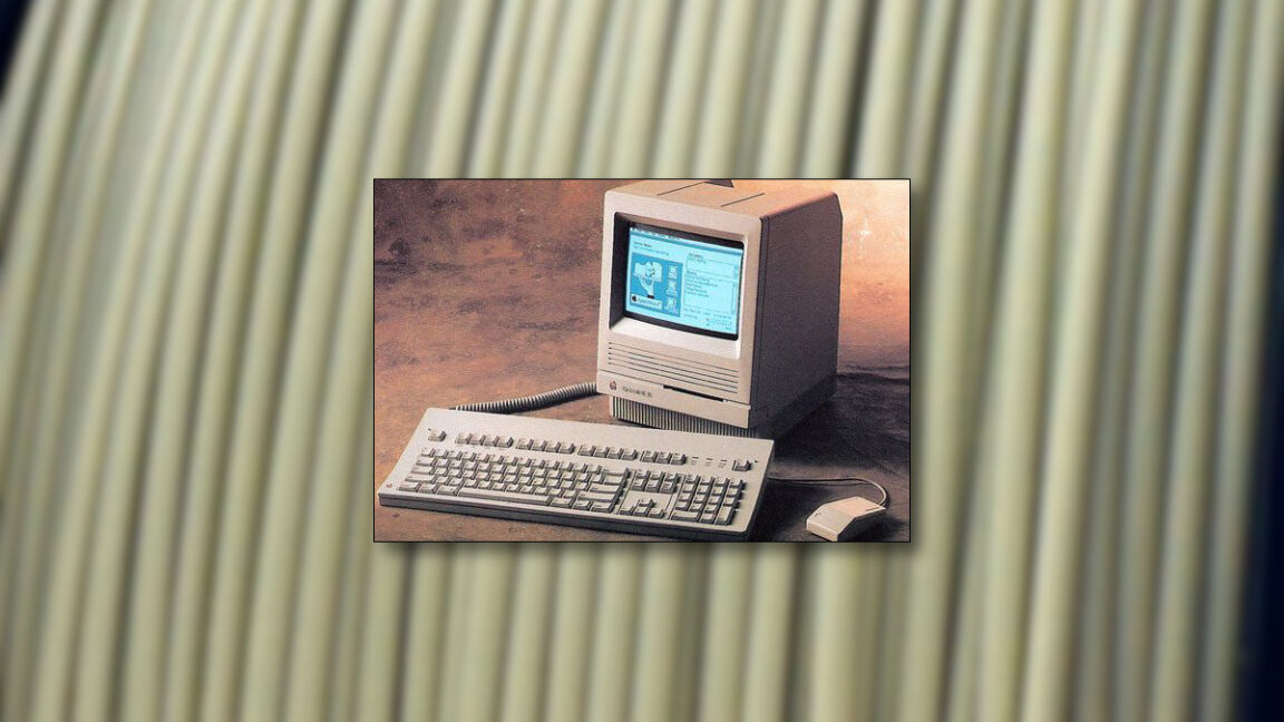
    The Mac SE, released in 1987, was one of many classic Macs to use the "Platinum" color scheme.

    Credit:

    Apple / Polar Filament

    The Mac SE, released in 1987, was one of many classic Macs to use the "Platinum" color scheme.

    Credit:

    Apple / Polar Filament

    Story text

    Size

    Small
    Standard
    Large

    Width
    *

    Standard
    Wide

    Links

    Standard
    Orange

    * Subscribers only
      Learn more

    On Tuesday, classic computer collector Joe Strosnider announced the availability of a new 3D-printer filament that replicates the iconic "Platinum" color scheme used in classic Macintosh computers from the late 1980s through the 1990s. The PLA filamentallows hobbyists to 3D-print nostalgic novelties, replacement parts, and accessories that match the original color of vintage Apple computers.
    Hobbyists commonly feed this type of filament into commercial desktop 3D printers, which heat the plastic and extrude it in a computer-controlled way to fabricate new plastic parts.
    The Platinum color, which Apple used in its desktop and portable computer lines starting with the Apple IIgs in 1986, has become synonymous with a distinctive era of classic Macintosh aesthetic. Over time, original Macintosh plastics have become brittle and discolored with age, so matching the "original" color can be a somewhat challenging and subjective experience.

    A close-up of "Retro Platinum" PLA filament by Polar Filament.

    Credit:

    Polar Filament

    Strosnider, who runs a website about his extensive vintage computer collection in Ohio, worked for years to color-match the distinctive beige-gray hue of the Macintosh Platinum scheme, resulting in a spool of hobby-ready plastic by Polar Filament and priced at per kilogram.
    According to a forum post, Strosnider paid approximately to develop the color and purchase an initial 25-kilogram supply of the filament. Rather than keeping the formulation proprietary, he arranged for Polar Filament to make the color publicly available.
    "I paid them a fee to color match the speaker box from inside my Mac Color Classic," Strosnider wrote in a Tinkerdifferent forum post on Tuesday. "In exchange, I asked them to release the color to the public so anyone can use it."

    A spool of "Retro Platinum" PLA filament by Polar Filament.

    Credit:

    Polar Filament

    The development addresses a gap in the vintage computing community, where enthusiasts sometimes struggle to find appropriately colored materials for restoration projects and new accessories. The new filament is an attempt to replace previous options that were either expensive, required international shipping, or had consistency issues that Strosnider described as "chalky."
    The 1.75 mm filament works with standard 3D printers and is compatible with automated material systems used in some newer printer models. On Bluesky, Strosnider encouraged buyers to "order plenty, and let them know you want them to print it forever" to ensure continued production of the specialty color.
    Extruded nostalgia
    The timing of the filament's release coincides with growing interest in 3D-printed cases and accessories for vintage computer hardware. One example is the SE Mini desktop case, a project by "GutBomb" that transforms Macintosh SE and SE/30 logic boards into compact desktop computers that can connect to modern displays. The case, designed to be 3D-printed in multiple pieces and assembled, represents the type of project that benefits from color-accurate filament.

    A 3D-printed "SE Mini" desktop case that allows using a vintage compact Mac board in a new enclosure.

    Credit:

    Joe Strosnider

    The SE Mini case requires approximately half a spool of filament and takes a couple of days to print on consumer 3D printers. Users can outfit the case with modern components, such as Pico PSUs and BlueSCSI storage devices, while maintaining the classic Macintosh appearance.
    Why create new "retro" devices? Because it's fun, and it's a great way to merge technology's past with the benefits of recent tech developments. Projects like the Platinum PLA filament, the SE Mini case, and the dedication of hobbyists like Strosnider ensure that appreciation for Apple's computers of yore will continue for decades.

    Benj Edwards
    Senior AI Reporter

    Benj Edwards
    Senior AI Reporter

    Benj Edwards is Ars Technica's Senior AI Reporter and founder of the site's dedicated AI beat in 2022. He's also a tech historian with almost two decades of experience. In his free time, he writes and records music, collects vintage computers, and enjoys nature. He lives in Raleigh, NC.

    3 Comments
    #endangered #classic #mac #plastic #color
    Endangered classic Mac plastic color returns as 3D-printer filament
    The color of nostalgia Endangered classic Mac plastic color returns as 3D-printer filament Mac fan paid to color-match iconic Apple beige-gray "Platinum" plastic for everyone. Benj Edwards – Jun 4, 2025 6:13 pm | 3 The Mac SE, released in 1987, was one of many classic Macs to use the "Platinum" color scheme. Credit: Apple / Polar Filament The Mac SE, released in 1987, was one of many classic Macs to use the "Platinum" color scheme. Credit: Apple / Polar Filament Story text Size Small Standard Large Width * Standard Wide Links Standard Orange * Subscribers only   Learn more On Tuesday, classic computer collector Joe Strosnider announced the availability of a new 3D-printer filament that replicates the iconic "Platinum" color scheme used in classic Macintosh computers from the late 1980s through the 1990s. The PLA filamentallows hobbyists to 3D-print nostalgic novelties, replacement parts, and accessories that match the original color of vintage Apple computers. Hobbyists commonly feed this type of filament into commercial desktop 3D printers, which heat the plastic and extrude it in a computer-controlled way to fabricate new plastic parts. The Platinum color, which Apple used in its desktop and portable computer lines starting with the Apple IIgs in 1986, has become synonymous with a distinctive era of classic Macintosh aesthetic. Over time, original Macintosh plastics have become brittle and discolored with age, so matching the "original" color can be a somewhat challenging and subjective experience. A close-up of "Retro Platinum" PLA filament by Polar Filament. Credit: Polar Filament Strosnider, who runs a website about his extensive vintage computer collection in Ohio, worked for years to color-match the distinctive beige-gray hue of the Macintosh Platinum scheme, resulting in a spool of hobby-ready plastic by Polar Filament and priced at per kilogram. According to a forum post, Strosnider paid approximately to develop the color and purchase an initial 25-kilogram supply of the filament. Rather than keeping the formulation proprietary, he arranged for Polar Filament to make the color publicly available. "I paid them a fee to color match the speaker box from inside my Mac Color Classic," Strosnider wrote in a Tinkerdifferent forum post on Tuesday. "In exchange, I asked them to release the color to the public so anyone can use it." A spool of "Retro Platinum" PLA filament by Polar Filament. Credit: Polar Filament The development addresses a gap in the vintage computing community, where enthusiasts sometimes struggle to find appropriately colored materials for restoration projects and new accessories. The new filament is an attempt to replace previous options that were either expensive, required international shipping, or had consistency issues that Strosnider described as "chalky." The 1.75 mm filament works with standard 3D printers and is compatible with automated material systems used in some newer printer models. On Bluesky, Strosnider encouraged buyers to "order plenty, and let them know you want them to print it forever" to ensure continued production of the specialty color. Extruded nostalgia The timing of the filament's release coincides with growing interest in 3D-printed cases and accessories for vintage computer hardware. One example is the SE Mini desktop case, a project by "GutBomb" that transforms Macintosh SE and SE/30 logic boards into compact desktop computers that can connect to modern displays. The case, designed to be 3D-printed in multiple pieces and assembled, represents the type of project that benefits from color-accurate filament. A 3D-printed "SE Mini" desktop case that allows using a vintage compact Mac board in a new enclosure. Credit: Joe Strosnider The SE Mini case requires approximately half a spool of filament and takes a couple of days to print on consumer 3D printers. Users can outfit the case with modern components, such as Pico PSUs and BlueSCSI storage devices, while maintaining the classic Macintosh appearance. Why create new "retro" devices? Because it's fun, and it's a great way to merge technology's past with the benefits of recent tech developments. Projects like the Platinum PLA filament, the SE Mini case, and the dedication of hobbyists like Strosnider ensure that appreciation for Apple's computers of yore will continue for decades. Benj Edwards Senior AI Reporter Benj Edwards Senior AI Reporter Benj Edwards is Ars Technica's Senior AI Reporter and founder of the site's dedicated AI beat in 2022. He's also a tech historian with almost two decades of experience. In his free time, he writes and records music, collects vintage computers, and enjoys nature. He lives in Raleigh, NC. 3 Comments #endangered #classic #mac #plastic #color
    ARSTECHNICA.COM
    Endangered classic Mac plastic color returns as 3D-printer filament
    The color of nostalgia Endangered classic Mac plastic color returns as 3D-printer filament Mac fan paid $900 to color-match iconic Apple beige-gray "Platinum" plastic for everyone. Benj Edwards – Jun 4, 2025 6:13 pm | 3 The Mac SE, released in 1987, was one of many classic Macs to use the "Platinum" color scheme. Credit: Apple / Polar Filament The Mac SE, released in 1987, was one of many classic Macs to use the "Platinum" color scheme. Credit: Apple / Polar Filament Story text Size Small Standard Large Width * Standard Wide Links Standard Orange * Subscribers only   Learn more On Tuesday, classic computer collector Joe Strosnider announced the availability of a new 3D-printer filament that replicates the iconic "Platinum" color scheme used in classic Macintosh computers from the late 1980s through the 1990s. The PLA filament (PLA is short for polylactic acid) allows hobbyists to 3D-print nostalgic novelties, replacement parts, and accessories that match the original color of vintage Apple computers. Hobbyists commonly feed this type of filament into commercial desktop 3D printers, which heat the plastic and extrude it in a computer-controlled way to fabricate new plastic parts. The Platinum color, which Apple used in its desktop and portable computer lines starting with the Apple IIgs in 1986, has become synonymous with a distinctive era of classic Macintosh aesthetic. Over time, original Macintosh plastics have become brittle and discolored with age, so matching the "original" color can be a somewhat challenging and subjective experience. A close-up of "Retro Platinum" PLA filament by Polar Filament. Credit: Polar Filament Strosnider, who runs a website about his extensive vintage computer collection in Ohio, worked for years to color-match the distinctive beige-gray hue of the Macintosh Platinum scheme, resulting in a spool of hobby-ready plastic by Polar Filament and priced at $21.99 per kilogram. According to a forum post, Strosnider paid approximately $900 to develop the color and purchase an initial 25-kilogram supply of the filament. Rather than keeping the formulation proprietary, he arranged for Polar Filament to make the color publicly available. "I paid them a fee to color match the speaker box from inside my Mac Color Classic," Strosnider wrote in a Tinkerdifferent forum post on Tuesday. "In exchange, I asked them to release the color to the public so anyone can use it." A spool of "Retro Platinum" PLA filament by Polar Filament. Credit: Polar Filament The development addresses a gap in the vintage computing community, where enthusiasts sometimes struggle to find appropriately colored materials for restoration projects and new accessories. The new filament is an attempt to replace previous options that were either expensive, required international shipping, or had consistency issues that Strosnider described as "chalky." The 1.75 mm filament works with standard 3D printers and is compatible with automated material systems used in some newer printer models. On Bluesky, Strosnider encouraged buyers to "order plenty, and let them know you want them to print it forever" to ensure continued production of the specialty color. Extruded nostalgia The timing of the filament's release coincides with growing interest in 3D-printed cases and accessories for vintage computer hardware. One example is the SE Mini desktop case, a project by "GutBomb" that transforms Macintosh SE and SE/30 logic boards into compact desktop computers that can connect to modern displays. The case, designed to be 3D-printed in multiple pieces and assembled, represents the type of project that benefits from color-accurate filament. A 3D-printed "SE Mini" desktop case that allows using a vintage compact Mac board in a new enclosure. Credit: Joe Strosnider The SE Mini case requires approximately half a spool of filament and takes a couple of days to print on consumer 3D printers. Users can outfit the case with modern components, such as Pico PSUs and BlueSCSI storage devices, while maintaining the classic Macintosh appearance. Why create new "retro" devices? Because it's fun, and it's a great way to merge technology's past with the benefits of recent tech developments. Projects like the Platinum PLA filament, the SE Mini case, and the dedication of hobbyists like Strosnider ensure that appreciation for Apple's computers of yore will continue for decades. Benj Edwards Senior AI Reporter Benj Edwards Senior AI Reporter Benj Edwards is Ars Technica's Senior AI Reporter and founder of the site's dedicated AI beat in 2022. He's also a tech historian with almost two decades of experience. In his free time, he writes and records music, collects vintage computers, and enjoys nature. He lives in Raleigh, NC. 3 Comments
    Like
    Love
    Wow
    Sad
    Angry
    249
    0 Комментарии 0 Поделились
  • Nintendo Switch 2 Accessories – Everything You Need to Know

    Any time a new console launches, it goes without saying that the actual hardware itself and the games that it is releasing with are always the top priorities for early adopters, but for a great number of the people who are hopping aboard that early, instant pickups of accessories are also usually high on that list. The Nintendo Switch 2’s release is right around the corner, and as you would expect, upon its release, a number of different accessories will also become available to allow players to optimize, customize, and supplement their Nintendo Switch 2 experience in a variety of ways. With the console’s release right around the corner, here, we’re going to talk about a few Switch 2 accessories that will be available alongside its release, and everything that you should know about them.
    NINTENDO SWITCH 2 PRO CONTROLLER – Same as with the Switch 1, Nintendo will also offer a Pro Controller with the Switch 2, an option that many are likely to make use of. For the most part, you can expect the Switch 2 Pro Controller to be similar to the Switch 1 Pro Controller, though as you’d expect, Nintendo will offer a few upgrades and enhancements with the controller’s new version. Similar to the jump from the Switch 1 to the Switch 2 itself, you can expect iterative changes between the two controllers. Let’s talk about those…
    NINTENDO SWITCH 2 PRO CONTROLLER – NEW FEATURES
    On top of everything that you’d expect from its previous version, the Switch 2 controller will also come with its own set of new features, including GL and GR buttons on the back that you’ll be able to map different actions and inputs to, the improved HD Rumble 2, the GameChat-tied C Button, and a 3.5 mm audio jack so you can directly plug in headsets.
    JOYCON 2 CONTROLLERS AND STRAPS – In case you want to have additional JoyCon 2 pairs available for multiplayer gameplay. they will be available to pick up. For now, Nintendo has only one colour combo available for JoyCon 2 controllers. They will be sold with straps, though straps are purchasable separately as well.
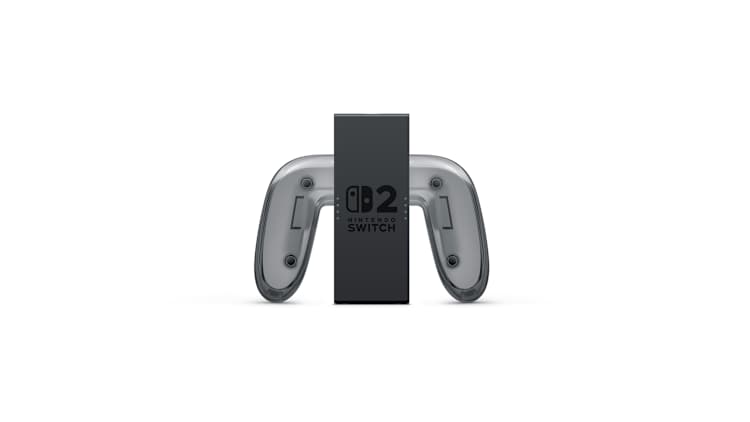
    JOYCON 2 CHARGING GRIP – Much like the original Switch, you can buy a separate JoyCon charging grip for your JoyCon 2 controllers, too, in case you want to be able to play with them while charging them. And much like the regular, non-charging capable JoyCon 2 grip that comes with the Switch 2 console out of the box, this grip will also have the extra GL and GR paddle buttons for players to be able to map any button or action to, and save a profile for on a per-game basis.
    JOYCON 2 WHEEL – Nintendo has something of a tradition of offering steering wheel controllers with its consoles, and that will continue with the Switch 2. JoyCon 2 steering wheels are also available, and each purchase comes with two sets- a red and a blue, same as JoyCon 2 controllers. With Mario Kart World being the big Switch 2 launch title, many will presumably be picking up the steering wheel accessory.
    NINTENDO SWITCH 2 CAMERA – One of the big signature features for the Switch 2, at least from Nintendo’s perspective, is Game Chat, the built in voice and video chat platform that will be offered to Switch 2 owners as part of a Nintendo Switch Online subscription. Obviously, the whole video chat aspect of that only makes sense with a camera, and since the Switch 2 doesn’t come with a camera built in, you can buy one separately if this is something that appeals to you. The good thing is that it seems like, at least initially, Nintendo plans to support this accessory in a fair few games too. Mario Kart World will support it right at launch, and Super Mario Party Jamboree is getting an updated native Switch 2 release to support it as well. So you should be able to get some good use out of it, if you do get it.
    HORI’S PIRANHA PLANT CAMERA FOR NINTENDO SWITCH 2 – If you want a different, whackier version of the Switch 2 Camera, an officially licensed third party option is available courtesy of Hori, which is selling a Piranha Plant Camera for the console. As its name suggests, the accessory is a Switch 2 Camera that comes in the shape of Super Mario’s iconic Piranha Plant.
    GAMECUBE CONTROLLER – The Nintendo Switch Online subscription will offer a brand new library of retro games on the Switch 2, with GameCube titles finally set to be added. The fan favorite console has been requested for retro compatibility on Nintendo consoles for what feels like forever now, so it’s great to see it finally happening here. Much like was the case for other home consoles added to Nintendo Switch Online, Nintendo will offer authentic recreations of GameCube controllers that subscribers can buy and use, if they want to really kick up their nostalgia into next gear. This controller will, like every other Switch 2 controller, include the C button on it. Confusingly enough, this GameCube controller will be totally separate from the GameCube controllers Nintendo has been selling for the last decade for Smash players; those, presumably, can still be used with these GameCube games, although they do lack this controller’s wireless functionality or C button.
    NINTENDO SWITCH 2 DOCK – The Switch 2 will obviously come with a dock right out the box, but if you do need an additional or a spare, you will be able to purchase individual Switch 2 docks, just like with the Switch 1. And though this should really go without saying, do keep in mind that Switch 1 docks won’t work with the Switch 2, and vice versa.
    CARRYING CASES

    Carrying cases are something of a necessity with portable consoles for a great many people, and yes, official first party options are available with the Switch 2 as well. A first party carry case and screen protector are being sold by Nintendo, as is a larger All-in-one carrying case that will also let you carry a dock cables, controllers, and cards all together. Of course, plenty of third party carry cases and screen protector options are also available.
    SAMSUNG MICROSD EXPRESS CARD – 256 GB FOR NINTENDO SWITCH 2 – The Switch 2, much like every other current generation machine on the market, comes with a built in SSD for its internal storage, to allow for quicker game streaming and loading times. But, much like on other systems, this poses a unique dilemma when it comes to expanding the storage space available- in fact, the problem is more pronounced for the Switch 2 because as a hybrid console, it can’t really rely on large SSD enclosures. The answer lies in its support for MicroSD Express cards- the “express” part of the name is important, because these cards read and write data incredibly fast, at speeds comparable to a solid state drive. These cards are the only microSD cards that will work on a Switch 2- the regular ones can be used to transfer or store screenshots and videos, but other than that, you need a microSD Express card. Currently, these cost a fair bit, but since this is a market standard format, hopefully the prices will go down very quickly over time.
    NINTENDO SWITCH ACCESSORIES COMPATIBILITY
    The most important point to keep in mind for Switch 2 accessories, arguably, is this one- every single Switch accessory and controller you already own is compatible and supported on the Switch 2. There are some obvious exceptions where those have been necessary- as mentioned, regular microSD cards won’t work on Switch 2 beyond in a very limited capacity, and obviously you cannot use you existing Switch 1 carrying cases or screen protectors for your much larger Switch 2. But those obvious exceptions aside, everything works on the Switch 2, other than when you need to use specific features that weren’t available with the Switch1. So, for instance, while your old Switch 1 JoyCons will work with the Switch 2,, you won’t be able to use any C button related features, since, well, there is no C button for you to use. Similarly, you can continue using your Switch 1 Pro Controller with the Switch 2, but you won’t be able to use it to power on your console. So if you’re not really in the mood to spend a lot of money on getting these accessories, which, let’s face it, are going to be pricey- well, you don’t have to. Most of your existing stuff will work just fine, with some caveats.
    #nintendo #switch #accessories #everything #you
    Nintendo Switch 2 Accessories – Everything You Need to Know
    Any time a new console launches, it goes without saying that the actual hardware itself and the games that it is releasing with are always the top priorities for early adopters, but for a great number of the people who are hopping aboard that early, instant pickups of accessories are also usually high on that list. The Nintendo Switch 2’s release is right around the corner, and as you would expect, upon its release, a number of different accessories will also become available to allow players to optimize, customize, and supplement their Nintendo Switch 2 experience in a variety of ways. With the console’s release right around the corner, here, we’re going to talk about a few Switch 2 accessories that will be available alongside its release, and everything that you should know about them. NINTENDO SWITCH 2 PRO CONTROLLER – Same as with the Switch 1, Nintendo will also offer a Pro Controller with the Switch 2, an option that many are likely to make use of. For the most part, you can expect the Switch 2 Pro Controller to be similar to the Switch 1 Pro Controller, though as you’d expect, Nintendo will offer a few upgrades and enhancements with the controller’s new version. Similar to the jump from the Switch 1 to the Switch 2 itself, you can expect iterative changes between the two controllers. Let’s talk about those… NINTENDO SWITCH 2 PRO CONTROLLER – NEW FEATURES On top of everything that you’d expect from its previous version, the Switch 2 controller will also come with its own set of new features, including GL and GR buttons on the back that you’ll be able to map different actions and inputs to, the improved HD Rumble 2, the GameChat-tied C Button, and a 3.5 mm audio jack so you can directly plug in headsets. JOYCON 2 CONTROLLERS AND STRAPS – In case you want to have additional JoyCon 2 pairs available for multiplayer gameplay. they will be available to pick up. For now, Nintendo has only one colour combo available for JoyCon 2 controllers. They will be sold with straps, though straps are purchasable separately as well. JOYCON 2 CHARGING GRIP – Much like the original Switch, you can buy a separate JoyCon charging grip for your JoyCon 2 controllers, too, in case you want to be able to play with them while charging them. And much like the regular, non-charging capable JoyCon 2 grip that comes with the Switch 2 console out of the box, this grip will also have the extra GL and GR paddle buttons for players to be able to map any button or action to, and save a profile for on a per-game basis. JOYCON 2 WHEEL – Nintendo has something of a tradition of offering steering wheel controllers with its consoles, and that will continue with the Switch 2. JoyCon 2 steering wheels are also available, and each purchase comes with two sets- a red and a blue, same as JoyCon 2 controllers. With Mario Kart World being the big Switch 2 launch title, many will presumably be picking up the steering wheel accessory. NINTENDO SWITCH 2 CAMERA – One of the big signature features for the Switch 2, at least from Nintendo’s perspective, is Game Chat, the built in voice and video chat platform that will be offered to Switch 2 owners as part of a Nintendo Switch Online subscription. Obviously, the whole video chat aspect of that only makes sense with a camera, and since the Switch 2 doesn’t come with a camera built in, you can buy one separately if this is something that appeals to you. The good thing is that it seems like, at least initially, Nintendo plans to support this accessory in a fair few games too. Mario Kart World will support it right at launch, and Super Mario Party Jamboree is getting an updated native Switch 2 release to support it as well. So you should be able to get some good use out of it, if you do get it. HORI’S PIRANHA PLANT CAMERA FOR NINTENDO SWITCH 2 – If you want a different, whackier version of the Switch 2 Camera, an officially licensed third party option is available courtesy of Hori, which is selling a Piranha Plant Camera for the console. As its name suggests, the accessory is a Switch 2 Camera that comes in the shape of Super Mario’s iconic Piranha Plant. GAMECUBE CONTROLLER – The Nintendo Switch Online subscription will offer a brand new library of retro games on the Switch 2, with GameCube titles finally set to be added. The fan favorite console has been requested for retro compatibility on Nintendo consoles for what feels like forever now, so it’s great to see it finally happening here. Much like was the case for other home consoles added to Nintendo Switch Online, Nintendo will offer authentic recreations of GameCube controllers that subscribers can buy and use, if they want to really kick up their nostalgia into next gear. This controller will, like every other Switch 2 controller, include the C button on it. Confusingly enough, this GameCube controller will be totally separate from the GameCube controllers Nintendo has been selling for the last decade for Smash players; those, presumably, can still be used with these GameCube games, although they do lack this controller’s wireless functionality or C button. NINTENDO SWITCH 2 DOCK – The Switch 2 will obviously come with a dock right out the box, but if you do need an additional or a spare, you will be able to purchase individual Switch 2 docks, just like with the Switch 1. And though this should really go without saying, do keep in mind that Switch 1 docks won’t work with the Switch 2, and vice versa. CARRYING CASES Carrying cases are something of a necessity with portable consoles for a great many people, and yes, official first party options are available with the Switch 2 as well. A first party carry case and screen protector are being sold by Nintendo, as is a larger All-in-one carrying case that will also let you carry a dock cables, controllers, and cards all together. Of course, plenty of third party carry cases and screen protector options are also available. SAMSUNG MICROSD EXPRESS CARD – 256 GB FOR NINTENDO SWITCH 2 – The Switch 2, much like every other current generation machine on the market, comes with a built in SSD for its internal storage, to allow for quicker game streaming and loading times. But, much like on other systems, this poses a unique dilemma when it comes to expanding the storage space available- in fact, the problem is more pronounced for the Switch 2 because as a hybrid console, it can’t really rely on large SSD enclosures. The answer lies in its support for MicroSD Express cards- the “express” part of the name is important, because these cards read and write data incredibly fast, at speeds comparable to a solid state drive. These cards are the only microSD cards that will work on a Switch 2- the regular ones can be used to transfer or store screenshots and videos, but other than that, you need a microSD Express card. Currently, these cost a fair bit, but since this is a market standard format, hopefully the prices will go down very quickly over time. NINTENDO SWITCH ACCESSORIES COMPATIBILITY The most important point to keep in mind for Switch 2 accessories, arguably, is this one- every single Switch accessory and controller you already own is compatible and supported on the Switch 2. There are some obvious exceptions where those have been necessary- as mentioned, regular microSD cards won’t work on Switch 2 beyond in a very limited capacity, and obviously you cannot use you existing Switch 1 carrying cases or screen protectors for your much larger Switch 2. But those obvious exceptions aside, everything works on the Switch 2, other than when you need to use specific features that weren’t available with the Switch1. So, for instance, while your old Switch 1 JoyCons will work with the Switch 2,, you won’t be able to use any C button related features, since, well, there is no C button for you to use. Similarly, you can continue using your Switch 1 Pro Controller with the Switch 2, but you won’t be able to use it to power on your console. So if you’re not really in the mood to spend a lot of money on getting these accessories, which, let’s face it, are going to be pricey- well, you don’t have to. Most of your existing stuff will work just fine, with some caveats. #nintendo #switch #accessories #everything #you
    GAMINGBOLT.COM
    Nintendo Switch 2 Accessories – Everything You Need to Know
    Any time a new console launches, it goes without saying that the actual hardware itself and the games that it is releasing with are always the top priorities for early adopters, but for a great number of the people who are hopping aboard that early, instant pickups of accessories are also usually high on that list. The Nintendo Switch 2’s release is right around the corner, and as you would expect, upon its release, a number of different accessories will also become available to allow players to optimize, customize, and supplement their Nintendo Switch 2 experience in a variety of ways. With the console’s release right around the corner, here, we’re going to talk about a few Switch 2 accessories that will be available alongside its release, and everything that you should know about them. NINTENDO SWITCH 2 PRO CONTROLLER – $84.99 Same as with the Switch 1 (and the Wii and the Wii U), Nintendo will also offer a Pro Controller with the Switch 2, an option that many are likely to make use of. For the most part, you can expect the Switch 2 Pro Controller to be similar to the Switch 1 Pro Controller, though as you’d expect, Nintendo will offer a few upgrades and enhancements with the controller’s new version. Similar to the jump from the Switch 1 to the Switch 2 itself, you can expect iterative changes between the two controllers. Let’s talk about those… NINTENDO SWITCH 2 PRO CONTROLLER – NEW FEATURES On top of everything that you’d expect from its previous version, the Switch 2 controller will also come with its own set of new features, including GL and GR buttons on the back that you’ll be able to map different actions and inputs to, the improved HD Rumble 2, the GameChat-tied C Button, and a 3.5 mm audio jack so you can directly plug in headsets. JOYCON 2 CONTROLLERS AND STRAPS – $13.99 In case you want to have additional JoyCon 2 pairs available for multiplayer gameplay (or as backups in case your main pair stops working, even though Nintendo is promising hardier JoyCons this time around- but you never know). they will be available to pick up. For now, Nintendo has only one colour combo available for JoyCon 2 controllers. They will be sold with straps, though straps are purchasable separately as well. JOYCON 2 CHARGING GRIP – $39.99 Much like the original Switch, you can buy a separate JoyCon charging grip for your JoyCon 2 controllers, too, in case you want to be able to play with them while charging them. And much like the regular, non-charging capable JoyCon 2 grip that comes with the Switch 2 console out of the box, this grip will also have the extra GL and GR paddle buttons for players to be able to map any button or action to, and save a profile for on a per-game basis. JOYCON 2 WHEEL – $24.99 Nintendo has something of a tradition of offering steering wheel controllers with its consoles, and that will continue with the Switch 2. JoyCon 2 steering wheels are also available, and each purchase comes with two sets- a red and a blue, same as JoyCon 2 controllers. With Mario Kart World being the big Switch 2 launch title, many will presumably be picking up the steering wheel accessory (though it will of course work with other racing games as well). NINTENDO SWITCH 2 CAMERA – $54.99 One of the big signature features for the Switch 2, at least from Nintendo’s perspective, is Game Chat, the built in voice and video chat platform that will be offered to Switch 2 owners as part of a Nintendo Switch Online subscription. Obviously, the whole video chat aspect of that only makes sense with a camera, and since the Switch 2 doesn’t come with a camera built in, you can buy one separately if this is something that appeals to you. The good thing is that it seems like, at least initially, Nintendo plans to support this accessory in a fair few games too. Mario Kart World will support it right at launch, and Super Mario Party Jamboree is getting an updated native Switch 2 release to support it as well. So you should be able to get some good use out of it, if you do get it. HORI’S PIRANHA PLANT CAMERA FOR NINTENDO SWITCH 2 – $59.99 If you want a different, whackier version of the Switch 2 Camera, an officially licensed third party option is available courtesy of Hori, which is selling a Piranha Plant Camera for the console. As its name suggests, the accessory is a Switch 2 Camera that comes in the shape of Super Mario’s iconic Piranha Plant. GAMECUBE CONTROLLER – $64.99 The Nintendo Switch Online subscription will offer a brand new library of retro games on the Switch 2, with GameCube titles finally set to be added. The fan favorite console has been requested for retro compatibility on Nintendo consoles for what feels like forever now, so it’s great to see it finally happening here. Much like was the case for other home consoles added to Nintendo Switch Online, Nintendo will offer authentic recreations of GameCube controllers that subscribers can buy and use, if they want to really kick up their nostalgia into next gear. This controller will, like every other Switch 2 controller, include the C button on it. Confusingly enough, this GameCube controller will be totally separate from the GameCube controllers Nintendo has been selling for the last decade for Smash players; those, presumably, can still be used with these GameCube games, although they do lack this controller’s wireless functionality or C button. NINTENDO SWITCH 2 DOCK – $119.99 The Switch 2 will obviously come with a dock right out the box, but if you do need an additional or a spare (or, you know, a replacement in the worst case scenario), you will be able to purchase individual Switch 2 docks, just like with the Switch 1. And though this should really go without saying, do keep in mind that Switch 1 docks won’t work with the Switch 2, and vice versa. CARRYING CASES Carrying cases are something of a necessity with portable consoles for a great many people, and yes, official first party options are available with the Switch 2 as well. A first party carry case and screen protector are being sold by Nintendo, as is a larger All-in-one carrying case that will also let you carry a dock cables, controllers, and cards all together. Of course, plenty of third party carry cases and screen protector options are also available. SAMSUNG MICROSD EXPRESS CARD – 256 GB FOR NINTENDO SWITCH 2 – $59.99 The Switch 2, much like every other current generation machine on the market, comes with a built in SSD for its internal storage, to allow for quicker game streaming and loading times. But, much like on other systems, this poses a unique dilemma when it comes to expanding the storage space available- in fact, the problem is more pronounced for the Switch 2 because as a hybrid console, it can’t really rely on large SSD enclosures. The answer lies in its support for MicroSD Express cards- the “express” part of the name is important, because these cards read and write data incredibly fast, at speeds comparable to a solid state drive. These cards are the only microSD cards that will work on a Switch 2- the regular ones can be used to transfer or store screenshots and videos, but other than that, you need a microSD Express card. Currently, these cost a fair bit, but since this is a market standard format, hopefully the prices will go down very quickly over time. NINTENDO SWITCH ACCESSORIES COMPATIBILITY The most important point to keep in mind for Switch 2 accessories, arguably, is this one- every single Switch accessory and controller you already own is compatible and supported on the Switch 2. There are some obvious exceptions where those have been necessary- as mentioned, regular microSD cards won’t work on Switch 2 beyond in a very limited capacity, and obviously you cannot use you existing Switch 1 carrying cases or screen protectors for your much larger Switch 2. But those obvious exceptions aside, everything works on the Switch 2, other than when you need to use specific features that weren’t available with the Switch1. So, for instance, while your old Switch 1 JoyCons will work with the Switch 2,, you won’t be able to use any C button related features, since, well, there is no C button for you to use. Similarly, you can continue using your Switch 1 Pro Controller with the Switch 2, but you won’t be able to use it to power on your console. So if you’re not really in the mood to spend a lot of money on getting these accessories, which, let’s face it, are going to be pricey- well, you don’t have to. Most of your existing stuff will work just fine, with some caveats.
    Like
    Love
    Wow
    Sad
    Angry
    210
    3 Комментарии 0 Поделились
  • Laptop USB-C Ports Are Not Created Equal. Microsoft Wants to Change That

    The USB-C port on today’s laptops can connect to accessories, transmit power to your PC, and even support an extra display. The only problem? Not every USB-C port will necessarily support data, power, or an additional display. Microsoft is trying to change that by enforcing new standards for PC vendors. In a blog post, the company revealed that many users have been encountering USB-C inconsistency issues in laptops built with USB4, the latest version of the interface.  “Windows Diagnostics Data shows that 27% of PCs with USB4 have encountered a limited functionality notification, meaning that a customer plugged a USB-C device in, but a featurethat device needs was not implemented on the PC and Windows notified the user,” wrote Ugan Sivagnanenthirarajah, a technical product manager at Microsoft. That’s a problem, especially if the consumer expects that a USB-C port will support everything, including charging, data, and displays. Sivagnanenthirarajah mentions a case where the user plugged in an external display into a laptop’s USB-C port only to wonder why it didn’t work. “PC manufacturers can implement ports that look identical but differ wildly in functionality,” he added. “One may charge your laptop and run a 4K display; another might only deliver USB 2.0 data speeds. The USB specification allows this, and without clear enforcement, the consumer experiences frustration, guesswork, and endless troubleshooting.”  Recommended by Our EditorsIn response, Microsoft is implementing a “minimum bar for USB-C port capabilities on PCs,” that’ll require them to support data, power charging, and a display through each connection. The company will enforce the requirement through Microsoft’s “Windows Hardware Compatibility Program,” which PC vendors can use to certify that their products have been designed to run the Windows OS. The goal is to turn optional features into mandatory ones, and “ensure a consistent level of performance you can count on,” Sivagnanenthirarajah said. “Your favorite USB 1, USB 2, and USB 3 peripherals, chargers, and displays will work exactly as advertised on any USB-C port on your WHCP-certified Windows 11 device,” he added.  Specifically, a USB-C port must offer USB Power Delivery charging and DisplayPort Alt-Mode. That said, the requirements permit each USB-C ports to differ in their data transfer speeds and display resolution support. In addition, Microsoft is enforcing a requirement for laptops that advertise USB4 40Gbps or 80Gbps ports. The same laptops “must “sustain full speed 40Gbps links on all USB-C ports,” the company says. The ports also need to offer full Thunderbolt 3 compatibility, support for up to two 4K monitors at 60Hz and feature “PCI Express tunnelling that allows external GPUs and NVMe enclosures to work seamlessly.”Still, the Windows Hardware Compatibility Program is both voluntary and not widely known among consumers. So it's unclear if PC vendors will commit to the requirements. Still, Microsoft’s blog post notes: “PC manufacturers are on track to achieve WHCP compliance across most systems in the coming years.”
    #laptop #usbc #ports #are #not
    Laptop USB-C Ports Are Not Created Equal. Microsoft Wants to Change That
    The USB-C port on today’s laptops can connect to accessories, transmit power to your PC, and even support an extra display. The only problem? Not every USB-C port will necessarily support data, power, or an additional display. Microsoft is trying to change that by enforcing new standards for PC vendors. In a blog post, the company revealed that many users have been encountering USB-C inconsistency issues in laptops built with USB4, the latest version of the interface.  “Windows Diagnostics Data shows that 27% of PCs with USB4 have encountered a limited functionality notification, meaning that a customer plugged a USB-C device in, but a featurethat device needs was not implemented on the PC and Windows notified the user,” wrote Ugan Sivagnanenthirarajah, a technical product manager at Microsoft. That’s a problem, especially if the consumer expects that a USB-C port will support everything, including charging, data, and displays. Sivagnanenthirarajah mentions a case where the user plugged in an external display into a laptop’s USB-C port only to wonder why it didn’t work. “PC manufacturers can implement ports that look identical but differ wildly in functionality,” he added. “One may charge your laptop and run a 4K display; another might only deliver USB 2.0 data speeds. The USB specification allows this, and without clear enforcement, the consumer experiences frustration, guesswork, and endless troubleshooting.”  Recommended by Our EditorsIn response, Microsoft is implementing a “minimum bar for USB-C port capabilities on PCs,” that’ll require them to support data, power charging, and a display through each connection. The company will enforce the requirement through Microsoft’s “Windows Hardware Compatibility Program,” which PC vendors can use to certify that their products have been designed to run the Windows OS. The goal is to turn optional features into mandatory ones, and “ensure a consistent level of performance you can count on,” Sivagnanenthirarajah said. “Your favorite USB 1, USB 2, and USB 3 peripherals, chargers, and displays will work exactly as advertised on any USB-C port on your WHCP-certified Windows 11 device,” he added.  Specifically, a USB-C port must offer USB Power Delivery charging and DisplayPort Alt-Mode. That said, the requirements permit each USB-C ports to differ in their data transfer speeds and display resolution support. In addition, Microsoft is enforcing a requirement for laptops that advertise USB4 40Gbps or 80Gbps ports. The same laptops “must “sustain full speed 40Gbps links on all USB-C ports,” the company says. The ports also need to offer full Thunderbolt 3 compatibility, support for up to two 4K monitors at 60Hz and feature “PCI Express tunnelling that allows external GPUs and NVMe enclosures to work seamlessly.”Still, the Windows Hardware Compatibility Program is both voluntary and not widely known among consumers. So it's unclear if PC vendors will commit to the requirements. Still, Microsoft’s blog post notes: “PC manufacturers are on track to achieve WHCP compliance across most systems in the coming years.” #laptop #usbc #ports #are #not
    ME.PCMAG.COM
    Laptop USB-C Ports Are Not Created Equal. Microsoft Wants to Change That
    The USB-C port on today’s laptops can connect to accessories, transmit power to your PC, and even support an extra display. The only problem? Not every USB-C port will necessarily support data, power, or an additional display. Microsoft is trying to change that by enforcing new standards for PC vendors. In a blog post, the company revealed that many users have been encountering USB-C inconsistency issues in laptops built with USB4, the latest version of the interface.  “Windows Diagnostics Data shows that 27% of PCs with USB4 have encountered a limited functionality notification, meaning that a customer plugged a USB-C device in, but a feature (alternate mode) that device needs was not implemented on the PC and Windows notified the user,” wrote Ugan Sivagnanenthirarajah, a technical product manager at Microsoft. That’s a problem, especially if the consumer expects that a USB-C port will support everything, including charging, data, and displays. Sivagnanenthirarajah mentions a case where the user plugged in an external display into a laptop’s USB-C port only to wonder why it didn’t work. “PC manufacturers can implement ports that look identical but differ wildly in functionality,” he added. “One may charge your laptop and run a 4K display; another might only deliver USB 2.0 data speeds. The USB specification allows this, and without clear enforcement, the consumer experiences frustration, guesswork, and endless troubleshooting.”  Recommended by Our EditorsIn response, Microsoft is implementing a “minimum bar for USB-C port capabilities on PCs,” that’ll require them to support data, power charging, and a display through each connection. The company will enforce the requirement through Microsoft’s “Windows Hardware Compatibility Program,” which PC vendors can use to certify that their products have been designed to run the Windows OS. (Credit: Microsoft)The goal is to turn optional features into mandatory ones, and “ensure a consistent level of performance you can count on,” Sivagnanenthirarajah said. “Your favorite USB 1, USB 2, and USB 3 peripherals, chargers, and displays will work exactly as advertised on any USB-C port on your WHCP-certified Windows 11 device,” he added.  Specifically, a USB-C port must offer USB Power Delivery charging and DisplayPort Alt-Mode. That said, the requirements permit each USB-C ports to differ in their data transfer speeds and display resolution support. In addition, Microsoft is enforcing a requirement for laptops that advertise USB4 40Gbps or 80Gbps ports. The same laptops “must “sustain full speed 40Gbps links on all USB-C ports,” the company says. The ports also need to offer full Thunderbolt 3 compatibility, support for up to two 4K monitors at 60Hz and feature “PCI Express tunnelling that allows external GPUs and NVMe enclosures to work seamlessly.”Still, the Windows Hardware Compatibility Program is both voluntary and not widely known among consumers. So it's unclear if PC vendors will commit to the requirements. Still, Microsoft’s blog post notes: “PC manufacturers are on track to achieve WHCP compliance across most systems in the coming years.”
    0 Комментарии 0 Поделились
  • Thrustmaster T598 + Hypercar Wheel review: a great value PC/PS5 sim racing wheel and pedals built on novel tech

    Thrustmaster T598 + Hypercar Wheel review: a great value PC/PS5 sim racing wheel and pedals built on novel tech
    Direct axial drive impresses, despite limited software and a firmly mid stock wheel.

    Image credit: Digital Foundry

    Review

    by Will Judd
    Deputy Editor, Digital Foundry

    Published on June 1, 2025

    We've seen an explosion in the number of affordable direct driveracing wheels over the past couple of years, with Fanatec and Moza offering increasingly inexpensive options that still deliver the precise, quick and long-lasting force feedback that cheaper gear- or belt-driven wheels can't match.
    Now, Thrustmaster is intruding on that territory with the T598, a PlayStation/PC direct drive wheel, wheel base and pedals that costs just £449/That's on a similar level to the PC-only £459/Moza R5 bundle and the €399/Fanatec CSL DD bundle, so how does the newcomer compare? And what's changed from the more expensive T818 we reviewed before?
    We've been testing the T598 - and the fancy upgraded HyperCar wheel that's available as an upgrade option - for weeks to find out. Our full review follows, so read on - or check out the quick links below to jump to what you're most interested in.

    To see this content please enable targeting cookies.

    Thrustmaster T598 wheel base review: direct axial drive vs traditional direct drive
    Interestingly, the T598 arguably comes with a more advanced DD motor than the more expensive T818 does. It uses a "direct axial drive" versus the standard "direct radial drive", where the magnets are aligned parallel to the wheel shaft rather than perpendicular. This ought to allow for more efficient torque generation, producing less waste heat, minimising precision-sapping magnetic interference and requiring less copper to produce. It also means the T598 can "overshoot" to deliver more than its rated 5nm of constant torque for short periods.
    However, this design also requires a physically taller yet slimmer enclosure, potentially blocking the view forward and requiring a different bolt pattern to attach the base to your desk or sim racing cockpit - both of which are slight annoyances with the T598.Interestingly, you can also feel a slight vibration and hear a quiet crackling noise emanating from the T598 base while idle - something I haven't heard or felt with other direct drive motors and is reportedly inherent to this design.

    There's a lot going on inside this wheel base - including some genuine innovation. | Image credit: Thrustmaster/Digital Foundry

    Thrustmaster has written a pair of white papers to explain why their take on direct driveis better than what came before. Image credit: Thrustmaster

    In terms of the force feedback itself, Thrustmaster have achieved something quite special here. In some titles with a good force feedback implementation - Assetto Corsa, Assetto Corsa Evo and F1 23 stood out to me here - the wheel feels great, with strong force feedback and plenty of detail. If you run up on a kerb or start to lose traction, you know about it right away and can take corrective action. I also appreciated the way that turning the wheel feels perfectly smooth when turning, without any cogging - the slightly jerky sensation common to low-end and mid-range direct drive motors that corresponds to slight attraction as you pass each magnet.
    However, balancing this, the wheel's force feedback feels a little less consistent than others I've tested from the likes of Fanatec or Moza at a similar price point, with some games like Project Cars 3 and Forza Motorsport feeling almost bereft of force feedback by comparison. You also have that slight vibration when the wheel is stationary, which is potentially more noticeable than the cogging sensation in traditional DD designs. The overshoot is also a mixed bag - as the sudden jump in torque can feel a little artificial in some scenarios, eg when you're warming your tyres by weaving in F1 before a safety car restart.
    I'd say that these positives and negatives largely cancel each other out, and you're left with force feedback that is good, way better than non-DD wheels, but not noticeably better than more common radial direct drive designs. Depending on the games you play, either DD style could be preferable. It'll be interesting to see if Thrustmaster are able to tune out some of these negative characteristics through firmware updates - or simply in later products using the same technology.

    1 of 7

    Caption

    Attribution

    Here's how the T598 looks IRL - from the wheel base itself to the default rim, the upgraded Hypercar wheel and the included dual pedals. Click to enlarge.

    Apart from the novel motor, the rest of the wheel base is fairly standard - there's a smalldisplay on the top for adjusting your settings and seeing in-game info like a rev counter, four large circular buttons buttons, the usual Thrustmaster quick release lock for securing your wheel rim and a small button on the back to turn the wheel base on and off. There are connection options for power, USB and connecting other components like pedals or shifters on the back too.
    Weirdly, there's no ability to change settings in the PC Thrustmaster Panel app - it just says this functionality is "coming soon!" - so right now you can only use it for updating firmware, testing buttons and changing between profiles.

    "Coming soon!" starts to become a little less believable six months after the first reviews hit. | Image credit: Digital Foundry

    Instead, you'll be using the built-in screen for making changes, which works well enough but doesn't provide any allowance for extra information - so you'll be sticking to the four basic pre-made profiles, referring to the manual or checking suggested setups online rather than reading built-in tool tips.
    You still get access to the full whack of settings here, and of course this works well for PS5/PS4 users who wouldn't expect a software experience anyway, but PC users may be disappointed to learn that there's no intuitive software interface here. I found the Boosted Media YT review of the wheelbase to offer some good insight into what settings you're likely to want to change from their default values.
    Thrustmaster T598 Sportcar wheel review: a workable default option

    The Sportcar wheel rim looks good - but a plastic construction and relatively spartan controls make it "OK" at best.

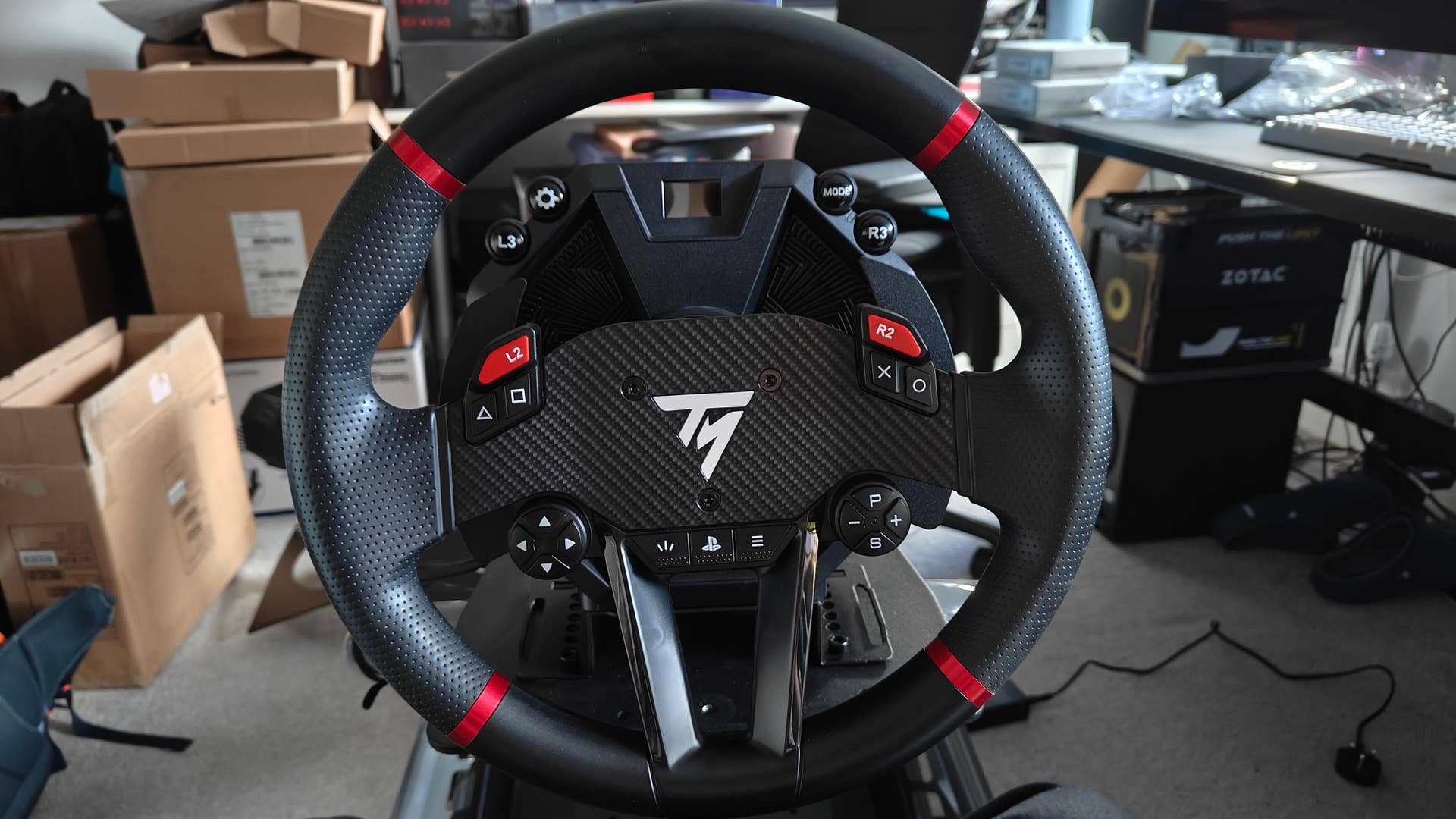
    The "Sportcar" wheel provided in the bundle is a little less impressive-looking than the base itself, with a plasticky feel throughout and fairly mushy buttons - though the paddles are snappy enough and feel good to use. The usual PS-style face buttons are split into two clumps up top with L2 and R2, which is a bit odd, with four individual directional buttons in the lower left, start/select/PS in the lower middle and four configuration buttons in the lower right.
    Those configuration buttons require extra explanation, so here we go: the P button at the top swaps between four different pages, indicated with a different colour LED, allowing the remaining three physical buttons to activate up to 12 different functions.There are no rotary encoders or other additional controls here, so PC players that prefer more complicated racing sims may feel a bit underserved by this clunky, cost-saving solution.
    The 815g wheel is at least sized reasonably, with 300mm circular shape that particularly suits drifting, rally and trucking - though all forms of driving and racing are of course possible. The rubber grips under your hands are reasonably comfortable, but you can still feel seams in various places. Overall, the wheel is possibly the weakest part of the package, but perfectly usable and acceptable for the price point.
    Thrustmaster Hypercar Wheel Add-On review: true luxury

    An incredible wheel with premium materials, excellent controls and a more specialised shape.

    Thrustmaster also sent over the £339/Hypercar wheel rim for testing, which is an upgrade option that uses significantly better materials - leather, alcantara, aluminium and carbon - and offers a huge number of extra controls. Its oval shape feels a bit more responsive for faster vehiclesthat require a quick change of direction, but drifting and rally doesn't feel natural. It supports the same PS4, PS5 and PC platforms as the stock option, but there are no legends printed on the buttons to help you.
    The difference in quality here is immediately apparent, with much better tactile feedback from the buttons and a huge number of additional controls for adjusting stuff like ERS deployment or brake bias. Each control feels well-placed, even if the T-shaped layout for the face buttons is slightly unnatural at first, and the paddles for shifting and the clutch are particularly well engineered. I also found holding the wheel a bit more comfortable thanks to that flattened out shape, the more premium materials and the absence of bumps or seams anywhere you're likely to hold.
    It's a huge upgrade in terms of feel and features then, as you'd hope for a wheel rim that costs nearly as much as the entire T598 kit and caboodle. As an upgrade option, I do rate it, though it perhaps makes slightly more sense for T818 owners that have already invested a bit more in the Thrusmaster ecosystem. Regardless, it was this rim that I used for the majority of my time with the T598, and the wheel base feels significantly better with the upgrade.
    Thrustmaster T598 Raceline pedals review: great feedback, but no clutch and no load cell upgrade offered at present

    Surprisingly good for two add-in pedals, in terms of feedback and flexibility.

    The pedals that come with the T598 are surprisingly good, with an accelerator, a brake pedaland no clutch pedal. Each pedal's spring assembly can be pushed into one of three positions to change the amount of pre-load - ie make it a bit softer or harder to press and the pedal plates can be shifted up and down. The narrow dimensions of the metal wheel plate meant that it was impossible to mount directly in the centre of the Playseat Trophy I used for testing, but the slightly off-centre installation I ended up with still worked just fine. They connect using a non-USB connection, so you can't use the pedals with other wheel bases.
    Using the middle distance setting and the firmer of the two springs for the brake, I found the T598 produced good results, on par or perhaps even a tad better than other metal-construction Hall Effect position sensorpedals I've tested such as the Moza SR-P Lite and Fanatec CSL. Braking is the critical point here, as you want to be able to feel when the brake has mechanically reached its threshold and then modulate your inputs from there, and the T598 pedals do allow for this quite easily. They're also not so hard to actuate that you end up having to hard-mount them to a sim rig for good results, and the included carpet spikes are reasonably effective in keeping the pedals in place.
    Presumably, it ought to be possible to add on a load cell brake pedal down the line to upgrade to a properthree pedal setup. For the F1 style driving that I prefer, the clutch pedal isn't used anyway, so it wasn't a massive issue for me - and we frequently see companies like Moza and Fanatec drop the clutch pedal on these aggessively priced bundles so Thrustmaster aren't losing ground by following suit.
    Thrustmaster T598 final verdict: a competitive £450 package with potential

    For PlayStation owners, this is an incredible value pickup that ranks among the cheapest DD options - and PC owners ought to consider it too.

    For £449/the Thrustmaster T598 is an excellent value direct drive wheel and pedal bundle for PlayStation and PC with some relatively minor quirks. The wheel base is powerful, detailed and responsive in most games, with some advantages over traditional DD designs but also some disadvantages - notably the taller shape and a slight hum/vibration while stationary. Traditional DD designs from the likes of Fanatec and Moza can offer more reliable force feedback that works over a wider range of games, cars and tracks, while also benefitting from better PC software, but there's certainly potential for Thrustmaster to improve here.
    The included wheel feels a bit cheap, with a predominantly plastic design, spongey buttons and a slightly odd layout, but the full circle shape and full PS5/PS4 compatibility is most welcome. Upgrading to the HyperCar wheel provides a huge uptick in materials, tactile feedback and number of controls, though this does come at a fairly steep price of £339/If you plan to use the T598 for years and have the budget for it, this is a super upgrade to aim for.
    The included Raceline LTE pedals are the most surprising element for me. These consist of only an accelerator and a brake with only moderate adjustability and a narrow base plate, but they feel great to use, are made from durable metal with HE sensors, and only really lose out to significantly more expensive load cell options. For an add-in for a relatively cheap DD bundle, they're a solid inclusion, and I hope Thrustmaster release a load cell brake pedal for users to upgrade to a better three-pedal setup later.
    Overall, it's an competitive first outing for Thrustmaster with the T598 and direct axial drive, and I'm curious to see where the company - and the tech - goes from here. With Fanatec still on the rebuild after being acquired by Corsair and Moza's offerings being hard to order online in some regions, Thrustmaster has a golden opportunity to seize a share of the mid-range and entry-level sim racing market, and the T598 is a positive start.
    #thrustmaster #t598 #hypercar #wheel #review
    Thrustmaster T598 + Hypercar Wheel review: a great value PC/PS5 sim racing wheel and pedals built on novel tech
    Thrustmaster T598 + Hypercar Wheel review: a great value PC/PS5 sim racing wheel and pedals built on novel tech Direct axial drive impresses, despite limited software and a firmly mid stock wheel. Image credit: Digital Foundry Review by Will Judd Deputy Editor, Digital Foundry Published on June 1, 2025 We've seen an explosion in the number of affordable direct driveracing wheels over the past couple of years, with Fanatec and Moza offering increasingly inexpensive options that still deliver the precise, quick and long-lasting force feedback that cheaper gear- or belt-driven wheels can't match. Now, Thrustmaster is intruding on that territory with the T598, a PlayStation/PC direct drive wheel, wheel base and pedals that costs just £449/That's on a similar level to the PC-only £459/Moza R5 bundle and the €399/Fanatec CSL DD bundle, so how does the newcomer compare? And what's changed from the more expensive T818 we reviewed before? We've been testing the T598 - and the fancy upgraded HyperCar wheel that's available as an upgrade option - for weeks to find out. Our full review follows, so read on - or check out the quick links below to jump to what you're most interested in. To see this content please enable targeting cookies. Thrustmaster T598 wheel base review: direct axial drive vs traditional direct drive Interestingly, the T598 arguably comes with a more advanced DD motor than the more expensive T818 does. It uses a "direct axial drive" versus the standard "direct radial drive", where the magnets are aligned parallel to the wheel shaft rather than perpendicular. This ought to allow for more efficient torque generation, producing less waste heat, minimising precision-sapping magnetic interference and requiring less copper to produce. It also means the T598 can "overshoot" to deliver more than its rated 5nm of constant torque for short periods. However, this design also requires a physically taller yet slimmer enclosure, potentially blocking the view forward and requiring a different bolt pattern to attach the base to your desk or sim racing cockpit - both of which are slight annoyances with the T598.Interestingly, you can also feel a slight vibration and hear a quiet crackling noise emanating from the T598 base while idle - something I haven't heard or felt with other direct drive motors and is reportedly inherent to this design. There's a lot going on inside this wheel base - including some genuine innovation. | Image credit: Thrustmaster/Digital Foundry Thrustmaster has written a pair of white papers to explain why their take on direct driveis better than what came before. Image credit: Thrustmaster In terms of the force feedback itself, Thrustmaster have achieved something quite special here. In some titles with a good force feedback implementation - Assetto Corsa, Assetto Corsa Evo and F1 23 stood out to me here - the wheel feels great, with strong force feedback and plenty of detail. If you run up on a kerb or start to lose traction, you know about it right away and can take corrective action. I also appreciated the way that turning the wheel feels perfectly smooth when turning, without any cogging - the slightly jerky sensation common to low-end and mid-range direct drive motors that corresponds to slight attraction as you pass each magnet. However, balancing this, the wheel's force feedback feels a little less consistent than others I've tested from the likes of Fanatec or Moza at a similar price point, with some games like Project Cars 3 and Forza Motorsport feeling almost bereft of force feedback by comparison. You also have that slight vibration when the wheel is stationary, which is potentially more noticeable than the cogging sensation in traditional DD designs. The overshoot is also a mixed bag - as the sudden jump in torque can feel a little artificial in some scenarios, eg when you're warming your tyres by weaving in F1 before a safety car restart. I'd say that these positives and negatives largely cancel each other out, and you're left with force feedback that is good, way better than non-DD wheels, but not noticeably better than more common radial direct drive designs. Depending on the games you play, either DD style could be preferable. It'll be interesting to see if Thrustmaster are able to tune out some of these negative characteristics through firmware updates - or simply in later products using the same technology. 1 of 7 Caption Attribution Here's how the T598 looks IRL - from the wheel base itself to the default rim, the upgraded Hypercar wheel and the included dual pedals. Click to enlarge. Apart from the novel motor, the rest of the wheel base is fairly standard - there's a smalldisplay on the top for adjusting your settings and seeing in-game info like a rev counter, four large circular buttons buttons, the usual Thrustmaster quick release lock for securing your wheel rim and a small button on the back to turn the wheel base on and off. There are connection options for power, USB and connecting other components like pedals or shifters on the back too. Weirdly, there's no ability to change settings in the PC Thrustmaster Panel app - it just says this functionality is "coming soon!" - so right now you can only use it for updating firmware, testing buttons and changing between profiles. "Coming soon!" starts to become a little less believable six months after the first reviews hit. | Image credit: Digital Foundry Instead, you'll be using the built-in screen for making changes, which works well enough but doesn't provide any allowance for extra information - so you'll be sticking to the four basic pre-made profiles, referring to the manual or checking suggested setups online rather than reading built-in tool tips. You still get access to the full whack of settings here, and of course this works well for PS5/PS4 users who wouldn't expect a software experience anyway, but PC users may be disappointed to learn that there's no intuitive software interface here. I found the Boosted Media YT review of the wheelbase to offer some good insight into what settings you're likely to want to change from their default values. Thrustmaster T598 Sportcar wheel review: a workable default option The Sportcar wheel rim looks good - but a plastic construction and relatively spartan controls make it "OK" at best. The "Sportcar" wheel provided in the bundle is a little less impressive-looking than the base itself, with a plasticky feel throughout and fairly mushy buttons - though the paddles are snappy enough and feel good to use. The usual PS-style face buttons are split into two clumps up top with L2 and R2, which is a bit odd, with four individual directional buttons in the lower left, start/select/PS in the lower middle and four configuration buttons in the lower right. Those configuration buttons require extra explanation, so here we go: the P button at the top swaps between four different pages, indicated with a different colour LED, allowing the remaining three physical buttons to activate up to 12 different functions.There are no rotary encoders or other additional controls here, so PC players that prefer more complicated racing sims may feel a bit underserved by this clunky, cost-saving solution. The 815g wheel is at least sized reasonably, with 300mm circular shape that particularly suits drifting, rally and trucking - though all forms of driving and racing are of course possible. The rubber grips under your hands are reasonably comfortable, but you can still feel seams in various places. Overall, the wheel is possibly the weakest part of the package, but perfectly usable and acceptable for the price point. Thrustmaster Hypercar Wheel Add-On review: true luxury An incredible wheel with premium materials, excellent controls and a more specialised shape. Thrustmaster also sent over the £339/Hypercar wheel rim for testing, which is an upgrade option that uses significantly better materials - leather, alcantara, aluminium and carbon - and offers a huge number of extra controls. Its oval shape feels a bit more responsive for faster vehiclesthat require a quick change of direction, but drifting and rally doesn't feel natural. It supports the same PS4, PS5 and PC platforms as the stock option, but there are no legends printed on the buttons to help you. The difference in quality here is immediately apparent, with much better tactile feedback from the buttons and a huge number of additional controls for adjusting stuff like ERS deployment or brake bias. Each control feels well-placed, even if the T-shaped layout for the face buttons is slightly unnatural at first, and the paddles for shifting and the clutch are particularly well engineered. I also found holding the wheel a bit more comfortable thanks to that flattened out shape, the more premium materials and the absence of bumps or seams anywhere you're likely to hold. It's a huge upgrade in terms of feel and features then, as you'd hope for a wheel rim that costs nearly as much as the entire T598 kit and caboodle. As an upgrade option, I do rate it, though it perhaps makes slightly more sense for T818 owners that have already invested a bit more in the Thrusmaster ecosystem. Regardless, it was this rim that I used for the majority of my time with the T598, and the wheel base feels significantly better with the upgrade. Thrustmaster T598 Raceline pedals review: great feedback, but no clutch and no load cell upgrade offered at present Surprisingly good for two add-in pedals, in terms of feedback and flexibility. The pedals that come with the T598 are surprisingly good, with an accelerator, a brake pedaland no clutch pedal. Each pedal's spring assembly can be pushed into one of three positions to change the amount of pre-load - ie make it a bit softer or harder to press and the pedal plates can be shifted up and down. The narrow dimensions of the metal wheel plate meant that it was impossible to mount directly in the centre of the Playseat Trophy I used for testing, but the slightly off-centre installation I ended up with still worked just fine. They connect using a non-USB connection, so you can't use the pedals with other wheel bases. Using the middle distance setting and the firmer of the two springs for the brake, I found the T598 produced good results, on par or perhaps even a tad better than other metal-construction Hall Effect position sensorpedals I've tested such as the Moza SR-P Lite and Fanatec CSL. Braking is the critical point here, as you want to be able to feel when the brake has mechanically reached its threshold and then modulate your inputs from there, and the T598 pedals do allow for this quite easily. They're also not so hard to actuate that you end up having to hard-mount them to a sim rig for good results, and the included carpet spikes are reasonably effective in keeping the pedals in place. Presumably, it ought to be possible to add on a load cell brake pedal down the line to upgrade to a properthree pedal setup. For the F1 style driving that I prefer, the clutch pedal isn't used anyway, so it wasn't a massive issue for me - and we frequently see companies like Moza and Fanatec drop the clutch pedal on these aggessively priced bundles so Thrustmaster aren't losing ground by following suit. Thrustmaster T598 final verdict: a competitive £450 package with potential For PlayStation owners, this is an incredible value pickup that ranks among the cheapest DD options - and PC owners ought to consider it too. For £449/the Thrustmaster T598 is an excellent value direct drive wheel and pedal bundle for PlayStation and PC with some relatively minor quirks. The wheel base is powerful, detailed and responsive in most games, with some advantages over traditional DD designs but also some disadvantages - notably the taller shape and a slight hum/vibration while stationary. Traditional DD designs from the likes of Fanatec and Moza can offer more reliable force feedback that works over a wider range of games, cars and tracks, while also benefitting from better PC software, but there's certainly potential for Thrustmaster to improve here. The included wheel feels a bit cheap, with a predominantly plastic design, spongey buttons and a slightly odd layout, but the full circle shape and full PS5/PS4 compatibility is most welcome. Upgrading to the HyperCar wheel provides a huge uptick in materials, tactile feedback and number of controls, though this does come at a fairly steep price of £339/If you plan to use the T598 for years and have the budget for it, this is a super upgrade to aim for. The included Raceline LTE pedals are the most surprising element for me. These consist of only an accelerator and a brake with only moderate adjustability and a narrow base plate, but they feel great to use, are made from durable metal with HE sensors, and only really lose out to significantly more expensive load cell options. For an add-in for a relatively cheap DD bundle, they're a solid inclusion, and I hope Thrustmaster release a load cell brake pedal for users to upgrade to a better three-pedal setup later. Overall, it's an competitive first outing for Thrustmaster with the T598 and direct axial drive, and I'm curious to see where the company - and the tech - goes from here. With Fanatec still on the rebuild after being acquired by Corsair and Moza's offerings being hard to order online in some regions, Thrustmaster has a golden opportunity to seize a share of the mid-range and entry-level sim racing market, and the T598 is a positive start. #thrustmaster #t598 #hypercar #wheel #review
    WWW.EUROGAMER.NET
    Thrustmaster T598 + Hypercar Wheel review: a great value PC/PS5 sim racing wheel and pedals built on novel tech
    Thrustmaster T598 + Hypercar Wheel review: a great value PC/PS5 sim racing wheel and pedals built on novel tech Direct axial drive impresses, despite limited software and a firmly mid stock wheel. Image credit: Digital Foundry Review by Will Judd Deputy Editor, Digital Foundry Published on June 1, 2025 We've seen an explosion in the number of affordable direct drive (DD) racing wheels over the past couple of years, with Fanatec and Moza offering increasingly inexpensive options that still deliver the precise, quick and long-lasting force feedback that cheaper gear- or belt-driven wheels can't match. Now, Thrustmaster is intruding on that territory with the T598, a PlayStation/PC direct drive wheel, wheel base and pedals that costs just £449/$499. That's on a similar level to the PC-only £459/$599 Moza R5 bundle and the €399/$569 Fanatec CSL DD bundle, so how does the newcomer compare? And what's changed from the more expensive T818 we reviewed before? We've been testing the T598 - and the fancy upgraded HyperCar wheel that's available as an upgrade option - for weeks to find out. Our full review follows, so read on - or check out the quick links below to jump to what you're most interested in. To see this content please enable targeting cookies. Thrustmaster T598 wheel base review: direct axial drive vs traditional direct drive Interestingly, the T598 arguably comes with a more advanced DD motor than the more expensive T818 does. It uses a "direct axial drive" versus the standard "direct radial drive", where the magnets are aligned parallel to the wheel shaft rather than perpendicular (see the diagram below). This ought to allow for more efficient torque generation, producing less waste heat, minimising precision-sapping magnetic interference and requiring less copper to produce. It also means the T598 can "overshoot" to deliver more than its rated 5nm of constant torque for short periods. However, this design also requires a physically taller yet slimmer enclosure (measuring 210x210x120mm), potentially blocking the view forward and requiring a different bolt pattern to attach the base to your desk or sim racing cockpit - both of which are slight annoyances with the T598. (You do get an angle bracket to allow for wider and potentially more compatible holes for your cockpit... but this makes the tall wheel base even taller. Table clamps are also included.) Interestingly, you can also feel a slight vibration and hear a quiet crackling noise emanating from the T598 base while idle - something I haven't heard or felt with other direct drive motors and is reportedly inherent to this design. There's a lot going on inside this wheel base - including some genuine innovation. | Image credit: Thrustmaster/Digital Foundry Thrustmaster has written a pair of white papers to explain why their take on direct drive ("axial flux") is better than what came before ("radial flux"). Image credit: Thrustmaster In terms of the force feedback itself, Thrustmaster have achieved something quite special here. In some titles with a good force feedback implementation - Assetto Corsa, Assetto Corsa Evo and F1 23 stood out to me here - the wheel feels great, with strong force feedback and plenty of detail. If you run up on a kerb or start to lose traction, you know about it right away and can take corrective action. I also appreciated the way that turning the wheel feels perfectly smooth when turning, without any cogging - the slightly jerky sensation common to low-end and mid-range direct drive motors that corresponds to slight attraction as you pass each magnet. However, balancing this, the wheel's force feedback feels a little less consistent than others I've tested from the likes of Fanatec or Moza at a similar price point, with some games like Project Cars 3 and Forza Motorsport feeling almost bereft of force feedback by comparison. You also have that slight vibration when the wheel is stationary, which is potentially more noticeable than the cogging sensation in traditional DD designs. The overshoot is also a mixed bag - as the sudden jump in torque can feel a little artificial in some scenarios, eg when you're warming your tyres by weaving in F1 before a safety car restart. I'd say that these positives and negatives largely cancel each other out, and you're left with force feedback that is good, way better than non-DD wheels, but not noticeably better than more common radial direct drive designs. Depending on the games you play, either DD style could be preferable. It'll be interesting to see if Thrustmaster are able to tune out some of these negative characteristics through firmware updates - or simply in later products using the same technology. 1 of 7 Caption Attribution Here's how the T598 looks IRL - from the wheel base itself to the default rim, the upgraded Hypercar wheel and the included dual pedals. Click to enlarge. Apart from the novel motor, the rest of the wheel base is fairly standard - there's a small (colour!) display on the top for adjusting your settings and seeing in-game info like a rev counter, four large circular buttons buttons (L3, R3, Mode and Settings), the usual Thrustmaster quick release lock for securing your wheel rim and a small button on the back to turn the wheel base on and off. There are connection options for power, USB and connecting other components like pedals or shifters on the back too. Weirdly, there's no ability to change settings in the PC Thrustmaster Panel app - it just says this functionality is "coming soon!" - so right now you can only use it for updating firmware, testing buttons and changing between profiles. "Coming soon!" starts to become a little less believable six months after the first reviews hit. | Image credit: Digital Foundry Instead, you'll be using the built-in screen for making changes, which works well enough but doesn't provide any allowance for extra information - so you'll be sticking to the four basic pre-made profiles, referring to the manual or checking suggested setups online rather than reading built-in tool tips. You still get access to the full whack of settings here, and of course this works well for PS5/PS4 users who wouldn't expect a software experience anyway, but PC users may be disappointed to learn that there's no intuitive software interface here. I found the Boosted Media YT review of the wheelbase to offer some good insight into what settings you're likely to want to change from their default values. Thrustmaster T598 Sportcar wheel review: a workable default option The Sportcar wheel rim looks good - but a plastic construction and relatively spartan controls make it "OK" at best. The "Sportcar" wheel provided in the bundle is a little less impressive-looking than the base itself, with a plasticky feel throughout and fairly mushy buttons - though the paddles are snappy enough and feel good to use. The usual PS-style face buttons are split into two clumps up top with L2 and R2, which is a bit odd, with four individual directional buttons in the lower left, start/select/PS in the lower middle and four configuration buttons in the lower right. Those configuration buttons require extra explanation, so here we go: the P button at the top swaps between four different pages, indicated with a different colour LED, allowing the remaining three physical buttons to activate up to 12 different functions. (The Fanatec GT DD Pro, by contrast, has dedicated five-way controls for each of its four functions. This costs more to produce, but allows you to use the controls without looking down to see what coloured light is active.) There are no rotary encoders or other additional controls here, so PC players that prefer more complicated racing sims may feel a bit underserved by this clunky, cost-saving solution. The 815g wheel is at least sized reasonably, with 300mm circular shape that particularly suits drifting, rally and trucking - though all forms of driving and racing are of course possible. The rubber grips under your hands are reasonably comfortable, but you can still feel seams in various places. Overall, the wheel is possibly the weakest part of the package, but perfectly usable and acceptable for the price point. Thrustmaster Hypercar Wheel Add-On review: true luxury An incredible wheel with premium materials, excellent controls and a more specialised shape. Thrustmaster also sent over the £339/$350 Hypercar wheel rim for testing, which is an upgrade option that uses significantly better materials - leather, alcantara, aluminium and carbon - and offers a huge number of extra controls (25 buttons, including four rotary encoders and two pairs of analogue paddles). Its oval shape feels a bit more responsive for faster vehicles (like F1 cars) that require a quick change of direction, but drifting and rally doesn't feel natural. It supports the same PS4, PS5 and PC platforms as the stock option, but there are no legends printed on the buttons to help you. The difference in quality here is immediately apparent, with much better tactile feedback from the buttons and a huge number of additional controls for adjusting stuff like ERS deployment or brake bias. Each control feels well-placed, even if the T-shaped layout for the face buttons is slightly unnatural at first, and the paddles for shifting and the clutch are particularly well engineered. I also found holding the wheel a bit more comfortable thanks to that flattened out shape, the more premium materials and the absence of bumps or seams anywhere you're likely to hold. It's a huge upgrade in terms of feel and features then, as you'd hope for a wheel rim that costs nearly as much as the entire T598 kit and caboodle. As an upgrade option, I do rate it, though it perhaps makes slightly more sense for T818 owners that have already invested a bit more in the Thrusmaster ecosystem. Regardless, it was this rim that I used for the majority of my time with the T598, and the wheel base feels significantly better with the upgrade. Thrustmaster T598 Raceline pedals review: great feedback, but no clutch and no load cell upgrade offered at present Surprisingly good for two add-in pedals, in terms of feedback and flexibility. The pedals that come with the T598 are surprisingly good, with an accelerator, a brake pedal (with a choice of two different spring options) and no clutch pedal. Each pedal's spring assembly can be pushed into one of three positions to change the amount of pre-load - ie make it a bit softer or harder to press and the pedal plates can be shifted up and down. The narrow dimensions of the metal wheel plate meant that it was impossible to mount directly in the centre of the Playseat Trophy I used for testing, but the slightly off-centre installation I ended up with still worked just fine. They connect using a non-USB connection, so you can't use the pedals with other wheel bases. Using the middle distance setting and the firmer of the two springs for the brake, I found the T598 produced good results, on par or perhaps even a tad better than other metal-construction Hall Effect position sensor (ie non-load cell) pedals I've tested such as the Moza SR-P Lite and Fanatec CSL. Braking is the critical point here, as you want to be able to feel when the brake has mechanically reached its threshold and then modulate your inputs from there, and the T598 pedals do allow for this quite easily. They're also not so hard to actuate that you end up having to hard-mount them to a sim rig for good results, and the included carpet spikes are reasonably effective in keeping the pedals in place. Presumably, it ought to be possible to add on a load cell brake pedal down the line to upgrade to a proper (if slightly cramped) three pedal setup. For the F1 style driving that I prefer, the clutch pedal isn't used anyway, so it wasn't a massive issue for me - and we frequently see companies like Moza and Fanatec drop the clutch pedal on these aggessively priced bundles so Thrustmaster aren't losing ground by following suit. Thrustmaster T598 final verdict: a competitive £450 package with potential For PlayStation owners, this is an incredible value pickup that ranks among the cheapest DD options - and PC owners ought to consider it too. For £449/$499, the Thrustmaster T598 is an excellent value direct drive wheel and pedal bundle for PlayStation and PC with some relatively minor quirks. The wheel base is powerful, detailed and responsive in most games, with some advantages over traditional DD designs but also some disadvantages - notably the taller shape and a slight hum/vibration while stationary. Traditional DD designs from the likes of Fanatec and Moza can offer more reliable force feedback that works over a wider range of games, cars and tracks, while also benefitting from better PC software, but there's certainly potential for Thrustmaster to improve here. The included wheel feels a bit cheap, with a predominantly plastic design, spongey buttons and a slightly odd layout, but the full circle shape and full PS5/PS4 compatibility is most welcome. Upgrading to the HyperCar wheel provides a huge uptick in materials, tactile feedback and number of controls, though this does come at a fairly steep price of £339/$350. If you plan to use the T598 for years and have the budget for it, this is a super upgrade to aim for. The included Raceline LTE pedals are the most surprising element for me. These consist of only an accelerator and a brake with only moderate adjustability and a narrow base plate, but they feel great to use, are made from durable metal with HE sensors, and only really lose out to significantly more expensive load cell options. For an add-in for a relatively cheap DD bundle, they're a solid inclusion, and I hope Thrustmaster release a load cell brake pedal for users to upgrade to a better three-pedal setup later. Overall, it's an competitive first outing for Thrustmaster with the T598 and direct axial drive, and I'm curious to see where the company - and the tech - goes from here. With Fanatec still on the rebuild after being acquired by Corsair and Moza's offerings being hard to order online in some regions, Thrustmaster has a golden opportunity to seize a share of the mid-range and entry-level sim racing market, and the T598 is a positive start.
    0 Комментарии 0 Поделились
  • O Plant-based Ton That Dam Cafe Restaurant / xưởng xép

    O Plant-based Ton That Dam Cafe Restaurant / xưởng xépSave this picture!© xưởng xépRestaurant, Adaptive Reuse•Nguyễn Thái Bình, Vietnam

    Architects:
    xưởng xép
    Area
    Area of this architecture project

    Area: 
    160 m²

    Year
    Completion year of this architecture project

    Year: 

    2023

    Photographs

    Photographs:xưởng xép

    Lead Architect:

    Lam Bao

    More SpecsLess Specs
    this picture!
    Text description provided by the architects. Tucked away within the dense fabric of the city, this modest and unassuming market offers a distinct counterpoint to the surrounding high-rise office buildings. Amid the city's rapid pace of development, its continued presence acts as a memory anchor—a place where familiar, everyday spaces persist, sustained by the enduring engagement of the local community.this picture!this picture!Set against that backdrop, the restaurant approaches the site as a careful addition—one that doesn't seek to stand out, but instead contributes a new rhythm to a space already rich with use and memory. The design builds upon the existing values of the old house, transforming them into a spatial experience that responds to contemporary needs.this picture!this picture!this picture!On the ground floor, the original timber beam structure—characteristic of traditional Chinese-influenced housing—is retained and repurposed as a dining area with a notably low ceiling. This spatial arrangement fosters a sense of intimacy, evoking the feeling of traditional communal meals: low tables, shared food, and a sense of togetherness.this picture!this picture!this picture!In contrast, the upper floor presents a loftier, more open volume, with the original roof structure preserved almost entirely. Natural light is filtered in through lightweight materials—such as wire mesh, planted foam panels, and subtly integrated lighting. Large-scale pendant lights are positioned in dialogue with the exposed timber, providing both a gentle sense of enclosure and a visual rhythm that ties the interior to the building's overall structure.this picture!this picture!The project is guided by an ethos of restraint, continuity, and reinterpretation. The new space does not override the old; rather, it seeks to clarify and reframe its value through a more contemporary and refined design language. The transitions between spatial layers, materials, and functions are intentionally composed—allowing the new architecture not only to settle naturally within the neighborhood, but to coexist and carry forward the narratives already deeply embedded in the site.this picture!

    Project gallerySee allShow less
    Project locationAddress:Ton That Dam, Ward Nguyen Thai Binh, Dist 1, HCMC, VietnamLocation to be used only as a reference. It could indicate city/country but not exact address.About this office
    Published on May 31, 2025Cite: "O Plant-based Ton That Dam Cafe Restaurant / xưởng xép" 31 May 2025. ArchDaily. Accessed . < ISSN 0719-8884Save世界上最受欢迎的建筑网站现已推出你的母语版本!想浏览ArchDaily中国吗?是否
    You've started following your first account!Did you know?You'll now receive updates based on what you follow! Personalize your stream and start following your favorite authors, offices and users.Go to my stream
    #plantbased #ton #that #dam #cafe
    O Plant-based Ton That Dam Cafe Restaurant / xưởng xép
    O Plant-based Ton That Dam Cafe Restaurant / xưởng xépSave this picture!© xưởng xépRestaurant, Adaptive Reuse•Nguyễn Thái Bình, Vietnam Architects: xưởng xép Area Area of this architecture project Area:  160 m² Year Completion year of this architecture project Year:  2023 Photographs Photographs:xưởng xép Lead Architect: Lam Bao More SpecsLess Specs this picture! Text description provided by the architects. Tucked away within the dense fabric of the city, this modest and unassuming market offers a distinct counterpoint to the surrounding high-rise office buildings. Amid the city's rapid pace of development, its continued presence acts as a memory anchor—a place where familiar, everyday spaces persist, sustained by the enduring engagement of the local community.this picture!this picture!Set against that backdrop, the restaurant approaches the site as a careful addition—one that doesn't seek to stand out, but instead contributes a new rhythm to a space already rich with use and memory. The design builds upon the existing values of the old house, transforming them into a spatial experience that responds to contemporary needs.this picture!this picture!this picture!On the ground floor, the original timber beam structure—characteristic of traditional Chinese-influenced housing—is retained and repurposed as a dining area with a notably low ceiling. This spatial arrangement fosters a sense of intimacy, evoking the feeling of traditional communal meals: low tables, shared food, and a sense of togetherness.this picture!this picture!this picture!In contrast, the upper floor presents a loftier, more open volume, with the original roof structure preserved almost entirely. Natural light is filtered in through lightweight materials—such as wire mesh, planted foam panels, and subtly integrated lighting. Large-scale pendant lights are positioned in dialogue with the exposed timber, providing both a gentle sense of enclosure and a visual rhythm that ties the interior to the building's overall structure.this picture!this picture!The project is guided by an ethos of restraint, continuity, and reinterpretation. The new space does not override the old; rather, it seeks to clarify and reframe its value through a more contemporary and refined design language. The transitions between spatial layers, materials, and functions are intentionally composed—allowing the new architecture not only to settle naturally within the neighborhood, but to coexist and carry forward the narratives already deeply embedded in the site.this picture! Project gallerySee allShow less Project locationAddress:Ton That Dam, Ward Nguyen Thai Binh, Dist 1, HCMC, VietnamLocation to be used only as a reference. It could indicate city/country but not exact address.About this office Published on May 31, 2025Cite: "O Plant-based Ton That Dam Cafe Restaurant / xưởng xép" 31 May 2025. ArchDaily. Accessed . < ISSN 0719-8884Save世界上最受欢迎的建筑网站现已推出你的母语版本!想浏览ArchDaily中国吗?是否 You've started following your first account!Did you know?You'll now receive updates based on what you follow! Personalize your stream and start following your favorite authors, offices and users.Go to my stream #plantbased #ton #that #dam #cafe
    WWW.ARCHDAILY.COM
    O Plant-based Ton That Dam Cafe Restaurant / xưởng xép
    O Plant-based Ton That Dam Cafe Restaurant / xưởng xépSave this picture!© xưởng xépRestaurant, Adaptive Reuse•Nguyễn Thái Bình, Vietnam Architects: xưởng xép Area Area of this architecture project Area:  160 m² Year Completion year of this architecture project Year:  2023 Photographs Photographs:xưởng xép Lead Architect: Lam Bao More SpecsLess Specs Save this picture! Text description provided by the architects. Tucked away within the dense fabric of the city, this modest and unassuming market offers a distinct counterpoint to the surrounding high-rise office buildings. Amid the city's rapid pace of development, its continued presence acts as a memory anchor—a place where familiar, everyday spaces persist, sustained by the enduring engagement of the local community.Save this picture!Save this picture!Set against that backdrop, the restaurant approaches the site as a careful addition—one that doesn't seek to stand out, but instead contributes a new rhythm to a space already rich with use and memory. The design builds upon the existing values of the old house, transforming them into a spatial experience that responds to contemporary needs.Save this picture!Save this picture!Save this picture!On the ground floor, the original timber beam structure—characteristic of traditional Chinese-influenced housing—is retained and repurposed as a dining area with a notably low ceiling. This spatial arrangement fosters a sense of intimacy, evoking the feeling of traditional communal meals: low tables, shared food, and a sense of togetherness.Save this picture!Save this picture!Save this picture!In contrast, the upper floor presents a loftier, more open volume, with the original roof structure preserved almost entirely. Natural light is filtered in through lightweight materials—such as wire mesh, planted foam panels, and subtly integrated lighting. Large-scale pendant lights are positioned in dialogue with the exposed timber, providing both a gentle sense of enclosure and a visual rhythm that ties the interior to the building's overall structure.Save this picture!Save this picture!The project is guided by an ethos of restraint, continuity, and reinterpretation. The new space does not override the old; rather, it seeks to clarify and reframe its value through a more contemporary and refined design language. The transitions between spatial layers, materials, and functions are intentionally composed—allowing the new architecture not only to settle naturally within the neighborhood, but to coexist and carry forward the narratives already deeply embedded in the site.Save this picture! Project gallerySee allShow less Project locationAddress:Ton That Dam, Ward Nguyen Thai Binh, Dist 1, HCMC, VietnamLocation to be used only as a reference. It could indicate city/country but not exact address.About this office Published on May 31, 2025Cite: "O Plant-based Ton That Dam Cafe Restaurant / xưởng xép" 31 May 2025. ArchDaily. Accessed . <https://www.archdaily.com/1030545/o-plant-based-ton-that-dam-cafe-restaurant-xuong-xep&gt ISSN 0719-8884Save世界上最受欢迎的建筑网站现已推出你的母语版本!想浏览ArchDaily中国吗?是否 You've started following your first account!Did you know?You'll now receive updates based on what you follow! Personalize your stream and start following your favorite authors, offices and users.Go to my stream
    0 Комментарии 0 Поделились
  • Modder crams RTX 4060 PC inside an office chair

    WTF?! Some people prefer to hide their PCs to save desk space or maintain a minimalist aesthetic, but a few modders have taken extreme measures to conceal their rigs inside furniture. The latest example successfully crams a mid-range gaming PC into an unassuming office chair.
    A recent video from YouTuber and modder "Basically Homeless" showcases one of the most unusual methods for conserving space in a PC gaming battle station: turning the chair into a case mod. Instructions for 3D printing an enclosure to fit inside a FlexiSpot office chair are available to subscribers of the YouTuber's free-tier Patreon.
    Related reading: FlexiSpot C7 Ergonomic Office Chair Review
    Luckily, the chair FlexiSpot donated for the video has an opening between the seat cushion and the chair mechanism just wide enough to accommodate a mini-ITX motherboard equipped with a Ryzen 7 9800X3D and 64GB of RAM. Inserting 50mm aluminum standoffs provides enough space for a low-profile cooler, a flex power supply unit, and a mini-ITX Nvidia RTX 4060.

    After some trial and error, Basically Homeless designed and 3D printed a custom enclosure to conceal the PC components between the seat and cylinder with sufficient ventilation and several I/O ports. The I/O port openings support keystone modules, allowing the modder to hot-swap various ports such as HDMI outputs, USB ports, and headphone jacks.
    However, when using the chair PC normally, the only cable that is partially visible at the bottom is the power cord, which Basically Homeless ran through several holes he cut into the base of the chair. This leaves the display as the last component that normally requires wires, which prompted the most unorthodox step of the entire project.

    A wireless monitor that receives a video signal over Wi-Fi is one option, but it adds about 10 milliseconds of input lag, which Basically Homeless couldn't accept. So he ran another cable through the lumbar and headrest, which connects to a Bigscreen Beyond VR headset. Even when playing non-VR games, itcan project a virtual 1080p screen in front of the viewer.
    Impressively, the PC components remain undamaged when reclining, and Basically Homeless doesn't feel them through the seat. However, he might have inadvertently turned it into a heated seat.
    // Related Stories

    In principle, the project resembles the Endgame Invisible PC, which modder and YouTuber Matthew Perks installed inside a desk last year. It includes a fold-out monitor, two PSUs, an RTX 4090, and liquid cooling.
    #modder #crams #rtx #inside #office
    Modder crams RTX 4060 PC inside an office chair
    WTF?! Some people prefer to hide their PCs to save desk space or maintain a minimalist aesthetic, but a few modders have taken extreme measures to conceal their rigs inside furniture. The latest example successfully crams a mid-range gaming PC into an unassuming office chair. A recent video from YouTuber and modder "Basically Homeless" showcases one of the most unusual methods for conserving space in a PC gaming battle station: turning the chair into a case mod. Instructions for 3D printing an enclosure to fit inside a FlexiSpot office chair are available to subscribers of the YouTuber's free-tier Patreon. Related reading: FlexiSpot C7 Ergonomic Office Chair Review Luckily, the chair FlexiSpot donated for the video has an opening between the seat cushion and the chair mechanism just wide enough to accommodate a mini-ITX motherboard equipped with a Ryzen 7 9800X3D and 64GB of RAM. Inserting 50mm aluminum standoffs provides enough space for a low-profile cooler, a flex power supply unit, and a mini-ITX Nvidia RTX 4060. After some trial and error, Basically Homeless designed and 3D printed a custom enclosure to conceal the PC components between the seat and cylinder with sufficient ventilation and several I/O ports. The I/O port openings support keystone modules, allowing the modder to hot-swap various ports such as HDMI outputs, USB ports, and headphone jacks. However, when using the chair PC normally, the only cable that is partially visible at the bottom is the power cord, which Basically Homeless ran through several holes he cut into the base of the chair. This leaves the display as the last component that normally requires wires, which prompted the most unorthodox step of the entire project. A wireless monitor that receives a video signal over Wi-Fi is one option, but it adds about 10 milliseconds of input lag, which Basically Homeless couldn't accept. So he ran another cable through the lumbar and headrest, which connects to a Bigscreen Beyond VR headset. Even when playing non-VR games, itcan project a virtual 1080p screen in front of the viewer. Impressively, the PC components remain undamaged when reclining, and Basically Homeless doesn't feel them through the seat. However, he might have inadvertently turned it into a heated seat. // Related Stories In principle, the project resembles the Endgame Invisible PC, which modder and YouTuber Matthew Perks installed inside a desk last year. It includes a fold-out monitor, two PSUs, an RTX 4090, and liquid cooling. #modder #crams #rtx #inside #office
    WWW.TECHSPOT.COM
    Modder crams RTX 4060 PC inside an office chair
    WTF?! Some people prefer to hide their PCs to save desk space or maintain a minimalist aesthetic, but a few modders have taken extreme measures to conceal their rigs inside furniture. The latest example successfully crams a mid-range gaming PC into an unassuming office chair. A recent video from YouTuber and modder "Basically Homeless" showcases one of the most unusual methods for conserving space in a PC gaming battle station: turning the chair into a case mod. Instructions for 3D printing an enclosure to fit inside a FlexiSpot office chair are available to subscribers of the YouTuber's free-tier Patreon. Related reading: FlexiSpot C7 Ergonomic Office Chair Review Luckily, the chair FlexiSpot donated for the video has an opening between the seat cushion and the chair mechanism just wide enough to accommodate a mini-ITX motherboard equipped with a Ryzen 7 9800X3D and 64GB of RAM. Inserting 50mm aluminum standoffs provides enough space for a low-profile cooler, a flex power supply unit (normally used in server racks), and a mini-ITX Nvidia RTX 4060. After some trial and error, Basically Homeless designed and 3D printed a custom enclosure to conceal the PC components between the seat and cylinder with sufficient ventilation and several I/O ports. The I/O port openings support keystone modules, allowing the modder to hot-swap various ports such as HDMI outputs, USB ports, and headphone jacks. However, when using the chair PC normally, the only cable that is partially visible at the bottom is the power cord, which Basically Homeless ran through several holes he cut into the base of the chair. This leaves the display as the last component that normally requires wires, which prompted the most unorthodox step of the entire project. A wireless monitor that receives a video signal over Wi-Fi is one option, but it adds about 10 milliseconds of input lag, which Basically Homeless couldn't accept. So he ran another cable through the lumbar and headrest, which connects to a Bigscreen Beyond VR headset. Even when playing non-VR games, it (or, alternatively, a Meta Quest) can project a virtual 1080p screen in front of the viewer. Impressively, the PC components remain undamaged when reclining, and Basically Homeless doesn't feel them through the seat. However, he might have inadvertently turned it into a heated seat. // Related Stories In principle, the project resembles the Endgame Invisible PC, which modder and YouTuber Matthew Perks installed inside a desk last year. It includes a fold-out monitor, two PSUs, an RTX 4090, and liquid cooling.
    0 Комментарии 0 Поделились
  • Villa Air / ARK-architecture

    Villa Air / ARK-architectureSave this picture!© Bilel KhemakhemHouses•Tunis, Tunisia

    Architects:
    ARK-architecture
    Area
    Area of this architecture project

    Area: 
    1500 m²

    Year
    Completion year of this architecture project

    Year: 

    2024

    Photographs

    Photographs:Bilel Khemakhem

    Manufacturers
    Brands with products used in this architecture project

    Manufacturers:  Trespa, Elements, QUICK-STEP, REVIGLASS, Saint Gobain Glass, Schüco, TOSHIBAMore SpecsLess Specs
    this picture!
    Text description provided by the architects. Villa Air is a distilled expression of contemporary architecture rooted in the Tunisian landscape. Set within a two-hectare plot in Morneg, this 1,500 m² residence unfolds as a meditative dialogue between built form and topography. The site, defined by its gentle slope and sweeping views, culminates in the striking silhouette of the Jbal Errsas mountain range—a natural horizon that anchors the architectural narrative. From the outset, the project embraces a central duality: the tension between gravitas and lightness, between groundedness and suspension. This dialectic, subtly embedded in the villa's name, structures the entire composition. Distributed across three levels, the house is articulated as a series of horizontal strata punctuated by bold cantilevers. These projections—remarkably slender at just 45 cm thick—embody both structural daring and environmental responsiveness, casting precise shadow lines that temper the Mediterranean sun.this picture!this picture!this picture!Rather than asserting dominance over the terrain, the architecture yields to it. The villa engages the land with measured restraint, allowing the natural contours to guide its form. A textured finish in earthy tones fosters chromatic continuity with the ground, while the massing cascades along the slope, suggesting a geological emergence rather than an architectural imposition. The principal façade distills the project's ethos: a calibrated composition of apertures that frames the landscape as a sequence of living tableaux. Each elevation is attuned to its orientation, choreographing a spatial experience that is both immersive and contemplative. Here, architecture acts not as a boundary, but as a lens.this picture!Materiality is approached with deliberate restraint. Pristine white volumes capture the shifting Mediterranean light, animating surfaces in a daily choreography of shadows. Travertine and timber introduce tactile warmth, while concrete elements — subtly tinted with sand pigments — ground the building in its context and enhance its material belonging. Internally, the spatial organization privileges continuity and flow. Circulations are not mere connectors, but choreographed transitions. Double-height volumes channel daylight deep into the core, while vertical pathways become elevated promenades offering ever-evolving perspectives of the surrounding landscape.this picture!this picture!this picture!The architecture explores a central paradox: the reconciliation of intimacy with openness, of enclosure with exposure. This tension is resolved through a refined gradation of thresholds, where interiors dissolve into terraces and open platforms, softening the boundaries between inside and out. Twin infinity pools extend the architectural geometry toward the horizon, amplifying the sensation of lightness and spatial suspension. Water and sky converge in a silent dialogue, completing the project's aspiration to exist not merely in the landscape but in symbiosis with it. Villa Air stands as a testament to a site-specific Mediterranean modernism — one that privileges clarity, precision, and sensory depth. More than a functional residence, it evokes a poetic condition of dwelling: a place where form, matter, and perception converge in quiet resonance.this picture!

    Project gallerySee allShow less
    About this officeARK-architectureOffice•••
    MaterialConcreteMaterials and TagsPublished on May 30, 2025Cite: "Villa Air / ARK-architecture" 30 May 2025. ArchDaily. Accessed . < ISSN 0719-8884Save世界上最受欢迎的建筑网站现已推出你的母语版本!想浏览ArchDaily中国吗?是否
    You've started following your first account!Did you know?You'll now receive updates based on what you follow! Personalize your stream and start following your favorite authors, offices and users.Go to my stream
    #villa #air #arkarchitecture
    Villa Air / ARK-architecture
    Villa Air / ARK-architectureSave this picture!© Bilel KhemakhemHouses•Tunis, Tunisia Architects: ARK-architecture Area Area of this architecture project Area:  1500 m² Year Completion year of this architecture project Year:  2024 Photographs Photographs:Bilel Khemakhem Manufacturers Brands with products used in this architecture project Manufacturers:  Trespa, Elements, QUICK-STEP, REVIGLASS, Saint Gobain Glass, Schüco, TOSHIBAMore SpecsLess Specs this picture! Text description provided by the architects. Villa Air is a distilled expression of contemporary architecture rooted in the Tunisian landscape. Set within a two-hectare plot in Morneg, this 1,500 m² residence unfolds as a meditative dialogue between built form and topography. The site, defined by its gentle slope and sweeping views, culminates in the striking silhouette of the Jbal Errsas mountain range—a natural horizon that anchors the architectural narrative. From the outset, the project embraces a central duality: the tension between gravitas and lightness, between groundedness and suspension. This dialectic, subtly embedded in the villa's name, structures the entire composition. Distributed across three levels, the house is articulated as a series of horizontal strata punctuated by bold cantilevers. These projections—remarkably slender at just 45 cm thick—embody both structural daring and environmental responsiveness, casting precise shadow lines that temper the Mediterranean sun.this picture!this picture!this picture!Rather than asserting dominance over the terrain, the architecture yields to it. The villa engages the land with measured restraint, allowing the natural contours to guide its form. A textured finish in earthy tones fosters chromatic continuity with the ground, while the massing cascades along the slope, suggesting a geological emergence rather than an architectural imposition. The principal façade distills the project's ethos: a calibrated composition of apertures that frames the landscape as a sequence of living tableaux. Each elevation is attuned to its orientation, choreographing a spatial experience that is both immersive and contemplative. Here, architecture acts not as a boundary, but as a lens.this picture!Materiality is approached with deliberate restraint. Pristine white volumes capture the shifting Mediterranean light, animating surfaces in a daily choreography of shadows. Travertine and timber introduce tactile warmth, while concrete elements — subtly tinted with sand pigments — ground the building in its context and enhance its material belonging. Internally, the spatial organization privileges continuity and flow. Circulations are not mere connectors, but choreographed transitions. Double-height volumes channel daylight deep into the core, while vertical pathways become elevated promenades offering ever-evolving perspectives of the surrounding landscape.this picture!this picture!this picture!The architecture explores a central paradox: the reconciliation of intimacy with openness, of enclosure with exposure. This tension is resolved through a refined gradation of thresholds, where interiors dissolve into terraces and open platforms, softening the boundaries between inside and out. Twin infinity pools extend the architectural geometry toward the horizon, amplifying the sensation of lightness and spatial suspension. Water and sky converge in a silent dialogue, completing the project's aspiration to exist not merely in the landscape but in symbiosis with it. Villa Air stands as a testament to a site-specific Mediterranean modernism — one that privileges clarity, precision, and sensory depth. More than a functional residence, it evokes a poetic condition of dwelling: a place where form, matter, and perception converge in quiet resonance.this picture! Project gallerySee allShow less About this officeARK-architectureOffice••• MaterialConcreteMaterials and TagsPublished on May 30, 2025Cite: "Villa Air / ARK-architecture" 30 May 2025. ArchDaily. Accessed . < ISSN 0719-8884Save世界上最受欢迎的建筑网站现已推出你的母语版本!想浏览ArchDaily中国吗?是否 You've started following your first account!Did you know?You'll now receive updates based on what you follow! Personalize your stream and start following your favorite authors, offices and users.Go to my stream #villa #air #arkarchitecture
    WWW.ARCHDAILY.COM
    Villa Air / ARK-architecture
    Villa Air / ARK-architectureSave this picture!© Bilel KhemakhemHouses•Tunis, Tunisia Architects: ARK-architecture Area Area of this architecture project Area:  1500 m² Year Completion year of this architecture project Year:  2024 Photographs Photographs:Bilel Khemakhem Manufacturers Brands with products used in this architecture project Manufacturers:  Trespa, Elements, QUICK-STEP, REVIGLASS, Saint Gobain Glass, Schüco, TOSHIBAMore SpecsLess Specs Save this picture! Text description provided by the architects. Villa Air is a distilled expression of contemporary architecture rooted in the Tunisian landscape. Set within a two-hectare plot in Morneg, this 1,500 m² residence unfolds as a meditative dialogue between built form and topography. The site, defined by its gentle slope and sweeping views, culminates in the striking silhouette of the Jbal Errsas mountain range—a natural horizon that anchors the architectural narrative. From the outset, the project embraces a central duality: the tension between gravitas and lightness, between groundedness and suspension. This dialectic, subtly embedded in the villa's name, structures the entire composition. Distributed across three levels, the house is articulated as a series of horizontal strata punctuated by bold cantilevers. These projections—remarkably slender at just 45 cm thick—embody both structural daring and environmental responsiveness, casting precise shadow lines that temper the Mediterranean sun.Save this picture!Save this picture!Save this picture!Rather than asserting dominance over the terrain, the architecture yields to it. The villa engages the land with measured restraint, allowing the natural contours to guide its form. A textured finish in earthy tones fosters chromatic continuity with the ground, while the massing cascades along the slope, suggesting a geological emergence rather than an architectural imposition. The principal façade distills the project's ethos: a calibrated composition of apertures that frames the landscape as a sequence of living tableaux. Each elevation is attuned to its orientation, choreographing a spatial experience that is both immersive and contemplative. Here, architecture acts not as a boundary, but as a lens.Save this picture!Materiality is approached with deliberate restraint. Pristine white volumes capture the shifting Mediterranean light, animating surfaces in a daily choreography of shadows. Travertine and timber introduce tactile warmth, while concrete elements — subtly tinted with sand pigments — ground the building in its context and enhance its material belonging. Internally, the spatial organization privileges continuity and flow. Circulations are not mere connectors, but choreographed transitions. Double-height volumes channel daylight deep into the core, while vertical pathways become elevated promenades offering ever-evolving perspectives of the surrounding landscape.Save this picture!Save this picture!Save this picture!The architecture explores a central paradox: the reconciliation of intimacy with openness, of enclosure with exposure. This tension is resolved through a refined gradation of thresholds, where interiors dissolve into terraces and open platforms, softening the boundaries between inside and out. Twin infinity pools extend the architectural geometry toward the horizon, amplifying the sensation of lightness and spatial suspension. Water and sky converge in a silent dialogue, completing the project's aspiration to exist not merely in the landscape but in symbiosis with it. Villa Air stands as a testament to a site-specific Mediterranean modernism — one that privileges clarity, precision, and sensory depth. More than a functional residence, it evokes a poetic condition of dwelling: a place where form, matter, and perception converge in quiet resonance.Save this picture! Project gallerySee allShow less About this officeARK-architectureOffice••• MaterialConcreteMaterials and TagsPublished on May 30, 2025Cite: "Villa Air / ARK-architecture" 30 May 2025. ArchDaily. Accessed . <https://www.archdaily.com/1030593/villa-air-ark-architecture&gt ISSN 0719-8884Save世界上最受欢迎的建筑网站现已推出你的母语版本!想浏览ArchDaily中国吗?是否 You've started following your first account!Did you know?You'll now receive updates based on what you follow! Personalize your stream and start following your favorite authors, offices and users.Go to my stream
    0 Комментарии 0 Поделились
  • Pope-Leighey House: Frank Lloyd Wright’s Usonian Ideal in Built Form

    Pope-Leighey House | © Peter Thomas via Unsplash
    Constructed in 1940, the Pope-Leighey House represents Frank Lloyd Wright’s Usonian vision, his architectural response to the social, economic, and aesthetic conditions of mid-20th-century America. Designed for middle-class clients, the Usonian houses were intended to democratize quality design, providing spatial dignity at an affordable cost. In stark contrast to the mass-produced suburban housing of the post-Depression era, Wright sought to design individualized homes rooted in site, economy, and human scale.

    Pope-Leighey House Technical Information

    Architects1-6: Frank Lloyd Wright
    Original Location: Falls Church, Virginia, USA
    Current Location: Woodlawn Plantation, Alexandria, Virginia, USA
    Gross Area: 111.5 m2 | 1,200 Sq. Ft.
    Project Years: 1939 – 1940
    Relocation: 1964Photographs: © Photographer

    The house of moderate cost is not only America’s major architectural problem but the problem most difficult for her major architects. I would rather solve it with satisfaction to myself and Usonia than anything I can think of.
    – Frank Lloyd Wright 7

    Pope-Leighey House Photographs

    © Lincoln Barbour

    © Peter Thomas via Unsplash

    © Peter Thomas via Unsplash

    © Lincoln Barbour

    © Lincoln Barbour

    © Peter Thomas via Unsplash

    © Peter Thomas via Unsplash

    © Peter Thomas via Unsplash
    Contextual Framework and Commissioning
    The house, commissioned by journalist Loren Pope, was initially situated in Falls Church, Virginia, on a wooded lot chosen to amplify Wright’s principles of organic architecture. Working within a modest budget, Pope approached Wright after reading his critique of conventional American housing. Wright accepted the commission and delivered a design reflecting his social idealism and formal ingenuity.
    In 1964, the house was relocated to the grounds of the Woodlawn Plantation in Alexandria, Virginia, due to the construction of Interstate 66. While disrupting the original site specificity, this preservation affirms the cultural value placed on the work and raises enduring questions about the transposability of architecture designed for a particular place.
    Design Principles and Architectural Language
    The Pope-Leighey House distills the essential characteristics of Wright’s Usonian ideology. Modest in scale, the 1,200-square-foot house is arranged in an L-shaped plan, responding to programmatic needs and solar orientation. The linearity of the bedroom wing intersects perpendicularly with the open-plan living space, forming a sheltered outdoor terrace that extends the perceived interior volume into the landscape.
    Wright’s orchestration of spatial experience is central to the house’s architectural impact. The low-ceilinged entrance compresses space, setting up a dynamic release into the double-height living area, an architectural maneuver reminiscent of his earlier Prairie houses. Here, horizontality is emphasized in elevation and experience, reinforced by continuous bands of clerestory windows and built-in furnishings that draw the eye laterally across space.
    Materially, the house embodies a deliberate economy. Red tidewater cypress, brick, and concrete are left exposed, articulating their structural and tectonic roles without ornament. The poured concrete floor contains radiant heating, a functional and experiential feature that foregrounds the integration of structure, comfort, and environmental control. Window mullions extend into perforated wooden panels, demonstrating Wright’s inclination to merge architecture and craft, blurring the line between enclosure and furnishing.
    Structural Rationality and Construction Methodology
    A defining feature of the Usonian series, particularly the Pope-Leighey House, is the modular planning system. Based on a two-foot grid, the plan promotes construction efficiency while enabling spatial flexibility. This systemic logic underpins the entire design, from wall placements to window dimensions, allowing the house to feel simultaneously rigorous and organic.
    Construction strategies were purposefully stripped of excess. The flat roof, cantilevered overhangs, and minimal interior partitions reflect an architecture of subtraction. Without a basement or attic, the house resists hierarchy in its vertical organization. Walls are built with simple sandwich panel techniques, and furniture is integrated into the architecture, reducing material use and creating visual unity.
    Despite the constraints, the house achieves a high level of tectonic expression. The integration of structure and detail is particularly evident in the living room’s perforated wood screens, which serve as decorative elements, light diffusers, and spatial dividers. These craft elements reinforce the Gesamtkunstwerk ambition in Wright’s residential works: a house as a total, synthesized environment.
    Legacy and Architectural Significance
    Today, the Pope-Leighey House is a critical touchstone in Wright’s late-career trajectory. It encapsulates a radical yet modest vision, architecture not as monumentality but as a refined environment for everyday life. Preserved by the National Trust for Historic Preservation, the house continues to serve as a pedagogical model, offering insights into material stewardship, compact living, and formal economy.
    In architectural discourse, Wright’s larger commissions often overshadow the Usonian homes. Yet the Pope-Leighey House demands recognition for what it accomplishes within limitations. It is a project that questions conventional paradigms of domestic space and asserts that thoughtful design is not a luxury reserved for the elite but a right that can and should be extended to all.
    The house’s quiet radicalism remains relevant in today’s discussions of affordable housing, sustainable design, and spatial minimalism. Its influence is evident in contemporary explorations of prefab architecture, passive environmental systems, and spatial efficiency, fields that continue to grapple with the same questions Wright addressed eight decades ago.
    Pope-Leighey House Plans

    Floor Plan | © Frank Lloyd Wright

    Section | © Frank Lloyd Wright

    East Elevation | © Frank Lloyd Wright

    North Elevation | © Frank Lloyd Wright

    West Elevation | © Frank Lloyd Wright
    Pope-Leighey House Image Gallery

    About Frank Lloyd Wright
    Frank Lloyd Wrightwas an American architect widely regarded as one of the most influential figures in modern architecture. Known for developing the philosophy of organic architecture, he sought harmony between human habitation and the natural world through forms, materials, and spatial compositions that responded to context. His prolific career includes iconic works such as Fallingwater, the Guggenheim Museum, and the Usonian houses, redefined residential architecture in the 20th century.
    Credits and Additional Notes

    Original Client: Loren Pope
    Architectural Style: Usonian
    Structure: Wood frame on a concrete slab with radiant heating
    Materials: Tidewater cypress, brick, concrete, glass
    Design Team: Frank Lloyd Wright and Taliesin Fellowship apprentices
    Preservation: Owned and maintained by the National Trust for Historic Preservation
    #popeleighey #house #frank #lloyd #wrights
    Pope-Leighey House: Frank Lloyd Wright’s Usonian Ideal in Built Form
    Pope-Leighey House | © Peter Thomas via Unsplash Constructed in 1940, the Pope-Leighey House represents Frank Lloyd Wright’s Usonian vision, his architectural response to the social, economic, and aesthetic conditions of mid-20th-century America. Designed for middle-class clients, the Usonian houses were intended to democratize quality design, providing spatial dignity at an affordable cost. In stark contrast to the mass-produced suburban housing of the post-Depression era, Wright sought to design individualized homes rooted in site, economy, and human scale. Pope-Leighey House Technical Information Architects1-6: Frank Lloyd Wright Original Location: Falls Church, Virginia, USA Current Location: Woodlawn Plantation, Alexandria, Virginia, USA Gross Area: 111.5 m2 | 1,200 Sq. Ft. Project Years: 1939 – 1940 Relocation: 1964Photographs: © Photographer The house of moderate cost is not only America’s major architectural problem but the problem most difficult for her major architects. I would rather solve it with satisfaction to myself and Usonia than anything I can think of. – Frank Lloyd Wright 7 Pope-Leighey House Photographs © Lincoln Barbour © Peter Thomas via Unsplash © Peter Thomas via Unsplash © Lincoln Barbour © Lincoln Barbour © Peter Thomas via Unsplash © Peter Thomas via Unsplash © Peter Thomas via Unsplash Contextual Framework and Commissioning The house, commissioned by journalist Loren Pope, was initially situated in Falls Church, Virginia, on a wooded lot chosen to amplify Wright’s principles of organic architecture. Working within a modest budget, Pope approached Wright after reading his critique of conventional American housing. Wright accepted the commission and delivered a design reflecting his social idealism and formal ingenuity. In 1964, the house was relocated to the grounds of the Woodlawn Plantation in Alexandria, Virginia, due to the construction of Interstate 66. While disrupting the original site specificity, this preservation affirms the cultural value placed on the work and raises enduring questions about the transposability of architecture designed for a particular place. Design Principles and Architectural Language The Pope-Leighey House distills the essential characteristics of Wright’s Usonian ideology. Modest in scale, the 1,200-square-foot house is arranged in an L-shaped plan, responding to programmatic needs and solar orientation. The linearity of the bedroom wing intersects perpendicularly with the open-plan living space, forming a sheltered outdoor terrace that extends the perceived interior volume into the landscape. Wright’s orchestration of spatial experience is central to the house’s architectural impact. The low-ceilinged entrance compresses space, setting up a dynamic release into the double-height living area, an architectural maneuver reminiscent of his earlier Prairie houses. Here, horizontality is emphasized in elevation and experience, reinforced by continuous bands of clerestory windows and built-in furnishings that draw the eye laterally across space. Materially, the house embodies a deliberate economy. Red tidewater cypress, brick, and concrete are left exposed, articulating their structural and tectonic roles without ornament. The poured concrete floor contains radiant heating, a functional and experiential feature that foregrounds the integration of structure, comfort, and environmental control. Window mullions extend into perforated wooden panels, demonstrating Wright’s inclination to merge architecture and craft, blurring the line between enclosure and furnishing. Structural Rationality and Construction Methodology A defining feature of the Usonian series, particularly the Pope-Leighey House, is the modular planning system. Based on a two-foot grid, the plan promotes construction efficiency while enabling spatial flexibility. This systemic logic underpins the entire design, from wall placements to window dimensions, allowing the house to feel simultaneously rigorous and organic. Construction strategies were purposefully stripped of excess. The flat roof, cantilevered overhangs, and minimal interior partitions reflect an architecture of subtraction. Without a basement or attic, the house resists hierarchy in its vertical organization. Walls are built with simple sandwich panel techniques, and furniture is integrated into the architecture, reducing material use and creating visual unity. Despite the constraints, the house achieves a high level of tectonic expression. The integration of structure and detail is particularly evident in the living room’s perforated wood screens, which serve as decorative elements, light diffusers, and spatial dividers. These craft elements reinforce the Gesamtkunstwerk ambition in Wright’s residential works: a house as a total, synthesized environment. Legacy and Architectural Significance Today, the Pope-Leighey House is a critical touchstone in Wright’s late-career trajectory. It encapsulates a radical yet modest vision, architecture not as monumentality but as a refined environment for everyday life. Preserved by the National Trust for Historic Preservation, the house continues to serve as a pedagogical model, offering insights into material stewardship, compact living, and formal economy. In architectural discourse, Wright’s larger commissions often overshadow the Usonian homes. Yet the Pope-Leighey House demands recognition for what it accomplishes within limitations. It is a project that questions conventional paradigms of domestic space and asserts that thoughtful design is not a luxury reserved for the elite but a right that can and should be extended to all. The house’s quiet radicalism remains relevant in today’s discussions of affordable housing, sustainable design, and spatial minimalism. Its influence is evident in contemporary explorations of prefab architecture, passive environmental systems, and spatial efficiency, fields that continue to grapple with the same questions Wright addressed eight decades ago. Pope-Leighey House Plans Floor Plan | © Frank Lloyd Wright Section | © Frank Lloyd Wright East Elevation | © Frank Lloyd Wright North Elevation | © Frank Lloyd Wright West Elevation | © Frank Lloyd Wright Pope-Leighey House Image Gallery About Frank Lloyd Wright Frank Lloyd Wrightwas an American architect widely regarded as one of the most influential figures in modern architecture. Known for developing the philosophy of organic architecture, he sought harmony between human habitation and the natural world through forms, materials, and spatial compositions that responded to context. His prolific career includes iconic works such as Fallingwater, the Guggenheim Museum, and the Usonian houses, redefined residential architecture in the 20th century. Credits and Additional Notes Original Client: Loren Pope Architectural Style: Usonian Structure: Wood frame on a concrete slab with radiant heating Materials: Tidewater cypress, brick, concrete, glass Design Team: Frank Lloyd Wright and Taliesin Fellowship apprentices Preservation: Owned and maintained by the National Trust for Historic Preservation #popeleighey #house #frank #lloyd #wrights
    ARCHEYES.COM
    Pope-Leighey House: Frank Lloyd Wright’s Usonian Ideal in Built Form
    Pope-Leighey House | © Peter Thomas via Unsplash Constructed in 1940, the Pope-Leighey House represents Frank Lloyd Wright’s Usonian vision, his architectural response to the social, economic, and aesthetic conditions of mid-20th-century America. Designed for middle-class clients, the Usonian houses were intended to democratize quality design, providing spatial dignity at an affordable cost. In stark contrast to the mass-produced suburban housing of the post-Depression era, Wright sought to design individualized homes rooted in site, economy, and human scale. Pope-Leighey House Technical Information Architects1-6: Frank Lloyd Wright Original Location: Falls Church, Virginia, USA Current Location: Woodlawn Plantation, Alexandria, Virginia, USA Gross Area: 111.5 m2 | 1,200 Sq. Ft. Project Years: 1939 – 1940 Relocation: 1964 (due to the construction of Interstate 66) Photographs: © Photographer The house of moderate cost is not only America’s major architectural problem but the problem most difficult for her major architects. I would rather solve it with satisfaction to myself and Usonia than anything I can think of. – Frank Lloyd Wright 7 Pope-Leighey House Photographs © Lincoln Barbour © Peter Thomas via Unsplash © Peter Thomas via Unsplash © Lincoln Barbour © Lincoln Barbour © Peter Thomas via Unsplash © Peter Thomas via Unsplash © Peter Thomas via Unsplash Contextual Framework and Commissioning The house, commissioned by journalist Loren Pope, was initially situated in Falls Church, Virginia, on a wooded lot chosen to amplify Wright’s principles of organic architecture. Working within a modest budget, Pope approached Wright after reading his critique of conventional American housing. Wright accepted the commission and delivered a design reflecting his social idealism and formal ingenuity. In 1964, the house was relocated to the grounds of the Woodlawn Plantation in Alexandria, Virginia, due to the construction of Interstate 66. While disrupting the original site specificity, this preservation affirms the cultural value placed on the work and raises enduring questions about the transposability of architecture designed for a particular place. Design Principles and Architectural Language The Pope-Leighey House distills the essential characteristics of Wright’s Usonian ideology. Modest in scale, the 1,200-square-foot house is arranged in an L-shaped plan, responding to programmatic needs and solar orientation. The linearity of the bedroom wing intersects perpendicularly with the open-plan living space, forming a sheltered outdoor terrace that extends the perceived interior volume into the landscape. Wright’s orchestration of spatial experience is central to the house’s architectural impact. The low-ceilinged entrance compresses space, setting up a dynamic release into the double-height living area, an architectural maneuver reminiscent of his earlier Prairie houses. Here, horizontality is emphasized in elevation and experience, reinforced by continuous bands of clerestory windows and built-in furnishings that draw the eye laterally across space. Materially, the house embodies a deliberate economy. Red tidewater cypress, brick, and concrete are left exposed, articulating their structural and tectonic roles without ornament. The poured concrete floor contains radiant heating, a functional and experiential feature that foregrounds the integration of structure, comfort, and environmental control. Window mullions extend into perforated wooden panels, demonstrating Wright’s inclination to merge architecture and craft, blurring the line between enclosure and furnishing. Structural Rationality and Construction Methodology A defining feature of the Usonian series, particularly the Pope-Leighey House, is the modular planning system. Based on a two-foot grid, the plan promotes construction efficiency while enabling spatial flexibility. This systemic logic underpins the entire design, from wall placements to window dimensions, allowing the house to feel simultaneously rigorous and organic. Construction strategies were purposefully stripped of excess. The flat roof, cantilevered overhangs, and minimal interior partitions reflect an architecture of subtraction. Without a basement or attic, the house resists hierarchy in its vertical organization. Walls are built with simple sandwich panel techniques, and furniture is integrated into the architecture, reducing material use and creating visual unity. Despite the constraints, the house achieves a high level of tectonic expression. The integration of structure and detail is particularly evident in the living room’s perforated wood screens, which serve as decorative elements, light diffusers, and spatial dividers. These craft elements reinforce the Gesamtkunstwerk ambition in Wright’s residential works: a house as a total, synthesized environment. Legacy and Architectural Significance Today, the Pope-Leighey House is a critical touchstone in Wright’s late-career trajectory. It encapsulates a radical yet modest vision, architecture not as monumentality but as a refined environment for everyday life. Preserved by the National Trust for Historic Preservation, the house continues to serve as a pedagogical model, offering insights into material stewardship, compact living, and formal economy. In architectural discourse, Wright’s larger commissions often overshadow the Usonian homes. Yet the Pope-Leighey House demands recognition for what it accomplishes within limitations. It is a project that questions conventional paradigms of domestic space and asserts that thoughtful design is not a luxury reserved for the elite but a right that can and should be extended to all. The house’s quiet radicalism remains relevant in today’s discussions of affordable housing, sustainable design, and spatial minimalism. Its influence is evident in contemporary explorations of prefab architecture, passive environmental systems, and spatial efficiency, fields that continue to grapple with the same questions Wright addressed eight decades ago. Pope-Leighey House Plans Floor Plan | © Frank Lloyd Wright Section | © Frank Lloyd Wright East Elevation | © Frank Lloyd Wright North Elevation | © Frank Lloyd Wright West Elevation | © Frank Lloyd Wright Pope-Leighey House Image Gallery About Frank Lloyd Wright Frank Lloyd Wright (1867–1959) was an American architect widely regarded as one of the most influential figures in modern architecture. Known for developing the philosophy of organic architecture, he sought harmony between human habitation and the natural world through forms, materials, and spatial compositions that responded to context. His prolific career includes iconic works such as Fallingwater, the Guggenheim Museum, and the Usonian houses, redefined residential architecture in the 20th century. Credits and Additional Notes Original Client: Loren Pope Architectural Style: Usonian Structure: Wood frame on a concrete slab with radiant heating Materials: Tidewater cypress, brick, concrete, glass Design Team: Frank Lloyd Wright and Taliesin Fellowship apprentices Preservation: Owned and maintained by the National Trust for Historic Preservation
    0 Комментарии 0 Поделились
  • Courtyard Design Ideas for Seamless Indoor-Outdoor Living

    In today’s homes, the boundaries between indoors and outdoors are becoming beautifully blurred, and courtyard design plays a key role in that transformation. No longer just decorative pockets of greenery, modern courtyards are fully integrated living spaces that bring natural light, fresh air, and a sense of calm right into the heart of the home. Whether you live in a city apartment or a suburban retreat, a well-designed courtyard can create flow, function, and serenity. It becomes more than an outdoor space, it becomes a natural extension of your daily life. In this guide, we’ll explore practical, creative courtyard design ideas that help you connect your interior with the outdoors. From lush garden rooms to cozy side patios, each idea is crafted to inspire a home that feels open, grounded, and alive.

    1. Open-Plan Layouts That Frame the Courtyard

    Image Source: The Architect Diary

    An open-plan layout that wraps around a courtyard transforms the entire home experience. By strategically positioning living areas,like the kitchen, living room, or dining space,around an open-air courtyard, the outdoors becomes an organic extension of your indoor life. Floor-to-ceiling windows or sliding doors allow natural light and garden views to flow freely. This setup not only maximizes the courtyard’s visibility but also encourages daily use, blurring the lines between inside and outside. It’s especially effective in warmer climates, where fresh air and sunlight can be enjoyed year-round. This courtyard design creates a social hub and a serene retreat in one integrated space.

    2. Use Vertical Space for Planting

    Image Source: HomesandGardens

    When square footage is limited, think upward. Using vertical space in your courtyard lets you enjoy lush greenery without compromising walkability or functionality. Wall-mounted planters, trellises, living green walls, and tiered shelves can host herbs, flowers, or trailing vines. This strategy not only maximizes planting room but also adds visual depth and texture. It’s ideal for urban courtyards or narrow side patios, where ground planting space is scarce. Vertical gardening also draws the eye upward, creating a sense of openness and scale. With thoughtful positioning, these green walls can mirror or complement interior design features, further connecting your indoor and outdoor worlds. 

    3. Water Features to Add Tranquility

    Image Source: Houzz

    A water feature, whether a bubbling fountain, koi pond, or minimalist wall cascade,adds peace and movement to your courtyard design. The gentle sound of flowing water soothes the mind and masks urban noise, turning the space into a true sanctuary. Water also reflects light and greenery, adding a dynamic visual layer. Compact courtyards benefit especially from wall-mounted or vertical designs, which save floor space while enhancing ambiance. Water features pair well with lush plants and stone elements for a naturalistic setting. Plus, they bring an added cooling effect in warmer climates. It’s a small feature with big sensory benefits.

    4. French-Style Courtyard

    Image Source: The Spruce

    A French-style courtyard adds classic romance and timeless charm to your home. These courtyards often feature symmetrical layouts, gravel pathways, wrought iron furniture, climbing vines, and a central focal point like a fountain or statue. Boxwood hedges and potted lavender or citrus trees evoke the ambiance of a Parisian garden café. Ideal for homes with European-inspired architecture, this courtyard design feels elegant yet grounded. French-style courtyards blend effortlessly with interiors that favor neutral palettes, antiques, and organic materials. Even in modern homes, this style offers a sophisticated counterpoint to sleek lines. It’s a refined yet welcoming space that makes every day feel like a getaway.

    5. Don’t Overcomplicate Your Space

    Image Source: HomesandGardens

    When it comes to courtyard design, simplicity often wins. Trying to incorporate too many features, like oversized furniture, mixed themes, or excessive décor,can make even a spacious courtyard feel cramped or chaotic. Instead, focus on clear, functional zones: a place to sit, a patch of green, perhaps one focal point like a water feature or tree. Neutral tones and natural textures help create a calm, cohesive atmosphere. Minimalism doesn’t mean boring, it means intentional. By keeping the design clean and uncluttered, your courtyard becomes a restful extension of your home, not an overstimulating departure from it. Simplicity creates harmony and usability.

    6. Introduce Outdoor Lighting

    Image Source: HomesandGardens

    Outdoor lighting is essential for enjoying your courtyard after dark and for enhancing safety, mood, and aesthetics. Use layered lighting: overhead string lights or sconces for ambient glow, path lights for navigation, and accent lights to highlight plants or architectural details. Solar-powered options make installation easy and eco-friendly. Smart lighting systems let you control brightness or color temperature from your phone. Choose fixtures that echo your home’s interior style,modern, rustic, or industrial,for cohesion. Well-designed lighting doesn’t just extend courtyard use into the night,it also turns the space into a visual feature from inside, contributing to a seamless indoor-outdoor design.

    7. Use Exaggerated Verticals to Maximize Space

    Image Source: Living get

    In courtyards with limited square footage, exaggerating vertical elements can dramatically expand the visual experience. Tall hedges, statement sculptures, narrow water walls, or climbing plants draw the eye upward, giving a sense of height and airiness. This is particularly useful in enclosed or urban settings where lateral space is tight. Pair vertical lines with mirrored surfaces or slim lighting fixtures for added effect. Inside, echo this verticality with tall windows or vertically stacked shelves that overlook the courtyard. These upward design cues establish continuity and give the entire area a modern, architectural flair while making it feel larger and more open.

    8. Side Patio Courtyard

    Image Source: The Spruce

    A side patio courtyard is a smart solution for homes with narrow or awkwardly shaped outdoor areas. Tucked alongside the house, this type of courtyard can become a cozy, private retreat or a secondary dining and lounge zone. Maximize the space with slim furniture, vertical planting, and clean lines. Use glass doors or large windows to open interior rooms,like a kitchen or hallway,directly onto the courtyard, improving light flow and visibility. Even modest side courtyards can feel spacious when thoughtfully designed. With the right layout and materials, they become stylish outdoor rooms that serve as peaceful escapes or vibrant entertaining spots.

    9. Built-In Benches or Daybeds

    Image Source: BetterHomes&gGardens

    Built-in benches or daybeds are functional and beautiful additions to any courtyard. These features maximize space and invite relaxation without cluttering the area with bulky furniture. Often integrated into low walls or along garden beds, they offer a clean, minimalist look while providing ample seating. Top them with weather-resistant cushions and fabrics in colors that echo your interior for design harmony. A daybed turns your courtyard into a sunlit lounge, ideal for reading or napping. Built-ins also make cleaning and maintenance easier and can be customized to fit awkward corners. Their permanence gives your courtyard design a polished, intentional finish.

    10. Backyard Turned Courtyard

    Image Source: Living get

    If your backyard feels underused or too open, consider transforming a portion of it into a courtyard. You can define the space by adding partial walls, fencing, or tall plantings like bamboo or hedges to create a sense of enclosure. Incorporate a central feature such as a tree, water fountain, or fire pit to anchor the space. Add comfortable seating, outdoor rugs, and potted plants to bring warmth and purpose. This approach turns a generic backyard into a functional, intimate zone,perfect for reading, relaxing, or hosting. A backyard courtyard offers structure while preserving openness, giving your outdoor area new life.

    11. Bring the Inside Out

    Image Source: HomesandGardens

    To achieve true indoor-outdoor harmony, replicate the feel of your interior design in the courtyard. Choose outdoor furnishings that mirror your indoor color palette, materials, and style. For example, use similar wood tones, textiles, and decorative elements like lanterns or throw pillows. Outdoor rugs, weatherproof sofas, and even coffee tables can make your courtyard feel like a living room under the sky. Add art, mirrors, or bookshelves with planters to soften the transition. This strategy helps the courtyard feel like a true continuation of your home rather than a separate zone. It enhances comfort, flow, and everyday livability.

    12. Indoor Courtyard Turned Private Garden

    Image Source: Architectural design

    An indoor courtyard can become a hidden garden sanctuary with the right design approach. Enclosed or semi-enclosed by glass or open ceilings, these courtyards are perfect for curated greenery, from ferns and moss to small trees or flowering vines. Add gravel paths, benches, or a water feature to create a peaceful retreat visible from multiple rooms. This setup is especially useful in dense urban homes, where privacy is valued. The garden becomes a quiet core for reflection and relaxation, away from the outside world. It not only improves aesthetics but also enhances indoor air quality and emotional wellness.

    16. Multipurpose Courtyard Space

    Image Source: Architectural design

    Why settle for just one use? Design your courtyard to serve multiple functions,such as a morning coffee nook, a kids’ play zone, or an evening yoga space. Use movable furniture, foldable tables, or modular seating that can be reconfigured as needed. Zone the area with rugs or planters to subtly divide uses without crowding the space. This flexible approach makes the courtyard dynamic and relevant to all members of the household. It’s especially useful in smaller homes where every square meter matters. A multipurpose courtyard adapts with your day, making it not just beautiful, but deeply practical.

    17. Courtyard with Kitchen Access

    Image Source: Decorpad

    One of the most functional courtyard design ideas is positioning it directly off the kitchen. This setup makes alfresco dining a breeze and encourages more frequent use of the outdoor space. Add a BBQ grill, outdoor sink, or even a full mini kitchen with countertop space. For seamless service, consider installing a pass-through window or fold-up bar. It’s perfect for entertaining or simply enjoying a quiet breakfast outside. This courtyard becomes a social hub and culinary extension, combining practicality with pleasure. With the right setup, your kitchen and courtyard will work in tandem to elevate daily life.

    18. Rustic Mediterranean Courtyard

    Image Source: Houzz

    Create the warm, welcoming feel of a Mediterranean escape by combining textured walls, clay pots, terracotta tiles, and flowering plants like bougainvillea or rosemary. Wrought-iron furniture, mosaic tables, and rustic wooden beams bring that sun-soaked, timeless atmosphere to life. Use soft, earthy tones, like sand, stone, and rust, to match your interior and make the courtyard feel grounded. This style blends perfectly with both traditional and bohemian interiors. With some soft lighting and olive trees, your courtyard becomes a rustic retreat that feels far away, even when it’s just a step from your living room.

    19. Create a Spa-Like Feel With a Bathroom Courtyard

    Image Source: Living get

    Transform your daily routine into a wellness ritual by connecting your bathroom to a serene courtyard. A small, private outdoor space just off the bath or shower instantly adds a spa-like vibe. Think smooth stone pathways, tropical plants, soft lighting, and perhaps a water feature to enhance tranquility. Frosted glass doors or large windows maintain privacy while allowing natural light to pour in. Even a compact courtyard can elevate a bathroom into a peaceful retreat that feels worlds away from daily stress. This seamless connection between your indoor sanctuary and outdoor calm fosters relaxation, mindfulness, and luxurious everyday living

    Wrap Up 

    Great home design isn’t just about what happens inside four walls, it’s about how your living spaces connect, flow, and breathe together. Whether it’s a peaceful garden retreat, an alfresco dining space, or a flexible zone for work and play, the right courtyard design creates harmony between indoors and out. At Home Designing , we believe the best homes are the ones that reflect how you live, and how you want to feel. These courtyard ideas are just one way to craft spaces that are not only functional, but deeply personal and inspiring.
    #courtyard #design #ideas #seamless #indooroutdoor
    Courtyard Design Ideas for Seamless Indoor-Outdoor Living
    In today’s homes, the boundaries between indoors and outdoors are becoming beautifully blurred, and courtyard design plays a key role in that transformation. No longer just decorative pockets of greenery, modern courtyards are fully integrated living spaces that bring natural light, fresh air, and a sense of calm right into the heart of the home. Whether you live in a city apartment or a suburban retreat, a well-designed courtyard can create flow, function, and serenity. It becomes more than an outdoor space, it becomes a natural extension of your daily life. In this guide, we’ll explore practical, creative courtyard design ideas that help you connect your interior with the outdoors. From lush garden rooms to cozy side patios, each idea is crafted to inspire a home that feels open, grounded, and alive. 1. Open-Plan Layouts That Frame the Courtyard Image Source: The Architect Diary An open-plan layout that wraps around a courtyard transforms the entire home experience. By strategically positioning living areas,like the kitchen, living room, or dining space,around an open-air courtyard, the outdoors becomes an organic extension of your indoor life. Floor-to-ceiling windows or sliding doors allow natural light and garden views to flow freely. This setup not only maximizes the courtyard’s visibility but also encourages daily use, blurring the lines between inside and outside. It’s especially effective in warmer climates, where fresh air and sunlight can be enjoyed year-round. This courtyard design creates a social hub and a serene retreat in one integrated space. 2. Use Vertical Space for Planting Image Source: HomesandGardens When square footage is limited, think upward. Using vertical space in your courtyard lets you enjoy lush greenery without compromising walkability or functionality. Wall-mounted planters, trellises, living green walls, and tiered shelves can host herbs, flowers, or trailing vines. This strategy not only maximizes planting room but also adds visual depth and texture. It’s ideal for urban courtyards or narrow side patios, where ground planting space is scarce. Vertical gardening also draws the eye upward, creating a sense of openness and scale. With thoughtful positioning, these green walls can mirror or complement interior design features, further connecting your indoor and outdoor worlds.  3. Water Features to Add Tranquility Image Source: Houzz A water feature, whether a bubbling fountain, koi pond, or minimalist wall cascade,adds peace and movement to your courtyard design. The gentle sound of flowing water soothes the mind and masks urban noise, turning the space into a true sanctuary. Water also reflects light and greenery, adding a dynamic visual layer. Compact courtyards benefit especially from wall-mounted or vertical designs, which save floor space while enhancing ambiance. Water features pair well with lush plants and stone elements for a naturalistic setting. Plus, they bring an added cooling effect in warmer climates. It’s a small feature with big sensory benefits. 4. French-Style Courtyard Image Source: The Spruce A French-style courtyard adds classic romance and timeless charm to your home. These courtyards often feature symmetrical layouts, gravel pathways, wrought iron furniture, climbing vines, and a central focal point like a fountain or statue. Boxwood hedges and potted lavender or citrus trees evoke the ambiance of a Parisian garden café. Ideal for homes with European-inspired architecture, this courtyard design feels elegant yet grounded. French-style courtyards blend effortlessly with interiors that favor neutral palettes, antiques, and organic materials. Even in modern homes, this style offers a sophisticated counterpoint to sleek lines. It’s a refined yet welcoming space that makes every day feel like a getaway. 5. Don’t Overcomplicate Your Space Image Source: HomesandGardens When it comes to courtyard design, simplicity often wins. Trying to incorporate too many features, like oversized furniture, mixed themes, or excessive décor,can make even a spacious courtyard feel cramped or chaotic. Instead, focus on clear, functional zones: a place to sit, a patch of green, perhaps one focal point like a water feature or tree. Neutral tones and natural textures help create a calm, cohesive atmosphere. Minimalism doesn’t mean boring, it means intentional. By keeping the design clean and uncluttered, your courtyard becomes a restful extension of your home, not an overstimulating departure from it. Simplicity creates harmony and usability. 6. Introduce Outdoor Lighting Image Source: HomesandGardens Outdoor lighting is essential for enjoying your courtyard after dark and for enhancing safety, mood, and aesthetics. Use layered lighting: overhead string lights or sconces for ambient glow, path lights for navigation, and accent lights to highlight plants or architectural details. Solar-powered options make installation easy and eco-friendly. Smart lighting systems let you control brightness or color temperature from your phone. Choose fixtures that echo your home’s interior style,modern, rustic, or industrial,for cohesion. Well-designed lighting doesn’t just extend courtyard use into the night,it also turns the space into a visual feature from inside, contributing to a seamless indoor-outdoor design. 7. Use Exaggerated Verticals to Maximize Space Image Source: Living get In courtyards with limited square footage, exaggerating vertical elements can dramatically expand the visual experience. Tall hedges, statement sculptures, narrow water walls, or climbing plants draw the eye upward, giving a sense of height and airiness. This is particularly useful in enclosed or urban settings where lateral space is tight. Pair vertical lines with mirrored surfaces or slim lighting fixtures for added effect. Inside, echo this verticality with tall windows or vertically stacked shelves that overlook the courtyard. These upward design cues establish continuity and give the entire area a modern, architectural flair while making it feel larger and more open. 8. Side Patio Courtyard Image Source: The Spruce A side patio courtyard is a smart solution for homes with narrow or awkwardly shaped outdoor areas. Tucked alongside the house, this type of courtyard can become a cozy, private retreat or a secondary dining and lounge zone. Maximize the space with slim furniture, vertical planting, and clean lines. Use glass doors or large windows to open interior rooms,like a kitchen or hallway,directly onto the courtyard, improving light flow and visibility. Even modest side courtyards can feel spacious when thoughtfully designed. With the right layout and materials, they become stylish outdoor rooms that serve as peaceful escapes or vibrant entertaining spots. 9. Built-In Benches or Daybeds Image Source: BetterHomes&gGardens Built-in benches or daybeds are functional and beautiful additions to any courtyard. These features maximize space and invite relaxation without cluttering the area with bulky furniture. Often integrated into low walls or along garden beds, they offer a clean, minimalist look while providing ample seating. Top them with weather-resistant cushions and fabrics in colors that echo your interior for design harmony. A daybed turns your courtyard into a sunlit lounge, ideal for reading or napping. Built-ins also make cleaning and maintenance easier and can be customized to fit awkward corners. Their permanence gives your courtyard design a polished, intentional finish. 10. Backyard Turned Courtyard Image Source: Living get If your backyard feels underused or too open, consider transforming a portion of it into a courtyard. You can define the space by adding partial walls, fencing, or tall plantings like bamboo or hedges to create a sense of enclosure. Incorporate a central feature such as a tree, water fountain, or fire pit to anchor the space. Add comfortable seating, outdoor rugs, and potted plants to bring warmth and purpose. This approach turns a generic backyard into a functional, intimate zone,perfect for reading, relaxing, or hosting. A backyard courtyard offers structure while preserving openness, giving your outdoor area new life. 11. Bring the Inside Out Image Source: HomesandGardens To achieve true indoor-outdoor harmony, replicate the feel of your interior design in the courtyard. Choose outdoor furnishings that mirror your indoor color palette, materials, and style. For example, use similar wood tones, textiles, and decorative elements like lanterns or throw pillows. Outdoor rugs, weatherproof sofas, and even coffee tables can make your courtyard feel like a living room under the sky. Add art, mirrors, or bookshelves with planters to soften the transition. This strategy helps the courtyard feel like a true continuation of your home rather than a separate zone. It enhances comfort, flow, and everyday livability. 12. Indoor Courtyard Turned Private Garden Image Source: Architectural design An indoor courtyard can become a hidden garden sanctuary with the right design approach. Enclosed or semi-enclosed by glass or open ceilings, these courtyards are perfect for curated greenery, from ferns and moss to small trees or flowering vines. Add gravel paths, benches, or a water feature to create a peaceful retreat visible from multiple rooms. This setup is especially useful in dense urban homes, where privacy is valued. The garden becomes a quiet core for reflection and relaxation, away from the outside world. It not only improves aesthetics but also enhances indoor air quality and emotional wellness. 16. Multipurpose Courtyard Space Image Source: Architectural design Why settle for just one use? Design your courtyard to serve multiple functions,such as a morning coffee nook, a kids’ play zone, or an evening yoga space. Use movable furniture, foldable tables, or modular seating that can be reconfigured as needed. Zone the area with rugs or planters to subtly divide uses without crowding the space. This flexible approach makes the courtyard dynamic and relevant to all members of the household. It’s especially useful in smaller homes where every square meter matters. A multipurpose courtyard adapts with your day, making it not just beautiful, but deeply practical. 17. Courtyard with Kitchen Access Image Source: Decorpad One of the most functional courtyard design ideas is positioning it directly off the kitchen. This setup makes alfresco dining a breeze and encourages more frequent use of the outdoor space. Add a BBQ grill, outdoor sink, or even a full mini kitchen with countertop space. For seamless service, consider installing a pass-through window or fold-up bar. It’s perfect for entertaining or simply enjoying a quiet breakfast outside. This courtyard becomes a social hub and culinary extension, combining practicality with pleasure. With the right setup, your kitchen and courtyard will work in tandem to elevate daily life. 18. Rustic Mediterranean Courtyard Image Source: Houzz Create the warm, welcoming feel of a Mediterranean escape by combining textured walls, clay pots, terracotta tiles, and flowering plants like bougainvillea or rosemary. Wrought-iron furniture, mosaic tables, and rustic wooden beams bring that sun-soaked, timeless atmosphere to life. Use soft, earthy tones, like sand, stone, and rust, to match your interior and make the courtyard feel grounded. This style blends perfectly with both traditional and bohemian interiors. With some soft lighting and olive trees, your courtyard becomes a rustic retreat that feels far away, even when it’s just a step from your living room. 19. Create a Spa-Like Feel With a Bathroom Courtyard Image Source: Living get Transform your daily routine into a wellness ritual by connecting your bathroom to a serene courtyard. A small, private outdoor space just off the bath or shower instantly adds a spa-like vibe. Think smooth stone pathways, tropical plants, soft lighting, and perhaps a water feature to enhance tranquility. Frosted glass doors or large windows maintain privacy while allowing natural light to pour in. Even a compact courtyard can elevate a bathroom into a peaceful retreat that feels worlds away from daily stress. This seamless connection between your indoor sanctuary and outdoor calm fosters relaxation, mindfulness, and luxurious everyday living Wrap Up  Great home design isn’t just about what happens inside four walls, it’s about how your living spaces connect, flow, and breathe together. Whether it’s a peaceful garden retreat, an alfresco dining space, or a flexible zone for work and play, the right courtyard design creates harmony between indoors and out. At Home Designing , we believe the best homes are the ones that reflect how you live, and how you want to feel. These courtyard ideas are just one way to craft spaces that are not only functional, but deeply personal and inspiring. #courtyard #design #ideas #seamless #indooroutdoor
    WWW.HOME-DESIGNING.COM
    Courtyard Design Ideas for Seamless Indoor-Outdoor Living
    In today’s homes, the boundaries between indoors and outdoors are becoming beautifully blurred, and courtyard design plays a key role in that transformation. No longer just decorative pockets of greenery, modern courtyards are fully integrated living spaces that bring natural light, fresh air, and a sense of calm right into the heart of the home. Whether you live in a city apartment or a suburban retreat, a well-designed courtyard can create flow, function, and serenity. It becomes more than an outdoor space, it becomes a natural extension of your daily life. In this guide, we’ll explore practical, creative courtyard design ideas that help you connect your interior with the outdoors. From lush garden rooms to cozy side patios, each idea is crafted to inspire a home that feels open, grounded, and alive. 1. Open-Plan Layouts That Frame the Courtyard Image Source: The Architect Diary An open-plan layout that wraps around a courtyard transforms the entire home experience. By strategically positioning living areas,like the kitchen, living room, or dining space,around an open-air courtyard, the outdoors becomes an organic extension of your indoor life. Floor-to-ceiling windows or sliding doors allow natural light and garden views to flow freely. This setup not only maximizes the courtyard’s visibility but also encourages daily use, blurring the lines between inside and outside. It’s especially effective in warmer climates, where fresh air and sunlight can be enjoyed year-round. This courtyard design creates a social hub and a serene retreat in one integrated space. 2. Use Vertical Space for Planting Image Source: HomesandGardens When square footage is limited, think upward. Using vertical space in your courtyard lets you enjoy lush greenery without compromising walkability or functionality. Wall-mounted planters, trellises, living green walls, and tiered shelves can host herbs, flowers, or trailing vines. This strategy not only maximizes planting room but also adds visual depth and texture. It’s ideal for urban courtyards or narrow side patios, where ground planting space is scarce. Vertical gardening also draws the eye upward, creating a sense of openness and scale. With thoughtful positioning, these green walls can mirror or complement interior design features, further connecting your indoor and outdoor worlds.  3. Water Features to Add Tranquility Image Source: Houzz A water feature, whether a bubbling fountain, koi pond, or minimalist wall cascade,adds peace and movement to your courtyard design. The gentle sound of flowing water soothes the mind and masks urban noise, turning the space into a true sanctuary. Water also reflects light and greenery, adding a dynamic visual layer. Compact courtyards benefit especially from wall-mounted or vertical designs, which save floor space while enhancing ambiance. Water features pair well with lush plants and stone elements for a naturalistic setting. Plus, they bring an added cooling effect in warmer climates. It’s a small feature with big sensory benefits. 4. French-Style Courtyard Image Source: The Spruce A French-style courtyard adds classic romance and timeless charm to your home. These courtyards often feature symmetrical layouts, gravel pathways, wrought iron furniture, climbing vines, and a central focal point like a fountain or statue. Boxwood hedges and potted lavender or citrus trees evoke the ambiance of a Parisian garden café. Ideal for homes with European-inspired architecture, this courtyard design feels elegant yet grounded. French-style courtyards blend effortlessly with interiors that favor neutral palettes, antiques, and organic materials. Even in modern homes, this style offers a sophisticated counterpoint to sleek lines. It’s a refined yet welcoming space that makes every day feel like a getaway. 5. Don’t Overcomplicate Your Space Image Source: HomesandGardens When it comes to courtyard design, simplicity often wins. Trying to incorporate too many features, like oversized furniture, mixed themes, or excessive décor,can make even a spacious courtyard feel cramped or chaotic. Instead, focus on clear, functional zones: a place to sit, a patch of green, perhaps one focal point like a water feature or tree. Neutral tones and natural textures help create a calm, cohesive atmosphere. Minimalism doesn’t mean boring, it means intentional. By keeping the design clean and uncluttered, your courtyard becomes a restful extension of your home, not an overstimulating departure from it. Simplicity creates harmony and usability. 6. Introduce Outdoor Lighting Image Source: HomesandGardens Outdoor lighting is essential for enjoying your courtyard after dark and for enhancing safety, mood, and aesthetics. Use layered lighting: overhead string lights or sconces for ambient glow, path lights for navigation, and accent lights to highlight plants or architectural details. Solar-powered options make installation easy and eco-friendly. Smart lighting systems let you control brightness or color temperature from your phone. Choose fixtures that echo your home’s interior style,modern, rustic, or industrial,for cohesion. Well-designed lighting doesn’t just extend courtyard use into the night,it also turns the space into a visual feature from inside, contributing to a seamless indoor-outdoor design. 7. Use Exaggerated Verticals to Maximize Space Image Source: Living get In courtyards with limited square footage, exaggerating vertical elements can dramatically expand the visual experience. Tall hedges, statement sculptures, narrow water walls, or climbing plants draw the eye upward, giving a sense of height and airiness. This is particularly useful in enclosed or urban settings where lateral space is tight. Pair vertical lines with mirrored surfaces or slim lighting fixtures for added effect. Inside, echo this verticality with tall windows or vertically stacked shelves that overlook the courtyard. These upward design cues establish continuity and give the entire area a modern, architectural flair while making it feel larger and more open. 8. Side Patio Courtyard Image Source: The Spruce A side patio courtyard is a smart solution for homes with narrow or awkwardly shaped outdoor areas. Tucked alongside the house, this type of courtyard can become a cozy, private retreat or a secondary dining and lounge zone. Maximize the space with slim furniture, vertical planting, and clean lines. Use glass doors or large windows to open interior rooms,like a kitchen or hallway,directly onto the courtyard, improving light flow and visibility. Even modest side courtyards can feel spacious when thoughtfully designed. With the right layout and materials, they become stylish outdoor rooms that serve as peaceful escapes or vibrant entertaining spots. 9. Built-In Benches or Daybeds Image Source: BetterHomes&gGardens Built-in benches or daybeds are functional and beautiful additions to any courtyard. These features maximize space and invite relaxation without cluttering the area with bulky furniture. Often integrated into low walls or along garden beds, they offer a clean, minimalist look while providing ample seating. Top them with weather-resistant cushions and fabrics in colors that echo your interior for design harmony. A daybed turns your courtyard into a sunlit lounge, ideal for reading or napping. Built-ins also make cleaning and maintenance easier and can be customized to fit awkward corners. Their permanence gives your courtyard design a polished, intentional finish. 10. Backyard Turned Courtyard Image Source: Living get If your backyard feels underused or too open, consider transforming a portion of it into a courtyard. You can define the space by adding partial walls, fencing, or tall plantings like bamboo or hedges to create a sense of enclosure. Incorporate a central feature such as a tree, water fountain, or fire pit to anchor the space. Add comfortable seating, outdoor rugs, and potted plants to bring warmth and purpose. This approach turns a generic backyard into a functional, intimate zone,perfect for reading, relaxing, or hosting. A backyard courtyard offers structure while preserving openness, giving your outdoor area new life. 11. Bring the Inside Out Image Source: HomesandGardens To achieve true indoor-outdoor harmony, replicate the feel of your interior design in the courtyard. Choose outdoor furnishings that mirror your indoor color palette, materials, and style. For example, use similar wood tones, textiles, and decorative elements like lanterns or throw pillows. Outdoor rugs, weatherproof sofas, and even coffee tables can make your courtyard feel like a living room under the sky. Add art, mirrors, or bookshelves with planters to soften the transition. This strategy helps the courtyard feel like a true continuation of your home rather than a separate zone. It enhances comfort, flow, and everyday livability. 12. Indoor Courtyard Turned Private Garden Image Source: Architectural design An indoor courtyard can become a hidden garden sanctuary with the right design approach. Enclosed or semi-enclosed by glass or open ceilings, these courtyards are perfect for curated greenery, from ferns and moss to small trees or flowering vines. Add gravel paths, benches, or a water feature to create a peaceful retreat visible from multiple rooms. This setup is especially useful in dense urban homes, where privacy is valued. The garden becomes a quiet core for reflection and relaxation, away from the outside world. It not only improves aesthetics but also enhances indoor air quality and emotional wellness. 16. Multipurpose Courtyard Space Image Source: Architectural design Why settle for just one use? Design your courtyard to serve multiple functions,such as a morning coffee nook, a kids’ play zone, or an evening yoga space. Use movable furniture, foldable tables, or modular seating that can be reconfigured as needed. Zone the area with rugs or planters to subtly divide uses without crowding the space. This flexible approach makes the courtyard dynamic and relevant to all members of the household. It’s especially useful in smaller homes where every square meter matters. A multipurpose courtyard adapts with your day, making it not just beautiful, but deeply practical. 17. Courtyard with Kitchen Access Image Source: Decorpad One of the most functional courtyard design ideas is positioning it directly off the kitchen. This setup makes alfresco dining a breeze and encourages more frequent use of the outdoor space. Add a BBQ grill, outdoor sink, or even a full mini kitchen with countertop space. For seamless service, consider installing a pass-through window or fold-up bar. It’s perfect for entertaining or simply enjoying a quiet breakfast outside. This courtyard becomes a social hub and culinary extension, combining practicality with pleasure. With the right setup, your kitchen and courtyard will work in tandem to elevate daily life. 18. Rustic Mediterranean Courtyard Image Source: Houzz Create the warm, welcoming feel of a Mediterranean escape by combining textured walls, clay pots, terracotta tiles, and flowering plants like bougainvillea or rosemary. Wrought-iron furniture, mosaic tables, and rustic wooden beams bring that sun-soaked, timeless atmosphere to life. Use soft, earthy tones, like sand, stone, and rust, to match your interior and make the courtyard feel grounded. This style blends perfectly with both traditional and bohemian interiors. With some soft lighting and olive trees, your courtyard becomes a rustic retreat that feels far away, even when it’s just a step from your living room. 19. Create a Spa-Like Feel With a Bathroom Courtyard Image Source: Living get Transform your daily routine into a wellness ritual by connecting your bathroom to a serene courtyard. A small, private outdoor space just off the bath or shower instantly adds a spa-like vibe. Think smooth stone pathways, tropical plants, soft lighting, and perhaps a water feature to enhance tranquility. Frosted glass doors or large windows maintain privacy while allowing natural light to pour in. Even a compact courtyard can elevate a bathroom into a peaceful retreat that feels worlds away from daily stress. This seamless connection between your indoor sanctuary and outdoor calm fosters relaxation, mindfulness, and luxurious everyday living Wrap Up  Great home design isn’t just about what happens inside four walls, it’s about how your living spaces connect, flow, and breathe together. Whether it’s a peaceful garden retreat, an alfresco dining space, or a flexible zone for work and play, the right courtyard design creates harmony between indoors and out. At Home Designing , we believe the best homes are the ones that reflect how you live, and how you want to feel. These courtyard ideas are just one way to craft spaces that are not only functional, but deeply personal and inspiring.
    0 Комментарии 0 Поделились