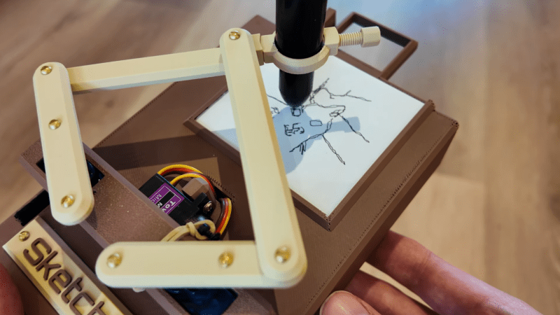
• A New Last Airbender Bestiary Art Book Launching September 23

    Beasts of the Four Nations: Creatures from Avatar: The Last Airbender and The Legend of Korra| Releases September 23 Preorder Beasts of the Four Nations: Creatures from Avatar: The Last Airbender and The Legend of Korra| Releases September 23 Preorder Earlier this year, Nickelodeon announced Avatar is coming back with a new animated series called Avatar: Seven Havens, and there's a new Avatar: The Last Airbender live-action movie on the way, too, making now a good time to brush up on the lore and rich worldbuilding the franchise is known for. One way to do that is with the upcoming Beasts of the Four Nations, a 128-page hardcover bestiary offering in-universe lore and behind-the-scenes details on the wildlife and mythical creatures of both animated series. You can preorder the standard edition foror secure a copy of the Deluxe Edition that includes exclusive cover art and a lithograph print. Preorders for both editions are available , and both ship September 23. Beasts of the Four Nations: Creatures from Avatar: The Last Airbender and The Legend of Korra| Releases September 23 Written by John O'Bryan, Beasts of the Four Nations includes illustrations and information on the many fantastical beasts of The Last Airbender's world. Everything from the Air Nomads’ flying bison to Kyoshi Island’s elephant koi and the Earth Kingdom’s singing groundhogs are detailed in the book, along with commentary by Avatar and Legend of Korra creators Bryan Konietzko and Michael Dante DiMartino. The standard edition launches September 23 and is available to preorder for. A Deluxe Edition will also launch on the same day that includes a few extras, which we've detailed below. Preorder Beasts of the Four Nations: Creatures from Avatar: The Last Airbender and The Legend of Korra| Releases September 23 The Beasts of the Four Nations Deluxe Edition contains all the contents of the standard edition, but features a few notable upgrades like foil highlights on the cover art and a protective slipcase. The book also comes with an exclusive lithograph print depicting Cai, the cabbage merchant who appears throughout the Avatar series, and his cart pulled by two ostrich horses. You can preorder the Beasts of the Four Nations Deluxe Edition for . Preorder Beasts of the Four Nations Deluxe EditionIf you want to explore more of the Avatar franchise’s visual history, you're in luck, as several more official Avatar: The Last Airbender and The Legend of Korra art books are available, and some are even discounted. There's a giant Avatar: The Last Airbender - The Art of the Animated Series art book that covers all four seasons of the show. It's packed with concept art, design, and production materials, ranging from the very first sketch through to the series finale.The Legend of Korra has a multi-volume art book series available as well Each volume focuses on a specific season of the show and features creator commentaries and exclusive artwork. Standard and Deluxe Editions are available for each volume. The Deluxe Editions include slipcases, lithographs, new covers, and bonus sketches by the show’s creators.Continue Reading at GameSpot
    #new #last #airbender #bestiary #art
    A New Last Airbender Bestiary Art Book Launching September 23
    Beasts of the Four Nations: Creatures from Avatar: The Last Airbender and The Legend of Korra| Releases September 23 Preorder Beasts of the Four Nations: Creatures from Avatar: The Last Airbender and The Legend of Korra| Releases September 23 Preorder Earlier this year, Nickelodeon announced Avatar is coming back with a new animated series called Avatar: Seven Havens, and there's a new Avatar: The Last Airbender live-action movie on the way, too, making now a good time to brush up on the lore and rich worldbuilding the franchise is known for. One way to do that is with the upcoming Beasts of the Four Nations, a 128-page hardcover bestiary offering in-universe lore and behind-the-scenes details on the wildlife and mythical creatures of both animated series. You can preorder the standard edition foror secure a copy of the Deluxe Edition that includes exclusive cover art and a lithograph print. Preorders for both editions are available , and both ship September 23. Beasts of the Four Nations: Creatures from Avatar: The Last Airbender and The Legend of Korra| Releases September 23 Written by John O'Bryan, Beasts of the Four Nations includes illustrations and information on the many fantastical beasts of The Last Airbender's world. Everything from the Air Nomads’ flying bison to Kyoshi Island’s elephant koi and the Earth Kingdom’s singing groundhogs are detailed in the book, along with commentary by Avatar and Legend of Korra creators Bryan Konietzko and Michael Dante DiMartino. The standard edition launches September 23 and is available to preorder for. A Deluxe Edition will also launch on the same day that includes a few extras, which we've detailed below. Preorder Beasts of the Four Nations: Creatures from Avatar: The Last Airbender and The Legend of Korra| Releases September 23 The Beasts of the Four Nations Deluxe Edition contains all the contents of the standard edition, but features a few notable upgrades like foil highlights on the cover art and a protective slipcase. The book also comes with an exclusive lithograph print depicting Cai, the cabbage merchant who appears throughout the Avatar series, and his cart pulled by two ostrich horses. You can preorder the Beasts of the Four Nations Deluxe Edition for . Preorder Beasts of the Four Nations Deluxe EditionIf you want to explore more of the Avatar franchise’s visual history, you're in luck, as several more official Avatar: The Last Airbender and The Legend of Korra art books are available, and some are even discounted. There's a giant Avatar: The Last Airbender - The Art of the Animated Series art book that covers all four seasons of the show. It's packed with concept art, design, and production materials, ranging from the very first sketch through to the series finale.The Legend of Korra has a multi-volume art book series available as well Each volume focuses on a specific season of the show and features creator commentaries and exclusive artwork. Standard and Deluxe Editions are available for each volume. The Deluxe Editions include slipcases, lithographs, new covers, and bonus sketches by the show’s creators.Continue Reading at GameSpot #new #last #airbender #bestiary #art
    WWW.GAMESPOT.COM
    A New Last Airbender Bestiary Art Book Launching September 23
    Beasts of the Four Nations: Creatures from Avatar: The Last Airbender and The Legend of Korra $37.19 (was $40) | Releases September 23 Preorder at Amazon Beasts of the Four Nations: Creatures from Avatar: The Last Airbender and The Legend of Korra (Deluxe Edition) $80 | Releases September 23 Preorder at Amazon Earlier this year, Nickelodeon announced Avatar is coming back with a new animated series called Avatar: Seven Havens, and there's a new Avatar: The Last Airbender live-action movie on the way, too, making now a good time to brush up on the lore and rich worldbuilding the franchise is known for. One way to do that is with the upcoming Beasts of the Four Nations, a 128-page hardcover bestiary offering in-universe lore and behind-the-scenes details on the wildlife and mythical creatures of both animated series. You can preorder the standard edition for $37.19 (down from $40) or secure a copy of the $80 Deluxe Edition that includes exclusive cover art and a lithograph print. Preorders for both editions are available at Amazon, and both ship September 23. Beasts of the Four Nations: Creatures from Avatar: The Last Airbender and The Legend of Korra $37.19 (was $40) | Releases September 23 Written by John O'Bryan, Beasts of the Four Nations includes illustrations and information on the many fantastical beasts of The Last Airbender's world. Everything from the Air Nomads’ flying bison to Kyoshi Island’s elephant koi and the Earth Kingdom’s singing groundhogs are detailed in the book, along with commentary by Avatar and Legend of Korra creators Bryan Konietzko and Michael Dante DiMartino. The standard edition launches September 23 and is available to preorder for $37.19 (down from $40) at Amazon. A Deluxe Edition will also launch on the same day that includes a few extras, which we've detailed below. Preorder at Amazon Beasts of the Four Nations: Creatures from Avatar: The Last Airbender and The Legend of Korra (Deluxe Edition) $80 | Releases September 23 The Beasts of the Four Nations Deluxe Edition contains all the contents of the standard edition, but features a few notable upgrades like foil highlights on the cover art and a protective slipcase. The book also comes with an exclusive lithograph print depicting Cai, the cabbage merchant who appears throughout the Avatar series, and his cart pulled by two ostrich horses. You can preorder the Beasts of the Four Nations Deluxe Edition for $80 at Amazon. Preorder at Amazon Beasts of the Four Nations Deluxe EditionIf you want to explore more of the Avatar franchise’s visual history, you're in luck, as several more official Avatar: The Last Airbender and The Legend of Korra art books are available, and some are even discounted. There's a giant Avatar: The Last Airbender - The Art of the Animated Series art book that covers all four seasons of the show. It's packed with concept art, design, and production materials, ranging from the very first sketch through to the series finale.The Legend of Korra has a multi-volume art book series available as well Each volume focuses on a specific season of the show and features creator commentaries and exclusive artwork. Standard and Deluxe Editions are available for each volume. The Deluxe Editions include slipcases, lithographs, new covers, and bonus sketches by the show’s creators.Continue Reading at GameSpot
    Like
    Love
    Angry
    Sad
    18
    0 Σχόλια 0 Μοιράστηκε
  • Startup Uses NVIDIA RTX-Powered Generative AI to Make Coolers, Cooler

    Mark Theriault founded the startup FITY envisioning a line of clever cooling products: cold drink holders that come with freezable pucks to keep beverages cold for longer without the mess of ice. The entrepreneur started with 3D prints of products in his basement, building one unit at a time, before eventually scaling to mass production.
    Founding a consumer product company from scratch was a tall order for a single person. Going from preliminary sketches to production-ready designs was a major challenge. To bring his creative vision to life, Theriault relied on AI and his NVIDIA GeForce RTX-equipped system. For him, AI isn’t just a tool — it’s an entire pipeline to help him accomplish his goals. about his workflow below.
    Plus, GeForce RTX 5050 laptops start arriving today at retailers worldwide, from GeForce RTX 5050 Laptop GPUs feature 2,560 NVIDIA Blackwell CUDA cores, fifth-generation AI Tensor Cores, fourth-generation RT Cores, a ninth-generation NVENC encoder and a sixth-generation NVDEC decoder.
    In addition, NVIDIA’s Plug and Play: Project G-Assist Plug-In Hackathon — running virtually through Wednesday, July 16 — invites developers to explore AI and build custom G-Assist plug-ins for a chance to win prizes. the date for the G-Assist Plug-In webinar on Wednesday, July 9, from 10-11 a.m. PT, to learn more about Project G-Assist capabilities and fundamentals, and to participate in a live Q&A session.
    From Concept to Completion
    To create his standout products, Theriault tinkers with potential FITY Flex cooler designs with traditional methods, from sketch to computer-aided design to rapid prototyping, until he finds the right vision. A unique aspect of the FITY Flex design is that it can be customized with fun, popular shoe charms.
    For packaging design inspiration, Theriault uses his preferred text-to-image generative AI model for prototyping, Stable Diffusion XL — which runs 60% faster with the NVIDIA TensorRT software development kit — using the modular, node-based interface ComfyUI.
    ComfyUI gives users granular control over every step of the generation process — prompting, sampling, model loading, image conditioning and post-processing. It’s ideal for advanced users like Theriault who want to customize how images are generated.
    Theriault’s uses of AI result in a complete computer graphics-based ad campaign. Image courtesy of FITY.
    NVIDIA and GeForce RTX GPUs based on the NVIDIA Blackwell architecture include fifth-generation Tensor Cores designed to accelerate AI and deep learning workloads. These GPUs work with CUDA optimizations in PyTorch to seamlessly accelerate ComfyUI, reducing generation time on FLUX.1-dev, an image generation model from Black Forest Labs, from two minutes per image on the Mac M3 Ultra to about four seconds on the GeForce RTX 5090 desktop GPU.
    ComfyUI can also add ControlNets — AI models that help control image generation — that Theriault uses for tasks like guiding human poses, setting compositions via depth mapping and converting scribbles to images.
    Theriault even creates his own fine-tuned models to keep his style consistent. He used low-rank adaptationmodels — small, efficient adapters into specific layers of the network — enabling hyper-customized generation with minimal compute cost.
    LoRA models allow Theriault to ideate on visuals quickly. Image courtesy of FITY.
    “Over the last few months, I’ve been shifting from AI-assisted computer graphics renders to fully AI-generated product imagery using a custom Flux LoRA I trained in house. My RTX 4080 SUPER GPU has been essential for getting the performance I need to train and iterate quickly.” – Mark Theriault, founder of FITY 

    Theriault also taps into generative AI to create marketing assets like FITY Flex product packaging. He uses FLUX.1, which excels at generating legible text within images, addressing a common challenge in text-to-image models.
    Though FLUX.1 models can typically consume over 23GB of VRAM, NVIDIA has collaborated with Black Forest Labs to help reduce the size of these models using quantization — a technique that reduces model size while maintaining quality. The models were then accelerated with TensorRT, which provides an up to 2x speedup over PyTorch.
    To simplify using these models in ComfyUI, NVIDIA created the FLUX.1 NIM microservice, a containerized version of FLUX.1 that can be loaded in ComfyUI and enables FP4 quantization and TensorRT support. Combined, the models come down to just over 11GB of VRAM, and performance improves by 2.5x.
    Theriault uses the Blender Cycles app to render out final files. For 3D workflows, NVIDIA offers the AI Blueprint for 3D-guided generative AI to ease the positioning and composition of 3D images, so anyone interested in this method can quickly get started.
    Photorealistic renders. Image courtesy of FITY.
    Finally, Theriault uses large language models to generate marketing copy — tailored for search engine optimization, tone and storytelling — as well as to complete his patent and provisional applications, work that usually costs thousands of dollars in legal fees and considerable time.
    Generative AI helps Theriault create promotional materials like the above. Image courtesy of FITY.
    “As a one-man band with a ton of content to generate, having on-the-fly generation capabilities for my product designs really helps speed things up.” – Mark Theriault, founder of FITY

    Every texture, every word, every photo, every accessory was a micro-decision, Theriault said. AI helped him survive the “death by a thousand cuts” that can stall solo startup founders, he added.
    Each week, the RTX AI Garage blog series features community-driven AI innovations and content for those looking to learn more about NVIDIA NIM microservices and AI Blueprints, as well as building AI agents, creative workflows, digital humans, productivity apps and more on AI PCs and workstations. 
    Plug in to NVIDIA AI PC on Facebook, Instagram, TikTok and X — and stay informed by subscribing to the RTX AI PC newsletter.
    Follow NVIDIA Workstation on LinkedIn and X. 
    See notice regarding software product information.
    #startup #uses #nvidia #rtxpowered #generative
    Startup Uses NVIDIA RTX-Powered Generative AI to Make Coolers, Cooler
    Mark Theriault founded the startup FITY envisioning a line of clever cooling products: cold drink holders that come with freezable pucks to keep beverages cold for longer without the mess of ice. The entrepreneur started with 3D prints of products in his basement, building one unit at a time, before eventually scaling to mass production. Founding a consumer product company from scratch was a tall order for a single person. Going from preliminary sketches to production-ready designs was a major challenge. To bring his creative vision to life, Theriault relied on AI and his NVIDIA GeForce RTX-equipped system. For him, AI isn’t just a tool — it’s an entire pipeline to help him accomplish his goals. about his workflow below. Plus, GeForce RTX 5050 laptops start arriving today at retailers worldwide, from GeForce RTX 5050 Laptop GPUs feature 2,560 NVIDIA Blackwell CUDA cores, fifth-generation AI Tensor Cores, fourth-generation RT Cores, a ninth-generation NVENC encoder and a sixth-generation NVDEC decoder. In addition, NVIDIA’s Plug and Play: Project G-Assist Plug-In Hackathon — running virtually through Wednesday, July 16 — invites developers to explore AI and build custom G-Assist plug-ins for a chance to win prizes. the date for the G-Assist Plug-In webinar on Wednesday, July 9, from 10-11 a.m. PT, to learn more about Project G-Assist capabilities and fundamentals, and to participate in a live Q&A session. From Concept to Completion To create his standout products, Theriault tinkers with potential FITY Flex cooler designs with traditional methods, from sketch to computer-aided design to rapid prototyping, until he finds the right vision. A unique aspect of the FITY Flex design is that it can be customized with fun, popular shoe charms. For packaging design inspiration, Theriault uses his preferred text-to-image generative AI model for prototyping, Stable Diffusion XL — which runs 60% faster with the NVIDIA TensorRT software development kit — using the modular, node-based interface ComfyUI. ComfyUI gives users granular control over every step of the generation process — prompting, sampling, model loading, image conditioning and post-processing. It’s ideal for advanced users like Theriault who want to customize how images are generated. Theriault’s uses of AI result in a complete computer graphics-based ad campaign. Image courtesy of FITY. NVIDIA and GeForce RTX GPUs based on the NVIDIA Blackwell architecture include fifth-generation Tensor Cores designed to accelerate AI and deep learning workloads. These GPUs work with CUDA optimizations in PyTorch to seamlessly accelerate ComfyUI, reducing generation time on FLUX.1-dev, an image generation model from Black Forest Labs, from two minutes per image on the Mac M3 Ultra to about four seconds on the GeForce RTX 5090 desktop GPU. ComfyUI can also add ControlNets — AI models that help control image generation — that Theriault uses for tasks like guiding human poses, setting compositions via depth mapping and converting scribbles to images. Theriault even creates his own fine-tuned models to keep his style consistent. He used low-rank adaptationmodels — small, efficient adapters into specific layers of the network — enabling hyper-customized generation with minimal compute cost. LoRA models allow Theriault to ideate on visuals quickly. Image courtesy of FITY. “Over the last few months, I’ve been shifting from AI-assisted computer graphics renders to fully AI-generated product imagery using a custom Flux LoRA I trained in house. My RTX 4080 SUPER GPU has been essential for getting the performance I need to train and iterate quickly.” – Mark Theriault, founder of FITY  Theriault also taps into generative AI to create marketing assets like FITY Flex product packaging. He uses FLUX.1, which excels at generating legible text within images, addressing a common challenge in text-to-image models. Though FLUX.1 models can typically consume over 23GB of VRAM, NVIDIA has collaborated with Black Forest Labs to help reduce the size of these models using quantization — a technique that reduces model size while maintaining quality. The models were then accelerated with TensorRT, which provides an up to 2x speedup over PyTorch. To simplify using these models in ComfyUI, NVIDIA created the FLUX.1 NIM microservice, a containerized version of FLUX.1 that can be loaded in ComfyUI and enables FP4 quantization and TensorRT support. Combined, the models come down to just over 11GB of VRAM, and performance improves by 2.5x. Theriault uses the Blender Cycles app to render out final files. For 3D workflows, NVIDIA offers the AI Blueprint for 3D-guided generative AI to ease the positioning and composition of 3D images, so anyone interested in this method can quickly get started. Photorealistic renders. Image courtesy of FITY. Finally, Theriault uses large language models to generate marketing copy — tailored for search engine optimization, tone and storytelling — as well as to complete his patent and provisional applications, work that usually costs thousands of dollars in legal fees and considerable time. Generative AI helps Theriault create promotional materials like the above. Image courtesy of FITY. “As a one-man band with a ton of content to generate, having on-the-fly generation capabilities for my product designs really helps speed things up.” – Mark Theriault, founder of FITY Every texture, every word, every photo, every accessory was a micro-decision, Theriault said. AI helped him survive the “death by a thousand cuts” that can stall solo startup founders, he added. Each week, the RTX AI Garage blog series features community-driven AI innovations and content for those looking to learn more about NVIDIA NIM microservices and AI Blueprints, as well as building AI agents, creative workflows, digital humans, productivity apps and more on AI PCs and workstations.  Plug in to NVIDIA AI PC on Facebook, Instagram, TikTok and X — and stay informed by subscribing to the RTX AI PC newsletter. Follow NVIDIA Workstation on LinkedIn and X.  See notice regarding software product information. #startup #uses #nvidia #rtxpowered #generative
    BLOGS.NVIDIA.COM
    Startup Uses NVIDIA RTX-Powered Generative AI to Make Coolers, Cooler
    Mark Theriault founded the startup FITY envisioning a line of clever cooling products: cold drink holders that come with freezable pucks to keep beverages cold for longer without the mess of ice. The entrepreneur started with 3D prints of products in his basement, building one unit at a time, before eventually scaling to mass production. Founding a consumer product company from scratch was a tall order for a single person. Going from preliminary sketches to production-ready designs was a major challenge. To bring his creative vision to life, Theriault relied on AI and his NVIDIA GeForce RTX-equipped system. For him, AI isn’t just a tool — it’s an entire pipeline to help him accomplish his goals. Read more about his workflow below. Plus, GeForce RTX 5050 laptops start arriving today at retailers worldwide, from $999. GeForce RTX 5050 Laptop GPUs feature 2,560 NVIDIA Blackwell CUDA cores, fifth-generation AI Tensor Cores, fourth-generation RT Cores, a ninth-generation NVENC encoder and a sixth-generation NVDEC decoder. In addition, NVIDIA’s Plug and Play: Project G-Assist Plug-In Hackathon — running virtually through Wednesday, July 16 — invites developers to explore AI and build custom G-Assist plug-ins for a chance to win prizes. Save the date for the G-Assist Plug-In webinar on Wednesday, July 9, from 10-11 a.m. PT, to learn more about Project G-Assist capabilities and fundamentals, and to participate in a live Q&A session. From Concept to Completion To create his standout products, Theriault tinkers with potential FITY Flex cooler designs with traditional methods, from sketch to computer-aided design to rapid prototyping, until he finds the right vision. A unique aspect of the FITY Flex design is that it can be customized with fun, popular shoe charms. For packaging design inspiration, Theriault uses his preferred text-to-image generative AI model for prototyping, Stable Diffusion XL — which runs 60% faster with the NVIDIA TensorRT software development kit — using the modular, node-based interface ComfyUI. ComfyUI gives users granular control over every step of the generation process — prompting, sampling, model loading, image conditioning and post-processing. It’s ideal for advanced users like Theriault who want to customize how images are generated. Theriault’s uses of AI result in a complete computer graphics-based ad campaign. Image courtesy of FITY. NVIDIA and GeForce RTX GPUs based on the NVIDIA Blackwell architecture include fifth-generation Tensor Cores designed to accelerate AI and deep learning workloads. These GPUs work with CUDA optimizations in PyTorch to seamlessly accelerate ComfyUI, reducing generation time on FLUX.1-dev, an image generation model from Black Forest Labs, from two minutes per image on the Mac M3 Ultra to about four seconds on the GeForce RTX 5090 desktop GPU. ComfyUI can also add ControlNets — AI models that help control image generation — that Theriault uses for tasks like guiding human poses, setting compositions via depth mapping and converting scribbles to images. Theriault even creates his own fine-tuned models to keep his style consistent. He used low-rank adaptation (LoRA) models — small, efficient adapters into specific layers of the network — enabling hyper-customized generation with minimal compute cost. LoRA models allow Theriault to ideate on visuals quickly. Image courtesy of FITY. “Over the last few months, I’ve been shifting from AI-assisted computer graphics renders to fully AI-generated product imagery using a custom Flux LoRA I trained in house. My RTX 4080 SUPER GPU has been essential for getting the performance I need to train and iterate quickly.” – Mark Theriault, founder of FITY  Theriault also taps into generative AI to create marketing assets like FITY Flex product packaging. He uses FLUX.1, which excels at generating legible text within images, addressing a common challenge in text-to-image models. Though FLUX.1 models can typically consume over 23GB of VRAM, NVIDIA has collaborated with Black Forest Labs to help reduce the size of these models using quantization — a technique that reduces model size while maintaining quality. The models were then accelerated with TensorRT, which provides an up to 2x speedup over PyTorch. To simplify using these models in ComfyUI, NVIDIA created the FLUX.1 NIM microservice, a containerized version of FLUX.1 that can be loaded in ComfyUI and enables FP4 quantization and TensorRT support. Combined, the models come down to just over 11GB of VRAM, and performance improves by 2.5x. Theriault uses the Blender Cycles app to render out final files. For 3D workflows, NVIDIA offers the AI Blueprint for 3D-guided generative AI to ease the positioning and composition of 3D images, so anyone interested in this method can quickly get started. Photorealistic renders. Image courtesy of FITY. Finally, Theriault uses large language models to generate marketing copy — tailored for search engine optimization, tone and storytelling — as well as to complete his patent and provisional applications, work that usually costs thousands of dollars in legal fees and considerable time. Generative AI helps Theriault create promotional materials like the above. Image courtesy of FITY. “As a one-man band with a ton of content to generate, having on-the-fly generation capabilities for my product designs really helps speed things up.” – Mark Theriault, founder of FITY Every texture, every word, every photo, every accessory was a micro-decision, Theriault said. AI helped him survive the “death by a thousand cuts” that can stall solo startup founders, he added. Each week, the RTX AI Garage blog series features community-driven AI innovations and content for those looking to learn more about NVIDIA NIM microservices and AI Blueprints, as well as building AI agents, creative workflows, digital humans, productivity apps and more on AI PCs and workstations.  Plug in to NVIDIA AI PC on Facebook, Instagram, TikTok and X — and stay informed by subscribing to the RTX AI PC newsletter. Follow NVIDIA Workstation on LinkedIn and X.  See notice regarding software product information.
    0 Σχόλια 0 Μοιράστηκε
  • In a world that feels increasingly lonely, the return of the Muppets in VR sparks a bittersweet nostalgia. I remember the joy they brought to my childhood, their silly antics and vibrant laughter. Yet, with every sketch they unveil, I can't help but feel the weight of their absence in reality, as if they are mere shadows of the happiness they once embodied. The vibrant colors of their world contrast sharply with the gray hues of my own life.

    As Muppet Vision 3D fades into memory, I am left with a void that no virtual experience can fill. The laughter that echoing in the theaters now feels like a distant dream, a reminder of the innocence that has long since slipped away. I find solace in these new sketches, yet they also serve as a painful reminder of how disconnected I am from the joy they once represented.

    Every character that pops up on the screen, every clever quip, feels like a fleeting moment of happiness that I can never truly grasp. It's as if the Muppets are reaching out from behind the screen, inviting me to join their world, but I remain trapped in my solitude, unable to cross that invisible barrier. The more I watch, the more I realize how far removed I am from that sense of belonging, that warmth of companionship.

    The Muppets may come back to entertain, but the laughter feels hollow without someone to share it with. Their quirky sketches remind me of what I've lost—connections that once brought light into my life, now replaced with echoes of silence. I yearn for the days when joy was a shared experience, not just a moment in a virtual world.

    As I sit in my quiet room, watching the colorful chaos unfold on the screen, I can’t help but feel the sting of loneliness creeping in. The Muppets might be back in VR, but for me, the laughter is just a whisper in the wind, fading away like all the moments I've wished to share with someone who understands. It’s a cruel irony that the return of something so beloved can also highlight just how alone I feel in this vast, unfeeling world.

    #Muppets #VR #Loneliness #Nostalgia #Heartbreak
    In a world that feels increasingly lonely, the return of the Muppets in VR sparks a bittersweet nostalgia. I remember the joy they brought to my childhood, their silly antics and vibrant laughter. Yet, with every sketch they unveil, I can't help but feel the weight of their absence in reality, as if they are mere shadows of the happiness they once embodied. The vibrant colors of their world contrast sharply with the gray hues of my own life. As Muppet Vision 3D fades into memory, I am left with a void that no virtual experience can fill. The laughter that echoing in the theaters now feels like a distant dream, a reminder of the innocence that has long since slipped away. I find solace in these new sketches, yet they also serve as a painful reminder of how disconnected I am from the joy they once represented. Every character that pops up on the screen, every clever quip, feels like a fleeting moment of happiness that I can never truly grasp. It's as if the Muppets are reaching out from behind the screen, inviting me to join their world, but I remain trapped in my solitude, unable to cross that invisible barrier. The more I watch, the more I realize how far removed I am from that sense of belonging, that warmth of companionship. The Muppets may come back to entertain, but the laughter feels hollow without someone to share it with. Their quirky sketches remind me of what I've lost—connections that once brought light into my life, now replaced with echoes of silence. I yearn for the days when joy was a shared experience, not just a moment in a virtual world. As I sit in my quiet room, watching the colorful chaos unfold on the screen, I can’t help but feel the sting of loneliness creeping in. The Muppets might be back in VR, but for me, the laughter is just a whisper in the wind, fading away like all the moments I've wished to share with someone who understands. It’s a cruel irony that the return of something so beloved can also highlight just how alone I feel in this vast, unfeeling world. #Muppets #VR #Loneliness #Nostalgia #Heartbreak
    Les Muppets reviennent en VR pour leurs sketches les plus fous
    Les Muppets n’ont pas disparu. Après la fermeture de Muppet Vision 3D aux studios d’Hollywood, […] Cet article Les Muppets reviennent en VR pour leurs sketches les plus fous a été publié sur REALITE-VIRTUELLE.COM.
    Like
    Love
    Wow
    Sad
    Angry
    617
    1 Σχόλια 0 Μοιράστηκε
  • Publishing your first manga might sound exciting, but honestly, it’s just a lot of work. It’s one of those things that you think will be fun, but then you realize it’s just a long journey filled with endless sketches and revisions. Six top manga artists talk about their experiences, but let’s be real, it’s not all that thrilling.

    First off, you have to come up with a story. Sounds easy, right? But then you sit there staring at a blank page, and the ideas just don’t come. You read what other artists say about their success, and it makes you feel like you should have everything figured out. They talk about characters and plots like it’s the easiest thing in the world. But between you and me, it’s exhausting.

    Then comes the drawing part. Sure, you might enjoy sketching sometimes, but doing it for hours every day? That’s where the fun starts to fade. You’ll probably go through phases where you hate your own art. It’s a cycle of drawing, erasing, and feeling disappointed. It’s not a glamorous process; it’s just a grind.

    After you’ve finally got something that resembles a story and some pages that are somewhat decent, you have to think about publishing. This is where the anxiety kicks in. Do you self-publish? Try to find a publisher? Each option has its own set of problems. You read advice from those six artists, and they all sound like they’ve got it figured out. But honestly, who has the energy to deal with all those logistics?

    Marketing is another thing. They say you need to promote yourself, build a following, and all that jazz. But scrolling through social media to post about your manga feels more like a chore than a fun activity. You might think you’ll enjoy it, but it’s just more work piled on top of everything else.

    In the end, the best advice might be to just get through it and hope for the best. You’ll survive the experience, maybe even learn something, but it’s not going to be a walk in the park. If you’re looking for a carefree journey, publishing your first manga probably isn’t it.

    So, yeah. That’s the reality. It’s not as glamorous as it sounds. You just do it, and hope that someday it might feel rewarding. But until then, it’s just a lot of waiting and wondering. Good luck, I guess.

    #Manga #Publishing #MangaArtists #Comics #ArtProcess
    Publishing your first manga might sound exciting, but honestly, it’s just a lot of work. It’s one of those things that you think will be fun, but then you realize it’s just a long journey filled with endless sketches and revisions. Six top manga artists talk about their experiences, but let’s be real, it’s not all that thrilling. First off, you have to come up with a story. Sounds easy, right? But then you sit there staring at a blank page, and the ideas just don’t come. You read what other artists say about their success, and it makes you feel like you should have everything figured out. They talk about characters and plots like it’s the easiest thing in the world. But between you and me, it’s exhausting. Then comes the drawing part. Sure, you might enjoy sketching sometimes, but doing it for hours every day? That’s where the fun starts to fade. You’ll probably go through phases where you hate your own art. It’s a cycle of drawing, erasing, and feeling disappointed. It’s not a glamorous process; it’s just a grind. After you’ve finally got something that resembles a story and some pages that are somewhat decent, you have to think about publishing. This is where the anxiety kicks in. Do you self-publish? Try to find a publisher? Each option has its own set of problems. You read advice from those six artists, and they all sound like they’ve got it figured out. But honestly, who has the energy to deal with all those logistics? Marketing is another thing. They say you need to promote yourself, build a following, and all that jazz. But scrolling through social media to post about your manga feels more like a chore than a fun activity. You might think you’ll enjoy it, but it’s just more work piled on top of everything else. In the end, the best advice might be to just get through it and hope for the best. You’ll survive the experience, maybe even learn something, but it’s not going to be a walk in the park. If you’re looking for a carefree journey, publishing your first manga probably isn’t it. So, yeah. That’s the reality. It’s not as glamorous as it sounds. You just do it, and hope that someday it might feel rewarding. But until then, it’s just a lot of waiting and wondering. Good luck, I guess. #Manga #Publishing #MangaArtists #Comics #ArtProcess
    How to publish your first manga (and survive the experience)
    Six top manga artists reveal the secrets behind their success
    Like
    Love
    Wow
    Angry
    Sad
    451
    1 Σχόλια 0 Μοιράστηκε
  • Why Designers Get Stuck In The Details And How To Stop

    You’ve drawn fifty versions of the same screen — and you still hate every one of them. Begrudgingly, you pick three, show them to your product manager, and hear: “Looks cool, but the idea doesn’t work.” Sound familiar?
    In this article, I’ll unpack why designers fall into detail work at the wrong moment, examining both process pitfalls and the underlying psychological reasons, as understanding these traps is the first step to overcoming them. I’ll also share tactics I use to climb out of that trap.
    Reason #1 You’re Afraid To Show Rough Work
    We designers worship detail. We’re taught that true craft equals razor‑sharp typography, perfect grids, and pixel precision. So the minute a task arrives, we pop open Figma and start polishing long before polish is needed.
    I’ve skipped the sketch phase more times than I care to admit. I told myself it would be faster, yet I always ended up spending hours producing a tidy mock‑up when a scribbled thumbnail would have sparked a five‑minute chat with my product manager. Rough sketches felt “unprofessional,” so I hid them.
    The cost? Lost time, wasted energy — and, by the third redo, teammates were quietly wondering if I even understood the brief.
    The real problem here is the habit: we open Figma and start perfecting the UI before we’ve even solved the problem.
    So why do we hide these rough sketches? It’s not just a bad habit or plain silly. There are solid psychological reasons behind it. We often just call it perfectionism, but it’s deeper than wanting things neat. Digging into the psychologyshows there are a couple of flavors driving this:

    Socially prescribed perfectionismIt’s that nagging feeling that everyone else expects perfect work from you, which makes showing anything rough feel like walking into the lion’s den.
    Self-oriented perfectionismWhere you’re the one setting impossibly high standards for yourself, leading to brutal self-criticism if anything looks slightly off.

    Either way, the result’s the same: showing unfinished work feels wrong, and you miss out on that vital early feedback.
    Back to the design side, remember that clients rarely see architects’ first pencil sketches, but these sketches still exist; they guide structural choices before the 3D render. Treat your thumbnails the same way — artifacts meant to collapse uncertainty, not portfolio pieces. Once stakeholders see the upside, roughness becomes a badge of speed, not sloppiness. So, the key is to consciously make that shift:
    Treat early sketches as disposable tools for thinking and actively share them to get feedback faster.

    Reason #2: You Fix The Symptom, Not The Cause
    Before tackling any task, we need to understand what business outcome we’re aiming for. Product managers might come to us asking to enlarge the payment button in the shopping cart because users aren’t noticing it. The suggested solution itself isn’t necessarily bad, but before redesigning the button, we should ask, “What data suggests they aren’t noticing it?” Don’t get me wrong, I’m not saying you shouldn’t trust your product manager. On the contrary, these questions help ensure you’re on the same page and working with the same data.
    From my experience, here are several reasons why users might not be clicking that coveted button:

    Users don’t understand that this step is for payment.
    They understand it’s about payment but expect order confirmation first.
    Due to incorrect translation, users don’t understand what the button means.
    Lack of trust signals.
    Unexpected additional coststhat appear at this stage.
    Technical issues.

    Now, imagine you simply did what the manager suggested. Would you have solved the problem? Hardly.
    Moreover, the responsibility for the unresolved issue would fall on you, as the interface solution lies within the design domain. The product manager actually did their job correctly by identifying a problem: suspiciously, few users are clicking the button.
    Psychologically, taking on this bigger role isn’t easy. It means overcoming the fear of making mistakes and the discomfort of exploring unclear problems rather than just doing tasks. This shift means seeing ourselves as partners who create value — even if it means fighting a hesitation to question product managers— and understanding that using our product logic expertise proactively is crucial for modern designers.
    There’s another critical reason why we, designers, need to be a bit like product managers: the rise of AI. I deliberately used a simple example about enlarging a button, but I’m confident that in the near future, AI will easily handle routine design tasks. This worries me, but at the same time, I’m already gladly stepping into the product manager’s territory: understanding product and business metrics, formulating hypotheses, conducting research, and so on. It might sound like I’m taking work away from PMs, but believe me, they undoubtedly have enough on their plates and are usually more than happy to delegate some responsibilities to designers.
    Reason #3: You’re Solving The Wrong Problem
    Before solving anything, ask whether the problem even deserves your attention.
    During a major home‑screen redesign, our goal was to drive more users into paid services. The initial hypothesis — making service buttons bigger and brighter might help returning users — seemed reasonable enough to test. However, even when A/B testsshowed minimal impact, we continued to tweak those buttons.
    Only later did it click: the home screen isn’t the place to sell; visitors open the app to start, not to buy. We removed that promo block, and nothing broke. Contextual entry points deeper into the journey performed brilliantly. Lesson learned:
    Without the right context, any visual tweak is lipstick on a pig.

    Why did we get stuck polishing buttons instead of stopping sooner? It’s easy to get tunnel vision. Psychologically, it’s likely the good old sunk cost fallacy kicking in: we’d already invested time in the buttons, so stopping felt like wasting that effort, even though the data wasn’t promising.
    It’s just easier to keep fiddling with something familiar than to admit we need a new plan. Perhaps the simple question I should have asked myself when results stalled was: “Are we optimizing the right thing or just polishing something that fundamentally doesn’t fit the user’s primary goal here?” That alone might have saved hours.
    Reason #4: You’re Drowning In Unactionable Feedback
    We all discuss our work with colleagues. But here’s a crucial point: what kind of question do you pose to kick off that discussion? If your go-to is “What do you think?” well, that question might lead you down a rabbit hole of personal opinions rather than actionable insights. While experienced colleagues will cut through the noise, others, unsure what to evaluate, might comment on anything and everything — fonts, button colors, even when you desperately need to discuss a user flow.
    What matters here are two things:

    The question you ask,
    The context you give.

    That means clearly stating the problem, what you’ve learned, and how your idea aims to fix it.
    For instance:
    “The problem is our payment conversion rate has dropped by X%. I’ve interviewed users and found they abandon payment because they don’t understand how the total amount is calculated. My solution is to show a detailed cost breakdown. Do you think this actually solves the problem for them?”

    Here, you’ve stated the problem, shared your insight, explained your solution, and asked a direct question. It’s even better if you prepare a list of specific sub-questions. For instance: “Are all items in the cost breakdown clear?” or “Does the placement of this breakdown feel intuitive within the payment flow?”
    Another good habit is to keep your rough sketches and previous iterations handy. Some of your colleagues’ suggestions might be things you’ve already tried. It’s great if you can discuss them immediately to either revisit those ideas or definitively set them aside.
    I’m not a psychologist, but experience tells me that, psychologically, the reluctance to be this specific often stems from a fear of our solution being rejected. We tend to internalize feedback: a seemingly innocent comment like, “Have you considered other ways to organize this section?” or “Perhaps explore a different structure for this part?” can instantly morph in our minds into “You completely messed up the structure. You’re a bad designer.” Imposter syndrome, in all its glory.
    So, to wrap up this point, here are two recommendations:

    Prepare for every design discussion.A couple of focused questions will yield far more valuable input than a vague “So, what do you think?”.
    Actively work on separating feedback on your design from your self-worth.If a mistake is pointed out, acknowledge it, learn from it, and you’ll be less likely to repeat it. This is often easier said than done. For me, it took years of working with a psychotherapist. If you struggle with this, I sincerely wish you strength in overcoming it.

    Reason #5 You’re Just Tired
    Sometimes, the issue isn’t strategic at all — it’s fatigue. Fussing over icon corners can feel like a cozy bunker when your brain is fried. There’s a name for this: decision fatigue. Basically, your brain’s battery for hard thinking is low, so it hides out in the easy, comfy zone of pixel-pushing.
    A striking example comes from a New York Times article titled “Do You Suffer From Decision Fatigue?.” It described how judges deciding on release requests were far more likely to grant release early in the daycompared to late in the daysimply because their decision-making energy was depleted. Luckily, designers rarely hold someone’s freedom in their hands, but the example dramatically shows how fatigue can impact our judgment and productivity.
    What helps here:

    Swap tasks.Trade tickets with another designer; novelty resets your focus.
    Talk to another designer.If NDA permits, ask peers outside the team for a sanity check.
    Step away.Even a ten‑minute walk can do more than a double‑shot espresso.

    By the way, I came up with these ideas while walking around my office. I was lucky to work near a river, and those short walks quickly turned into a helpful habit.

    And one more trick that helps me snap out of detail mode early: if I catch myself making around 20 little tweaks — changing font weight, color, border radius — I just stop. Over time, it turned into a habit. I have a similar one with Instagram: by the third reel, my brain quietly asks, “Wait, weren’t we working?” Funny how that kind of nudge saves a ton of time.
    Four Steps I Use to Avoid Drowning In Detail
    Knowing these potential traps, here’s the practical process I use to stay on track:
    1. Define the Core Problem & Business Goal
    Before anything, dig deep: what’s the actual problem we’re solving, not just the requested task or a surface-level symptom? Ask ‘why’ repeatedly. What user pain or business need are we addressing? Then, state the clear business goal: “What metric am I moving, and do we have data to prove this is the right lever?” If retention is the goal, decide whether push reminders, gamification, or personalised content is the best route. The wrong lever, or tackling a symptom instead of the cause, dooms everything downstream.
    2. Choose the MechanicOnce the core problem and goal are clear, lock the solution principle or ‘mechanic’ first. Going with a game layer? Decide if it’s leaderboards, streaks, or badges. Write it down. Then move on. No UI yet. This keeps the focus high-level before diving into pixels.
    3. Wireframe the Flow & Get Focused Feedback
    Now open Figma. Map screens, layout, and transitions. Boxes and arrows are enough. Keep the fidelity low so the discussion stays on the flow, not colour. Crucially, when you share these early wires, ask specific questions and provide clear contextto get actionable feedback, not just vague opinions.
    4. Polish the VisualsI only let myself tweak grids, type scales, and shadows after the flow is validated. If progress stalls, or before a major polish effort, I surface the work in a design critique — again using targeted questions and clear context — instead of hiding in version 47. This ensures detailing serves the now-validated solution.
    Even for something as small as a single button, running these four checkpoints takes about ten minutes and saves hours of decorative dithering.
    Wrapping Up
    Next time you feel the pull to vanish into mock‑ups before the problem is nailed down, pause and ask what you might be avoiding. Yes, that can expose an uncomfortable truth. But pausing to ask what you might be avoiding — maybe the fuzzy core problem, or just asking for tough feedback — gives you the power to face the real issue head-on. It keeps the project focused on solving the right problem, not just perfecting a flawed solution.
    Attention to detail is a superpower when used at the right moment. Obsessing over pixels too soon, though, is a bad habit and a warning light telling us the process needs a rethink.
    #why #designers #get #stuck #details
    Why Designers Get Stuck In The Details And How To Stop
    You’ve drawn fifty versions of the same screen — and you still hate every one of them. Begrudgingly, you pick three, show them to your product manager, and hear: “Looks cool, but the idea doesn’t work.” Sound familiar? In this article, I’ll unpack why designers fall into detail work at the wrong moment, examining both process pitfalls and the underlying psychological reasons, as understanding these traps is the first step to overcoming them. I’ll also share tactics I use to climb out of that trap. Reason #1 You’re Afraid To Show Rough Work We designers worship detail. We’re taught that true craft equals razor‑sharp typography, perfect grids, and pixel precision. So the minute a task arrives, we pop open Figma and start polishing long before polish is needed. I’ve skipped the sketch phase more times than I care to admit. I told myself it would be faster, yet I always ended up spending hours producing a tidy mock‑up when a scribbled thumbnail would have sparked a five‑minute chat with my product manager. Rough sketches felt “unprofessional,” so I hid them. The cost? Lost time, wasted energy — and, by the third redo, teammates were quietly wondering if I even understood the brief. The real problem here is the habit: we open Figma and start perfecting the UI before we’ve even solved the problem. So why do we hide these rough sketches? It’s not just a bad habit or plain silly. There are solid psychological reasons behind it. We often just call it perfectionism, but it’s deeper than wanting things neat. Digging into the psychologyshows there are a couple of flavors driving this: Socially prescribed perfectionismIt’s that nagging feeling that everyone else expects perfect work from you, which makes showing anything rough feel like walking into the lion’s den. Self-oriented perfectionismWhere you’re the one setting impossibly high standards for yourself, leading to brutal self-criticism if anything looks slightly off. Either way, the result’s the same: showing unfinished work feels wrong, and you miss out on that vital early feedback. Back to the design side, remember that clients rarely see architects’ first pencil sketches, but these sketches still exist; they guide structural choices before the 3D render. Treat your thumbnails the same way — artifacts meant to collapse uncertainty, not portfolio pieces. Once stakeholders see the upside, roughness becomes a badge of speed, not sloppiness. So, the key is to consciously make that shift: Treat early sketches as disposable tools for thinking and actively share them to get feedback faster. Reason #2: You Fix The Symptom, Not The Cause Before tackling any task, we need to understand what business outcome we’re aiming for. Product managers might come to us asking to enlarge the payment button in the shopping cart because users aren’t noticing it. The suggested solution itself isn’t necessarily bad, but before redesigning the button, we should ask, “What data suggests they aren’t noticing it?” Don’t get me wrong, I’m not saying you shouldn’t trust your product manager. On the contrary, these questions help ensure you’re on the same page and working with the same data. From my experience, here are several reasons why users might not be clicking that coveted button: Users don’t understand that this step is for payment. They understand it’s about payment but expect order confirmation first. Due to incorrect translation, users don’t understand what the button means. Lack of trust signals. Unexpected additional coststhat appear at this stage. Technical issues. Now, imagine you simply did what the manager suggested. Would you have solved the problem? Hardly. Moreover, the responsibility for the unresolved issue would fall on you, as the interface solution lies within the design domain. The product manager actually did their job correctly by identifying a problem: suspiciously, few users are clicking the button. Psychologically, taking on this bigger role isn’t easy. It means overcoming the fear of making mistakes and the discomfort of exploring unclear problems rather than just doing tasks. This shift means seeing ourselves as partners who create value — even if it means fighting a hesitation to question product managers— and understanding that using our product logic expertise proactively is crucial for modern designers. There’s another critical reason why we, designers, need to be a bit like product managers: the rise of AI. I deliberately used a simple example about enlarging a button, but I’m confident that in the near future, AI will easily handle routine design tasks. This worries me, but at the same time, I’m already gladly stepping into the product manager’s territory: understanding product and business metrics, formulating hypotheses, conducting research, and so on. It might sound like I’m taking work away from PMs, but believe me, they undoubtedly have enough on their plates and are usually more than happy to delegate some responsibilities to designers. Reason #3: You’re Solving The Wrong Problem Before solving anything, ask whether the problem even deserves your attention. During a major home‑screen redesign, our goal was to drive more users into paid services. The initial hypothesis — making service buttons bigger and brighter might help returning users — seemed reasonable enough to test. However, even when A/B testsshowed minimal impact, we continued to tweak those buttons. Only later did it click: the home screen isn’t the place to sell; visitors open the app to start, not to buy. We removed that promo block, and nothing broke. Contextual entry points deeper into the journey performed brilliantly. Lesson learned: Without the right context, any visual tweak is lipstick on a pig. Why did we get stuck polishing buttons instead of stopping sooner? It’s easy to get tunnel vision. Psychologically, it’s likely the good old sunk cost fallacy kicking in: we’d already invested time in the buttons, so stopping felt like wasting that effort, even though the data wasn’t promising. It’s just easier to keep fiddling with something familiar than to admit we need a new plan. Perhaps the simple question I should have asked myself when results stalled was: “Are we optimizing the right thing or just polishing something that fundamentally doesn’t fit the user’s primary goal here?” That alone might have saved hours. Reason #4: You’re Drowning In Unactionable Feedback We all discuss our work with colleagues. But here’s a crucial point: what kind of question do you pose to kick off that discussion? If your go-to is “What do you think?” well, that question might lead you down a rabbit hole of personal opinions rather than actionable insights. While experienced colleagues will cut through the noise, others, unsure what to evaluate, might comment on anything and everything — fonts, button colors, even when you desperately need to discuss a user flow. What matters here are two things: The question you ask, The context you give. That means clearly stating the problem, what you’ve learned, and how your idea aims to fix it. For instance: “The problem is our payment conversion rate has dropped by X%. I’ve interviewed users and found they abandon payment because they don’t understand how the total amount is calculated. My solution is to show a detailed cost breakdown. Do you think this actually solves the problem for them?” Here, you’ve stated the problem, shared your insight, explained your solution, and asked a direct question. It’s even better if you prepare a list of specific sub-questions. For instance: “Are all items in the cost breakdown clear?” or “Does the placement of this breakdown feel intuitive within the payment flow?” Another good habit is to keep your rough sketches and previous iterations handy. Some of your colleagues’ suggestions might be things you’ve already tried. It’s great if you can discuss them immediately to either revisit those ideas or definitively set them aside. I’m not a psychologist, but experience tells me that, psychologically, the reluctance to be this specific often stems from a fear of our solution being rejected. We tend to internalize feedback: a seemingly innocent comment like, “Have you considered other ways to organize this section?” or “Perhaps explore a different structure for this part?” can instantly morph in our minds into “You completely messed up the structure. You’re a bad designer.” Imposter syndrome, in all its glory. So, to wrap up this point, here are two recommendations: Prepare for every design discussion.A couple of focused questions will yield far more valuable input than a vague “So, what do you think?”. Actively work on separating feedback on your design from your self-worth.If a mistake is pointed out, acknowledge it, learn from it, and you’ll be less likely to repeat it. This is often easier said than done. For me, it took years of working with a psychotherapist. If you struggle with this, I sincerely wish you strength in overcoming it. Reason #5 You’re Just Tired Sometimes, the issue isn’t strategic at all — it’s fatigue. Fussing over icon corners can feel like a cozy bunker when your brain is fried. There’s a name for this: decision fatigue. Basically, your brain’s battery for hard thinking is low, so it hides out in the easy, comfy zone of pixel-pushing. A striking example comes from a New York Times article titled “Do You Suffer From Decision Fatigue?.” It described how judges deciding on release requests were far more likely to grant release early in the daycompared to late in the daysimply because their decision-making energy was depleted. Luckily, designers rarely hold someone’s freedom in their hands, but the example dramatically shows how fatigue can impact our judgment and productivity. What helps here: Swap tasks.Trade tickets with another designer; novelty resets your focus. Talk to another designer.If NDA permits, ask peers outside the team for a sanity check. Step away.Even a ten‑minute walk can do more than a double‑shot espresso. By the way, I came up with these ideas while walking around my office. I was lucky to work near a river, and those short walks quickly turned into a helpful habit. And one more trick that helps me snap out of detail mode early: if I catch myself making around 20 little tweaks — changing font weight, color, border radius — I just stop. Over time, it turned into a habit. I have a similar one with Instagram: by the third reel, my brain quietly asks, “Wait, weren’t we working?” Funny how that kind of nudge saves a ton of time. Four Steps I Use to Avoid Drowning In Detail Knowing these potential traps, here’s the practical process I use to stay on track: 1. Define the Core Problem & Business Goal Before anything, dig deep: what’s the actual problem we’re solving, not just the requested task or a surface-level symptom? Ask ‘why’ repeatedly. What user pain or business need are we addressing? Then, state the clear business goal: “What metric am I moving, and do we have data to prove this is the right lever?” If retention is the goal, decide whether push reminders, gamification, or personalised content is the best route. The wrong lever, or tackling a symptom instead of the cause, dooms everything downstream. 2. Choose the MechanicOnce the core problem and goal are clear, lock the solution principle or ‘mechanic’ first. Going with a game layer? Decide if it’s leaderboards, streaks, or badges. Write it down. Then move on. No UI yet. This keeps the focus high-level before diving into pixels. 3. Wireframe the Flow & Get Focused Feedback Now open Figma. Map screens, layout, and transitions. Boxes and arrows are enough. Keep the fidelity low so the discussion stays on the flow, not colour. Crucially, when you share these early wires, ask specific questions and provide clear contextto get actionable feedback, not just vague opinions. 4. Polish the VisualsI only let myself tweak grids, type scales, and shadows after the flow is validated. If progress stalls, or before a major polish effort, I surface the work in a design critique — again using targeted questions and clear context — instead of hiding in version 47. This ensures detailing serves the now-validated solution. Even for something as small as a single button, running these four checkpoints takes about ten minutes and saves hours of decorative dithering. Wrapping Up Next time you feel the pull to vanish into mock‑ups before the problem is nailed down, pause and ask what you might be avoiding. Yes, that can expose an uncomfortable truth. But pausing to ask what you might be avoiding — maybe the fuzzy core problem, or just asking for tough feedback — gives you the power to face the real issue head-on. It keeps the project focused on solving the right problem, not just perfecting a flawed solution. Attention to detail is a superpower when used at the right moment. Obsessing over pixels too soon, though, is a bad habit and a warning light telling us the process needs a rethink. #why #designers #get #stuck #details
    SMASHINGMAGAZINE.COM
    Why Designers Get Stuck In The Details And How To Stop
    You’ve drawn fifty versions of the same screen — and you still hate every one of them. Begrudgingly, you pick three, show them to your product manager, and hear: “Looks cool, but the idea doesn’t work.” Sound familiar? In this article, I’ll unpack why designers fall into detail work at the wrong moment, examining both process pitfalls and the underlying psychological reasons, as understanding these traps is the first step to overcoming them. I’ll also share tactics I use to climb out of that trap. Reason #1 You’re Afraid To Show Rough Work We designers worship detail. We’re taught that true craft equals razor‑sharp typography, perfect grids, and pixel precision. So the minute a task arrives, we pop open Figma and start polishing long before polish is needed. I’ve skipped the sketch phase more times than I care to admit. I told myself it would be faster, yet I always ended up spending hours producing a tidy mock‑up when a scribbled thumbnail would have sparked a five‑minute chat with my product manager. Rough sketches felt “unprofessional,” so I hid them. The cost? Lost time, wasted energy — and, by the third redo, teammates were quietly wondering if I even understood the brief. The real problem here is the habit: we open Figma and start perfecting the UI before we’ve even solved the problem. So why do we hide these rough sketches? It’s not just a bad habit or plain silly. There are solid psychological reasons behind it. We often just call it perfectionism, but it’s deeper than wanting things neat. Digging into the psychology (like the research by Hewitt and Flett) shows there are a couple of flavors driving this: Socially prescribed perfectionismIt’s that nagging feeling that everyone else expects perfect work from you, which makes showing anything rough feel like walking into the lion’s den. Self-oriented perfectionismWhere you’re the one setting impossibly high standards for yourself, leading to brutal self-criticism if anything looks slightly off. Either way, the result’s the same: showing unfinished work feels wrong, and you miss out on that vital early feedback. Back to the design side, remember that clients rarely see architects’ first pencil sketches, but these sketches still exist; they guide structural choices before the 3D render. Treat your thumbnails the same way — artifacts meant to collapse uncertainty, not portfolio pieces. Once stakeholders see the upside, roughness becomes a badge of speed, not sloppiness. So, the key is to consciously make that shift: Treat early sketches as disposable tools for thinking and actively share them to get feedback faster. Reason #2: You Fix The Symptom, Not The Cause Before tackling any task, we need to understand what business outcome we’re aiming for. Product managers might come to us asking to enlarge the payment button in the shopping cart because users aren’t noticing it. The suggested solution itself isn’t necessarily bad, but before redesigning the button, we should ask, “What data suggests they aren’t noticing it?” Don’t get me wrong, I’m not saying you shouldn’t trust your product manager. On the contrary, these questions help ensure you’re on the same page and working with the same data. From my experience, here are several reasons why users might not be clicking that coveted button: Users don’t understand that this step is for payment. They understand it’s about payment but expect order confirmation first. Due to incorrect translation, users don’t understand what the button means. Lack of trust signals (no security icons, unclear seller information). Unexpected additional costs (hidden fees, shipping) that appear at this stage. Technical issues (inactive button, page freezing). Now, imagine you simply did what the manager suggested. Would you have solved the problem? Hardly. Moreover, the responsibility for the unresolved issue would fall on you, as the interface solution lies within the design domain. The product manager actually did their job correctly by identifying a problem: suspiciously, few users are clicking the button. Psychologically, taking on this bigger role isn’t easy. It means overcoming the fear of making mistakes and the discomfort of exploring unclear problems rather than just doing tasks. This shift means seeing ourselves as partners who create value — even if it means fighting a hesitation to question product managers (which might come from a fear of speaking up or a desire to avoid challenging authority) — and understanding that using our product logic expertise proactively is crucial for modern designers. There’s another critical reason why we, designers, need to be a bit like product managers: the rise of AI. I deliberately used a simple example about enlarging a button, but I’m confident that in the near future, AI will easily handle routine design tasks. This worries me, but at the same time, I’m already gladly stepping into the product manager’s territory: understanding product and business metrics, formulating hypotheses, conducting research, and so on. It might sound like I’m taking work away from PMs, but believe me, they undoubtedly have enough on their plates and are usually more than happy to delegate some responsibilities to designers. Reason #3: You’re Solving The Wrong Problem Before solving anything, ask whether the problem even deserves your attention. During a major home‑screen redesign, our goal was to drive more users into paid services. The initial hypothesis — making service buttons bigger and brighter might help returning users — seemed reasonable enough to test. However, even when A/B tests (a method of comparing two versions of a design to determine which performs better) showed minimal impact, we continued to tweak those buttons. Only later did it click: the home screen isn’t the place to sell; visitors open the app to start, not to buy. We removed that promo block, and nothing broke. Contextual entry points deeper into the journey performed brilliantly. Lesson learned: Without the right context, any visual tweak is lipstick on a pig. Why did we get stuck polishing buttons instead of stopping sooner? It’s easy to get tunnel vision. Psychologically, it’s likely the good old sunk cost fallacy kicking in: we’d already invested time in the buttons, so stopping felt like wasting that effort, even though the data wasn’t promising. It’s just easier to keep fiddling with something familiar than to admit we need a new plan. Perhaps the simple question I should have asked myself when results stalled was: “Are we optimizing the right thing or just polishing something that fundamentally doesn’t fit the user’s primary goal here?” That alone might have saved hours. Reason #4: You’re Drowning In Unactionable Feedback We all discuss our work with colleagues. But here’s a crucial point: what kind of question do you pose to kick off that discussion? If your go-to is “What do you think?” well, that question might lead you down a rabbit hole of personal opinions rather than actionable insights. While experienced colleagues will cut through the noise, others, unsure what to evaluate, might comment on anything and everything — fonts, button colors, even when you desperately need to discuss a user flow. What matters here are two things: The question you ask, The context you give. That means clearly stating the problem, what you’ve learned, and how your idea aims to fix it. For instance: “The problem is our payment conversion rate has dropped by X%. I’ve interviewed users and found they abandon payment because they don’t understand how the total amount is calculated. My solution is to show a detailed cost breakdown. Do you think this actually solves the problem for them?” Here, you’ve stated the problem (conversion drop), shared your insight (user confusion), explained your solution (cost breakdown), and asked a direct question. It’s even better if you prepare a list of specific sub-questions. For instance: “Are all items in the cost breakdown clear?” or “Does the placement of this breakdown feel intuitive within the payment flow?” Another good habit is to keep your rough sketches and previous iterations handy. Some of your colleagues’ suggestions might be things you’ve already tried. It’s great if you can discuss them immediately to either revisit those ideas or definitively set them aside. I’m not a psychologist, but experience tells me that, psychologically, the reluctance to be this specific often stems from a fear of our solution being rejected. We tend to internalize feedback: a seemingly innocent comment like, “Have you considered other ways to organize this section?” or “Perhaps explore a different structure for this part?” can instantly morph in our minds into “You completely messed up the structure. You’re a bad designer.” Imposter syndrome, in all its glory. So, to wrap up this point, here are two recommendations: Prepare for every design discussion.A couple of focused questions will yield far more valuable input than a vague “So, what do you think?”. Actively work on separating feedback on your design from your self-worth.If a mistake is pointed out, acknowledge it, learn from it, and you’ll be less likely to repeat it. This is often easier said than done. For me, it took years of working with a psychotherapist. If you struggle with this, I sincerely wish you strength in overcoming it. Reason #5 You’re Just Tired Sometimes, the issue isn’t strategic at all — it’s fatigue. Fussing over icon corners can feel like a cozy bunker when your brain is fried. There’s a name for this: decision fatigue. Basically, your brain’s battery for hard thinking is low, so it hides out in the easy, comfy zone of pixel-pushing. A striking example comes from a New York Times article titled “Do You Suffer From Decision Fatigue?.” It described how judges deciding on release requests were far more likely to grant release early in the day (about 70% of cases) compared to late in the day (less than 10%) simply because their decision-making energy was depleted. Luckily, designers rarely hold someone’s freedom in their hands, but the example dramatically shows how fatigue can impact our judgment and productivity. What helps here: Swap tasks.Trade tickets with another designer; novelty resets your focus. Talk to another designer.If NDA permits, ask peers outside the team for a sanity check. Step away.Even a ten‑minute walk can do more than a double‑shot espresso. By the way, I came up with these ideas while walking around my office. I was lucky to work near a river, and those short walks quickly turned into a helpful habit. And one more trick that helps me snap out of detail mode early: if I catch myself making around 20 little tweaks — changing font weight, color, border radius — I just stop. Over time, it turned into a habit. I have a similar one with Instagram: by the third reel, my brain quietly asks, “Wait, weren’t we working?” Funny how that kind of nudge saves a ton of time. Four Steps I Use to Avoid Drowning In Detail Knowing these potential traps, here’s the practical process I use to stay on track: 1. Define the Core Problem & Business Goal Before anything, dig deep: what’s the actual problem we’re solving, not just the requested task or a surface-level symptom? Ask ‘why’ repeatedly. What user pain or business need are we addressing? Then, state the clear business goal: “What metric am I moving, and do we have data to prove this is the right lever?” If retention is the goal, decide whether push reminders, gamification, or personalised content is the best route. The wrong lever, or tackling a symptom instead of the cause, dooms everything downstream. 2. Choose the Mechanic (Solution Principle) Once the core problem and goal are clear, lock the solution principle or ‘mechanic’ first. Going with a game layer? Decide if it’s leaderboards, streaks, or badges. Write it down. Then move on. No UI yet. This keeps the focus high-level before diving into pixels. 3. Wireframe the Flow & Get Focused Feedback Now open Figma. Map screens, layout, and transitions. Boxes and arrows are enough. Keep the fidelity low so the discussion stays on the flow, not colour. Crucially, when you share these early wires, ask specific questions and provide clear context (as discussed in ‘Reason #4’) to get actionable feedback, not just vague opinions. 4. Polish the Visuals (Mindfully) I only let myself tweak grids, type scales, and shadows after the flow is validated. If progress stalls, or before a major polish effort, I surface the work in a design critique — again using targeted questions and clear context — instead of hiding in version 47. This ensures detailing serves the now-validated solution. Even for something as small as a single button, running these four checkpoints takes about ten minutes and saves hours of decorative dithering. Wrapping Up Next time you feel the pull to vanish into mock‑ups before the problem is nailed down, pause and ask what you might be avoiding. Yes, that can expose an uncomfortable truth. But pausing to ask what you might be avoiding — maybe the fuzzy core problem, or just asking for tough feedback — gives you the power to face the real issue head-on. It keeps the project focused on solving the right problem, not just perfecting a flawed solution. Attention to detail is a superpower when used at the right moment. Obsessing over pixels too soon, though, is a bad habit and a warning light telling us the process needs a rethink.
    Like
    Love
    Wow
    Angry
    Sad
    596
    0 Σχόλια 0 Μοιράστηκε
  • opng designs exhibition for Dior facing Noguchi Sunken Garden

    An immersive architectural installation designed by the architecture and design firm opng is staged inside the former Chase Manhattan banking hall, a 1961 structure by SOM. House of Craft x Dior is a show of haute couture works from the fashion house’s archives. Presented by UBS and Dior, and curated by fashion icon Carine Roitfeld, the clothing and accessories are  brought to life in this historic setting. The exhibition orbits around Isamu Noguchi’s 1964 Sunken Garden, a serene, geometric landscape of basalt stones, water, and abstracted nature. opng’s design uses the site’s tranquility, creating a mirrored, “maze-like” architecture that visually connects the haute couture on display with Noguchi’s own sculptural language.

    The exhibition spans 30,000 square feet, wrapping visitors in a network of 10-foot mirrored walls. These surfaces reflect and multiply Dior gowns, accessories, process sketches, and photographs. 
    The exhibition includes a striking 60-foot “Silhouette Wall” featuring Brigitte Niedermair’s portraits of each designer’s most defining creations.House of Craft x Dior pays tribute to all seven of Dior’s creative directors—Christian Dior, Yves Saint Laurent, Marc Bohan, Gianfranco Ferré, John Galliano, Raf Simons, and Maria Grazia Chiuri—as well as menswear designer Kim Jones. Each director’s vision is represented through silhouettes, displayed alongside behind-the-scenes materials that offer insight into the meticulousness of couture.

    The exhibition includes a striking 60-foot “Silhouette Wall” featuring Brigitte Niedermair’s portraits of each designer’s most defining creations. A 24-foot worktable is surrounded by videos of couturiers from Dior’s Haute Couture House describing the construction process of making Dior’s most recognizable garments.
    Noguchi’s Sunken Garden makes for a historic setting for the fashion exhibitionCommissioned by Chase in 1961, Noguchi’s Sunken Garden embodies a midcentury belief in art’s ability to humanize the urban landscape. By placing Dior’s intricate couture into this minimalist, tranquil site, UBS and opng initiates a conversation between eras, disciplines, and design philosophies.
    opng’s exhibition design includes tables and rectangular vitrines that can be hung on the walls.The exhibition is part of UBS’s ongoing House of Craft initiative, which launched in 2024. House of Craft x Dior on view from June 6 to June 8.
    #opng #designs #exhibition #dior #facing
    opng designs exhibition for Dior facing Noguchi Sunken Garden
    An immersive architectural installation designed by the architecture and design firm opng is staged inside the former Chase Manhattan banking hall, a 1961 structure by SOM. House of Craft x Dior is a show of haute couture works from the fashion house’s archives. Presented by UBS and Dior, and curated by fashion icon Carine Roitfeld, the clothing and accessories are  brought to life in this historic setting. The exhibition orbits around Isamu Noguchi’s 1964 Sunken Garden, a serene, geometric landscape of basalt stones, water, and abstracted nature. opng’s design uses the site’s tranquility, creating a mirrored, “maze-like” architecture that visually connects the haute couture on display with Noguchi’s own sculptural language. The exhibition spans 30,000 square feet, wrapping visitors in a network of 10-foot mirrored walls. These surfaces reflect and multiply Dior gowns, accessories, process sketches, and photographs.  The exhibition includes a striking 60-foot “Silhouette Wall” featuring Brigitte Niedermair’s portraits of each designer’s most defining creations.House of Craft x Dior pays tribute to all seven of Dior’s creative directors—Christian Dior, Yves Saint Laurent, Marc Bohan, Gianfranco Ferré, John Galliano, Raf Simons, and Maria Grazia Chiuri—as well as menswear designer Kim Jones. Each director’s vision is represented through silhouettes, displayed alongside behind-the-scenes materials that offer insight into the meticulousness of couture. The exhibition includes a striking 60-foot “Silhouette Wall” featuring Brigitte Niedermair’s portraits of each designer’s most defining creations. A 24-foot worktable is surrounded by videos of couturiers from Dior’s Haute Couture House describing the construction process of making Dior’s most recognizable garments. Noguchi’s Sunken Garden makes for a historic setting for the fashion exhibitionCommissioned by Chase in 1961, Noguchi’s Sunken Garden embodies a midcentury belief in art’s ability to humanize the urban landscape. By placing Dior’s intricate couture into this minimalist, tranquil site, UBS and opng initiates a conversation between eras, disciplines, and design philosophies. opng’s exhibition design includes tables and rectangular vitrines that can be hung on the walls.The exhibition is part of UBS’s ongoing House of Craft initiative, which launched in 2024. House of Craft x Dior on view from June 6 to June 8. #opng #designs #exhibition #dior #facing
    WWW.ARCHPAPER.COM
    opng designs exhibition for Dior facing Noguchi Sunken Garden
    An immersive architectural installation designed by the architecture and design firm opng is staged inside the former Chase Manhattan banking hall, a 1961 structure by SOM. House of Craft x Dior is a show of haute couture works from the fashion house’s archives. Presented by UBS and Dior, and curated by fashion icon Carine Roitfeld, the clothing and accessories are  brought to life in this historic setting. The exhibition orbits around Isamu Noguchi’s 1964 Sunken Garden, a serene, geometric landscape of basalt stones, water, and abstracted nature. opng’s design uses the site’s tranquility, creating a mirrored, “maze-like” architecture that visually connects the haute couture on display with Noguchi’s own sculptural language. The exhibition spans 30,000 square feet, wrapping visitors in a network of 10-foot mirrored walls. These surfaces reflect and multiply Dior gowns, accessories, process sketches, and photographs.  The exhibition includes a striking 60-foot “Silhouette Wall” featuring Brigitte Niedermair’s portraits of each designer’s most defining creations. (Naho Kubota/Courtesy opng) House of Craft x Dior pays tribute to all seven of Dior’s creative directors—Christian Dior, Yves Saint Laurent, Marc Bohan, Gianfranco Ferré, John Galliano, Raf Simons, and Maria Grazia Chiuri—as well as menswear designer Kim Jones. Each director’s vision is represented through silhouettes, displayed alongside behind-the-scenes materials that offer insight into the meticulousness of couture. The exhibition includes a striking 60-foot “Silhouette Wall” featuring Brigitte Niedermair’s portraits of each designer’s most defining creations. A 24-foot worktable is surrounded by videos of couturiers from Dior’s Haute Couture House describing the construction process of making Dior’s most recognizable garments. Noguchi’s Sunken Garden makes for a historic setting for the fashion exhibition (Naho Kubota/Courtesy opng) Commissioned by Chase in 1961, Noguchi’s Sunken Garden embodies a midcentury belief in art’s ability to humanize the urban landscape. By placing Dior’s intricate couture into this minimalist, tranquil site, UBS and opng initiates a conversation between eras, disciplines, and design philosophies. opng’s exhibition design includes tables and rectangular vitrines that can be hung on the walls. (Naho Kubota/Courtesy opng) The exhibition is part of UBS’s ongoing House of Craft initiative, which launched in 2024. House of Craft x Dior on view from June 6 to June 8.
    Like
    Love
    Wow
    Sad
    Angry
    705
    0 Σχόλια 0 Μοιράστηκε
  • Collaboration: The Most Underrated UX Skill No One Talks About

    When people talk about UX, it’s usually about the things they can see and interact with, like wireframes and prototypes, smart interactions, and design tools like Figma, Miro, or Maze. Some of the outputs are even glamorized, like design systems, research reports, and pixel-perfect UI designs. But here’s the truth I’ve seen again and again in over two decades of working in UX: none of that moves the needle if there is no collaboration.
    Great UX doesn’t happen in isolation. It happens through conversations with engineers, product managers, customer-facing teams, and the customer support teams who manage support tickets. Amazing UX ideas come alive in messy Miro sessions, cross-functional workshops, and those online chatswhere people align, adapt, and co-create.
    Some of the most impactful moments in my career weren’t when I was “designing” in the traditional sense. They have been gaining incredible insights when discussing problems with teammates who have varied experiences, brainstorming, and coming up with ideas that I never could have come up with on my own. As I always say, ten minds in a room will come up with ten times as many ideas as one mind. Often, many ideas are the most useful outcome.
    There have been times when a team has helped to reframe a problem in a workshop, taken vague and conflicting feedback, and clarified a path forward, or I’ve sat with a sales rep and heard the same user complaint show up in multiple conversations. This is when design becomes a team sport, and when your ability to capture the outcomes multiplies the UX impact.
    Why This Article Matters Now
    The reason collaboration feels so urgent now is that the way we work since COVID has changed, according to a study published by the US Department of Labor. Teams are more cross-functional, often remote, and increasingly complex. Silos are easier to fall into, due to distance or lack of face-to-face contact, and yet alignment has never been more important. We can’t afford to see collaboration as a “nice to have” anymore. It’s a core skill, especially in UX, where our work touches so many parts of an organisation.
    Let’s break down what collaboration in UX really means, and why it deserves way more attention than it gets.
    What Is Collaboration In UX, Really?
    Let’s start by clearing up a misconception. Collaboration is not the same as cooperation.

    Cooperation: “You do your thing, I’ll do mine, and we’ll check in later.”
    Collaboration: “Let’s figure this out together and co-own the outcome.”

    Collaboration, as defined in the book Communication Concepts, published by Deakin University, involves working with others to produce outputs and/or achieve shared goals. The outcome of collaboration is typically a tangible product or a measurable achievement, such as solving a problem or making a decision. Here’s an example from a recent project:
    Recently, I worked on a fraud alert platform for a fintech business. It was a six-month project, and we had zero access to users, as the product had not yet hit the market. Also, the users were highly specialised in the B2B finance space and were difficult to find. Additionally, the team members I needed to collaborate with were based in Malaysia and Melbourne, while I am located in Sydney.
    Instead of treating that as a dead end, we turned inward: collaborating with subject matter experts, professional services consultants, compliance specialists, and customer support team members who had deep knowledge of fraud patterns and customer pain points. Through bi-weekly workshops using a Miro board, iterative feedback loops, and sketching sessions, we worked on design solution options. I even asked them to present their own design version as part of the process.

    After months of iterating on the fraud investigation platform through these collaboration sessions, I ended up with two different design frameworks for the investigator’s dashboard. Instead of just presenting the “best one” and hoping for buy-in, I ran a voting exercise with PMs, engineers, SMEs, and customer support. Everyone had a voice. The winning design was created and validated with the input of the team, resulting in an outcome that solved many problems for the end user and was owned by the entire team. That’s collaboration!

    It is definitely one of the most satisfying projects of my career.
    On the other hand, I recently caught up with an old colleague who now serves as a product owner. Her story was a cautionary tale: the design team had gone ahead with a major redesign of an app without looping her in until late in the game. Not surprisingly, the new design missed several key product constraints and business goals. It had to be scrapped and redone, with her now at the table. That experience reinforced what we all know deep down: your best work rarely happens in isolation.
    As illustrated in my experience, true collaboration can span many roles. It’s not just between designers and PMs. It can also include QA testers who identify real-world issues, content strategists who ensure our language is clear and inclusive, sales representatives who interact with customers on a daily basis, marketers who understand the brand’s voice, and, of course, customer support agents who are often the first to hear when something goes wrong. The best outcomes arrive when we’re open to different perspectives and inputs.
    Why Collaboration Is So Overlooked?
    If collaboration is so powerful, why don’t we talk about it more?
    In my experience, one reason is the myth of the “lone UX hero”. Many of us entered the field inspired by stories of design geniuses revolutionising products on their own. Our portfolios often reflect that as well. We showcase our solo work, our processes, and our wins. Job descriptions often reinforce the idea of the solo UX designer, listing tool proficiency and deliverables more than soft skills and team dynamics.
    And then there’s the team culture within many organisations of “just get the work done”, which often leads to fewer meetings and tighter deadlines. As a result, a sense of collaboration is inefficient and wasted. I have also experienced working with some designers where perfectionism and territoriality creep in — “This is my design” — which kills the open, communal spirit that collaboration needs.
    When Collaboration Is The User Research
    In an ideal world, we’d always have direct access to users. But let’s be real. Sometimes that just doesn’t happen. Whether it’s due to budget constraints, time limitations, or layers of bureaucracy, talking to end users isn’t always possible. That’s where collaboration with team members becomes even more crucial.
    The next best thing to talking to users? Talking to the people who talk to users. Sales teams, customer success reps, tech support, and field engineers. They’re all user researchers in disguise!
    On another B2C project, the end users were having trouble completing the key task. My role was to redesign the onboarding experience for an online identity capture tool for end users. I was unable to schedule interviews with end users due to budget and time constraints, so I turned to the sales and tech support teams.
    I conducted multiple mini-workshops to identify the most common onboarding issues they had heard directly from our customers. This led to a huge “aha” moment: most users dropped off before the document capture process. They may have been struggling with a lack of instruction, not knowing the required time, or not understanding the steps involved in completing the onboarding process.
    That insight reframed my approach, and we ultimately redesigned the flow to prioritize orientation and clear instructions before proceeding to the setup steps. Below is an example of one of the screen designs, including some of the instructions we added.

    This kind of collaboration is user research. It’s not a substitute for talking to users directly, but it’s a powerful proxy when you have limited options.
    But What About Using AI?
    Glad you asked! Even AI tools, which are increasingly being used for idea generation, pattern recognition, or rapid prototyping, don’t replace collaboration; they just change the shape of it.
    AI can help you explore design patterns, draft user flows, or generate multiple variations of a layout in seconds. It’s fantastic for getting past creative blocks or pressure-testing your assumptions. But let’s be clear: these tools are accelerators, not oracles. As an innovation and strategy consultant Nathan Waterhouse points out, AI can point you in a direction, but it can’t tell you which direction is the right one in your specific context. That still requires human judgment, empathy, and an understanding of the messy realities of users and business goals.
    You still need people, especially those closest to your users, to validate, challenge, and evolve any AI-generated idea. For instance, you might use ChatGPT to brainstorm onboarding flows for a SaaS tool, but if you’re not involving customer support reps who regularly hear “I didn’t know where to start” or “I couldn’t even log in,” you’re just working with assumptions. The same applies to engineers who know what is technically feasible or PMs who understand where the business is headed.
    AI can generate ideas, but only collaboration turns those ideas into something usable, valuable, and real. Think of it as a powerful ingredient, but not the whole recipe.
    How To Strengthen Your UX Collaboration Skills?
    If collaboration doesn’t come naturally or hasn’t been a focus, that’s okay. Like any skill, it can be practiced and improved. Here are a few ways to level up:

    Cultivate curiosity about your teammates.Ask engineers what keeps them up at night. Learn what metrics your PMs care about. Understand the types of tickets the support team handles most frequently. The more you care about their challenges, the more they'll care about yours.
    Get comfortable facilitating.You don’t need to be a certified Design Sprint master, but learning how to run a structured conversation, align stakeholders, or synthesize different points of view is hugely valuable. Even a simple “What’s working? What’s not?” retro can be an amazing starting point in identifying where you need to focus next.
    Share early, share often.Don’t wait until your designs are polished to get input. Messy sketches and rough prototypes invite collaboration. When others feel like they’ve helped shape the work, they’re more invested in its success.
    Practice active listening.When someone critiques your work, don’t immediately defend. Pause. Ask follow-up questions. Reframe the feedback. Collaboration isn’t about consensus; it’s about finding a shared direction that can honour multiple truths.
    Co-own the outcome.Let go of your ego. The best UX work isn’t “your” work. It’s the result of many voices, skill sets, and conversations converging toward a solution that helps users. It’s not “I”, it’s “we” that will solve this problem together.

    Conclusion: UX Is A Team Sport
    Great design doesn’t emerge from a vacuum. It comes from open dialogue, cross-functional understanding, and a shared commitment to solving real problems for real people.
    If there’s one thing I wish every early-career designer knew, it’s this:
    Collaboration is not a side skill. It’s the engine behind every meaningful design outcome. And for seasoned professionals, it’s the superpower that turns good teams into great ones.
    So next time you’re tempted to go heads-down and just “crank out a design,” pause to reflect. Ask who else should be in the room. And invite them in, not just to review your work, but to help create it.
    Because in the end, the best UX isn’t just what you make. It’s what you make together.
    Further Reading On SmashingMag

    “Presenting UX Research And Design To Stakeholders: The Power Of Persuasion,” Victor Yocco
    “Transforming The Relationship Between Designers And Developers,” Chris Day
    “Effective Communication For Everyday Meetings,” Andrii Zhdan
    “Preventing Bad UX Through Integrated Design Workflows,” Ceara Crawshaw
    #collaboration #most #underrated #skill #one
    Collaboration: The Most Underrated UX Skill No One Talks About
    When people talk about UX, it’s usually about the things they can see and interact with, like wireframes and prototypes, smart interactions, and design tools like Figma, Miro, or Maze. Some of the outputs are even glamorized, like design systems, research reports, and pixel-perfect UI designs. But here’s the truth I’ve seen again and again in over two decades of working in UX: none of that moves the needle if there is no collaboration. Great UX doesn’t happen in isolation. It happens through conversations with engineers, product managers, customer-facing teams, and the customer support teams who manage support tickets. Amazing UX ideas come alive in messy Miro sessions, cross-functional workshops, and those online chatswhere people align, adapt, and co-create. Some of the most impactful moments in my career weren’t when I was “designing” in the traditional sense. They have been gaining incredible insights when discussing problems with teammates who have varied experiences, brainstorming, and coming up with ideas that I never could have come up with on my own. As I always say, ten minds in a room will come up with ten times as many ideas as one mind. Often, many ideas are the most useful outcome. There have been times when a team has helped to reframe a problem in a workshop, taken vague and conflicting feedback, and clarified a path forward, or I’ve sat with a sales rep and heard the same user complaint show up in multiple conversations. This is when design becomes a team sport, and when your ability to capture the outcomes multiplies the UX impact. Why This Article Matters Now The reason collaboration feels so urgent now is that the way we work since COVID has changed, according to a study published by the US Department of Labor. Teams are more cross-functional, often remote, and increasingly complex. Silos are easier to fall into, due to distance or lack of face-to-face contact, and yet alignment has never been more important. We can’t afford to see collaboration as a “nice to have” anymore. It’s a core skill, especially in UX, where our work touches so many parts of an organisation. Let’s break down what collaboration in UX really means, and why it deserves way more attention than it gets. What Is Collaboration In UX, Really? Let’s start by clearing up a misconception. Collaboration is not the same as cooperation. Cooperation: “You do your thing, I’ll do mine, and we’ll check in later.” Collaboration: “Let’s figure this out together and co-own the outcome.” Collaboration, as defined in the book Communication Concepts, published by Deakin University, involves working with others to produce outputs and/or achieve shared goals. The outcome of collaboration is typically a tangible product or a measurable achievement, such as solving a problem or making a decision. Here’s an example from a recent project: Recently, I worked on a fraud alert platform for a fintech business. It was a six-month project, and we had zero access to users, as the product had not yet hit the market. Also, the users were highly specialised in the B2B finance space and were difficult to find. Additionally, the team members I needed to collaborate with were based in Malaysia and Melbourne, while I am located in Sydney. Instead of treating that as a dead end, we turned inward: collaborating with subject matter experts, professional services consultants, compliance specialists, and customer support team members who had deep knowledge of fraud patterns and customer pain points. Through bi-weekly workshops using a Miro board, iterative feedback loops, and sketching sessions, we worked on design solution options. I even asked them to present their own design version as part of the process. After months of iterating on the fraud investigation platform through these collaboration sessions, I ended up with two different design frameworks for the investigator’s dashboard. Instead of just presenting the “best one” and hoping for buy-in, I ran a voting exercise with PMs, engineers, SMEs, and customer support. Everyone had a voice. The winning design was created and validated with the input of the team, resulting in an outcome that solved many problems for the end user and was owned by the entire team. That’s collaboration! It is definitely one of the most satisfying projects of my career. On the other hand, I recently caught up with an old colleague who now serves as a product owner. Her story was a cautionary tale: the design team had gone ahead with a major redesign of an app without looping her in until late in the game. Not surprisingly, the new design missed several key product constraints and business goals. It had to be scrapped and redone, with her now at the table. That experience reinforced what we all know deep down: your best work rarely happens in isolation. As illustrated in my experience, true collaboration can span many roles. It’s not just between designers and PMs. It can also include QA testers who identify real-world issues, content strategists who ensure our language is clear and inclusive, sales representatives who interact with customers on a daily basis, marketers who understand the brand’s voice, and, of course, customer support agents who are often the first to hear when something goes wrong. The best outcomes arrive when we’re open to different perspectives and inputs. Why Collaboration Is So Overlooked? If collaboration is so powerful, why don’t we talk about it more? In my experience, one reason is the myth of the “lone UX hero”. Many of us entered the field inspired by stories of design geniuses revolutionising products on their own. Our portfolios often reflect that as well. We showcase our solo work, our processes, and our wins. Job descriptions often reinforce the idea of the solo UX designer, listing tool proficiency and deliverables more than soft skills and team dynamics. And then there’s the team culture within many organisations of “just get the work done”, which often leads to fewer meetings and tighter deadlines. As a result, a sense of collaboration is inefficient and wasted. I have also experienced working with some designers where perfectionism and territoriality creep in — “This is my design” — which kills the open, communal spirit that collaboration needs. When Collaboration Is The User Research In an ideal world, we’d always have direct access to users. But let’s be real. Sometimes that just doesn’t happen. Whether it’s due to budget constraints, time limitations, or layers of bureaucracy, talking to end users isn’t always possible. That’s where collaboration with team members becomes even more crucial. The next best thing to talking to users? Talking to the people who talk to users. Sales teams, customer success reps, tech support, and field engineers. They’re all user researchers in disguise! On another B2C project, the end users were having trouble completing the key task. My role was to redesign the onboarding experience for an online identity capture tool for end users. I was unable to schedule interviews with end users due to budget and time constraints, so I turned to the sales and tech support teams. I conducted multiple mini-workshops to identify the most common onboarding issues they had heard directly from our customers. This led to a huge “aha” moment: most users dropped off before the document capture process. They may have been struggling with a lack of instruction, not knowing the required time, or not understanding the steps involved in completing the onboarding process. That insight reframed my approach, and we ultimately redesigned the flow to prioritize orientation and clear instructions before proceeding to the setup steps. Below is an example of one of the screen designs, including some of the instructions we added. This kind of collaboration is user research. It’s not a substitute for talking to users directly, but it’s a powerful proxy when you have limited options. But What About Using AI? Glad you asked! Even AI tools, which are increasingly being used for idea generation, pattern recognition, or rapid prototyping, don’t replace collaboration; they just change the shape of it. AI can help you explore design patterns, draft user flows, or generate multiple variations of a layout in seconds. It’s fantastic for getting past creative blocks or pressure-testing your assumptions. But let’s be clear: these tools are accelerators, not oracles. As an innovation and strategy consultant Nathan Waterhouse points out, AI can point you in a direction, but it can’t tell you which direction is the right one in your specific context. That still requires human judgment, empathy, and an understanding of the messy realities of users and business goals. You still need people, especially those closest to your users, to validate, challenge, and evolve any AI-generated idea. For instance, you might use ChatGPT to brainstorm onboarding flows for a SaaS tool, but if you’re not involving customer support reps who regularly hear “I didn’t know where to start” or “I couldn’t even log in,” you’re just working with assumptions. The same applies to engineers who know what is technically feasible or PMs who understand where the business is headed. AI can generate ideas, but only collaboration turns those ideas into something usable, valuable, and real. Think of it as a powerful ingredient, but not the whole recipe. How To Strengthen Your UX Collaboration Skills? If collaboration doesn’t come naturally or hasn’t been a focus, that’s okay. Like any skill, it can be practiced and improved. Here are a few ways to level up: Cultivate curiosity about your teammates.Ask engineers what keeps them up at night. Learn what metrics your PMs care about. Understand the types of tickets the support team handles most frequently. The more you care about their challenges, the more they'll care about yours. Get comfortable facilitating.You don’t need to be a certified Design Sprint master, but learning how to run a structured conversation, align stakeholders, or synthesize different points of view is hugely valuable. Even a simple “What’s working? What’s not?” retro can be an amazing starting point in identifying where you need to focus next. Share early, share often.Don’t wait until your designs are polished to get input. Messy sketches and rough prototypes invite collaboration. When others feel like they’ve helped shape the work, they’re more invested in its success. Practice active listening.When someone critiques your work, don’t immediately defend. Pause. Ask follow-up questions. Reframe the feedback. Collaboration isn’t about consensus; it’s about finding a shared direction that can honour multiple truths. Co-own the outcome.Let go of your ego. The best UX work isn’t “your” work. It’s the result of many voices, skill sets, and conversations converging toward a solution that helps users. It’s not “I”, it’s “we” that will solve this problem together. Conclusion: UX Is A Team Sport Great design doesn’t emerge from a vacuum. It comes from open dialogue, cross-functional understanding, and a shared commitment to solving real problems for real people. If there’s one thing I wish every early-career designer knew, it’s this: Collaboration is not a side skill. It’s the engine behind every meaningful design outcome. And for seasoned professionals, it’s the superpower that turns good teams into great ones. So next time you’re tempted to go heads-down and just “crank out a design,” pause to reflect. Ask who else should be in the room. And invite them in, not just to review your work, but to help create it. Because in the end, the best UX isn’t just what you make. It’s what you make together. Further Reading On SmashingMag “Presenting UX Research And Design To Stakeholders: The Power Of Persuasion,” Victor Yocco “Transforming The Relationship Between Designers And Developers,” Chris Day “Effective Communication For Everyday Meetings,” Andrii Zhdan “Preventing Bad UX Through Integrated Design Workflows,” Ceara Crawshaw #collaboration #most #underrated #skill #one
    SMASHINGMAGAZINE.COM
    Collaboration: The Most Underrated UX Skill No One Talks About
    When people talk about UX, it’s usually about the things they can see and interact with, like wireframes and prototypes, smart interactions, and design tools like Figma, Miro, or Maze. Some of the outputs are even glamorized, like design systems, research reports, and pixel-perfect UI designs. But here’s the truth I’ve seen again and again in over two decades of working in UX: none of that moves the needle if there is no collaboration. Great UX doesn’t happen in isolation. It happens through conversations with engineers, product managers, customer-facing teams, and the customer support teams who manage support tickets. Amazing UX ideas come alive in messy Miro sessions, cross-functional workshops, and those online chats (e.g., Slack or Teams) where people align, adapt, and co-create. Some of the most impactful moments in my career weren’t when I was “designing” in the traditional sense. They have been gaining incredible insights when discussing problems with teammates who have varied experiences, brainstorming, and coming up with ideas that I never could have come up with on my own. As I always say, ten minds in a room will come up with ten times as many ideas as one mind. Often, many ideas are the most useful outcome. There have been times when a team has helped to reframe a problem in a workshop, taken vague and conflicting feedback, and clarified a path forward, or I’ve sat with a sales rep and heard the same user complaint show up in multiple conversations. This is when design becomes a team sport, and when your ability to capture the outcomes multiplies the UX impact. Why This Article Matters Now The reason collaboration feels so urgent now is that the way we work since COVID has changed, according to a study published by the US Department of Labor. Teams are more cross-functional, often remote, and increasingly complex. Silos are easier to fall into, due to distance or lack of face-to-face contact, and yet alignment has never been more important. We can’t afford to see collaboration as a “nice to have” anymore. It’s a core skill, especially in UX, where our work touches so many parts of an organisation. Let’s break down what collaboration in UX really means, and why it deserves way more attention than it gets. What Is Collaboration In UX, Really? Let’s start by clearing up a misconception. Collaboration is not the same as cooperation. Cooperation: “You do your thing, I’ll do mine, and we’ll check in later.” Collaboration: “Let’s figure this out together and co-own the outcome.” Collaboration, as defined in the book Communication Concepts, published by Deakin University, involves working with others to produce outputs and/or achieve shared goals. The outcome of collaboration is typically a tangible product or a measurable achievement, such as solving a problem or making a decision. Here’s an example from a recent project: Recently, I worked on a fraud alert platform for a fintech business. It was a six-month project, and we had zero access to users, as the product had not yet hit the market. Also, the users were highly specialised in the B2B finance space and were difficult to find. Additionally, the team members I needed to collaborate with were based in Malaysia and Melbourne, while I am located in Sydney. Instead of treating that as a dead end, we turned inward: collaborating with subject matter experts, professional services consultants, compliance specialists, and customer support team members who had deep knowledge of fraud patterns and customer pain points. Through bi-weekly workshops using a Miro board, iterative feedback loops, and sketching sessions, we worked on design solution options. I even asked them to present their own design version as part of the process. After months of iterating on the fraud investigation platform through these collaboration sessions, I ended up with two different design frameworks for the investigator’s dashboard. Instead of just presenting the “best one” and hoping for buy-in, I ran a voting exercise with PMs, engineers, SMEs, and customer support. Everyone had a voice. The winning design was created and validated with the input of the team, resulting in an outcome that solved many problems for the end user and was owned by the entire team. That’s collaboration! It is definitely one of the most satisfying projects of my career. On the other hand, I recently caught up with an old colleague who now serves as a product owner. Her story was a cautionary tale: the design team had gone ahead with a major redesign of an app without looping her in until late in the game. Not surprisingly, the new design missed several key product constraints and business goals. It had to be scrapped and redone, with her now at the table. That experience reinforced what we all know deep down: your best work rarely happens in isolation. As illustrated in my experience, true collaboration can span many roles. It’s not just between designers and PMs. It can also include QA testers who identify real-world issues, content strategists who ensure our language is clear and inclusive, sales representatives who interact with customers on a daily basis, marketers who understand the brand’s voice, and, of course, customer support agents who are often the first to hear when something goes wrong. The best outcomes arrive when we’re open to different perspectives and inputs. Why Collaboration Is So Overlooked? If collaboration is so powerful, why don’t we talk about it more? In my experience, one reason is the myth of the “lone UX hero”. Many of us entered the field inspired by stories of design geniuses revolutionising products on their own. Our portfolios often reflect that as well. We showcase our solo work, our processes, and our wins. Job descriptions often reinforce the idea of the solo UX designer, listing tool proficiency and deliverables more than soft skills and team dynamics. And then there’s the team culture within many organisations of “just get the work done”, which often leads to fewer meetings and tighter deadlines. As a result, a sense of collaboration is inefficient and wasted. I have also experienced working with some designers where perfectionism and territoriality creep in — “This is my design” — which kills the open, communal spirit that collaboration needs. When Collaboration Is The User Research In an ideal world, we’d always have direct access to users. But let’s be real. Sometimes that just doesn’t happen. Whether it’s due to budget constraints, time limitations, or layers of bureaucracy, talking to end users isn’t always possible. That’s where collaboration with team members becomes even more crucial. The next best thing to talking to users? Talking to the people who talk to users. Sales teams, customer success reps, tech support, and field engineers. They’re all user researchers in disguise! On another B2C project, the end users were having trouble completing the key task. My role was to redesign the onboarding experience for an online identity capture tool for end users. I was unable to schedule interviews with end users due to budget and time constraints, so I turned to the sales and tech support teams. I conducted multiple mini-workshops to identify the most common onboarding issues they had heard directly from our customers. This led to a huge “aha” moment: most users dropped off before the document capture process. They may have been struggling with a lack of instruction, not knowing the required time, or not understanding the steps involved in completing the onboarding process. That insight reframed my approach, and we ultimately redesigned the flow to prioritize orientation and clear instructions before proceeding to the setup steps. Below is an example of one of the screen designs, including some of the instructions we added. This kind of collaboration is user research. It’s not a substitute for talking to users directly, but it’s a powerful proxy when you have limited options. But What About Using AI? Glad you asked! Even AI tools, which are increasingly being used for idea generation, pattern recognition, or rapid prototyping, don’t replace collaboration; they just change the shape of it. AI can help you explore design patterns, draft user flows, or generate multiple variations of a layout in seconds. It’s fantastic for getting past creative blocks or pressure-testing your assumptions. But let’s be clear: these tools are accelerators, not oracles. As an innovation and strategy consultant Nathan Waterhouse points out, AI can point you in a direction, but it can’t tell you which direction is the right one in your specific context. That still requires human judgment, empathy, and an understanding of the messy realities of users and business goals. You still need people, especially those closest to your users, to validate, challenge, and evolve any AI-generated idea. For instance, you might use ChatGPT to brainstorm onboarding flows for a SaaS tool, but if you’re not involving customer support reps who regularly hear “I didn’t know where to start” or “I couldn’t even log in,” you’re just working with assumptions. The same applies to engineers who know what is technically feasible or PMs who understand where the business is headed. AI can generate ideas, but only collaboration turns those ideas into something usable, valuable, and real. Think of it as a powerful ingredient, but not the whole recipe. How To Strengthen Your UX Collaboration Skills? If collaboration doesn’t come naturally or hasn’t been a focus, that’s okay. Like any skill, it can be practiced and improved. Here are a few ways to level up: Cultivate curiosity about your teammates.Ask engineers what keeps them up at night. Learn what metrics your PMs care about. Understand the types of tickets the support team handles most frequently. The more you care about their challenges, the more they'll care about yours. Get comfortable facilitating.You don’t need to be a certified Design Sprint master, but learning how to run a structured conversation, align stakeholders, or synthesize different points of view is hugely valuable. Even a simple “What’s working? What’s not?” retro can be an amazing starting point in identifying where you need to focus next. Share early, share often.Don’t wait until your designs are polished to get input. Messy sketches and rough prototypes invite collaboration. When others feel like they’ve helped shape the work, they’re more invested in its success. Practice active listening.When someone critiques your work, don’t immediately defend. Pause. Ask follow-up questions. Reframe the feedback. Collaboration isn’t about consensus; it’s about finding a shared direction that can honour multiple truths. Co-own the outcome.Let go of your ego. The best UX work isn’t “your” work. It’s the result of many voices, skill sets, and conversations converging toward a solution that helps users. It’s not “I”, it’s “we” that will solve this problem together. Conclusion: UX Is A Team Sport Great design doesn’t emerge from a vacuum. It comes from open dialogue, cross-functional understanding, and a shared commitment to solving real problems for real people. If there’s one thing I wish every early-career designer knew, it’s this: Collaboration is not a side skill. It’s the engine behind every meaningful design outcome. And for seasoned professionals, it’s the superpower that turns good teams into great ones. So next time you’re tempted to go heads-down and just “crank out a design,” pause to reflect. Ask who else should be in the room. And invite them in, not just to review your work, but to help create it. Because in the end, the best UX isn’t just what you make. It’s what you make together. Further Reading On SmashingMag “Presenting UX Research And Design To Stakeholders: The Power Of Persuasion,” Victor Yocco “Transforming The Relationship Between Designers And Developers,” Chris Day “Effective Communication For Everyday Meetings,” Andrii Zhdan “Preventing Bad UX Through Integrated Design Workflows,” Ceara Crawshaw
    Like
    Love
    Wow
    Sad
    Angry
    444
    0 Σχόλια 0 Μοιράστηκε
  • Apply for Publication in Architizer’s New Book “How to Visualize Architecture”!

    It’s time to share your vision with the world: Applications are now open to get your work featured in Architizer’s new print publication, How to Visualize Architecture!
    This stunning new book will highlight how architects, designers and creative thinkers shape culture, influence clients and envision what architecture can be through powerful concepts, ideas and imagery.
    The only way to apply for your work to be showcased in this landmark publication is to enter your work in the 2025 Vision Awards before the Main Entry Deadline on June 6th, 2025.
    Apply for Publication

    Every Vision Awards Winner will have their work published in this instructional guide, which will lift the curtain on creative processes in architecture, from early sketches and conceptual drawings, to renderings and physical models, to powerful photographs of finished projects.
    Don’t miss your chance to secure a spot in How to Visualize Architecture and a host of other prizes for your work!
    Let Your Work Lead the Conversation
    How to Visualize Architecture will serve as a global reference for clients, collaborators and the next generation of architects. Thematic chapters will explore key concepts that are critical to communication of architectural ideas, including:

    Narrative: How to craft compelling visual stories that communicate architectural vision, from concept to construction.
    Environment: How to root projects within their landscape, city or climate, building a powerful sense of place.
    Atmosphere: How to evoke emotion and spark intrigue in architecture through a variety of creative techniques.
    Identity: How to imbue architecture with the cultural and social meaning within a distinct, localized context.
    Tectonics: How to celebrate structure, materiality and craft, translating abstract ideas into physical manifestations.

    With so much design content living online, being published in a high-quality print anthology gives your work a lasting, tangible presence. This publication will be distributed to a global network of design professionals, making it a timeless showcase of the visionaries defining architecture today.
    Start My Entry

    Create a Lasting Legacy for Your Vision
    Your work is already inspiring. Winning a Vision Award and getting published in How to Visualize Architecture promises to transform it into an educational precedent for decades to come. For every emerging architect, client, student and creative professional that picks up a copy, your work will be presented as an exemplar for architectural ideation and representation — today and tomorrow.
    To get yourself in the running for inclusion, start your entry for this year’s Vision Awards today, and make 2025 the year your work is celebrated — both online and in print.
    Apply for Publication
    To find out more about the Vision Awards, check out our handy About pages, including FAQs, fees and deadlines, and eligibility and guidelines. If you have any questions about the program, please don’t hesitate to reach out to us at visionawards@architizer.com.
    The post Apply for Publication in Architizer’s New Book “How to Visualize Architecture”! appeared first on Journal.
    #apply #publication #architizers #new #book
    Apply for Publication in Architizer’s New Book “How to Visualize Architecture”!
    It’s time to share your vision with the world: Applications are now open to get your work featured in Architizer’s new print publication, How to Visualize Architecture! This stunning new book will highlight how architects, designers and creative thinkers shape culture, influence clients and envision what architecture can be through powerful concepts, ideas and imagery. The only way to apply for your work to be showcased in this landmark publication is to enter your work in the 2025 Vision Awards before the Main Entry Deadline on June 6th, 2025. Apply for Publication Every Vision Awards Winner will have their work published in this instructional guide, which will lift the curtain on creative processes in architecture, from early sketches and conceptual drawings, to renderings and physical models, to powerful photographs of finished projects. Don’t miss your chance to secure a spot in How to Visualize Architecture and a host of other prizes for your work! Let Your Work Lead the Conversation How to Visualize Architecture will serve as a global reference for clients, collaborators and the next generation of architects. Thematic chapters will explore key concepts that are critical to communication of architectural ideas, including: Narrative: How to craft compelling visual stories that communicate architectural vision, from concept to construction. Environment: How to root projects within their landscape, city or climate, building a powerful sense of place. Atmosphere: How to evoke emotion and spark intrigue in architecture through a variety of creative techniques. Identity: How to imbue architecture with the cultural and social meaning within a distinct, localized context. Tectonics: How to celebrate structure, materiality and craft, translating abstract ideas into physical manifestations. With so much design content living online, being published in a high-quality print anthology gives your work a lasting, tangible presence. This publication will be distributed to a global network of design professionals, making it a timeless showcase of the visionaries defining architecture today. Start My Entry Create a Lasting Legacy for Your Vision Your work is already inspiring. Winning a Vision Award and getting published in How to Visualize Architecture promises to transform it into an educational precedent for decades to come. For every emerging architect, client, student and creative professional that picks up a copy, your work will be presented as an exemplar for architectural ideation and representation — today and tomorrow. To get yourself in the running for inclusion, start your entry for this year’s Vision Awards today, and make 2025 the year your work is celebrated — both online and in print. Apply for Publication To find out more about the Vision Awards, check out our handy About pages, including FAQs, fees and deadlines, and eligibility and guidelines. If you have any questions about the program, please don’t hesitate to reach out to us at visionawards@architizer.com. The post Apply for Publication in Architizer’s New Book “How to Visualize Architecture”! appeared first on Journal. #apply #publication #architizers #new #book
    ARCHITIZER.COM
    Apply for Publication in Architizer’s New Book “How to Visualize Architecture”!
    It’s time to share your vision with the world: Applications are now open to get your work featured in Architizer’s new print publication, How to Visualize Architecture! This stunning new book will highlight how architects, designers and creative thinkers shape culture, influence clients and envision what architecture can be through powerful concepts, ideas and imagery. The only way to apply for your work to be showcased in this landmark publication is to enter your work in the 2025 Vision Awards before the Main Entry Deadline on June 6th, 2025. Apply for Publication Every Vision Awards Winner will have their work published in this instructional guide, which will lift the curtain on creative processes in architecture, from early sketches and conceptual drawings, to renderings and physical models, to powerful photographs of finished projects. Don’t miss your chance to secure a spot in How to Visualize Architecture and a host of other prizes for your work! Let Your Work Lead the Conversation How to Visualize Architecture will serve as a global reference for clients, collaborators and the next generation of architects. Thematic chapters will explore key concepts that are critical to communication of architectural ideas, including: Narrative: How to craft compelling visual stories that communicate architectural vision, from concept to construction. Environment: How to root projects within their landscape, city or climate, building a powerful sense of place. Atmosphere: How to evoke emotion and spark intrigue in architecture through a variety of creative techniques. Identity: How to imbue architecture with the cultural and social meaning within a distinct, localized context. Tectonics: How to celebrate structure, materiality and craft, translating abstract ideas into physical manifestations. With so much design content living online, being published in a high-quality print anthology gives your work a lasting, tangible presence. This publication will be distributed to a global network of design professionals, making it a timeless showcase of the visionaries defining architecture today. Start My Entry Create a Lasting Legacy for Your Vision Your work is already inspiring. Winning a Vision Award and getting published in How to Visualize Architecture promises to transform it into an educational precedent for decades to come. For every emerging architect, client, student and creative professional that picks up a copy, your work will be presented as an exemplar for architectural ideation and representation — today and tomorrow. To get yourself in the running for inclusion, start your entry for this year’s Vision Awards today, and make 2025 the year your work is celebrated — both online and in print. Apply for Publication To find out more about the Vision Awards, check out our handy About pages, including FAQs, fees and deadlines, and eligibility and guidelines. If you have any questions about the program, please don’t hesitate to reach out to us at visionawards@architizer.com. The post Apply for Publication in Architizer’s New Book “How to Visualize Architecture”! appeared first on Journal.
    0 Σχόλια 0 Μοιράστηκε
  • Remembering the controversial iOS 7 introduction

    With just days to go before WWDC, the consensus is that Apple will unveil a big, visionOS-inspired redesign across its operating systems. And while some might be dreading a repeat of the iOS 7 announcement from a decade ago, it’s been long enough that many readers might not rememberwhat that overhaul actually looked like.
    So here’s a quick refresher on what happened, and why this year will likelybe different.

    The years between 2011 and 2013 were pretty busy at Apple. Following Steve Jobs’ passing, Apple fired Scott Forstallover the botched release of Apple Maps. That left a gap in software design leadership, which was filled by Jony Ive, who also led hardware design.
    Soon after, rumors began swirling that he was planning a major visual overhaul of the entire system.
    Flat
    In the run-up to WWDC 2013, the Wall Street Journal reported that Ive had been working on “a more ‘flat design’ that is starker and simpler,” a sharp departure from the great skeuomorphic visuals of the time.
    Some time after that, 9to5Mac exclusively shared mockups of the redesign, which had been leaked to Mark Gurman.

    It was chaos.
    I vividly remember thinking it was reckless to publish such unfairly primitive sketches of what would certainly be a more polished overhaul. After weeks of intense debate and fierce expectations that the rumors had been wrong, Apple introduced iOS 7:
    In the years that followed, Apple scaled back its over-flattening of the system, evolving toward what we have today. Now, that’s about to change once again.
    Why iOS 26 probably won’t be like iOS 7
    Currently, most reports tend to agree that the redesign will be deeply influenced by the visual language of visionOS, with its translucent layers, depth effects, and soft glassy textures. And even if you’re like me and you’ve never worn an Apple Vision Pro, chances are you’ve seen what visionOS looks like. Apple has already laid the groundwork, so the change won’t be such a jarring surprise, like with iOS 7.

    And from a design perspective, speaking as someone who’s worked in graphic design for over two decades, the best move Apple could make is exactly what’s been reported: updating all systems at once.
    If you’ve ever had to adapt interfaces and key visuals to multiple concepts, such as wide, narrow, square, rectangular, big, small, etc., you know that with every new aspect ratio, you become a little more familiar and more comfortable with each individual element.
    By starting out with the virtually boundless, unconstrained environment of visionOS, then increasingly moving to smaller interfaces across macOS, iPadOS, iOS, and watchOS, every decision informs past and future visual adaptations. In other words, a redesign this broad can be iterative in both directions.
    Will it be beautiful? That’s subjective. Even iOS 7 had a handful of defenders. But one thing is certain: Apple’s design team knows how much this moment matters.
    This is the biggest task they’ve been given since Ive left the company, and they are well aware of the contentious history of iOS design updates. The mere fact that the new design hasn’t leaked yet points to the absence of dissidents inside the team, and considering how close we are to the announcement, that’s already a victory in itself.

    Add 9to5Mac to your Google News feed. 

    FTC: We use income earning auto affiliate links. More.You’re reading 9to5Mac — experts who break news about Apple and its surrounding ecosystem, day after day. Be sure to check out our homepage for all the latest news, and follow 9to5Mac on Twitter, Facebook, and LinkedIn to stay in the loop. Don’t know where to start? Check out our exclusive stories, reviews, how-tos, and subscribe to our YouTube channel
    #remembering #controversial #ios #introduction
    Remembering the controversial iOS 7 introduction
    With just days to go before WWDC, the consensus is that Apple will unveil a big, visionOS-inspired redesign across its operating systems. And while some might be dreading a repeat of the iOS 7 announcement from a decade ago, it’s been long enough that many readers might not rememberwhat that overhaul actually looked like. So here’s a quick refresher on what happened, and why this year will likelybe different. The years between 2011 and 2013 were pretty busy at Apple. Following Steve Jobs’ passing, Apple fired Scott Forstallover the botched release of Apple Maps. That left a gap in software design leadership, which was filled by Jony Ive, who also led hardware design. Soon after, rumors began swirling that he was planning a major visual overhaul of the entire system. Flat In the run-up to WWDC 2013, the Wall Street Journal reported that Ive had been working on “a more ‘flat design’ that is starker and simpler,” a sharp departure from the great skeuomorphic visuals of the time. Some time after that, 9to5Mac exclusively shared mockups of the redesign, which had been leaked to Mark Gurman. It was chaos. I vividly remember thinking it was reckless to publish such unfairly primitive sketches of what would certainly be a more polished overhaul. After weeks of intense debate and fierce expectations that the rumors had been wrong, Apple introduced iOS 7: In the years that followed, Apple scaled back its over-flattening of the system, evolving toward what we have today. Now, that’s about to change once again. Why iOS 26 probably won’t be like iOS 7 Currently, most reports tend to agree that the redesign will be deeply influenced by the visual language of visionOS, with its translucent layers, depth effects, and soft glassy textures. And even if you’re like me and you’ve never worn an Apple Vision Pro, chances are you’ve seen what visionOS looks like. Apple has already laid the groundwork, so the change won’t be such a jarring surprise, like with iOS 7. And from a design perspective, speaking as someone who’s worked in graphic design for over two decades, the best move Apple could make is exactly what’s been reported: updating all systems at once. If you’ve ever had to adapt interfaces and key visuals to multiple concepts, such as wide, narrow, square, rectangular, big, small, etc., you know that with every new aspect ratio, you become a little more familiar and more comfortable with each individual element. By starting out with the virtually boundless, unconstrained environment of visionOS, then increasingly moving to smaller interfaces across macOS, iPadOS, iOS, and watchOS, every decision informs past and future visual adaptations. In other words, a redesign this broad can be iterative in both directions. Will it be beautiful? That’s subjective. Even iOS 7 had a handful of defenders. But one thing is certain: Apple’s design team knows how much this moment matters. This is the biggest task they’ve been given since Ive left the company, and they are well aware of the contentious history of iOS design updates. The mere fact that the new design hasn’t leaked yet points to the absence of dissidents inside the team, and considering how close we are to the announcement, that’s already a victory in itself. Add 9to5Mac to your Google News feed.  FTC: We use income earning auto affiliate links. More.You’re reading 9to5Mac — experts who break news about Apple and its surrounding ecosystem, day after day. Be sure to check out our homepage for all the latest news, and follow 9to5Mac on Twitter, Facebook, and LinkedIn to stay in the loop. Don’t know where to start? Check out our exclusive stories, reviews, how-tos, and subscribe to our YouTube channel #remembering #controversial #ios #introduction
    9TO5MAC.COM
    Remembering the controversial iOS 7 introduction
    With just days to go before WWDC, the consensus is that Apple will unveil a big, visionOS-inspired redesign across its operating systems. And while some might be dreading a repeat of the iOS 7 announcement from a decade ago, it’s been long enough that many readers might not remember (or may have never even seen) what that overhaul actually looked like. So here’s a quick refresher on what happened, and why this year will likely (I mean, hopefully?) be different. The years between 2011 and 2013 were pretty busy at Apple. Following Steve Jobs’ passing, Apple fired Scott Forstall (then SVP of iOS Software) over the botched release of Apple Maps. That left a gap in software design leadership, which was filled by Jony Ive, who also led hardware design. Soon after, rumors began swirling that he was planning a major visual overhaul of the entire system. Flat In the run-up to WWDC 2013, the Wall Street Journal reported that Ive had been working on “a more ‘flat design’ that is starker and simpler,” a sharp departure from the great skeuomorphic visuals of the time (think linen textures, paper-like folders, glass effects, and yes, Corinthian leather). Some time after that, 9to5Mac exclusively shared mockups of the redesign, which had been leaked to Mark Gurman. It was chaos. I vividly remember thinking it was reckless to publish such unfairly primitive sketches of what would certainly be a more polished overhaul. After weeks of intense debate and fierce expectations that the rumors had been wrong, Apple introduced iOS 7: In the years that followed, Apple scaled back its over-flattening of the system, evolving toward what we have today. Now, that’s about to change once again. Why iOS 26 probably won’t be like iOS 7 Currently, most reports tend to agree that the redesign will be deeply influenced by the visual language of visionOS, with its translucent layers, depth effects, and soft glassy textures. And even if you’re like me and you’ve never worn an Apple Vision Pro, chances are you’ve seen what visionOS looks like. Apple has already laid the groundwork, so the change won’t be such a jarring surprise, like with iOS 7. And from a design perspective, speaking as someone who’s worked in graphic design for over two decades, the best move Apple could make is exactly what’s been reported: updating all systems at once. If you’ve ever had to adapt interfaces and key visuals to multiple concepts, such as wide, narrow, square, rectangular, big, small, etc., you know that with every new aspect ratio, you become a little more familiar and more comfortable with each individual element. By starting out with the virtually boundless, unconstrained environment of visionOS, then increasingly moving to smaller interfaces across macOS, iPadOS, iOS, and watchOS, every decision informs past and future visual adaptations. In other words, a redesign this broad can be iterative in both directions. Will it be beautiful? That’s subjective. Even iOS 7 had a handful of defenders. But one thing is certain: Apple’s design team knows how much this moment matters. This is the biggest task they’ve been given since Ive left the company, and they are well aware of the contentious history of iOS design updates. The mere fact that the new design hasn’t leaked yet points to the absence of dissidents inside the team, and considering how close we are to the announcement, that’s already a victory in itself. Add 9to5Mac to your Google News feed.  FTC: We use income earning auto affiliate links. More.You’re reading 9to5Mac — experts who break news about Apple and its surrounding ecosystem, day after day. Be sure to check out our homepage for all the latest news, and follow 9to5Mac on Twitter, Facebook, and LinkedIn to stay in the loop. Don’t know where to start? Check out our exclusive stories, reviews, how-tos, and subscribe to our YouTube channel
    0 Σχόλια 0 Μοιράστηκε