• WWW.POLYGON.COM
    Assassin’s Creed Shadows is getting loads of free post-launch updates
    Ubisoft is promising more Assassin’s Creed Shadows updates than you can shake a bo at, with plans to deliver “free updates on the regular” that will add items such as a new game plus mode, new quests and story expansions, and community-driven improvements, the publisher announced Wednesday. As previously announced, Shadows’ first expansion, Claws of Awaji, is coming later this year. Claws of Awaji will introduce a new area to the game’s map: Awaji Island, which is located in the eastern part of Japan’s Inland Sea. (Well, technically, it’s already on the map — you can see it lying approximately due west of the port city of Sakai. But you’ll actually be able to explore it in the expansion.) Claws of Awaji “continues Naoe and Yasuke’s story right after the end of Shadows’ epilogue,” Ubisoft said in a blog post. It will add about 10 hours’ worth of content to the game, including a new weapon for Naoe: the bo, a staff used in Japanese martial arts. Ubisoft offered the expansion as a bonus for anybody who pre-ordered the game, but has yet to announce a price for everyone else. In addition to Claws of Awaji, Ubisoft will release a number of free updates that the company is calling Story Drops, starting in May with “The Works of Luis Frois.” Frois, a Jesuit missionary and scholar, is among the group of Portuguese men who land in Japan with Yasuke at the beginning of Assassin’s Creed Shadows. The second Story Drop is scheduled to be released in June, and will add to the game another ally that you can recruit into the League of the Hidden Blade. Each Story Drop will include “additional backstory that will permanently impact the game,” according to Ubisoft. Assassin’s Creed Shadows’ developers are also working on more quality-of-life improvements. Following the game’s first post-launch patch earlier this month, which added auto-follow for the player character’s horse, the team is planning to add new parkour moves to give Naoe and Yasuke more options. (Here’s hoping the developers bring back the ability to sell or dismantle multiple items at once — which was included in the early April patch but was later disabled due to bugs.) For instance, it’s currently impossible to jump from a standstill to grab a ledge that looks like it’s within reach; that’s coming in a future patch. Also in the works are community-requested features such as the option to wear headgear in cutscenes. Larger features are on the way, too, such as a new game plus mode that will raise the level cap, and new difficulty settings for both stealth and combat that will make them more unforgiving.
    0 Reacties 0 aandelen 16 Views
  • DESIGN-MILK.COM
    POETICA Reimagines Glass and Paper as Vessels for Memories
    Glass and paper remain being two of the most ancient manmade materials, eons of trial, error, and history in their wake. Two such ubiquitous substances that we could possibly take them for granted in our modern lives, so removed from the places where our objects are made. POETICA by WonderGlass with new works from Ronan Bouroullec and Vincent Van Duysen, offer a fresh take on the storied materials. During Salone del Mobile 2025, POETICA, presented in collaboration with ethereal wallpapers from Calico Wallpaper, and with special contribution by Officine Saffi Lab, wove glass and paper into a shared language of memory and imagination. Rooted in the timeless tradition of storytelling and artistry, POETICA invites visitors to explore the transformation of materials into vessels of emotion and narrative. Here, glass and paper transcend their everyday identities, becoming conduits between the visible and the unseen, the real and the remembered. At the heart of POETICA lies a dialogue between form and feeling. The installation blurs the boundary between the tangible and the abstract, revealing subtle dimensions as each piece interacts with its environment. Every object is a story in motion – originating in the designer’s vision, shaped by the hands of skilled artisans, and brought to life through the gaze of the viewer. The result is a poetic continuum – where design, craft, and perception converge to tell a narrative that’s ever-shifting and deeply personal. Multiple magnitudes of space add dimension, focusing first on the glass pieces from the Optô collection by Vincent Van Duysen, lit underneath on a generous platform to catch the pieces in their best light. The slight blue undertones of thick fuxed glass add a sumptuous quality to the pieces, hefty in their distortion of detail. Clear, blown-glass vases and glasses extend from the tops of the tables in some places, giving an oddly natural effect to a quite industrial form. These perforated pieces sit in an expanse of blue carpet, part of the optical illusion of the walls of the exhibition, which extend upward in a massive, slow gradient thanks to Calico Wallpaper. As the navy of the carpet flows into the blue of the walls, a pleasing peach emerges, only to be topped by warm lighting that cascades down the face of the wallpaper, adding intriguing shadow and softness to the room. Lastly, the stately interior of the Istituto dei Ciechi adds a quiet level of luxury, just peeking out and making itself known through the portholes and soaring arches of the surrounding walls. At the further end of the hall, we pass the perforated glass sculptures and immersive walls to come upon a more natural interpretation of glass by Ronan Bouroullec. The organic forms interwoven with geometric regularity in a backlit box, illuminate the textural qualities of the layers of glass. Rounded forms, each with distinct color and shape assortments, contain cavities for a singular, sweet flower. Surrounding the forms are panels of glass, hung in space to form layers of transparency, hue indelibly at the whim of whatever lies behind. We see these layers beautifully rendered, the deep ochre of the yellow glass interacting elegantly with the rounded multitudes of green glass behind. All elements are beholden to one another in their transparency, a charming dialogue on how we are all colored by our own perception – and perhaps a solution on how to mitigate these natural foibles in our own lives. To learn more about the work of Vincent Van Duysen, Ronan Bouroullec, and Calico Wallpaper in the POETICA exhibition by WonderGlass, please visit wonderglass.com. Photography by Antonio Managò.
    0 Reacties 0 aandelen 14 Views
  • UXDESIGN.CC
    It’s not always hammer time
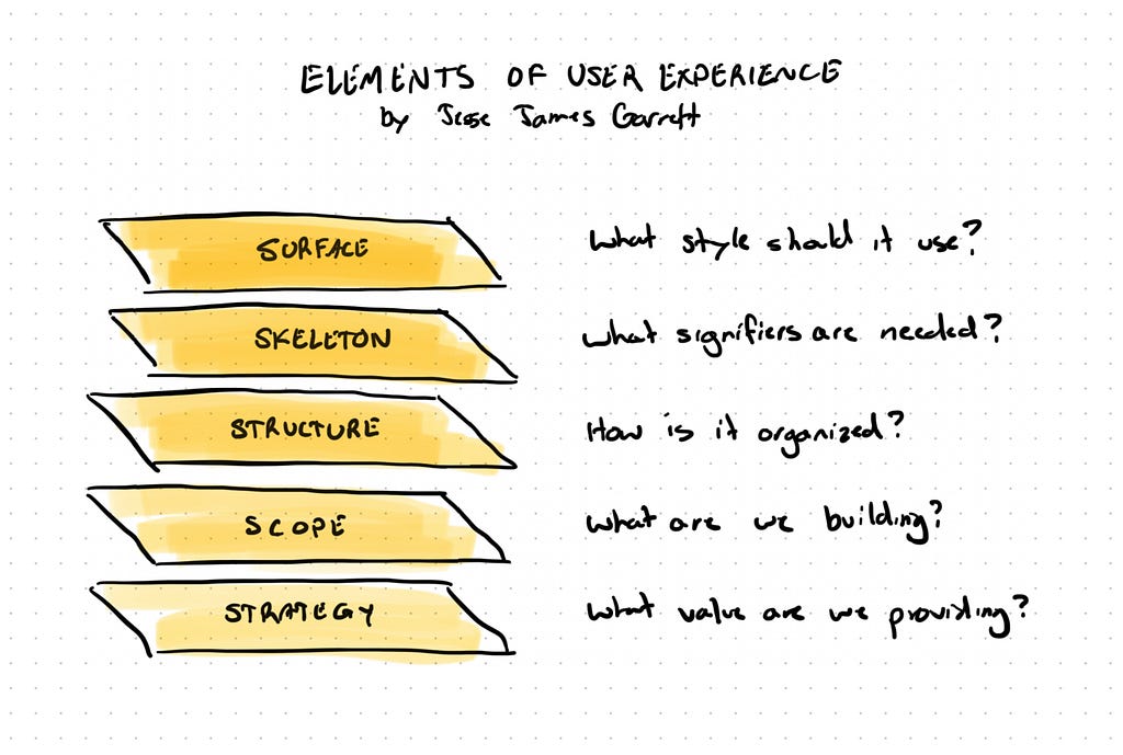
    Choosing the right UX tool for the problemImagine you are a homeowner, and you need to renovate your kitchen. You do your research and hire a contractor. On day one, he shows up with a big trailer behind his tough-looking truck. You’re excited. But something weird happens. Every time you see him working, he’s only got a hammer. No measuring tape. No level. No saw. Just a hammer, or two.The contractor swings it with confidence. They can drive nails like a pro. They’ve even gotten good at taking measurements with it. “That’ll be 5 hammers plus a head”. They’ll even bring in a sledgehammer every once in a while. But would you trust them to rebuild your kitchen? Handle the plumbing and electrical? Lay new flooring? Install the cabinets level?Nope. Definitely not.But, in digital experience design, we see this all the time. Designers rushing in to “solve” problems with one big hammer: a UI layout. Maybe it’s a “lo-fi” wireframe, or maybe they jump straight into hi-fi layouts in Figma. Either way, they are dragging rectangles around, hoping to fix whatever experience problem is in front of them. And just like that contractor, they make progress and look busy, but are they really being effective?If we want to design truly great experiences, we need more than a hammer. We need a broader set of tools and the wisdom to know when to reach for each one.Garrett’s famous layers of UXJesse James Garrett’s Elements of User Experience lays out a time-tested framework for what’s needed to create a user experience.When most people think of “UX,” what they picture is the user interface. That glossy finish on top of a much deeper structure. For most of the UX partners, it’s the most compelling visual. And, at some level, UX designers have reinforced this expectation by over-relying on UI layouts to communicate.But user interfaces are just that, “interfaces”. They’re the top-most layer that a user interacts with to experience the value that lies within a product or service. Interfaces are extremely important, but it’s only the access point of a good experience. They include what Garrett dubs the “surface”, or the visual styling and branding of the interface, and the “skeleton” which includes the structural nature of interface layout, navigation structures and patterns, and informational layouts and choices.Garrett’s five elements of user experienceBut, lingering beneath the shiny interface are critical foundational layers:Structure: Interfaces are supported by information. Information is accessed by moving around to different spots within the system. Both the organization of the information and the choreography through the system must be solid or the interface will fall flat. If users don’t get the info they need, game over. If they can’t easily get from one spot to another, then they bail.Scope: More importantly below the supporting structure is the scope of the product or feature. There must be a line in the sand explaining what’s in the product or service and what’s not. There must be clarity around what a feature means, and what’s needed for it to be valuable.Strategy: For a product or service to be successful it must be created with users in mind. There must be a definition of what users want and what we choose to build for them. And, more importantly we must know what we will not build. It must be backed up by a solid business model that can support the product.Each of these layers interact with the others, creating a strong, coherent experience from the ground up. If you only focus on the surface without addressing the underlying structure, you may fail to address the problem.Understanding this metaphor of layers is essential for two reasons:Identifying the problem type. It’s never as clean as a single layer, but typically the bulk of a problem lives in one of the layers that Garrett has laid out. Is the data well organized? Are we targeting the right users? Do workflows have logical steps and progression? The answers to these questions lead to the next reason.Choosing a tool to solve it. You wouldn’t use a hammer to cut a board (I suppose you can, but it’ll be way more work and end up as a mess). In the same way, you can’t use UI layout to solve deeper information organization problems (well, you can, but it’s a lot more effort, and you would make a mess).Each layer focuses on different types of questions: Why are we building this? What needs to be included? How will it be organized? How will it behave?But we often find ourselves under deadlines and real-world pressure to ship it quickly. It’s tempting to stay in the interface layer to “save time”. Sure, it’s fast. It’s visible. It feelsproductive. You can show something tangible to stakeholders. But skipping layers can be like skipping steps in building a house. No matter how beautiful the walls look, if the foundation is messed up, it will eventually crumble.UX Designers must be comfortable and skilled in wrestling with problems in all the layers. It takes patience to define strategy, intentionality to shape structure, and the foresight to ensure the skeleton will hold what we want to build.The common trap: defaulting to UIAfter that exploration of the layers, I hope you start to feel the tension. When you’re in the middle of a project and things get fuzzy, opening your UI layout tool of choice can feel like progress. It’s fast. It’s concrete.You can quickly start laying out information, drop in some buttons, craft the necessary content, add a dash of icons and typography. Look at you go! You’ve built a thing!But when we jump straight to UI, we miss opportunities to address different kinds of problems:Clarify the user’s real goals. Determine the primary task the user needs to complete, and thus drive the affordances and signifiers you choose, and the visual hierarchy you construct.Align the front and backstage processes that support the experience. Digital experiences are supported by a variety of digital and human services that a consumer may never see. We are always seeking to provide harmony between the optimal experience of the user and the services needed to support it.Untangle broken user flows. Revisit the series of steps a user is proceeding through. Consider different choreography options that make more logical sense to the user.Fix missing or confusing content structures. Revisit not just one screen, but the entire context of the workflows and the application to ensure content is consistent throughout. Additionally, you can ensure that you balance too much information with too little, and leverage progressive disclosure. (This is not an excuse to just “add some content” to fix it.)After looking at these few examples, you should see that the kinds of problems in digital experience design live at multiple different levels. They are of different kinds and types. Some are about organization, others about choreography, others about visual prominence, others about value match, and still others are more varieties than I have space to lay out here.In my opinion, only a small percentage of UX problems are directly UI problems. So where does that leave us?Which tool will you choose?Tools every designer should reach forAs we engage with the various kinds of problems, I recommend using Garrett’s layers as a diagnosis tool to help pinpoint the type of problem you’re dealing with. Then, grab an appropriate tool off the shelf to help with that problem type. You shouldn’t use a hammer to drive in a screw. And, you shouldn’t jump to your favorite UX tool or technique too quickly.Here are a few of my favorite “deep tracks” from the world of UX that I’ve grown to love:Creative short-form briefs: From Jared Spool, these help you quickly define the real problem, constraints, and goals of a project or feature. It helps bring alignment to the end user and the goals of the project.Object mapping: From Sophia V Prater, this tool helps you organize the elements of objects (conceptual elements) which lays a clear foundation for representing them to the user. It identifies prominent elements of the digital experience and their relationships. (Learn more by checking out OOUX)Service blueprints: This is one of my personal favorites when dealing with a new or complex workflow. It brings UX close to development partners to clearly show what’s needed at each step from the user and the system.Wireflows: It’s not user flow and it’s not a wireframe. It’s in-between. I love using these to map and give more life to how a user will accomplish tasks, step by step, before any details are added to a screen. In combination with a service blueprint, this is a powerful visual. It also helps identify high-level patterns that can be used throughout a flow or a digital product.These are just a few of my go-to tools. Each tool shines a light on a different part of the experience. They help you see the invisible stuff that UI layout might miss or make a mess of. UI layout is still an appropriate tool, but it’s best used when you’re dealing with a UI kind of problem.You don’t always need every toolBefore I go any further, I don’t want to be mistaken for saying something I haven’t. You don’t need to use every tool. Effective designers aren’t over-eager with all the tools in their shop. They’re problem solvers. So they evaluate the best tool for the job and leave the rest back in the shop. If the tool fits the job, then they’ll grab it off the shelf or out of the yard.Resist the temptation to use each tool as a “step” in the “design process”. Just don’t do it. Not every project needs you to bring in the heavy pneumatic jackhammer of service design. Not every project needs a full audit of the pages or views within an app. Not every project needs a full-on card sort. Sometimes all you need is a simple hand-drawn picture. And other times you may need a mix of tools and approaches to get the job done. Slow down to identify what tools are most helpful. Develop the skill to know which tool to grab based on the problem you’re facing.Choosing wisely saves time, focuses effort, and makes your design work stronger.So, is it hammer time?Real-world example: my job interview assignmentYears ago, I was looking for a new job as a Lead UX Designer. As part of the interview process, I was given a design assignment (it was an era where this was more common). The challenge was given pretty clear, straightforward goals. I only had a few hours to work, so I set off to it quickly. Given the time pressure, I could have gone straight into UI layout and polishing screens to make something beautiful.But I didn’t. I started by mapping out key flows to meet the goals of the user in this hypothetical project. I did some planning and organizing, then I set off to some wireframes to make it real enough to show my thinking and direction. I didn’t even get to a full prototype. I didn’t even have color or appealing typography. I ended up showing a crappy black-and-white wireframe with a few clickable elements to demonstrate key points. It was a pseudo-prototype.Why do I tell you this story? Because the core problem I was solving for in this challenge was not a UI problem. It was a choreography problem. I spent more time mapping out the path a user would navigate, rather than the screens they would see in the experience.And you know what? That’s what got me the job. They saw me targeting the core problem and not just the pretty visuals. Later I learned that I was actually competing against one other designer in this round. The other candidate? They created a beautiful UI, but it lacked the structure and rigor of a smooth flow. It came down to targeting the right level of problem. And that’s what led to multiple successful product releases over the years in that role.Become a master builderIf you want to grow in your UX work, I encourage you to slow down and look at the UX problems you encounter. Don’t assume that it’s a blank canvas for sparkly UI, but rather complex structures that need precision to target the level of problem you’re dealing with. It takes practice. It takes a little time up front. Most of all, it takes intention.So, back to our contractor analogy. Be the kind of contractor who not only has the tools needed for the job, but the kind of person who chooses their tool carefully. Be the kind of contractor who understands what’s needed and can craft with precision because your tool matches the need for the job.Design isn’t about swinging the same tool harder. It’s about knowing which one to reach for…and why.It’s not always hammer time was originally published in UX Collective on Medium, where people are continuing the conversation by highlighting and responding to this story.
    0 Reacties 0 aandelen 15 Views
  • LIFEHACKER.COM
    I Started Customizing My Steam Deck Controls, and It Was a Literal Game Changer
    Valve's Steam Deck has quickly become my go-to gaming handheld. I've clocked—oh god—500 hours just in Hades II on the Steam Deck. Yet I spent full weeks of my life using this device without diving into its most powerful feature: its customizable controls. Here's why you should be using them, even if you think you don't need to.At first, I avoided customizing my controls because I usually like to play the way the developer intended. That ended when I sprained my left wrist while in the middle of replaying Chrono Trigger. I wanted to keep playing, but I needed to rest my wrist. What could I do?That's correct: Obviously, I should remap the in-game controls so I could access almost every function in the game with just one hand, prop up the Steam Deck, and keep playing. Once I'd done that successfully, though, I started experimenting with every game to see what I could do.Get started by trying out community layoutsAlmost every game that's playable on the Steam Deck has its own controller layout ready to go, but you can always edit it. Simply press the Steam button while playing the game, then scroll to Controller Settings. You'll see a layout that shows which inputs each of the Steam Deck's buttons, control sticks, and touchpads are mapped to. At the bottom, you'll see a button labeled Controller Settings. Click that to start editing.Your first option is to change your entire layout. If you click "Edit Layout," you'll create a copy of the existing layout with your own changes (which you can always reset), but you can also browse community-made layouts to see if someone made something that's more comfortable for you. If you try a community layout and don't like it, your original layout will always be available to swap back.Make games designed for a mouse feel more naturalOne of the most slept-on superpowers of the Steam Deck—and what, in my opinion, makes it superior to most Windows-based handhelds—is its dual trackpads. These small squares just under each joystick work similarly to your laptop's trackpad. They have haptic feedback, and you can even click them. The Steam Deck has a touchscreen for entering text, but for my money, the trackpads are a better analog for mouse input.For example, Stardew Valley is a game that was initially designed for PC, and while its controller support is stellar, there are still a few menus where it would be handy to have a mouse. The default controller input maps the right trackpad to be seen as a joystick input. However, I swapped mine so that it reads like a mouse instead. This lets me quickly click on menus, or hover over items more easily than I would with controller inputs.You can change this behavior under the Trackpads section while editing your controller layout. You can pick from a few types of behavior (the nuance between "Joystick" and "As Joystick" can be, uh, confusing) so experiment with what works best for you. You can also add custom inputs for just touching the pad, and for clicking it.Boost your ergonomics with rear grip buttonsThe four back grip buttons (labeled L4, L5, R4, and R5) are quickly becoming my best friends. Depending on your hand size, they might be a little tough to reach, but they're what let me play Chrono Trigger with just one hand while the other was wrapped in a cold compress. These are so simple to enable, you don't even need to customize the controller layout.Each back grip button can be assigned to any existing input, but you can take it further by tweaking their settings. Click the gear icon next to each input and you can set each button to register as a single press, double press, long press, or a range of other options. You can even set one rear button to register as starting to press a key, then a different rear button to register as releasing that key. So, for example, if I want to buy thousands of pieces of wood from Robin's shop in Stardew Valley, I could start hitting the buy button, then walk away to get a snack while the numbers tick up. (Or I could install a bulk buy with gamepads mod, but still.)There's also a robust Turbo mode settings menu, though it's worth mentioning you should probably be wary of using this in any multiplayer games if you don't want your account banned. You can set a button to rapidly repeat an input while holding it down, adjust the interval between inputs, or even set it as a toggle.Create your own input menu overlaysBy far, one of the coolest tools on the Steam Deck is the ability to create your own input menus. My favorite is the Radial Menu. This creates an overlay on top of your game that lets you assign different inputs to a wheel for easy access. While editing your layout, go to Trackpads and from the behavior dropdown, choose Create Radial Menu. This will let you generate a radial overlay that appears whenever you touch this touchpad. This has been a lifesaver for me in games like Stardew Valley, where cycling through the toolbar is more cumbersome than on a desktop. The default configuration has you press the left and right triggers to move through the toolbar one step at a time. Nah; my custom radial menu lets me jump to the slot I want quickly with a single gesture.You can create radial menu layouts and apply them to the touchpads, joysticks, or even gyro controls (more on that below). It's one of the best ways to augment your game inputs, especially for games that aren't purposely designed with gamepad controls in mind. The Radial Menu creation interface Credit: Eric Ravenscraft Get precision aiming with gyro controlsIt gets overlooked a lot, but the Steam Deck has built-in gyro capabilities, and you can turn them on for any game in your library. Sort of. The Steam Deck will try to map gyro movements to inputs the game can comprehend, which usually works pretty well, but might be finicky depending on the game. Expect to do a little experimentation here.By default, Gyro controls will be off, but you can enable them with a simple toggle in the controller settings. After that, you can activate gyro movement by placing your thumb on the right control stick. The top of this stick is touch sensitive, so you don't need to move it, just come in contact with it. It also works by touching the right touchpad, but you can change this behavior in the controller settings.While you're activating gyro controls, tilting the Steam Deck will send corresponding mouse inputs to your game. In my experience, this worked great in first-person games like Doom Eternal, where you use the right control stick to point your camera. The gyro movements will give you a little extra precision control while tilting your Deck, while your thumb is where it would normally be on the control stick anyway.The amount of effort that's already gone into making sure most Steam games play well on the Steam Deck is already pretty incredible. Before it came out, I was skeptical it would work, and I've never been more happy to be proven wrong. Between official developer support and community layouts, almost every game I've played on the Steam Deck felt like it was made to be there.But that doesn't mean the customization has to stop. Even if you've never had a problem with any of the controls on your Steam Deck, it's worth diving into the customization tools to see if you can make your games feel more comfortable for you.
    0 Reacties 0 aandelen 17 Views
  • WWW.ENGADGET.COM
    Mark Zuckerberg 'predicts' AI will write most of Meta's code within 12 to 18 months
    Mark Zuckerberg says he believes most of the Meta's code will be written by AI agents sometime within the next year-and-a-half. Zuckerberg made the prediction during an hour-long interview with podcaster Dwarkesh Patel.  "I would guess sometime in the next 12 to 18 months, we'll reach the point where most of the code that's going towards these efforts is written by AI," said Zuckerberg, referring to the company's efforts to build internal AI agents. "And I don't mean like autocomplete... I'm talking more like you give it a goal, it can run tests, it can improve things, it can find issues, it writes higher quality code than the average very good person on the team already."  Meta CEO, Mark Zuckerberg:"within 12-18 months, most of the code is written by AI"It won’t just be autocomplete.AI agents will set goals, run tests, find problems, and write better code than top engineers. pic.twitter.com/2del08UA45— Haider. (@slow_developer) April 29, 2025 This is not the first time Zuckerberg has made this type of prediction. During his awkward appearance on The Joe Rogan Experience earlier this year, he said, "Probably in 2025, we at Meta, as well as the other companies that are basically working on this, are going to have an AI that can effectively be a sort of mid-level engineer that you have at your company that can write code."  Notice how the goal posts have moved. Less than five months ago, Zuckerberg said coding agents that could effectively replace most human programmers were within reach. Now, those same systems will not arrive by mid-2026 at the earliest. The changing timelines underscore exactly why we should be critical of the AI industry and its many promises. AI agents may very well one day replace mid-level programmers, but right now predictions like the one made by Zuckerberg and many others are, at best, advertisements for technologies that don't yet exist and may never perform at the level their advocates say they will. This article originally appeared on Engadget at https://www.engadget.com/ai/mark-zuckerberg-predicts-ai-will-write-most-of-metas-code-within-12-to-18-months-213851646.html?src=rss
    0 Reacties 0 aandelen 17 Views
  • WWW.TECHRADAR.COM
    Amazon's best TV just got some nice free upgrades
    Amazon has upgraded its flagship Fire TV Omni with Mini-LED with Interactive Art and Dual-Audio.
    0 Reacties 0 aandelen 15 Views
  • WWW.CNBC.COM
    Meta shares rise on stronger-than-expected revenue for the quarter
    Meta shares more than 5% after the company reported stronger-than-expected revenue in the first quarter.
    0 Reacties 0 aandelen 15 Views
  • WWW.FASTCOMPANY.COM
    Why Jimmy Fallon is now in the tortilla chip business
    Jimmy Fallon has done plenty of commercials and branded segments on his late-night show. Last year, he partnered with Beats by Dre for a signature set of headphones and put them head-to-head against Kim Kardashian’s design.  Now, The Tonight Show host is taking his business interests to a new level by becoming a brand partner and investor in tortilla chips and salsa brand Xochitl. His first challenge is pretty basic: teach people how to pronounce the brand name. (It’s so-cheel.) “It’s like so-chill. Or so-cheel media. So-cheel network. So-cheel distortion,” says Fallon. “It gets easier the more you practice it. So that’s my first job. And then once I get that out there, they’ll probably give me other assignments.” [Photo: Xochitl] Xochitl is America’s largest independent tortilla chip brand, but it is still far lesser known than your grocery store staples on the tortilla chip shelf, and lacks full national distribution. It’s looking to Fallon for a mainstream boost. Founded in 1995, the Irving, Texas-based brand is aiming to take a bigger bite out of the $11 billion North American tortilla chip market. It’s a growing category, with Frito-Lay’s Tostitos brand dominating, and Utz’s On the Border also a major player. Last May, private equity firm Forward Consumer Partners took a 50% stake in Xochitl. Chairman Matt Leeds says the goal here is to drive brand awareness and grow distribution. Who better to do that than a guy with 32.4 million YouTube subscribers and 27.4 million Instagram followers? “We believe that his involvement will create a lot of excitement, which can open distribution opportunities and retail partnerships,” Leeds says. “As a brand looking to emphasize warmth, authenticity, and shared experiences, Jimmy’s funny, approachable, and family-friendly persona aligns well with us and our brand strategy.” Now just say the name. [Photo: Xochitl] Right chip, right time At times it can seem like you can’t swing an empty booze bottle without hitting a celebrity tequila or whiskey. And yes, even beer. Fallon says he’s been offered similar opportunities in the past, but none really fit.  “I’ve been offered my own whiskey, my own tequila, and all that stuff, and I just don’t want to be out there boozing it up at the golf course, selling bottles of stuff,” Fallon says. “What am I doing? I didn’t know anything about that. But this? Tortilla chips, I can get behind. It’s on brand for me, and I have no problem selling this and standing behind it.” For Xochitl, the strategy is as simple as it gets: Ask a very famous guy who seems fun to not only promote but be involved in the brand.  “The partnership with Jimmy grew out of a simple insight: Xochitl is hard to pronounce but easy to love,” Leeds says. “We started with a blank sheet of paper, and Jimmy was literally our first and best idea for someone who could help teach people the Xochitl name in a way that’s fun, unique, and memorable.” Leeds called. Fallon answered. And just so happened to have been eating Xochitl chips that weekend.  “He called me up, and I said, ‘Wait, I actually know what you’re talking about!’ ” Fallon says. “I had no clue how it’s pronounced, though. He gave me this kind of rundown of where the business is, and I thought this sounded like a fun opportunity. I love business stories, I love marketing stuff, and I’d love to help see something grow and become giant.” Financial details of the deal were not disclosed. [Photo: Xochitl] Marching orders For Fallon, this is a unique opportunity to work with a brand that has very clear and ambitious objectives in mind.  “This has the chance and opportunity to really grow,” Fallon says. “When a brand is already massive, then I’m just doing a commercial or something. It’s a paid gig. It’s all good. You do the commercial, and you hope it’s funny. But with this? I’m a partner and an investor, so if it works out, I might actually see some dividends. I’ve got some skin in the game.” Before announcing the Fallon partnership, Xochitl had fewer than 5,000 Instagram followers. So there’s plenty of room to grow. Fallon is a self-described ad nerd and just wrapped production on a new advertising-based reality show for NBC that’s set to launch later this year.  Now it’s just a matter of taking everything he’s ever learned about advertising and marketing, and putting it to work. “They’re in select stores and some participating Walmarts, but they’re not in Whole Foods or Target,” Fallon says. “That’s the challenge. I know my marching orders, and I want to see if I can get them there. I want to see if I can get them in every store in the country. It’ll be fun.” This week, Xochitl is dropping its first-ever flavor collaboration with McCormick & Company’s Cholula hot sauce brand, exclusively at more than 2,000 Walmart stores, and it will roll out on Amazon and at grocers nationwide in the coming months. Between Late Night and The Tonight Show, Fallon has spent the last 16 years helping his celebrity guests plug their latest movies, TV, music, and more. Now he’s excited to really be selling his own brand. “One of my jobs at The Tonight Show is to always be selling everyone else’s stuff, which is great. I love it. It’s my favorite job,” he says. “So now I’m, like, ‘Why not do it for myself?’ ” One more time, it’s so-cheel.
    0 Reacties 0 aandelen 16 Views
  • WWW.CORE77.COM
    From China, Solar-Powered Pergolas
    In my rural area, you can buy ready-made sheds. You still need to prepare a foundation, and site the shed in an area accessible by the truck that will deliver it, but it's a popular-enough option that they're a common sight in yards.In China, a company called Ombra is producing a less utilitarian and more sophisticated version. The Ombra Solar Pergola is a pre-fab structure with glass walls and solar-panel-festooned louvers on the roof. The idea is that you can add extra outdoor living space (or for restaurants, dining space) that can generate its own electricity for lighting and climate control. The design is modular, so multiple units can be connected to create a contiguous interior space. As with those Boxabl pre-fab houses, my main gripe with this design is the flat roof. That's fine for Nevada or Arizona, but would be problematic, long-term, for any region that gets rain or snow. That hasn't stopped "design lovers" from lavishing praise on the structures; the Solar Pergola has won an iF Design Award, a Red Dot Design Award and the Gold Prize at this year's Milan Design Awards. Given the current state of international trade, fat chance we'll see these 'Stateside.
    0 Reacties 0 aandelen 13 Views
  • WWW.YANKODESIGN.COM
    INAIR AI Spatial Computer brings multiscreen set up to your virtual workspace
    We are so used to having an expansive workstation with more than one display and all the computing power at our disposal to get daily tasks done most productively. When we step outside, the gauntlet shifts to the portable laptops that have evolved exponentially in terms of computing power. To expand the working area, one can connect an external monitor but going beyond that is a cliché when we talk of portability. The INAIR AI Spatial Computer is a different beast as it is not limited by the physical constraints of carrying your laptop. We got the chance to experience the future-forward computing machine at Global Connect Media Day in Shenzhen, and totally liked the idea of having an expansive virtual space for getting everything done super smoothly. To be precise, it brings the benefits of a big virtual screen to open multiple applications without any physical constraints of carrying a laptop, external monitor, or any other gear to achieve the same level of computing prowess as a workstation. Designer: INAIR INAIR AI Spatial Computer The tangible components of the computing machine are the lightweight glasses that make possible the virtual reality screen at your disposal, the INAIR pod which is the AI-powered computing heart of the gadget, and the wireless Touchboard keyboard which comes with customized touch gestures to work on the 3D space on offer. This next-generation portable computer aided by smart AI, blurs the lines between physical working spaces and the virtual working environment that is not limited by the confines of traditional displays. With just three accessories required, the spatial computer eliminates the need for carrying any laptops or external monitors. Six Virtual Screens = Multi-monitor setup in your pocket INAIR transforms any environment into an expansive virtual screen measuring 134-inches with support for up to six virtual screens at a time. That much screen real estate is enough for your professional endeavors, whether you are an editor, coder, educator, digital artist, or power user who needs multiple screens for multitasking productivity. The spatial computing solution gives the user the liberty to utilize their visible area to put up apps or software. Talking of which, the INAIR system is compatible with the Android app ecosystem along with its own suite of applications tailored for enhancing work productivity. Ergonomic Design for Comfort and Custom Fit The smart glasses made out of magnesium alloy frames ensure long hours of comfortable wearing, which has been an issue with VR headsets of the current era. This makes the INAIR a more practical option for real-world usage and varying situations of use. Whether it is about making presentations on the go, working in a remote café, or finishing up your coding tasks at home; the new age solution addresses a lot of shortcomings associated with high-end hardware that at most times, is not portable. Productivity and Entertainment Galore This suite of compact gadgets combines to turn any place into a private office, creative studio, or personal entertainment hub when you need to have some relaxing time. The six virtual screens can be repositioned or resized at will to give you more freedom when it comes to multitasking. According to Hai Huang, CEO of INAIR, the INAIR AI Spatial Computer offers the next step in AR and AI-powered spatial computing. Hai adds, “This all-in-one solution is designed to meet the demands of modern workflows, empowering users with seamless, hands-free productivity and enhanced immersion in any environment.” Borderless Digital Life That’s Super Secure INAIR Spatial Computer is loaded with AI-assisted functions to make real-time translations and voice commands possible for a seamless workflow. Privacy is at the forefront thanks to the electrochromic technology that lets you switch between opaque and translucent modes depending on the location of use. The transition is as simple as swiping a finger across the capacitive privacy slider on the frame of the glasses. These smart glasses, weighing just 68 grams have an air-cushioned nose pad for long-term wear, and in our demo session, we found them to be super lightweight and comfortable. INAIR Pod and Touchpad The input comes from the Pod, which is powered by a Qualcomm microchip that is powerful enough for the advanced computing requirements of multitasking and AI. It is an advanced input device designed specifically for augmented reality and virtual reality applications. The peripheral is tailored for 3D spaces for smoother navigation in the VR environment, courtesy of the customized touch gestures. You can even stream PC content remotely to elevate your fast-paced digital work life. The Touchboard keyboard, on the other hand, comes in handy for all your typing needs and to set up a portable office anywhere. Both the INAIR Pod and the Touchboard aim to recreate the familiar control dynamics of laptop input but with reimagined freedom for virtual spaces. The post INAIR AI Spatial Computer brings multiscreen set up to your virtual workspace first appeared on Yanko Design.
    0 Reacties 0 aandelen 12 Views