• Q&A: How anacondas, chickens, and locals may be able to coexist in the Amazon

    A coiled giant anaconda. They are the largest snake species in Brazil and play a major role in legends including the ‘Boiuna’ and the ‘Cobra Grande.’ CREDIT: Beatriz Cosendey.

    Get the Popular Science daily newsletter
    Breakthroughs, discoveries, and DIY tips sent every weekday.

    South America’s lush Amazon region is a biodiversity hotspot, which means that every living thing must find a way to co-exist. Even some of the most feared snakes on the planet–anacondas. In a paper published June 16 in the journal Frontiers in Amphibian and Reptile Science, conservation biologists Beatriz Cosendey and Juarez Carlos Brito Pezzuti from the Federal University of Pará’s Center for Amazonian Studies in Brazil, analyze the key points behind the interactions between humans and the local anaconda populations.
    Ahead of the paper’s publication, the team at Frontiers conducted this wide-ranging Q&A with Conesday. It has not been altered.
    Frontiers: What inspired you to become a researcher?
    Beatriz Cosendey: As a child, I was fascinated by reports and documentaries about field research and often wondered what it took to be there and what kind of knowledge was being produced. Later, as an ecologist, I felt the need for approaches that better connected scientific research with real-world contexts. I became especially interested in perspectives that viewed humans not as separate from nature, but as part of ecological systems. This led me to explore integrative methods that incorporate local and traditional knowledge, aiming to make research more relevant and accessible to the communities involved.
    F: Can you tell us about the research you’re currently working on?
    BC: My research focuses on ethnobiology, an interdisciplinary field intersecting ecology, conservation, and traditional knowledge. We investigate not only the biodiversity of an area but also the relationship local communities have with surrounding species, providing a better understanding of local dynamics and areas needing special attention for conservation. After all, no one knows a place better than those who have lived there for generations. This deep familiarity allows for early detection of changes or environmental shifts. Additionally, developing a collaborative project with residents generates greater engagement, as they recognize themselves as active contributors; and collective participation is essential for effective conservation.
    Local boating the Amazon River. CREDIT: Beatriz Cosendey.
    F: Could you tell us about one of the legends surrounding anacondas?
    BC: One of the greatest myths is about the Great Snake—a huge snake that is said to inhabit the Amazon River and sleep beneath the town. According to the dwellers, the Great Snake is an anaconda that has grown too large; its movements can shake the river’s waters, and its eyes look like fire in the darkness of night. People say anacondas can grow so big that they can swallow large animals—including humans or cattle—without difficulty.
    F: What could be the reasons why the traditional role of anacondas as a spiritual and mythological entity has changed? Do you think the fact that fewer anacondas have been seen in recent years contributes to their diminished importance as an mythological entity?
    BC: Not exactly. I believe the two are related, but not in a direct way. The mythology still exists, but among Aritapera dwellers, there’s a more practical, everyday concern—mainly the fear of losing their chickens. As a result, anacondas have come to be seen as stealthy thieves. These traits are mostly associated with smaller individuals, while the larger ones—which may still carry the symbolic weight of the ‘Great Snake’—tend to retreat to more sheltered areas; because of the presence of houses, motorized boats, and general noise, they are now seen much less frequently.
    A giant anaconda is being measured. Credit: Pedro Calazans.
    F: Can you share some of the quotes you’ve collected in interviews that show the attitude of community members towards anacondas? How do chickens come into play?
    BC: When talking about anacondas, one thing always comes up: chickens. “Chicken is herfavorite dish. If one clucks, she comes,” said one dweller. This kind of remark helps explain why the conflict is often framed in economic terms. During the interviews and conversations with local dwellers, many emphasized the financial impact of losing their animals: “The biggest loss is that they keep taking chicks and chickens…” or “You raise the chicken—you can’t just let it be eaten for free, right?”
    For them, it’s a loss of investment, especially since corn, which is used as chicken feed, is expensive. As one person put it: “We spend time feeding and raising the birds, and then the snake comes and takes them.” One dweller shared that, in an attempt to prevent another loss, he killed the anaconda and removed the last chicken it had swallowed from its belly—”it was still fresh,” he said—and used it for his meal, cooking the chicken for lunch so it wouldn’t go to waste.
    One of the Amazonas communities where the researchers conducted their research. CREDIT: Beatriz Cosendey.
    Some interviewees reported that they had to rebuild their chicken coops and pigsties because too many anacondas were getting in. Participants would point out where the anaconda had entered and explained that they came in through gaps or cracks but couldn’t get out afterwards because they ‘tufavam’ — a local term referring to the snake’s body swelling after ingesting prey.
    We saw chicken coops made with mesh, with nylon, some that worked and some that didn’t. Guided by the locals’ insights, we concluded that the best solution to compensate for the gaps between the wooden slats is to line the coop with a fine nylon mesh, and on the outside, a layer of wire mesh, which protects the inner mesh and prevents the entry of larger animals.
    F: Are there any common misconceptions about this area of research? How would you address them?
    BC: Yes, very much. Although ethnobiology is an old science, it’s still underexplored and often misunderstood. In some fields, there are ongoing debates about the robustness and scientific validity of the field and related areas. This is largely because the findings don’t always rely only on hard statistical data.
    However, like any other scientific field, it follows standardized methodologies, and no result is accepted without proper grounding. What happens is that ethnobiology leans more toward the human sciences, placing human beings and traditional knowledge as key variables within its framework.
    To address these misconceptions, I believe it’s important to emphasize that ethnobiology produces solid and relevant knowledge—especially in the context of conservation and sustainable development. It offers insights that purely biological approaches might overlook and helps build bridges between science and society.
    The study focused on the várzea regions of the Lower Amazon River. CREDIT: Beatriz Cosendey.
    F: What are some of the areas of research you’d like to see tackled in the years ahead?
    BC: I’d like to see more conservation projects that include local communities as active participants rather than as passive observers. Incorporating their voices, perspectives, and needs not only makes initiatives more effective, but also more just. There is also great potential in recognizing and valuing traditional knowledge. Beyond its cultural significance, certain practices—such as the use of natural compounds—could become practical assets for other vulnerable regions. Once properly documented and understood, many of these approaches offer adaptable forms of environmental management and could help inform broader conservation strategies elsewhere.
    F: How has open science benefited the reach and impact of your research?
    BC: Open science is crucial for making research more accessible. By eliminating access barriers, it facilitates a broader exchange of knowledge—important especially for interdisciplinary research like mine which draws on multiple knowledge systems and gains value when shared widely. For scientific work, it ensures that knowledge reaches a wider audience, including practitioners and policymakers. This openness fosters dialogue across different sectors, making research more inclusive and encouraging greater collaboration among diverse groups.
    The Q&A can also be read here.
    #qampampa #how #anacondas #chickens #locals
    Q&A: How anacondas, chickens, and locals may be able to coexist in the Amazon
    A coiled giant anaconda. They are the largest snake species in Brazil and play a major role in legends including the ‘Boiuna’ and the ‘Cobra Grande.’ CREDIT: Beatriz Cosendey. Get the Popular Science daily newsletter💡 Breakthroughs, discoveries, and DIY tips sent every weekday. South America’s lush Amazon region is a biodiversity hotspot, which means that every living thing must find a way to co-exist. Even some of the most feared snakes on the planet–anacondas. In a paper published June 16 in the journal Frontiers in Amphibian and Reptile Science, conservation biologists Beatriz Cosendey and Juarez Carlos Brito Pezzuti from the Federal University of Pará’s Center for Amazonian Studies in Brazil, analyze the key points behind the interactions between humans and the local anaconda populations. Ahead of the paper’s publication, the team at Frontiers conducted this wide-ranging Q&A with Conesday. It has not been altered. Frontiers: What inspired you to become a researcher? Beatriz Cosendey: As a child, I was fascinated by reports and documentaries about field research and often wondered what it took to be there and what kind of knowledge was being produced. Later, as an ecologist, I felt the need for approaches that better connected scientific research with real-world contexts. I became especially interested in perspectives that viewed humans not as separate from nature, but as part of ecological systems. This led me to explore integrative methods that incorporate local and traditional knowledge, aiming to make research more relevant and accessible to the communities involved. F: Can you tell us about the research you’re currently working on? BC: My research focuses on ethnobiology, an interdisciplinary field intersecting ecology, conservation, and traditional knowledge. We investigate not only the biodiversity of an area but also the relationship local communities have with surrounding species, providing a better understanding of local dynamics and areas needing special attention for conservation. After all, no one knows a place better than those who have lived there for generations. This deep familiarity allows for early detection of changes or environmental shifts. Additionally, developing a collaborative project with residents generates greater engagement, as they recognize themselves as active contributors; and collective participation is essential for effective conservation. Local boating the Amazon River. CREDIT: Beatriz Cosendey. F: Could you tell us about one of the legends surrounding anacondas? BC: One of the greatest myths is about the Great Snake—a huge snake that is said to inhabit the Amazon River and sleep beneath the town. According to the dwellers, the Great Snake is an anaconda that has grown too large; its movements can shake the river’s waters, and its eyes look like fire in the darkness of night. People say anacondas can grow so big that they can swallow large animals—including humans or cattle—without difficulty. F: What could be the reasons why the traditional role of anacondas as a spiritual and mythological entity has changed? Do you think the fact that fewer anacondas have been seen in recent years contributes to their diminished importance as an mythological entity? BC: Not exactly. I believe the two are related, but not in a direct way. The mythology still exists, but among Aritapera dwellers, there’s a more practical, everyday concern—mainly the fear of losing their chickens. As a result, anacondas have come to be seen as stealthy thieves. These traits are mostly associated with smaller individuals, while the larger ones—which may still carry the symbolic weight of the ‘Great Snake’—tend to retreat to more sheltered areas; because of the presence of houses, motorized boats, and general noise, they are now seen much less frequently. A giant anaconda is being measured. Credit: Pedro Calazans. F: Can you share some of the quotes you’ve collected in interviews that show the attitude of community members towards anacondas? How do chickens come into play? BC: When talking about anacondas, one thing always comes up: chickens. “Chicken is herfavorite dish. If one clucks, she comes,” said one dweller. This kind of remark helps explain why the conflict is often framed in economic terms. During the interviews and conversations with local dwellers, many emphasized the financial impact of losing their animals: “The biggest loss is that they keep taking chicks and chickens…” or “You raise the chicken—you can’t just let it be eaten for free, right?” For them, it’s a loss of investment, especially since corn, which is used as chicken feed, is expensive. As one person put it: “We spend time feeding and raising the birds, and then the snake comes and takes them.” One dweller shared that, in an attempt to prevent another loss, he killed the anaconda and removed the last chicken it had swallowed from its belly—”it was still fresh,” he said—and used it for his meal, cooking the chicken for lunch so it wouldn’t go to waste. One of the Amazonas communities where the researchers conducted their research. CREDIT: Beatriz Cosendey. Some interviewees reported that they had to rebuild their chicken coops and pigsties because too many anacondas were getting in. Participants would point out where the anaconda had entered and explained that they came in through gaps or cracks but couldn’t get out afterwards because they ‘tufavam’ — a local term referring to the snake’s body swelling after ingesting prey. We saw chicken coops made with mesh, with nylon, some that worked and some that didn’t. Guided by the locals’ insights, we concluded that the best solution to compensate for the gaps between the wooden slats is to line the coop with a fine nylon mesh, and on the outside, a layer of wire mesh, which protects the inner mesh and prevents the entry of larger animals. F: Are there any common misconceptions about this area of research? How would you address them? BC: Yes, very much. Although ethnobiology is an old science, it’s still underexplored and often misunderstood. In some fields, there are ongoing debates about the robustness and scientific validity of the field and related areas. This is largely because the findings don’t always rely only on hard statistical data. However, like any other scientific field, it follows standardized methodologies, and no result is accepted without proper grounding. What happens is that ethnobiology leans more toward the human sciences, placing human beings and traditional knowledge as key variables within its framework. To address these misconceptions, I believe it’s important to emphasize that ethnobiology produces solid and relevant knowledge—especially in the context of conservation and sustainable development. It offers insights that purely biological approaches might overlook and helps build bridges between science and society. The study focused on the várzea regions of the Lower Amazon River. CREDIT: Beatriz Cosendey. F: What are some of the areas of research you’d like to see tackled in the years ahead? BC: I’d like to see more conservation projects that include local communities as active participants rather than as passive observers. Incorporating their voices, perspectives, and needs not only makes initiatives more effective, but also more just. There is also great potential in recognizing and valuing traditional knowledge. Beyond its cultural significance, certain practices—such as the use of natural compounds—could become practical assets for other vulnerable regions. Once properly documented and understood, many of these approaches offer adaptable forms of environmental management and could help inform broader conservation strategies elsewhere. F: How has open science benefited the reach and impact of your research? BC: Open science is crucial for making research more accessible. By eliminating access barriers, it facilitates a broader exchange of knowledge—important especially for interdisciplinary research like mine which draws on multiple knowledge systems and gains value when shared widely. For scientific work, it ensures that knowledge reaches a wider audience, including practitioners and policymakers. This openness fosters dialogue across different sectors, making research more inclusive and encouraging greater collaboration among diverse groups. The Q&A can also be read here. #qampampa #how #anacondas #chickens #locals
    Q&A: How anacondas, chickens, and locals may be able to coexist in the Amazon
    www.popsci.com
    A coiled giant anaconda. They are the largest snake species in Brazil and play a major role in legends including the ‘Boiuna’ and the ‘Cobra Grande.’ CREDIT: Beatriz Cosendey. Get the Popular Science daily newsletter💡 Breakthroughs, discoveries, and DIY tips sent every weekday. South America’s lush Amazon region is a biodiversity hotspot, which means that every living thing must find a way to co-exist. Even some of the most feared snakes on the planet–anacondas. In a paper published June 16 in the journal Frontiers in Amphibian and Reptile Science, conservation biologists Beatriz Cosendey and Juarez Carlos Brito Pezzuti from the Federal University of Pará’s Center for Amazonian Studies in Brazil, analyze the key points behind the interactions between humans and the local anaconda populations. Ahead of the paper’s publication, the team at Frontiers conducted this wide-ranging Q&A with Conesday. It has not been altered. Frontiers: What inspired you to become a researcher? Beatriz Cosendey: As a child, I was fascinated by reports and documentaries about field research and often wondered what it took to be there and what kind of knowledge was being produced. Later, as an ecologist, I felt the need for approaches that better connected scientific research with real-world contexts. I became especially interested in perspectives that viewed humans not as separate from nature, but as part of ecological systems. This led me to explore integrative methods that incorporate local and traditional knowledge, aiming to make research more relevant and accessible to the communities involved. F: Can you tell us about the research you’re currently working on? BC: My research focuses on ethnobiology, an interdisciplinary field intersecting ecology, conservation, and traditional knowledge. We investigate not only the biodiversity of an area but also the relationship local communities have with surrounding species, providing a better understanding of local dynamics and areas needing special attention for conservation. After all, no one knows a place better than those who have lived there for generations. This deep familiarity allows for early detection of changes or environmental shifts. Additionally, developing a collaborative project with residents generates greater engagement, as they recognize themselves as active contributors; and collective participation is essential for effective conservation. Local boating the Amazon River. CREDIT: Beatriz Cosendey. F: Could you tell us about one of the legends surrounding anacondas? BC: One of the greatest myths is about the Great Snake—a huge snake that is said to inhabit the Amazon River and sleep beneath the town. According to the dwellers, the Great Snake is an anaconda that has grown too large; its movements can shake the river’s waters, and its eyes look like fire in the darkness of night. People say anacondas can grow so big that they can swallow large animals—including humans or cattle—without difficulty. F: What could be the reasons why the traditional role of anacondas as a spiritual and mythological entity has changed? Do you think the fact that fewer anacondas have been seen in recent years contributes to their diminished importance as an mythological entity? BC: Not exactly. I believe the two are related, but not in a direct way. The mythology still exists, but among Aritapera dwellers, there’s a more practical, everyday concern—mainly the fear of losing their chickens. As a result, anacondas have come to be seen as stealthy thieves. These traits are mostly associated with smaller individuals (up to around 2–2.5 meters), while the larger ones—which may still carry the symbolic weight of the ‘Great Snake’—tend to retreat to more sheltered areas; because of the presence of houses, motorized boats, and general noise, they are now seen much less frequently. A giant anaconda is being measured. Credit: Pedro Calazans. F: Can you share some of the quotes you’ve collected in interviews that show the attitude of community members towards anacondas? How do chickens come into play? BC: When talking about anacondas, one thing always comes up: chickens. “Chicken is her [the anaconda’s] favorite dish. If one clucks, she comes,” said one dweller. This kind of remark helps explain why the conflict is often framed in economic terms. During the interviews and conversations with local dwellers, many emphasized the financial impact of losing their animals: “The biggest loss is that they keep taking chicks and chickens…” or “You raise the chicken—you can’t just let it be eaten for free, right?” For them, it’s a loss of investment, especially since corn, which is used as chicken feed, is expensive. As one person put it: “We spend time feeding and raising the birds, and then the snake comes and takes them.” One dweller shared that, in an attempt to prevent another loss, he killed the anaconda and removed the last chicken it had swallowed from its belly—”it was still fresh,” he said—and used it for his meal, cooking the chicken for lunch so it wouldn’t go to waste. One of the Amazonas communities where the researchers conducted their research. CREDIT: Beatriz Cosendey. Some interviewees reported that they had to rebuild their chicken coops and pigsties because too many anacondas were getting in. Participants would point out where the anaconda had entered and explained that they came in through gaps or cracks but couldn’t get out afterwards because they ‘tufavam’ — a local term referring to the snake’s body swelling after ingesting prey. We saw chicken coops made with mesh, with nylon, some that worked and some that didn’t. Guided by the locals’ insights, we concluded that the best solution to compensate for the gaps between the wooden slats is to line the coop with a fine nylon mesh (to block smaller animals), and on the outside, a layer of wire mesh, which protects the inner mesh and prevents the entry of larger animals. F: Are there any common misconceptions about this area of research? How would you address them? BC: Yes, very much. Although ethnobiology is an old science, it’s still underexplored and often misunderstood. In some fields, there are ongoing debates about the robustness and scientific validity of the field and related areas. This is largely because the findings don’t always rely only on hard statistical data. However, like any other scientific field, it follows standardized methodologies, and no result is accepted without proper grounding. What happens is that ethnobiology leans more toward the human sciences, placing human beings and traditional knowledge as key variables within its framework. To address these misconceptions, I believe it’s important to emphasize that ethnobiology produces solid and relevant knowledge—especially in the context of conservation and sustainable development. It offers insights that purely biological approaches might overlook and helps build bridges between science and society. The study focused on the várzea regions of the Lower Amazon River. CREDIT: Beatriz Cosendey. F: What are some of the areas of research you’d like to see tackled in the years ahead? BC: I’d like to see more conservation projects that include local communities as active participants rather than as passive observers. Incorporating their voices, perspectives, and needs not only makes initiatives more effective, but also more just. There is also great potential in recognizing and valuing traditional knowledge. Beyond its cultural significance, certain practices—such as the use of natural compounds—could become practical assets for other vulnerable regions. Once properly documented and understood, many of these approaches offer adaptable forms of environmental management and could help inform broader conservation strategies elsewhere. F: How has open science benefited the reach and impact of your research? BC: Open science is crucial for making research more accessible. By eliminating access barriers, it facilitates a broader exchange of knowledge—important especially for interdisciplinary research like mine which draws on multiple knowledge systems and gains value when shared widely. For scientific work, it ensures that knowledge reaches a wider audience, including practitioners and policymakers. This openness fosters dialogue across different sectors, making research more inclusive and encouraging greater collaboration among diverse groups. The Q&A can also be read here.
    Like
    Love
    Wow
    Sad
    Angry
    443
    · 2 Comentários ·0 Compartilhamentos ·0 Anterior
  • Casa Sofia by Mário Martins Atelier: A Contemporary Urban Infill in Lagos

    Casa Sofia | © Fernando Guerra / FG+SG
    Located in the historic heart of Lagos, Portugal, Casa Sofia by Mário Martins Atelier is a thoughtful exercise in urban integration and contemporary reinterpretation. Occupying a site once held by a modest two-story house, the project is situated on the corner of a block facing the Church of St Sebastião. With its commanding presence, this national monument set a formidable challenge for the architects: introducing a new residence that respects the weight of history while offering a clear, contemporary expression.

    Casa Sofia Technical Information

    Architects1-4: Mário Martins Atelier
    Location: Lagos, Portugal
    Project Completion Years: 2023
    Photographs: © Fernando Guerra / FG+SG

    It is therefore important to design a building to fit into and complete the block. A house that is quiet and solid, with rhythmic metrics, whose new design brings an identity, with the weight and scent of the times, to a city that has existed for many centuries.
    – Mário Martins Atelier

    Casa Sofia Photographs

    © Fernando Guerra / FG+SG

    © Fernando Guerra / FG+SG

    © Fernando Guerra / FG+SG

    © Fernando Guerra / FG+SG

    © Fernando Guerra / FG+SG

    © Fernando Guerra / FG+SG

    © Fernando Guerra / FG+SG

    © Fernando Guerra / FG+SG

    © Fernando Guerra / FG+SG

    © Fernando Guerra / FG+SG

    © Fernando Guerra / FG+SG
    Spatial Organization and Circulation
    The design’s ambition is anchored in reconciling modern residential needs with the dense urban fabric that defines the walled city. Rather than imposing a bold or disruptive form, the project embraces the existing rhythms and textures of the surrounding architecture. The result is a building that both defers to and elevates the neighborhood’s character. Its restrained profile and carefully modulated facade echo the massing and articulation of the original house while introducing an identity that is clearly of its time.
    At the core of Casa Sofia’s spatial organization is a deliberate hierarchy of spaces that transitions seamlessly between public, semi-public, and private domains. Entry from the street occurs through a modest set of steps leading to an exterior atrium. This threshold mediates the relationship between the public realm and the interior, grounding the house in its urban context. Once inside, an open hall reveals the vertical flow of the building, dominated by a staircase that appears to float, linking the house’s various levels while maintaining visual continuity throughout.
    The ground floor houses three bedrooms, each with an ensuite bathroom, radiating from the central hall. This level also contains a small basement for technical support, reinforcing the discreet layering of functional and domestic spaces. Midway up the staircase, the house opens onto a garage, a laundry room, and an intimate courtyard. These areas, essential for daily life, are seamlessly integrated into the overall composition, contributing to a spatial richness that is both pragmatic and sensorial.
    On the first floor, an open-plan arrangement accommodates the main living spaces. Around a central void, the living and dining areas, kitchen, and master suite are arranged to encourage visual interplay and shared light. This configuration enhances the spatial porosity, ensuring that despite the density of the historic center, the house retains a sense of openness and fluidity. Above, a recessed roof level recedes from the street, culminating in a panoramic terrace with a swimming pool. Here, the building dissolves into the sky, offering expansive views and light-filled leisure spaces that contrast with the more enclosed lower floors.
    Materiality and Craftsmanship
    Materiality plays a decisive role in mediating the building’s relationship with its context. White-painted plaster, a familiar element in the region, is punctuated by deep limestone moldings. These details create a play of light and shadow that emphasizes the facade’s verticality and rhythm. The generous thickness of the walls, carried over from the site’s earlier construction, lends a sense of solidity and permanence to the house, recalling the tactile traditions of the Algarve’s architecture.
    The interior and exterior detailing is characterized by an economy of means, where each material is selected for its ability to reinforce the house’s quiet presence. Local materials and craftsmanship ground the project in its immediate context while responding to environmental imperatives. High thermal comfort is achieved through careful orientation and passive design strategies, complemented by the integration of solar control and water conservation measures. These considerations underscore the project’s commitment to sustainability without resorting to superficial gestures.
    Broader Urban and Cultural Implications
    Beyond its immediate function as a family home, Casa Sofia engages in a broader dialogue with its urban and cultural surroundings. The project exemplifies a measured response to the question of how to build within a historical setting without resorting to nostalgia or pastiche. It demonstrates that contemporary architecture can find resonance within heritage contexts by prioritizing the values of continuity, scale, and material authenticity.
    In its measured dialogue with the Church of St Sebastião and the centuries-old urban landscape of Lagos, Casa Sofia illustrates the potential for architecture to enrich the experience of place through quiet, rigorous interventions. It is a project that reaffirms architecture’s capacity to negotiate between past and present, crafting spaces that are at once deeply contextual and unambiguously of their moment.
    Casa Sofia Plans

    Sketch | © Mário Martins Atelier

    Ground Level | © Mário Martins Atelier

    Level 1 | © Mário Martins Atelier

    Level 2 | © Mário Martins Atelier

    Roof Plan | © Mário Martins Atelier

    Section | © Mário Martins Atelier
    Casa Sofia Image Gallery

    About Mário Martins Atelier
    Mário Martins Atelier is a Portuguese architecture and urbanism practice founded in 2000 by architect Mário Martins, who holds a degree from the Faculty of Architecture at the Technical University of Lisbon. Headquartered in Lagos with a secondary office in Lisbon, the firm operates with a dedicated multidisciplinary team. The office has developed a broad spectrum of work, from single-family homes and collective housing to public buildings and urban regeneration, distinguished by technical precision, contextual sensitivity, and sustainable strategies.
    Credits and Additional Notes

    Lead Architect: Mário Martins, arq.
    Project Team: Rita Rocha, Sónia Fialho, Susana Caetano, Susana Jóia, Ana Graça
    Engineering: Nuno Grave Engenharia
    Building: Marques Antunes Engenharia Lda
    #casa #sofia #mário #martins #atelier
    Casa Sofia by Mário Martins Atelier: A Contemporary Urban Infill in Lagos
    Casa Sofia | © Fernando Guerra / FG+SG Located in the historic heart of Lagos, Portugal, Casa Sofia by Mário Martins Atelier is a thoughtful exercise in urban integration and contemporary reinterpretation. Occupying a site once held by a modest two-story house, the project is situated on the corner of a block facing the Church of St Sebastião. With its commanding presence, this national monument set a formidable challenge for the architects: introducing a new residence that respects the weight of history while offering a clear, contemporary expression. Casa Sofia Technical Information Architects1-4: Mário Martins Atelier Location: Lagos, Portugal Project Completion Years: 2023 Photographs: © Fernando Guerra / FG+SG It is therefore important to design a building to fit into and complete the block. A house that is quiet and solid, with rhythmic metrics, whose new design brings an identity, with the weight and scent of the times, to a city that has existed for many centuries. – Mário Martins Atelier Casa Sofia Photographs © Fernando Guerra / FG+SG © Fernando Guerra / FG+SG © Fernando Guerra / FG+SG © Fernando Guerra / FG+SG © Fernando Guerra / FG+SG © Fernando Guerra / FG+SG © Fernando Guerra / FG+SG © Fernando Guerra / FG+SG © Fernando Guerra / FG+SG © Fernando Guerra / FG+SG © Fernando Guerra / FG+SG Spatial Organization and Circulation The design’s ambition is anchored in reconciling modern residential needs with the dense urban fabric that defines the walled city. Rather than imposing a bold or disruptive form, the project embraces the existing rhythms and textures of the surrounding architecture. The result is a building that both defers to and elevates the neighborhood’s character. Its restrained profile and carefully modulated facade echo the massing and articulation of the original house while introducing an identity that is clearly of its time. At the core of Casa Sofia’s spatial organization is a deliberate hierarchy of spaces that transitions seamlessly between public, semi-public, and private domains. Entry from the street occurs through a modest set of steps leading to an exterior atrium. This threshold mediates the relationship between the public realm and the interior, grounding the house in its urban context. Once inside, an open hall reveals the vertical flow of the building, dominated by a staircase that appears to float, linking the house’s various levels while maintaining visual continuity throughout. The ground floor houses three bedrooms, each with an ensuite bathroom, radiating from the central hall. This level also contains a small basement for technical support, reinforcing the discreet layering of functional and domestic spaces. Midway up the staircase, the house opens onto a garage, a laundry room, and an intimate courtyard. These areas, essential for daily life, are seamlessly integrated into the overall composition, contributing to a spatial richness that is both pragmatic and sensorial. On the first floor, an open-plan arrangement accommodates the main living spaces. Around a central void, the living and dining areas, kitchen, and master suite are arranged to encourage visual interplay and shared light. This configuration enhances the spatial porosity, ensuring that despite the density of the historic center, the house retains a sense of openness and fluidity. Above, a recessed roof level recedes from the street, culminating in a panoramic terrace with a swimming pool. Here, the building dissolves into the sky, offering expansive views and light-filled leisure spaces that contrast with the more enclosed lower floors. Materiality and Craftsmanship Materiality plays a decisive role in mediating the building’s relationship with its context. White-painted plaster, a familiar element in the region, is punctuated by deep limestone moldings. These details create a play of light and shadow that emphasizes the facade’s verticality and rhythm. The generous thickness of the walls, carried over from the site’s earlier construction, lends a sense of solidity and permanence to the house, recalling the tactile traditions of the Algarve’s architecture. The interior and exterior detailing is characterized by an economy of means, where each material is selected for its ability to reinforce the house’s quiet presence. Local materials and craftsmanship ground the project in its immediate context while responding to environmental imperatives. High thermal comfort is achieved through careful orientation and passive design strategies, complemented by the integration of solar control and water conservation measures. These considerations underscore the project’s commitment to sustainability without resorting to superficial gestures. Broader Urban and Cultural Implications Beyond its immediate function as a family home, Casa Sofia engages in a broader dialogue with its urban and cultural surroundings. The project exemplifies a measured response to the question of how to build within a historical setting without resorting to nostalgia or pastiche. It demonstrates that contemporary architecture can find resonance within heritage contexts by prioritizing the values of continuity, scale, and material authenticity. In its measured dialogue with the Church of St Sebastião and the centuries-old urban landscape of Lagos, Casa Sofia illustrates the potential for architecture to enrich the experience of place through quiet, rigorous interventions. It is a project that reaffirms architecture’s capacity to negotiate between past and present, crafting spaces that are at once deeply contextual and unambiguously of their moment. Casa Sofia Plans Sketch | © Mário Martins Atelier Ground Level | © Mário Martins Atelier Level 1 | © Mário Martins Atelier Level 2 | © Mário Martins Atelier Roof Plan | © Mário Martins Atelier Section | © Mário Martins Atelier Casa Sofia Image Gallery About Mário Martins Atelier Mário Martins Atelier is a Portuguese architecture and urbanism practice founded in 2000 by architect Mário Martins, who holds a degree from the Faculty of Architecture at the Technical University of Lisbon. Headquartered in Lagos with a secondary office in Lisbon, the firm operates with a dedicated multidisciplinary team. The office has developed a broad spectrum of work, from single-family homes and collective housing to public buildings and urban regeneration, distinguished by technical precision, contextual sensitivity, and sustainable strategies. Credits and Additional Notes Lead Architect: Mário Martins, arq. Project Team: Rita Rocha, Sónia Fialho, Susana Caetano, Susana Jóia, Ana Graça Engineering: Nuno Grave Engenharia Building: Marques Antunes Engenharia Lda #casa #sofia #mário #martins #atelier
    Casa Sofia by Mário Martins Atelier: A Contemporary Urban Infill in Lagos
    archeyes.com
    Casa Sofia | © Fernando Guerra / FG+SG Located in the historic heart of Lagos, Portugal, Casa Sofia by Mário Martins Atelier is a thoughtful exercise in urban integration and contemporary reinterpretation. Occupying a site once held by a modest two-story house, the project is situated on the corner of a block facing the Church of St Sebastião. With its commanding presence, this national monument set a formidable challenge for the architects: introducing a new residence that respects the weight of history while offering a clear, contemporary expression. Casa Sofia Technical Information Architects1-4: Mário Martins Atelier Location: Lagos, Portugal Project Completion Years: 2023 Photographs: © Fernando Guerra / FG+SG It is therefore important to design a building to fit into and complete the block. A house that is quiet and solid, with rhythmic metrics, whose new design brings an identity, with the weight and scent of the times, to a city that has existed for many centuries. – Mário Martins Atelier Casa Sofia Photographs © Fernando Guerra / FG+SG © Fernando Guerra / FG+SG © Fernando Guerra / FG+SG © Fernando Guerra / FG+SG © Fernando Guerra / FG+SG © Fernando Guerra / FG+SG © Fernando Guerra / FG+SG © Fernando Guerra / FG+SG © Fernando Guerra / FG+SG © Fernando Guerra / FG+SG © Fernando Guerra / FG+SG Spatial Organization and Circulation The design’s ambition is anchored in reconciling modern residential needs with the dense urban fabric that defines the walled city. Rather than imposing a bold or disruptive form, the project embraces the existing rhythms and textures of the surrounding architecture. The result is a building that both defers to and elevates the neighborhood’s character. Its restrained profile and carefully modulated facade echo the massing and articulation of the original house while introducing an identity that is clearly of its time. At the core of Casa Sofia’s spatial organization is a deliberate hierarchy of spaces that transitions seamlessly between public, semi-public, and private domains. Entry from the street occurs through a modest set of steps leading to an exterior atrium. This threshold mediates the relationship between the public realm and the interior, grounding the house in its urban context. Once inside, an open hall reveals the vertical flow of the building, dominated by a staircase that appears to float, linking the house’s various levels while maintaining visual continuity throughout. The ground floor houses three bedrooms, each with an ensuite bathroom, radiating from the central hall. This level also contains a small basement for technical support, reinforcing the discreet layering of functional and domestic spaces. Midway up the staircase, the house opens onto a garage, a laundry room, and an intimate courtyard. These areas, essential for daily life, are seamlessly integrated into the overall composition, contributing to a spatial richness that is both pragmatic and sensorial. On the first floor, an open-plan arrangement accommodates the main living spaces. Around a central void, the living and dining areas, kitchen, and master suite are arranged to encourage visual interplay and shared light. This configuration enhances the spatial porosity, ensuring that despite the density of the historic center, the house retains a sense of openness and fluidity. Above, a recessed roof level recedes from the street, culminating in a panoramic terrace with a swimming pool. Here, the building dissolves into the sky, offering expansive views and light-filled leisure spaces that contrast with the more enclosed lower floors. Materiality and Craftsmanship Materiality plays a decisive role in mediating the building’s relationship with its context. White-painted plaster, a familiar element in the region, is punctuated by deep limestone moldings. These details create a play of light and shadow that emphasizes the facade’s verticality and rhythm. The generous thickness of the walls, carried over from the site’s earlier construction, lends a sense of solidity and permanence to the house, recalling the tactile traditions of the Algarve’s architecture. The interior and exterior detailing is characterized by an economy of means, where each material is selected for its ability to reinforce the house’s quiet presence. Local materials and craftsmanship ground the project in its immediate context while responding to environmental imperatives. High thermal comfort is achieved through careful orientation and passive design strategies, complemented by the integration of solar control and water conservation measures. These considerations underscore the project’s commitment to sustainability without resorting to superficial gestures. Broader Urban and Cultural Implications Beyond its immediate function as a family home, Casa Sofia engages in a broader dialogue with its urban and cultural surroundings. The project exemplifies a measured response to the question of how to build within a historical setting without resorting to nostalgia or pastiche. It demonstrates that contemporary architecture can find resonance within heritage contexts by prioritizing the values of continuity, scale, and material authenticity. In its measured dialogue with the Church of St Sebastião and the centuries-old urban landscape of Lagos, Casa Sofia illustrates the potential for architecture to enrich the experience of place through quiet, rigorous interventions. It is a project that reaffirms architecture’s capacity to negotiate between past and present, crafting spaces that are at once deeply contextual and unambiguously of their moment. Casa Sofia Plans Sketch | © Mário Martins Atelier Ground Level | © Mário Martins Atelier Level 1 | © Mário Martins Atelier Level 2 | © Mário Martins Atelier Roof Plan | © Mário Martins Atelier Section | © Mário Martins Atelier Casa Sofia Image Gallery About Mário Martins Atelier Mário Martins Atelier is a Portuguese architecture and urbanism practice founded in 2000 by architect Mário Martins, who holds a degree from the Faculty of Architecture at the Technical University of Lisbon (1988). Headquartered in Lagos with a secondary office in Lisbon, the firm operates with a dedicated multidisciplinary team. The office has developed a broad spectrum of work, from single-family homes and collective housing to public buildings and urban regeneration, distinguished by technical precision, contextual sensitivity, and sustainable strategies. Credits and Additional Notes Lead Architect: Mário Martins, arq. Project Team: Rita Rocha, Sónia Fialho, Susana Caetano, Susana Jóia, Ana Graça Engineering: Nuno Grave Engenharia Building: Marques Antunes Engenharia Lda
    Like
    Love
    Wow
    Sad
    Angry
    395
    · 2 Comentários ·0 Compartilhamentos ·0 Anterior
  • Building an Architectural Visualization Community: The Case for Physical Gatherings

    Barbara Betlejewska is a PR consultant and manager with extensive experience in architecture and real estate, currently involved with World Visualization Festival, a global event bringing together CGI and digital storytelling professionals for 3 days of presentations, workshops, and networking in Warsaw, Poland, this October.
    Over the last twenty years, visualization and 3D rendering have evolved from supporting tools to become central pillars of architectural storytelling, design development, and marketing across various industries. As digital technologies have advanced, the landscape of creative work has changed dramatically. Artists can now collaborate with clients worldwide without leaving their homes, and their careers can flourish without ever setting foot in a traditional studio.
    In this hyper-connected world, where access to knowledge, clients, and inspiration is just a click away, do we still need to gather in person? Do conferences, festivals and meetups in the CGI and architectural visualization world still carry weight?

    The People Behind the Pixels
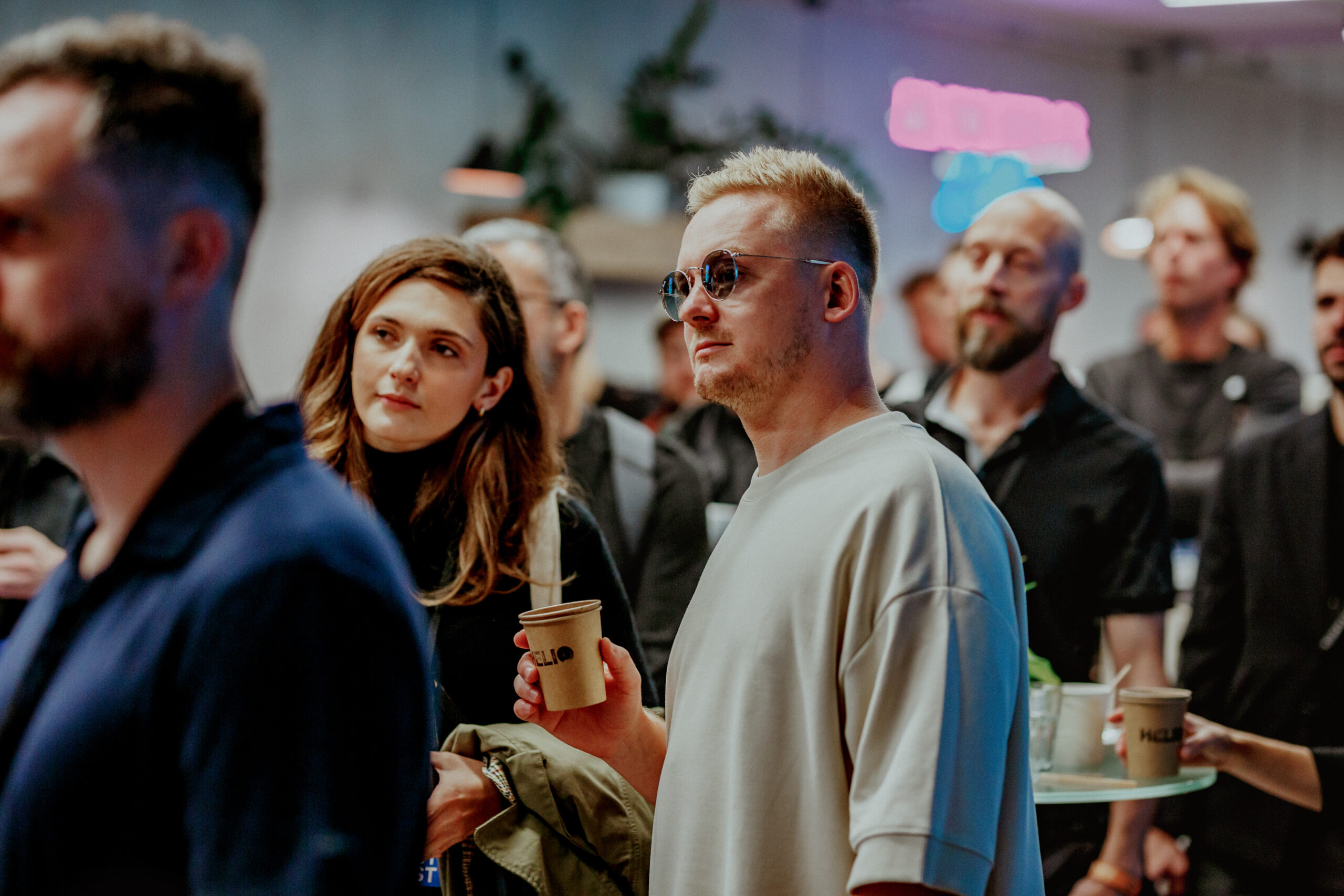
    Professionals from the visualization industry exchanging ideas at WVF 2024.
    For a growing number of professionals — especially those in creative and tech-driven fields — remote work has become the norm. The shift to digital workflows, accelerated by the pandemic, has brought freedom and flexibility that many are reluctant to give up. It’s easier than ever to work for clients in distant cities or countries, to build a freelance career from a laptop, or to pursue the lifestyle of a digital nomad.
    On the surface, it is a broadening of horizons. But for many, the freedom of remote work comes with a cost: isolation. For visualization artists, the reality often means spending long hours alone, rarely interacting face-to-face with peers or collaborators. And while there are undeniable advantages to independent work, the lack of human connection can lead to creative stagnation, professional burnout, and a sense of detachment from the industry as a whole.
    Despite being a highly technical and often solitary craft, visualization and CGI thrive on the exchange of ideas, feedback and inspiration. The tools and techniques evolve rapidly, and staying relevant usually means learning not just from tutorials but from honest conversations with others who understand the nuances of the field.

    A Community in the Making
    Professionals from the visualization industry exchanging ideas at WVF 2024.
    That need for connection is what pushed Michał Nowak, a Polish visualizer and founder of Nowak Studio, to organize Poland’s first-ever architectural visualization meetup in 2017. With no background in event planning, he wasn’t sure where to begin, but he knew something was missing. The Polish Arch Viz scene lacked a shared space for meetings, discussions, and idea exchange. Michał wanted more than screen time; he wanted honest conversations, spontaneous collaboration and a chance to grow alongside others in the field.
    What began as a modest gathering quickly grew into something much bigger. That original meetup evolved into what is now the World Visualization Festival, an international event that welcomes artists from across Europe and beyond.
    “I didn’t expect our small gathering to grow into a global festival,” Michał says. “But I knew I wanted a connection. I believed that through sharing ideas and experiences, we could all grow professionally, creatively, and personally. And that we’d enjoy the journey more.”
    The response was overwhelming. Each year, more artists from across Poland and Europe join the event in Wrocław, located in south-western Poland. Michał also traveled to other festivals in countries like Portugal and Austria, where he observed the same thing: a spirit of openness, generosity, and shared curiosity. No matter the country or the maturity of the market, the needs were the same — people wanted to connect, learn and grow.
    And beyond the professional side, there was something else: joy. These events were simply fun. They were energizing. They gave people a reason to step away from their desks and remember why they love what they do.

    The Professional Benefits
    Hands-on learning at the AI-driven visualization workshop in Warsaw, October 2024.
    The professional benefits of attending industry events are well documented. These gatherings provide access to mentorship, collaboration and knowledge that can be challenging to find online. Festivals and industry meetups serve as platforms for emerging trends, new tools and fresh workflows — often before they hit the mainstream. They’re places where ideas collide, assumptions are challenged and growth happens.
    The range of topics covered at such events is broad, encompassing everything from portfolio reviews and in-depth discussions of particular rendering engines to discussions about pricing your work and building a sustainable business. At the 2024 edition of the World Visualization Festival, panels focused on scaling creative businesses and navigating industry rates drew some of the biggest crowds, proving that artists are hungry for both artistic and entrepreneurial insights.
    Being part of a creative community also shapes professional identity. It’s not just about finding clients — it’s about finding your place. In a field as fast-moving and competitive as Arch Viz, connection and conversation aren’t luxuries. They’re tools for survival.
    There’s also the matter of building your social capital. Online interactions can only go so far. Meeting someone in person builds relationships that stick. The coffee-break conversations, the spontaneous feedback — these are the moments that cement a community and have the power to spark future projects or long-lasting partnerships. This usually doesn’t happen in Zoom calls.
    And let’s not forget the symbolic power of events like industry awards, such as the Architizer’s Vision Awards or CGArchitect’s 3D Awards. These aren’t just celebrations of talent; they’re affirmations of the craft itself. They contribute to the growth and cohesion of the industry while helping to establish and promote best practices. These events clearly define the role and significance of CGI and visualization as a distinct profession, positioned at the intersection of architecture, marketing, and sales. They advocate for the field to be recognized on its own terms, not merely as a support service, but as an independent discipline. For its creators, they bring visibility, credit, and recognition — elements that inspire growth and fuel motivation to keep pushing the craft forward. Occasions like these remind us that what we do has actual value, impact and meaning.

    The Energy We Take Home
    The WVF 2024 afterparty provided a vibrant space for networking and celebration in Warsaw.
    Many artists describe the post-event glow: a renewed sense of purpose, a fresh jolt of energy, an eagerness to get back to work. Sometimes, new projects emerge, new clients appear, or long-dormant ideas finally gain momentum. These events aren’t just about learning — they’re about recharging.
    One of the most potent moments of last year’s WVF was a series of talks focused on mental health and creative well-being. Co-organized by Michał Nowak and the Polish Arch Viz studio ELEMENT, the festival addressed the emotional realities of the profession, including burnout, self-doubt, and the pressure to constantly produce. These conversations resonated deeply because they were real.
    Seeing that others face the same struggles — and come through them — is profoundly reassuring. Listening to someone share a business strategy that worked, or a failure they learned from, turns competition into camaraderie. Vulnerability becomes strength. Shared experiences become the foundation of resilience.

    Make a Statement. Show up!
    Top industry leaders shared insights during presentations at WVF 2024
    In an era when nearly everything can be done online, showing up in person is a powerful statement. It says: I want more than just efficiency. I want connection, creativity and conversation.
    As the CGI and visualization industries continue to evolve, the need for human connection hasn’t disappeared — it’s grown stronger. Conferences, festivals and meetups, such as World Viz Fest, remain vital spaces for knowledge sharing, innovation and community building. They give us a chance to reset, reconnect and remember that we are part of something bigger than our screens.
    So, yes, despite the tools, the bandwidth, and the ever-faster workflows, we still need to meet in person. Not out of nostalgia, but out of necessity. Because, no matter how far technology takes us, creativity remains a human endeavor.
    Architizer’s Vision Awards are back! The global awards program honors the world’s best architectural concepts, ideas and imagery. Start your entry ahead of the Final Entry Deadline on July 11th. 
    The post Building an Architectural Visualization Community: The Case for Physical Gatherings appeared first on Journal.
    #building #architectural #visualization #community #case
    Building an Architectural Visualization Community: The Case for Physical Gatherings
    Barbara Betlejewska is a PR consultant and manager with extensive experience in architecture and real estate, currently involved with World Visualization Festival, a global event bringing together CGI and digital storytelling professionals for 3 days of presentations, workshops, and networking in Warsaw, Poland, this October. Over the last twenty years, visualization and 3D rendering have evolved from supporting tools to become central pillars of architectural storytelling, design development, and marketing across various industries. As digital technologies have advanced, the landscape of creative work has changed dramatically. Artists can now collaborate with clients worldwide without leaving their homes, and their careers can flourish without ever setting foot in a traditional studio. In this hyper-connected world, where access to knowledge, clients, and inspiration is just a click away, do we still need to gather in person? Do conferences, festivals and meetups in the CGI and architectural visualization world still carry weight? The People Behind the Pixels Professionals from the visualization industry exchanging ideas at WVF 2024. For a growing number of professionals — especially those in creative and tech-driven fields — remote work has become the norm. The shift to digital workflows, accelerated by the pandemic, has brought freedom and flexibility that many are reluctant to give up. It’s easier than ever to work for clients in distant cities or countries, to build a freelance career from a laptop, or to pursue the lifestyle of a digital nomad. On the surface, it is a broadening of horizons. But for many, the freedom of remote work comes with a cost: isolation. For visualization artists, the reality often means spending long hours alone, rarely interacting face-to-face with peers or collaborators. And while there are undeniable advantages to independent work, the lack of human connection can lead to creative stagnation, professional burnout, and a sense of detachment from the industry as a whole. Despite being a highly technical and often solitary craft, visualization and CGI thrive on the exchange of ideas, feedback and inspiration. The tools and techniques evolve rapidly, and staying relevant usually means learning not just from tutorials but from honest conversations with others who understand the nuances of the field. A Community in the Making Professionals from the visualization industry exchanging ideas at WVF 2024. That need for connection is what pushed Michał Nowak, a Polish visualizer and founder of Nowak Studio, to organize Poland’s first-ever architectural visualization meetup in 2017. With no background in event planning, he wasn’t sure where to begin, but he knew something was missing. The Polish Arch Viz scene lacked a shared space for meetings, discussions, and idea exchange. Michał wanted more than screen time; he wanted honest conversations, spontaneous collaboration and a chance to grow alongside others in the field. What began as a modest gathering quickly grew into something much bigger. That original meetup evolved into what is now the World Visualization Festival, an international event that welcomes artists from across Europe and beyond. “I didn’t expect our small gathering to grow into a global festival,” Michał says. “But I knew I wanted a connection. I believed that through sharing ideas and experiences, we could all grow professionally, creatively, and personally. And that we’d enjoy the journey more.” The response was overwhelming. Each year, more artists from across Poland and Europe join the event in Wrocław, located in south-western Poland. Michał also traveled to other festivals in countries like Portugal and Austria, where he observed the same thing: a spirit of openness, generosity, and shared curiosity. No matter the country or the maturity of the market, the needs were the same — people wanted to connect, learn and grow. And beyond the professional side, there was something else: joy. These events were simply fun. They were energizing. They gave people a reason to step away from their desks and remember why they love what they do. The Professional Benefits Hands-on learning at the AI-driven visualization workshop in Warsaw, October 2024. The professional benefits of attending industry events are well documented. These gatherings provide access to mentorship, collaboration and knowledge that can be challenging to find online. Festivals and industry meetups serve as platforms for emerging trends, new tools and fresh workflows — often before they hit the mainstream. They’re places where ideas collide, assumptions are challenged and growth happens. The range of topics covered at such events is broad, encompassing everything from portfolio reviews and in-depth discussions of particular rendering engines to discussions about pricing your work and building a sustainable business. At the 2024 edition of the World Visualization Festival, panels focused on scaling creative businesses and navigating industry rates drew some of the biggest crowds, proving that artists are hungry for both artistic and entrepreneurial insights. Being part of a creative community also shapes professional identity. It’s not just about finding clients — it’s about finding your place. In a field as fast-moving and competitive as Arch Viz, connection and conversation aren’t luxuries. They’re tools for survival. There’s also the matter of building your social capital. Online interactions can only go so far. Meeting someone in person builds relationships that stick. The coffee-break conversations, the spontaneous feedback — these are the moments that cement a community and have the power to spark future projects or long-lasting partnerships. This usually doesn’t happen in Zoom calls. And let’s not forget the symbolic power of events like industry awards, such as the Architizer’s Vision Awards or CGArchitect’s 3D Awards. These aren’t just celebrations of talent; they’re affirmations of the craft itself. They contribute to the growth and cohesion of the industry while helping to establish and promote best practices. These events clearly define the role and significance of CGI and visualization as a distinct profession, positioned at the intersection of architecture, marketing, and sales. They advocate for the field to be recognized on its own terms, not merely as a support service, but as an independent discipline. For its creators, they bring visibility, credit, and recognition — elements that inspire growth and fuel motivation to keep pushing the craft forward. Occasions like these remind us that what we do has actual value, impact and meaning. The Energy We Take Home The WVF 2024 afterparty provided a vibrant space for networking and celebration in Warsaw. Many artists describe the post-event glow: a renewed sense of purpose, a fresh jolt of energy, an eagerness to get back to work. Sometimes, new projects emerge, new clients appear, or long-dormant ideas finally gain momentum. These events aren’t just about learning — they’re about recharging. One of the most potent moments of last year’s WVF was a series of talks focused on mental health and creative well-being. Co-organized by Michał Nowak and the Polish Arch Viz studio ELEMENT, the festival addressed the emotional realities of the profession, including burnout, self-doubt, and the pressure to constantly produce. These conversations resonated deeply because they were real. Seeing that others face the same struggles — and come through them — is profoundly reassuring. Listening to someone share a business strategy that worked, or a failure they learned from, turns competition into camaraderie. Vulnerability becomes strength. Shared experiences become the foundation of resilience. Make a Statement. Show up! Top industry leaders shared insights during presentations at WVF 2024 In an era when nearly everything can be done online, showing up in person is a powerful statement. It says: I want more than just efficiency. I want connection, creativity and conversation. As the CGI and visualization industries continue to evolve, the need for human connection hasn’t disappeared — it’s grown stronger. Conferences, festivals and meetups, such as World Viz Fest, remain vital spaces for knowledge sharing, innovation and community building. They give us a chance to reset, reconnect and remember that we are part of something bigger than our screens. So, yes, despite the tools, the bandwidth, and the ever-faster workflows, we still need to meet in person. Not out of nostalgia, but out of necessity. Because, no matter how far technology takes us, creativity remains a human endeavor. Architizer’s Vision Awards are back! The global awards program honors the world’s best architectural concepts, ideas and imagery. Start your entry ahead of the Final Entry Deadline on July 11th.  The post Building an Architectural Visualization Community: The Case for Physical Gatherings appeared first on Journal. #building #architectural #visualization #community #case
    Building an Architectural Visualization Community: The Case for Physical Gatherings
    architizer.com
    Barbara Betlejewska is a PR consultant and manager with extensive experience in architecture and real estate, currently involved with World Visualization Festival, a global event bringing together CGI and digital storytelling professionals for 3 days of presentations, workshops, and networking in Warsaw, Poland, this October. Over the last twenty years, visualization and 3D rendering have evolved from supporting tools to become central pillars of architectural storytelling, design development, and marketing across various industries. As digital technologies have advanced, the landscape of creative work has changed dramatically. Artists can now collaborate with clients worldwide without leaving their homes, and their careers can flourish without ever setting foot in a traditional studio. In this hyper-connected world, where access to knowledge, clients, and inspiration is just a click away, do we still need to gather in person? Do conferences, festivals and meetups in the CGI and architectural visualization world still carry weight? The People Behind the Pixels Professionals from the visualization industry exchanging ideas at WVF 2024. For a growing number of professionals — especially those in creative and tech-driven fields — remote work has become the norm. The shift to digital workflows, accelerated by the pandemic, has brought freedom and flexibility that many are reluctant to give up. It’s easier than ever to work for clients in distant cities or countries, to build a freelance career from a laptop, or to pursue the lifestyle of a digital nomad. On the surface, it is a broadening of horizons. But for many, the freedom of remote work comes with a cost: isolation. For visualization artists, the reality often means spending long hours alone, rarely interacting face-to-face with peers or collaborators. And while there are undeniable advantages to independent work, the lack of human connection can lead to creative stagnation, professional burnout, and a sense of detachment from the industry as a whole. Despite being a highly technical and often solitary craft, visualization and CGI thrive on the exchange of ideas, feedback and inspiration. The tools and techniques evolve rapidly, and staying relevant usually means learning not just from tutorials but from honest conversations with others who understand the nuances of the field. A Community in the Making Professionals from the visualization industry exchanging ideas at WVF 2024. That need for connection is what pushed Michał Nowak, a Polish visualizer and founder of Nowak Studio, to organize Poland’s first-ever architectural visualization meetup in 2017. With no background in event planning, he wasn’t sure where to begin, but he knew something was missing. The Polish Arch Viz scene lacked a shared space for meetings, discussions, and idea exchange. Michał wanted more than screen time; he wanted honest conversations, spontaneous collaboration and a chance to grow alongside others in the field. What began as a modest gathering quickly grew into something much bigger. That original meetup evolved into what is now the World Visualization Festival (WVF), an international event that welcomes artists from across Europe and beyond. “I didn’t expect our small gathering to grow into a global festival,” Michał says. “But I knew I wanted a connection. I believed that through sharing ideas and experiences, we could all grow professionally, creatively, and personally. And that we’d enjoy the journey more.” The response was overwhelming. Each year, more artists from across Poland and Europe join the event in Wrocław, located in south-western Poland. Michał also traveled to other festivals in countries like Portugal and Austria, where he observed the same thing: a spirit of openness, generosity, and shared curiosity. No matter the country or the maturity of the market, the needs were the same — people wanted to connect, learn and grow. And beyond the professional side, there was something else: joy. These events were simply fun. They were energizing. They gave people a reason to step away from their desks and remember why they love what they do. The Professional Benefits Hands-on learning at the AI-driven visualization workshop in Warsaw, October 2024. The professional benefits of attending industry events are well documented. These gatherings provide access to mentorship, collaboration and knowledge that can be challenging to find online. Festivals and industry meetups serve as platforms for emerging trends, new tools and fresh workflows — often before they hit the mainstream. They’re places where ideas collide, assumptions are challenged and growth happens. The range of topics covered at such events is broad, encompassing everything from portfolio reviews and in-depth discussions of particular rendering engines to discussions about pricing your work and building a sustainable business. At the 2024 edition of the World Visualization Festival, panels focused on scaling creative businesses and navigating industry rates drew some of the biggest crowds, proving that artists are hungry for both artistic and entrepreneurial insights. Being part of a creative community also shapes professional identity. It’s not just about finding clients — it’s about finding your place. In a field as fast-moving and competitive as Arch Viz, connection and conversation aren’t luxuries. They’re tools for survival. There’s also the matter of building your social capital. Online interactions can only go so far. Meeting someone in person builds relationships that stick. The coffee-break conversations, the spontaneous feedback — these are the moments that cement a community and have the power to spark future projects or long-lasting partnerships. This usually doesn’t happen in Zoom calls. And let’s not forget the symbolic power of events like industry awards, such as the Architizer’s Vision Awards or CGArchitect’s 3D Awards. These aren’t just celebrations of talent; they’re affirmations of the craft itself. They contribute to the growth and cohesion of the industry while helping to establish and promote best practices. These events clearly define the role and significance of CGI and visualization as a distinct profession, positioned at the intersection of architecture, marketing, and sales. They advocate for the field to be recognized on its own terms, not merely as a support service, but as an independent discipline. For its creators, they bring visibility, credit, and recognition — elements that inspire growth and fuel motivation to keep pushing the craft forward. Occasions like these remind us that what we do has actual value, impact and meaning. The Energy We Take Home The WVF 2024 afterparty provided a vibrant space for networking and celebration in Warsaw. Many artists describe the post-event glow: a renewed sense of purpose, a fresh jolt of energy, an eagerness to get back to work. Sometimes, new projects emerge, new clients appear, or long-dormant ideas finally gain momentum. These events aren’t just about learning — they’re about recharging. One of the most potent moments of last year’s WVF was a series of talks focused on mental health and creative well-being. Co-organized by Michał Nowak and the Polish Arch Viz studio ELEMENT, the festival addressed the emotional realities of the profession, including burnout, self-doubt, and the pressure to constantly produce. These conversations resonated deeply because they were real. Seeing that others face the same struggles — and come through them — is profoundly reassuring. Listening to someone share a business strategy that worked, or a failure they learned from, turns competition into camaraderie. Vulnerability becomes strength. Shared experiences become the foundation of resilience. Make a Statement. Show up! Top industry leaders shared insights during presentations at WVF 2024 In an era when nearly everything can be done online, showing up in person is a powerful statement. It says: I want more than just efficiency. I want connection, creativity and conversation. As the CGI and visualization industries continue to evolve, the need for human connection hasn’t disappeared — it’s grown stronger. Conferences, festivals and meetups, such as World Viz Fest, remain vital spaces for knowledge sharing, innovation and community building. They give us a chance to reset, reconnect and remember that we are part of something bigger than our screens. So, yes, despite the tools, the bandwidth, and the ever-faster workflows, we still need to meet in person. Not out of nostalgia, but out of necessity. Because, no matter how far technology takes us, creativity remains a human endeavor. Architizer’s Vision Awards are back! The global awards program honors the world’s best architectural concepts, ideas and imagery. Start your entry ahead of the Final Entry Deadline on July 11th.  The post Building an Architectural Visualization Community: The Case for Physical Gatherings appeared first on Journal.
    Like
    Love
    Wow
    Sad
    Angry
    532
    · 2 Comentários ·0 Compartilhamentos ·0 Anterior
  • F5: Leta Sobierajski Talks Giant Pandas, Sculptural Clothing + More

    When Leta Sobierajski enrolled in college, she already knew what she was meant to do, and she didn’t settle for anything less. “When I went to school for graphic design, I really didn’t have a backup plan – it was this, or nothing,” she says. “My work is a constantly evolving practice, and from the beginning, I have always convinced myself that if I put in the time and experimentation, I would grow and evolve.”
    After graduation, Sobierajski took on a range of projects, which included animation, print, and branding elements. She collaborated with corporate clients, but realized that she wouldn’t feel comfortable following anyone else’s rules in a 9-to-5 environment.
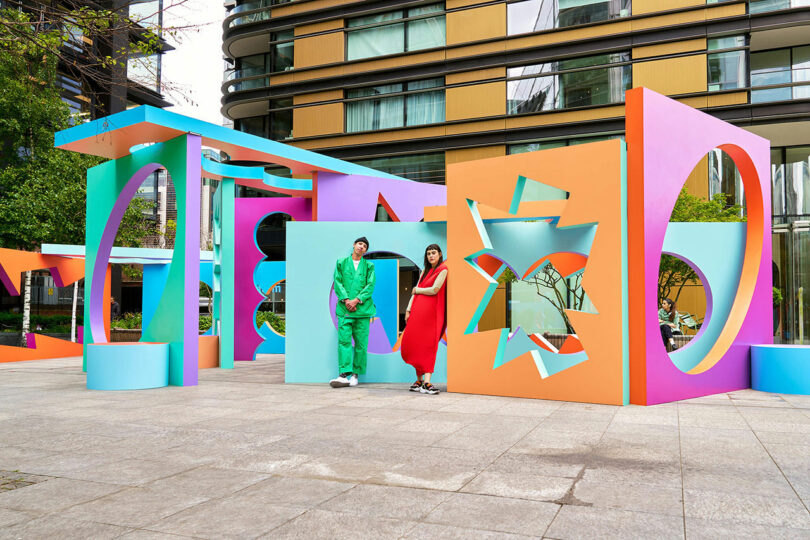
    Leta Sobierajskiand Wade Jeffree\\\ Photo: Matt Dutile
    Sobierajski eventually decided to team up with fellow artist and kindred spirit Wade Jeffree. In 2016 they launched their Brooklyn-based studio, Wade and Leta. The duo, who share a taste for quirky aesthetics, produces sculpture, installations, or anything else they can dream up. Never static in thinking or method, they are constantly searching for another medium to try that will complement their shared vision of the moment.
    The pair is currently interested in permanency, and they want to utilize more metal, a strong material that will stand the test of time. Small architectural pieces are also on tap, and on a grander scale, they’d like to focus on a park or communal area that everyone can enjoy.
    With so many ideas swirling around, Sobierajski will record a concept in at least three different ways so that she’s sure to unearth it at a later date. “In some ways, I like to think I’m impeccably organized, as I have countless spreadsheets tracking our work, our lives, and our well-being,” she explains. “The reality is that I am great at over-complicating situations with my intensified list-making and note-taking. The only thing to do is to trust the process.”
    Today, Leta Sobierajski joins us for Friday Five!
    Photo: Melitta Baumeister and Michał Plata
    1. Melitta Baumeister and Michał Plata
    The work of Melitta Baumeister and Michał Plata has been a constant inspiration to me for their innovative, artful, and architectural silhouettes. By a practice of draping and arduous pattern-making, the garments that they develop season after season feel like they could be designed for existence in another universe. I’m a person who likes to dress up for anything when I’m not in the studio, and every time I opt to wear one of their looks, I feel like I can take on the world. The best part about their pieces is that they’re extremely functional, so whether I need to hop on a bicycle or show up at an opening, I’m still able to make a statement – these garments even have the ability to strike up conversations on their own.
    Photo: Wade and Leta
    2. Pandas!
    I was recently in Chengdu to launch a new project and we took half the day to visit the Chengdu Research Base of Giant Pandas and I am a new panda convert. Yes, they’re docile and cute, but their lifestyles are utterly chill and deeply enviable for us adults with responsibilities. Giant pandas primarily eat bamboo and can consume 20-40 kilograms per day. When they’re not doing that, they’re sleeping. When we visited, many could be seen reclining on their backs, feasting on some of the finest bamboo they could select within arm’s reach. While not necessarily playful in appearance, they do seem quite cheeky in their agendas and will do as little as they can to make the most of their meals. It felt like I was watching a mirrored image of myself on a Sunday afternoon while trying to make the most of my last hours of the weekend.
    Photo: Courtesy of Aoiro
    3. Aoiro
    I’m not really a candle personbut I love the luxurious subtlety of a fragrant space. It’s an intangible feeling that really can only be experienced in the present. Some of the best people to create these fragrances, in my opinion, are Shizuko and Manuel, the masterminds behind Aoiro, a Japanese and Austrian duo who have developed a keen sense for embodying the fragrances of some of the most intriguing and captivating olfactory atmospheres – earthy forest floors with crackling pine needles, blue cypress tickling the moon in an indigo sky, and rainfall on a spirited Japanese island. Despite living in an urban city, Aoiro’s olfactory design is capable of transporting me to the deepest forests of misty Yakushima island.
    Photo: Wade and Leta
    4. Takuro Kuwata
    A few months ago, I saw the work of Japanese ceramicist Takuro Kuwata at an exhibition at Salon94 and have been having trouble getting it out of my head. Kuwata’s work exemplifies someone who has worked with a medium so much to completely use the medium as a medium – if that makes sense. His ability to manipulate clay and glaze and use it to create gravity-defying effects within the kiln are exceptionally mysterious to me and feel like they could only be accomplished with years and years of experimentation with the material. I’m equally impressed seeing how he’s grown his work with scale, juxtaposing it with familiar iconography like the fuzzy peach, but sculpting it from materials like bronze.
    Photo: Wade and Leta
    5. The Site of Reversible Destiny, a park built by artists Arakawa and Gins, in Yoro Japan
    The park is a testament to their career as writers, architects, and their idea of reversible destiny, which in its most extreme form, eliminates death. For all that are willing to listen, Arakawa and Gins’ Reversible Destiny mentality aims to make our lives a little more youthful by encouraging us to reevaluate our relationship with architecture and our surroundings. The intention of “reversible destiny” is not to prolong death, postpone it, grow older alongside it, but to entirely not acknowledge and surpass it. Wadeand I have spent the last ten years traveling to as many of their remaining sites as possible to further understand this notion of creating spaces to extend our lives and question how conventional living spaces can become detrimental to our longevity.
     
    Works by Wade and Leta:
    Photo: Wade and Leta and Matt Alexander
    Now You See Me is a large-scale installation in the heart of Shoreditch, London, that explores the relationship between positive and negative space through bold color, geometry, and light. Simple, familiar shapes are embedded within monolithic forms, creating a layered visual experience that shifts throughout the day. As sunlight passes through the structures, shadows and silhouettes stretch and connect, forming dynamic compositions on the surrounding concrete.
    Photo: Wade and Leta and John Wylie
    Paint Your Own Path is series of five towering sculptures, ranging from 10 to 15 feet tall, invites viewers to explore balance, tension, and perspective through bold color and form. Inspired by the delicate, often precarious act of stacking objects, the sculptures appear as if they might topple – yet each one holds steady, challenging perceptions of stability. Created in partnership with the Corolla Cross, the installation transforms its environment into a pop-colored landscape.
    Photo: Millenia Walk and Outer Edit, Eurthe Studio
    Monument to Movement is a 14-meter-tall kinetic sculpture that celebrates the spirit of the holiday season through rhythm, motion, and color. Rising skyward in layered compositions, the work symbolizes collective joy, renewal, and the shared energy of celebrations that span cultures and traditions. Powered by motors and constructed from metal beams and cardboard forms, the sculpture continuously shifts, inviting viewers to reflect on the passage of time and the cycles that connect us all.
    Photo: Wade and Leta and Erika Hara, Piotr Maslanka, and Jeremy Renault
    Falling Into Place is a vibrant rooftop installation at Ginza Six that explores themes of alignment, adaptability, and perspective. Six colorful structures – each with a void like a missing puzzle piece – serve as spaces for reflection, inviting visitors to consider their place within a greater whole. Rather than focusing on absence, the design transforms emptiness into opportunity, encouraging people to embrace spontaneity and the unfolding nature of life. Playful yet contemplative, the work emphasizes that only through connection and participation can the full picture come into view.
    Photo: Wade and Leta and Erika Hara, Piotr Maslanka, and Jeremy Renault
    Photo: Wade and Leta
    Stop, Listen, Look is a 7-meter-tall interactive artwork atop IFS Chengdu that captures the vibrant rhythm of the city through movement, sound, and form. Blending motorized and wind-powered elements with seesaws and sound modulation, it invites people of all ages to engage, play, and reflect. Inspired by Chengdu’s balance of tradition and modernity, the piece incorporates circular motifs from local symbolism alongside bold, geometric forms to create a dialogue between past and present. With light, motion, and community at its core, the work invites visitors to connect with the city – and each other – through shared interaction.

    The Cloud is a permanent sculptural kiosk in Burlington, Vermont’s historic City Hall Park, created in collaboration with Brooklyn-based Studio RENZ+OEI. Designed to reinterpret the ephemeral nature of clouds through architecture, it blends art, air, and imagination into a light, fluid structure that defies traditional rigidity. Originally born from a creative exchange between longtime friends and collaborators, the design challenges expectations of permanence by embodying movement and openness. Now home to a local food vendor, The Cloud brings a playful, uplifting presence to the park, inviting reflection and interaction rain or shine..
    #leta #sobierajski #talks #giant #pandas
    F5: Leta Sobierajski Talks Giant Pandas, Sculptural Clothing + More
    When Leta Sobierajski enrolled in college, she already knew what she was meant to do, and she didn’t settle for anything less. “When I went to school for graphic design, I really didn’t have a backup plan – it was this, or nothing,” she says. “My work is a constantly evolving practice, and from the beginning, I have always convinced myself that if I put in the time and experimentation, I would grow and evolve.” After graduation, Sobierajski took on a range of projects, which included animation, print, and branding elements. She collaborated with corporate clients, but realized that she wouldn’t feel comfortable following anyone else’s rules in a 9-to-5 environment. Leta Sobierajskiand Wade Jeffree\\\ Photo: Matt Dutile Sobierajski eventually decided to team up with fellow artist and kindred spirit Wade Jeffree. In 2016 they launched their Brooklyn-based studio, Wade and Leta. The duo, who share a taste for quirky aesthetics, produces sculpture, installations, or anything else they can dream up. Never static in thinking or method, they are constantly searching for another medium to try that will complement their shared vision of the moment. The pair is currently interested in permanency, and they want to utilize more metal, a strong material that will stand the test of time. Small architectural pieces are also on tap, and on a grander scale, they’d like to focus on a park or communal area that everyone can enjoy. With so many ideas swirling around, Sobierajski will record a concept in at least three different ways so that she’s sure to unearth it at a later date. “In some ways, I like to think I’m impeccably organized, as I have countless spreadsheets tracking our work, our lives, and our well-being,” she explains. “The reality is that I am great at over-complicating situations with my intensified list-making and note-taking. The only thing to do is to trust the process.” Today, Leta Sobierajski joins us for Friday Five! Photo: Melitta Baumeister and Michał Plata 1. Melitta Baumeister and Michał Plata The work of Melitta Baumeister and Michał Plata has been a constant inspiration to me for their innovative, artful, and architectural silhouettes. By a practice of draping and arduous pattern-making, the garments that they develop season after season feel like they could be designed for existence in another universe. I’m a person who likes to dress up for anything when I’m not in the studio, and every time I opt to wear one of their looks, I feel like I can take on the world. The best part about their pieces is that they’re extremely functional, so whether I need to hop on a bicycle or show up at an opening, I’m still able to make a statement – these garments even have the ability to strike up conversations on their own. Photo: Wade and Leta 2. Pandas! I was recently in Chengdu to launch a new project and we took half the day to visit the Chengdu Research Base of Giant Pandas and I am a new panda convert. Yes, they’re docile and cute, but their lifestyles are utterly chill and deeply enviable for us adults with responsibilities. Giant pandas primarily eat bamboo and can consume 20-40 kilograms per day. When they’re not doing that, they’re sleeping. When we visited, many could be seen reclining on their backs, feasting on some of the finest bamboo they could select within arm’s reach. While not necessarily playful in appearance, they do seem quite cheeky in their agendas and will do as little as they can to make the most of their meals. It felt like I was watching a mirrored image of myself on a Sunday afternoon while trying to make the most of my last hours of the weekend. Photo: Courtesy of Aoiro 3. Aoiro I’m not really a candle personbut I love the luxurious subtlety of a fragrant space. It’s an intangible feeling that really can only be experienced in the present. Some of the best people to create these fragrances, in my opinion, are Shizuko and Manuel, the masterminds behind Aoiro, a Japanese and Austrian duo who have developed a keen sense for embodying the fragrances of some of the most intriguing and captivating olfactory atmospheres – earthy forest floors with crackling pine needles, blue cypress tickling the moon in an indigo sky, and rainfall on a spirited Japanese island. Despite living in an urban city, Aoiro’s olfactory design is capable of transporting me to the deepest forests of misty Yakushima island. Photo: Wade and Leta 4. Takuro Kuwata A few months ago, I saw the work of Japanese ceramicist Takuro Kuwata at an exhibition at Salon94 and have been having trouble getting it out of my head. Kuwata’s work exemplifies someone who has worked with a medium so much to completely use the medium as a medium – if that makes sense. His ability to manipulate clay and glaze and use it to create gravity-defying effects within the kiln are exceptionally mysterious to me and feel like they could only be accomplished with years and years of experimentation with the material. I’m equally impressed seeing how he’s grown his work with scale, juxtaposing it with familiar iconography like the fuzzy peach, but sculpting it from materials like bronze. Photo: Wade and Leta 5. The Site of Reversible Destiny, a park built by artists Arakawa and Gins, in Yoro Japan The park is a testament to their career as writers, architects, and their idea of reversible destiny, which in its most extreme form, eliminates death. For all that are willing to listen, Arakawa and Gins’ Reversible Destiny mentality aims to make our lives a little more youthful by encouraging us to reevaluate our relationship with architecture and our surroundings. The intention of “reversible destiny” is not to prolong death, postpone it, grow older alongside it, but to entirely not acknowledge and surpass it. Wadeand I have spent the last ten years traveling to as many of their remaining sites as possible to further understand this notion of creating spaces to extend our lives and question how conventional living spaces can become detrimental to our longevity.   Works by Wade and Leta: Photo: Wade and Leta and Matt Alexander Now You See Me is a large-scale installation in the heart of Shoreditch, London, that explores the relationship between positive and negative space through bold color, geometry, and light. Simple, familiar shapes are embedded within monolithic forms, creating a layered visual experience that shifts throughout the day. As sunlight passes through the structures, shadows and silhouettes stretch and connect, forming dynamic compositions on the surrounding concrete. Photo: Wade and Leta and John Wylie Paint Your Own Path is series of five towering sculptures, ranging from 10 to 15 feet tall, invites viewers to explore balance, tension, and perspective through bold color and form. Inspired by the delicate, often precarious act of stacking objects, the sculptures appear as if they might topple – yet each one holds steady, challenging perceptions of stability. Created in partnership with the Corolla Cross, the installation transforms its environment into a pop-colored landscape. Photo: Millenia Walk and Outer Edit, Eurthe Studio Monument to Movement is a 14-meter-tall kinetic sculpture that celebrates the spirit of the holiday season through rhythm, motion, and color. Rising skyward in layered compositions, the work symbolizes collective joy, renewal, and the shared energy of celebrations that span cultures and traditions. Powered by motors and constructed from metal beams and cardboard forms, the sculpture continuously shifts, inviting viewers to reflect on the passage of time and the cycles that connect us all. Photo: Wade and Leta and Erika Hara, Piotr Maslanka, and Jeremy Renault Falling Into Place is a vibrant rooftop installation at Ginza Six that explores themes of alignment, adaptability, and perspective. Six colorful structures – each with a void like a missing puzzle piece – serve as spaces for reflection, inviting visitors to consider their place within a greater whole. Rather than focusing on absence, the design transforms emptiness into opportunity, encouraging people to embrace spontaneity and the unfolding nature of life. Playful yet contemplative, the work emphasizes that only through connection and participation can the full picture come into view. Photo: Wade and Leta and Erika Hara, Piotr Maslanka, and Jeremy Renault Photo: Wade and Leta Stop, Listen, Look is a 7-meter-tall interactive artwork atop IFS Chengdu that captures the vibrant rhythm of the city through movement, sound, and form. Blending motorized and wind-powered elements with seesaws and sound modulation, it invites people of all ages to engage, play, and reflect. Inspired by Chengdu’s balance of tradition and modernity, the piece incorporates circular motifs from local symbolism alongside bold, geometric forms to create a dialogue between past and present. With light, motion, and community at its core, the work invites visitors to connect with the city – and each other – through shared interaction. The Cloud is a permanent sculptural kiosk in Burlington, Vermont’s historic City Hall Park, created in collaboration with Brooklyn-based Studio RENZ+OEI. Designed to reinterpret the ephemeral nature of clouds through architecture, it blends art, air, and imagination into a light, fluid structure that defies traditional rigidity. Originally born from a creative exchange between longtime friends and collaborators, the design challenges expectations of permanence by embodying movement and openness. Now home to a local food vendor, The Cloud brings a playful, uplifting presence to the park, inviting reflection and interaction rain or shine.. #leta #sobierajski #talks #giant #pandas
    F5: Leta Sobierajski Talks Giant Pandas, Sculptural Clothing + More
    design-milk.com
    When Leta Sobierajski enrolled in college, she already knew what she was meant to do, and she didn’t settle for anything less. “When I went to school for graphic design, I really didn’t have a backup plan – it was this, or nothing,” she says. “My work is a constantly evolving practice, and from the beginning, I have always convinced myself that if I put in the time and experimentation, I would grow and evolve.” After graduation, Sobierajski took on a range of projects, which included animation, print, and branding elements. She collaborated with corporate clients, but realized that she wouldn’t feel comfortable following anyone else’s rules in a 9-to-5 environment. Leta Sobierajski (standing) and Wade Jeffree (on ladder) \\\ Photo: Matt Dutile Sobierajski eventually decided to team up with fellow artist and kindred spirit Wade Jeffree. In 2016 they launched their Brooklyn-based studio, Wade and Leta. The duo, who share a taste for quirky aesthetics, produces sculpture, installations, or anything else they can dream up. Never static in thinking or method, they are constantly searching for another medium to try that will complement their shared vision of the moment. The pair is currently interested in permanency, and they want to utilize more metal, a strong material that will stand the test of time. Small architectural pieces are also on tap, and on a grander scale, they’d like to focus on a park or communal area that everyone can enjoy. With so many ideas swirling around, Sobierajski will record a concept in at least three different ways so that she’s sure to unearth it at a later date. “In some ways, I like to think I’m impeccably organized, as I have countless spreadsheets tracking our work, our lives, and our well-being,” she explains. “The reality is that I am great at over-complicating situations with my intensified list-making and note-taking. The only thing to do is to trust the process.” Today, Leta Sobierajski joins us for Friday Five! Photo: Melitta Baumeister and Michał Plata 1. Melitta Baumeister and Michał Plata The work of Melitta Baumeister and Michał Plata has been a constant inspiration to me for their innovative, artful, and architectural silhouettes. By a practice of draping and arduous pattern-making, the garments that they develop season after season feel like they could be designed for existence in another universe. I’m a person who likes to dress up for anything when I’m not in the studio, and every time I opt to wear one of their looks, I feel like I can take on the world. The best part about their pieces is that they’re extremely functional, so whether I need to hop on a bicycle or show up at an opening, I’m still able to make a statement – these garments even have the ability to strike up conversations on their own. Photo: Wade and Leta 2. Pandas! I was recently in Chengdu to launch a new project and we took half the day to visit the Chengdu Research Base of Giant Pandas and I am a new panda convert. Yes, they’re docile and cute, but their lifestyles are utterly chill and deeply enviable for us adults with responsibilities. Giant pandas primarily eat bamboo and can consume 20-40 kilograms per day. When they’re not doing that, they’re sleeping. When we visited, many could be seen reclining on their backs, feasting on some of the finest bamboo they could select within arm’s reach. While not necessarily playful in appearance, they do seem quite cheeky in their agendas and will do as little as they can to make the most of their meals. It felt like I was watching a mirrored image of myself on a Sunday afternoon while trying to make the most of my last hours of the weekend. Photo: Courtesy of Aoiro 3. Aoiro I’m not really a candle person (I forget to light it, and then I forget it’s lit, and then I panic when it’s been lit for too long) but I love the luxurious subtlety of a fragrant space. It’s an intangible feeling that really can only be experienced in the present. Some of the best people to create these fragrances, in my opinion, are Shizuko and Manuel, the masterminds behind Aoiro, a Japanese and Austrian duo who have developed a keen sense for embodying the fragrances of some of the most intriguing and captivating olfactory atmospheres – earthy forest floors with crackling pine needles, blue cypress tickling the moon in an indigo sky, and rainfall on a spirited Japanese island. Despite living in an urban city, Aoiro’s olfactory design is capable of transporting me to the deepest forests of misty Yakushima island. Photo: Wade and Leta 4. Takuro Kuwata A few months ago, I saw the work of Japanese ceramicist Takuro Kuwata at an exhibition at Salon94 and have been having trouble getting it out of my head. Kuwata’s work exemplifies someone who has worked with a medium so much to completely use the medium as a medium – if that makes sense. His ability to manipulate clay and glaze and use it to create gravity-defying effects within the kiln are exceptionally mysterious to me and feel like they could only be accomplished with years and years of experimentation with the material. I’m equally impressed seeing how he’s grown his work with scale, juxtaposing it with familiar iconography like the fuzzy peach, but sculpting it from materials like bronze. Photo: Wade and Leta 5. The Site of Reversible Destiny, a park built by artists Arakawa and Gins, in Yoro Japan The park is a testament to their career as writers, architects, and their idea of reversible destiny, which in its most extreme form, eliminates death. For all that are willing to listen, Arakawa and Gins’ Reversible Destiny mentality aims to make our lives a little more youthful by encouraging us to reevaluate our relationship with architecture and our surroundings. The intention of “reversible destiny” is not to prolong death, postpone it, grow older alongside it, but to entirely not acknowledge and surpass it. Wade (my partner) and I have spent the last ten years traveling to as many of their remaining sites as possible to further understand this notion of creating spaces to extend our lives and question how conventional living spaces can become detrimental to our longevity.   Works by Wade and Leta: Photo: Wade and Leta and Matt Alexander Now You See Me is a large-scale installation in the heart of Shoreditch, London, that explores the relationship between positive and negative space through bold color, geometry, and light. Simple, familiar shapes are embedded within monolithic forms, creating a layered visual experience that shifts throughout the day. As sunlight passes through the structures, shadows and silhouettes stretch and connect, forming dynamic compositions on the surrounding concrete. Photo: Wade and Leta and John Wylie Paint Your Own Path is series of five towering sculptures, ranging from 10 to 15 feet tall, invites viewers to explore balance, tension, and perspective through bold color and form. Inspired by the delicate, often precarious act of stacking objects, the sculptures appear as if they might topple – yet each one holds steady, challenging perceptions of stability. Created in partnership with the Corolla Cross, the installation transforms its environment into a pop-colored landscape. Photo: Millenia Walk and Outer Edit, Eurthe Studio Monument to Movement is a 14-meter-tall kinetic sculpture that celebrates the spirit of the holiday season through rhythm, motion, and color. Rising skyward in layered compositions, the work symbolizes collective joy, renewal, and the shared energy of celebrations that span cultures and traditions. Powered by motors and constructed from metal beams and cardboard forms, the sculpture continuously shifts, inviting viewers to reflect on the passage of time and the cycles that connect us all. Photo: Wade and Leta and Erika Hara, Piotr Maslanka, and Jeremy Renault Falling Into Place is a vibrant rooftop installation at Ginza Six that explores themes of alignment, adaptability, and perspective. Six colorful structures – each with a void like a missing puzzle piece – serve as spaces for reflection, inviting visitors to consider their place within a greater whole. Rather than focusing on absence, the design transforms emptiness into opportunity, encouraging people to embrace spontaneity and the unfolding nature of life. Playful yet contemplative, the work emphasizes that only through connection and participation can the full picture come into view. Photo: Wade and Leta and Erika Hara, Piotr Maslanka, and Jeremy Renault Photo: Wade and Leta Stop, Listen, Look is a 7-meter-tall interactive artwork atop IFS Chengdu that captures the vibrant rhythm of the city through movement, sound, and form. Blending motorized and wind-powered elements with seesaws and sound modulation, it invites people of all ages to engage, play, and reflect. Inspired by Chengdu’s balance of tradition and modernity, the piece incorporates circular motifs from local symbolism alongside bold, geometric forms to create a dialogue between past and present. With light, motion, and community at its core, the work invites visitors to connect with the city – and each other – through shared interaction. The Cloud is a permanent sculptural kiosk in Burlington, Vermont’s historic City Hall Park, created in collaboration with Brooklyn-based Studio RENZ+OEI. Designed to reinterpret the ephemeral nature of clouds through architecture, it blends art, air, and imagination into a light, fluid structure that defies traditional rigidity. Originally born from a creative exchange between longtime friends and collaborators, the design challenges expectations of permanence by embodying movement and openness. Now home to a local food vendor, The Cloud brings a playful, uplifting presence to the park, inviting reflection and interaction rain or shine..
    Like
    Love
    Wow
    Sad
    Angry
    502
    · 0 Comentários ·0 Compartilhamentos ·0 Anterior
  • Why an Xbox Video Game Franchise Is a Partner in a Major Exhibit at The Louvre Museum

    While it’s now accepted by many that video games are an art form, it still might be hard to believe that one is featured in an exhibit at the same museum that’s home to Leonardo da Vinci’s “Mona Lisa”: The Louvre in Paris.

    But this week, Xbox and World’s Edge Studio announced a partnership with what is arguably the most prestigious museum in the world for its new exhibition, “Mamluks 1250–1517.”

    Related Stories

    For those who are unaware of how the gaming studios connect to this aspect of the Egyptian Syrian empire: The Mamluks cavalry are among the many units featured in Xbox and World’s Edge Studio’s “Age of Empires” video game franchise. The cavalry is a fan favorite choice in the game centered around traversing the ages and competing against rival empires, particularly in “Age of Empires II: Definitive Edition.”

    Popular on Variety

    Presented at the Louvre until July 28, the exhibit “Mamluks 1250–1517″ recounts “the glorious and unique history of this Egyptian Syrian empire, which represents a golden age for the Near East during the Islamic era,” per its official description. “Bringing together 260 pieces from international collections, the exhibition explores the richness of this singular and lesser-known society through a spectacular and immersive scenography.”

    This marks the first time a video game franchise has collaborated with the Louvre Museum, with installations and events that occur both in person at the museum and online through the “Age of Empires” game:

    Official “Louvre Museum” scenario in Age of Empires II: Definitive Edition
    Players can embody General Baybars and Sultan Qutuz at the really heart of the Ain Jalut battle, which opposed the Mamluk Sultanate to the Mongol Empire. This scenario, speciallycreated for the occasion, is already available in Age of Empires II: Definitive Edition.Exclusive Gaming Night on Twitch Live from the Louvre
    On Thursday, June 12, at 8 PM, streamer and journalist Samuel Etiennewill replay live from the exhibition “Mamluks 1250-1517” at the Louvre the official“Louvre Museum” scenario to relive the famous Battle of Ain Jalut on the game Age of EmpiresII: Definitive Edition, in the presence of Le Louvre Teams and one of the studio’s developers.This is an opportunity to learn more about the history of the Mamluks and their representationin the various episodes of the saga.Cross-Interview: The Louvre x Age of Empires
    To discover more, an interview featuring Adam Isgreen, creative director at World’s Edge, thestudio behind the franchise, and Souraya Noujaïm and Carine Juvin, curators of the exhibition,is available on the YouTube channels of the Louvre and Age of Empires.Mediation and Gaming Sessions at the Museum
    Museum visitors at the Louvre are invited to test the scenario of the Battle of Ain Jalut,specially designed for the Mamluk exhibition, in the presence of a Louvre mediator and anXbox representative during an exceptional series of workshops. The sessions will take place onFridays, June 20, 27, and 4 & 11 of July. All information and registrations are available here:www.louvre.fr

    “World’s Edge is honoured to collaborate with Le Louvre,” head of World’s Edge studio Michael Mann said. “The ‘Age of Empires’ franchise has been bringing history to life for more than 65 million players around the world for almost 30 years. We’ve always believed in the great potential for our games to spark an interest in history and culture. We often hear of teachers using ‘Age of Empires’ to teach history to their students and stories from our players about how ‘Age of Empires’ has driven them to learn more, or even to pursue history academically or as a career. This opportunity to bring the amazing stories of the Mamluks to new audiences through the Louvre’s exhibition is one we’re excited to be a part of. We hope that through the excellent work of the Louvre’s team, the legacy of the Mamluks can be shared around the world, and that people enjoy their stories as they come to life through ‘Age of Empires.'”

    “We are delighted to welcome ‘Age of Empires’ as part of the exhibition Mamluks 1250–1517, through a unique partnership that blends the pleasures of gaming with learning and discovery,” Souraya Noujaim, director of the Department of Islamic Arts and chief curator of the exhibition at le Louvre Museum, said. “It is a way for the museum to engage with diverse audiences and offer a new narrative, one that resonates with contemporary sensitivities, allowing for a deeper understanding of artworks and a greater openness to world history. Beyond the game, the museum experience becomes an opportunity to move from the virtual to the real and uncover the true history of the Mamluks and their unique contribution to universal heritage.”

    See video and images below from the “Age of Empires” in-game event and the in-person exhibit at the Louvre.
    #why #xbox #video #game #franchise
    Why an Xbox Video Game Franchise Is a Partner in a Major Exhibit at The Louvre Museum
    While it’s now accepted by many that video games are an art form, it still might be hard to believe that one is featured in an exhibit at the same museum that’s home to Leonardo da Vinci’s “Mona Lisa”: The Louvre in Paris. But this week, Xbox and World’s Edge Studio announced a partnership with what is arguably the most prestigious museum in the world for its new exhibition, “Mamluks 1250–1517.” Related Stories For those who are unaware of how the gaming studios connect to this aspect of the Egyptian Syrian empire: The Mamluks cavalry are among the many units featured in Xbox and World’s Edge Studio’s “Age of Empires” video game franchise. The cavalry is a fan favorite choice in the game centered around traversing the ages and competing against rival empires, particularly in “Age of Empires II: Definitive Edition.” Popular on Variety Presented at the Louvre until July 28, the exhibit “Mamluks 1250–1517″ recounts “the glorious and unique history of this Egyptian Syrian empire, which represents a golden age for the Near East during the Islamic era,” per its official description. “Bringing together 260 pieces from international collections, the exhibition explores the richness of this singular and lesser-known society through a spectacular and immersive scenography.” This marks the first time a video game franchise has collaborated with the Louvre Museum, with installations and events that occur both in person at the museum and online through the “Age of Empires” game: Official “Louvre Museum” scenario in Age of Empires II: Definitive Edition Players can embody General Baybars and Sultan Qutuz at the really heart of the Ain Jalut battle, which opposed the Mamluk Sultanate to the Mongol Empire. This scenario, speciallycreated for the occasion, is already available in Age of Empires II: Definitive Edition.Exclusive Gaming Night on Twitch Live from the Louvre On Thursday, June 12, at 8 PM, streamer and journalist Samuel Etiennewill replay live from the exhibition “Mamluks 1250-1517” at the Louvre the official“Louvre Museum” scenario to relive the famous Battle of Ain Jalut on the game Age of EmpiresII: Definitive Edition, in the presence of Le Louvre Teams and one of the studio’s developers.This is an opportunity to learn more about the history of the Mamluks and their representationin the various episodes of the saga.Cross-Interview: The Louvre x Age of Empires To discover more, an interview featuring Adam Isgreen, creative director at World’s Edge, thestudio behind the franchise, and Souraya Noujaïm and Carine Juvin, curators of the exhibition,is available on the YouTube channels of the Louvre and Age of Empires.Mediation and Gaming Sessions at the Museum Museum visitors at the Louvre are invited to test the scenario of the Battle of Ain Jalut,specially designed for the Mamluk exhibition, in the presence of a Louvre mediator and anXbox representative during an exceptional series of workshops. The sessions will take place onFridays, June 20, 27, and 4 & 11 of July. All information and registrations are available here:www.louvre.fr “World’s Edge is honoured to collaborate with Le Louvre,” head of World’s Edge studio Michael Mann said. “The ‘Age of Empires’ franchise has been bringing history to life for more than 65 million players around the world for almost 30 years. We’ve always believed in the great potential for our games to spark an interest in history and culture. We often hear of teachers using ‘Age of Empires’ to teach history to their students and stories from our players about how ‘Age of Empires’ has driven them to learn more, or even to pursue history academically or as a career. This opportunity to bring the amazing stories of the Mamluks to new audiences through the Louvre’s exhibition is one we’re excited to be a part of. We hope that through the excellent work of the Louvre’s team, the legacy of the Mamluks can be shared around the world, and that people enjoy their stories as they come to life through ‘Age of Empires.'” “We are delighted to welcome ‘Age of Empires’ as part of the exhibition Mamluks 1250–1517, through a unique partnership that blends the pleasures of gaming with learning and discovery,” Souraya Noujaim, director of the Department of Islamic Arts and chief curator of the exhibition at le Louvre Museum, said. “It is a way for the museum to engage with diverse audiences and offer a new narrative, one that resonates with contemporary sensitivities, allowing for a deeper understanding of artworks and a greater openness to world history. Beyond the game, the museum experience becomes an opportunity to move from the virtual to the real and uncover the true history of the Mamluks and their unique contribution to universal heritage.” See video and images below from the “Age of Empires” in-game event and the in-person exhibit at the Louvre. #why #xbox #video #game #franchise
    Why an Xbox Video Game Franchise Is a Partner in a Major Exhibit at The Louvre Museum
    variety.com
    While it’s now accepted by many that video games are an art form, it still might be hard to believe that one is featured in an exhibit at the same museum that’s home to Leonardo da Vinci’s “Mona Lisa”: The Louvre in Paris. But this week, Xbox and World’s Edge Studio announced a partnership with what is arguably the most prestigious museum in the world for its new exhibition, “Mamluks 1250–1517.” Related Stories For those who are unaware of how the gaming studios connect to this aspect of the Egyptian Syrian empire: The Mamluks cavalry are among the many units featured in Xbox and World’s Edge Studio’s “Age of Empires” video game franchise. The cavalry is a fan favorite choice in the game centered around traversing the ages and competing against rival empires, particularly in “Age of Empires II: Definitive Edition.” Popular on Variety Presented at the Louvre until July 28, the exhibit “Mamluks 1250–1517″ recounts “the glorious and unique history of this Egyptian Syrian empire, which represents a golden age for the Near East during the Islamic era,” per its official description. “Bringing together 260 pieces from international collections, the exhibition explores the richness of this singular and lesser-known society through a spectacular and immersive scenography.” This marks the first time a video game franchise has collaborated with the Louvre Museum, with installations and events that occur both in person at the museum and online through the “Age of Empires” game: Official “Louvre Museum” scenario in Age of Empires II: Definitive Edition Players can embody General Baybars and Sultan Qutuz at the really heart of the Ain Jalut battle(1260), which opposed the Mamluk Sultanate to the Mongol Empire. This scenario, speciallycreated for the occasion, is already available in Age of Empires II: Definitive Edition (see onhttp://www.ageofempire.com/lelouvre for instructions on finding the map in the game) [LiveTuesday 10th at 9am PT/6pm BST].Exclusive Gaming Night on Twitch Live from the Louvre On Thursday, June 12, at 8 PM, streamer and journalist Samuel Etienne (1.1M FrenchStreamer) will replay live from the exhibition “Mamluks 1250-1517” at the Louvre the official“Louvre Museum” scenario to relive the famous Battle of Ain Jalut on the game Age of EmpiresII: Definitive Edition, in the presence of Le Louvre Teams and one of the studio’s developers.This is an opportunity to learn more about the history of the Mamluks and their representationin the various episodes of the saga.Cross-Interview: The Louvre x Age of Empires To discover more, an interview featuring Adam Isgreen, creative director at World’s Edge, thestudio behind the franchise, and Souraya Noujaïm and Carine Juvin, curators of the exhibition,is available on the YouTube channels of the Louvre and Age of Empires.Mediation and Gaming Sessions at the Museum Museum visitors at the Louvre are invited to test the scenario of the Battle of Ain Jalut,specially designed for the Mamluk exhibition, in the presence of a Louvre mediator and anXbox representative during an exceptional series of workshops. The sessions will take place onFridays, June 20, 27, and 4 & 11 of July. All information and registrations are available here:www.louvre.fr “World’s Edge is honoured to collaborate with Le Louvre,” head of World’s Edge studio Michael Mann said. “The ‘Age of Empires’ franchise has been bringing history to life for more than 65 million players around the world for almost 30 years. We’ve always believed in the great potential for our games to spark an interest in history and culture. We often hear of teachers using ‘Age of Empires’ to teach history to their students and stories from our players about how ‘Age of Empires’ has driven them to learn more, or even to pursue history academically or as a career. This opportunity to bring the amazing stories of the Mamluks to new audiences through the Louvre’s exhibition is one we’re excited to be a part of. We hope that through the excellent work of the Louvre’s team, the legacy of the Mamluks can be shared around the world, and that people enjoy their stories as they come to life through ‘Age of Empires.'” “We are delighted to welcome ‘Age of Empires’ as part of the exhibition Mamluks 1250–1517, through a unique partnership that blends the pleasures of gaming with learning and discovery,” Souraya Noujaim, director of the Department of Islamic Arts and chief curator of the exhibition at le Louvre Museum, said. “It is a way for the museum to engage with diverse audiences and offer a new narrative, one that resonates with contemporary sensitivities, allowing for a deeper understanding of artworks and a greater openness to world history. Beyond the game, the museum experience becomes an opportunity to move from the virtual to the real and uncover the true history of the Mamluks and their unique contribution to universal heritage.” See video and images below from the “Age of Empires” in-game event and the in-person exhibit at the Louvre.
    0 Comentários ·0 Compartilhamentos ·0 Anterior
  • 432 Park Avenue by Rafael Viñoly Architects: Minimalism in the New York Skyline

    432 Park Avenue | © Halkin Mason Photography, Courtesy of Rafael Viñoly Architects
    Located in Midtown Manhattan, 432 Park Avenue is a prominent figure in the evolution of supertall residential towers. Completed in 2015, this 1,396-foot-high building by Rafael Viñoly Architects asserts a commanding presence over the city’s skyline. Its minimalist form and rigorous geometry have sparked considerable debate within the architectural community, marking it as a significant and controversial addition to New York City’s built environment.

    432 Park Avenue Technical Information

    Architects1-8: Rafael Viñoly Architects
    Location: Midtown Manhattan, New York City, USA
    Gross Area: 38,344 m2 | 412,637 Sq. Ft.
    Project Years: 2011 – 2015
    Photographs: © Halkin Mason Photography, Courtesy of Rafael Viñoly Architects

    It’s a building designed for the enjoyment of its occupants, not for the delight of its creator.
    – Rafael Viñoly

    432 Park Avenue Photographs

    © Halkin Mason Photography, Courtesy of Rafael Viñoly Architects

    Courtesy of Rafael Viñoly Architects

    Courtesy of Rafael Viñoly Architects

    Courtesy of Rafael Viñoly Architects

    Courtesy of Rafael Viñoly Architects
    Design Intent and Conceptual Framework
    At the heart of 432 Park Avenue’s design lies a commitment to pure geometry. The square, an elemental form, defines every aspect of the building, from its floor plate to its overall silhouette. This strict adherence to geometry speaks to Viñoly’s rationalist sensibilities and interest in stripping architecture to its fundamental components. The tower’s proportions, with its height-to-width ratio of roughly 1:15, transform this simple geometry into a monumental presence. This conceptual rigor positions the building as an object of formal clarity and a deliberate statement within the city’s varied skyline.
    The design’s minimalism extends beyond the building’s shape, reflecting Viñoly’s pursuit of a refined and disciplined expression. Eschewing decorative flourishes, the tower’s form directly responds to programmatic needs and structural imperatives. This disciplined approach underpins the project’s ambition to redefine the experience of vertical living, asserting that luxury in residential design can emerge from formal simplicity and a mastery of proportion.
    Spatial Organization and Interior Volumes
    The interior organization of 432 Park Avenue reveals an equally uncompromising commitment to clarity and openness. Each residential floor is free of interior columns, a testament to the structural ingenuity of the concrete exoskeleton. This column-free arrangement grants unobstructed floor plans and expansive panoramic views of the city, the rivers, and beyond. Floor-to-ceiling windows, measuring nearly 10 feet in height, accentuate the sense of openness and lightness within each residence.
    The tower’s slender core houses the vertical circulation and mechanical systems, ensuring the perimeter remains uninterrupted. This core placement allows for generous living spaces that maximize privacy and connection to the urban landscape. The interplay between structural precision and panoramic transparency shapes the experience of inhabiting these spaces. The result is a sequence of interiors that privilege intimacy and vastness, anchoring domestic life within an architectural expression of purity.
    Materiality, Structural Clarity, and Detailing
    Material choices in 432 Park Avenue reinforce the project’s disciplined approach. The building’s exposed concrete frame, treated as structure and façade, lends the tower a stark yet refined character. The grid of square windows, systematically repeated across the height of the building, becomes a defining feature of its visual identity. This modular repetition establishes a rhythmic order and speaks to the building’s underlying structural logic.
    High-strength concrete enables the tower’s slender profile and exceptional height while imparting a tactile materiality that resists the glassy anonymity typical of many contemporary towers. The restrained palette and attention to detail emphasize the tectonic clarity of the building’s assembly. By treating the structure itself as an architectural finish, Viñoly’s design elevates the material expression of concrete into a fundamental element of the building’s identity.
    Urban and Cultural Significance
    As one of the tallest residential buildings in the Western Hemisphere, 432 Park Avenue has significantly altered the Manhattan skyline. Its unwavering verticality and minimal ornamentation create a dialogue with the city’s diverse architectural heritage, juxtaposing a severe abstraction against a backdrop of historic and contemporary towers.
    432 Park Avenue occupies a distinctive place in the ongoing narrative of New York City’s architectural evolution. Its reductive form, structural clarity, and spatial generosity offer a compelling study of the power of minimalism at an urban scale.
    432 Park Avenue Plans

    Floor Plans | © Rafael Viñoly Architects

    Floor Plans | © Rafael Viñoly Architects

    Floor Plans | © Rafael Viñoly Architects

    Floor Plans | © Rafael Viñoly Architects
    432 Park Avenue Image Gallery

    © Rafael Viñoly Architects

    About Rafael Viñoly Architects
    Rafael Viñoly, a Uruguayan-born architect, founded Rafael Viñoly Architects in New York City in 1983. After studies in Buenos Aires and early practice in Argentina, he relocated to the U.S.. He established a global firm with offices in cities including London, Palo Alto, and Abu Dhabi. Renowned for large-scale, function-driven projects such as the Tokyo International Forum, Cleveland Museum of Art expansions, and 432 Park Avenue, the firm is praised for combining structural clarity, context-sensitive design, and institutional rigor across six continents.
    Credits and Additional Notes

    Client: Macklowe Properties and CIM Group
    Design Team: Rafael Viñoly, Deborah Berke Partners, Bentel & BentelStructural Engineer: WSP Cantor Seinuk
    Mechanical, Electrical, and Plumbing Engineers: Jaros, Baum & BollesConstruction Manager: Lendlease
    Height: 1,396 feetNumber of Floors: 96 stories
    Construction Years: 2011–2015
    #park #avenue #rafael #viñoly #architects
    432 Park Avenue by Rafael Viñoly Architects: Minimalism in the New York Skyline
    432 Park Avenue | © Halkin Mason Photography, Courtesy of Rafael Viñoly Architects Located in Midtown Manhattan, 432 Park Avenue is a prominent figure in the evolution of supertall residential towers. Completed in 2015, this 1,396-foot-high building by Rafael Viñoly Architects asserts a commanding presence over the city’s skyline. Its minimalist form and rigorous geometry have sparked considerable debate within the architectural community, marking it as a significant and controversial addition to New York City’s built environment. 432 Park Avenue Technical Information Architects1-8: Rafael Viñoly Architects Location: Midtown Manhattan, New York City, USA Gross Area: 38,344 m2 | 412,637 Sq. Ft. Project Years: 2011 – 2015 Photographs: © Halkin Mason Photography, Courtesy of Rafael Viñoly Architects It’s a building designed for the enjoyment of its occupants, not for the delight of its creator. – Rafael Viñoly 432 Park Avenue Photographs © Halkin Mason Photography, Courtesy of Rafael Viñoly Architects Courtesy of Rafael Viñoly Architects Courtesy of Rafael Viñoly Architects Courtesy of Rafael Viñoly Architects Courtesy of Rafael Viñoly Architects Design Intent and Conceptual Framework At the heart of 432 Park Avenue’s design lies a commitment to pure geometry. The square, an elemental form, defines every aspect of the building, from its floor plate to its overall silhouette. This strict adherence to geometry speaks to Viñoly’s rationalist sensibilities and interest in stripping architecture to its fundamental components. The tower’s proportions, with its height-to-width ratio of roughly 1:15, transform this simple geometry into a monumental presence. This conceptual rigor positions the building as an object of formal clarity and a deliberate statement within the city’s varied skyline. The design’s minimalism extends beyond the building’s shape, reflecting Viñoly’s pursuit of a refined and disciplined expression. Eschewing decorative flourishes, the tower’s form directly responds to programmatic needs and structural imperatives. This disciplined approach underpins the project’s ambition to redefine the experience of vertical living, asserting that luxury in residential design can emerge from formal simplicity and a mastery of proportion. Spatial Organization and Interior Volumes The interior organization of 432 Park Avenue reveals an equally uncompromising commitment to clarity and openness. Each residential floor is free of interior columns, a testament to the structural ingenuity of the concrete exoskeleton. This column-free arrangement grants unobstructed floor plans and expansive panoramic views of the city, the rivers, and beyond. Floor-to-ceiling windows, measuring nearly 10 feet in height, accentuate the sense of openness and lightness within each residence. The tower’s slender core houses the vertical circulation and mechanical systems, ensuring the perimeter remains uninterrupted. This core placement allows for generous living spaces that maximize privacy and connection to the urban landscape. The interplay between structural precision and panoramic transparency shapes the experience of inhabiting these spaces. The result is a sequence of interiors that privilege intimacy and vastness, anchoring domestic life within an architectural expression of purity. Materiality, Structural Clarity, and Detailing Material choices in 432 Park Avenue reinforce the project’s disciplined approach. The building’s exposed concrete frame, treated as structure and façade, lends the tower a stark yet refined character. The grid of square windows, systematically repeated across the height of the building, becomes a defining feature of its visual identity. This modular repetition establishes a rhythmic order and speaks to the building’s underlying structural logic. High-strength concrete enables the tower’s slender profile and exceptional height while imparting a tactile materiality that resists the glassy anonymity typical of many contemporary towers. The restrained palette and attention to detail emphasize the tectonic clarity of the building’s assembly. By treating the structure itself as an architectural finish, Viñoly’s design elevates the material expression of concrete into a fundamental element of the building’s identity. Urban and Cultural Significance As one of the tallest residential buildings in the Western Hemisphere, 432 Park Avenue has significantly altered the Manhattan skyline. Its unwavering verticality and minimal ornamentation create a dialogue with the city’s diverse architectural heritage, juxtaposing a severe abstraction against a backdrop of historic and contemporary towers. 432 Park Avenue occupies a distinctive place in the ongoing narrative of New York City’s architectural evolution. Its reductive form, structural clarity, and spatial generosity offer a compelling study of the power of minimalism at an urban scale. 432 Park Avenue Plans Floor Plans | © Rafael Viñoly Architects Floor Plans | © Rafael Viñoly Architects Floor Plans | © Rafael Viñoly Architects Floor Plans | © Rafael Viñoly Architects 432 Park Avenue Image Gallery © Rafael Viñoly Architects About Rafael Viñoly Architects Rafael Viñoly, a Uruguayan-born architect, founded Rafael Viñoly Architects in New York City in 1983. After studies in Buenos Aires and early practice in Argentina, he relocated to the U.S.. He established a global firm with offices in cities including London, Palo Alto, and Abu Dhabi. Renowned for large-scale, function-driven projects such as the Tokyo International Forum, Cleveland Museum of Art expansions, and 432 Park Avenue, the firm is praised for combining structural clarity, context-sensitive design, and institutional rigor across six continents. Credits and Additional Notes Client: Macklowe Properties and CIM Group Design Team: Rafael Viñoly, Deborah Berke Partners, Bentel & BentelStructural Engineer: WSP Cantor Seinuk Mechanical, Electrical, and Plumbing Engineers: Jaros, Baum & BollesConstruction Manager: Lendlease Height: 1,396 feetNumber of Floors: 96 stories Construction Years: 2011–2015 #park #avenue #rafael #viñoly #architects
    432 Park Avenue by Rafael Viñoly Architects: Minimalism in the New York Skyline
    archeyes.com
    432 Park Avenue | © Halkin Mason Photography, Courtesy of Rafael Viñoly Architects Located in Midtown Manhattan, 432 Park Avenue is a prominent figure in the evolution of supertall residential towers. Completed in 2015, this 1,396-foot-high building by Rafael Viñoly Architects asserts a commanding presence over the city’s skyline. Its minimalist form and rigorous geometry have sparked considerable debate within the architectural community, marking it as a significant and controversial addition to New York City’s built environment. 432 Park Avenue Technical Information Architects1-8: Rafael Viñoly Architects Location: Midtown Manhattan, New York City, USA Gross Area: 38,344 m2 | 412,637 Sq. Ft. Project Years: 2011 – 2015 Photographs: © Halkin Mason Photography, Courtesy of Rafael Viñoly Architects It’s a building designed for the enjoyment of its occupants, not for the delight of its creator. – Rafael Viñoly 432 Park Avenue Photographs © Halkin Mason Photography, Courtesy of Rafael Viñoly Architects Courtesy of Rafael Viñoly Architects Courtesy of Rafael Viñoly Architects Courtesy of Rafael Viñoly Architects Courtesy of Rafael Viñoly Architects Design Intent and Conceptual Framework At the heart of 432 Park Avenue’s design lies a commitment to pure geometry. The square, an elemental form, defines every aspect of the building, from its floor plate to its overall silhouette. This strict adherence to geometry speaks to Viñoly’s rationalist sensibilities and interest in stripping architecture to its fundamental components. The tower’s proportions, with its height-to-width ratio of roughly 1:15, transform this simple geometry into a monumental presence. This conceptual rigor positions the building as an object of formal clarity and a deliberate statement within the city’s varied skyline. The design’s minimalism extends beyond the building’s shape, reflecting Viñoly’s pursuit of a refined and disciplined expression. Eschewing decorative flourishes, the tower’s form directly responds to programmatic needs and structural imperatives. This disciplined approach underpins the project’s ambition to redefine the experience of vertical living, asserting that luxury in residential design can emerge from formal simplicity and a mastery of proportion. Spatial Organization and Interior Volumes The interior organization of 432 Park Avenue reveals an equally uncompromising commitment to clarity and openness. Each residential floor is free of interior columns, a testament to the structural ingenuity of the concrete exoskeleton. This column-free arrangement grants unobstructed floor plans and expansive panoramic views of the city, the rivers, and beyond. Floor-to-ceiling windows, measuring nearly 10 feet in height, accentuate the sense of openness and lightness within each residence. The tower’s slender core houses the vertical circulation and mechanical systems, ensuring the perimeter remains uninterrupted. This core placement allows for generous living spaces that maximize privacy and connection to the urban landscape. The interplay between structural precision and panoramic transparency shapes the experience of inhabiting these spaces. The result is a sequence of interiors that privilege intimacy and vastness, anchoring domestic life within an architectural expression of purity. Materiality, Structural Clarity, and Detailing Material choices in 432 Park Avenue reinforce the project’s disciplined approach. The building’s exposed concrete frame, treated as structure and façade, lends the tower a stark yet refined character. The grid of square windows, systematically repeated across the height of the building, becomes a defining feature of its visual identity. This modular repetition establishes a rhythmic order and speaks to the building’s underlying structural logic. High-strength concrete enables the tower’s slender profile and exceptional height while imparting a tactile materiality that resists the glassy anonymity typical of many contemporary towers. The restrained palette and attention to detail emphasize the tectonic clarity of the building’s assembly. By treating the structure itself as an architectural finish, Viñoly’s design elevates the material expression of concrete into a fundamental element of the building’s identity. Urban and Cultural Significance As one of the tallest residential buildings in the Western Hemisphere, 432 Park Avenue has significantly altered the Manhattan skyline. Its unwavering verticality and minimal ornamentation create a dialogue with the city’s diverse architectural heritage, juxtaposing a severe abstraction against a backdrop of historic and contemporary towers. 432 Park Avenue occupies a distinctive place in the ongoing narrative of New York City’s architectural evolution. Its reductive form, structural clarity, and spatial generosity offer a compelling study of the power of minimalism at an urban scale. 432 Park Avenue Plans Floor Plans | © Rafael Viñoly Architects Floor Plans | © Rafael Viñoly Architects Floor Plans | © Rafael Viñoly Architects Floor Plans | © Rafael Viñoly Architects 432 Park Avenue Image Gallery © Rafael Viñoly Architects About Rafael Viñoly Architects Rafael Viñoly, a Uruguayan-born architect (1944–2023), founded Rafael Viñoly Architects in New York City in 1983. After studies in Buenos Aires and early practice in Argentina, he relocated to the U.S.. He established a global firm with offices in cities including London, Palo Alto, and Abu Dhabi. Renowned for large-scale, function-driven projects such as the Tokyo International Forum, Cleveland Museum of Art expansions, and 432 Park Avenue, the firm is praised for combining structural clarity, context-sensitive design, and institutional rigor across six continents. Credits and Additional Notes Client: Macklowe Properties and CIM Group Design Team: Rafael Viñoly (Architect), Deborah Berke Partners (Interior Design of residential units), Bentel & Bentel (Amenity Spaces Design) Structural Engineer: WSP Cantor Seinuk Mechanical, Electrical, and Plumbing Engineers: Jaros, Baum & Bolles (JB&B) Construction Manager: Lendlease Height: 1,396 feet (425.5 meters) Number of Floors: 96 stories Construction Years: 2011–2015
    0 Comentários ·0 Compartilhamentos ·0 Anterior
  • Casa Morena by Mário Martins Atelier: Architectural Dialogue with Nature

    Casa Morena | © Fernando Guerra / FG+SG
    In the coastal enclave of Lagos, Portugal, Mário Martins Atelier has crafted Casa Morena. This residence quietly asserts itself as an ode to the dialogue between architecture and its natural setting. Completed in 2024, this project demonstrates a considered response to its environment, where the interplay of light, material, and landscape defines a sense of place rather than architectural imposition.

    Casa Morena Technical Information

    Architects1-5: Mário Martins Atelier
    Location: Lagos, Portugal
    Project Years: 2024
    Photographs: © Fernando Guerra / FG+SG

    A simple house, one that wishes to be discreet and to be influenced by its location, to become a house that is pleasant with thoughtful landscaping.
    – Mário Martins Atelier

    Casa Morena Photographs

    © Fernando Guerra / FG+SG

    © Fernando Guerra / FG+SG

    © Fernando Guerra / FG+SG

    © Fernando Guerra / FG+SG

    © Fernando Guerra / FG+SG

    © Fernando Guerra / FG+SG

    © Fernando Guerra / FG+SG

    © Fernando Guerra / FG+SG

    © Fernando Guerra / FG+SG

    © Fernando Guerra / FG+SG
    A Contextual Response to Landscape and Light
    The design of Casa Morena finds its genesis in the site itself, a pine-scented plot overlooking the expanse of a bay. The pine trees, longstanding witnesses to the landscape’s evolution, provide the project’s visual anchor and spatial logic. In a move that both respects and celebrates these natural elements, Mário Martins Atelier structured the house’s reticulated plan to echo the presence of the trees, creating a composition that unfolds as a series of volumes harmonizing with the vertical rhythm of the trunks.
    The solid base of the house, built from locally sourced schist, emerges directly from the terrain. These robust walls establish a tactile continuity with the ground, their rough textures anchoring the architecture within the landscape. In contrast, the upper volumes of the house adopt a distinctly lighter expression: horizontal planes rendered in white plaster, their smooth surfaces catching and refracting the region’s luminous sun. This duality, earthbound solidity, and aerial lightness establish an architectural narrative rooted in the elemental.
    Casa Morena Experiential Flow
    Casa Morena’s spatial arrangement articulates a clear hierarchy of public and private domains. On the ground floor, the house embraces openness and transparency. An expansive entrance hall blurs the threshold inside and out, guiding inhabitants and visitors into a luminous social heart. The lounge, kitchen, and office flow seamlessly into the garden, unified by a continuous glazed façade that invites the outside in.
    This deliberate porosity extends to a covered terrace, an intermediary space that dissolves the boundary between shelter and exposure. The terrace, framed by the garden’s green canopy and the swimming pool’s long line, becomes a place of repose and contemplation. The pool itself demarcates the transition from a cultivated garden to the looser, more rugged landscape beyond, its linear form echoing the horizon’s expanse.
    Ascending to the upper floor, the architectural language shifts towards intimacy. The bedrooms, each with direct access to terraces and patios, create secluded zones that still maintain a fluid relationship with the outdoors. A discreet rooftop terrace, accessible from these private quarters, offers a hidden sanctuary where the interplay of views and light remains uninterrupted.
    Material Tectonics and Environmental Strategy
    Casa Morena’s material palette is rooted in regional specificity and tactile sensibility. Schist, extracted from the site, is not merely a structural element but a narrative thread linking the building to its geological past. Its earthy warmth and rugged surface provide a counterpoint to the luminous white of the upper volumes, an articulation of contrast that enlivens the building’s silhouette.
    White, the chromatic signature of the Algarve region, is employed with restraint and nuance. Its reflective qualities intensify the play of shadow and light, a dynamic that shifts with the passing of the day. In this interplay, architecture becomes an instrument for registering the ephemeral, and the environment itself becomes a participant in the spatial drama.
    Environmental stewardship is also woven into the project’s DNA. Discreetly integrated systems on the roof harness solar energy and manage water resources, extending the house’s commitment to a sustainable coexistence with its setting.
    Casa Morena Plans

    Basement | © Mario Martins Atelier

    Ground Level | © Mario Martins Atelier

    Upper Level | © Mario Martins Atelier

    Roof Plan | © Mario Martins Atelier

    Elevations | © Mario Martins Atelier
    Casa Morena Image Gallery

    About Mário Martins Atelier
    Mário Martins Atelier is an architectural studio based in Lagos and Lisbon, Portugal, led by Mário Martins. The practice is known for its context-sensitive approach, crafting contemporary projects seamlessly integrating with their surroundings while prioritizing regional materials and environmental considerations.
    Credits and Additional Notes

    Lead Architect: Mário Martins, arq.
    Project Team: Nuno Colaço, Sónia Fialho, Susana Jóia, Mariana Franco, Ana Graça
    Engineering: Nuno Grave Engenharia
    Landscape: HB-Hipolito Bettencourt – Arquitectura Paisagista, Lda.
    Building Contractor: Marques Antunes Engenharia Lda.
    #casa #morena #mário #martins #atelier
    Casa Morena by Mário Martins Atelier: Architectural Dialogue with Nature
    Casa Morena | © Fernando Guerra / FG+SG In the coastal enclave of Lagos, Portugal, Mário Martins Atelier has crafted Casa Morena. This residence quietly asserts itself as an ode to the dialogue between architecture and its natural setting. Completed in 2024, this project demonstrates a considered response to its environment, where the interplay of light, material, and landscape defines a sense of place rather than architectural imposition. Casa Morena Technical Information Architects1-5: Mário Martins Atelier Location: Lagos, Portugal Project Years: 2024 Photographs: © Fernando Guerra / FG+SG A simple house, one that wishes to be discreet and to be influenced by its location, to become a house that is pleasant with thoughtful landscaping. – Mário Martins Atelier Casa Morena Photographs © Fernando Guerra / FG+SG © Fernando Guerra / FG+SG © Fernando Guerra / FG+SG © Fernando Guerra / FG+SG © Fernando Guerra / FG+SG © Fernando Guerra / FG+SG © Fernando Guerra / FG+SG © Fernando Guerra / FG+SG © Fernando Guerra / FG+SG © Fernando Guerra / FG+SG A Contextual Response to Landscape and Light The design of Casa Morena finds its genesis in the site itself, a pine-scented plot overlooking the expanse of a bay. The pine trees, longstanding witnesses to the landscape’s evolution, provide the project’s visual anchor and spatial logic. In a move that both respects and celebrates these natural elements, Mário Martins Atelier structured the house’s reticulated plan to echo the presence of the trees, creating a composition that unfolds as a series of volumes harmonizing with the vertical rhythm of the trunks. The solid base of the house, built from locally sourced schist, emerges directly from the terrain. These robust walls establish a tactile continuity with the ground, their rough textures anchoring the architecture within the landscape. In contrast, the upper volumes of the house adopt a distinctly lighter expression: horizontal planes rendered in white plaster, their smooth surfaces catching and refracting the region’s luminous sun. This duality, earthbound solidity, and aerial lightness establish an architectural narrative rooted in the elemental. Casa Morena Experiential Flow Casa Morena’s spatial arrangement articulates a clear hierarchy of public and private domains. On the ground floor, the house embraces openness and transparency. An expansive entrance hall blurs the threshold inside and out, guiding inhabitants and visitors into a luminous social heart. The lounge, kitchen, and office flow seamlessly into the garden, unified by a continuous glazed façade that invites the outside in. This deliberate porosity extends to a covered terrace, an intermediary space that dissolves the boundary between shelter and exposure. The terrace, framed by the garden’s green canopy and the swimming pool’s long line, becomes a place of repose and contemplation. The pool itself demarcates the transition from a cultivated garden to the looser, more rugged landscape beyond, its linear form echoing the horizon’s expanse. Ascending to the upper floor, the architectural language shifts towards intimacy. The bedrooms, each with direct access to terraces and patios, create secluded zones that still maintain a fluid relationship with the outdoors. A discreet rooftop terrace, accessible from these private quarters, offers a hidden sanctuary where the interplay of views and light remains uninterrupted. Material Tectonics and Environmental Strategy Casa Morena’s material palette is rooted in regional specificity and tactile sensibility. Schist, extracted from the site, is not merely a structural element but a narrative thread linking the building to its geological past. Its earthy warmth and rugged surface provide a counterpoint to the luminous white of the upper volumes, an articulation of contrast that enlivens the building’s silhouette. White, the chromatic signature of the Algarve region, is employed with restraint and nuance. Its reflective qualities intensify the play of shadow and light, a dynamic that shifts with the passing of the day. In this interplay, architecture becomes an instrument for registering the ephemeral, and the environment itself becomes a participant in the spatial drama. Environmental stewardship is also woven into the project’s DNA. Discreetly integrated systems on the roof harness solar energy and manage water resources, extending the house’s commitment to a sustainable coexistence with its setting. Casa Morena Plans Basement | © Mario Martins Atelier Ground Level | © Mario Martins Atelier Upper Level | © Mario Martins Atelier Roof Plan | © Mario Martins Atelier Elevations | © Mario Martins Atelier Casa Morena Image Gallery About Mário Martins Atelier Mário Martins Atelier is an architectural studio based in Lagos and Lisbon, Portugal, led by Mário Martins. The practice is known for its context-sensitive approach, crafting contemporary projects seamlessly integrating with their surroundings while prioritizing regional materials and environmental considerations. Credits and Additional Notes Lead Architect: Mário Martins, arq. Project Team: Nuno Colaço, Sónia Fialho, Susana Jóia, Mariana Franco, Ana Graça Engineering: Nuno Grave Engenharia Landscape: HB-Hipolito Bettencourt – Arquitectura Paisagista, Lda. Building Contractor: Marques Antunes Engenharia Lda. #casa #morena #mário #martins #atelier
    Casa Morena by Mário Martins Atelier: Architectural Dialogue with Nature
    archeyes.com
    Casa Morena | © Fernando Guerra / FG+SG In the coastal enclave of Lagos, Portugal, Mário Martins Atelier has crafted Casa Morena. This residence quietly asserts itself as an ode to the dialogue between architecture and its natural setting. Completed in 2024, this project demonstrates a considered response to its environment, where the interplay of light, material, and landscape defines a sense of place rather than architectural imposition. Casa Morena Technical Information Architects1-5: Mário Martins Atelier Location: Lagos, Portugal Project Years: 2024 Photographs: © Fernando Guerra / FG+SG A simple house, one that wishes to be discreet and to be influenced by its location, to become a house that is pleasant with thoughtful landscaping. – Mário Martins Atelier Casa Morena Photographs © Fernando Guerra / FG+SG © Fernando Guerra / FG+SG © Fernando Guerra / FG+SG © Fernando Guerra / FG+SG © Fernando Guerra / FG+SG © Fernando Guerra / FG+SG © Fernando Guerra / FG+SG © Fernando Guerra / FG+SG © Fernando Guerra / FG+SG © Fernando Guerra / FG+SG A Contextual Response to Landscape and Light The design of Casa Morena finds its genesis in the site itself, a pine-scented plot overlooking the expanse of a bay. The pine trees, longstanding witnesses to the landscape’s evolution, provide the project’s visual anchor and spatial logic. In a move that both respects and celebrates these natural elements, Mário Martins Atelier structured the house’s reticulated plan to echo the presence of the trees, creating a composition that unfolds as a series of volumes harmonizing with the vertical rhythm of the trunks. The solid base of the house, built from locally sourced schist, emerges directly from the terrain. These robust walls establish a tactile continuity with the ground, their rough textures anchoring the architecture within the landscape. In contrast, the upper volumes of the house adopt a distinctly lighter expression: horizontal planes rendered in white plaster, their smooth surfaces catching and refracting the region’s luminous sun. This duality, earthbound solidity, and aerial lightness establish an architectural narrative rooted in the elemental. Casa Morena Experiential Flow Casa Morena’s spatial arrangement articulates a clear hierarchy of public and private domains. On the ground floor, the house embraces openness and transparency. An expansive entrance hall blurs the threshold inside and out, guiding inhabitants and visitors into a luminous social heart. The lounge, kitchen, and office flow seamlessly into the garden, unified by a continuous glazed façade that invites the outside in. This deliberate porosity extends to a covered terrace, an intermediary space that dissolves the boundary between shelter and exposure. The terrace, framed by the garden’s green canopy and the swimming pool’s long line, becomes a place of repose and contemplation. The pool itself demarcates the transition from a cultivated garden to the looser, more rugged landscape beyond, its linear form echoing the horizon’s expanse. Ascending to the upper floor, the architectural language shifts towards intimacy. The bedrooms, each with direct access to terraces and patios, create secluded zones that still maintain a fluid relationship with the outdoors. A discreet rooftop terrace, accessible from these private quarters, offers a hidden sanctuary where the interplay of views and light remains uninterrupted. Material Tectonics and Environmental Strategy Casa Morena’s material palette is rooted in regional specificity and tactile sensibility. Schist, extracted from the site, is not merely a structural element but a narrative thread linking the building to its geological past. Its earthy warmth and rugged surface provide a counterpoint to the luminous white of the upper volumes, an articulation of contrast that enlivens the building’s silhouette. White, the chromatic signature of the Algarve region, is employed with restraint and nuance. Its reflective qualities intensify the play of shadow and light, a dynamic that shifts with the passing of the day. In this interplay, architecture becomes an instrument for registering the ephemeral, and the environment itself becomes a participant in the spatial drama. Environmental stewardship is also woven into the project’s DNA. Discreetly integrated systems on the roof harness solar energy and manage water resources, extending the house’s commitment to a sustainable coexistence with its setting. Casa Morena Plans Basement | © Mario Martins Atelier Ground Level | © Mario Martins Atelier Upper Level | © Mario Martins Atelier Roof Plan | © Mario Martins Atelier Elevations | © Mario Martins Atelier Casa Morena Image Gallery About Mário Martins Atelier Mário Martins Atelier is an architectural studio based in Lagos and Lisbon, Portugal, led by Mário Martins. The practice is known for its context-sensitive approach, crafting contemporary projects seamlessly integrating with their surroundings while prioritizing regional materials and environmental considerations. Credits and Additional Notes Lead Architect: Mário Martins, arq. Project Team: Nuno Colaço, Sónia Fialho, Susana Jóia, Mariana Franco, Ana Graça Engineering: Nuno Grave Engenharia Landscape: HB-Hipolito Bettencourt – Arquitectura Paisagista, Lda. Building Contractor: Marques Antunes Engenharia Lda.
    Love
    1
    · 0 Comentários ·0 Compartilhamentos ·0 Anterior
  • How Do I Make A Small Space Look Bigger Without Renovating

    Living in a small space doesn’t mean you have to feel cramped or boxed in. With the right design tricks, you can make even the tiniest room feel open, airy, and inviting, no renovation required. Whether you’re in a compact apartment, a small home, or just trying to make the most of a single room, smart styling and layout choices can dramatically shift how the space looks and feels. From strategic lighting and paint colors to furniture swaps and clever storage solutions, there are plenty of easy, affordable ways to stretch your square footage visually. Ready to transform your space? Here are some practical, design-savvy ideas to make your home feel bigger without tearing down a single wall.

    1. Opt for Multi-Functional Furniture

    Image Source: House Beautiful

    In a small space, every piece of furniture should earn its keep. Look for multi-functional items: ottomans that open up for storage, beds with drawers underneath, or coffee tables that can extend or lift to become a desk. Not only do these pieces help reduce clutter, but they also free up floor space, making the room look more open. Bonus points for furniture that can be folded away when not in use. By choosing versatile pieces, you’re making the most of every inch without sacrificing style or comfort.

    2. Keep Pathways Clear

    Image Source: The Spruce

    One of the simplest yet most effective ways to make a small space feel bigger is to keep pathways and walkways clear. When furniture or clutter blocks natural movement through a room, it can make the space feel cramped and chaotic. Take a walk through your home and notice where you’re dodging corners or squeezing between pieces,those are areas to rethink. Opt for smaller furniture with slim profiles, or rearrange what you have to create an easy, natural flow. Open walkways help your eyes move freely through the room, making everything feel more spacious, breathable, and intentional. It’s all about giving yourself room to move,literally and visually.

    3. Use Glass and Lucite Furniture

    Image Source: The Spruce

    Transparent furniture made from glass or Lucitetakes up less visual space because you can see right through it. A glass coffee table or clear dining chairs can provide functionality without cluttering up the view. These pieces practically disappear into the background, which helps the room feel more open. They also add a touch of modern sophistication. When you need furniture but don’t want it to dominate the room, going clear is a clever design choice.

    4. Don’t Over-Clutter Your Space

    Image Source: House Beautiful

    In small spaces, clutter accumulates fast,and it visually shrinks your environment. The more items scattered around, the more cramped the room feels. Start by taking a critical look at what you own and asking: do I really need this here? Use storage bins, under-bed containers, or floating shelves to hide away what you don’t use daily. Keep surfaces like countertops, desks, and coffee tables as clear as possible. A minimal, clean setup allows the eye to rest and makes the space feel open and intentional. Remember: less stuff equals more space,both physically and mentally.

    5. Utilize Your Windows

    Image Source: House Beautiful

    Windows are like built-in art that can also dramatically affect how big or small your space feels. Don’t cover them with heavy drapes or clutter them with too many objects on the sill. Keep window treatments light and minimal,sheer curtains or roller blinds are perfect. If privacy isn’t a big concern, consider leaving them bare. Letting natural light flood in through your windows instantly opens up your space and makes it feel brighter and more expansive. You can also place mirrors or shiny surfaces near windows to reflect more light into the room and maximize their impact.

    6. Downsize Your Dining Table

    Image Source: House Beautiful

    A large dining table can dominate a small room, leaving little space to move or breathe. If you rarely entertain a big crowd, consider downsizing to a smaller round or drop-leaf table. These take up less visual and physical space and still offer enough room for daily meals. You can always keep a folding table or stackable chairs nearby for when guests do come over. Round tables are especially great for small spaces because they allow smoother traffic flow and eliminate awkward corners. Plus, a smaller table encourages intimacy during meals and helps the whole area feel more open and functional.

    7. Use Mirrors Strategically

    Image Source: The Tiny Cottage

    Mirrors can work magic in a small room. They reflect both natural and artificial light, which can instantly make a space feel larger and brighter. A large mirror on a wall opposite a window can double the amount of light in your room. Mirrored furniture or decor elements like trays and picture frames also help. Think about using mirrored closet doors or even creating a mirror gallery wall. It’s not just about brightness; mirrors also create a sense of depth, tricking the eye into seeing more space than there actually is.

    8. Install a Murphy Bed

    Image Source: House Beautiful

    A Murphy bedis a game-changer for anyone living in a tight space. It folds up into the wall or a cabinet when not in use, instantly transforming your bedroom into a living room, office, or workout area. This setup gives you the flexibility to have a multi-purpose room without sacrificing comfort. Modern Murphy beds often come with built-in shelves or desks, offering even more function without taking up extra space. If you want to reclaim your floor during the day and still get a good night’s sleep, this is one smart solution.

    9. Paint It White

    Image Source: House Beautiful

    Painting your walls white is one of the easiest and most effective tricks to make a space feel bigger. White reflects light, helping the room feel open, clean, and fresh. It creates a seamless look, making walls seem to recede and ceilings feel higher. You can still have fun with the space, layer in texture, subtle patterns, or neutral accessories to keep it from feeling sterile. White also acts as a blank canvas, letting your furniture and art stand out. Whether you’re decorating a studio apartment or a small home office, a fresh coat of white paint can work wonders.

    10. Prioritize Natural Light

    Image Source: The Spruce

    Natural light has an incredible ability to make any room feel more spacious and welcoming. To make the most of it, avoid blocking windows with bulky furniture or dark curtains. Consider using light-filtering shades or sheer curtains to let sunlight pour in while maintaining some privacy. Arrange mirrors or reflective surfaces like glossy tables and metallic decor to bounce the light around the room. Even placing furniture in a way that lets light flow freely can change how open your home feels. Natural light not only brightens your space but also boosts your mood, making it a double win.

    11. Maximize Shelving

    Image Source: House Beautiful

    When floor space is limited, vertical storage becomes your best ally. Floating shelves, wall-mounted units, or tall bookcases draw the eye upward, creating a sense of height and maximizing every inch. They’re perfect for books, plants, artwork, or even kitchen supplies if you’re short on cabinets. You can also install corner shelves to use often-overlooked spots. Keep them tidy and curated,group items by color, size, or theme for a visually pleasing look. Shelving helps reduce clutter on the floor and tabletops, keeping your home organized and visually open without requiring any extra square footage.

    12. Keep It Neutral

    Image Source: House Beautiful

    Neutral tones, like soft whites, light grays, warm beiges, and pale taupes,can make a space feel calm and cohesive. These colors reflect light well and reduce visual clutter, making your room appear larger. A neutral palette doesn’t mean boring; you can still play with textures, patterns, and accents within that color family. Add throw pillows, rugs, or wall art in layered neutrals for interest without overwhelming the space. When everything flows in similar tones, it creates continuity, which tricks the eye into seeing a more expansive area. It’s an effortless way to open up your home without lifting a hammer.

    13. Choose Benches, Not Chairs

    Image Source: House Beautiful

    When space is tight, traditional dining chairs or bulky accent seats can eat up more room than they’re worth. Benches, on the other hand, are a sleek, versatile alternative. They tuck neatly under tables when not in use, saving valuable floor space and keeping walkways open. In entryways, living rooms, or at the foot of a bed, a bench offers seating and can double as storage or display. Some come with built-in compartments or open space beneath for baskets. Plus, benches visually declutter the room with their simple, low-profile design.

    14. Use Vertical Spaces

    Image Source: The Spruce

    When you’re short on square footage, think vertical. Use tall bookshelves, wall-mounted shelves, and hanging storage to keep things off the floor. Vertical lines naturally draw the eye upward, which creates a feeling of height and openness. Consider mounting floating shelves for books, plants, or decorative items. Hooks and pegboards can add function without taking up space. Making use of your wall space not only maximizes storage but also frees up floor area, which visually enlarges the room.

    15. Add a Gallery Wall

    Image Source: House Beautiful

    It might seem counterintuitive, but adding a gallery wall can actually make a small space feel bigger,if done right. A curated display of art, photos, or prints draws the eye upward and outward, giving the illusion of a larger area. Stick to cohesive frames and colors to maintain a clean, intentional look. You can go symmetrical for a polished feel or get creative with an organic, freeform layout. Position the gallery higher on the wall to elongate the space visually. Just be sure not to overcrowd,balance is key. A thoughtful gallery wall adds personality without cluttering the room.

    Finishing Notes:

    Creating a spacious feel in a small home doesn’t require a sledgehammer or a major remodel, it just takes a bit of strategy and smart design. From downsizing your dining table to letting natural light pour in, each tip we’ve shared is an easy, budget-friendly way to visually open up your space.

    If you’re looking for even more inspiration, layout ideas, or style guides, be sure to explore Home Designing. It’s packed with expert advice, modern interior trends, and visual walkthroughs to help you transform your space, big or small, into something that truly feels like home.
    #how #make #small #space #look
    How Do I Make A Small Space Look Bigger Without Renovating
    Living in a small space doesn’t mean you have to feel cramped or boxed in. With the right design tricks, you can make even the tiniest room feel open, airy, and inviting, no renovation required. Whether you’re in a compact apartment, a small home, or just trying to make the most of a single room, smart styling and layout choices can dramatically shift how the space looks and feels. From strategic lighting and paint colors to furniture swaps and clever storage solutions, there are plenty of easy, affordable ways to stretch your square footage visually. Ready to transform your space? Here are some practical, design-savvy ideas to make your home feel bigger without tearing down a single wall. 1. Opt for Multi-Functional Furniture Image Source: House Beautiful In a small space, every piece of furniture should earn its keep. Look for multi-functional items: ottomans that open up for storage, beds with drawers underneath, or coffee tables that can extend or lift to become a desk. Not only do these pieces help reduce clutter, but they also free up floor space, making the room look more open. Bonus points for furniture that can be folded away when not in use. By choosing versatile pieces, you’re making the most of every inch without sacrificing style or comfort. 2. Keep Pathways Clear Image Source: The Spruce One of the simplest yet most effective ways to make a small space feel bigger is to keep pathways and walkways clear. When furniture or clutter blocks natural movement through a room, it can make the space feel cramped and chaotic. Take a walk through your home and notice where you’re dodging corners or squeezing between pieces,those are areas to rethink. Opt for smaller furniture with slim profiles, or rearrange what you have to create an easy, natural flow. Open walkways help your eyes move freely through the room, making everything feel more spacious, breathable, and intentional. It’s all about giving yourself room to move,literally and visually. 3. Use Glass and Lucite Furniture Image Source: The Spruce Transparent furniture made from glass or Lucitetakes up less visual space because you can see right through it. A glass coffee table or clear dining chairs can provide functionality without cluttering up the view. These pieces practically disappear into the background, which helps the room feel more open. They also add a touch of modern sophistication. When you need furniture but don’t want it to dominate the room, going clear is a clever design choice. 4. Don’t Over-Clutter Your Space Image Source: House Beautiful In small spaces, clutter accumulates fast,and it visually shrinks your environment. The more items scattered around, the more cramped the room feels. Start by taking a critical look at what you own and asking: do I really need this here? Use storage bins, under-bed containers, or floating shelves to hide away what you don’t use daily. Keep surfaces like countertops, desks, and coffee tables as clear as possible. A minimal, clean setup allows the eye to rest and makes the space feel open and intentional. Remember: less stuff equals more space,both physically and mentally. 5. Utilize Your Windows Image Source: House Beautiful Windows are like built-in art that can also dramatically affect how big or small your space feels. Don’t cover them with heavy drapes or clutter them with too many objects on the sill. Keep window treatments light and minimal,sheer curtains or roller blinds are perfect. If privacy isn’t a big concern, consider leaving them bare. Letting natural light flood in through your windows instantly opens up your space and makes it feel brighter and more expansive. You can also place mirrors or shiny surfaces near windows to reflect more light into the room and maximize their impact. 6. Downsize Your Dining Table Image Source: House Beautiful A large dining table can dominate a small room, leaving little space to move or breathe. If you rarely entertain a big crowd, consider downsizing to a smaller round or drop-leaf table. These take up less visual and physical space and still offer enough room for daily meals. You can always keep a folding table or stackable chairs nearby for when guests do come over. Round tables are especially great for small spaces because they allow smoother traffic flow and eliminate awkward corners. Plus, a smaller table encourages intimacy during meals and helps the whole area feel more open and functional. 7. Use Mirrors Strategically Image Source: The Tiny Cottage Mirrors can work magic in a small room. They reflect both natural and artificial light, which can instantly make a space feel larger and brighter. A large mirror on a wall opposite a window can double the amount of light in your room. Mirrored furniture or decor elements like trays and picture frames also help. Think about using mirrored closet doors or even creating a mirror gallery wall. It’s not just about brightness; mirrors also create a sense of depth, tricking the eye into seeing more space than there actually is. 8. Install a Murphy Bed Image Source: House Beautiful A Murphy bedis a game-changer for anyone living in a tight space. It folds up into the wall or a cabinet when not in use, instantly transforming your bedroom into a living room, office, or workout area. This setup gives you the flexibility to have a multi-purpose room without sacrificing comfort. Modern Murphy beds often come with built-in shelves or desks, offering even more function without taking up extra space. If you want to reclaim your floor during the day and still get a good night’s sleep, this is one smart solution. 9. Paint It White Image Source: House Beautiful Painting your walls white is one of the easiest and most effective tricks to make a space feel bigger. White reflects light, helping the room feel open, clean, and fresh. It creates a seamless look, making walls seem to recede and ceilings feel higher. You can still have fun with the space, layer in texture, subtle patterns, or neutral accessories to keep it from feeling sterile. White also acts as a blank canvas, letting your furniture and art stand out. Whether you’re decorating a studio apartment or a small home office, a fresh coat of white paint can work wonders. 10. Prioritize Natural Light Image Source: The Spruce Natural light has an incredible ability to make any room feel more spacious and welcoming. To make the most of it, avoid blocking windows with bulky furniture or dark curtains. Consider using light-filtering shades or sheer curtains to let sunlight pour in while maintaining some privacy. Arrange mirrors or reflective surfaces like glossy tables and metallic decor to bounce the light around the room. Even placing furniture in a way that lets light flow freely can change how open your home feels. Natural light not only brightens your space but also boosts your mood, making it a double win. 11. Maximize Shelving Image Source: House Beautiful When floor space is limited, vertical storage becomes your best ally. Floating shelves, wall-mounted units, or tall bookcases draw the eye upward, creating a sense of height and maximizing every inch. They’re perfect for books, plants, artwork, or even kitchen supplies if you’re short on cabinets. You can also install corner shelves to use often-overlooked spots. Keep them tidy and curated,group items by color, size, or theme for a visually pleasing look. Shelving helps reduce clutter on the floor and tabletops, keeping your home organized and visually open without requiring any extra square footage. 12. Keep It Neutral Image Source: House Beautiful Neutral tones, like soft whites, light grays, warm beiges, and pale taupes,can make a space feel calm and cohesive. These colors reflect light well and reduce visual clutter, making your room appear larger. A neutral palette doesn’t mean boring; you can still play with textures, patterns, and accents within that color family. Add throw pillows, rugs, or wall art in layered neutrals for interest without overwhelming the space. When everything flows in similar tones, it creates continuity, which tricks the eye into seeing a more expansive area. It’s an effortless way to open up your home without lifting a hammer. 13. Choose Benches, Not Chairs Image Source: House Beautiful When space is tight, traditional dining chairs or bulky accent seats can eat up more room than they’re worth. Benches, on the other hand, are a sleek, versatile alternative. They tuck neatly under tables when not in use, saving valuable floor space and keeping walkways open. In entryways, living rooms, or at the foot of a bed, a bench offers seating and can double as storage or display. Some come with built-in compartments or open space beneath for baskets. Plus, benches visually declutter the room with their simple, low-profile design. 14. Use Vertical Spaces Image Source: The Spruce When you’re short on square footage, think vertical. Use tall bookshelves, wall-mounted shelves, and hanging storage to keep things off the floor. Vertical lines naturally draw the eye upward, which creates a feeling of height and openness. Consider mounting floating shelves for books, plants, or decorative items. Hooks and pegboards can add function without taking up space. Making use of your wall space not only maximizes storage but also frees up floor area, which visually enlarges the room. 15. Add a Gallery Wall Image Source: House Beautiful It might seem counterintuitive, but adding a gallery wall can actually make a small space feel bigger,if done right. A curated display of art, photos, or prints draws the eye upward and outward, giving the illusion of a larger area. Stick to cohesive frames and colors to maintain a clean, intentional look. You can go symmetrical for a polished feel or get creative with an organic, freeform layout. Position the gallery higher on the wall to elongate the space visually. Just be sure not to overcrowd,balance is key. A thoughtful gallery wall adds personality without cluttering the room. Finishing Notes: Creating a spacious feel in a small home doesn’t require a sledgehammer or a major remodel, it just takes a bit of strategy and smart design. From downsizing your dining table to letting natural light pour in, each tip we’ve shared is an easy, budget-friendly way to visually open up your space. If you’re looking for even more inspiration, layout ideas, or style guides, be sure to explore Home Designing. It’s packed with expert advice, modern interior trends, and visual walkthroughs to help you transform your space, big or small, into something that truly feels like home. #how #make #small #space #look
    How Do I Make A Small Space Look Bigger Without Renovating
    www.home-designing.com
    Living in a small space doesn’t mean you have to feel cramped or boxed in. With the right design tricks, you can make even the tiniest room feel open, airy, and inviting, no renovation required. Whether you’re in a compact apartment, a small home, or just trying to make the most of a single room, smart styling and layout choices can dramatically shift how the space looks and feels. From strategic lighting and paint colors to furniture swaps and clever storage solutions, there are plenty of easy, affordable ways to stretch your square footage visually. Ready to transform your space? Here are some practical, design-savvy ideas to make your home feel bigger without tearing down a single wall. 1. Opt for Multi-Functional Furniture Image Source: House Beautiful In a small space, every piece of furniture should earn its keep. Look for multi-functional items: ottomans that open up for storage, beds with drawers underneath, or coffee tables that can extend or lift to become a desk. Not only do these pieces help reduce clutter, but they also free up floor space, making the room look more open. Bonus points for furniture that can be folded away when not in use. By choosing versatile pieces, you’re making the most of every inch without sacrificing style or comfort. 2. Keep Pathways Clear Image Source: The Spruce One of the simplest yet most effective ways to make a small space feel bigger is to keep pathways and walkways clear. When furniture or clutter blocks natural movement through a room, it can make the space feel cramped and chaotic. Take a walk through your home and notice where you’re dodging corners or squeezing between pieces,those are areas to rethink. Opt for smaller furniture with slim profiles, or rearrange what you have to create an easy, natural flow. Open walkways help your eyes move freely through the room, making everything feel more spacious, breathable, and intentional. It’s all about giving yourself room to move,literally and visually. 3. Use Glass and Lucite Furniture Image Source: The Spruce Transparent furniture made from glass or Lucite (acrylic) takes up less visual space because you can see right through it. A glass coffee table or clear dining chairs can provide functionality without cluttering up the view. These pieces practically disappear into the background, which helps the room feel more open. They also add a touch of modern sophistication. When you need furniture but don’t want it to dominate the room, going clear is a clever design choice. 4. Don’t Over-Clutter Your Space Image Source: House Beautiful In small spaces, clutter accumulates fast,and it visually shrinks your environment. The more items scattered around, the more cramped the room feels. Start by taking a critical look at what you own and asking: do I really need this here? Use storage bins, under-bed containers, or floating shelves to hide away what you don’t use daily. Keep surfaces like countertops, desks, and coffee tables as clear as possible. A minimal, clean setup allows the eye to rest and makes the space feel open and intentional. Remember: less stuff equals more space,both physically and mentally. 5. Utilize Your Windows Image Source: House Beautiful Windows are like built-in art that can also dramatically affect how big or small your space feels. Don’t cover them with heavy drapes or clutter them with too many objects on the sill. Keep window treatments light and minimal,sheer curtains or roller blinds are perfect. If privacy isn’t a big concern, consider leaving them bare. Letting natural light flood in through your windows instantly opens up your space and makes it feel brighter and more expansive. You can also place mirrors or shiny surfaces near windows to reflect more light into the room and maximize their impact. 6. Downsize Your Dining Table Image Source: House Beautiful A large dining table can dominate a small room, leaving little space to move or breathe. If you rarely entertain a big crowd, consider downsizing to a smaller round or drop-leaf table. These take up less visual and physical space and still offer enough room for daily meals. You can always keep a folding table or stackable chairs nearby for when guests do come over. Round tables are especially great for small spaces because they allow smoother traffic flow and eliminate awkward corners. Plus, a smaller table encourages intimacy during meals and helps the whole area feel more open and functional. 7. Use Mirrors Strategically Image Source: The Tiny Cottage Mirrors can work magic in a small room. They reflect both natural and artificial light, which can instantly make a space feel larger and brighter. A large mirror on a wall opposite a window can double the amount of light in your room. Mirrored furniture or decor elements like trays and picture frames also help. Think about using mirrored closet doors or even creating a mirror gallery wall. It’s not just about brightness; mirrors also create a sense of depth, tricking the eye into seeing more space than there actually is. 8. Install a Murphy Bed Image Source: House Beautiful A Murphy bed (also known as a wall bed) is a game-changer for anyone living in a tight space. It folds up into the wall or a cabinet when not in use, instantly transforming your bedroom into a living room, office, or workout area. This setup gives you the flexibility to have a multi-purpose room without sacrificing comfort. Modern Murphy beds often come with built-in shelves or desks, offering even more function without taking up extra space. If you want to reclaim your floor during the day and still get a good night’s sleep, this is one smart solution. 9. Paint It White Image Source: House Beautiful Painting your walls white is one of the easiest and most effective tricks to make a space feel bigger. White reflects light, helping the room feel open, clean, and fresh. It creates a seamless look, making walls seem to recede and ceilings feel higher. You can still have fun with the space, layer in texture, subtle patterns, or neutral accessories to keep it from feeling sterile. White also acts as a blank canvas, letting your furniture and art stand out. Whether you’re decorating a studio apartment or a small home office, a fresh coat of white paint can work wonders. 10. Prioritize Natural Light Image Source: The Spruce Natural light has an incredible ability to make any room feel more spacious and welcoming. To make the most of it, avoid blocking windows with bulky furniture or dark curtains. Consider using light-filtering shades or sheer curtains to let sunlight pour in while maintaining some privacy. Arrange mirrors or reflective surfaces like glossy tables and metallic decor to bounce the light around the room. Even placing furniture in a way that lets light flow freely can change how open your home feels. Natural light not only brightens your space but also boosts your mood, making it a double win. 11. Maximize Shelving Image Source: House Beautiful When floor space is limited, vertical storage becomes your best ally. Floating shelves, wall-mounted units, or tall bookcases draw the eye upward, creating a sense of height and maximizing every inch. They’re perfect for books, plants, artwork, or even kitchen supplies if you’re short on cabinets. You can also install corner shelves to use often-overlooked spots. Keep them tidy and curated,group items by color, size, or theme for a visually pleasing look. Shelving helps reduce clutter on the floor and tabletops, keeping your home organized and visually open without requiring any extra square footage. 12. Keep It Neutral Image Source: House Beautiful Neutral tones, like soft whites, light grays, warm beiges, and pale taupes,can make a space feel calm and cohesive. These colors reflect light well and reduce visual clutter, making your room appear larger. A neutral palette doesn’t mean boring; you can still play with textures, patterns, and accents within that color family. Add throw pillows, rugs, or wall art in layered neutrals for interest without overwhelming the space. When everything flows in similar tones, it creates continuity, which tricks the eye into seeing a more expansive area. It’s an effortless way to open up your home without lifting a hammer. 13. Choose Benches, Not Chairs Image Source: House Beautiful When space is tight, traditional dining chairs or bulky accent seats can eat up more room than they’re worth. Benches, on the other hand, are a sleek, versatile alternative. They tuck neatly under tables when not in use, saving valuable floor space and keeping walkways open. In entryways, living rooms, or at the foot of a bed, a bench offers seating and can double as storage or display. Some come with built-in compartments or open space beneath for baskets. Plus, benches visually declutter the room with their simple, low-profile design. 14. Use Vertical Spaces Image Source: The Spruce When you’re short on square footage, think vertical. Use tall bookshelves, wall-mounted shelves, and hanging storage to keep things off the floor. Vertical lines naturally draw the eye upward, which creates a feeling of height and openness. Consider mounting floating shelves for books, plants, or decorative items. Hooks and pegboards can add function without taking up space. Making use of your wall space not only maximizes storage but also frees up floor area, which visually enlarges the room. 15. Add a Gallery Wall Image Source: House Beautiful It might seem counterintuitive, but adding a gallery wall can actually make a small space feel bigger,if done right. A curated display of art, photos, or prints draws the eye upward and outward, giving the illusion of a larger area. Stick to cohesive frames and colors to maintain a clean, intentional look. You can go symmetrical for a polished feel or get creative with an organic, freeform layout. Position the gallery higher on the wall to elongate the space visually. Just be sure not to overcrowd,balance is key. A thoughtful gallery wall adds personality without cluttering the room. Finishing Notes: Creating a spacious feel in a small home doesn’t require a sledgehammer or a major remodel, it just takes a bit of strategy and smart design. From downsizing your dining table to letting natural light pour in, each tip we’ve shared is an easy, budget-friendly way to visually open up your space. If you’re looking for even more inspiration, layout ideas, or style guides, be sure to explore Home Designing. It’s packed with expert advice, modern interior trends, and visual walkthroughs to help you transform your space, big or small, into something that truly feels like home.
    0 Comentários ·0 Compartilhamentos ·0 Anterior
  • Chic Minimalist Tiny Home Delivers Style With Effortless Mobility For Modern Nomads

    The Botanical Cabin by Plume is a refreshing testament to the enduring appeal of minimal living. Designed and crafted in France, this tiny house is more than a fleeting trend or a clever response to spatial constraints. It is a study in how thoughtful design can elevate even the most compact of footprints into something both beautiful and deeply functional. Built on a trailer, the Botanical Cabin measures just under twenty feet in length, yet every inch is meticulously utilized, creating a home that feels open, airy, and full of light.
    As you move inside, you are immediately struck by the cabin’s abundant natural illumination. Large windows frame the greenery outside, inviting the outdoors in and making the interior feel much larger than its modest measurements suggest. The layout flows effortlessly from one space to the next, with clever woodwork offering moments of privacy without sacrificing openness. There is a gentle rhythm to the way spaces are defined, making the entire experience feel both cozy and uncluttered.
    Designer: Plume

    The kitchen, though compact, is a masterclass in efficiency. A built-in breakfast bar serves as both a dining area and a generous workspace for meal prep. The use of wood throughout the kitchen and living areas unifies the aesthetic but also brings a warmth that is often missing from modern, small-scale structures. Each detail, from the mini fridge to the compact stove, is chosen for practicality without compromising the visual serenity of the space.
    Every element in the Botanical Cabin seems to have a purpose that goes beyond mere utility. The ethereal, soft decor imparts a whimsical quality, turning this portable dwelling into a sanctuary for romantic getaways or peaceful solo retreats. It is easy to imagine settling into its intimate nooks with a book or gazing out at the landscape in quiet contemplation. The cabin’s atmosphere is one of gentle luxury, where comfort is derived from simplicity rather than abundance.

    Plume’s approach to design, evident in the Botanical Cabin, is rooted in a deep respect for both craftsmanship and environment. The use of natural materials and a restrained palette is pleasing to the eye and also fosters a sense of harmony with the surroundings. This is a home that invites reflection, not just on the space itself but on the kind of life one wishes to lead within its walls. It encourages a slower, more intentional way of living, where each object and every moment is appreciated.
    For those of us who find inspiration in architecture and interiors, the Botanical Cabin is a reminder of how powerful minimal design can be. It proves that a small home does not have to feel temporary or incomplete. Instead, it can be a place of real belonging, where design and daily life are intertwined with grace. The Botanical Cabin stands as a quiet ode to the beauty of less, and in its simplicity, it offers endless possibilities for living well.

    The post Chic Minimalist Tiny Home Delivers Style With Effortless Mobility For Modern Nomads first appeared on Yanko Design.
    #chic #minimalist #tiny #home #delivers
    Chic Minimalist Tiny Home Delivers Style With Effortless Mobility For Modern Nomads
    The Botanical Cabin by Plume is a refreshing testament to the enduring appeal of minimal living. Designed and crafted in France, this tiny house is more than a fleeting trend or a clever response to spatial constraints. It is a study in how thoughtful design can elevate even the most compact of footprints into something both beautiful and deeply functional. Built on a trailer, the Botanical Cabin measures just under twenty feet in length, yet every inch is meticulously utilized, creating a home that feels open, airy, and full of light. As you move inside, you are immediately struck by the cabin’s abundant natural illumination. Large windows frame the greenery outside, inviting the outdoors in and making the interior feel much larger than its modest measurements suggest. The layout flows effortlessly from one space to the next, with clever woodwork offering moments of privacy without sacrificing openness. There is a gentle rhythm to the way spaces are defined, making the entire experience feel both cozy and uncluttered. Designer: Plume The kitchen, though compact, is a masterclass in efficiency. A built-in breakfast bar serves as both a dining area and a generous workspace for meal prep. The use of wood throughout the kitchen and living areas unifies the aesthetic but also brings a warmth that is often missing from modern, small-scale structures. Each detail, from the mini fridge to the compact stove, is chosen for practicality without compromising the visual serenity of the space. Every element in the Botanical Cabin seems to have a purpose that goes beyond mere utility. The ethereal, soft decor imparts a whimsical quality, turning this portable dwelling into a sanctuary for romantic getaways or peaceful solo retreats. It is easy to imagine settling into its intimate nooks with a book or gazing out at the landscape in quiet contemplation. The cabin’s atmosphere is one of gentle luxury, where comfort is derived from simplicity rather than abundance. Plume’s approach to design, evident in the Botanical Cabin, is rooted in a deep respect for both craftsmanship and environment. The use of natural materials and a restrained palette is pleasing to the eye and also fosters a sense of harmony with the surroundings. This is a home that invites reflection, not just on the space itself but on the kind of life one wishes to lead within its walls. It encourages a slower, more intentional way of living, where each object and every moment is appreciated. For those of us who find inspiration in architecture and interiors, the Botanical Cabin is a reminder of how powerful minimal design can be. It proves that a small home does not have to feel temporary or incomplete. Instead, it can be a place of real belonging, where design and daily life are intertwined with grace. The Botanical Cabin stands as a quiet ode to the beauty of less, and in its simplicity, it offers endless possibilities for living well. The post Chic Minimalist Tiny Home Delivers Style With Effortless Mobility For Modern Nomads first appeared on Yanko Design. #chic #minimalist #tiny #home #delivers
    Chic Minimalist Tiny Home Delivers Style With Effortless Mobility For Modern Nomads
    www.yankodesign.com
    The Botanical Cabin by Plume is a refreshing testament to the enduring appeal of minimal living. Designed and crafted in France, this tiny house is more than a fleeting trend or a clever response to spatial constraints. It is a study in how thoughtful design can elevate even the most compact of footprints into something both beautiful and deeply functional. Built on a trailer, the Botanical Cabin measures just under twenty feet in length, yet every inch is meticulously utilized, creating a home that feels open, airy, and full of light. As you move inside, you are immediately struck by the cabin’s abundant natural illumination. Large windows frame the greenery outside, inviting the outdoors in and making the interior feel much larger than its modest measurements suggest. The layout flows effortlessly from one space to the next, with clever woodwork offering moments of privacy without sacrificing openness. There is a gentle rhythm to the way spaces are defined, making the entire experience feel both cozy and uncluttered. Designer: Plume The kitchen, though compact, is a masterclass in efficiency. A built-in breakfast bar serves as both a dining area and a generous workspace for meal prep. The use of wood throughout the kitchen and living areas unifies the aesthetic but also brings a warmth that is often missing from modern, small-scale structures. Each detail, from the mini fridge to the compact stove, is chosen for practicality without compromising the visual serenity of the space. Every element in the Botanical Cabin seems to have a purpose that goes beyond mere utility. The ethereal, soft decor imparts a whimsical quality, turning this portable dwelling into a sanctuary for romantic getaways or peaceful solo retreats. It is easy to imagine settling into its intimate nooks with a book or gazing out at the landscape in quiet contemplation. The cabin’s atmosphere is one of gentle luxury, where comfort is derived from simplicity rather than abundance. Plume’s approach to design, evident in the Botanical Cabin, is rooted in a deep respect for both craftsmanship and environment. The use of natural materials and a restrained palette is pleasing to the eye and also fosters a sense of harmony with the surroundings. This is a home that invites reflection, not just on the space itself but on the kind of life one wishes to lead within its walls. It encourages a slower, more intentional way of living, where each object and every moment is appreciated. For those of us who find inspiration in architecture and interiors, the Botanical Cabin is a reminder of how powerful minimal design can be. It proves that a small home does not have to feel temporary or incomplete. Instead, it can be a place of real belonging, where design and daily life are intertwined with grace. The Botanical Cabin stands as a quiet ode to the beauty of less, and in its simplicity, it offers endless possibilities for living well. The post Chic Minimalist Tiny Home Delivers Style With Effortless Mobility For Modern Nomads first appeared on Yanko Design.
    0 Comentários ·0 Compartilhamentos ·0 Anterior
CGShares https://cgshares.com