Transparent Design: How See-Through Materials Are Revolutionizing Architecture & Product Design
Transparent design is the intentional use of see-through or translucent materials and visual strategies to evoke openness, honesty, and fluidity in both spatial and product design. It enhances light flow, visibility, and interaction, blurring boundaries between spaces or revealing inner layers of products.
In interiors, this manifests through glass walls, acrylic dividers, and open layouts that invite natural light and visual connection. Transparency in product design often exposes internal mechanisms in products, fostering trust and curiosity by making functions visible. It focuses on simplicity, clarity, and minimalist form, creating seamless connections between objects and their environments. Let’s now explore how transparency shapes the function, experience, and emotional impact of spatial and product design.
Transparent Spatial Design
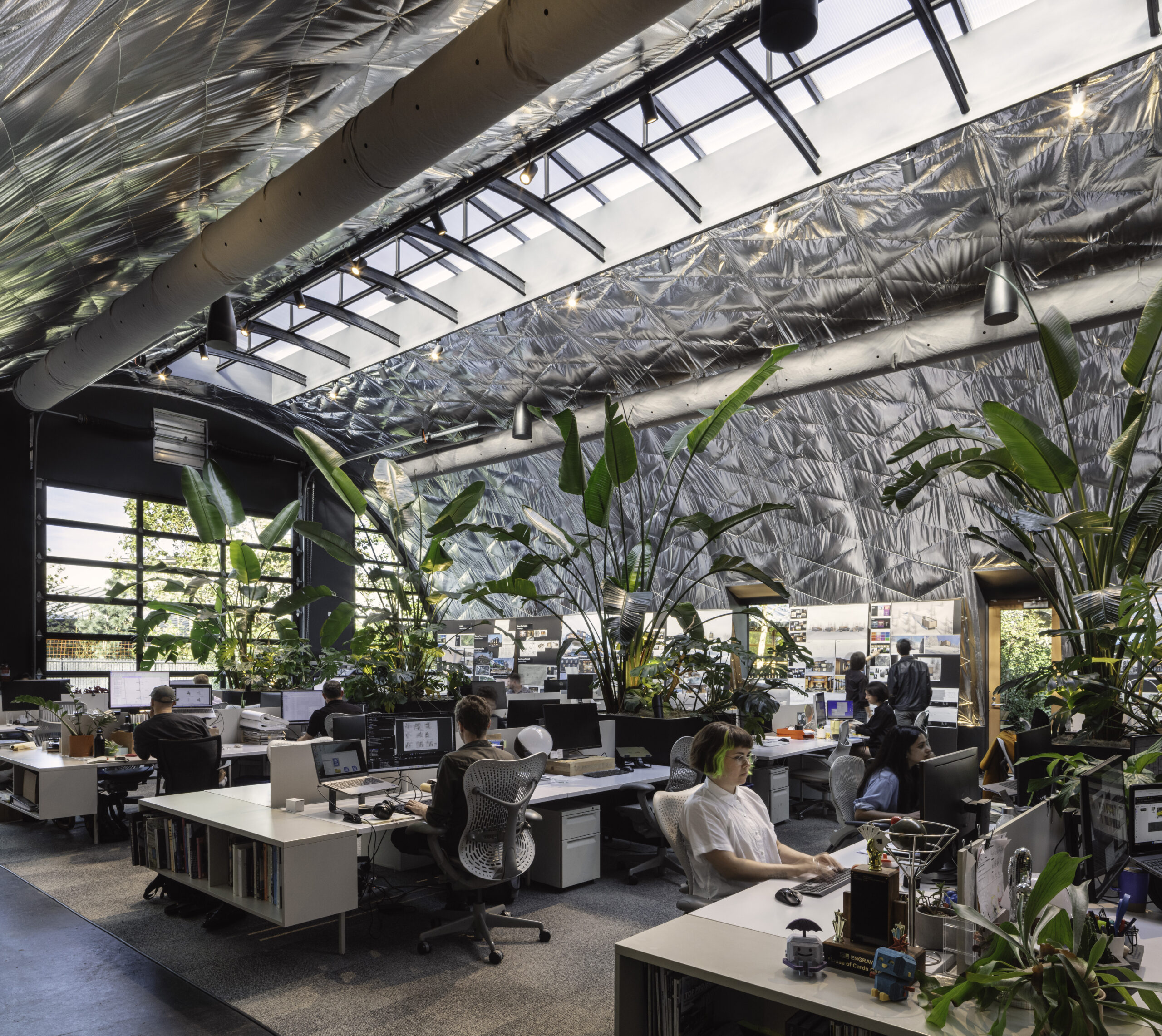
Transparency in spatial design serves as a powerful architectural language that transcends mere material choice, creating profound connections between spaces and their inhabitants. By employing translucent or clear elements, designers can dissolve traditional boundaries, allowing light to penetrate deeply into interiors while establishing visual relationships between previously separated areas. This permeability creates a dynamic spatial experience where environments flow into one another, expanding perceived dimensions and fostering a sense of openness. The strategic use of transparent elements – whether through glass partitions, open floor plans, or permeable screens – transforms rigid spatial hierarchies into fluid, interconnected zones that respond to contemporary needs for flexibility and connection with both surrounding spaces and natural environments.
Beyond its physical manifestations, transparency embodies deeper philosophical principles in design, representing honesty, clarity, and accessibility. It democratizes space by removing visual barriers that traditionally signaled exclusion or privacy, instead promoting inclusivity and shared experience. In public buildings, transparent features invite engagement and participation, while in residential contexts, they nurture connection to nature and enhance wellbeing through abundant natural light. This approach challenges designers to thoughtfully balance openness with necessary privacy, creating nuanced spatial sequences that can reveal or conceal as needed. When skillfully implemented, transparency becomes more than an aesthetic choice, it becomes a fundamental design strategy that shapes how we experience, navigate, and emotionally respond to our built environment.
1. Expands Perception of Space
Transparency in spatial design enhances how people perceive space by blurring the boundaries between rooms and creating a seamless connection between the indoors and the outdoors. Materials like glass and acrylic create visual continuity, making interiors feel larger, more open, and seamlessly integrated.
This approach encourages a fluid transition between spaces, eliminates confinement, and promotes spatial freedom. As a result, transparent design contributes to an inviting atmosphere while maximising natural views and light penetration throughout the environment.
Nestled in St. Donat near Montreal, the Apple Tree House by ACDF Architecture is a striking example of transparent design rooted in emotional memory. Wrapped around a central courtyard with a symbolic apple tree, the low-slung home features expansive glass walls that create continuous visual access to nature. The transparent layout not only blurs the boundaries between indoors and outdoors but also transforms the apple tree into a living focal point and is visible from multiple angles and spaces within the house.
This thoughtful transparency allows natural light to flood the interiors while connecting the home’s occupants with the changing seasons outside. The home’s square-shaped plan includes three black-clad volumes that house bedrooms, a lounge, and service areas. Despite the openness, privacy is preserved through deliberate wall placements. Wooden ceilings and concrete floors add warmth and texture, but it’s the full-height glazing that defines the home that frames nature as a permanent, ever-evolving artwork at its heart.
2. Enhances the Feeling of Openness
One of the core benefits of transparent design is its ability to harness natural light, transforming enclosed areas into luminous, uplifting environments. By using translucent or clear materials, designers reduce the need for artificial lighting and minimize visual barriers.
This not only improves energy efficiency but also fosters emotional well-being by connecting occupants to daylight and exterior views. Ultimately, transparency promotes a feeling of openness and calm, aligning with minimalist and modern architectural principles.
The Living O’Pod by UN10 Design Studio is a transparent, two-story pod designed as a minimalist retreat that fully immerses its occupants in nature. Built with a steel frame and glass panels all around, this glass bubble offers uninterrupted panoramic views of the Finnish wilderness. Its remote location provides the privacy needed to embrace transparency, allowing residents to enjoy stunning sunrises, sunsets, and starry nights from within. The open design blurs the line between indoors and outdoors, creating a unique connection with the environment.
Located in Repovesi, Finland, the pod’s interiors feature warm plywood floors and walls that complement the natural setting. A standout feature is its 360° rotation, which allows the entire structure to turn and capture optimal light and views throughout the day. Equipped with thermal insulation and heating, the Living O’Pod ensures comfort year-round and builds a harmonious relationship between people and nature.
3. Encourages Interaction
Transparent design reimagines interiors as active participants in the user experience, rather than passive backgrounds. Open sightlines and clear partitions encourage movement, visibility, and spontaneous interaction among occupants. This layout strategy fosters social connectivity, enhances spatial navigation, and aligns with contemporary needs for collaboration and flexibility.
Whether in residential, commercial, or public spaces, transparency supports an intuitive spatial flow that strengthens the emotional and functional relationship between people and their environment.
The Beach Cabin on the Baltic Sea, designed by Peter Kuczia, is a striking architectural piece located near Gdansk in northern Poland. This small gastronomy facility combines simplicity with bold design, harmoniously fitting into the beach environment while standing out through its innovative form. The structure is composed of two distinct parts: an enclosed space and an expansive open living and dining area that maximizes natural light and offers shelter. This dual arrangement creates a balanced yet dynamic architectural composition that respects the surrounding landscape.
A defining feature of the cabin is its open dining area, which is divided into two sections—one traditional cabin-style and the other constructed entirely of glass. The transparent glass facade provides uninterrupted panoramic views of the Baltic Sea, the shoreline, and the sky, enhancing the connection between interior and nature. Elevated on stilts, the building appears to float above the sand, minimizing environmental impact and contributing to its ethereal, dreamlike quality.
Transparent Product Design
In product design, transparency serves as both a functional strategy and a powerful communicative tool that transforms the relationship between users and objects. By revealing internal components and operational mechanisms through clear or translucent materials, designers create an immediate visual understanding of how products function, demystifying technology and inviting engagement. This design approach establishes an honest dialogue with consumers, building trust through visibility rather than concealment. Beyond mere aesthetics, transparent design celebrates the beauty of engineering, turning circuit boards, gears, and mechanical elements into intentional visual features that tell the product’s story. From the nostalgic appeal of see-through gaming consoles to modern tech accessories, this approach satisfies our innate curiosity about how things work while creating a more informed user experience.
The psychological impact of transparency in products extends beyond functional clarity to create deeper emotional connections. When users can observe a product’s inner workings, they develop increased confidence in its quality and craftsmanship, fostering a sense of reliability that opaque designs often struggle to convey. This visibility also democratizes understanding, making complex technologies more accessible and less intimidating to diverse users. Transparent design elements can evoke powerful nostalgic associations while simultaneously appearing futuristic and innovative, creating a timeless appeal that transcends trends. By embracing transparency, designers reject the notion that complexity should be hidden, instead celebrating the intricate engineering that powers our everyday objects. This philosophy aligns perfectly with contemporary values of authenticity and mindful consumption, where users increasingly seek products that communicate honesty in both form and function.
1. Reveals Functionality
Transparent product design exposes internal components like wiring, gears, or circuits, turning functional parts into visual features. This approach demystifies the object, inviting users to understand how it works rather than hiding its complexity. It fosters appreciation for craftsmanship and engineering while encouraging educational curiosity. By showcasing what lies beneath the surface, designers build an honest relationship with consumers that is based on clarity, trust, and visible function.
Packing a backpack often means tossing everything in and hoping for the best—until you need something fast. This transparent modular backpack concept reimagines that daily hassle with a clear, compartmentalized design that lets you see all your gear at a glance. No more digging through a dark abyss—every item has its visible place. The bag features four detachable, differently sized boxes that snap together with straps, letting you customize what you carry. Grab just the tech module or gym gear block and go—simple, efficient, and streamlined. Unlike traditional organizers that hide contents in pouches, the transparent material keeps everything in plain sight, saving time and frustration.
While it raises valid concerns around privacy and security, the clarity and convenience it offers make it ideal for fast-paced, on-the-go lifestyles. With form meeting function, this concept shows how transparent design can transform not just how a bag looks, but how it works.
2. Enhances User Engagement
When users can see how a product operates, they feel more confident using it. Transparent casings invite interaction by reducing uncertainty about internal processes. This visible clarity reassures users about the product’s integrity and quality, creating a psychological sense of openness and reliability.
Especially in tech and appliances, this strategy deepens user trust and adds emotional value by allowing a more intimate connection with the design’s purpose and construction.
The transparent Sony Glass Blue WF-C710N earbuds represent something more meaningful than a mere aesthetic choice, embodying a refreshing philosophy of technological honesty. While most devices conceal their inner workings behind opaque shells, Sony’s decision to reveal the intricate circuitry and precision components celebrates the engineering artistry that makes these tiny audio marvels possible.
As you catch glimpses of copper coils and circuit boards through the crystal-clear housing, there’s a renewed appreciation for the invisible complexity that delivers your favorite music, serving as a visual reminder that sometimes the most beautiful designs are those that have nothing to hide.
3. Celebrates Aesthetic Engineering
Transparency turns utilitarian details into design features, allowing users to visually experience the beauty of inner mechanisms. This trend, seen in everything from vintage electronics to modern gadgets and watches, values technical artistry as much as outer form.
Transparent design redefines aesthetics by focusing on the raw, mechanical truth of a product. It appeals to minimalism and industrial design lovers, offering visual depth and storytelling through exposed structure rather than decorative surface embellishment.
DAB Motors’ 1α Transparent Edition brings retro tech flair into modern mobility with its striking transparent bodywork. Inspired by the see-through gadgets of the ”90s—like the Game Boy Color and clear Nintendo controllers—this electric motorcycle reveals its inner mechanics with style. The semi-translucent panels offer a rare peek at the bike’s intricate engineering, blending nostalgia with innovation. Carbon fiber elements, sourced from repurposed Airbus materials, complement the lightweight transparency, creating a visual experience that’s both futuristic and rooted in classic design aesthetics.
The see-through design isn’t just for looks—it enhances the connection between rider and machine. Exposed components like the integrated LCD dashboard, lenticular headlight, and visible frame structure emphasize function and precision. This openness aligns with a broader transparent design philosophy, where clarity and honesty in construction are celebrated. The DAB 1α turns heads not by hiding complexity, but by proudly displaying it, making every ride a statement in motion.
Beyond just materials, transparent design also reflects a deeper design philosophy that values clarity in purpose, function, and sustainability. It supports minimalist thinking by focusing on what’s essential, reducing visual clutter, and making spaces or products easier to understand and engage with. Whether in interiors or objects, transparency helps create a more honest, functional, and connected user experienceThe post Transparent Design: How See-Through Materials Are Revolutionizing Architecture & Product Design first appeared on Yanko Design.
#transparent #design #how #seethrough #materialsTransparent Design: How See-Through Materials Are Revolutionizing Architecture & Product Design
Transparent design is the intentional use of see-through or translucent materials and visual strategies to evoke openness, honesty, and fluidity in both spatial and product design. It enhances light flow, visibility, and interaction, blurring boundaries between spaces or revealing inner layers of products.
In interiors, this manifests through glass walls, acrylic dividers, and open layouts that invite natural light and visual connection. Transparency in product design often exposes internal mechanisms in products, fostering trust and curiosity by making functions visible. It focuses on simplicity, clarity, and minimalist form, creating seamless connections between objects and their environments. Let’s now explore how transparency shapes the function, experience, and emotional impact of spatial and product design.
Transparent Spatial Design
Transparency in spatial design serves as a powerful architectural language that transcends mere material choice, creating profound connections between spaces and their inhabitants. By employing translucent or clear elements, designers can dissolve traditional boundaries, allowing light to penetrate deeply into interiors while establishing visual relationships between previously separated areas. This permeability creates a dynamic spatial experience where environments flow into one another, expanding perceived dimensions and fostering a sense of openness. The strategic use of transparent elements – whether through glass partitions, open floor plans, or permeable screens – transforms rigid spatial hierarchies into fluid, interconnected zones that respond to contemporary needs for flexibility and connection with both surrounding spaces and natural environments.
Beyond its physical manifestations, transparency embodies deeper philosophical principles in design, representing honesty, clarity, and accessibility. It democratizes space by removing visual barriers that traditionally signaled exclusion or privacy, instead promoting inclusivity and shared experience. In public buildings, transparent features invite engagement and participation, while in residential contexts, they nurture connection to nature and enhance wellbeing through abundant natural light. This approach challenges designers to thoughtfully balance openness with necessary privacy, creating nuanced spatial sequences that can reveal or conceal as needed. When skillfully implemented, transparency becomes more than an aesthetic choice, it becomes a fundamental design strategy that shapes how we experience, navigate, and emotionally respond to our built environment.
1. Expands Perception of Space
Transparency in spatial design enhances how people perceive space by blurring the boundaries between rooms and creating a seamless connection between the indoors and the outdoors. Materials like glass and acrylic create visual continuity, making interiors feel larger, more open, and seamlessly integrated.
This approach encourages a fluid transition between spaces, eliminates confinement, and promotes spatial freedom. As a result, transparent design contributes to an inviting atmosphere while maximising natural views and light penetration throughout the environment.
Nestled in St. Donat near Montreal, the Apple Tree House by ACDF Architecture is a striking example of transparent design rooted in emotional memory. Wrapped around a central courtyard with a symbolic apple tree, the low-slung home features expansive glass walls that create continuous visual access to nature. The transparent layout not only blurs the boundaries between indoors and outdoors but also transforms the apple tree into a living focal point and is visible from multiple angles and spaces within the house.
This thoughtful transparency allows natural light to flood the interiors while connecting the home’s occupants with the changing seasons outside. The home’s square-shaped plan includes three black-clad volumes that house bedrooms, a lounge, and service areas. Despite the openness, privacy is preserved through deliberate wall placements. Wooden ceilings and concrete floors add warmth and texture, but it’s the full-height glazing that defines the home that frames nature as a permanent, ever-evolving artwork at its heart.
2. Enhances the Feeling of Openness
One of the core benefits of transparent design is its ability to harness natural light, transforming enclosed areas into luminous, uplifting environments. By using translucent or clear materials, designers reduce the need for artificial lighting and minimize visual barriers.
This not only improves energy efficiency but also fosters emotional well-being by connecting occupants to daylight and exterior views. Ultimately, transparency promotes a feeling of openness and calm, aligning with minimalist and modern architectural principles.
The Living O’Pod by UN10 Design Studio is a transparent, two-story pod designed as a minimalist retreat that fully immerses its occupants in nature. Built with a steel frame and glass panels all around, this glass bubble offers uninterrupted panoramic views of the Finnish wilderness. Its remote location provides the privacy needed to embrace transparency, allowing residents to enjoy stunning sunrises, sunsets, and starry nights from within. The open design blurs the line between indoors and outdoors, creating a unique connection with the environment.
Located in Repovesi, Finland, the pod’s interiors feature warm plywood floors and walls that complement the natural setting. A standout feature is its 360° rotation, which allows the entire structure to turn and capture optimal light and views throughout the day. Equipped with thermal insulation and heating, the Living O’Pod ensures comfort year-round and builds a harmonious relationship between people and nature.
3. Encourages Interaction
Transparent design reimagines interiors as active participants in the user experience, rather than passive backgrounds. Open sightlines and clear partitions encourage movement, visibility, and spontaneous interaction among occupants. This layout strategy fosters social connectivity, enhances spatial navigation, and aligns with contemporary needs for collaboration and flexibility.
Whether in residential, commercial, or public spaces, transparency supports an intuitive spatial flow that strengthens the emotional and functional relationship between people and their environment.
The Beach Cabin on the Baltic Sea, designed by Peter Kuczia, is a striking architectural piece located near Gdansk in northern Poland. This small gastronomy facility combines simplicity with bold design, harmoniously fitting into the beach environment while standing out through its innovative form. The structure is composed of two distinct parts: an enclosed space and an expansive open living and dining area that maximizes natural light and offers shelter. This dual arrangement creates a balanced yet dynamic architectural composition that respects the surrounding landscape.
A defining feature of the cabin is its open dining area, which is divided into two sections—one traditional cabin-style and the other constructed entirely of glass. The transparent glass facade provides uninterrupted panoramic views of the Baltic Sea, the shoreline, and the sky, enhancing the connection between interior and nature. Elevated on stilts, the building appears to float above the sand, minimizing environmental impact and contributing to its ethereal, dreamlike quality.
Transparent Product Design
In product design, transparency serves as both a functional strategy and a powerful communicative tool that transforms the relationship between users and objects. By revealing internal components and operational mechanisms through clear or translucent materials, designers create an immediate visual understanding of how products function, demystifying technology and inviting engagement. This design approach establishes an honest dialogue with consumers, building trust through visibility rather than concealment. Beyond mere aesthetics, transparent design celebrates the beauty of engineering, turning circuit boards, gears, and mechanical elements into intentional visual features that tell the product’s story. From the nostalgic appeal of see-through gaming consoles to modern tech accessories, this approach satisfies our innate curiosity about how things work while creating a more informed user experience.
The psychological impact of transparency in products extends beyond functional clarity to create deeper emotional connections. When users can observe a product’s inner workings, they develop increased confidence in its quality and craftsmanship, fostering a sense of reliability that opaque designs often struggle to convey. This visibility also democratizes understanding, making complex technologies more accessible and less intimidating to diverse users. Transparent design elements can evoke powerful nostalgic associations while simultaneously appearing futuristic and innovative, creating a timeless appeal that transcends trends. By embracing transparency, designers reject the notion that complexity should be hidden, instead celebrating the intricate engineering that powers our everyday objects. This philosophy aligns perfectly with contemporary values of authenticity and mindful consumption, where users increasingly seek products that communicate honesty in both form and function.
1. Reveals Functionality
Transparent product design exposes internal components like wiring, gears, or circuits, turning functional parts into visual features. This approach demystifies the object, inviting users to understand how it works rather than hiding its complexity. It fosters appreciation for craftsmanship and engineering while encouraging educational curiosity. By showcasing what lies beneath the surface, designers build an honest relationship with consumers that is based on clarity, trust, and visible function.
Packing a backpack often means tossing everything in and hoping for the best—until you need something fast. This transparent modular backpack concept reimagines that daily hassle with a clear, compartmentalized design that lets you see all your gear at a glance. No more digging through a dark abyss—every item has its visible place. The bag features four detachable, differently sized boxes that snap together with straps, letting you customize what you carry. Grab just the tech module or gym gear block and go—simple, efficient, and streamlined. Unlike traditional organizers that hide contents in pouches, the transparent material keeps everything in plain sight, saving time and frustration.
While it raises valid concerns around privacy and security, the clarity and convenience it offers make it ideal for fast-paced, on-the-go lifestyles. With form meeting function, this concept shows how transparent design can transform not just how a bag looks, but how it works.
2. Enhances User Engagement
When users can see how a product operates, they feel more confident using it. Transparent casings invite interaction by reducing uncertainty about internal processes. This visible clarity reassures users about the product’s integrity and quality, creating a psychological sense of openness and reliability.
Especially in tech and appliances, this strategy deepens user trust and adds emotional value by allowing a more intimate connection with the design’s purpose and construction.
The transparent Sony Glass Blue WF-C710N earbuds represent something more meaningful than a mere aesthetic choice, embodying a refreshing philosophy of technological honesty. While most devices conceal their inner workings behind opaque shells, Sony’s decision to reveal the intricate circuitry and precision components celebrates the engineering artistry that makes these tiny audio marvels possible.
As you catch glimpses of copper coils and circuit boards through the crystal-clear housing, there’s a renewed appreciation for the invisible complexity that delivers your favorite music, serving as a visual reminder that sometimes the most beautiful designs are those that have nothing to hide.
3. Celebrates Aesthetic Engineering
Transparency turns utilitarian details into design features, allowing users to visually experience the beauty of inner mechanisms. This trend, seen in everything from vintage electronics to modern gadgets and watches, values technical artistry as much as outer form.
Transparent design redefines aesthetics by focusing on the raw, mechanical truth of a product. It appeals to minimalism and industrial design lovers, offering visual depth and storytelling through exposed structure rather than decorative surface embellishment.
DAB Motors’ 1α Transparent Edition brings retro tech flair into modern mobility with its striking transparent bodywork. Inspired by the see-through gadgets of the ”90s—like the Game Boy Color and clear Nintendo controllers—this electric motorcycle reveals its inner mechanics with style. The semi-translucent panels offer a rare peek at the bike’s intricate engineering, blending nostalgia with innovation. Carbon fiber elements, sourced from repurposed Airbus materials, complement the lightweight transparency, creating a visual experience that’s both futuristic and rooted in classic design aesthetics.
The see-through design isn’t just for looks—it enhances the connection between rider and machine. Exposed components like the integrated LCD dashboard, lenticular headlight, and visible frame structure emphasize function and precision. This openness aligns with a broader transparent design philosophy, where clarity and honesty in construction are celebrated. The DAB 1α turns heads not by hiding complexity, but by proudly displaying it, making every ride a statement in motion.
Beyond just materials, transparent design also reflects a deeper design philosophy that values clarity in purpose, function, and sustainability. It supports minimalist thinking by focusing on what’s essential, reducing visual clutter, and making spaces or products easier to understand and engage with. Whether in interiors or objects, transparency helps create a more honest, functional, and connected user experienceThe post Transparent Design: How See-Through Materials Are Revolutionizing Architecture & Product Design first appeared on Yanko Design.
#transparent #design #how #seethrough #materials