Graduate Student Develops an A.I.-Based Approach to Restore Time-Damaged Artwork to Its Former Glory
Graduate Student Develops an A.I.-Based Approach to Restore Time-Damaged Artwork to Its Former Glory
The method could help bring countless old paintings, currently stored in the back rooms of galleries with limited conservation budgets, to light
Scans of the painting retouched with a new technique during various stages in the process. On the right is the restored painting with the applied laminate mask.
Courtesy of the researchers via MIT
In a contest for jobs requiring the most patience, art restoration might take first place. Traditionally, conservators restore paintings by recreating the artwork’s exact colors to fill in the damage, one spot at a time. Even with the help of X-ray imaging and pigment analyses, several parts of the expensive process, such as the cleaning and retouching, are done by hand, as noted by Artnet’s Jo Lawson-Tancred.
Now, a mechanical engineering graduate student at MIT has developed an artificial intelligence-based approach that can achieve a faithful restoration in just hours—instead of months of work.
In a paper published Wednesday in the journal Nature, Alex Kachkine describes a new method that applies digital restorations to paintings by placing a thin film on top. If the approach becomes widespread, it could make art restoration more accessible and help bring countless damaged paintings, currently stored in the back rooms of galleries with limited conservation budgets, back to light.
The new technique “is a restoration process that saves a lot of time and money, while also being reversible, which some people feel is really important to preserving the underlying character of a piece,” Kachkine tells Nature’s Amanda Heidt.
Meet the engineer who invented an AI-powered way to restore art
Watch on
While filling in damaged areas of a painting would seem like a logical solution to many people, direct retouching raises ethical concerns for modern conservators. That’s because an artwork’s damage is part of its history, and retouching might detract from the painter’s original vision. “For example, instead of removing flaking paint and retouching the painting, a conservator might try to fix the loose paint particles to their original places,” writes Hartmut Kutzke, a chemist at the University of Oslo’s Museum of Cultural History, for Nature News and Views. If retouching is absolutely necessary, he adds, it should be reversible.
As such, some institutions have started restoring artwork virtually and presenting the restoration next to the untouched, physical version. Many art lovers might argue, however, that a digital restoration printed out or displayed on a screen doesn’t quite compare to seeing the original painting in its full glory.
That’s where Kachkine, who is also an art collector and amateur conservator, comes in. The MIT student has developed a way to apply digital restorations onto a damaged painting. In short, the approach involves using pre-existing A.I. tools to create a digital version of what the freshly painted artwork would have looked like. Based on this reconstruction, Kachkine’s new software assembles a map of the retouches, and their exact colors, necessary to fill the gaps present in the painting today.
The map is then printed onto two layers of thin, transparent polymer film—one with colored retouches and one with the same pattern in white—that attach to the painting with conventional varnish. This “mask” aligns the retouches with the gaps while leaving the rest of the artwork visible.
“In order to fully reproduce color, you need both white and color ink to get the full spectrum,” Kachkine explains in an MIT statement. “If those two layers are misaligned, that’s very easy to see. So, I also developed a few computational tools, based on what we know of human color perception, to determine how small of a region we can practically align and restore.”
The method’s magic lies in the fact that the mask is removable, and the digital file provides a record of the modifications for future conservators to study.
Kachkine demonstrated the approach on a 15th-century oil painting in dire need of restoration, by a Dutch artist whose name is now unknown. The retouches were generated by matching the surrounding color, replicating similar patterns visible elsewhere in the painting or copying the artist’s style in other paintings, per Nature News and Views. Overall, the painting’s 5,612 damaged regions were filled with 57,314 different colors in 3.5 hours—66 hours faster than traditional methods would have likely taken.
Overview of Physically-Applied Digital Restoration
Watch on
“It followed years of effort to try to get the method working,” Kachkine tells the Guardian’s Ian Sample. “There was a fair bit of relief that finally this method was able to reconstruct and stitch together the surviving parts of the painting.”
The new process still poses ethical considerations, such as whether the applied film disrupts the viewing experience or whether A.I.-generated corrections to the painting are accurate. Additionally, Kutzke writes for Nature News and Views that the effect of the varnish on the painting should be studied more deeply.
Still, Kachkine says this technique could help address the large number of damaged artworks that live in storage rooms. “This approach grants greatly increased foresight and flexibility to conservators,” per the study, “enabling the restoration of countless damaged paintings deemed unworthy of high conservation budgets.”
Get the latest stories in your inbox every weekday.
#graduate #student #develops #aibased #approach
Graduate Student Develops an A.I.-Based Approach to Restore Time-Damaged Artwork to Its Former Glory
Graduate Student Develops an A.I.-Based Approach to Restore Time-Damaged Artwork to Its Former Glory
The method could help bring countless old paintings, currently stored in the back rooms of galleries with limited conservation budgets, to light
Scans of the painting retouched with a new technique during various stages in the process. On the right is the restored painting with the applied laminate mask.
Courtesy of the researchers via MIT
In a contest for jobs requiring the most patience, art restoration might take first place. Traditionally, conservators restore paintings by recreating the artwork’s exact colors to fill in the damage, one spot at a time. Even with the help of X-ray imaging and pigment analyses, several parts of the expensive process, such as the cleaning and retouching, are done by hand, as noted by Artnet’s Jo Lawson-Tancred.
Now, a mechanical engineering graduate student at MIT has developed an artificial intelligence-based approach that can achieve a faithful restoration in just hours—instead of months of work.
In a paper published Wednesday in the journal Nature, Alex Kachkine describes a new method that applies digital restorations to paintings by placing a thin film on top. If the approach becomes widespread, it could make art restoration more accessible and help bring countless damaged paintings, currently stored in the back rooms of galleries with limited conservation budgets, back to light.
The new technique “is a restoration process that saves a lot of time and money, while also being reversible, which some people feel is really important to preserving the underlying character of a piece,” Kachkine tells Nature’s Amanda Heidt.
Meet the engineer who invented an AI-powered way to restore art
Watch on
While filling in damaged areas of a painting would seem like a logical solution to many people, direct retouching raises ethical concerns for modern conservators. That’s because an artwork’s damage is part of its history, and retouching might detract from the painter’s original vision. “For example, instead of removing flaking paint and retouching the painting, a conservator might try to fix the loose paint particles to their original places,” writes Hartmut Kutzke, a chemist at the University of Oslo’s Museum of Cultural History, for Nature News and Views. If retouching is absolutely necessary, he adds, it should be reversible.
As such, some institutions have started restoring artwork virtually and presenting the restoration next to the untouched, physical version. Many art lovers might argue, however, that a digital restoration printed out or displayed on a screen doesn’t quite compare to seeing the original painting in its full glory.
That’s where Kachkine, who is also an art collector and amateur conservator, comes in. The MIT student has developed a way to apply digital restorations onto a damaged painting. In short, the approach involves using pre-existing A.I. tools to create a digital version of what the freshly painted artwork would have looked like. Based on this reconstruction, Kachkine’s new software assembles a map of the retouches, and their exact colors, necessary to fill the gaps present in the painting today.
The map is then printed onto two layers of thin, transparent polymer film—one with colored retouches and one with the same pattern in white—that attach to the painting with conventional varnish. This “mask” aligns the retouches with the gaps while leaving the rest of the artwork visible.
“In order to fully reproduce color, you need both white and color ink to get the full spectrum,” Kachkine explains in an MIT statement. “If those two layers are misaligned, that’s very easy to see. So, I also developed a few computational tools, based on what we know of human color perception, to determine how small of a region we can practically align and restore.”
The method’s magic lies in the fact that the mask is removable, and the digital file provides a record of the modifications for future conservators to study.
Kachkine demonstrated the approach on a 15th-century oil painting in dire need of restoration, by a Dutch artist whose name is now unknown. The retouches were generated by matching the surrounding color, replicating similar patterns visible elsewhere in the painting or copying the artist’s style in other paintings, per Nature News and Views. Overall, the painting’s 5,612 damaged regions were filled with 57,314 different colors in 3.5 hours—66 hours faster than traditional methods would have likely taken.
Overview of Physically-Applied Digital Restoration
Watch on
“It followed years of effort to try to get the method working,” Kachkine tells the Guardian’s Ian Sample. “There was a fair bit of relief that finally this method was able to reconstruct and stitch together the surviving parts of the painting.”
The new process still poses ethical considerations, such as whether the applied film disrupts the viewing experience or whether A.I.-generated corrections to the painting are accurate. Additionally, Kutzke writes for Nature News and Views that the effect of the varnish on the painting should be studied more deeply.
Still, Kachkine says this technique could help address the large number of damaged artworks that live in storage rooms. “This approach grants greatly increased foresight and flexibility to conservators,” per the study, “enabling the restoration of countless damaged paintings deemed unworthy of high conservation budgets.”
Get the latest stories in your inbox every weekday.
#graduate #student #develops #aibased #approach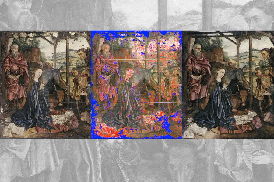
0 Комментарии
·0 Поделились
·0 предпросмотр