Why is everyone on the team a UXer? Layers of player experience
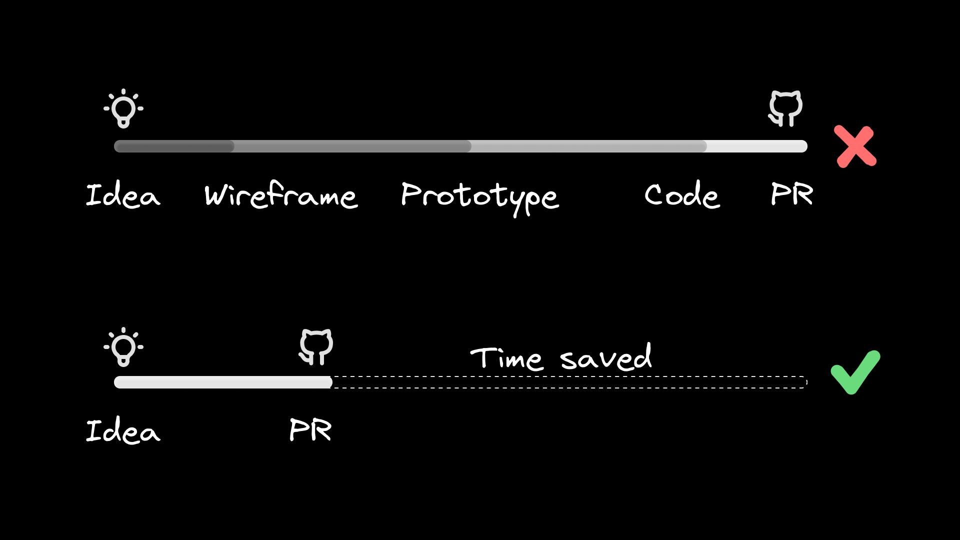
Hello, my name is Oleksandr, I’m a Senior UX/UI Designer at Ubisoft. At Games Gathering Kyiv ’24, I gave a presentation titled “Layers of Player Experience. Why is everyone on the team a UXer”. This article is a supplement and an alternative form of that presentation.Tutorials Menu in The Last of Us Part IITo have an experience, we first need a user. As a result, users interact with the product and gain that experience.A game is a tool — a generator of experiences, emotions, and memories for the audience. And that’s why games are bought, loved and hated. It is for the experience they provide. Exceptions, when we tend to accumulate: we buy games during some Steam sale, so we will never launch them.You can’t design an experience; you can design a product through which people gain an experience. That is, our Figma prototype is UI, and as soon as we let people use it. They share thoughts, impressions, expectations, feelings… this is UX. And even memes talk about it.UX MemesOur goal is not a game, but the player’s experience. I came across a thought that stood out to me:“The Game Direction is the concrete manifestation of the Target Game Experience and is the first thing you should aim for. This makes game development a sort of “reverse-engineering process”At the moment, in the essence of UX, and in our context of Player Experience, I have identified 4 layers-components that influence the perception of the product.UX LayersFunctionalityLet’s start with the first one: functionality is the basic and most objective part. It answers the question: Does the game work properly?For example, does it meet such requirements as load time, memory usage, number of frames per second, etc. In an ideal world, there are no crashes, friezes, softlocks, servers can withstand a large number of players, excellent optimization for different platforms and adaptation for input/output devices, various edge cases, Poka-yoke protection, etc. are also considered and covered. And of course, it affects the audience experience. Some critical moments can make the game completely unplayable, while others become memes.Assassin’s Creed UnityUsabilityThe next level is usability — it defines how easy and convenient the product is to use.The main task of this area is to minimize cognitiveand physicalloads during interaction. In many products and services, teams aim to track and remove all friction and difficulties users may face. In games, however, we look for and remove only those obstacles that are not there by design.For example, in the VR shooter Half Life Alyx, reloading is implemented as follows: you need to press a button on the controller to eject the empty magazine from the weapon, then reach back to grab a new one and carefully install it. From a usability perspective, this is not ideal, requiring a certain physical dexterity, and it would technically be simpler to assign these actions to a single button. But this would reduce the challenge in the game, the immersion in the world, and would likely not improve the overall gaming experience.Half Life AlyxOn the other hand, if players get lost in the menu, cannot perform the actions they need, do not understand why their character dies every time, fails a mission, or cannot master a certain mechanic due to lack of and poor tutorials. Something definitely needs to be done about this. Otherwise, players may feel frustrated — like the game is being unfair or not entirely honest with them.Usability in games relies on the same methods and research as other software development. Covers the following sections and disciplines:Interaction Design, IxDVisual DesignHeuristics, for example Jakob Nielsen’s in gamesPlatform GuidelinesAccessibility Standards: Web Content Accessibility Guidelinesand Xbox Accessibility GuidelinesPrimary research:Card sortingModerated and unmoderated usability testsEye-trackingA/B testingSecondary research:Market and competitor analysisOpen source data analysisClosed source data analysisUsability is an important aspect of a game. Moreover, even for the entire platform or industry. The market is full of direct and indirect competitors, all fighting for our time and attention.Let’s look at the Quick Resume function on Xbox Series, which allows you to instantly switch between multiple games, preserving their state, like Alt-Tab between windows. Moreover, thanks to it, after turning off the console, players can continue the game exactly from where they left off, just by pressing one button:I press the Xbox logo on the gamepad → the console turns on → the TV automatically turns on via HDMI-CEC and selects the HDMI console source → the console launches the last session game → I get into the game exactly where I stopped.This greatly simplifies interaction, reduces the number of steps for players to reach Value, and bypasses competitors, as the operating system screen of the TV often contains preview sections for Netflix, YouTube, etc. Our brain already finds this action, playing a game, more appealing because it requires less effort.In the book “Show Your Work” by Austin Kleon, author of the bestsellers “Steal Like an Artist” and “Show Your Work”, writes:“Your attention is one of the most valuable things you have, so everyone wants to steal it from you.” go further — there’s a branch of philosophy called aesthetics. It’s the study of sensory, non-utilitarian ways of understanding the world, a critical reflection on art, culture, and nature.In our field, aesthetics relates to the physical and digital form of the product. It encompasses sensory aspects such as appearance, sound, tactility, taste, and smell. Accordingly, I have identified 5 types of aesthetics:VisualMusic/AuditoryTactileTasteScentVisual AestheticsIt doesn’t always mean “beautiful”, “pleasant to the eye”. It’s about how the game looks… what impressions it evokes because of this. It can be “beautiful” as is usually considered, and “ugly”, “terrible”, or even “disgusting”, “repulsive”. Each game has its own proportion, somewhere more beauty — the Ori series, Ghost of Tsushima, Just Dance, … Somewhere ugliness, horror, and disgust — Scorn, Resident Evil, Dead Space, Little Nightmares…It’s the same in art — just look at the works of Zdzisław Beksiński, H.R. Giger, or Ukrainian artist Ivan Marchuk, the founder of the plentanism technique.Paintings by Zdzislaw BeksinskiPaintings “Awakening” and “Sorrow” by Ivan MarchukAesthetics should correspond to the game’s setting and lore, support immersion in this fictional world. An interesting unique visual style is another way to stand out in the market. For example, the creators of Cuphead were inspired by the aesthetics of 1930s cartoons, surrealism, and the jazz era.CupheadThe game is known for its distinctive crafted animation and soundtracks, which make it recognizable and stand out among others. The loud title of the marketing book “Differentiate or Die” comes to mind.In design and development, there is often a challenge: to find a balance between functionality, convenience, and aesthetics. You can overdo it with visual effects, animations, which will reduce performance and optimization. Get carried away with graphic elements, and this will add “visual noise”, lower readability, and accordingly, worsen usability.This dilemma is present in other subject areas as well. For example, chess sets. Pieces can be extremely detailed, made of expensive materials, but not very usable because players confuse their roles due to a certain unique, non-standard appearance. These obstacles do not contribute to the game and can ruin the entire experience, especially if the mistake leads to critical consequences in the match. Or take industrial design: for some time, Apple devices did not have as many ports/interfaces as their competitors’ devices. That is, for the sake of aesthetics, they neglect certain convenience and practicality. Maybe too convenient things form “convenient” people? ;)Auditory AestheticsIt greatly influences the atmosphere, emotions, and mood of the players. These include all the sounds that accompany the game: soundtracks, ambient sounds, sound design, dialogues, dubbing, and more. This has a significant impact on the gaming experience, even down to the goosebumps.This game component can be reflected in other products, such as vinyl records. It offers a new experience for users, providing auditory, tactile, and visual aesthetics.Alan Wake 2 Vinyl RecordsTactile AestheticsThese refer to the sensations related to physical perception during the game — from how we interact with peripheral devices.A few examples: gamepad vibration, Dual Sense adaptive triggers, steering wheel and pedals, special gloves or suits with tactile feedback. All this serves to provide greater immersion and inform about the game state.Special game editions with additional materials, such as 3D models, figurines, maps, or other items from the game world, can also be considered part of tactile aesthetics. This adds a physical aspect to the game interaction experience, can enhance the sense of involvement and value for players. It provides a certain tactile contact with the game universe, even when our PC or console is turned off due to a power outage.S.T.A.L.K.E.R. 2: Heart of Chornobyl Ultimate EditionTaste AestheticsHmm, can we try a game by taste? “Of course!” — marketing and business will joyfully exclaim. But no one will force us to gnaw on consoles or game discs. The approach is more gentle and courteous.So, on the shelves of grocery stores, we’ll find Nuka-Cola from the Fallout universe, Butterbeer, or Beans with different flavors from the Potterverse. The line between the game world and reality is blurring, and here we enter the realm of product placement: Calorie Mateappear in Metal Gear Solid, Monster Energy drinks in Death Stranding, and Nonstop in S.T.A.L.K.E.R..Nuka-Cola from the Fallout universeScent AestheticsI began exploring this topic and discovered GameScent — a device that reacts to game events such as shooting, explosions, racing, storms, and forests, releasing corresponding smells. It’s a form of 4D gaming, an attempt to expand the gaming experience to another sense. But I think we should be careful with this — who knows what it might emit when burning cannabis fields in Far Cry 3.GameScentBut in fact, if we delve deeper, we can think about certain new niches. The Moth and Rabbit perfume brand, founded in 2016, is known for its unique approach. They create unisex perfumes inspired by movies and stories, such as Parasite, The Lobster, La Haine, and The Color of Pomegranates. The focus is not only on the scent but also on the emotional and sensory experience.I feel like perfumers and marketers could easily craft fragrance concepts for games like GTA, RDR2, or The Last of Us… Thus adding a new dimension of experience for the audience. I will share my own associations — what perfumes remind me of different parts of Far Cry.FUNNow we have reached the core, the center that creates the desire to use this or that entertainment product. You can fix bugs, work on optimization, improve usability, and create aesthetics as much as you want. However, if a game has no fun, it is not interesting to play, and it is most likely doomed to fail.There is an expression Usable yet Useless. Because many products appear on the market that don’t find their purpose, have no value for the customers. And of course, we know a lot of such examples among published games. Or those that were canceled in development because the team never found the “FUN recipe” in practice. That said, projects can also be canceled for many other reasons — finances, the market, team issues, tech limitations, shifting priorities, or strategic decisions…Well, fun is a rabbit hole — a vast and complex topic that touches many areas. A person’s impression of it is individual, personal, and subjective.“We are not many standard selves, but many different universes” — Vasyl Symonenko.Making a game that works for everyone is possible. Making a game that is interesting and liked by everyone — I don’t think so. Here, I will try to describe certain components of fun as simply as possible.MotivationAgain, it’s not easy because there is no single theory of motivation. But the dominant framework, which is also described in management books, is the self-determination theory. It suggests that our motivation comes from both intrinsic driversand extrinsic drivers.Let’s start with the three intrinsic ones:Competence is a need to feel successful, skilled, and to see yourself progress and develop. It’s about growth and providing players with the right level of challenge to showcase their skills. Competence is one of the key drivers. A nice real-life example would be when you give a riddle to your friends. Time passes, and they don’t want you to give them the answer — they want to solve it themselves to experience the feeling of “We did it!”Autonomy is a need for self-expression, to feel that you have an impact, that your choices matter. This is a certain level of freedom in the game, the ability to customize characters, their belongings, make decisions, participate in dialogues that change the further course of events…Relatedness is a need to have meaningful social connections, whether through cooperation or competition, because we are social beings. Accordingly, these are all kinds of coop or competitive modes in online or offline game mods.Extrinsic drivers are external rewards. Ideally, they also immerse and help progress, providing some recognition, feedback on the players’ competence. Goals and rewards should be meaningful to the players.More on player motivation in this talk by Celia Hodent, former Director of User Experience at Epic Games.EmotionEmotions are very important, they affect our perception, decision-making and memory — the more emotional the experience, the better we will remember it. Here I have highlighted:Immersion, which is also shaped by aesthetics.The feeling of the game — 3CLinking Narrative — Story — PlotSurprises and new content: locations, seasons, tournaments, modes, etc.So to speak, we ride the emotional roller coaster. In any case, it is better in the game than in life. So as not to complain like Chris Isaak in the song Wicked Game “What a wicked game you play to make me feel this way”.FlowThe state of flow, a concept introduced by psychologist Mihaly Csikszentmihalyi, occurs at the appropriate level of challenge and skills. The mental state in which a person is fully engaged in what they are doing is a feeling of focus, concentration, and success during the activity. Flow can occur during various activities such as sports, work, daily life, creativity, and others.State of FlowThe main components and conditions in a game are:Difficulty curve — the level of challenges, “match of skills and challenges”Learning curve — onboarding players and step-by-step distributed tutorials;Pacing — a rhythm of stress and rest. The best rest is a change of activity.The state of flow is so captivating that we lose track of time.Ethical Aspects and ResponsibilityThis is about the conscious and unconscious use of deceptive design patterns, to increase business revenue. It is an exploitation of our biases and perception. Some companies have lawsuits regarding these decisions in certain countries.There is also a book written in a simple, concise form “Hooked: How to Build Habit-Forming Products” — Nir Eyal, Ryan Hoover. It allowed me to look at various products, services from a different angle and notice, recognize their methods of engagement.Summary about FunIn the book “A Theory of Fun for Game Design” by Raph Koster, there is a phrase “Learning is the drug”. The feeling of fun is the brain’s emotional reaction to learning. Even curiosity is enjoyable in itself, which is why we dislike spoilers — or at least, part of us does.Just as in games we solve puzzles, learn combos, scripts, and timings for further progress, so is it in life. A cat that drops things from the table for its learningor scientists trying to solve the mystery of the universe. Our brain always wants to find a pattern, a cause-and-effect relationship, to create structure in chaos. And as soon as it finds it, it becomes uninteresting and boring. As Dua Lipa sings in her song “New Rules”, “Now I’m standin’ back from it, I finally see the pattern.”Brand ConnectionWe can combine these layers and add another one around that also affects the game’s perception by the audience and its loyalty. This is the company’s brand, its philosophy, position, previous experience with its products and services. As well as personal brand: Neil Druckmann, Dan & Sam Houser, Hideo Kojima, etc. of these components of the Game UX is handled by specific teams and stakeholders. In the image below, I have only indicated a part of the job titles that came to mind. In game development, especially for large projects, there are significantly more roles, and the credits are proof of that. Management is responsible for effective coordination and cooperation of these teams. Moreover, the R&D process of the game is impossible without the support of other company departments — HR, infrastructure, operational team, finance, etc.UX Layers & TeamAll these layers-components are closely interconnected, influencing and depending on each other. People from “Fun” tell we need a game world without seams and loading, while people from “Functionality”, having studied this issue, say that at the moment it is impossible, or requires additional resources, technologies. The search for a solution, a compromise is ongoing.Although my main focus is usability and aesthetics. It is necessary to collaborate with a large number of different teams. For example, when I worked on the High Contrast Mode feature, I first aligned with the Game Design team and then shared prototypes with the Render team, which made its implementation possible. All these layers-components are important for players’ experiences.On the FinalA game can bring not just fun, but also a deeper experience, raising and revealing important themes. It is an important medium for exploring social, ethical, and psychological issues. Games evoke emotions and empathy, allowing players to experience stories, situations that raise questions about morality, responsibility, and human values.Valiant HeartsWe love games with all their advantages and disadvantages. After all, there are no perfect products, as they are created by imperfect people, and perhaps a bit by hallucinating AI.“There is a crack in everything, that’s how the light gets in.” — Leonard Cohen, Anthem.Thank you!Why is everyone on the team a UXer? Layers of player experience was originally published in UX Collective on Medium, where people are continuing the conversation by highlighting and responding to this story.
#why #everyone #team #uxer #layersWhy is everyone on the team a UXer? Layers of player experience
Hello, my name is Oleksandr, I’m a Senior UX/UI Designer at Ubisoft. At Games Gathering Kyiv ’24, I gave a presentation titled “Layers of Player Experience. Why is everyone on the team a UXer”. This article is a supplement and an alternative form of that presentation.Tutorials Menu in The Last of Us Part IITo have an experience, we first need a user. As a result, users interact with the product and gain that experience.A game is a tool — a generator of experiences, emotions, and memories for the audience. And that’s why games are bought, loved and hated. It is for the experience they provide. Exceptions, when we tend to accumulate: we buy games during some Steam sale, so we will never launch them.You can’t design an experience; you can design a product through which people gain an experience. That is, our Figma prototype is UI, and as soon as we let people use it. They share thoughts, impressions, expectations, feelings… this is UX. And even memes talk about it.UX MemesOur goal is not a game, but the player’s experience. I came across a thought that stood out to me:“The Game Direction is the concrete manifestation of the Target Game Experience and is the first thing you should aim for. This makes game development a sort of “reverse-engineering process”At the moment, in the essence of UX, and in our context of Player Experience, I have identified 4 layers-components that influence the perception of the product.UX LayersFunctionalityLet’s start with the first one: functionality is the basic and most objective part. It answers the question: Does the game work properly?For example, does it meet such requirements as load time, memory usage, number of frames per second, etc. In an ideal world, there are no crashes, friezes, softlocks, servers can withstand a large number of players, excellent optimization for different platforms and adaptation for input/output devices, various edge cases, Poka-yoke protection, etc. are also considered and covered. And of course, it affects the audience experience. Some critical moments can make the game completely unplayable, while others become memes.Assassin’s Creed UnityUsabilityThe next level is usability — it defines how easy and convenient the product is to use.The main task of this area is to minimize cognitiveand physicalloads during interaction. In many products and services, teams aim to track and remove all friction and difficulties users may face. In games, however, we look for and remove only those obstacles that are not there by design.For example, in the VR shooter Half Life Alyx, reloading is implemented as follows: you need to press a button on the controller to eject the empty magazine from the weapon, then reach back to grab a new one and carefully install it. From a usability perspective, this is not ideal, requiring a certain physical dexterity, and it would technically be simpler to assign these actions to a single button. But this would reduce the challenge in the game, the immersion in the world, and would likely not improve the overall gaming experience.Half Life AlyxOn the other hand, if players get lost in the menu, cannot perform the actions they need, do not understand why their character dies every time, fails a mission, or cannot master a certain mechanic due to lack of and poor tutorials. Something definitely needs to be done about this. Otherwise, players may feel frustrated — like the game is being unfair or not entirely honest with them.Usability in games relies on the same methods and research as other software development. Covers the following sections and disciplines:Interaction Design, IxDVisual DesignHeuristics, for example Jakob Nielsen’s in gamesPlatform GuidelinesAccessibility Standards: Web Content Accessibility Guidelinesand Xbox Accessibility GuidelinesPrimary research:Card sortingModerated and unmoderated usability testsEye-trackingA/B testingSecondary research:Market and competitor analysisOpen source data analysisClosed source data analysisUsability is an important aspect of a game. Moreover, even for the entire platform or industry. The market is full of direct and indirect competitors, all fighting for our time and attention.Let’s look at the Quick Resume function on Xbox Series, which allows you to instantly switch between multiple games, preserving their state, like Alt-Tab between windows. Moreover, thanks to it, after turning off the console, players can continue the game exactly from where they left off, just by pressing one button:I press the Xbox logo on the gamepad → the console turns on → the TV automatically turns on via HDMI-CEC and selects the HDMI console source → the console launches the last session game → I get into the game exactly where I stopped.This greatly simplifies interaction, reduces the number of steps for players to reach Value, and bypasses competitors, as the operating system screen of the TV often contains preview sections for Netflix, YouTube, etc. Our brain already finds this action, playing a game, more appealing because it requires less effort.In the book “Show Your Work” by Austin Kleon, author of the bestsellers “Steal Like an Artist” and “Show Your Work”, writes:“Your attention is one of the most valuable things you have, so everyone wants to steal it from you.” go further — there’s a branch of philosophy called aesthetics. It’s the study of sensory, non-utilitarian ways of understanding the world, a critical reflection on art, culture, and nature.In our field, aesthetics relates to the physical and digital form of the product. It encompasses sensory aspects such as appearance, sound, tactility, taste, and smell. Accordingly, I have identified 5 types of aesthetics:VisualMusic/AuditoryTactileTasteScentVisual AestheticsIt doesn’t always mean “beautiful”, “pleasant to the eye”. It’s about how the game looks… what impressions it evokes because of this. It can be “beautiful” as is usually considered, and “ugly”, “terrible”, or even “disgusting”, “repulsive”. Each game has its own proportion, somewhere more beauty — the Ori series, Ghost of Tsushima, Just Dance, … Somewhere ugliness, horror, and disgust — Scorn, Resident Evil, Dead Space, Little Nightmares…It’s the same in art — just look at the works of Zdzisław Beksiński, H.R. Giger, or Ukrainian artist Ivan Marchuk, the founder of the plentanism technique.Paintings by Zdzislaw BeksinskiPaintings “Awakening” and “Sorrow” by Ivan MarchukAesthetics should correspond to the game’s setting and lore, support immersion in this fictional world. An interesting unique visual style is another way to stand out in the market. For example, the creators of Cuphead were inspired by the aesthetics of 1930s cartoons, surrealism, and the jazz era.CupheadThe game is known for its distinctive crafted animation and soundtracks, which make it recognizable and stand out among others. The loud title of the marketing book “Differentiate or Die” comes to mind.In design and development, there is often a challenge: to find a balance between functionality, convenience, and aesthetics. You can overdo it with visual effects, animations, which will reduce performance and optimization. Get carried away with graphic elements, and this will add “visual noise”, lower readability, and accordingly, worsen usability.This dilemma is present in other subject areas as well. For example, chess sets. Pieces can be extremely detailed, made of expensive materials, but not very usable because players confuse their roles due to a certain unique, non-standard appearance. These obstacles do not contribute to the game and can ruin the entire experience, especially if the mistake leads to critical consequences in the match. Or take industrial design: for some time, Apple devices did not have as many ports/interfaces as their competitors’ devices. That is, for the sake of aesthetics, they neglect certain convenience and practicality. Maybe too convenient things form “convenient” people? ;)Auditory AestheticsIt greatly influences the atmosphere, emotions, and mood of the players. These include all the sounds that accompany the game: soundtracks, ambient sounds, sound design, dialogues, dubbing, and more. This has a significant impact on the gaming experience, even down to the goosebumps.This game component can be reflected in other products, such as vinyl records. It offers a new experience for users, providing auditory, tactile, and visual aesthetics.Alan Wake 2 Vinyl RecordsTactile AestheticsThese refer to the sensations related to physical perception during the game — from how we interact with peripheral devices.A few examples: gamepad vibration, Dual Sense adaptive triggers, steering wheel and pedals, special gloves or suits with tactile feedback. All this serves to provide greater immersion and inform about the game state.Special game editions with additional materials, such as 3D models, figurines, maps, or other items from the game world, can also be considered part of tactile aesthetics. This adds a physical aspect to the game interaction experience, can enhance the sense of involvement and value for players. It provides a certain tactile contact with the game universe, even when our PC or console is turned off due to a power outage.S.T.A.L.K.E.R. 2: Heart of Chornobyl Ultimate EditionTaste AestheticsHmm, can we try a game by taste? “Of course!” — marketing and business will joyfully exclaim. But no one will force us to gnaw on consoles or game discs. The approach is more gentle and courteous.So, on the shelves of grocery stores, we’ll find Nuka-Cola from the Fallout universe, Butterbeer, or Beans with different flavors from the Potterverse. The line between the game world and reality is blurring, and here we enter the realm of product placement: Calorie Mateappear in Metal Gear Solid, Monster Energy drinks in Death Stranding, and Nonstop in S.T.A.L.K.E.R..Nuka-Cola from the Fallout universeScent AestheticsI began exploring this topic and discovered GameScent — a device that reacts to game events such as shooting, explosions, racing, storms, and forests, releasing corresponding smells. It’s a form of 4D gaming, an attempt to expand the gaming experience to another sense. But I think we should be careful with this — who knows what it might emit when burning cannabis fields in Far Cry 3.GameScentBut in fact, if we delve deeper, we can think about certain new niches. The Moth and Rabbit perfume brand, founded in 2016, is known for its unique approach. They create unisex perfumes inspired by movies and stories, such as Parasite, The Lobster, La Haine, and The Color of Pomegranates. The focus is not only on the scent but also on the emotional and sensory experience.I feel like perfumers and marketers could easily craft fragrance concepts for games like GTA, RDR2, or The Last of Us… Thus adding a new dimension of experience for the audience. I will share my own associations — what perfumes remind me of different parts of Far Cry.FUNNow we have reached the core, the center that creates the desire to use this or that entertainment product. You can fix bugs, work on optimization, improve usability, and create aesthetics as much as you want. However, if a game has no fun, it is not interesting to play, and it is most likely doomed to fail.There is an expression Usable yet Useless. Because many products appear on the market that don’t find their purpose, have no value for the customers. And of course, we know a lot of such examples among published games. Or those that were canceled in development because the team never found the “FUN recipe” in practice. That said, projects can also be canceled for many other reasons — finances, the market, team issues, tech limitations, shifting priorities, or strategic decisions…Well, fun is a rabbit hole — a vast and complex topic that touches many areas. A person’s impression of it is individual, personal, and subjective.“We are not many standard selves, but many different universes” — Vasyl Symonenko.Making a game that works for everyone is possible. Making a game that is interesting and liked by everyone — I don’t think so. Here, I will try to describe certain components of fun as simply as possible.MotivationAgain, it’s not easy because there is no single theory of motivation. But the dominant framework, which is also described in management books, is the self-determination theory. It suggests that our motivation comes from both intrinsic driversand extrinsic drivers.Let’s start with the three intrinsic ones:Competence is a need to feel successful, skilled, and to see yourself progress and develop. It’s about growth and providing players with the right level of challenge to showcase their skills. Competence is one of the key drivers. A nice real-life example would be when you give a riddle to your friends. Time passes, and they don’t want you to give them the answer — they want to solve it themselves to experience the feeling of “We did it!”Autonomy is a need for self-expression, to feel that you have an impact, that your choices matter. This is a certain level of freedom in the game, the ability to customize characters, their belongings, make decisions, participate in dialogues that change the further course of events…Relatedness is a need to have meaningful social connections, whether through cooperation or competition, because we are social beings. Accordingly, these are all kinds of coop or competitive modes in online or offline game mods.Extrinsic drivers are external rewards. Ideally, they also immerse and help progress, providing some recognition, feedback on the players’ competence. Goals and rewards should be meaningful to the players.More on player motivation in this talk by Celia Hodent, former Director of User Experience at Epic Games.EmotionEmotions are very important, they affect our perception, decision-making and memory — the more emotional the experience, the better we will remember it. Here I have highlighted:Immersion, which is also shaped by aesthetics.The feeling of the game — 3CLinking Narrative — Story — PlotSurprises and new content: locations, seasons, tournaments, modes, etc.So to speak, we ride the emotional roller coaster. In any case, it is better in the game than in life. So as not to complain like Chris Isaak in the song Wicked Game “What a wicked game you play to make me feel this way”.FlowThe state of flow, a concept introduced by psychologist Mihaly Csikszentmihalyi, occurs at the appropriate level of challenge and skills. The mental state in which a person is fully engaged in what they are doing is a feeling of focus, concentration, and success during the activity. Flow can occur during various activities such as sports, work, daily life, creativity, and others.State of FlowThe main components and conditions in a game are:Difficulty curve — the level of challenges, “match of skills and challenges”Learning curve — onboarding players and step-by-step distributed tutorials;Pacing — a rhythm of stress and rest. The best rest is a change of activity.The state of flow is so captivating that we lose track of time.Ethical Aspects and ResponsibilityThis is about the conscious and unconscious use of deceptive design patterns, to increase business revenue. It is an exploitation of our biases and perception. Some companies have lawsuits regarding these decisions in certain countries.There is also a book written in a simple, concise form “Hooked: How to Build Habit-Forming Products” — Nir Eyal, Ryan Hoover. It allowed me to look at various products, services from a different angle and notice, recognize their methods of engagement.Summary about FunIn the book “A Theory of Fun for Game Design” by Raph Koster, there is a phrase “Learning is the drug”. The feeling of fun is the brain’s emotional reaction to learning. Even curiosity is enjoyable in itself, which is why we dislike spoilers — or at least, part of us does.Just as in games we solve puzzles, learn combos, scripts, and timings for further progress, so is it in life. A cat that drops things from the table for its learningor scientists trying to solve the mystery of the universe. Our brain always wants to find a pattern, a cause-and-effect relationship, to create structure in chaos. And as soon as it finds it, it becomes uninteresting and boring. As Dua Lipa sings in her song “New Rules”, “Now I’m standin’ back from it, I finally see the pattern.”Brand ConnectionWe can combine these layers and add another one around that also affects the game’s perception by the audience and its loyalty. This is the company’s brand, its philosophy, position, previous experience with its products and services. As well as personal brand: Neil Druckmann, Dan & Sam Houser, Hideo Kojima, etc. of these components of the Game UX is handled by specific teams and stakeholders. In the image below, I have only indicated a part of the job titles that came to mind. In game development, especially for large projects, there are significantly more roles, and the credits are proof of that. Management is responsible for effective coordination and cooperation of these teams. Moreover, the R&D process of the game is impossible without the support of other company departments — HR, infrastructure, operational team, finance, etc.UX Layers & TeamAll these layers-components are closely interconnected, influencing and depending on each other. People from “Fun” tell we need a game world without seams and loading, while people from “Functionality”, having studied this issue, say that at the moment it is impossible, or requires additional resources, technologies. The search for a solution, a compromise is ongoing.Although my main focus is usability and aesthetics. It is necessary to collaborate with a large number of different teams. For example, when I worked on the High Contrast Mode feature, I first aligned with the Game Design team and then shared prototypes with the Render team, which made its implementation possible. All these layers-components are important for players’ experiences.On the FinalA game can bring not just fun, but also a deeper experience, raising and revealing important themes. It is an important medium for exploring social, ethical, and psychological issues. Games evoke emotions and empathy, allowing players to experience stories, situations that raise questions about morality, responsibility, and human values.Valiant HeartsWe love games with all their advantages and disadvantages. After all, there are no perfect products, as they are created by imperfect people, and perhaps a bit by hallucinating AI.“There is a crack in everything, that’s how the light gets in.” — Leonard Cohen, Anthem.Thank you!Why is everyone on the team a UXer? Layers of player experience was originally published in UX Collective on Medium, where people are continuing the conversation by highlighting and responding to this story.
#why #everyone #team #uxer #layers