50 Preppy Fonts with Rich & Fancy Vibes
In this article:See more ▼Post may contain affiliate links which give us commissions at no cost to you.Preppy fonts capture that quintessential East Coast elite vibe – think Nantucket summers, yacht clubs, and monogrammed everything. These typefaces embody the perfect balance of tradition and refinement that makes preppy design so timeless and aspirational.
But here’s the thing: not all fonts can pull off that coveted preppy aesthetic. The best preppy fonts have a certain je ne sais quoi – they’re classic without being stuffy, elegant without being pretentious, and refined without being inaccessible.
In this comprehensive guide, we’ll explore the most gorgeous preppy fonts that’ll have your designs looking like they belong in the pages of Town & Country magazine. So grab your pearls and let’s dive into this typographic treasure trove!
Psst... Did you know you can get unlimited downloads of 59,000+ fonts and millions of other creative assets for just /mo? Learn more »The Preppiest Fonts That Define 2025
Let’s start with the crème de la crème – the fonts that truly embody that preppy spirit. I’ve curated this list based on their ability to channel that classic New England charm while remaining versatile enough for modern design needs.
Gatsby Prelude
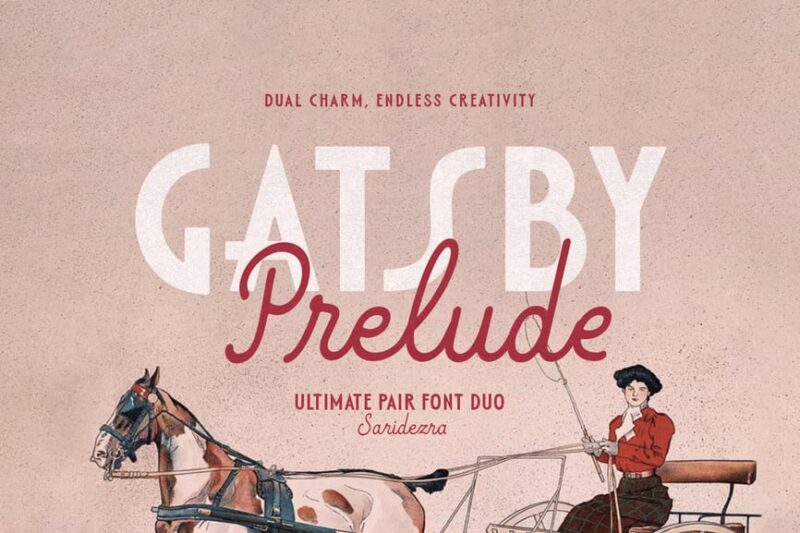
Gatsby Prelude is an elegant and modern Art Deco font duo. It combines sans-serif characters with decorative elements, perfect for creating sophisticated designs with a touch of vintage glamour.Burtuqol
Burtuqol is a vintage slab serif font that exudes a retro charm. Its bold, chunky serifs and aged appearance make it ideal for projects requiring a nostalgic or timeworn aesthetic.Gafler
Gafler is a classy vintage serif font with decorative elements. It combines elegance with a touch of old-world charm, making it perfect for high-end branding and classic design projects.Get 300+ Fonts for FREEEnter your email to download our 100% free "Font Lover's Bundle". For commercial & personal use. No royalties. No fees. No attribution. 100% free to use anywhere.
Kagnue
Kagnue is a modern and classy serif font. It offers a fresh take on traditional serif typefaces, blending contemporary design with timeless elegance for versatile use in various design contexts.The Blendinroom
The Blendinroom is a retro serif typeface featuring luxurious ligatures. Its vintage-inspired design and intricate details make it ideal for creating sophisticated, old-world aesthetics in design projects.MODER BULES
MODER BULES is a playful sans-serif font with a fun, childlike appeal. Its quirky design makes it perfect for kids-oriented projects or Halloween-themed designs, adding a touch of whimsy to typography.Nickey Vintage
Nickey Vintage is a decorative display font with a strong vintage flair. Its bold, eye-catching characters make it ideal for headlines, logos, and designs that require a striking retro aesthetic.Ladger
Ladger is a casual script font that exudes luxury and elegance. Its flowing lines and graceful curves make it perfect for logo designs, high-end branding, and projects requiring a touch of sophistication.Hadnich
Hadnich is a modern script font with a brush-like quality. Its versatile design makes it suitable for various applications, from signage to branding, offering a contemporary take on handwritten typography.Belly and Park
Belly and Park is a condensed beauty classic font family featuring both serif and sans-serif styles. Its vintage-inspired design and narrow characters make it ideal for creating elegant, space-efficient layouts.Loubag
Loubag is a modern retro font family encompassing sans-serif, serif, and decorative styles. Its bold, fashion-forward design makes it perfect for creating eye-catching headlines and trendy branding materials.Petter And Sons
Petter And Sons is a romantic beauty script font with decorative elements. Its elegant, flowing design makes it ideal for wedding invitations, luxury branding, and projects requiring a touch of refined beauty.Preteoria
Preteoria is a modern cursive font with a sleek, contemporary feel. Its smooth curves and clean lines make it versatile for various design applications, from branding to digital media projects.Delauney
Delauney is an Art Deco-inspired sans-serif font that captures the essence of the roaring twenties. Its geometric shapes and sleek lines make it perfect for creating designs with a bold, metropolitan flair.Amadi Vintage
Amadi Vintage is a chic and beautiful serif font with a timeless appeal. Its elegant design and vintage-inspired details make it ideal for creating sophisticated, classic-looking designs and branding materials.LEDERSON
LEDERSON is a vintage-inspired shadow font. Its weathered look and strong character make it perfect for designs requiring an authentic, aged aesthetic.Fancyou
Fancyou is a versatile serif font with alternate characters. Its elegant design and customizable options make it suitable for a wide range of projects, from formal invitations to modern branding materials.Catterpie Font
Catterpie is a handwritten script font that mimics natural handlettering. Its fluid, signature-like style makes it perfect for creating personal, authentic-looking designs and branding materials.Jemmy Wonder
Jemmy Wonder is a Victorian-inspired serif font with a strong vintage character. Its ornate details and old-world charm make it ideal for creating designs with a classic, nostalgic feel.Monthey
Monthey is a bold, elegant vintage display serif font. Its chunky characters and 70s-inspired design make it perfect for creating eye-catching headlines and retro-themed branding materials.Madville
Madville is a classy script font with a versatile design. Its elegant curves and smooth transitions make it suitable for a wide range of projects, from formal invitations to modern branding materials.Crowk
Crowk is a luxury serif font with a timeless, elegant appeal. Its refined design and classic proportions make it ideal for high-end branding, editorial layouts, and sophisticated design projects.Peachy Fantasy
Peachy Fantasy is an Art Nouveau-inspired display font with decorative elements. Its vintage charm and unique character make it perfect for creating eye-catching headlines and artistic design projects.Cormier
Cormier is a decorative sans-serif font with a strong artistic flair. Its unique design and fashion-forward aesthetic make it ideal for creating bold, attention-grabbing headlines and branding materials.Syntage
Syntage is a decorative modern luxury font with both serif and ornamental elements. Its retro-inspired design and luxurious details make it perfect for high-end branding and sophisticated design projects.Jeniffer Selfies
Jeniffer Selfies is a retro-inspired bold font combining sans-serif and script styles. Its playful design and vintage feel make it ideal for creating nostalgic, fun-loving designs and branding materials.The Rilman
The Rilman is a ligature-rich rounded sans-serif font with a 90s-inspired design. Its retro charm and smooth edges make it perfect for creating playful, nostalgic designs and branding materials.Milky Croffle
Milky Croffle is a classic beauty elegant serif font. Its refined design and timeless appeal make it ideal for creating sophisticated layouts, high-end branding, and projects requiring a touch of traditional elegance.
What Makes a Font Feel Preppy?
You might be wondering what exactly gives a font that unmistakable preppy vibe. After years of working with typography, I’ve identified several key characteristics that define the preppy aesthetic:
Classic Serif Structure: Most preppy fonts are serifs, drawing inspiration from traditional typography used in prestigious publications and academic institutions. These serifs aren’t just decorative – they’re a nod to centuries of refined typographic tradition.
Elegant Proportions: Preppy fonts tend to have well-balanced letterforms with moderate contrast between thick and thin strokes. They’re neither too delicate nor too bold – just perfectly poised, like a well-tailored blazer.
Timeless Appeal: The best preppy fonts don’t scream “trendy.” Instead, they whisper “timeless.” They’re the typography equivalent of a strand of pearls – always appropriate, never out of style.
Sophisticated Details: Look for subtle refinements in letterforms – graceful curves, well-crafted terminals, and thoughtful spacing. These details separate truly preppy fonts from their more pedestrian cousins.
Heritage Inspiration: Many preppy fonts draw inspiration from historical typefaces used by Ivy League universities, prestigious publishing houses, and old-money families. This connection to tradition is what gives them their authentic preppy pedigree.
Where to Use Preppy FontsPreppy fonts aren’t one-size-fits-all solutions, but when used appropriately, they’re absolutely magical. Here’s where they shine brightest:
Wedding Invitations: Nothing says “elegant affair” quite like a beautifully chosen preppy serif. These fonts are perfect for formal invitations, save-the-dates, and wedding stationery that needs to feel sophisticated and timeless.
Luxury Branding: Brands targeting affluent audiences or positioning themselves as premium often benefit from preppy typography. Think boutique hotels, high-end fashion, or artisanal goods.
Editorial Design: Magazines, newsletters, and publications focusing on lifestyle, fashion, or culture can leverage preppy fonts to establish credibility and sophistication.
Corporate Identity: Professional services, law firms, financial institutions, and consulting companies often choose preppy fonts to convey trustworthiness and establishment credibility.
Academic Materials: Universities, prep schools, and educational institutions naturally gravitate toward preppy typography that reflects their traditional values and heritage.
However, preppy fonts might not be the best choice for:
Tech Startups: The traditional nature of preppy fonts can feel at odds with innovation and disruption. Modern sans serifs usually work better for tech companies.
Children’s Brands: While elegant, preppy fonts might feel too formal for products targeting young children. Playful, rounded fonts are typically more appropriate.
Casual Brands: If your brand personality is laid-back and approachable, overly formal preppy fonts might create distance between you and your audience.
How to Choose the Perfect Preppy Font
Selecting the right preppy font requires careful consideration of several factors. Here’s my tried-and-true process:
Consider Your Audience: Are you designing for actual prep school alumni, or are you trying to capture that aspirational preppy aesthetic for a broader audience? Your target demographic should influence how traditional or accessible your font choice is.
Evaluate the Context: A wedding invitation can handle more ornate details than a business card. Consider where your text will appear and how much personality the context can support.
Test Readability: Preppy doesn’t mean hard to read. Always test your chosen font at various sizes to ensure it remains legible. Your typography should enhance communication, not hinder it.
Think About Pairing: Will you be using this font alone or pairing it with others? Consider how your preppy serif will work alongside sans serifs for body text or script fonts for accents.
Consider Your Medium: Some preppy fonts work beautifully in print but struggle on screens. Others are optimized for digital use but lose their charm in print. Choose accordingly.
Pairing Preppy Fonts Like a Pro
The magic of preppy typography often lies in thoughtful font pairing. Here are some winning combinations that never fail:
Classic Serif + Clean Sans Serif: Pair your preppy serif headline font with a crisp, readable sans serif for body text. This creates hierarchy while maintaining sophistication.
Traditional Serif + Script Accent: Use a refined script font sparingly for special elements like signatures or decorative text, balanced by a solid preppy serif for main content.
Serif + Serif Variation: Sometimes pairing two serifs from the same family – perhaps a regular weight for body text and a bold condensed version for headlines – creates beautiful, cohesive designs.
Remember, less is often more with preppy design. Stick to two or three fonts maximum, and let the inherent elegance of your chosen typefaces do the heavy lifting.
The Psychology Behind Preppy Typography
Understanding why preppy fonts work so well psychologically can help you use them more effectively. These typefaces tap into powerful associations:
Trust and Reliability: The traditional nature of preppy fonts suggests stability and permanence. When people see these fonts, they subconsciously associate them with established institutions and time-tested values.
Sophistication and Education: Preppy fonts are reminiscent of academic institutions and intellectual pursuits. They suggest refinement, education, and cultural awareness.
Exclusivity and Status: Let’s be honest – part of the preppy aesthetic’s appeal is its association with privilege and exclusivity. These fonts can make designs feel more premium and aspirational.
Quality and Craftsmanship: The careful attention to typographic detail in preppy fonts suggests similar attention to quality in whatever they’re representing.
Modern Takes on Classic Preppy Style
While preppy fonts are rooted in tradition, the best designers know how to give them contemporary flair. Here are some ways to modernize preppy typography:
Unexpected Color Palettes: Pair traditional preppy fonts with modern colors. Think sage green and cream instead of navy and white, or soft blush tones for a fresh take.
Generous White Space: Give your preppy fonts room to breathe with plenty of white space. This modern approach to layout keeps traditional fonts feeling fresh and uncluttered.
Mixed Media Integration: Combine preppy typography with photography, illustrations, or graphic elements for a more contemporary feel while maintaining that sophisticated foundation.
Strategic Contrast: Pair your refined preppy fonts with unexpected elements – maybe a bold geometric shape or modern photography – to create dynamic tension.
Preppy Font Alternatives for Every Budget
Not every preppy project has a premium font budget, and that’s okay! Here are some strategies for achieving that coveted preppy look without breaking the bank:
Google Fonts Gems: Fonts like Playfair Display, Crimson Text, and Libre Baskerville offer sophisticated serif options that can work beautifully for preppy designs.
Font Pairing Magic: Sometimes combining two free fonts thoughtfully can create a more expensive-looking result than using a single premium font poorly.
Focus on Execution: A free font used with excellent spacing, hierarchy, and layout will always look better than an expensive font used carelessly.
Common Preppy Font Mistakes to Avoid
Even with the perfect preppy font, poor execution can ruin the effect. Here are the most common mistakes I see designers make:
Overdoing the Decoration: Just because a font has elegant details doesn’t mean you need to add more flourishes. Let the typeface’s inherent sophistication speak for itself.
Ignoring Hierarchy: Preppy design relies on clear, elegant hierarchy. Don’t make everything the same size or weight – create visual flow through thoughtful typography scaling.
Poor Spacing: Cramped text kills the elegant feel of preppy fonts. Give your typography generous leading and appropriate margins.
Wrong Context: Using an ultra-formal preppy font for a casual pizza restaurant’s menu will feel jarring and inappropriate. Match your font choice to your content and audience.
The Future of Preppy Typography
As we look ahead in 2025, preppy fonts continue to evolve while maintaining their classic appeal. We’re seeing interesting trends emerge:
Variable Font Technology: Modern preppy fonts are increasingly available as variable fonts, allowing designers to fine-tune weight, width, and optical size for perfect customization.
Screen Optimization: Classic preppy fonts are being redrawn and optimized for digital screens without losing their traditional charm.
Inclusive Preppy: Designers are expanding the preppy aesthetic beyond its traditional boundaries, creating fonts that maintain sophistication while feeling more accessible and diverse.
Sustainable Design: The timeless nature of preppy fonts aligns perfectly with sustainable design principles – these typefaces won’t look dated next year, making them environmentally responsible choices.
Conclusion: Embracing Timeless Elegance
Preppy fonts represent more than just letterforms – they’re a gateway to timeless elegance and sophisticated communication. Whether you’re designing wedding invitations for a Martha’s Vineyard ceremony or creating brand identity for a boutique law firm, the right preppy font can elevate your work from merely professional to genuinely distinguished.
The beauty of preppy typography lies in its ability to feel both traditional and fresh, formal yet approachable. These fonts have stood the test of time because they tap into something fundamental about how we perceive quality, tradition, and sophistication.
As you explore the world of preppy fonts, remember that the best typography choices support your message rather than overshadowing it. Choose fonts that enhance your content’s inherent qualities and speak to your audience’s aspirations and values.
So whether you’re channeling that old-money aesthetic or simply want to add a touch of refined elegance to your designs, preppy fonts offer a wealth of possibilities. After all, good typography, like good manners, never goes out of style.
#preppy #fonts #with #rich #ampamp50 Preppy Fonts with Rich & Fancy Vibes
In this article:See more ▼Post may contain affiliate links which give us commissions at no cost to you.Preppy fonts capture that quintessential East Coast elite vibe – think Nantucket summers, yacht clubs, and monogrammed everything. These typefaces embody the perfect balance of tradition and refinement that makes preppy design so timeless and aspirational.
But here’s the thing: not all fonts can pull off that coveted preppy aesthetic. The best preppy fonts have a certain je ne sais quoi – they’re classic without being stuffy, elegant without being pretentious, and refined without being inaccessible.
In this comprehensive guide, we’ll explore the most gorgeous preppy fonts that’ll have your designs looking like they belong in the pages of Town & Country magazine. So grab your pearls and let’s dive into this typographic treasure trove!
👋 Psst... Did you know you can get unlimited downloads of 59,000+ fonts and millions of other creative assets for just /mo? Learn more »The Preppiest Fonts That Define 2025
Let’s start with the crème de la crème – the fonts that truly embody that preppy spirit. I’ve curated this list based on their ability to channel that classic New England charm while remaining versatile enough for modern design needs.
Gatsby Prelude
Gatsby Prelude is an elegant and modern Art Deco font duo. It combines sans-serif characters with decorative elements, perfect for creating sophisticated designs with a touch of vintage glamour.Burtuqol
Burtuqol is a vintage slab serif font that exudes a retro charm. Its bold, chunky serifs and aged appearance make it ideal for projects requiring a nostalgic or timeworn aesthetic.Gafler
Gafler is a classy vintage serif font with decorative elements. It combines elegance with a touch of old-world charm, making it perfect for high-end branding and classic design projects.Get 300+ Fonts for FREEEnter your email to download our 100% free "Font Lover's Bundle". For commercial & personal use. No royalties. No fees. No attribution. 100% free to use anywhere.
Kagnue
Kagnue is a modern and classy serif font. It offers a fresh take on traditional serif typefaces, blending contemporary design with timeless elegance for versatile use in various design contexts.The Blendinroom
The Blendinroom is a retro serif typeface featuring luxurious ligatures. Its vintage-inspired design and intricate details make it ideal for creating sophisticated, old-world aesthetics in design projects.MODER BULES
MODER BULES is a playful sans-serif font with a fun, childlike appeal. Its quirky design makes it perfect for kids-oriented projects or Halloween-themed designs, adding a touch of whimsy to typography.Nickey Vintage
Nickey Vintage is a decorative display font with a strong vintage flair. Its bold, eye-catching characters make it ideal for headlines, logos, and designs that require a striking retro aesthetic.Ladger
Ladger is a casual script font that exudes luxury and elegance. Its flowing lines and graceful curves make it perfect for logo designs, high-end branding, and projects requiring a touch of sophistication.Hadnich
Hadnich is a modern script font with a brush-like quality. Its versatile design makes it suitable for various applications, from signage to branding, offering a contemporary take on handwritten typography.Belly and Park
Belly and Park is a condensed beauty classic font family featuring both serif and sans-serif styles. Its vintage-inspired design and narrow characters make it ideal for creating elegant, space-efficient layouts.Loubag
Loubag is a modern retro font family encompassing sans-serif, serif, and decorative styles. Its bold, fashion-forward design makes it perfect for creating eye-catching headlines and trendy branding materials.Petter And Sons
Petter And Sons is a romantic beauty script font with decorative elements. Its elegant, flowing design makes it ideal for wedding invitations, luxury branding, and projects requiring a touch of refined beauty.Preteoria
Preteoria is a modern cursive font with a sleek, contemporary feel. Its smooth curves and clean lines make it versatile for various design applications, from branding to digital media projects.Delauney
Delauney is an Art Deco-inspired sans-serif font that captures the essence of the roaring twenties. Its geometric shapes and sleek lines make it perfect for creating designs with a bold, metropolitan flair.Amadi Vintage
Amadi Vintage is a chic and beautiful serif font with a timeless appeal. Its elegant design and vintage-inspired details make it ideal for creating sophisticated, classic-looking designs and branding materials.LEDERSON
LEDERSON is a vintage-inspired shadow font. Its weathered look and strong character make it perfect for designs requiring an authentic, aged aesthetic.Fancyou
Fancyou is a versatile serif font with alternate characters. Its elegant design and customizable options make it suitable for a wide range of projects, from formal invitations to modern branding materials.Catterpie Font
Catterpie is a handwritten script font that mimics natural handlettering. Its fluid, signature-like style makes it perfect for creating personal, authentic-looking designs and branding materials.Jemmy Wonder
Jemmy Wonder is a Victorian-inspired serif font with a strong vintage character. Its ornate details and old-world charm make it ideal for creating designs with a classic, nostalgic feel.Monthey
Monthey is a bold, elegant vintage display serif font. Its chunky characters and 70s-inspired design make it perfect for creating eye-catching headlines and retro-themed branding materials.Madville
Madville is a classy script font with a versatile design. Its elegant curves and smooth transitions make it suitable for a wide range of projects, from formal invitations to modern branding materials.Crowk
Crowk is a luxury serif font with a timeless, elegant appeal. Its refined design and classic proportions make it ideal for high-end branding, editorial layouts, and sophisticated design projects.Peachy Fantasy
Peachy Fantasy is an Art Nouveau-inspired display font with decorative elements. Its vintage charm and unique character make it perfect for creating eye-catching headlines and artistic design projects.Cormier
Cormier is a decorative sans-serif font with a strong artistic flair. Its unique design and fashion-forward aesthetic make it ideal for creating bold, attention-grabbing headlines and branding materials.Syntage
Syntage is a decorative modern luxury font with both serif and ornamental elements. Its retro-inspired design and luxurious details make it perfect for high-end branding and sophisticated design projects.Jeniffer Selfies
Jeniffer Selfies is a retro-inspired bold font combining sans-serif and script styles. Its playful design and vintage feel make it ideal for creating nostalgic, fun-loving designs and branding materials.The Rilman
The Rilman is a ligature-rich rounded sans-serif font with a 90s-inspired design. Its retro charm and smooth edges make it perfect for creating playful, nostalgic designs and branding materials.Milky Croffle
Milky Croffle is a classic beauty elegant serif font. Its refined design and timeless appeal make it ideal for creating sophisticated layouts, high-end branding, and projects requiring a touch of traditional elegance.
What Makes a Font Feel Preppy?
You might be wondering what exactly gives a font that unmistakable preppy vibe. After years of working with typography, I’ve identified several key characteristics that define the preppy aesthetic:
Classic Serif Structure: Most preppy fonts are serifs, drawing inspiration from traditional typography used in prestigious publications and academic institutions. These serifs aren’t just decorative – they’re a nod to centuries of refined typographic tradition.
Elegant Proportions: Preppy fonts tend to have well-balanced letterforms with moderate contrast between thick and thin strokes. They’re neither too delicate nor too bold – just perfectly poised, like a well-tailored blazer.
Timeless Appeal: The best preppy fonts don’t scream “trendy.” Instead, they whisper “timeless.” They’re the typography equivalent of a strand of pearls – always appropriate, never out of style.
Sophisticated Details: Look for subtle refinements in letterforms – graceful curves, well-crafted terminals, and thoughtful spacing. These details separate truly preppy fonts from their more pedestrian cousins.
Heritage Inspiration: Many preppy fonts draw inspiration from historical typefaces used by Ivy League universities, prestigious publishing houses, and old-money families. This connection to tradition is what gives them their authentic preppy pedigree.
Where to Use Preppy FontsPreppy fonts aren’t one-size-fits-all solutions, but when used appropriately, they’re absolutely magical. Here’s where they shine brightest:
Wedding Invitations: Nothing says “elegant affair” quite like a beautifully chosen preppy serif. These fonts are perfect for formal invitations, save-the-dates, and wedding stationery that needs to feel sophisticated and timeless.
Luxury Branding: Brands targeting affluent audiences or positioning themselves as premium often benefit from preppy typography. Think boutique hotels, high-end fashion, or artisanal goods.
Editorial Design: Magazines, newsletters, and publications focusing on lifestyle, fashion, or culture can leverage preppy fonts to establish credibility and sophistication.
Corporate Identity: Professional services, law firms, financial institutions, and consulting companies often choose preppy fonts to convey trustworthiness and establishment credibility.
Academic Materials: Universities, prep schools, and educational institutions naturally gravitate toward preppy typography that reflects their traditional values and heritage.
However, preppy fonts might not be the best choice for:
Tech Startups: The traditional nature of preppy fonts can feel at odds with innovation and disruption. Modern sans serifs usually work better for tech companies.
Children’s Brands: While elegant, preppy fonts might feel too formal for products targeting young children. Playful, rounded fonts are typically more appropriate.
Casual Brands: If your brand personality is laid-back and approachable, overly formal preppy fonts might create distance between you and your audience.
How to Choose the Perfect Preppy Font
Selecting the right preppy font requires careful consideration of several factors. Here’s my tried-and-true process:
Consider Your Audience: Are you designing for actual prep school alumni, or are you trying to capture that aspirational preppy aesthetic for a broader audience? Your target demographic should influence how traditional or accessible your font choice is.
Evaluate the Context: A wedding invitation can handle more ornate details than a business card. Consider where your text will appear and how much personality the context can support.
Test Readability: Preppy doesn’t mean hard to read. Always test your chosen font at various sizes to ensure it remains legible. Your typography should enhance communication, not hinder it.
Think About Pairing: Will you be using this font alone or pairing it with others? Consider how your preppy serif will work alongside sans serifs for body text or script fonts for accents.
Consider Your Medium: Some preppy fonts work beautifully in print but struggle on screens. Others are optimized for digital use but lose their charm in print. Choose accordingly.
Pairing Preppy Fonts Like a Pro
The magic of preppy typography often lies in thoughtful font pairing. Here are some winning combinations that never fail:
Classic Serif + Clean Sans Serif: Pair your preppy serif headline font with a crisp, readable sans serif for body text. This creates hierarchy while maintaining sophistication.
Traditional Serif + Script Accent: Use a refined script font sparingly for special elements like signatures or decorative text, balanced by a solid preppy serif for main content.
Serif + Serif Variation: Sometimes pairing two serifs from the same family – perhaps a regular weight for body text and a bold condensed version for headlines – creates beautiful, cohesive designs.
Remember, less is often more with preppy design. Stick to two or three fonts maximum, and let the inherent elegance of your chosen typefaces do the heavy lifting.
The Psychology Behind Preppy Typography
Understanding why preppy fonts work so well psychologically can help you use them more effectively. These typefaces tap into powerful associations:
Trust and Reliability: The traditional nature of preppy fonts suggests stability and permanence. When people see these fonts, they subconsciously associate them with established institutions and time-tested values.
Sophistication and Education: Preppy fonts are reminiscent of academic institutions and intellectual pursuits. They suggest refinement, education, and cultural awareness.
Exclusivity and Status: Let’s be honest – part of the preppy aesthetic’s appeal is its association with privilege and exclusivity. These fonts can make designs feel more premium and aspirational.
Quality and Craftsmanship: The careful attention to typographic detail in preppy fonts suggests similar attention to quality in whatever they’re representing.
Modern Takes on Classic Preppy Style
While preppy fonts are rooted in tradition, the best designers know how to give them contemporary flair. Here are some ways to modernize preppy typography:
Unexpected Color Palettes: Pair traditional preppy fonts with modern colors. Think sage green and cream instead of navy and white, or soft blush tones for a fresh take.
Generous White Space: Give your preppy fonts room to breathe with plenty of white space. This modern approach to layout keeps traditional fonts feeling fresh and uncluttered.
Mixed Media Integration: Combine preppy typography with photography, illustrations, or graphic elements for a more contemporary feel while maintaining that sophisticated foundation.
Strategic Contrast: Pair your refined preppy fonts with unexpected elements – maybe a bold geometric shape or modern photography – to create dynamic tension.
Preppy Font Alternatives for Every Budget
Not every preppy project has a premium font budget, and that’s okay! Here are some strategies for achieving that coveted preppy look without breaking the bank:
Google Fonts Gems: Fonts like Playfair Display, Crimson Text, and Libre Baskerville offer sophisticated serif options that can work beautifully for preppy designs.
Font Pairing Magic: Sometimes combining two free fonts thoughtfully can create a more expensive-looking result than using a single premium font poorly.
Focus on Execution: A free font used with excellent spacing, hierarchy, and layout will always look better than an expensive font used carelessly.
Common Preppy Font Mistakes to Avoid
Even with the perfect preppy font, poor execution can ruin the effect. Here are the most common mistakes I see designers make:
Overdoing the Decoration: Just because a font has elegant details doesn’t mean you need to add more flourishes. Let the typeface’s inherent sophistication speak for itself.
Ignoring Hierarchy: Preppy design relies on clear, elegant hierarchy. Don’t make everything the same size or weight – create visual flow through thoughtful typography scaling.
Poor Spacing: Cramped text kills the elegant feel of preppy fonts. Give your typography generous leading and appropriate margins.
Wrong Context: Using an ultra-formal preppy font for a casual pizza restaurant’s menu will feel jarring and inappropriate. Match your font choice to your content and audience.
The Future of Preppy Typography
As we look ahead in 2025, preppy fonts continue to evolve while maintaining their classic appeal. We’re seeing interesting trends emerge:
Variable Font Technology: Modern preppy fonts are increasingly available as variable fonts, allowing designers to fine-tune weight, width, and optical size for perfect customization.
Screen Optimization: Classic preppy fonts are being redrawn and optimized for digital screens without losing their traditional charm.
Inclusive Preppy: Designers are expanding the preppy aesthetic beyond its traditional boundaries, creating fonts that maintain sophistication while feeling more accessible and diverse.
Sustainable Design: The timeless nature of preppy fonts aligns perfectly with sustainable design principles – these typefaces won’t look dated next year, making them environmentally responsible choices.
Conclusion: Embracing Timeless Elegance
Preppy fonts represent more than just letterforms – they’re a gateway to timeless elegance and sophisticated communication. Whether you’re designing wedding invitations for a Martha’s Vineyard ceremony or creating brand identity for a boutique law firm, the right preppy font can elevate your work from merely professional to genuinely distinguished.
The beauty of preppy typography lies in its ability to feel both traditional and fresh, formal yet approachable. These fonts have stood the test of time because they tap into something fundamental about how we perceive quality, tradition, and sophistication.
As you explore the world of preppy fonts, remember that the best typography choices support your message rather than overshadowing it. Choose fonts that enhance your content’s inherent qualities and speak to your audience’s aspirations and values.
So whether you’re channeling that old-money aesthetic or simply want to add a touch of refined elegance to your designs, preppy fonts offer a wealth of possibilities. After all, good typography, like good manners, never goes out of style.
#preppy #fonts #with #rich #ampamp


 map
map


