Looking Back at Two Classics: ILM Deploys the Fleet in ‘Star Trek: First Contact’ and ‘Rogue One: A Star Wars Story’
Guided by visual effects supervisor John Knoll, ILM embraced continually evolving methodologies to craft breathtaking visual effects for the iconic space battles in First Contact and Rogue One.
By Jay Stobie
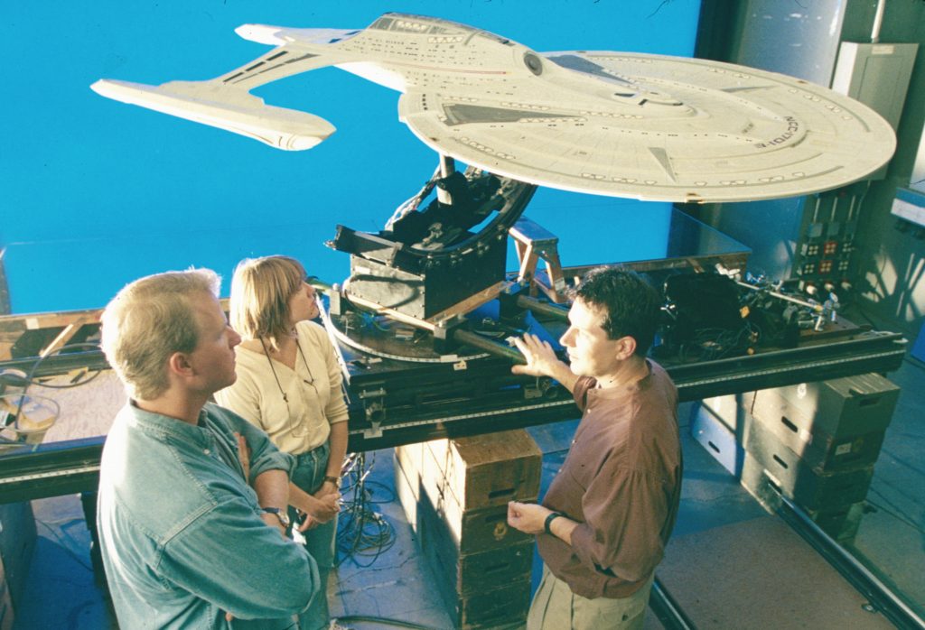
Visual effects supervisor John Knollconfers with modelmakers Kim Smith and John Goodson with the miniature of the U.S.S. Enterprise-E during production of Star Trek: First Contact.
Bolstered by visual effects from Industrial Light & Magic, Star Trek: First Contactand Rogue One: A Star Wars Storypropelled their respective franchises to new heights. While Star Trek Generationswelcomed Captain Jean-Luc Picard’screw to the big screen, First Contact stood as the first Star Trek feature that did not focus on its original captain, the legendary James T. Kirk. Similarly, though Rogue One immediately preceded the events of Star Wars: A New Hope, it was set apart from the episodic Star Wars films and launched an era of storytelling outside of the main Skywalker saga that has gone on to include Solo: A Star Wars Story, The Mandalorian, Andor, Ahsoka, The Acolyte, and more.
The two films also shared a key ILM contributor, John Knoll, who served as visual effects supervisor on both projects, as well as an executive producer on Rogue One. Currently, ILM’s executive creative director and senior visual effects supervisor, Knoll – who also conceived the initial framework for Rogue One’s story – guided ILM as it brought its talents to bear on these sci-fi and fantasy epics. The work involved crafting two spectacular starship-packed space clashes – First Contact’s Battle of Sector 001 and Rogue One’s Battle of Scarif. Although these iconic installments were released roughly two decades apart, they represent a captivating case study of how ILM’s approach to visual effects has evolved over time. With this in mind, let’s examine the films’ unforgettable space battles through the lens of fascinating in-universe parallels and the ILM-produced fleets that face off near Earth and Scarif.
A final frame from the Battle of Scarif in Rogue One: A Star Wars Story.
A Context for Conflict
In First Contact, the United Federation of Planets – a 200-year-old interstellar government consisting of more than 150 member worlds – braces itself for an invasion by the Borg – an overwhelmingly powerful collective composed of cybernetic beings who devastate entire planets by assimilating their biological populations and technological innovations. The Borg only send a single vessel, a massive cube containing thousands of hive-minded drones and their queen, pushing the Federation’s Starfleet defenders to Earth’s doorstep. Conversely, in Rogue One, the Rebel Alliance – a fledgling coalition of freedom fighters – seeks to undermine and overthrow the stalwart Galactic Empire – a totalitarian regime preparing to tighten its grip on the galaxy by revealing a horrifying superweapon. A rebel team infiltrates a top-secret vault on Scarif in a bid to steal plans to that battle station, the dreaded Death Star, with hopes of exploiting a vulnerability in its design.
On the surface, the situations could not seem to be more disparate, particularly in terms of the Federation’s well-established prestige and the Rebel Alliance’s haphazardly organized factions. Yet, upon closer inspection, the spaceborne conflicts at Earth and Scarif are linked by a vital commonality. The threat posed by the Borg is well-known to the Federation, but the sudden intrusion upon their space takes its defenses by surprise. Starfleet assembles any vessel within range – including antiquated Oberth-class science ships – to intercept the Borg cube in the Typhon Sector, only to be forced back to Earth on the edge of defeat. The unsanctioned mission to Scarif with Jyn Ersoand Cassian Andorand the sudden need to take down the planet’s shield gate propels the Rebel Alliance fleet into rushing to their rescue with everything from their flagship Profundity to GR-75 medium transports. Whether Federation or Rebel Alliance, these fleets gather in last-ditch efforts to oppose enemies who would embrace their eradication – the Battles of Sector 001 and Scarif are fights for survival.
From Physical to Digital
By the time Jonathan Frakes was selected to direct First Contact, Star Trek’s reliance on constructing traditional physical modelsfor its features was gradually giving way to innovative computer graphicsmodels, resulting in the film’s use of both techniques. “If one of the ships was to be seen full-screen and at length,” associate visual effects supervisor George Murphy told Cinefex’s Kevin H. Martin, “we knew it would be done as a stage model. Ships that would be doing a lot of elaborate maneuvers in space battle scenes would be created digitally.” In fact, physical and CG versions of the U.S.S. Enterprise-E appear in the film, with the latter being harnessed in shots involving the vessel’s entry into a temporal vortex at the conclusion of the Battle of Sector 001.
Despite the technological leaps that ILM pioneered in the decades between First Contact and Rogue One, they considered filming physical miniatures for certain ship-related shots in the latter film. ILM considered filming physical miniatures for certain ship-related shots in Rogue One. The feature’s fleets were ultimately created digitally to allow for changes throughout post-production. “If it’s a photographed miniature element, it’s not possible to go back and make adjustments. So it’s the additional flexibility that comes with the computer graphics models that’s very attractive to many people,” John Knoll relayed to writer Jon Witmer at American Cinematographer’s TheASC.com.
However, Knoll aimed to develop computer graphics that retained the same high-quality details as their physical counterparts, leading ILM to employ a modern approach to a time-honored modelmaking tactic. “I also wanted to emulate the kit-bashing aesthetic that had been part of Star Wars from the very beginning, where a lot of mechanical detail had been added onto the ships by using little pieces from plastic model kits,” explained Knoll in his chat with TheASC.com. For Rogue One, ILM replicated the process by obtaining such kits, scanning their parts, building a computer graphics library, and applying the CG parts to digitally modeled ships. “I’m very happy to say it was super-successful,” concluded Knoll. “I think a lot of our digital models look like they are motion-control models.”
John Knollconfers with Kim Smith and John Goodson with the miniature of the U.S.S. Enterprise-E during production of Star Trek: First Contact.
Legendary Lineages
In First Contact, Captain Picard commanded a brand-new vessel, the Sovereign-class U.S.S. Enterprise-E, continuing the celebrated starship’s legacy in terms of its famous name and design aesthetic. Designed by John Eaves and developed into blueprints by Rick Sternbach, the Enterprise-E was built into a 10-foot physical model by ILM model project supervisor John Goodson and his shop’s talented team. ILM infused the ship with extraordinary detail, including viewports equipped with backlit set images from the craft’s predecessor, the U.S.S. Enterprise-D. For the vessel’s larger windows, namely those associated with the observation lounge and arboretum, ILM took a painstakingly practical approach to match the interiors shown with the real-world set pieces. “We filled that area of the model with tiny, micro-scale furniture,” Goodson informed Cinefex, “including tables and chairs.”
Rogue One’s rebel team initially traversed the galaxy in a U-wing transport/gunship, which, much like the Enterprise-E, was a unique vessel that nonetheless channeled a certain degree of inspiration from a classic design. Lucasfilm’s Doug Chiang, a co-production designer for Rogue One, referred to the U-wing as the film’s “Huey helicopter version of an X-wing” in the Designing Rogue One bonus featurette on Disney+ before revealing that, “Towards the end of the design cycle, we actually decided that maybe we should put in more X-wing features. And so we took the X-wing engines and literally mounted them onto the configuration that we had going.” Modeled by ILM digital artist Colie Wertz, the U-wing’s final computer graphics design subtly incorporated these X-wing influences to give the transport a distinctive feel without making the craft seem out of place within the rebel fleet.
While ILM’s work on the Enterprise-E’s viewports offered a compelling view toward the ship’s interior, a breakthrough LED setup for Rogue One permitted ILM to obtain realistic lighting on actors as they looked out from their ships and into the space around them. “All of our major spaceship cockpit scenes were done that way, with the gimbal in this giant horseshoe of LED panels we got fromVER, and we prepared graphics that went on the screens,” John Knoll shared with American Cinematographer’s Benjamin B and Jon D. Witmer. Furthermore, in Disney+’s Rogue One: Digital Storytelling bonus featurette, visual effects producer Janet Lewin noted, “For the actors, I think, in the space battle cockpits, for them to be able to see what was happening in the battle brought a higher level of accuracy to their performance.”
The U.S.S. Enterprise-E in Star Trek: First Contact.
Familiar Foes
To transport First Contact’s Borg invaders, John Goodson’s team at ILM resurrected the Borg cube design previously seen in Star Trek: The Next Generationand Star Trek: Deep Space Nine, creating a nearly three-foot physical model to replace the one from the series. Art consultant and ILM veteran Bill George proposed that the cube’s seemingly straightforward layout be augmented with a complex network of photo-etched brass, a suggestion which produced a jagged surface and offered a visual that was both intricate and menacing. ILM also developed a two-foot motion-control model for a Borg sphere, a brand-new auxiliary vessel that emerged from the cube. “We vacuformed about 15 different patterns that conformed to this spherical curve and covered those with a lot of molded and cast pieces. Then we added tons of acid-etched brass over it, just like we had on the cube,” Goodson outlined to Cinefex’s Kevin H. Martin.
As for Rogue One’s villainous fleet, reproducing the original trilogy’s Death Star and Imperial Star Destroyers centered upon translating physical models into digital assets. Although ILM no longer possessed A New Hope’s three-foot Death Star shooting model, John Knoll recreated the station’s surface paneling by gathering archival images, and as he spelled out to writer Joe Fordham in Cinefex, “I pieced all the images together. I unwrapped them into texture space and projected them onto a sphere with a trench. By doing that with enough pictures, I got pretty complete coverage of the original model, and that became a template upon which to redraw very high-resolution texture maps. Every panel, every vertical striped line, I matched from a photograph. It was as accurate as it was possible to be as a reproduction of the original model.”
Knoll’s investigative eye continued to pay dividends when analyzing the three-foot and eight-foot Star Destroyer motion-control models, which had been built for A New Hope and Star Wars: The Empire Strikes Back, respectively. “Our general mantra was, ‘Match your memory of it more than the reality,’ because sometimes you go look at the actual prop in the archive building or you look back at the actual shot from the movie, and you go, ‘Oh, I remember it being a little better than that,’” Knoll conveyed to TheASC.com. This philosophy motivated ILM to combine elements from those two physical models into a single digital design. “Generally, we copied the three-footer for details like the superstructure on the top of the bridge, but then we copied the internal lighting plan from the eight-footer,” Knoll explained. “And then the upper surface of the three-footer was relatively undetailed because there were no shots that saw it closely, so we took a lot of the high-detail upper surface from the eight-footer. So it’s this amalgam of the two models, but the goal was to try to make it look like you remember it from A New Hope.”
A final frame from Rogue One: A Star Wars Story.
Forming Up the Fleets
In addition to the U.S.S. Enterprise-E, the Battle of Sector 001 debuted numerous vessels representing four new Starfleet ship classes – the Akira, Steamrunner, Saber, and Norway – all designed by ILM visual effects art director Alex Jaeger. “Since we figured a lot of the background action in the space battle would be done with computer graphics ships that needed to be built from scratch anyway, I realized that there was no reason not to do some new designs,” John Knoll told American Cinematographer writer Ron Magid. Used in previous Star Trek projects, older physical models for the Oberth and Nebula classes were mixed into the fleet for good measure, though the vast majority of the armada originated as computer graphics.
Over at Scarif, ILM portrayed the Rebel Alliance forces with computer graphics models of fresh designs, live-action versions of Star Wars Rebels’ VCX-100 light freighter Ghost and Hammerhead corvettes, and Star Wars staples. These ships face off against two Imperial Star Destroyers and squadrons of TIE fighters, and – upon their late arrival to the battle – Darth Vader’s Star Destroyer and the Death Star. The Tantive IV, a CR90 corvette more popularly referred to as a blockade runner, made its own special cameo at the tail end of the fight. As Princess Leia Organa’spersonal ship, the Tantive IV received the Death Star plans and fled the scene, destined to be captured by Vader’s Star Destroyer at the beginning of A New Hope. And, while we’re on the subject of intricate starship maneuvers and space-based choreography…
Although the First Contact team could plan visual effects shots with animated storyboards, ILM supplied Gareth Edwards with a next-level virtual viewfinder that allowed the director to select his shots by immersing himself among Rogue One’s ships in real time. “What we wanted to do is give Gareth the opportunity to shoot his space battles and other all-digital scenes the same way he shoots his live-action. Then he could go in with this sort of virtual viewfinder and view the space battle going on, and figure out what the best angle was to shoot those ships from,” senior animation supervisor Hal Hickel described in the Rogue One: Digital Storytelling featurette. Hickel divulged that the sequence involving the dish array docking with the Death Star was an example of the “spontaneous discovery of great angles,” as the scene was never storyboarded or previsualized.
Visual effects supervisor John Knoll with director Gareth Edwards during production of Rogue One: A Star Wars Story.
Tough Little Ships
The Federation and Rebel Alliance each deployed “tough little ships”in their respective conflicts, namely the U.S.S. Defiant from Deep Space Nine and the Tantive IV from A New Hope. VisionArt had already built a CG Defiant for the Deep Space Nine series, but ILM upgraded the model with images gathered from the ship’s three-foot physical model. A similar tactic was taken to bring the Tantive IV into the digital realm for Rogue One. “This was the Blockade Runner. This was the most accurate 1:1 reproduction we could possibly have made,” model supervisor Russell Paul declared to Cinefex’s Joe Fordham. “We did an extensive photo reference shoot and photogrammetry re-creation of the miniature. From there, we built it out as accurately as possible.” Speaking of sturdy ships, if you look very closely, you can spot a model of the Millennium Falcon flashing across the background as the U.S.S. Defiant makes an attack run on the Borg cube at the Battle of Sector 001!
Exploration and Hope
The in-universe ramifications that materialize from the Battles of Sector 001 and Scarif are monumental. The destruction of the Borg cube compels the Borg Queen to travel back in time in an attempt to vanquish Earth before the Federation can even be formed, but Captain Picard and the Enterprise-E foil the plot and end up helping their 21st century ancestors make “first contact” with another species, the logic-revering Vulcans. The post-Scarif benefits take longer to play out for the Rebel Alliance, but the theft of the Death Star plans eventually leads to the superweapon’s destruction. The Galactic Civil War is far from over, but Scarif is a significant step in the Alliance’s effort to overthrow the Empire.
The visual effects ILM provided for First Contact and Rogue One contributed significantly to the critical and commercial acclaim both pictures enjoyed, a victory reflecting the relentless dedication, tireless work ethic, and innovative spirit embodied by visual effects supervisor John Knoll and ILM’s entire staff. While being interviewed for The Making of Star Trek: First Contact, actor Patrick Stewart praised ILM’s invaluable influence, emphasizing, “ILM was with us, on this movie, almost every day on set. There is so much that they are involved in.” And, regardless of your personal preferences – phasers or lasers, photon torpedoes or proton torpedoes, warp speed or hyperspace – perhaps Industrial Light & Magic’s ability to infuse excitement into both franchises demonstrates that Star Trek and Star Wars encompass themes that are not competitive, but compatible. After all, what goes together better than exploration and hope?
–
Jay Stobieis a writer, author, and consultant who has contributed articles to ILM.com, Skysound.com, Star Wars Insider, StarWars.com, Star Trek Explorer, Star Trek Magazine, and StarTrek.com. Jay loves sci-fi, fantasy, and film, and you can learn more about him by visiting JayStobie.com or finding him on Twitter, Instagram, and other social media platforms at @StobiesGalaxy.
#looking #back #two #classics #ilmLooking Back at Two Classics: ILM Deploys the Fleet in ‘Star Trek: First Contact’ and ‘Rogue One: A Star Wars Story’
Guided by visual effects supervisor John Knoll, ILM embraced continually evolving methodologies to craft breathtaking visual effects for the iconic space battles in First Contact and Rogue One.
By Jay Stobie
Visual effects supervisor John Knollconfers with modelmakers Kim Smith and John Goodson with the miniature of the U.S.S. Enterprise-E during production of Star Trek: First Contact.
Bolstered by visual effects from Industrial Light & Magic, Star Trek: First Contactand Rogue One: A Star Wars Storypropelled their respective franchises to new heights. While Star Trek Generationswelcomed Captain Jean-Luc Picard’screw to the big screen, First Contact stood as the first Star Trek feature that did not focus on its original captain, the legendary James T. Kirk. Similarly, though Rogue One immediately preceded the events of Star Wars: A New Hope, it was set apart from the episodic Star Wars films and launched an era of storytelling outside of the main Skywalker saga that has gone on to include Solo: A Star Wars Story, The Mandalorian, Andor, Ahsoka, The Acolyte, and more.
The two films also shared a key ILM contributor, John Knoll, who served as visual effects supervisor on both projects, as well as an executive producer on Rogue One. Currently, ILM’s executive creative director and senior visual effects supervisor, Knoll – who also conceived the initial framework for Rogue One’s story – guided ILM as it brought its talents to bear on these sci-fi and fantasy epics. The work involved crafting two spectacular starship-packed space clashes – First Contact’s Battle of Sector 001 and Rogue One’s Battle of Scarif. Although these iconic installments were released roughly two decades apart, they represent a captivating case study of how ILM’s approach to visual effects has evolved over time. With this in mind, let’s examine the films’ unforgettable space battles through the lens of fascinating in-universe parallels and the ILM-produced fleets that face off near Earth and Scarif.
A final frame from the Battle of Scarif in Rogue One: A Star Wars Story.
A Context for Conflict
In First Contact, the United Federation of Planets – a 200-year-old interstellar government consisting of more than 150 member worlds – braces itself for an invasion by the Borg – an overwhelmingly powerful collective composed of cybernetic beings who devastate entire planets by assimilating their biological populations and technological innovations. The Borg only send a single vessel, a massive cube containing thousands of hive-minded drones and their queen, pushing the Federation’s Starfleet defenders to Earth’s doorstep. Conversely, in Rogue One, the Rebel Alliance – a fledgling coalition of freedom fighters – seeks to undermine and overthrow the stalwart Galactic Empire – a totalitarian regime preparing to tighten its grip on the galaxy by revealing a horrifying superweapon. A rebel team infiltrates a top-secret vault on Scarif in a bid to steal plans to that battle station, the dreaded Death Star, with hopes of exploiting a vulnerability in its design.
On the surface, the situations could not seem to be more disparate, particularly in terms of the Federation’s well-established prestige and the Rebel Alliance’s haphazardly organized factions. Yet, upon closer inspection, the spaceborne conflicts at Earth and Scarif are linked by a vital commonality. The threat posed by the Borg is well-known to the Federation, but the sudden intrusion upon their space takes its defenses by surprise. Starfleet assembles any vessel within range – including antiquated Oberth-class science ships – to intercept the Borg cube in the Typhon Sector, only to be forced back to Earth on the edge of defeat. The unsanctioned mission to Scarif with Jyn Ersoand Cassian Andorand the sudden need to take down the planet’s shield gate propels the Rebel Alliance fleet into rushing to their rescue with everything from their flagship Profundity to GR-75 medium transports. Whether Federation or Rebel Alliance, these fleets gather in last-ditch efforts to oppose enemies who would embrace their eradication – the Battles of Sector 001 and Scarif are fights for survival.
From Physical to Digital
By the time Jonathan Frakes was selected to direct First Contact, Star Trek’s reliance on constructing traditional physical modelsfor its features was gradually giving way to innovative computer graphicsmodels, resulting in the film’s use of both techniques. “If one of the ships was to be seen full-screen and at length,” associate visual effects supervisor George Murphy told Cinefex’s Kevin H. Martin, “we knew it would be done as a stage model. Ships that would be doing a lot of elaborate maneuvers in space battle scenes would be created digitally.” In fact, physical and CG versions of the U.S.S. Enterprise-E appear in the film, with the latter being harnessed in shots involving the vessel’s entry into a temporal vortex at the conclusion of the Battle of Sector 001.
Despite the technological leaps that ILM pioneered in the decades between First Contact and Rogue One, they considered filming physical miniatures for certain ship-related shots in the latter film. ILM considered filming physical miniatures for certain ship-related shots in Rogue One. The feature’s fleets were ultimately created digitally to allow for changes throughout post-production. “If it’s a photographed miniature element, it’s not possible to go back and make adjustments. So it’s the additional flexibility that comes with the computer graphics models that’s very attractive to many people,” John Knoll relayed to writer Jon Witmer at American Cinematographer’s TheASC.com.
However, Knoll aimed to develop computer graphics that retained the same high-quality details as their physical counterparts, leading ILM to employ a modern approach to a time-honored modelmaking tactic. “I also wanted to emulate the kit-bashing aesthetic that had been part of Star Wars from the very beginning, where a lot of mechanical detail had been added onto the ships by using little pieces from plastic model kits,” explained Knoll in his chat with TheASC.com. For Rogue One, ILM replicated the process by obtaining such kits, scanning their parts, building a computer graphics library, and applying the CG parts to digitally modeled ships. “I’m very happy to say it was super-successful,” concluded Knoll. “I think a lot of our digital models look like they are motion-control models.”
John Knollconfers with Kim Smith and John Goodson with the miniature of the U.S.S. Enterprise-E during production of Star Trek: First Contact.
Legendary Lineages
In First Contact, Captain Picard commanded a brand-new vessel, the Sovereign-class U.S.S. Enterprise-E, continuing the celebrated starship’s legacy in terms of its famous name and design aesthetic. Designed by John Eaves and developed into blueprints by Rick Sternbach, the Enterprise-E was built into a 10-foot physical model by ILM model project supervisor John Goodson and his shop’s talented team. ILM infused the ship with extraordinary detail, including viewports equipped with backlit set images from the craft’s predecessor, the U.S.S. Enterprise-D. For the vessel’s larger windows, namely those associated with the observation lounge and arboretum, ILM took a painstakingly practical approach to match the interiors shown with the real-world set pieces. “We filled that area of the model with tiny, micro-scale furniture,” Goodson informed Cinefex, “including tables and chairs.”
Rogue One’s rebel team initially traversed the galaxy in a U-wing transport/gunship, which, much like the Enterprise-E, was a unique vessel that nonetheless channeled a certain degree of inspiration from a classic design. Lucasfilm’s Doug Chiang, a co-production designer for Rogue One, referred to the U-wing as the film’s “Huey helicopter version of an X-wing” in the Designing Rogue One bonus featurette on Disney+ before revealing that, “Towards the end of the design cycle, we actually decided that maybe we should put in more X-wing features. And so we took the X-wing engines and literally mounted them onto the configuration that we had going.” Modeled by ILM digital artist Colie Wertz, the U-wing’s final computer graphics design subtly incorporated these X-wing influences to give the transport a distinctive feel without making the craft seem out of place within the rebel fleet.
While ILM’s work on the Enterprise-E’s viewports offered a compelling view toward the ship’s interior, a breakthrough LED setup for Rogue One permitted ILM to obtain realistic lighting on actors as they looked out from their ships and into the space around them. “All of our major spaceship cockpit scenes were done that way, with the gimbal in this giant horseshoe of LED panels we got fromVER, and we prepared graphics that went on the screens,” John Knoll shared with American Cinematographer’s Benjamin B and Jon D. Witmer. Furthermore, in Disney+’s Rogue One: Digital Storytelling bonus featurette, visual effects producer Janet Lewin noted, “For the actors, I think, in the space battle cockpits, for them to be able to see what was happening in the battle brought a higher level of accuracy to their performance.”
The U.S.S. Enterprise-E in Star Trek: First Contact.
Familiar Foes
To transport First Contact’s Borg invaders, John Goodson’s team at ILM resurrected the Borg cube design previously seen in Star Trek: The Next Generationand Star Trek: Deep Space Nine, creating a nearly three-foot physical model to replace the one from the series. Art consultant and ILM veteran Bill George proposed that the cube’s seemingly straightforward layout be augmented with a complex network of photo-etched brass, a suggestion which produced a jagged surface and offered a visual that was both intricate and menacing. ILM also developed a two-foot motion-control model for a Borg sphere, a brand-new auxiliary vessel that emerged from the cube. “We vacuformed about 15 different patterns that conformed to this spherical curve and covered those with a lot of molded and cast pieces. Then we added tons of acid-etched brass over it, just like we had on the cube,” Goodson outlined to Cinefex’s Kevin H. Martin.
As for Rogue One’s villainous fleet, reproducing the original trilogy’s Death Star and Imperial Star Destroyers centered upon translating physical models into digital assets. Although ILM no longer possessed A New Hope’s three-foot Death Star shooting model, John Knoll recreated the station’s surface paneling by gathering archival images, and as he spelled out to writer Joe Fordham in Cinefex, “I pieced all the images together. I unwrapped them into texture space and projected them onto a sphere with a trench. By doing that with enough pictures, I got pretty complete coverage of the original model, and that became a template upon which to redraw very high-resolution texture maps. Every panel, every vertical striped line, I matched from a photograph. It was as accurate as it was possible to be as a reproduction of the original model.”
Knoll’s investigative eye continued to pay dividends when analyzing the three-foot and eight-foot Star Destroyer motion-control models, which had been built for A New Hope and Star Wars: The Empire Strikes Back, respectively. “Our general mantra was, ‘Match your memory of it more than the reality,’ because sometimes you go look at the actual prop in the archive building or you look back at the actual shot from the movie, and you go, ‘Oh, I remember it being a little better than that,’” Knoll conveyed to TheASC.com. This philosophy motivated ILM to combine elements from those two physical models into a single digital design. “Generally, we copied the three-footer for details like the superstructure on the top of the bridge, but then we copied the internal lighting plan from the eight-footer,” Knoll explained. “And then the upper surface of the three-footer was relatively undetailed because there were no shots that saw it closely, so we took a lot of the high-detail upper surface from the eight-footer. So it’s this amalgam of the two models, but the goal was to try to make it look like you remember it from A New Hope.”
A final frame from Rogue One: A Star Wars Story.
Forming Up the Fleets
In addition to the U.S.S. Enterprise-E, the Battle of Sector 001 debuted numerous vessels representing four new Starfleet ship classes – the Akira, Steamrunner, Saber, and Norway – all designed by ILM visual effects art director Alex Jaeger. “Since we figured a lot of the background action in the space battle would be done with computer graphics ships that needed to be built from scratch anyway, I realized that there was no reason not to do some new designs,” John Knoll told American Cinematographer writer Ron Magid. Used in previous Star Trek projects, older physical models for the Oberth and Nebula classes were mixed into the fleet for good measure, though the vast majority of the armada originated as computer graphics.
Over at Scarif, ILM portrayed the Rebel Alliance forces with computer graphics models of fresh designs, live-action versions of Star Wars Rebels’ VCX-100 light freighter Ghost and Hammerhead corvettes, and Star Wars staples. These ships face off against two Imperial Star Destroyers and squadrons of TIE fighters, and – upon their late arrival to the battle – Darth Vader’s Star Destroyer and the Death Star. The Tantive IV, a CR90 corvette more popularly referred to as a blockade runner, made its own special cameo at the tail end of the fight. As Princess Leia Organa’spersonal ship, the Tantive IV received the Death Star plans and fled the scene, destined to be captured by Vader’s Star Destroyer at the beginning of A New Hope. And, while we’re on the subject of intricate starship maneuvers and space-based choreography…
Although the First Contact team could plan visual effects shots with animated storyboards, ILM supplied Gareth Edwards with a next-level virtual viewfinder that allowed the director to select his shots by immersing himself among Rogue One’s ships in real time. “What we wanted to do is give Gareth the opportunity to shoot his space battles and other all-digital scenes the same way he shoots his live-action. Then he could go in with this sort of virtual viewfinder and view the space battle going on, and figure out what the best angle was to shoot those ships from,” senior animation supervisor Hal Hickel described in the Rogue One: Digital Storytelling featurette. Hickel divulged that the sequence involving the dish array docking with the Death Star was an example of the “spontaneous discovery of great angles,” as the scene was never storyboarded or previsualized.
Visual effects supervisor John Knoll with director Gareth Edwards during production of Rogue One: A Star Wars Story.
Tough Little Ships
The Federation and Rebel Alliance each deployed “tough little ships”in their respective conflicts, namely the U.S.S. Defiant from Deep Space Nine and the Tantive IV from A New Hope. VisionArt had already built a CG Defiant for the Deep Space Nine series, but ILM upgraded the model with images gathered from the ship’s three-foot physical model. A similar tactic was taken to bring the Tantive IV into the digital realm for Rogue One. “This was the Blockade Runner. This was the most accurate 1:1 reproduction we could possibly have made,” model supervisor Russell Paul declared to Cinefex’s Joe Fordham. “We did an extensive photo reference shoot and photogrammetry re-creation of the miniature. From there, we built it out as accurately as possible.” Speaking of sturdy ships, if you look very closely, you can spot a model of the Millennium Falcon flashing across the background as the U.S.S. Defiant makes an attack run on the Borg cube at the Battle of Sector 001!
Exploration and Hope
The in-universe ramifications that materialize from the Battles of Sector 001 and Scarif are monumental. The destruction of the Borg cube compels the Borg Queen to travel back in time in an attempt to vanquish Earth before the Federation can even be formed, but Captain Picard and the Enterprise-E foil the plot and end up helping their 21st century ancestors make “first contact” with another species, the logic-revering Vulcans. The post-Scarif benefits take longer to play out for the Rebel Alliance, but the theft of the Death Star plans eventually leads to the superweapon’s destruction. The Galactic Civil War is far from over, but Scarif is a significant step in the Alliance’s effort to overthrow the Empire.
The visual effects ILM provided for First Contact and Rogue One contributed significantly to the critical and commercial acclaim both pictures enjoyed, a victory reflecting the relentless dedication, tireless work ethic, and innovative spirit embodied by visual effects supervisor John Knoll and ILM’s entire staff. While being interviewed for The Making of Star Trek: First Contact, actor Patrick Stewart praised ILM’s invaluable influence, emphasizing, “ILM was with us, on this movie, almost every day on set. There is so much that they are involved in.” And, regardless of your personal preferences – phasers or lasers, photon torpedoes or proton torpedoes, warp speed or hyperspace – perhaps Industrial Light & Magic’s ability to infuse excitement into both franchises demonstrates that Star Trek and Star Wars encompass themes that are not competitive, but compatible. After all, what goes together better than exploration and hope?
–
Jay Stobieis a writer, author, and consultant who has contributed articles to ILM.com, Skysound.com, Star Wars Insider, StarWars.com, Star Trek Explorer, Star Trek Magazine, and StarTrek.com. Jay loves sci-fi, fantasy, and film, and you can learn more about him by visiting JayStobie.com or finding him on Twitter, Instagram, and other social media platforms at @StobiesGalaxy.
#looking #back #two #classics #ilm