The Last of Us – Season 2: Alex Wang (Production VFX Supervisor) & Fiona Campbell Westgate (Production VFX Producer)
After detailing the VFX work on The Last of Us Season 1 in 2023, Alex Wang returns to reflect on how the scope and complexity have evolved in Season 2.
With close to 30 years of experience in the visual effects industry, Fiona Campbell Westgate has contributed to major productions such as Ghost in the Shell, Avatar: The Way of Water, Ant-Man and the Wasp: Quantumania, and Nyad. Her work on Nyad earned her a VES Award for Outstanding Supporting Visual Effects in a Photoreal Feature.
Collaboration with Craig Mazin and Neil Druckmann is key to shaping the visual universe of The Last of Us. Can you share with us how you work with them and how they influence the visual direction of the series?
Alex Wang // Craig visualizes the shot or scene before putting words on the page. His writing is always exceptionally detailed and descriptive, ultimately helping us to imagine the shot. Of course, no one understands The Last of Us better than Neil, who knows all aspects of the lore very well. He’s done much research and design work with the Naughty Dog team, so he gives us good guidance regarding creature and environment designs. I always try to begin with concept art to get the ball rolling with Craig and Neil’s ideas. This season, we collaborated with Chromatic Studios for concept art. They also contributed to the games, so I felt that continuity was beneficial for our show.
Fiona Campbell Westgate // From the outset, it was clear that collaborating with Craig would be an exceptional experience. Early meetings revealed just how personable and invested Craig is. He works closely with every department to ensure that each episode is done to the highest level. Craig places unwavering trust in our VFX Supervisor, Alex Wang. They have an understanding between them that lends to an exceptional partnership. As the VFX Producer, I know how vital the dynamic between the Showrunner and VFX Supervisor is; working with these two has made for one of the best professional experiences of my career.
Photograph by Liane Hentscher/HBO
How has your collaboration with Craig evolved between the first and second seasons? Were there any adjustments in the visual approach or narrative techniques you made this season?
Alex Wang // Since everything was new in Season 1, we dedicated a lot of time and effort to exploring the show’s visual language, and we all learned a great deal about what worked and what didn’t for the show. In my initial conversations with Craig about Season 2, it was clear that he wanted to expand the show’s scope by utilizing what we established and learned in Season 1. He felt significantly more at ease fully committing to using VFX to help tell the story this season.
The first season involved multiple VFX studios to handle the complexity of the effects. How did you divide the work among different studios for the second season?
Alex Wang // Most of the vendors this season were also in Season 1, so we already had a shorthand. The VFX Producer, Fiona Campbell Westgate, and I work closely together to decide how to divide the work among our vendors. The type of work needs to be well-suited for the vendor and fit into our budget and schedule. We were extremely fortunate to have the vendors we did this season. I want to take this opportunity to thank Weta FX, DNEG, RISE, Distillery VFX, Storm Studios, Important Looking Pirates, Blackbird, Wylie Co., RVX, and VDK. We also had ILM for concept art and Digital Domain for previs.
Fiona Campbell Westgate // Alex Wang and I were very aware of the tight delivery schedule, which added to the challenge of distributing the workload. We planned the work based on the individual studio’s capabilities, and tried not to burden them with back to back episodes wherever possible. Fortunately, there was shorthand with vendors from Season One, who were well-acquainted with the process and the quality of work the show required.
The town of Jackson is a key location in The Last of Us. Could you explain how you approached creating and expanding this environment for the second season?
Alex Wang // Since Season 1, this show has created incredible sets. However, the Jackson town set build is by far the most impressive in terms of scope. They constructed an 822 ft x 400 ft set in Minaty Bay that resembled a real town! I had early discussions with Production Designer Don MacAulay and his team about where they should concentrate their efforts and where VFX would make the most sense to take over. They focused on developing the town’s main street, where we believed most scenes would occur. There is a big reveal of Jackson in the first episode after Ellie comes out of the barn. Distillery VFX was responsible for the town’s extension, which appears seamless because the team took great pride in researching and ensuring the architecture aligned with the set while staying true to the tone of Jackson, Wyoming.
Fiona Campbell Westgate // An impressive set was constructed in Minaty Bay, which served as the foundation for VFX to build upon. There is a beautiful establishing shot of Jackson in Episode 1 that was completed by Distillery, showing a safe and almost normal setting as Season Two starts. Across the episodes, Jackson set extensions were completed by our partners at RISE and Weta. Each had a different phase of Jackson to create, from almost idyllic to a town immersed in Battle.
What challenges did you face filming Jackson on both real and virtual sets? Was there a particular fusion between visual effects and live-action shots to make it feel realistic?
Alex Wang // I always advocate for building exterior sets outdoors to take advantage of natural light. However, the drawback is that we cannot control the weather and lighting when filming over several days across two units. In Episode 2, there’s supposed to be a winter storm in Jackson, so maintaining consistency within the episode was essential. On sunny and rainy days, we used cranes to lift large 30x60ft screens to block the sun or rain. It was impossible to shield the entire set from the rain or sun, so we prioritized protecting the actors from sunlight or rain. Thus, you can imagine there was extensive weather cleanup for the episode to ensure consistency within the sequences.
Fiona Campbell Westgate // We were fortunate that production built a large scale Jackson set. It provided a base for the full CG Jackson aerial shots and CG Set Extensions. The weather conditions at Minaty Bay presented a challenge during the filming of the end of the Battle sequence in Episode 2. While there were periods of bright sunshine, rainfall occurred during the filming of the end of the Battle sequence in Episode 2. In addition to the obvious visual effects work, it became necessary to replace the ground cover.
Photograph by Liane Hentscher/HBO
The attack on Jackson by the horde of infected in season 2 is a very intense moment. How did you approach the visual effects for this sequence? What techniques did you use to make the scale of the attack feel as impressive as it did?
Alex Wang // We knew this would be a very complex sequence to shoot, and for it to be successful, we needed to start planning with the HODs from the very beginning. We began previs during prep with Weta FX and the episode’s director, Mark Mylod. The previs helped us understand Mark and the showrunner’s vision. This then served as a blueprint for all departments to follow, and in many instances, we filmed the previs.
Fiona Campbell Westgate // The sheer size of the CG Infected Horde sets the tone for the scale of the Battle. It’s an intimidating moment when they are revealed through the blowing snow. The addition of CG explosions and atmospheric effects contributed in adding scale to the sequence.
Can you give us an insight into the technical challenges of capturing the infected horde? How much of the effect was done using CGI, and how much was achieved with practical effects?
Alex Wang // Starting with a detailed previs that Mark and Craig approved was essential for planning the horde. We understood that we would never have enough stunt performers to fill a horde, nor could they carry out some stunts that would be too dangerous. I reviewed the previs with Stunt Coordinator Marny Eng numerous times to decide the best placements for her team’s stunt performers. We also collaborated with Barrie Gower from the Prosthetics team to determine the most effective allocation of his team’s efforts. Stunt performers positioned closest to the camera would receive the full prosthetic treatment, which can take hours.
Weta FX was responsible for the incredible CG Infected horde work in the Jackson Battle. They have been a creative partner with HBO’s The Last of Us since Season 1, so they were brought on early for Season 2. I began discussions with Weta’s VFX supervisor, Nick Epstein, about how we could tackle these complex horde shots very early during the shoot.
Typically, repetition in CG crowd scenes can be acceptable, such as armies with soldiers dressed in the same uniform or armour. However, for our Infected horde, Craig wanted to convey that the Infected didn’t come off an assembly line or all shop at the same clothing department store. Any repetition would feel artificial. These Infected were once civilians with families, or they were groups of raiders. We needed complex variations in height, body size, age, clothing, and hair. We built our base library of Infected, and then Nick and the Weta FX team developed a “mix and match” system, allowing the Infected to wear any costume and hair groom. A procedural texturing system was also developed for costumes, providing even greater variation.
The most crucial aspect of the Infected horde was their motion. We had numerous shots cutting back-to-back with practical Infected, as well as shots where our CG Infected ran right alongside a stunt horde. It was incredibly unforgiving! Weta FX’s animation supervisor from Season 1, Dennis Yoo, returned for Season 2 to meet the challenge. Having been part of the first season, Dennis understood the expectations of Craig and Neil. Similar to issues of model repetition within a horde, it was relatively easy to perceive repetition, especially if they were running toward the same target. It was essential to enhance the details of their performances with nuances such as tripping and falling, getting back up, and trampling over each other. There also needed to be a difference in the Infected’s running speed. To ensure we had enough complexity within the horde, Dennis motion-captured almost 600 unique motion cycles.
We had over a hundred shots in episode 2 that required CG Infected horde.
Fiona Campbell Westgate // Nick Epstein, Weta VFX Supervisor, and Dennis Yoo, Weta Animation Supervisor, were faced with having to add hero, close-up Horde that had to integrate with practical Stunt performers. They achieved this through over 60 motion capture sessions and running it through a deformation system they developed. Every detail was applied to allow for a seamless blend with our practical Stunt performances. The Weta team created a custom costume and hair system that provided individual looks to the CG Infected Horde. We were able to avoid the repetitive look of a CG crowd due to these efforts.
The movement of the infected horde is crucial for the intensity of the scene. How did you manage the animation and simulation of the infected to ensure smooth and realistic interaction with the environment?
Fiona Campbell Westgate // We worked closely with the Stunt department to plan out positioning and where VFX would be adding the CG Horde. Craig Mazin wanted the Infected Horde to move in a way that humans cannot. The deformation system kept the body shape anatomically correct and allowed us to push the limits from how a human physically moves.
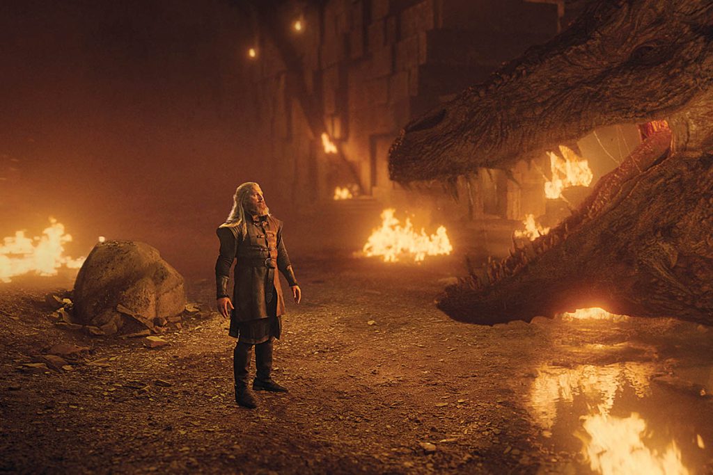
The Bloater makes a terrifying return this season. What were the key challenges in designing and animating this creature? How did you work on the Bloater’s interaction with the environment and other characters?
Alex Wang // In Season 1, the Kansas City cul-de-sac sequence featured only a handful of Bloater shots. This season, however, nearly forty shots showcase the Bloater in broad daylight during the Battle of Jackson. We needed to redesign the Bloater asset to ensure it looked good in close-up shots from head to toe. Weta FX designed the Bloater for Season 1 and revamped the design for this season. Starting with the Bloater’s silhouette, it had to appear large, intimidating, and menacing. We explored enlarging the cordyceps head shape to make it feel almost like a crown, enhancing the Bloater’s impressive and strong presence.
During filming, a stunt double stood in for the Bloater. This was mainly for scale reference and composition. It also helped the Infected stunt performers understand the Bloater’s spatial position, allowing them to avoid running through his space. Once we had an edit, Dennis mocapped the Bloater’s performances with his team. It is always challenging to get the motion right for a creature that weighs 600 pounds. We don’t want the mocap to be overly exaggerated, but it does break the character if the Bloater feels too “light.” The brilliant animation team at Weta FX brought the Bloater character to life and nailed it!
When Tommy goes head-to-head with the Bloater, Craig was quite specific during the prep days about how the Bloater would bubble, melt, and burn as Tommy torches him with the flamethrower. Important Looking Pirates took on the “Burning Bloater” sequence, led by VFX Supervisor Philip Engstrom. They began with extensive R&D to ensure the Bloater’s skin would start to bubble and burn. ILP took the final Bloater asset from Weta FX and had to resculpt and texture the asset for the Bloater’s final burn state. Craig felt it was important for the Bloater to appear maimed at the end. The layers of FX were so complex that the R&D continued almost to the end of the delivery schedule.
Fiona Campbell Westgate // This season the Bloater had to be bigger, more intimidating. The CG Asset was recreated to withstand the scrutiny of close ups and in daylight. Both Craig Mazin and Neil Druckmann worked closely with us during the process of the build. We referenced the game and applied elements of that version with ours. You’ll notice that his head is in the shape of crown, this is to convey he’s a powerful force.
During the Burning Bloater sequence in Episode 2, we brainstormed with Philip Engström, ILP VFX Supervisor, on how this creature would react to the flamethrower and how it would affect the ground as it burns. When the Bloater finally falls to the ground and dies, the extraordinary detail of the embers burning, fluid draining and melting the surrounding snow really sells that the CG creature was in the terrain.
Given the Bloater’s imposing size, how did you approach its integration into scenes with the actors? What techniques did you use to create such a realistic and menacing appearance?
Fiona Campbell Westgate // For the Bloater, a stunt performer wearing a motion capture suit was filmed on set. This provided interaction with the actors and the environment. VFX enhanced the intensity of his movements, incorporating simulations to the CG Bloater’s skin and muscles that would reflect the weight and force as this terrifying creature moves.
Seattle in The Last of Us is a completely devastated city. Can you talk about how you recreated this destruction? What were the most difficult visual aspects to realize for this post-apocalyptic city?
Fiona Campbell Westgate // We were meticulous in blending the CG destruction with the practical environment. The flora’s ability to overtake the environment had to be believable, and we adhered to the principle of form follows function. Due to the vastness of the CG devastation it was crucial to avoid repetitive effects. Consequently, our vendors were tasked with creating bespoke designs that evoked a sense of awe and beauty.
Was Seattle’s architecture a key element in how you designed the visual effects? How did you adapt the city’s real-life urban landscape to meet the needs of the story while maintaining a coherent aesthetic?
Alex Wang // It’s always important to Craig and Neil that we remain true to the cities our characters are in. DNEG was one of our primary vendors for Boston in Season 1, so it was natural for them to return for Season 2, this time focusing on Seattle. DNEG’s VFX Supervisor, Stephen James, who played a crucial role in developing the visual language of Boston for Season 1, also returns for this season. Stephen and Melaina Maceled a team to Seattle to shoot plates and perform lidar scans of parts of the city. We identified the buildings unique to Seattle that would have existed in 2003, so we ensured these buildings were always included in our establishing shots.
Overgrowth and destruction have significantly influenced the environments in The Last of Us. The environment functions almost as a character in both Season 1 and Season 2. In the last season, the building destruction in Boston was primarily caused by military bombings. During this season, destruction mainly arises from dilapidation. Living in the Pacific Northwest, I understand how damp
it can get for most of the year. I imagined that, over 20 years, the integrity of the buildings would be compromised by natural forces. This abundant moisture creates an exceptionally lush and vibrant landscape for much of the year. Therefore, when designing Seattle, we ensured that the destruction and overgrowth appeared intentional and aesthetically distinct from those of Boston.
Fiona Campbell Westgate // Led by Stephen James, DNEG VFX Supervisor, and Melaina Mace, DNEG DFX Supervisor, the team captured photography, drone footage and the Clear Angle team captured LiDAR data over a three-day period in Seattle. It was crucial to include recognizable Seattle landmarks that would resonate with people familiar with the game.
The devastated city almost becomes a character in itself this season. What aspects of the visual effects did you have to enhance to increase the immersion of the viewer into this hostile and deteriorated environment?
Fiona Campbell Westgate // It is indeed a character. Craig wanted it to be deteriorated but to have moments where it’s also beautiful in its devastation. For instance, in the Music Store in Episode 4 where Ellie is playing guitar for Dina, the deteriorated interior provides a beautiful backdrop to this intimate moment. The Set Decorating team dressed a specific section of the set, while VFX extended the destruction and overgrowth to encompass the entire environment, immersing the viewer in strange yet familiar surroundings.
Photograph by Liane Hentscher/HBO
The sequence where Ellie navigates a boat through a violent storm is stunning. What were the key challenges in creating this scene, especially with water simulation and the storm’s effects?
Alex Wang // In the concluding episode of Season 2, Ellie is deep in Seattle, searching for Abby. The episode draws us closer to the Aquarium, where this area of Seattle is heavily flooded. Naturally, this brings challenges with CG water. In the scene where Ellie encounters Isaac and the W.L.F soldiers by the dock, we had a complex shoot involving multiple locations, including a water tank and a boat gimbal. There were also several full CG shots. For Isaac’s riverine boat, which was in a stormy ocean, I felt it was essential that the boat and the actors were given the appropriate motion. Weta FX assisted with tech-vis for all the boat gimbal work. We began with different ocean wave sizes caused by the storm, and once the filmmakers selected one, the boat’s motion in the tech-vis fed the special FX gimbal.
When Ellie gets into the Jon boat, I didn’t want it on the same gimbal because I felt it would be too mechanical. Ellie’s weight needed to affect the boat as she got in, and that wouldn’t have happened with a mechanical gimbal. So, we opted to have her boat in a water tank for this scene. Special FX had wave makers that provided the boat with the appropriate movement.
Instead of guessing what the ocean sim for the riverine boat should be, the tech- vis data enabled DNEG to get a head start on the water simulations in post-production. Craig wanted this sequence to appear convincingly dark, much like it looks out on the ocean at night. This allowed us to create dramatic visuals, using lightning strikes at moments to reveal depth.
Were there any memorable moments or scenes from the series that you found particularly rewarding or challenging to work on from a visual effects standpoint?
Alex Wang // The Last of Us tells the story of our characters’ journey. If you look at how season 2 begins in Jackson, it differs significantly from how we conclude the season in Seattle. We seldom return to the exact location in each episode, meaning every episode presents a unique challenge. The scope of work this season has been incredibly rewarding. We burned a Bloater, and we also introduced spores this season!
Photograph by Liane Hentscher/HBO
Looking back on the project, what aspects of the visual effects are you most proud of?
Alex Wang // The Jackson Battle was incredibly complex, involving a grueling and lengthy shoot in quite challenging conditions, along with over 600 VFX shots in episode 2. It was truly inspiring to witness the determination of every department and vendor to give their all and create something remarkable.
Fiona Campbell Westgate // I am immensely proud of the exceptional work accomplished by all of our vendors. During the VFX reviews, I found myself clapping with delight when the final shots were displayed; it was exciting to see remarkable results of the artists’ efforts come to light.
How long have you worked on this show?
Alex Wang // I’ve been on this season for nearly two years.
Fiona Campbell Westgate // A little over one year; I joined the show in April 2024.
What’s the VFX shots count?
Alex Wang // We had just over 2,500 shots this Season.
Fiona Campbell Westgate // In Season 2, there were a total of 2656 visual effects shots.
What is your next project?
Fiona Campbell Westgate // Stay tuned…
A big thanks for your time.
WANT TO KNOW MORE?Blackbird: Dedicated page about The Last of Us – Season 2 website.DNEG: Dedicated page about The Last of Us – Season 2 on DNEG website.Important Looking Pirates: Dedicated page about The Last of Us – Season 2 website.RISE: Dedicated page about The Last of Us – Season 2 website.Weta FX: Dedicated page about The Last of Us – Season 2 website.
© Vincent Frei – The Art of VFX – 2025
#last #season #alex #wang #productionThe Last of Us – Season 2: Alex Wang (Production VFX Supervisor) & Fiona Campbell Westgate (Production VFX Producer)
After detailing the VFX work on The Last of Us Season 1 in 2023, Alex Wang returns to reflect on how the scope and complexity have evolved in Season 2.
With close to 30 years of experience in the visual effects industry, Fiona Campbell Westgate has contributed to major productions such as Ghost in the Shell, Avatar: The Way of Water, Ant-Man and the Wasp: Quantumania, and Nyad. Her work on Nyad earned her a VES Award for Outstanding Supporting Visual Effects in a Photoreal Feature.
Collaboration with Craig Mazin and Neil Druckmann is key to shaping the visual universe of The Last of Us. Can you share with us how you work with them and how they influence the visual direction of the series?
Alex Wang // Craig visualizes the shot or scene before putting words on the page. His writing is always exceptionally detailed and descriptive, ultimately helping us to imagine the shot. Of course, no one understands The Last of Us better than Neil, who knows all aspects of the lore very well. He’s done much research and design work with the Naughty Dog team, so he gives us good guidance regarding creature and environment designs. I always try to begin with concept art to get the ball rolling with Craig and Neil’s ideas. This season, we collaborated with Chromatic Studios for concept art. They also contributed to the games, so I felt that continuity was beneficial for our show.
Fiona Campbell Westgate // From the outset, it was clear that collaborating with Craig would be an exceptional experience. Early meetings revealed just how personable and invested Craig is. He works closely with every department to ensure that each episode is done to the highest level. Craig places unwavering trust in our VFX Supervisor, Alex Wang. They have an understanding between them that lends to an exceptional partnership. As the VFX Producer, I know how vital the dynamic between the Showrunner and VFX Supervisor is; working with these two has made for one of the best professional experiences of my career.
Photograph by Liane Hentscher/HBO
How has your collaboration with Craig evolved between the first and second seasons? Were there any adjustments in the visual approach or narrative techniques you made this season?
Alex Wang // Since everything was new in Season 1, we dedicated a lot of time and effort to exploring the show’s visual language, and we all learned a great deal about what worked and what didn’t for the show. In my initial conversations with Craig about Season 2, it was clear that he wanted to expand the show’s scope by utilizing what we established and learned in Season 1. He felt significantly more at ease fully committing to using VFX to help tell the story this season.
The first season involved multiple VFX studios to handle the complexity of the effects. How did you divide the work among different studios for the second season?
Alex Wang // Most of the vendors this season were also in Season 1, so we already had a shorthand. The VFX Producer, Fiona Campbell Westgate, and I work closely together to decide how to divide the work among our vendors. The type of work needs to be well-suited for the vendor and fit into our budget and schedule. We were extremely fortunate to have the vendors we did this season. I want to take this opportunity to thank Weta FX, DNEG, RISE, Distillery VFX, Storm Studios, Important Looking Pirates, Blackbird, Wylie Co., RVX, and VDK. We also had ILM for concept art and Digital Domain for previs.
Fiona Campbell Westgate // Alex Wang and I were very aware of the tight delivery schedule, which added to the challenge of distributing the workload. We planned the work based on the individual studio’s capabilities, and tried not to burden them with back to back episodes wherever possible. Fortunately, there was shorthand with vendors from Season One, who were well-acquainted with the process and the quality of work the show required.
The town of Jackson is a key location in The Last of Us. Could you explain how you approached creating and expanding this environment for the second season?
Alex Wang // Since Season 1, this show has created incredible sets. However, the Jackson town set build is by far the most impressive in terms of scope. They constructed an 822 ft x 400 ft set in Minaty Bay that resembled a real town! I had early discussions with Production Designer Don MacAulay and his team about where they should concentrate their efforts and where VFX would make the most sense to take over. They focused on developing the town’s main street, where we believed most scenes would occur. There is a big reveal of Jackson in the first episode after Ellie comes out of the barn. Distillery VFX was responsible for the town’s extension, which appears seamless because the team took great pride in researching and ensuring the architecture aligned with the set while staying true to the tone of Jackson, Wyoming.
Fiona Campbell Westgate // An impressive set was constructed in Minaty Bay, which served as the foundation for VFX to build upon. There is a beautiful establishing shot of Jackson in Episode 1 that was completed by Distillery, showing a safe and almost normal setting as Season Two starts. Across the episodes, Jackson set extensions were completed by our partners at RISE and Weta. Each had a different phase of Jackson to create, from almost idyllic to a town immersed in Battle.
What challenges did you face filming Jackson on both real and virtual sets? Was there a particular fusion between visual effects and live-action shots to make it feel realistic?
Alex Wang // I always advocate for building exterior sets outdoors to take advantage of natural light. However, the drawback is that we cannot control the weather and lighting when filming over several days across two units. In Episode 2, there’s supposed to be a winter storm in Jackson, so maintaining consistency within the episode was essential. On sunny and rainy days, we used cranes to lift large 30x60ft screens to block the sun or rain. It was impossible to shield the entire set from the rain or sun, so we prioritized protecting the actors from sunlight or rain. Thus, you can imagine there was extensive weather cleanup for the episode to ensure consistency within the sequences.
Fiona Campbell Westgate // We were fortunate that production built a large scale Jackson set. It provided a base for the full CG Jackson aerial shots and CG Set Extensions. The weather conditions at Minaty Bay presented a challenge during the filming of the end of the Battle sequence in Episode 2. While there were periods of bright sunshine, rainfall occurred during the filming of the end of the Battle sequence in Episode 2. In addition to the obvious visual effects work, it became necessary to replace the ground cover.
Photograph by Liane Hentscher/HBO
The attack on Jackson by the horde of infected in season 2 is a very intense moment. How did you approach the visual effects for this sequence? What techniques did you use to make the scale of the attack feel as impressive as it did?
Alex Wang // We knew this would be a very complex sequence to shoot, and for it to be successful, we needed to start planning with the HODs from the very beginning. We began previs during prep with Weta FX and the episode’s director, Mark Mylod. The previs helped us understand Mark and the showrunner’s vision. This then served as a blueprint for all departments to follow, and in many instances, we filmed the previs.
Fiona Campbell Westgate // The sheer size of the CG Infected Horde sets the tone for the scale of the Battle. It’s an intimidating moment when they are revealed through the blowing snow. The addition of CG explosions and atmospheric effects contributed in adding scale to the sequence.
Can you give us an insight into the technical challenges of capturing the infected horde? How much of the effect was done using CGI, and how much was achieved with practical effects?
Alex Wang // Starting with a detailed previs that Mark and Craig approved was essential for planning the horde. We understood that we would never have enough stunt performers to fill a horde, nor could they carry out some stunts that would be too dangerous. I reviewed the previs with Stunt Coordinator Marny Eng numerous times to decide the best placements for her team’s stunt performers. We also collaborated with Barrie Gower from the Prosthetics team to determine the most effective allocation of his team’s efforts. Stunt performers positioned closest to the camera would receive the full prosthetic treatment, which can take hours.
Weta FX was responsible for the incredible CG Infected horde work in the Jackson Battle. They have been a creative partner with HBO’s The Last of Us since Season 1, so they were brought on early for Season 2. I began discussions with Weta’s VFX supervisor, Nick Epstein, about how we could tackle these complex horde shots very early during the shoot.
Typically, repetition in CG crowd scenes can be acceptable, such as armies with soldiers dressed in the same uniform or armour. However, for our Infected horde, Craig wanted to convey that the Infected didn’t come off an assembly line or all shop at the same clothing department store. Any repetition would feel artificial. These Infected were once civilians with families, or they were groups of raiders. We needed complex variations in height, body size, age, clothing, and hair. We built our base library of Infected, and then Nick and the Weta FX team developed a “mix and match” system, allowing the Infected to wear any costume and hair groom. A procedural texturing system was also developed for costumes, providing even greater variation.
The most crucial aspect of the Infected horde was their motion. We had numerous shots cutting back-to-back with practical Infected, as well as shots where our CG Infected ran right alongside a stunt horde. It was incredibly unforgiving! Weta FX’s animation supervisor from Season 1, Dennis Yoo, returned for Season 2 to meet the challenge. Having been part of the first season, Dennis understood the expectations of Craig and Neil. Similar to issues of model repetition within a horde, it was relatively easy to perceive repetition, especially if they were running toward the same target. It was essential to enhance the details of their performances with nuances such as tripping and falling, getting back up, and trampling over each other. There also needed to be a difference in the Infected’s running speed. To ensure we had enough complexity within the horde, Dennis motion-captured almost 600 unique motion cycles.
We had over a hundred shots in episode 2 that required CG Infected horde.
Fiona Campbell Westgate // Nick Epstein, Weta VFX Supervisor, and Dennis Yoo, Weta Animation Supervisor, were faced with having to add hero, close-up Horde that had to integrate with practical Stunt performers. They achieved this through over 60 motion capture sessions and running it through a deformation system they developed. Every detail was applied to allow for a seamless blend with our practical Stunt performances. The Weta team created a custom costume and hair system that provided individual looks to the CG Infected Horde. We were able to avoid the repetitive look of a CG crowd due to these efforts.
The movement of the infected horde is crucial for the intensity of the scene. How did you manage the animation and simulation of the infected to ensure smooth and realistic interaction with the environment?
Fiona Campbell Westgate // We worked closely with the Stunt department to plan out positioning and where VFX would be adding the CG Horde. Craig Mazin wanted the Infected Horde to move in a way that humans cannot. The deformation system kept the body shape anatomically correct and allowed us to push the limits from how a human physically moves.
The Bloater makes a terrifying return this season. What were the key challenges in designing and animating this creature? How did you work on the Bloater’s interaction with the environment and other characters?
Alex Wang // In Season 1, the Kansas City cul-de-sac sequence featured only a handful of Bloater shots. This season, however, nearly forty shots showcase the Bloater in broad daylight during the Battle of Jackson. We needed to redesign the Bloater asset to ensure it looked good in close-up shots from head to toe. Weta FX designed the Bloater for Season 1 and revamped the design for this season. Starting with the Bloater’s silhouette, it had to appear large, intimidating, and menacing. We explored enlarging the cordyceps head shape to make it feel almost like a crown, enhancing the Bloater’s impressive and strong presence.
During filming, a stunt double stood in for the Bloater. This was mainly for scale reference and composition. It also helped the Infected stunt performers understand the Bloater’s spatial position, allowing them to avoid running through his space. Once we had an edit, Dennis mocapped the Bloater’s performances with his team. It is always challenging to get the motion right for a creature that weighs 600 pounds. We don’t want the mocap to be overly exaggerated, but it does break the character if the Bloater feels too “light.” The brilliant animation team at Weta FX brought the Bloater character to life and nailed it!
When Tommy goes head-to-head with the Bloater, Craig was quite specific during the prep days about how the Bloater would bubble, melt, and burn as Tommy torches him with the flamethrower. Important Looking Pirates took on the “Burning Bloater” sequence, led by VFX Supervisor Philip Engstrom. They began with extensive R&D to ensure the Bloater’s skin would start to bubble and burn. ILP took the final Bloater asset from Weta FX and had to resculpt and texture the asset for the Bloater’s final burn state. Craig felt it was important for the Bloater to appear maimed at the end. The layers of FX were so complex that the R&D continued almost to the end of the delivery schedule.
Fiona Campbell Westgate // This season the Bloater had to be bigger, more intimidating. The CG Asset was recreated to withstand the scrutiny of close ups and in daylight. Both Craig Mazin and Neil Druckmann worked closely with us during the process of the build. We referenced the game and applied elements of that version with ours. You’ll notice that his head is in the shape of crown, this is to convey he’s a powerful force.
During the Burning Bloater sequence in Episode 2, we brainstormed with Philip Engström, ILP VFX Supervisor, on how this creature would react to the flamethrower and how it would affect the ground as it burns. When the Bloater finally falls to the ground and dies, the extraordinary detail of the embers burning, fluid draining and melting the surrounding snow really sells that the CG creature was in the terrain.
Given the Bloater’s imposing size, how did you approach its integration into scenes with the actors? What techniques did you use to create such a realistic and menacing appearance?
Fiona Campbell Westgate // For the Bloater, a stunt performer wearing a motion capture suit was filmed on set. This provided interaction with the actors and the environment. VFX enhanced the intensity of his movements, incorporating simulations to the CG Bloater’s skin and muscles that would reflect the weight and force as this terrifying creature moves.
Seattle in The Last of Us is a completely devastated city. Can you talk about how you recreated this destruction? What were the most difficult visual aspects to realize for this post-apocalyptic city?
Fiona Campbell Westgate // We were meticulous in blending the CG destruction with the practical environment. The flora’s ability to overtake the environment had to be believable, and we adhered to the principle of form follows function. Due to the vastness of the CG devastation it was crucial to avoid repetitive effects. Consequently, our vendors were tasked with creating bespoke designs that evoked a sense of awe and beauty.
Was Seattle’s architecture a key element in how you designed the visual effects? How did you adapt the city’s real-life urban landscape to meet the needs of the story while maintaining a coherent aesthetic?
Alex Wang // It’s always important to Craig and Neil that we remain true to the cities our characters are in. DNEG was one of our primary vendors for Boston in Season 1, so it was natural for them to return for Season 2, this time focusing on Seattle. DNEG’s VFX Supervisor, Stephen James, who played a crucial role in developing the visual language of Boston for Season 1, also returns for this season. Stephen and Melaina Maceled a team to Seattle to shoot plates and perform lidar scans of parts of the city. We identified the buildings unique to Seattle that would have existed in 2003, so we ensured these buildings were always included in our establishing shots.
Overgrowth and destruction have significantly influenced the environments in The Last of Us. The environment functions almost as a character in both Season 1 and Season 2. In the last season, the building destruction in Boston was primarily caused by military bombings. During this season, destruction mainly arises from dilapidation. Living in the Pacific Northwest, I understand how damp
it can get for most of the year. I imagined that, over 20 years, the integrity of the buildings would be compromised by natural forces. This abundant moisture creates an exceptionally lush and vibrant landscape for much of the year. Therefore, when designing Seattle, we ensured that the destruction and overgrowth appeared intentional and aesthetically distinct from those of Boston.
Fiona Campbell Westgate // Led by Stephen James, DNEG VFX Supervisor, and Melaina Mace, DNEG DFX Supervisor, the team captured photography, drone footage and the Clear Angle team captured LiDAR data over a three-day period in Seattle. It was crucial to include recognizable Seattle landmarks that would resonate with people familiar with the game.
The devastated city almost becomes a character in itself this season. What aspects of the visual effects did you have to enhance to increase the immersion of the viewer into this hostile and deteriorated environment?
Fiona Campbell Westgate // It is indeed a character. Craig wanted it to be deteriorated but to have moments where it’s also beautiful in its devastation. For instance, in the Music Store in Episode 4 where Ellie is playing guitar for Dina, the deteriorated interior provides a beautiful backdrop to this intimate moment. The Set Decorating team dressed a specific section of the set, while VFX extended the destruction and overgrowth to encompass the entire environment, immersing the viewer in strange yet familiar surroundings.
Photograph by Liane Hentscher/HBO
The sequence where Ellie navigates a boat through a violent storm is stunning. What were the key challenges in creating this scene, especially with water simulation and the storm’s effects?
Alex Wang // In the concluding episode of Season 2, Ellie is deep in Seattle, searching for Abby. The episode draws us closer to the Aquarium, where this area of Seattle is heavily flooded. Naturally, this brings challenges with CG water. In the scene where Ellie encounters Isaac and the W.L.F soldiers by the dock, we had a complex shoot involving multiple locations, including a water tank and a boat gimbal. There were also several full CG shots. For Isaac’s riverine boat, which was in a stormy ocean, I felt it was essential that the boat and the actors were given the appropriate motion. Weta FX assisted with tech-vis for all the boat gimbal work. We began with different ocean wave sizes caused by the storm, and once the filmmakers selected one, the boat’s motion in the tech-vis fed the special FX gimbal.
When Ellie gets into the Jon boat, I didn’t want it on the same gimbal because I felt it would be too mechanical. Ellie’s weight needed to affect the boat as she got in, and that wouldn’t have happened with a mechanical gimbal. So, we opted to have her boat in a water tank for this scene. Special FX had wave makers that provided the boat with the appropriate movement.
Instead of guessing what the ocean sim for the riverine boat should be, the tech- vis data enabled DNEG to get a head start on the water simulations in post-production. Craig wanted this sequence to appear convincingly dark, much like it looks out on the ocean at night. This allowed us to create dramatic visuals, using lightning strikes at moments to reveal depth.
Were there any memorable moments or scenes from the series that you found particularly rewarding or challenging to work on from a visual effects standpoint?
Alex Wang // The Last of Us tells the story of our characters’ journey. If you look at how season 2 begins in Jackson, it differs significantly from how we conclude the season in Seattle. We seldom return to the exact location in each episode, meaning every episode presents a unique challenge. The scope of work this season has been incredibly rewarding. We burned a Bloater, and we also introduced spores this season!
Photograph by Liane Hentscher/HBO
Looking back on the project, what aspects of the visual effects are you most proud of?
Alex Wang // The Jackson Battle was incredibly complex, involving a grueling and lengthy shoot in quite challenging conditions, along with over 600 VFX shots in episode 2. It was truly inspiring to witness the determination of every department and vendor to give their all and create something remarkable.
Fiona Campbell Westgate // I am immensely proud of the exceptional work accomplished by all of our vendors. During the VFX reviews, I found myself clapping with delight when the final shots were displayed; it was exciting to see remarkable results of the artists’ efforts come to light.
How long have you worked on this show?
Alex Wang // I’ve been on this season for nearly two years.
Fiona Campbell Westgate // A little over one year; I joined the show in April 2024.
What’s the VFX shots count?
Alex Wang // We had just over 2,500 shots this Season.
Fiona Campbell Westgate // In Season 2, there were a total of 2656 visual effects shots.
What is your next project?
Fiona Campbell Westgate // Stay tuned…
A big thanks for your time.
WANT TO KNOW MORE?Blackbird: Dedicated page about The Last of Us – Season 2 website.DNEG: Dedicated page about The Last of Us – Season 2 on DNEG website.Important Looking Pirates: Dedicated page about The Last of Us – Season 2 website.RISE: Dedicated page about The Last of Us – Season 2 website.Weta FX: Dedicated page about The Last of Us – Season 2 website.
© Vincent Frei – The Art of VFX – 2025
#last #season #alex #wang #production