An Architect’s Guide to Venice and its Modern Architecture
Whether you’re heading to this year’s Biennale, planning a future visit, or simply daydreaming about Venice, this guide—contributed by Hamilton-based architect Bill Curran—offers insights and ideas for exploring the canal-crossed city.
Venice is like eating an entire box of chocolate liqueurs in one go.
– Truman Capote
Venice is my mystical addiction and I soon will make my 26th trip there, always for about 10 days or more. I keep getting asked why, and asked by other architects to share what to do and what to see. Only Italo Calvino could have reimaginedsuch a magical, unique place, a water-born gem forged from 120 islands linked by 400 bridges and beset by a crazy-quilt medieval street and canal pattern. Abstract, dancing light forms dappling off water, the distinct automobile-less quiet. La Serenissima, The Most Serene One.
Most buildings along the Grand Canal were warehouses with the family home above on the piano nobile floor above, and servant apartments above that in the attics, in a sea-faring nation state of global traders and merchants like Marco Polo. Uniquely built on a foundation of 1,000-year-old wood pilings, its uneven, wonky buildings have forged a rich place in history, literature and movies: Joseph Brodsky’s Watermark, Hemingway’s Across the River and into the Trees, Don’t Look Now starring Donald Sutherland, Mann’s Death in Venice, The Comfort of Strangers with Christopher Walken, Henry James’ The Wings of the Dove and The Aspern Papers, Kate Hepburn’s ‘Summertime. Yes, yes, Ruskin’s Stones of Venice is an option, as are Merchant of Venice and Casanova.
Palazzo Querini Stampalia: Photo via Wikipedia
THE MODERN ARCHITECTURE OF VENICE
Much of Venetian life is lived in centuries-old buildings, with a crushing post-war recession leaving it preserved in amber for decades until the mass tourists found it. Now somewhat relieved of at least the cruise ship daytrippers, it is a reasonable place again, except maybe in peak summer. The weight of history, a conservatism for preservation and post-war anti-Americanism led to architectural stagnation. So there are few new, modern buildings, mostly on the edges, and some fine interior interventions, mostly invisible. For modern architecture enthusiasts Venice is a challenge.
Carlo Scarpa– Photo via Wikipedia, licensed under the Creative Commons Attribution 2.0 Generic license
Here is what modern architects should see:
Carlo Scarpa‘s Must-See Works:
Go see any of Scarpa’s interventions, demonstrating his mastery of detailing, materials, joinery and his approach to blending with existing fabric. He is Italy’s organicist, their Frank Lloyd Wright, and they even worked together.
Negozio Olivetti: The tiny former Olivetti typewriter showroom enfronting Piazza San Marco is perhaps the most wonderful of his works. It is open now to visit as a heritage museum. ”God is in the details”; Scarpa carefully considered every detail, material and connection.
Le magasin Olivetti de Carlo Scarpa. Photo via Wikipedia. This file is licensed under the Creative Commons Attribution 2.0 Generic license
The Fondazione Querini Stampalia is a must see, a renovated palazzo with ground floor exhibit spaces with tidewater allowed to rise up inside in one area you bridge across. The former entrance bridge is a lovely gem of exquisite detailing, rendered obsolete by a meh renovation by Mario Botta. A MUST is to have a coffee or prosecco in Scarpa’s garden and see the craft and detail of its amazing water feature. The original palazzo rooms are a lovely semi-public library inhabited by uni students; sign up as a member on-line for free. Walk up the spiral stair.
The entry gate to the UIAV Architecture School in Campo Tolentini is an unexpected wonder. A brutalist yet crisply detailed sliding concrete and steel gate, a sculpted concrete lychgate, then an ancient doorway placed on the lawn as a basin.
Main Gate of the Tolentini building headquarters of Iuav university of Venice designed by Carlo Scarpa. Photo via Wikipedia, licensed under the Creative Commons Attribution 2.0 Generic license
OTHER MODERN ARCHITECTURE TO SEE:
Minimalist Dave Chipperfield expanded an area of suede-like concrete columbariums on the St. Michele cemetery island. Sublime. Extra points if you can find the tomb Scarpa designed nearby.
The Ponte della Costituzioneis the fourth bridge over the Grand Canal in Venice, Italy. It was designed by Santiago Calatrava.Calatrava’s Ponte della Constituzione bridge is an elegant, springing gazelle over the entrance to the Grand Central. But the glass steps are slippery and are being replaced soon, and the City is suing Calatrava, oops. The barrier-free lift pod died soon after opening. It is lovely though.
Le Canal della Giudecca, la Punta della Dogana, la basilique Santa Maria della Salute de Venise et le Canal Grande à Venise. Photo via Wikipedia
Tadao Ando’s Punte Della Dognana museum is large, with sublime, super-minimalist, steel and glass and velvety exposed concrete interventions, while his Palazzo Grassi Museum was more restoration. A little known fact is that Ando used Scarpa’s lovely woven basketweave metal gate design in homage. An important hidden gem is the Teatrino Grassi behind the Museum, a small but fabulous, spatially dramatic theatre that often has events, a must-see!
Fondaco dei Tedeschi: At the foot of Rialto Bridge and renovated by Rem Koolhaas, this former German trading post had been transformed into a luxury shopping mall but closed last month, a financial failure. Graced with a stunning atrium and a not well know fabulous rooftop viewing terrace, its future is now uncertain. The atrium bar is by Phillipe Starck and is cool. Try it just in case.
Fondaco dei Tedeschi. Photo via Wikipedia
Procuratie Vecchie: This iconic 16th storey building is one of Piazza San Marco’s defining buildings, and David Chipperfield’s restoration and renovation of this building, which defines Piazza San Marco, is all about preservation with a few modern, minimalist interventions. It operates as a Biennale exhibit space.
Infill housing on former industrial sites on Guidecca Island includes several interesting new developments called the Fregnans, IACP and Junghans sites. A small site called Campo di Marte includes side-by-sides by Alvaro Siza, Aldo Rossi and Carlo Aymonino; some day there will be a Rafael Moneo on the empty lot.
View this post on Instagram
A post shared by Denton Corker MarshallAT THE BIENNALE:
At the Biennale grounds there is much to see, with the only recent project the Australia Pavilion by Denton Corker, a black granite box hovering along a canal. Famous buildings include the Nordic Pavilion, Venezuela Pavilion, Finland Pavilion, former Ticket Booth, Giardino dell Sculture, Bookstoreand there are some fab modern interiors inside the old boat factory buildings. Canada’s Pavilion by the Milan firm BBPRfrom 1956 is awkward, weird and much loathed by artists and curators.
Le pavillon des pays nordiques. Photo via Wikipedia, licensed under the Creative Commons Attribution 2.0 Generic license.
Just outside the Biennale on the Zattere waterfront is a stirring Monument to the Women Partisans of WWII, laid in the water by Augusto Maurer over a simple stepped-base designed by Scarpa.
Venezia – Complesso monastico di San Giorgio Maggiore. Photo via Wikipedia, licensed under the Creative Commons Attribution-Share Alike 4.0 International license.
BEYOND THE BIENNALE
The Vatican Chapels: In 2018 the Vatican decided to participate in the Biennale for the first time for some reason and commissioned ten architects to design chapels that are located in a wooded area on the Venetian island of San Giorgio Maggiore, behind Palladio’s church. The architects include Norman Foster, Eduardo Souto de Moura, and Smiljan Radic, and includes The Asplund Pavilion, like the Woodland Chapel that inspired it. It is intended as a “place of orientation, encounter, meditation, and salutation.” The 10 chapels each symbolize one of the Ten Commandments, and offer 10 unique interpretations of the original Woodland Chapel; many are open air. These are fab and make you think!
Chiese San Giorgio Maggiore was designed by Palladio and is fine. But its bell tower offers magnificent city views and avoids the long lines, crowds and costs of Piazza San Marco’s Campanile. Next to San Giorgio you should tour the Cini Foundation, with an amazing stair by Longhera, the modern Monica Lunga Libraryand a lovely Borges-inspired labyrinth garden. Behind San Giorgio en route to the Chapels is the Museo del Vetro and the fabulous Le Stanze della Fotografiafeaturing a Mapplethorpe retrospective this year.An unknown MUST DO is a concert in the stunning Auditorium Lo Squero, with but 200 comfy seats in an adapted boat workshop with a stage wall of glass onto the lagoon and the Venitian cityscape.
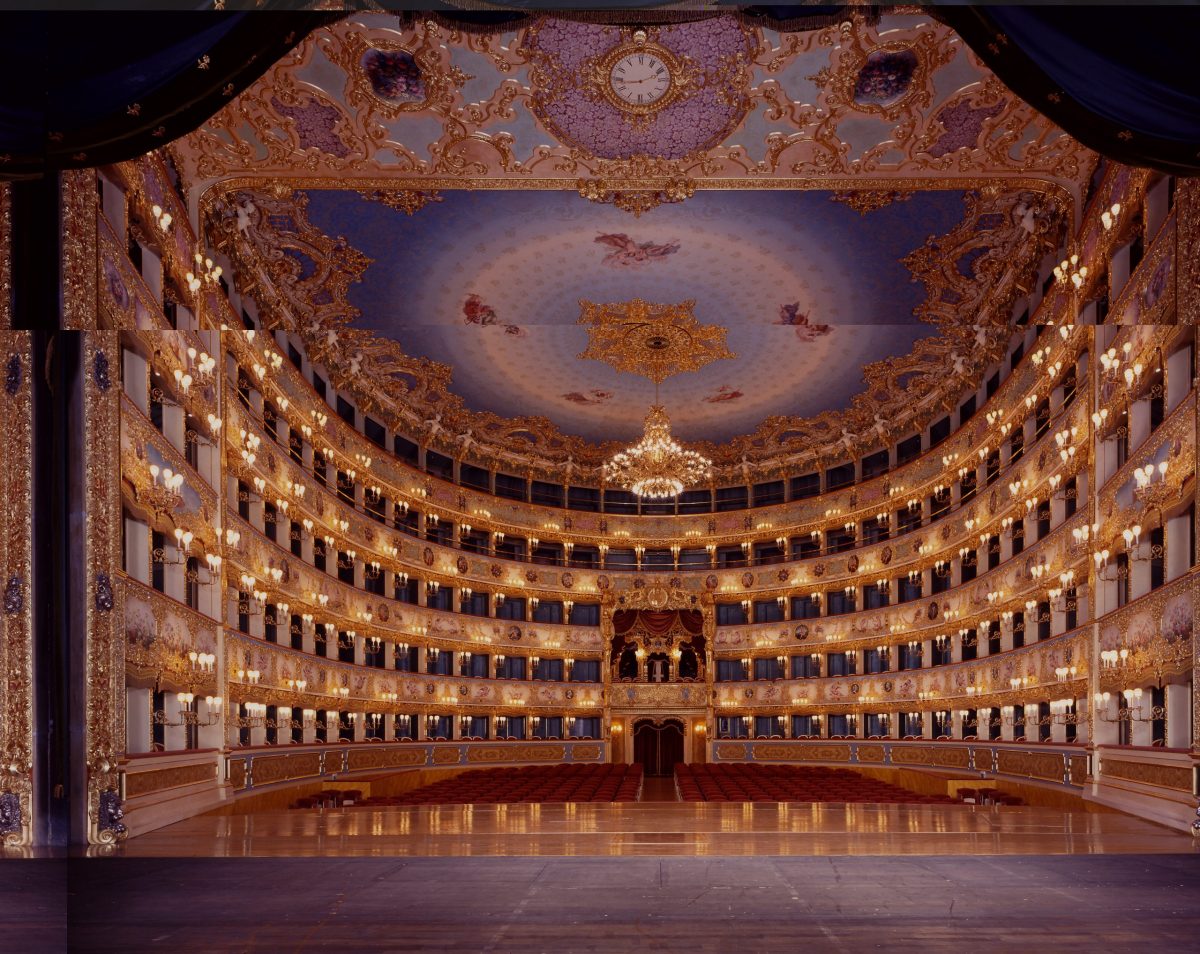
La Fenice Opera House in Venice, Italy. Image via: Wikipedia
La Fenice Opera House: after burning down in 1996, Aldo Rossi supervised the rebuilding, more or less ‘as it was, as it is’, the Italian heritage cop-out. There is no Rossi to see here, but it is a lovely grand hall. Book a concert with private box seats.
Venice Marco Polo Airport is definitely Aldo Rossi-inspired in its language, materials and colours. The ‘Gateway Terminal’ boat bus and taxi dock is a true grand gateway.
Venice Marco Polo airport. Photo via Wikipedia
HIDDEN GEMS
Fondazione Vendova by Renzo Piano features automated displays of huge paintings by a local abstract modernist moving about a wonderful huge open warehouse and around viewers. Bizarre and fascinating.
Massimo Scolari was a colleague or Rossi’s and is a brilliant, Rationalist visionary and painter, renown to those of us devotees of the Scarpa/Rossi/Scolari cult in the 1980’s. His ‘Wings’ sculpture is a large scale artwork motif from his drawings now perched on the roof of the UIAV School of Architecture, and from the 1991 Biennale. Do yourself a favour, dear reader, look up his work. Krier, Duany and the New Urbanists took note. He reminds me of the 1920s Italian Futurists.
You can tour all the fine old churches you want, but only one matters to me: Santa Maria dei Miracoli, a barrel-vaulted, marble and wood-roofed confection. San Nicolo dei Mendicoli is admittedly pretty fab, and featured in ‘Don’t Look Now’. And the Basilica of Santa Maria Assunta on Torcello has an amazing mosaic floor, very unusual stone slab window shutters.
For the Scarpiani: There is a courtroom, the Manilo Capitolo, inside the Venice Civic Tribunale building in the Rialto Market that was renovated by Scarpa, and is amazing in its detail, including furniture and furnishings. You have to pass security to get in, and wait until court ends if on. It is worth it!
The Aula Mario Baratto is a large classroom in a Palazzo overlooking the Grand Canal designed by Carlo Scarpa with amazing wood details and furniture. The room has stunning frescoes also. You can book a tour through Universite Ca’ Foscari. The view at a bend in the Grand Canal is stunning, and you can see the Fondazione Masieribuilding off to the left across the side canal.
Within the Accademia Galleries and Correr Museum are a number of small renovations, stairs and art stands designed by Scarpa. Next to the Chiesa di San Sebastino decorated by Veronese is the Scarpa entrance to a linguistics library for the Universita Ca’ Foscari.
Fondation W – Wilmotte & Associés: A French architect who is not shy and presumably rather wealthy runs his own exhibition space focused on architecture; ‘…it is both a laboratory and shop window…’, so one of those. Worth a look.
There is a recent Courthouse that is sleek, long, narrow, black and compelling on the north side of Piazzalle Roma, but I have not yet wandered in.
FOOD AND DRINKS FOR ARCHITECTS
Philippe Starck’s lobby bar at the Palazzina Grassi hotel is the only cool, mod bar in town. Wow! Ask the barman to see the secret Krug Room and use the PG bar’s unique selfie washroom. I love this bar: old, new, electic. Also, Starck has a house on Burano, next to the pescheria. He wants you to drop by.
Restaurant Algiubagiò is the only cool, modern restaurant and it has fab food. It also has a great terrace over the water. Go!
Zanze XVI is a nice clean mod interior and Michelin food. Worth it.
Ristorante Lineadombra: A lovely, crisp modern interior and crisp modern Venetian food. A great terrace on the water also.
Local Venice is a newer, clean, crisp resto with ‘interesting’ prices. Your call.
Osteria Alla Bifora, while in a traditional workshop space, is a clean open loft, adorned modernly with a lovely array of industrial and historic relics. It is a lovely bar with charcuterie and a patio on the buzzy campo for students. Great for late night.
Cicchetti are Venetian tapas, a standard lunch you must try. All’ Arco near Rialto has excellent nouveau food and 50m away is the lovely old school Do Mori. Osteria Al Squero in Dorsoduro overlooks one of the last working gondola workshops, and 100m away is the great Cantino del Vino già Schiavi. Basegò has creative, nouveau cichetti.
Drinks on a patio along the Grand Canal can only be had economically at Taverna al Remer, or in Campo Erberia at Nanzaria, Bancogira, Al Pesador or Osteria Al Cichetteria. Avoid any place around Rialto Bridge except these. El Sbarlefo San Pantalon has a Scarpa vibe and a hip, young crowd. There is a Banksy 50’ away.
Ristorante Venissa is a short bridge from Burano to Mazzorbo island, a Michelin-starred delight set in its own vineyard.
Since restaurant design cannot tie you up here, try some fab local joints:
Trattoria Anzolo Raffaele : The owner’s wife is from Montreal, which is something. A favorite!
Pietra Rossa: A fab, smart place with a hidden garden run by a hip, fun young restauranteur, Andrea. Ask for the Canadian architect discount.
Oste Mauro Lorenzon : An entertaining wine and charcuterie bar run by the hip young restauranteur’s larger than life father, and nearby. Mauro is a true iconoclast. Only open evenings and I dare you to hang there late.
Anice Stellato: A great family run spot, especially for fish. Excellent food always.
La Colonna Ristorante: A nice, neighbourhood joint hidden in a small campo.
Il Paradiso Perduto: A very lively joint with good food and, rarely in Venice, music. Buzzy and fun.
Busa da Lele: Great neighbourhood joint on Murano in a lovely Campo.
Trattoria Da Romano: Best local joint on Burano. Starck hangs here, as did Bourdain.
Cafes:
Bacaro aea Pescaria is at the corner by Campo de la Becarie. Tiny, but run by lovely guys who cater to pescaria staff. Stand outside with a prosecco and watch the market street theatre. Extra points if you come by for a late night drink.
Bar ai Artisti is my second fav café, in Campo S. Barnaba facing where Kate Hepburn splashed into the canal. Real, fab pastries, great terrace in Campo too.
Café at Querini Stampalia: get a free visit to Scarpa’s garden and wander it with a coffee or prosecco. Make sure to see the bookstore also.
Carlo Scarpa à la Fondation Querini Stampalia. Photo via Wikipedia,
A lesser known place is the nice café in the Biennale Office next to Hotel Monaco, called Ombra del Leone.
The café in the Galleria Internationale d’Arte Moderna Ca’ Pesaro is great with a terrace on the Grand Canal.
Cocktail bars:
Retro Venezia: Cool, retro vibe. The owner’s wife dated a Canadian hockey player. You must know him.
Il Mercante: A fabulous cocktail bar. Go.
Time Social Bar: Another cool cocktail bar.
Vero Vino: A fab wine bar where you can sit along a canal. Many good restaurants nearby!
Arts Bar Venice: If you must have a cocktail with a compelling story, and are ok with a pricetag. Claims Scarpa design influence, I say no. But read the cocktail stories, they are smart and are named for artists including Scarpa.
Bar Longhi in in the Gritti Hotel is a classic, although cheesey to me. Hemingway liked it. It has a Grand Canal terrace.
The Hilton Stucky Hotel is a fabulous former flour factory from when they built plants to look like castles, but now has a bland, soulless Hilton interior like you are in Dayton. But it has a rooftop bar and terrace with amazing sunset views!
While traditional, the stunning, ornate lobby, atrium and main stair of the Hotel Danieli are a must-see. Have a drink in the lobby bar by the piano player some evening.
STAYING MODERN
Palazzina Grassi is the only modern hotel in Venice, with a really lovely, unique lobby/bar/restaurant all done by Philippe Starck. At least see the fab bar! Johnny Depp’s favourite.
Generator Hostel: A hip new-age ‘design-focused’ hostel well worth a look. Not like any hostel I ever patronized, no kegs on the porch. Go visit the lobby for the design. A Euro chain.
DD724 is a small boutique hotel by an Italian architect with thoughtful detailing and colours, near the Peggy Guggenheim Museum, and they have a small remote outpost with fabulous apartment called iQS that is lovely. The owner’s brother is the architect. My fave!
Avogaria: Not just a 5 room hotel, it is ‘a concept’, which is great, right? But very cool. An architect is one of the owners.
German minimalist architect Matteo Thun’s JW Mariott Venice Resort Hotel and Spa is an expensive convent renovation on its own lagoon island that shows how blandness is yawningly close to minimalism.
The Hotel Bauer Palazzo has a really lovely mid-century modern section facing Campo San Moise, but it is shrouded in construction scaffolding for now.
SHOPPING MODERN FOR ARCHITECTS
It is hard to find cool modern shopping options, but here is where you can:
Libreria Acqua Alta: Used books and a lovely, unexpected, fab, alt experience. You must see and wander this experience! It has cats too.
Giovanna Zanella: Shoes that are absolute works of art! At least look in her window.
Bancolotto N10: Stunning women’s clothing made in the women’ prison as a job skill training program. Impeccable clothes; save a moll from a life of crime.
Designs188: Giorgio Nason makes fabulous glass jewellery around the corner from the Peggy Guggenheim Museum.
Davide Penso: Artisan made glass jewellery on Murano.
Ferrovetro Murano: Artisan made jewellery, bags, scarfs..
Madera: All the cool designer housewares and jewellery.
DECLARE: Cool, modern leathergoods in a very sweet modern shop with exquisite metal detailing. A must see!
Ottica Urbani: Cool Italian eyewear and sunglasses.
Paperowl: Handmade paper, products, classes.
Feeling Venice: Cool design and tourist bling can be found only here. No shot glasses.
MISSED OPPORTUNITIES, MEMORIES AND B-SIDES
The Masieri Foundation: Look up the tragic story of this project, a lovely, small memorial to a young architect who died in a car accident on his honeymoon en route to visit Fallingwater in 1952. Yep. His widow commissioned Frank Lloyd Wright to design a small student residence and study centre, but it was stopped by anti-American and anti-Modernism sentiments.. This may be Venice’s saddest architectural loss ever. The consolation prize is a very, very lovely Scarpa interior reno. Try to get in, ring the bell!.
Also cancelled: Lou Kahn’s Palace of Congress set for the Arsenale, Corbusier’s New Venice Hospital which would have been sitting over the Lagoon in Cannaregio near the rail viaduct, Gehry’s Venice Gateway. Also lost was Rossi’s temporary Teatro del Mondo, a barged small theatre that tooted around Venice and was featured in a similar installation in 1988 at the R.C. Harris Water Treatment Plant. All available on-line.
Teatro del Mondo di Aldo Rossi, Venezia 1980. Photo via Wikipedia, CC BY-SA 4.0
Itches to scratch: Exercise your design skills to finish the perennial favorite ‘Unfinished Palazzo’ of the Peggy Guggenheim Museum, design a new Masieri Foundation, design the 11th Vatican Chapel or infill the derelict gasometer site next to Palladio’s Chiese San Francisco della Vigna.
FURTHER AFIELD
Within an hour’s drive, you can see the simply amazing Tombe Brion in San Vito Altivole and the tiny, stunning Giptotecha Canova in Possagna, the Nardini Grappa Distillery in Bassano del Grappa by Maximillio Fuksas, and a ferry and taxi will get you to Richard Meier’s Jesolo Lido Condos on the beach. A longer drive of two hours into the mountains near Cortina will bring you to Scarpa’s lovely and little known Nostra Signore di Cadora Church. It is sublime! Check out the floor! Zaha Hadid’s stunning Messner Mountain Museum floats above Cortina, accessible by cable car.
The recent M-09 Museum on mainland Mestre, a quick 10 minute train ride from Venice, by Sauerbruch + Hutton is a lovely urban museum with dynamic cladding.
Castelvecchio Museum. Photo via Wikipedia
The Veneto region is home to many cool things, and fab train service gets you quickly to Verona, Vicenza. There are Palladio villas scattered about the Veneto, and you can daytrip by canal boat from Venice to them.
Go stand where Hemingway was wounded in WWI near Fossalta Di Piave, which led to his famous novel, ‘A Farewell to Arms’. He never got to visit Venice until 1948, then fell in love with the city, leading to ‘Across the River and into the Trees’. He also threatened to burn down FLW’s Masieri Foundation if built.
OTHER GOOD ARCHITECTURAL REFERENCES
Venice Modern Architecture Map
The only guidebook to Modern Architecture in Venice
These architectural guide folks do tours geared to architects: Architecture Tour Venice – Guiding Architects
Venice Architecture City Guide: 15 Historical and Contemporary Attractions to Discover in Italy’s City of Canals | ArchDaily
Venice architecture, what to see: buildings by Scarpa, Chipperfield and other great architects
The post An Architect’s Guide to Venice and its Modern Architecture appeared first on Canadian Architect.
#architects #guide #venice #its #modernAn Architect’s Guide to Venice and its Modern Architecture
Whether you’re heading to this year’s Biennale, planning a future visit, or simply daydreaming about Venice, this guide—contributed by Hamilton-based architect Bill Curran—offers insights and ideas for exploring the canal-crossed city.
Venice is like eating an entire box of chocolate liqueurs in one go.
– Truman Capote
Venice is my mystical addiction and I soon will make my 26th trip there, always for about 10 days or more. I keep getting asked why, and asked by other architects to share what to do and what to see. Only Italo Calvino could have reimaginedsuch a magical, unique place, a water-born gem forged from 120 islands linked by 400 bridges and beset by a crazy-quilt medieval street and canal pattern. Abstract, dancing light forms dappling off water, the distinct automobile-less quiet. La Serenissima, The Most Serene One.
Most buildings along the Grand Canal were warehouses with the family home above on the piano nobile floor above, and servant apartments above that in the attics, in a sea-faring nation state of global traders and merchants like Marco Polo. Uniquely built on a foundation of 1,000-year-old wood pilings, its uneven, wonky buildings have forged a rich place in history, literature and movies: Joseph Brodsky’s Watermark, Hemingway’s Across the River and into the Trees, Don’t Look Now starring Donald Sutherland, Mann’s Death in Venice, The Comfort of Strangers with Christopher Walken, Henry James’ The Wings of the Dove and The Aspern Papers, Kate Hepburn’s ‘Summertime. Yes, yes, Ruskin’s Stones of Venice is an option, as are Merchant of Venice and Casanova.
Palazzo Querini Stampalia: Photo via Wikipedia
THE MODERN ARCHITECTURE OF VENICE
Much of Venetian life is lived in centuries-old buildings, with a crushing post-war recession leaving it preserved in amber for decades until the mass tourists found it. Now somewhat relieved of at least the cruise ship daytrippers, it is a reasonable place again, except maybe in peak summer. The weight of history, a conservatism for preservation and post-war anti-Americanism led to architectural stagnation. So there are few new, modern buildings, mostly on the edges, and some fine interior interventions, mostly invisible. For modern architecture enthusiasts Venice is a challenge.
Carlo Scarpa– Photo via Wikipedia, licensed under the Creative Commons Attribution 2.0 Generic license
Here is what modern architects should see:
Carlo Scarpa‘s Must-See Works:
Go see any of Scarpa’s interventions, demonstrating his mastery of detailing, materials, joinery and his approach to blending with existing fabric. He is Italy’s organicist, their Frank Lloyd Wright, and they even worked together.
Negozio Olivetti: The tiny former Olivetti typewriter showroom enfronting Piazza San Marco is perhaps the most wonderful of his works. It is open now to visit as a heritage museum. ”God is in the details”; Scarpa carefully considered every detail, material and connection.
Le magasin Olivetti de Carlo Scarpa. Photo via Wikipedia. This file is licensed under the Creative Commons Attribution 2.0 Generic license
The Fondazione Querini Stampalia is a must see, a renovated palazzo with ground floor exhibit spaces with tidewater allowed to rise up inside in one area you bridge across. The former entrance bridge is a lovely gem of exquisite detailing, rendered obsolete by a meh renovation by Mario Botta. A MUST is to have a coffee or prosecco in Scarpa’s garden and see the craft and detail of its amazing water feature. The original palazzo rooms are a lovely semi-public library inhabited by uni students; sign up as a member on-line for free. Walk up the spiral stair.
The entry gate to the UIAV Architecture School in Campo Tolentini is an unexpected wonder. A brutalist yet crisply detailed sliding concrete and steel gate, a sculpted concrete lychgate, then an ancient doorway placed on the lawn as a basin.
Main Gate of the Tolentini building headquarters of Iuav university of Venice designed by Carlo Scarpa. Photo via Wikipedia, licensed under the Creative Commons Attribution 2.0 Generic license
OTHER MODERN ARCHITECTURE TO SEE:
Minimalist Dave Chipperfield expanded an area of suede-like concrete columbariums on the St. Michele cemetery island. Sublime. Extra points if you can find the tomb Scarpa designed nearby.
The Ponte della Costituzioneis the fourth bridge over the Grand Canal in Venice, Italy. It was designed by Santiago Calatrava.Calatrava’s Ponte della Constituzione bridge is an elegant, springing gazelle over the entrance to the Grand Central. But the glass steps are slippery and are being replaced soon, and the City is suing Calatrava, oops. The barrier-free lift pod died soon after opening. It is lovely though.
Le Canal della Giudecca, la Punta della Dogana, la basilique Santa Maria della Salute de Venise et le Canal Grande à Venise. Photo via Wikipedia
Tadao Ando’s Punte Della Dognana museum is large, with sublime, super-minimalist, steel and glass and velvety exposed concrete interventions, while his Palazzo Grassi Museum was more restoration. A little known fact is that Ando used Scarpa’s lovely woven basketweave metal gate design in homage. An important hidden gem is the Teatrino Grassi behind the Museum, a small but fabulous, spatially dramatic theatre that often has events, a must-see!
Fondaco dei Tedeschi: At the foot of Rialto Bridge and renovated by Rem Koolhaas, this former German trading post had been transformed into a luxury shopping mall but closed last month, a financial failure. Graced with a stunning atrium and a not well know fabulous rooftop viewing terrace, its future is now uncertain. The atrium bar is by Phillipe Starck and is cool. Try it just in case.
Fondaco dei Tedeschi. Photo via Wikipedia
Procuratie Vecchie: This iconic 16th storey building is one of Piazza San Marco’s defining buildings, and David Chipperfield’s restoration and renovation of this building, which defines Piazza San Marco, is all about preservation with a few modern, minimalist interventions. It operates as a Biennale exhibit space.
Infill housing on former industrial sites on Guidecca Island includes several interesting new developments called the Fregnans, IACP and Junghans sites. A small site called Campo di Marte includes side-by-sides by Alvaro Siza, Aldo Rossi and Carlo Aymonino; some day there will be a Rafael Moneo on the empty lot.
View this post on Instagram
A post shared by Denton Corker MarshallAT THE BIENNALE:
At the Biennale grounds there is much to see, with the only recent project the Australia Pavilion by Denton Corker, a black granite box hovering along a canal. Famous buildings include the Nordic Pavilion, Venezuela Pavilion, Finland Pavilion, former Ticket Booth, Giardino dell Sculture, Bookstoreand there are some fab modern interiors inside the old boat factory buildings. Canada’s Pavilion by the Milan firm BBPRfrom 1956 is awkward, weird and much loathed by artists and curators.
Le pavillon des pays nordiques. Photo via Wikipedia, licensed under the Creative Commons Attribution 2.0 Generic license.
Just outside the Biennale on the Zattere waterfront is a stirring Monument to the Women Partisans of WWII, laid in the water by Augusto Maurer over a simple stepped-base designed by Scarpa.
Venezia – Complesso monastico di San Giorgio Maggiore. Photo via Wikipedia, licensed under the Creative Commons Attribution-Share Alike 4.0 International license.
BEYOND THE BIENNALE
The Vatican Chapels: In 2018 the Vatican decided to participate in the Biennale for the first time for some reason and commissioned ten architects to design chapels that are located in a wooded area on the Venetian island of San Giorgio Maggiore, behind Palladio’s church. The architects include Norman Foster, Eduardo Souto de Moura, and Smiljan Radic, and includes The Asplund Pavilion, like the Woodland Chapel that inspired it. It is intended as a “place of orientation, encounter, meditation, and salutation.” The 10 chapels each symbolize one of the Ten Commandments, and offer 10 unique interpretations of the original Woodland Chapel; many are open air. These are fab and make you think!
Chiese San Giorgio Maggiore was designed by Palladio and is fine. But its bell tower offers magnificent city views and avoids the long lines, crowds and costs of Piazza San Marco’s Campanile. Next to San Giorgio you should tour the Cini Foundation, with an amazing stair by Longhera, the modern Monica Lunga Libraryand a lovely Borges-inspired labyrinth garden. Behind San Giorgio en route to the Chapels is the Museo del Vetro and the fabulous Le Stanze della Fotografiafeaturing a Mapplethorpe retrospective this year.An unknown MUST DO is a concert in the stunning Auditorium Lo Squero, with but 200 comfy seats in an adapted boat workshop with a stage wall of glass onto the lagoon and the Venitian cityscape.
La Fenice Opera House in Venice, Italy. Image via: Wikipedia
La Fenice Opera House: after burning down in 1996, Aldo Rossi supervised the rebuilding, more or less ‘as it was, as it is’, the Italian heritage cop-out. There is no Rossi to see here, but it is a lovely grand hall. Book a concert with private box seats.
Venice Marco Polo Airport is definitely Aldo Rossi-inspired in its language, materials and colours. The ‘Gateway Terminal’ boat bus and taxi dock is a true grand gateway.
Venice Marco Polo airport. Photo via Wikipedia
HIDDEN GEMS
Fondazione Vendova by Renzo Piano features automated displays of huge paintings by a local abstract modernist moving about a wonderful huge open warehouse and around viewers. Bizarre and fascinating.
Massimo Scolari was a colleague or Rossi’s and is a brilliant, Rationalist visionary and painter, renown to those of us devotees of the Scarpa/Rossi/Scolari cult in the 1980’s. His ‘Wings’ sculpture is a large scale artwork motif from his drawings now perched on the roof of the UIAV School of Architecture, and from the 1991 Biennale. Do yourself a favour, dear reader, look up his work. Krier, Duany and the New Urbanists took note. He reminds me of the 1920s Italian Futurists.
You can tour all the fine old churches you want, but only one matters to me: Santa Maria dei Miracoli, a barrel-vaulted, marble and wood-roofed confection. San Nicolo dei Mendicoli is admittedly pretty fab, and featured in ‘Don’t Look Now’. And the Basilica of Santa Maria Assunta on Torcello has an amazing mosaic floor, very unusual stone slab window shutters.
For the Scarpiani: There is a courtroom, the Manilo Capitolo, inside the Venice Civic Tribunale building in the Rialto Market that was renovated by Scarpa, and is amazing in its detail, including furniture and furnishings. You have to pass security to get in, and wait until court ends if on. It is worth it!
The Aula Mario Baratto is a large classroom in a Palazzo overlooking the Grand Canal designed by Carlo Scarpa with amazing wood details and furniture. The room has stunning frescoes also. You can book a tour through Universite Ca’ Foscari. The view at a bend in the Grand Canal is stunning, and you can see the Fondazione Masieribuilding off to the left across the side canal.
Within the Accademia Galleries and Correr Museum are a number of small renovations, stairs and art stands designed by Scarpa. Next to the Chiesa di San Sebastino decorated by Veronese is the Scarpa entrance to a linguistics library for the Universita Ca’ Foscari.
Fondation W – Wilmotte & Associés: A French architect who is not shy and presumably rather wealthy runs his own exhibition space focused on architecture; ‘…it is both a laboratory and shop window…’, so one of those. Worth a look.
There is a recent Courthouse that is sleek, long, narrow, black and compelling on the north side of Piazzalle Roma, but I have not yet wandered in.
FOOD AND DRINKS FOR ARCHITECTS
Philippe Starck’s lobby bar at the Palazzina Grassi hotel is the only cool, mod bar in town. Wow! Ask the barman to see the secret Krug Room and use the PG bar’s unique selfie washroom. I love this bar: old, new, electic. Also, Starck has a house on Burano, next to the pescheria. He wants you to drop by.
Restaurant Algiubagiò is the only cool, modern restaurant and it has fab food. It also has a great terrace over the water. Go!
Zanze XVI is a nice clean mod interior and Michelin food. Worth it.
Ristorante Lineadombra: A lovely, crisp modern interior and crisp modern Venetian food. A great terrace on the water also.
Local Venice is a newer, clean, crisp resto with ‘interesting’ prices. Your call.
Osteria Alla Bifora, while in a traditional workshop space, is a clean open loft, adorned modernly with a lovely array of industrial and historic relics. It is a lovely bar with charcuterie and a patio on the buzzy campo for students. Great for late night.
Cicchetti are Venetian tapas, a standard lunch you must try. All’ Arco near Rialto has excellent nouveau food and 50m away is the lovely old school Do Mori. Osteria Al Squero in Dorsoduro overlooks one of the last working gondola workshops, and 100m away is the great Cantino del Vino già Schiavi. Basegò has creative, nouveau cichetti.
Drinks on a patio along the Grand Canal can only be had economically at Taverna al Remer, or in Campo Erberia at Nanzaria, Bancogira, Al Pesador or Osteria Al Cichetteria. Avoid any place around Rialto Bridge except these. El Sbarlefo San Pantalon has a Scarpa vibe and a hip, young crowd. There is a Banksy 50’ away.
Ristorante Venissa is a short bridge from Burano to Mazzorbo island, a Michelin-starred delight set in its own vineyard.
Since restaurant design cannot tie you up here, try some fab local joints:
Trattoria Anzolo Raffaele : The owner’s wife is from Montreal, which is something. A favorite!
Pietra Rossa: A fab, smart place with a hidden garden run by a hip, fun young restauranteur, Andrea. Ask for the Canadian architect discount.
Oste Mauro Lorenzon : An entertaining wine and charcuterie bar run by the hip young restauranteur’s larger than life father, and nearby. Mauro is a true iconoclast. Only open evenings and I dare you to hang there late.
Anice Stellato: A great family run spot, especially for fish. Excellent food always.
La Colonna Ristorante: A nice, neighbourhood joint hidden in a small campo.
Il Paradiso Perduto: A very lively joint with good food and, rarely in Venice, music. Buzzy and fun.
Busa da Lele: Great neighbourhood joint on Murano in a lovely Campo.
Trattoria Da Romano: Best local joint on Burano. Starck hangs here, as did Bourdain.
Cafes:
Bacaro aea Pescaria is at the corner by Campo de la Becarie. Tiny, but run by lovely guys who cater to pescaria staff. Stand outside with a prosecco and watch the market street theatre. Extra points if you come by for a late night drink.
Bar ai Artisti is my second fav café, in Campo S. Barnaba facing where Kate Hepburn splashed into the canal. Real, fab pastries, great terrace in Campo too.
Café at Querini Stampalia: get a free visit to Scarpa’s garden and wander it with a coffee or prosecco. Make sure to see the bookstore also.
Carlo Scarpa à la Fondation Querini Stampalia. Photo via Wikipedia,
A lesser known place is the nice café in the Biennale Office next to Hotel Monaco, called Ombra del Leone.
The café in the Galleria Internationale d’Arte Moderna Ca’ Pesaro is great with a terrace on the Grand Canal.
Cocktail bars:
Retro Venezia: Cool, retro vibe. The owner’s wife dated a Canadian hockey player. You must know him.
Il Mercante: A fabulous cocktail bar. Go.
Time Social Bar: Another cool cocktail bar.
Vero Vino: A fab wine bar where you can sit along a canal. Many good restaurants nearby!
Arts Bar Venice: If you must have a cocktail with a compelling story, and are ok with a pricetag. Claims Scarpa design influence, I say no. But read the cocktail stories, they are smart and are named for artists including Scarpa.
Bar Longhi in in the Gritti Hotel is a classic, although cheesey to me. Hemingway liked it. It has a Grand Canal terrace.
The Hilton Stucky Hotel is a fabulous former flour factory from when they built plants to look like castles, but now has a bland, soulless Hilton interior like you are in Dayton. But it has a rooftop bar and terrace with amazing sunset views!
While traditional, the stunning, ornate lobby, atrium and main stair of the Hotel Danieli are a must-see. Have a drink in the lobby bar by the piano player some evening.
STAYING MODERN
Palazzina Grassi is the only modern hotel in Venice, with a really lovely, unique lobby/bar/restaurant all done by Philippe Starck. At least see the fab bar! Johnny Depp’s favourite.
Generator Hostel: A hip new-age ‘design-focused’ hostel well worth a look. Not like any hostel I ever patronized, no kegs on the porch. Go visit the lobby for the design. A Euro chain.
DD724 is a small boutique hotel by an Italian architect with thoughtful detailing and colours, near the Peggy Guggenheim Museum, and they have a small remote outpost with fabulous apartment called iQS that is lovely. The owner’s brother is the architect. My fave!
Avogaria: Not just a 5 room hotel, it is ‘a concept’, which is great, right? But very cool. An architect is one of the owners.
German minimalist architect Matteo Thun’s JW Mariott Venice Resort Hotel and Spa is an expensive convent renovation on its own lagoon island that shows how blandness is yawningly close to minimalism.
The Hotel Bauer Palazzo has a really lovely mid-century modern section facing Campo San Moise, but it is shrouded in construction scaffolding for now.
SHOPPING MODERN FOR ARCHITECTS
It is hard to find cool modern shopping options, but here is where you can:
Libreria Acqua Alta: Used books and a lovely, unexpected, fab, alt experience. You must see and wander this experience! It has cats too.
Giovanna Zanella: Shoes that are absolute works of art! At least look in her window.
Bancolotto N10: Stunning women’s clothing made in the women’ prison as a job skill training program. Impeccable clothes; save a moll from a life of crime.
Designs188: Giorgio Nason makes fabulous glass jewellery around the corner from the Peggy Guggenheim Museum.
Davide Penso: Artisan made glass jewellery on Murano.
Ferrovetro Murano: Artisan made jewellery, bags, scarfs..
Madera: All the cool designer housewares and jewellery.
DECLARE: Cool, modern leathergoods in a very sweet modern shop with exquisite metal detailing. A must see!
Ottica Urbani: Cool Italian eyewear and sunglasses.
Paperowl: Handmade paper, products, classes.
Feeling Venice: Cool design and tourist bling can be found only here. No shot glasses.
MISSED OPPORTUNITIES, MEMORIES AND B-SIDES
The Masieri Foundation: Look up the tragic story of this project, a lovely, small memorial to a young architect who died in a car accident on his honeymoon en route to visit Fallingwater in 1952. Yep. His widow commissioned Frank Lloyd Wright to design a small student residence and study centre, but it was stopped by anti-American and anti-Modernism sentiments.. This may be Venice’s saddest architectural loss ever. The consolation prize is a very, very lovely Scarpa interior reno. Try to get in, ring the bell!.
Also cancelled: Lou Kahn’s Palace of Congress set for the Arsenale, Corbusier’s New Venice Hospital which would have been sitting over the Lagoon in Cannaregio near the rail viaduct, Gehry’s Venice Gateway. Also lost was Rossi’s temporary Teatro del Mondo, a barged small theatre that tooted around Venice and was featured in a similar installation in 1988 at the R.C. Harris Water Treatment Plant. All available on-line.
Teatro del Mondo di Aldo Rossi, Venezia 1980. Photo via Wikipedia, CC BY-SA 4.0
Itches to scratch: Exercise your design skills to finish the perennial favorite ‘Unfinished Palazzo’ of the Peggy Guggenheim Museum, design a new Masieri Foundation, design the 11th Vatican Chapel or infill the derelict gasometer site next to Palladio’s Chiese San Francisco della Vigna.
FURTHER AFIELD
Within an hour’s drive, you can see the simply amazing Tombe Brion in San Vito Altivole and the tiny, stunning Giptotecha Canova in Possagna, the Nardini Grappa Distillery in Bassano del Grappa by Maximillio Fuksas, and a ferry and taxi will get you to Richard Meier’s Jesolo Lido Condos on the beach. A longer drive of two hours into the mountains near Cortina will bring you to Scarpa’s lovely and little known Nostra Signore di Cadora Church. It is sublime! Check out the floor! Zaha Hadid’s stunning Messner Mountain Museum floats above Cortina, accessible by cable car.
The recent M-09 Museum on mainland Mestre, a quick 10 minute train ride from Venice, by Sauerbruch + Hutton is a lovely urban museum with dynamic cladding.
Castelvecchio Museum. Photo via Wikipedia
The Veneto region is home to many cool things, and fab train service gets you quickly to Verona, Vicenza. There are Palladio villas scattered about the Veneto, and you can daytrip by canal boat from Venice to them.
Go stand where Hemingway was wounded in WWI near Fossalta Di Piave, which led to his famous novel, ‘A Farewell to Arms’. He never got to visit Venice until 1948, then fell in love with the city, leading to ‘Across the River and into the Trees’. He also threatened to burn down FLW’s Masieri Foundation if built.
OTHER GOOD ARCHITECTURAL REFERENCES
Venice Modern Architecture Map
The only guidebook to Modern Architecture in Venice
These architectural guide folks do tours geared to architects: Architecture Tour Venice – Guiding Architects
Venice Architecture City Guide: 15 Historical and Contemporary Attractions to Discover in Italy’s City of Canals | ArchDaily
Venice architecture, what to see: buildings by Scarpa, Chipperfield and other great architects
The post An Architect’s Guide to Venice and its Modern Architecture appeared first on Canadian Architect.
#architects #guide #venice #its #modern